Enter your brand or company name to get started.
Logo Trends for 2024:
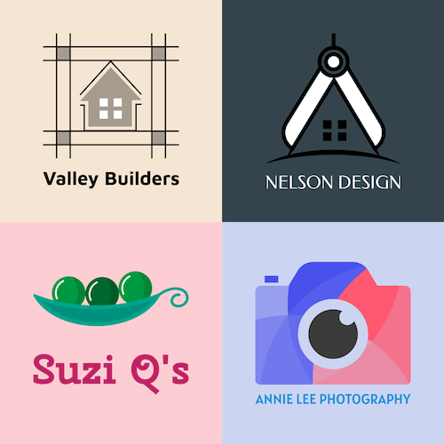
1. Neo-minimalism.
Minimalist logos have been in fashion for the last 50 years and show no signs of fading in popularity. These simple designs clearly and cleverly portray the brand's message in just a few sleek lines and look great anywhere, from small business cards to large billboards. They are also highly scalable due to their simplified design.
Neo-minimalist designs include illustrative or single-line drawings comprising block printing, simple outlines, and neutral tones. Typically, minimalist logos use one or two colors to remove unnecessary details and provide viewers with a visual rest from the high volume of information surrounding them.
These clutter-free, flexible designs are highly effective for engaging potential customers, as they can generally be understood at a glance or leave room for interpretation, as viewers can associate their own experiences with the design.
Whether you want to implement your minimalist look with the help of layers, monograms, negative space, or geometric shapes, this logo design trend is a classic that always looks modern, is always reinventing itself, and will be with us next year.
As examples of the minimalist style, we've chosen the Apple and Nike logos, as well as two logos created with Zarla.


2. Bold colors and color blocking.
In strong contrast to minimalist style and muted colors, is the latest trend: using bold colors and color blocking to stand out and draw attention to your brand. With a saturated market, your brand needs to stand out, and color blocking is bold, fearless, and energetic.
Color-blocked logos are unapologetic, they're loud and use high-contrast color blocking, strong lines, and often 3D imagery. It gives the impression that the brands are modern, high-energy, eager, and competitive, and is a visually appealing, memorable trend.
This trend is particularly popular with young consumers as it radiates fun, enthusiasm, and cheerfulness through the use of vivid colors. Color blocking is also a versatile trend, creating a dynamic look suitable for a wide range of companies.
As examples of bold color logos, we've chosen the 7Up and Slack logos, as well as two logos created with Zarla.


3. Geometric shapes.
Geometric shapes continue to be a trend this year as they create a modern feel with a sleek appearance that perfectly follows the minimalist trend. Geometric shapes are great for symbolic logos, as each form has its own symbolism. For example, curving lines express ease, squares represent strength, triangles show stability, etc.
It is therefore important to understand the symbolism of the geometric shapes you incorporate to elegantly capture your brand’s essence in a conceptual way. Geometric logos have more structure, bringing out feelings of trust and reliability while also maintaining a gentle, uncomplicated aesthetic.
Geometric shapes can be added using symbols, initials, or the brand name’s typography, or can be influenced by merging hard shapes with lines or stripes or utilizing negative space. The biggest advantage of this trend is its scalability.
So, to take advantage this year, try experimenting with geometric shapes, vivid colors, line thickness, and layering to create a lighter, more personal feel that will make a lasting impression.
As examples of geometric logos, we’ve chosen the Adidas and Target logos, as well as two logos created with Zarla.


4. Vintage or retro revival.
In strong contrast to all the minimalist trends we’re seeing this year is the revival of vintage or retro designs combined with futuristic technological stylings. This trend follows the dictates of fashion, which is naturally cyclical, and many brands even dig into their archives and revive older logo designs. These logos are designed to make an impact and bring out strong feelings of nostalgia.
The vintage aesthetic, and in particular vintage fonts, is an elaborate style that immediately grabs attention and allows a brand to tell its story and create positive associations with customers. It also has the effect of making a business appear to be well-established and authentic.
Whether it's lovingly recreated illustrations in the style of the 1930s, or the garish neon look of the 1980s, it’s possible that retro designs will not change much over the next few years. So, if you decide to use a nostalgic logo, you should emphasize authenticity, carefully matching colors, fonts, and graphics to your brand message.
As examples of nostalgic logos, we have chosen the logos of Jack Daniel’s and Burberry, as well as two logos created with Zarla.


5. Negative space.
The use of negative space, or the blank spaces within or around a design, is one of the big logo trends this year. The best-known pioneer of this design style is the clever FedEx logo, with the arrow in negative space between the second "E" in the company name and the "X."
Using negative space is a fairly straightforward way of capturing attention. It generally causes viewers to look again through the clever use of optical illusions and hidden shapes and meanings, giving the logo design a fun direction that still offers structure. It can also make for a great icebreaker for a business, inspiring conversation.
Negative space logos are ideal for companies that want to demonstrate their creativity or trigger an ‘aha’ effect. However, you should not make the composition too subtle, otherwise, the effect may be lost.
As examples of negative space logos, we've chosen the logos of FedEx Express and Toblerone, as well as two logos created with Zarla.


6. Abstract psychedelic.
The psychedelic art trend is linked to the retro revival trend but also evolved from the metallic, liquid fonts. It features abstract psychedelia combined with futuristic, tech-inspired ideas that have nostalgic and sci-fi aesthetics.
Abstract psychedelia is often seen in the font of the logo, incorporating trippy, funky texts that can be difficult to read. It also includes abstract shapes as well as '60s and '70s images, such as butterflies, flowers, and rainbows. These logos are fun, and casual, and give a business a more human vibe.
As examples of psychedelic logos, we've chosen the Museum of London and Sunkist logos, as well as two logos created with Zarla.


7. Controlled chaos with typefaces.
This year is seeing the continued popularity of wordmark and lettermark logos. Using just the brand name creates awareness and recognition for start-up brands, but playing with different typefaces and creative text styles creates memorability and attracts a more active, younger, and progressive-thinking customer base.
2023 was the year for experimental typography, and this trend is still going strong. This year, text and monogram logos are all about "individuality," and there are various ways to creatively use typefaces and make them your own in this trend — there are no limits to the imagination.
Letters in the company name could be stretched or set bold or thin, or letter components could simply disappear. You could merge icons into your business name or weave objects or lines through the typeface for a creative and timeless look. Using only sans serif fonts creates a minimalist look that allows for creativity in colors and icons.
Lowercase letters highlight accessibility, while flared serifs are playful and carefree. Using text in circles, archways, and tombstone-based shapes encases your brand information and acts as a tool of illustration. There is also stairway letter placement, relocating letters, unusual font forms, and contrasting shades to consider.
However you play with your typefaces, your brand name should still be recognizable and easy to read, so choose a typeface that represents your brand and can grow with it; some fonts will always be in style, while others are fleeting trends.
As examples of typography logos, we have chosen NASA and the London Science Museum, as well as two logos created with Zarla.


8. Animation.
The use of animation leads to a creative, interactive logo design that captures the essence of a brand in motion. You can add more context to an animated logo than with a static logo, bringing the brand message and background to life for an authentic, original effect.
Animated logos are ideal for companies that want to compete in the fiercely competitive digital environment and create an emotional connection with their customers, as they're great for triggering childhood memories and telling stories. In addition, animated logos can be easily integrated into electronic media and so appear technically innovative.
To meet the increasing demands for moving content in logo design, a combination of sleeker 2D and more complex 3D animations is becoming more popular. However, you should be aware that 3D animations can be more costly as they are more complex.
Animations can also lead to personalization in brands, responding to user preferences to provide a tailored experience. This is a beneficial feature in a world saturated with motion and interaction and makes the logo an integral part of user interaction with the brand.
As examples of animation logos, we’ve chosen LG and Beyond Plastic logos, as well as two custom logos created using Zarla designs.


9. Art Deco.
The Art Deco trend includes geometric shapes, luxury aesthetics, lavish details, and a timeless appeal that references the 1920s and the Jazz culture. This trend is linked to the vintage revival, creating logos inspired by art deco but combined with an edge of modernity.
Art Deco influences on logos often include symmetry, complex details, and limited color palettes featuring metallics, forming a timeless glamour that appeals to a wide range of customers.
The Art Deco trend allows businesses to state that they are sophisticated, elegant, and maybe a little avante-garde. The strong visual style also allows a business to stand out from the competition and leave a lasting impression on its customers. This trend can also show customers that the business is creative, innovative, and unique.
As examples of Art Deco logos, we've chosen the DecoDance Club and El Rayo Tequila logos, as well as two logos created with Zarla.


10. Sustainability and eco-friendliness.
In today’s technically-driven world, people can feel disconnected from the world around them. This has led to a trend toward referencing a higher power in logo design. Generation Y in particular is embracing alternative and new-age spirituality, pushing against established norms in the search for meaning and connection.
This trend focuses on the use of images like planets, glyphs, and nature-inspired motifs from astrology, tarot, and mysticism. It is a fresh and modern trend that can easily be incorporated with other trends or can simply use earthy colors and organic elements.
These nature-inspired logos reflect organic approaches and environmental friendliness and are more in vogue than ever this year. Should you choose a logo that symbolizes sustainability and eco-friendliness, you must make sure that your entire brand presence is aligned with it. Otherwise, you will quickly lose credibility.
If you implement this approach consistently, you can be sure that with a logo that is close to nature, you have an excellent marketing tool in your hand that will appeal especially to representatives of the demanding Generation Y.
We have chosen the logos of Whole Foods Market and Godiva as examples of sustainability and eco-friendly logos, as well as two logos created with Zarla.


