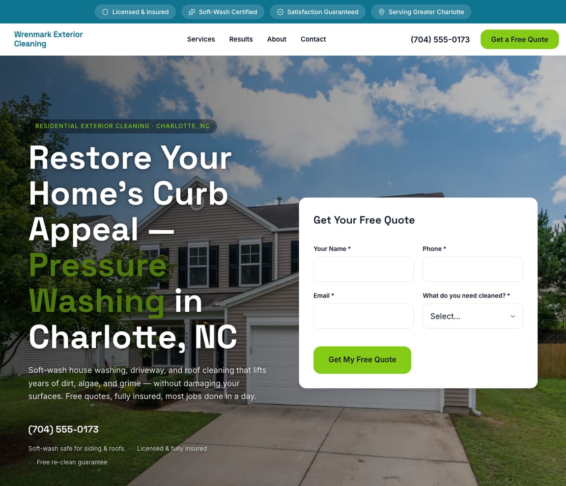
Inspiration · Pressure Washing
Pressure Washing Website Design: The Best Examples, Explained
Looking for pressure washing website examples? These 12 are the best we could find — standout real pressure washing sites plus designs you can build with Zarla — and each comes with a breakdown of the specific design move that makes it work. Find a look you love and you can build a site in that exact style, free, in about 30 seconds.
Real sites + designs you can build with Zarla — free to build and preview, no credit card
Build yours
Ready-made pressure washing websites
Open one to see the whole site, then put your business in it — free to build and preview.
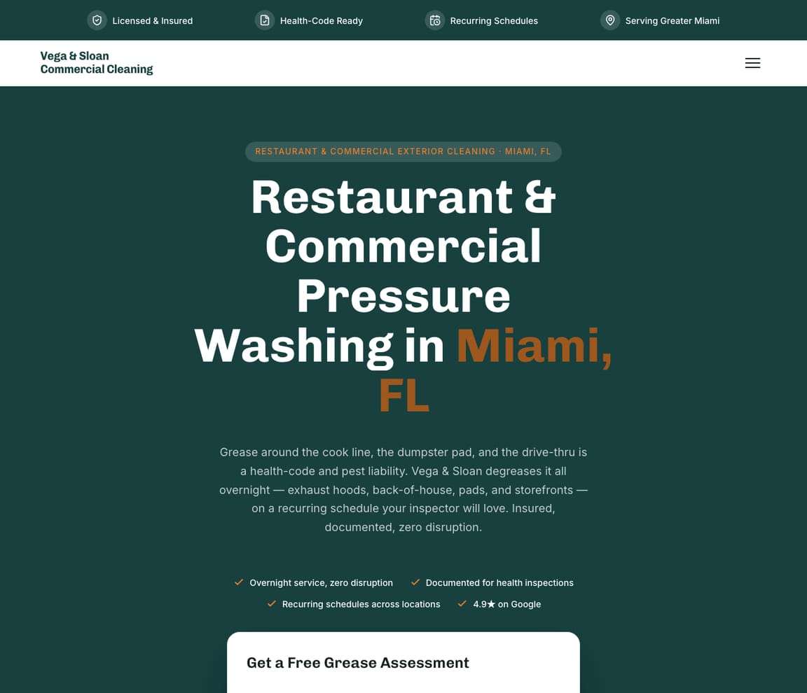
What should a pressure washing website have?
People hire a pressure washer while looking at a stained driveway, roof or fence, so the page names the surface, the town and the proof you've cleaned plenty of them.
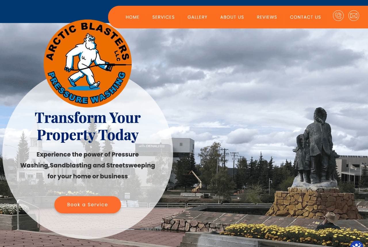
- Your town, in your own photos. Arctic Blasters shoots Fairbanks landmarks and offers to "clean up Fairbanks" across the North Star Borough, which no national chain can copy. See Arctic Blasters
- The stain named, not the method. Owners search for the problem they can see. Pennington & Ross Roof Wash heads its page "Get Rid of the Black Streaks for Good" instead of "soft washing". See Pennington & Ross Roof Wash
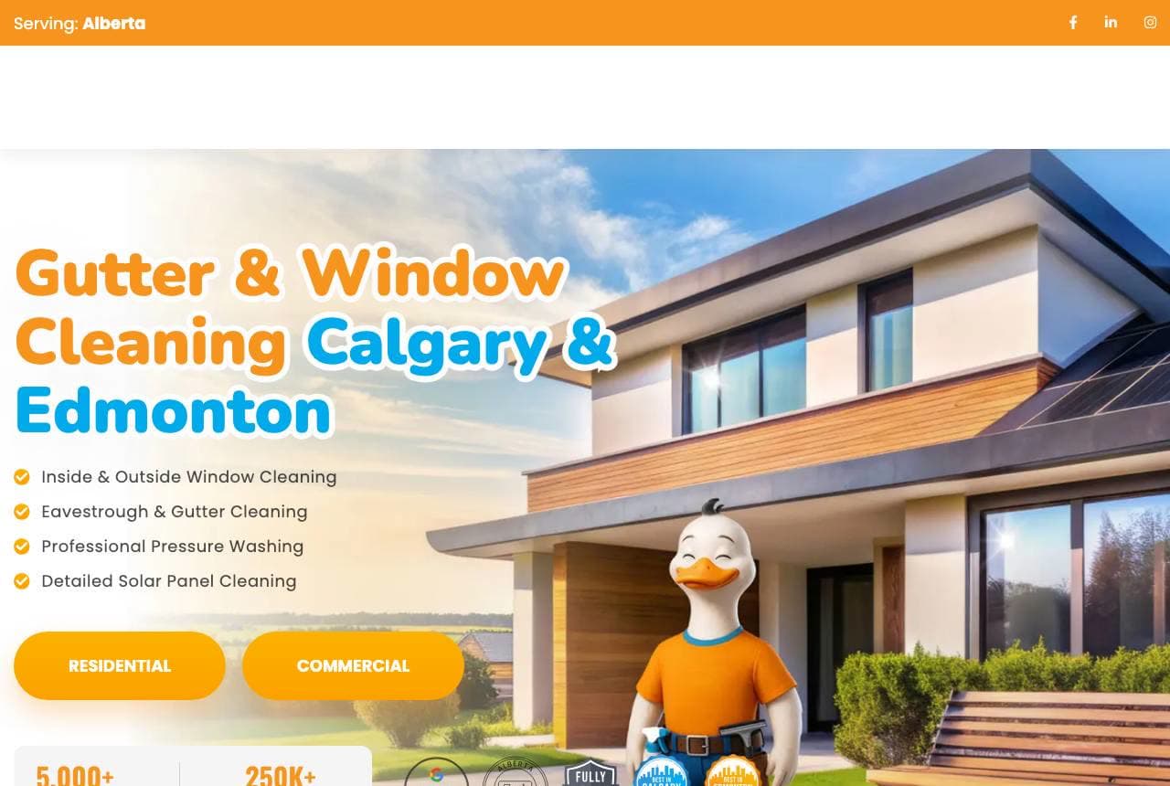
- Numbers behind the friendly face. Winducks pairs its duck mascot with insured-and-certified badges, 5,000+ customers and 250,000+ windows washed, so the cartoon reads as a real company. See Winducks
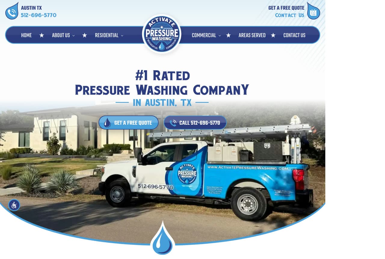
- Quote and call, everywhere you scroll. Activate Pressure Washing repeats its "Get a Free Quote" and "Call" buttons at every scroll depth, and keeps the phone number on screen. See Activate Pressure Washing
What every pressure washing website design needs
Look at the pressure washing sites that win the job and the same elements repeat: before-and-after photos of a driveway, a deck or a roof as the first thing on the page, because the result sells itself; the services by surface (house washing, roof soft washing, driveways and concrete, decks and fences, commercial), each with the method named so a homeowner knows you will not blast their siding; a quote form that asks for the address and a photo, with a phone number beside it; 'insured' under the buttons and real photos of your rig; reviews near the top; the towns you serve by name; and flat prices or a 'from' price where you can, because 'call for a quote' loses the people comparing three companies on a Saturday. Each example below calls out the specific choice worth stealing for your own pressure washing website.
- Window & Gutter Cleaning
- Playful
- Orange + sky
Winducks: A duck mascot carrying serious numbers
Winducks pairs the friendliest device in branding — a cartoon duck in work overalls, giving a thumbs-up on the front lawn — with unexpectedly serious proof: 5,000+ customers served, 250,000+ windows washed, insured-and-certified badges, and 'Best in Edmonton and Calgary' award seals. The headline stays keyword-plain (gutter and window cleaning plus both city names) while the mascot does the memorability work, and checkmarked service bullets make the scope scannable in seconds. Residential and commercial buttons split the two audiences immediately. It's the complete formula for a local service brand: a character people remember at referral time, riding on numbers that survive scrutiny.
- A mascot makes the referral conversation effortless
- 250K-windows stat grounds the cartoon in real scale
- Keyword + both city names in one working headline
Steal this: Pair your mascot with your biggest real number — charm plus proof beats either alone.
Opens a similar Zarla design you can make yours.
- Pressure Washing
- Trade-classic
- Blue + white
Activate Pressure Washing: The rig as the hero, ranked #1 above it
Activate Pressure Washing leads with its work truck — decaled, tank-loaded, parked proud in front of a clean Austin home — under '#1 Rated Pressure Washing Company in Austin, TX.' The blue liquid-swoosh frame around the photography is unapologetically trade aesthetics, and the paired pill CTAs (Get a Free Quote / Call) repeat at every scroll depth. A second rig photo further down reinforces the fleet impression. This is the honest center of the category done crisply: the truck proves you're equipped, the ranking claim proves you're chosen, and the phone number never leaves the screen. For most exterior-cleaning outfits, this is the design to beat.
- Equipment photography proves capability instantly
- A ranked claim with the city name anchors local search
- Quote + call CTAs repeat at every scroll depth
Opens a similar Zarla design you can make yours.
- Power Washing
- Eco
- Green + white
Clean Green Power Washing: An eco position with a memorable threat
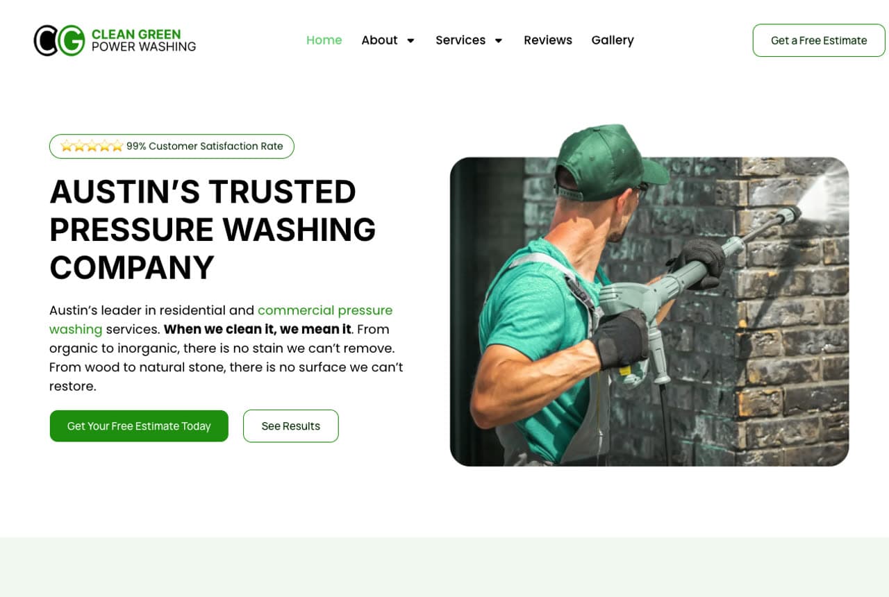
Clean Green Power Washing builds its brand into its name and then writes the category's best line of copy: 'When we clean it, we mean it. From organic to inorganic, there is no stain we can't remove. From wood to natural stone, there is no surface we can't restore.' The green palette and a 99% customer-satisfaction badge carry the eco-plus-competence promise, while a rounded photo card of a tech mid-blast on brick supplies the action. Service cards below segment house washing, wood restoration, and natural stone — each with surface-specific reassurance about technique. Eco-positioning plus swaggering copy is an unusual combination, and it makes this Austin outfit feel both safe and formidable.
- 'No stain we can't remove' is confidence written plainly
- Green branding + satisfaction stat sell safe-but-strong
- Surface-specific service cards reassure about technique
Opens a similar Zarla design you can make yours.
- Power Washing
- Proof-led
- Navy + white
Prestige Power Washing: Review volume as the visual centerpiece
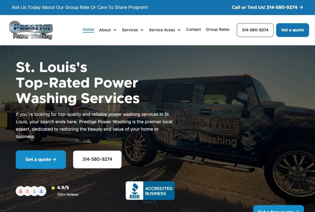
Prestige Power Washing runs a dark truck-at-dusk hero — 'St. Louis's Top-Rated Power Washing Services' — but its real architecture is proof: a 4.9/5 chip citing 700+ reviews sits beside a BBB-accredited badge in the hero, and the very next section is a carousel titled 'Five Star Reviews' quoting customers on communication, price, and fence-restoring results. A group-rate referral program banner tops the page, converting happy neighbors into an acquisition channel. When your review base reaches into the hundreds, this is the right allocation: make the count unmissable up top, then let the individual voices carry the middle of the page.
- 700+ reviews is the headline stat — count it in the hero
- A review carousel gives individual voices the mid-page
- Group-rate banners turn neighbors into pipelines
Opens a similar Zarla design you can make yours.
- Industrial Cleaning
- Eco
- Green + navy
Big Green Men: Industrial scope behind a friendly name
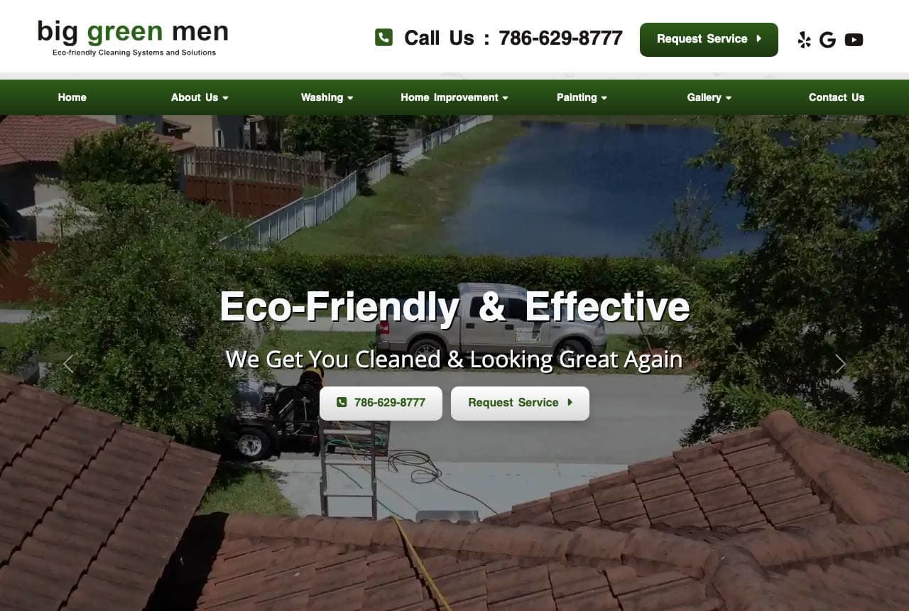
Big Green Men sounds like a lawn crew and reads like a contractor: 'Eco-Friendly & Effective — We Get You Cleaned & Looking Great Again' floats over drone footage of a tile-roof wash, while the copy beneath talks industrial cleaning, proprietary formulas, and fifteen years serving Miami and South Florida. An estimate form with project-description field rides the left rail, sized for commercial inquiries rather than quick quotes. The green-forward palette keeps the eco thread from name to design. It's a useful pattern for operators straddling residential and industrial work: keep the approachable name and colors, but let the form fields and vocabulary signal the bigger jobs you want.
- A drone roof-wash hero proves scale immediately
- Project-description form fields invite commercial work
- Name, palette, and copy hold one eco thread end to end
Opens a similar Zarla design you can make yours.

- Pressure Washing
- Proven
- Cobalt + bronze
Deacon & Hale Pressure Washing: Proof-strip confidence for the flagship claim
Deacon & Hale Pressure Washing is Zarla's flagship pressure-washing design, opening on the proof-strip hero: 'Tampa's Premier Pressure Washing' over a strip of ratings, credentials, and response-time chips — the layout that made the Moritz pattern famous, tuned for exterior cleaning. Deep cobalt with a bronze accent reads established rather than flashy, and the structure underneath runs the classic local-service gauntlet: services grid, before-and-after gallery, reviews, quote form. This is the design to clone when you want the category's proven conversion order with zero experimentation — the design equivalent of a well-maintained rig. Swap Tampa for your city and the proof chips for your own numbers in about 30 seconds.
- Proof-strip heroes front-load ratings and credentials
- Cobalt + bronze reads established, not gimmicky
- The classic local-service conversion order, pre-built
- Pressure Washing
- Local
Arctic Blasters: A hometown mascot for a frontier market
Arctic Blasters wraps a Fairbanks pressure-washing outfit in a badge-style mascot roundel — an arctic character mid-blast — and an invitation to 'Transform Your Property Today' over photography of the town's own monuments and flower beds. The copy leans local and familial: a family-run business 'here to help you clean up Fairbanks,' offering pressure washing, dustless sandblasting, and street sweeping for the North Star Borough. In a remote market, that specificity is the moat; no national chain photographs YOUR town square. The orange-on-navy palette keeps energy high against long-winter imagery. Small-market operators: your town's landmarks are brand assets nobody else can use.
Opens a similar Zarla design you can make yours.

- Bin Cleaning
- Subscription
Ferris & Blythe Bin Co.: A subscription pitch for a chore nobody claims
Ferris & Blythe Bin Co. is Zarla's trash-bin-cleaning design, selling the niche the industry forgot to brand: 'Trash Bin Cleaning in Raleigh, NC' on a form-centered hero — headline, checkmark value props, and a signup card in one screen, built for a subscription business rather than one-off jobs. The fresh green-and-marigold palette does deliberate work against the product's, well, subject matter: everything about the design smells clean. Recurring route businesses live or die on effortless signup, so the form takes the hero and the copy sells the schedule, not a single visit. If your service is subscription-shaped, clone this and let the layout do the retention math for you.

- Graffiti Removal
- Urban
Reyes & Cole Surface Restoration: Street-level urgency in stroked type
Reyes & Cole Surface Restoration is Zarla's graffiti-removal design, borrowing the energy of what it erases: 'Graffiti Removal in Los Angeles' set in oversized outline type — hollow, stroked letterforms that glow against near-black like the problem it solves — with a single shock of pink as the accent. The outline hero gives the page an urban edge no photo could, while the structure underneath stays strictly commercial: response times, property-manager framing, quote capture. It's a sharp positioning trick — look streetwise enough to understand the canvas, professional enough to restore it. For removal, restoration, and emergency exterior trades, this is the design with adrenaline already in it.

- Fleet Washing
- B2B
Calloway & Trent Fleet Wash: B2B washing with a dispatch-grade form
Calloway & Trent Fleet Wash is Zarla's fleet-washing design, talking to operations managers, not homeowners: 'Fleet & Truck Washing in Kansas City, MO' above a form-quickquote bar tuned for fleet size and schedule, on a midnight field with a single sky-blue accent. The design's restraint is the pitch — fleet contracts are procurement decisions, so the page reads like a vendor who understands POs, insurance certificates, and route windows. No suds photography needed; the typography and form do the qualifying. For any washer chasing recurring commercial contracts over driveway jobs, clone this and put your capacity in the headline.

- Solar Panel Cleaning
- ROI-led
Marsh & Okoye Solar Wash: Selling kilowatts, not cleanliness
Marsh & Okoye Solar Wash is Zarla's solar-panel-cleaning design, making the niche's smartest argument in its headline: 'Get Back the Power You're Paying For — Solar Panel Cleaning in Phoenix.' Dirty panels cost measurable money, so the pitch is energy yield, not sparkle — a framing that turns a cleaning service into a payback calculation. The centered hero holds the line in clean type on a photovoltaic blue field with a sun-gold accent, palette as on-topic as it gets. Solar owners are data people; the page's efficiency-first language meets them there. If your service has a quantifiable ROI, put the recovered value in the headline and let the cleaning be the mechanism.

- Roof Cleaning
- Symptom-led
Pennington & Ross Roof Wash: The black streaks, named and banished
Pennington & Ross Roof Wash is Zarla's roof-cleaning design, leading with the exact thing homeowners google: 'Get Rid of the Black Streaks for Good — Roof Cleaning in Orlando, FL.' The bottom-editorial hero pins that promise low over a full-bleed roofline photo, cinematic rather than catalog-like, in slate with an amber accent. Naming the visible symptom (gloeocapsa streaks, though nobody calls them that) beats naming the service — the customer doesn't want 'soft washing,' they want the streaks gone permanently, and 'for good' answers the fear that they'll return. Symptom-first headlines with a permanence promise: the highest-converting formula for restoration trades, pre-built here.
Keep exploring
Browse pressure washing website templatesPressure Washing website builder — how Zarla builds yoursPressure washing website cost: AI vs agencyWrite your pressure washing business plan — free, with startup costs and a sample planBest website builders for pressure washing businesses, scored on the same testsHow to start a pressure washing business, step by step
Frequently asked
What should a pressure washing website show first?
The result. A clean driveway, deck or roof next to the dirty one does more selling than any headline, which is why the strongest sites in this gallery put the work or the rig in the first screen: Activate Pressure Washing parks its decaled truck in front of a clean Austin home, and Big Green Men floats its headline over drone footage of a tile-roof wash. Under the photo, a quote button and a phone number, then the surfaces you clean.
Should a pressure washing website explain soft washing?
Yes, if you clean roofs or siding. A homeowner's fear is that a pressure washer will strip paint or damage shingles, so name the method for each surface. Pennington & Ross Roof Wash leads with the exact thing homeowners search — 'Get Rid of the Black Streaks for Good' — and Clean Green Power Washing's best line promises that from wood to natural stone there is no surface it can't restore. Saying which surfaces get low pressure and which get soap does more for trust than any badge.
How should a pressure washing website handle quotes?
Ask for what you need to price the job without a visit: the address, the surfaces and, if you can, a photo. Most of the real sites here pair a quote form with a call button — Activate repeats its Get a Free Quote and Call pills down the page, and Big Green Men offers an estimate form on its home page. Calloway & Trent Fleet Wash, Zarla's fleet-washing design, swaps the homeowner questions for fleet size and schedule, because that is how a fleet manager buys.
How is a website for bin cleaning, solar panel cleaning or graffiti removal different?
Each niche sells a different payoff. Ferris & Blythe Bin Co. is built for a subscription, with a signup card in the hero instead of a one-off quote. Marsh & Okoye Solar Wash sells energy, not sparkle — 'Get Back the Power You're Paying For' — because dirty panels cost money. Reyes & Cole Surface Restoration sets 'Graffiti Removal in Los Angeles' in hollow outline type and talks to property owners who need it gone fast.
What proof works best on a pressure washing website?
Review volume and the word insured. Prestige Power Washing makes reviews its centerpiece — a rating chip beside a BBB badge in the hero, then a carousel titled 'Five Star Reviews'. Winducks pairs a cartoon duck mascot with serious numbers and insured-and-certified badges. Deacon & Hale, Zarla's flagship design, runs a strip of ratings, credentials and response-time chips straight under the headline. Real before-and-after photos of your own jobs back all of it up.
You've seen what works. Now make it yours.
Describe your business and Zarla designs a complete, professional website in about 30 seconds — built to convert, just like the ones above.
Free to build and preview · no credit card · publish to your own domain on Premium