Inspiration
Website Design Inspiration
A curated, annotated collection of the best website designs — organised by industry, with a breakdown of what makes each one work. Find a look you love, then build it free in about 30 seconds.
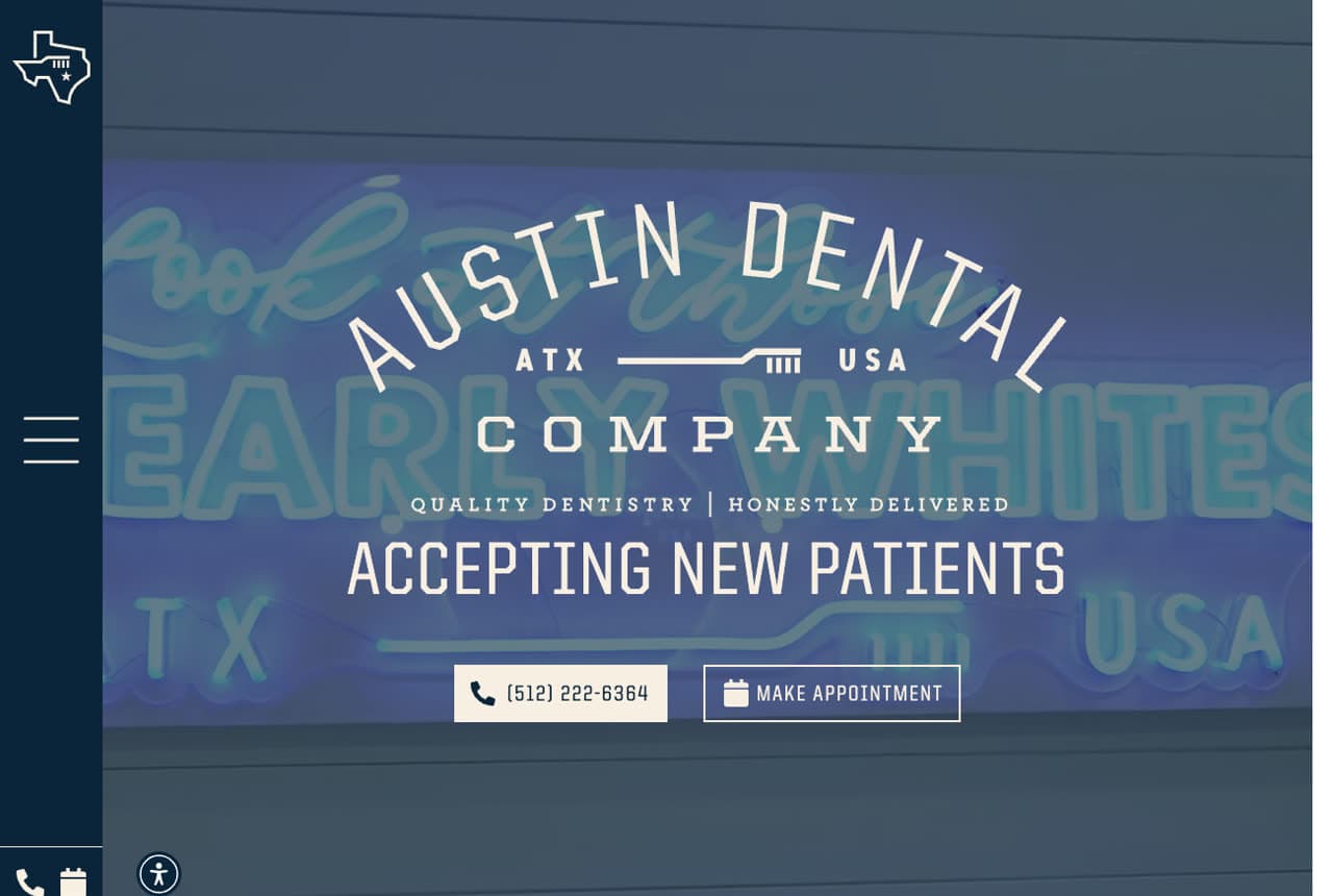
The Best Small Business Website Examples (and Why They Work)
The best small business sites do three things fast: they prove you're trustworthy before the visitor scrolls (reviews, years in business, real photos), they point to one clear action (call, book, quote), and they let real photos and customer words carry the selling. Everything below is a variation on those three moves — pick the one that fits how your customers decide.
Browse the gallery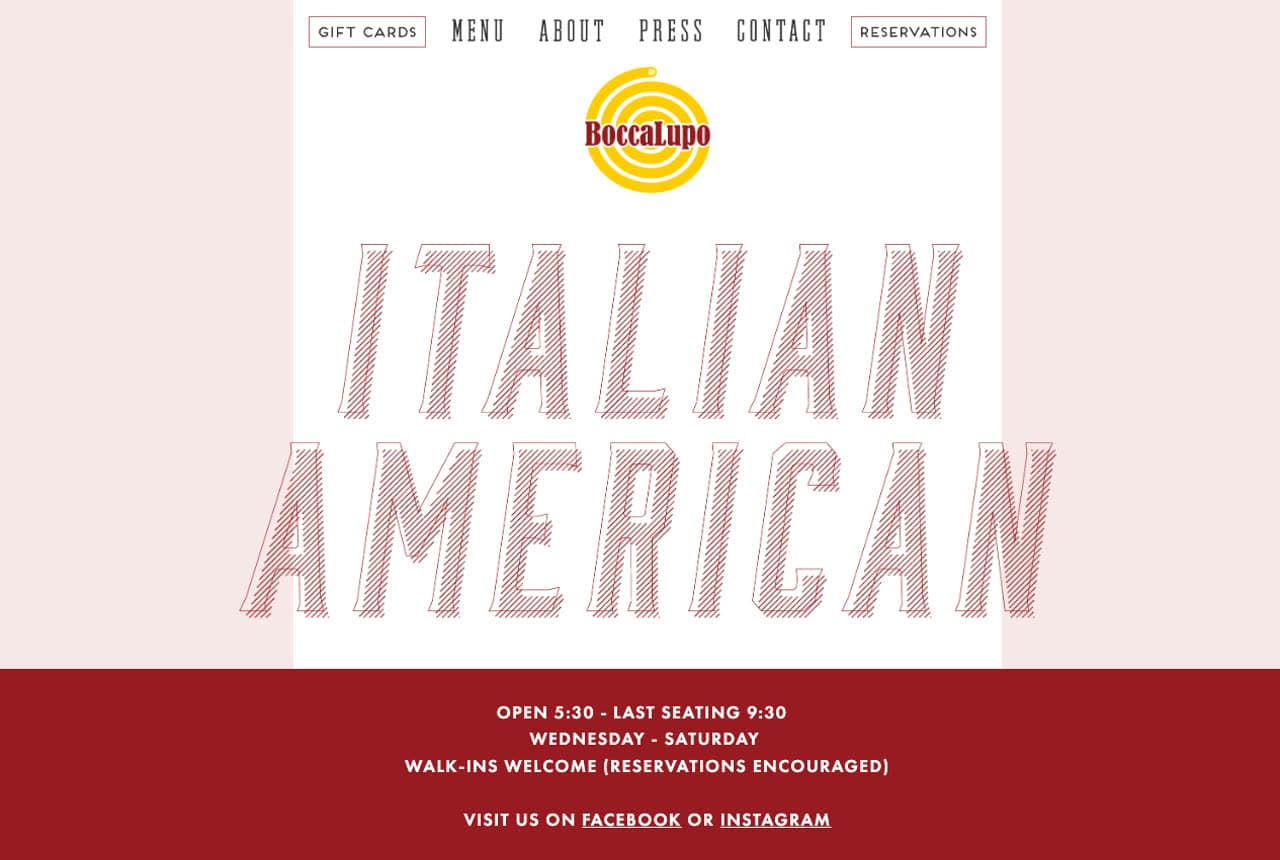
Website Design Ideas, Explained
Great design isn't about taste — it's about fit. A steakhouse goes dark so the fire glows; a family photographer goes warm so you feel the candid moment; a luxury brand strips everything back because restraint signals 'expensive.' As you browse, notice how each style is matched to the feeling the business needs to create. Pick the feeling first; the look follows.
Browse the gallery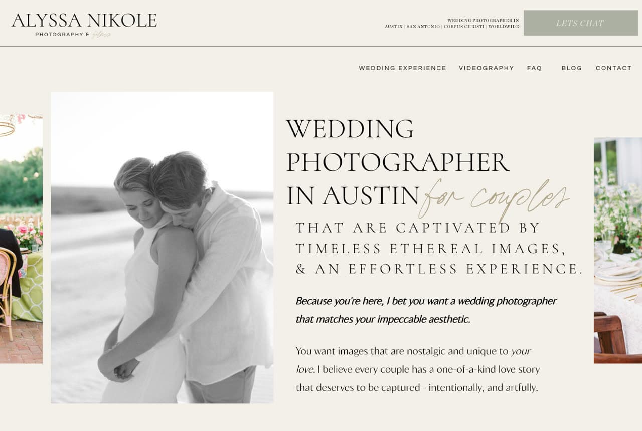
The Best Photography Website Examples, Explained
Across the best photography sites, the same patterns repeat: let one big image (or a rotating gallery) carry the hero, frame the work with warm neutrals so the photos pop, match the palette to the niche, and use copy with a real point of view to attract the right clients. The design's only job is to get out of the way of the work and make the viewer feel something.
Browse the gallery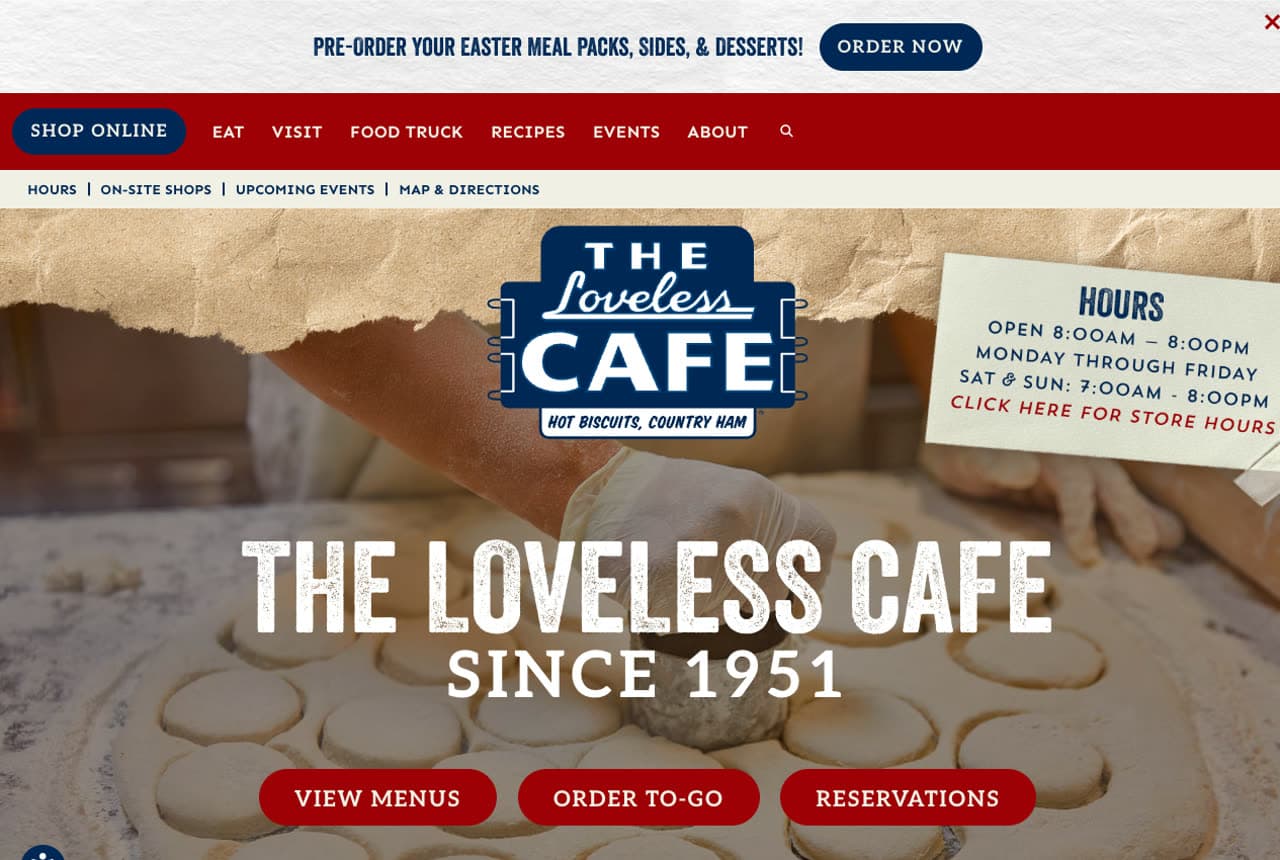
The Best Restaurant Website Examples, Explained
The best restaurant sites share a few moves: they lead with photography that makes you hungry (or with the room's atmosphere), they make one action obvious — reserve a table, order online, or find the cart — and they let a real voice in the copy do the selling instead of generic descriptions. Whether it's a 70-year-old Southern cafe or a brand-new food cart, the design's job is to set the mood and then get out of the way of the next step. Each example below calls out the specific choice worth stealing for your own restaurant website.
Browse the gallery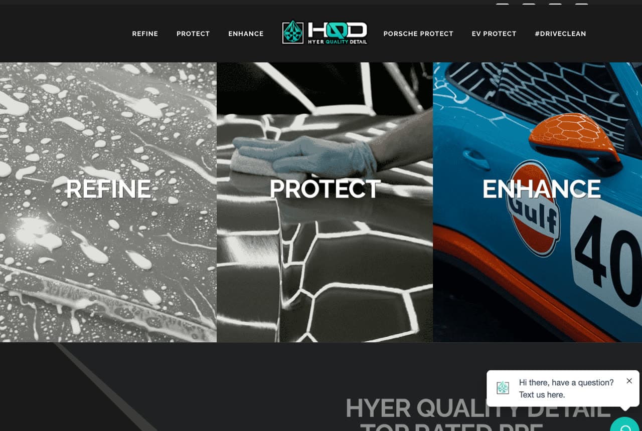
Car & Auto Detailing Website Design: The Best Examples, Explained
The best car detailing sites share a few moves: they lead with a dark, high-contrast theme that makes reflections and paintwork pop, they prove credibility fast (Google ratings, customer avatars, the calibre of cars they service), they remove the 'call for a quote' friction with transparent or productised pricing, and they make one action obvious — book online, get a quote, or call. Whether it's a concours studio or a $50 express wash, the design's job is to make the work look flawless and the booking feel easy. Each example below calls out the specific choice worth stealing for your own car detailing website.
Browse the gallery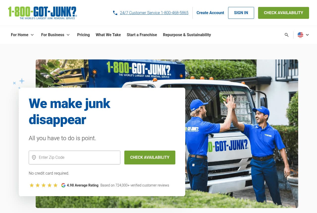
The Best Junk Removal Website Examples, Explained
The best junk removal sites share a few moves: they promise effortlessness and remove the 'call for a quote' friction with instant or upfront pricing, they prove trust at scale (Google ratings, real crew photos, huge review counts), and they give one clear reason to choose them — fair 'pay for the space' pricing, an eco or donation mission, veteran ownership, or white-glove service. The category defaults to green and the same truck-and-crew photo, so the ones that win often break that mold. Each example below calls out the specific choice worth stealing for your own junk removal website.
Browse the gallery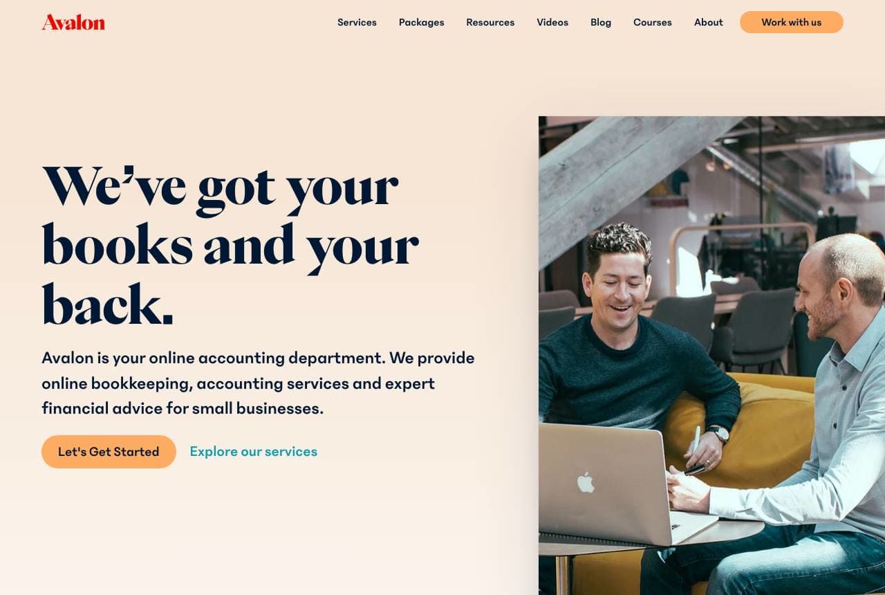
The Best Bookkeeping Website Examples, Explained
Bookkeeping is a trust purchase — you're handing someone your books — so the best bookkeeping websites do three things fast: they claim a niche (an industry, a software, a situation like catch-up work), they prove competence with specifics (client counts, funds raised, certifications — not adjectives), and they point to one clear action. Notice how many of the designs below lead with typography and brand personality rather than stock photography: in a category drowning in blue suits and calculator photos, a distinctive voice is the cheapest differentiator.
Browse the gallery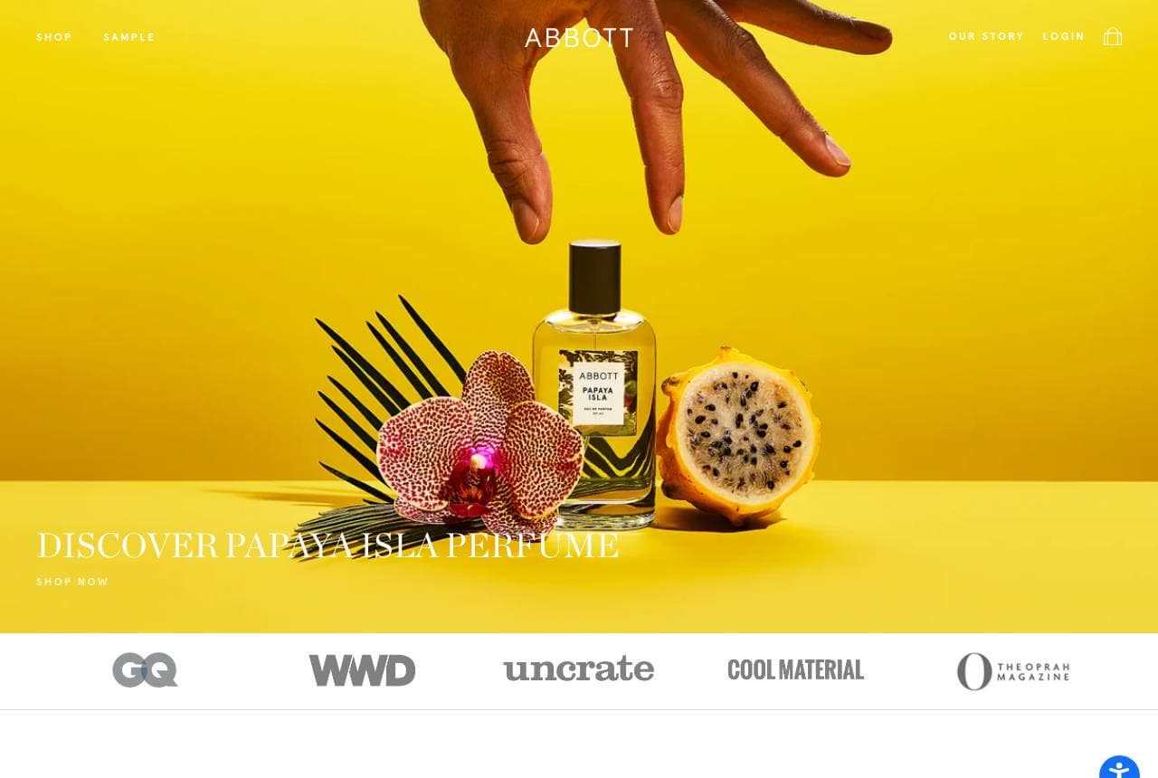
The Best Perfume Website Examples, Explained
Every perfume site fights the same problem: the product is invisible and the screen has no nose. The best ones translate scent into sight — staging bottles with their raw ingredients, building a color world per fragrance, or writing a story the visitor can almost smell — and then lower the risk of buying blind with samples, discovery sets, and quizzes. Notice how much personality wins here: in a category where every product is a glass rectangle, the brand voice around the bottle is the entire differentiation.
Browse the gallery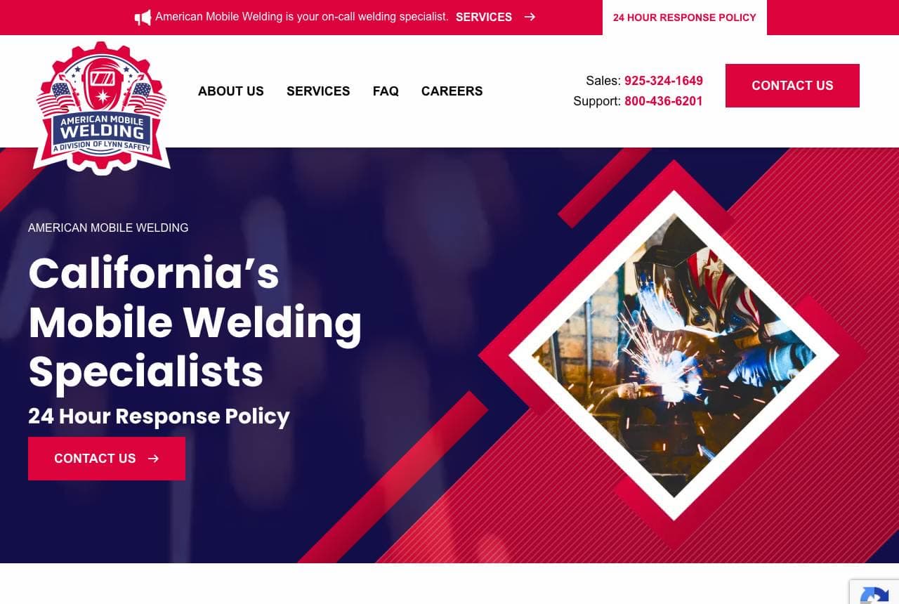
The Best Welding Website Examples, Explained
The best welding websites share a few moves: they earn trust fast, lead with strong visuals of the work, point to one clear action, and match the design to how their customers decide. Each example below calls out the specific choice worth stealing for your own welding website.
Browse the gallery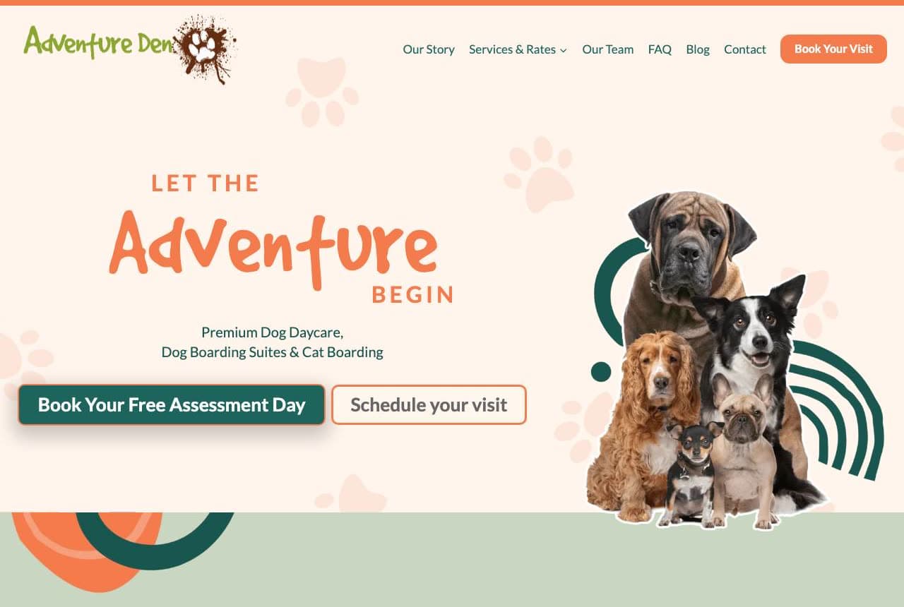
The Best Pet Sitting Website Examples, Explained
The best pet sitting websites share a few moves: they earn trust fast, lead with strong visuals of the work, point to one clear action, and match the design to how their customers decide. Each example below calls out the specific choice worth stealing for your own pet sitting website.
Browse the gallery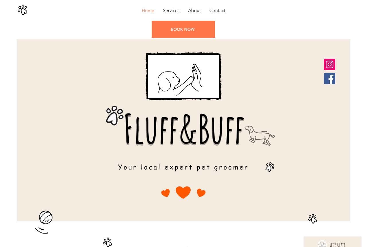
The Best Dog Groomer Website Examples, Explained
The best dog groomer websites share a few moves: they earn trust fast, lead with strong visuals of the work, point to one clear action, and match the design to how their customers decide. Each example below calls out the specific choice worth stealing for your own dog groomer website.
Browse the gallery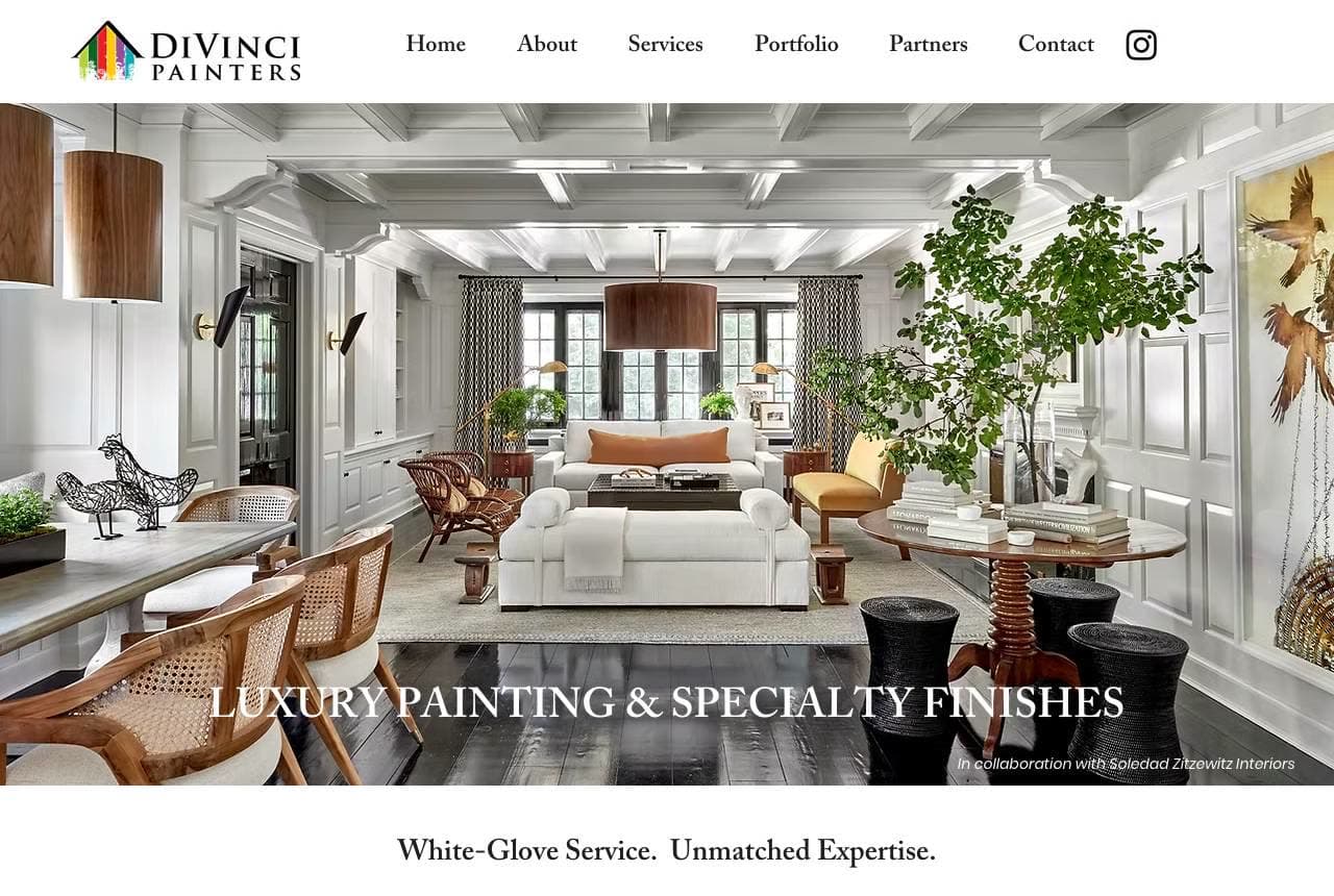
Painting Company Website Design: The Best Examples, Explained
Look at the painting company sites that win the estimate and the same elements repeat: before-and-after photos of real jobs, interior and exterior, as the first thing on the page; the services split the way a homeowner thinks about them (interior, exterior, cabinets, decks and fences, commercial), with a line on prep and the paint brands you use; an estimate form that asks for the rooms or the square footage and a photo, with a phone number beside it; reviews and the number of homes painted near the top; the towns you serve by name; and a guarantee on the work, stated plainly. Each example below calls out the specific choice worth stealing for your own painting company website.
Browse the gallery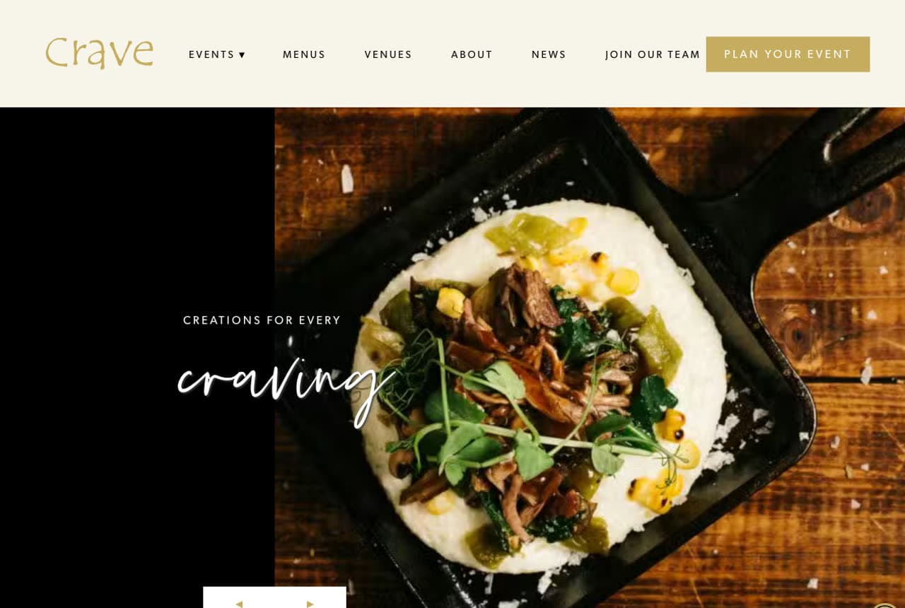
The Best Catering Website Examples, Explained
The best catering websites share a few moves: they earn trust fast, lead with strong visuals of the work, point to one clear action, and match the design to how their customers decide. Each example below calls out the specific choice worth stealing for your own catering website.
Browse the gallery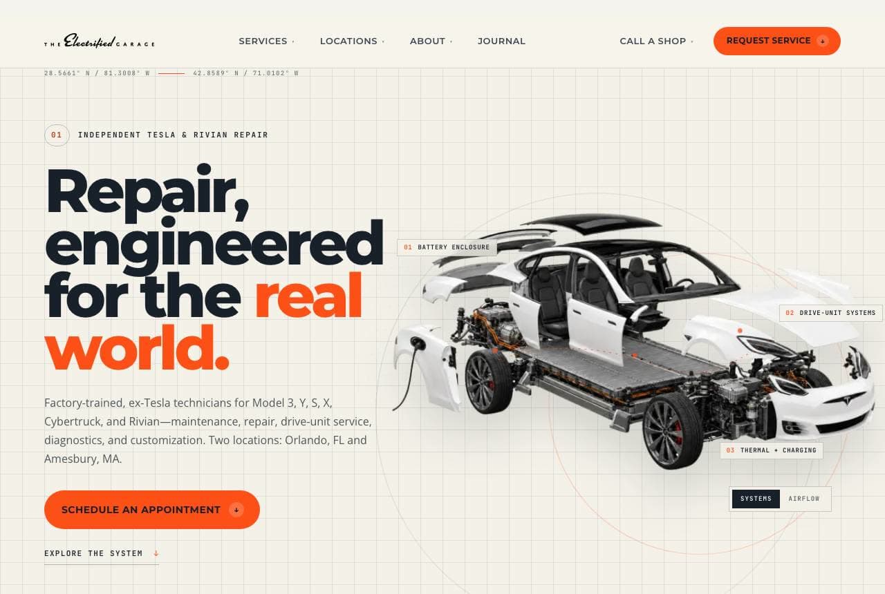
The Best Auto Repair Website Examples, Explained
The best auto repair websites share a few moves: they earn trust fast, lead with strong visuals of the work, point to one clear action, and match the design to how their customers decide. Each example below calls out the specific choice worth stealing for your own auto repair website.
Browse the gallery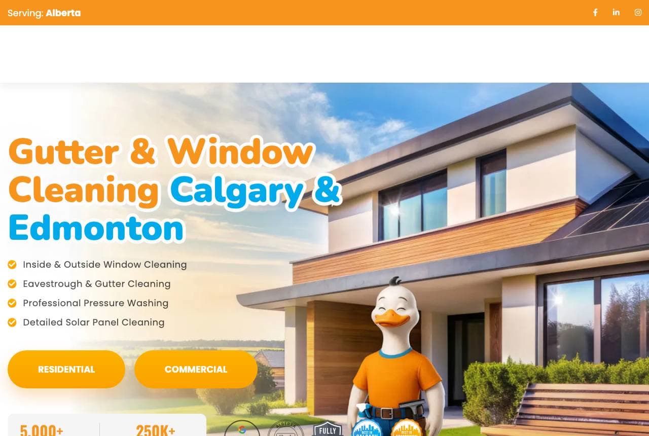
Pressure Washing Website Design: The Best Examples, Explained
Look at the pressure washing sites that win the job and the same elements repeat: before-and-after photos of a driveway, a deck or a roof as the first thing on the page, because the result sells itself; the services by surface (house washing, roof soft washing, driveways and concrete, decks and fences, commercial), each with the method named so a homeowner knows you will not blast their siding; a quote form that asks for the address and a photo, with a phone number beside it; 'insured' under the buttons and real photos of your rig; reviews near the top; the towns you serve by name; and flat prices or a 'from' price where you can, because 'call for a quote' loses the people comparing three companies on a Saturday. Each example below calls out the specific choice worth stealing for your own pressure washing website.
Browse the gallery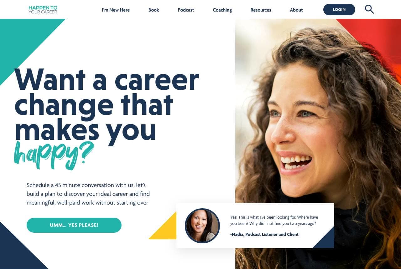
The Best Life Coach Website Examples, Explained
The best life coach websites share a few moves: they earn trust fast, lead with strong visuals of the work, point to one clear action, and match the design to how their customers decide. Each example below calls out the specific choice worth stealing for your own life coach website.
Browse the gallery
The Best Notary Website Examples, Explained
The best notary websites share a few moves: they earn trust fast, lead with strong visuals of the work, point to one clear action, and match the design to how their customers decide. Each example below calls out the specific choice worth stealing for your own notary website.
Browse the gallery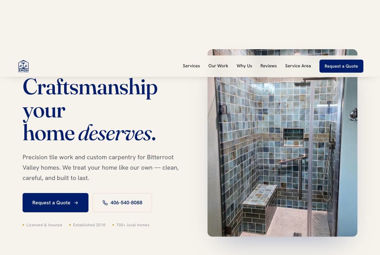
Handyman Website Design: The Best Examples, Explained
Look at the handyman sites that win the job and the same elements repeat: a short list of the jobs you actually do, grouped the way a homeowner thinks (repairs, mounting and assembly, carpentry, painting, small bathroom and kitchen jobs), with the jobs you do not do said plainly; a quote form that asks for a photo of the problem, because most handyman jobs can be priced from a picture; a phone number and a text option beside it; how you charge, hourly with a minimum or a flat rate per job; real photos of you and your van, since a handyman is hired on trust; reviews near the top; the towns you cover; and 'insured' under the buttons. Each example below calls out the specific choice worth stealing for your own handyman website.
Browse the gallery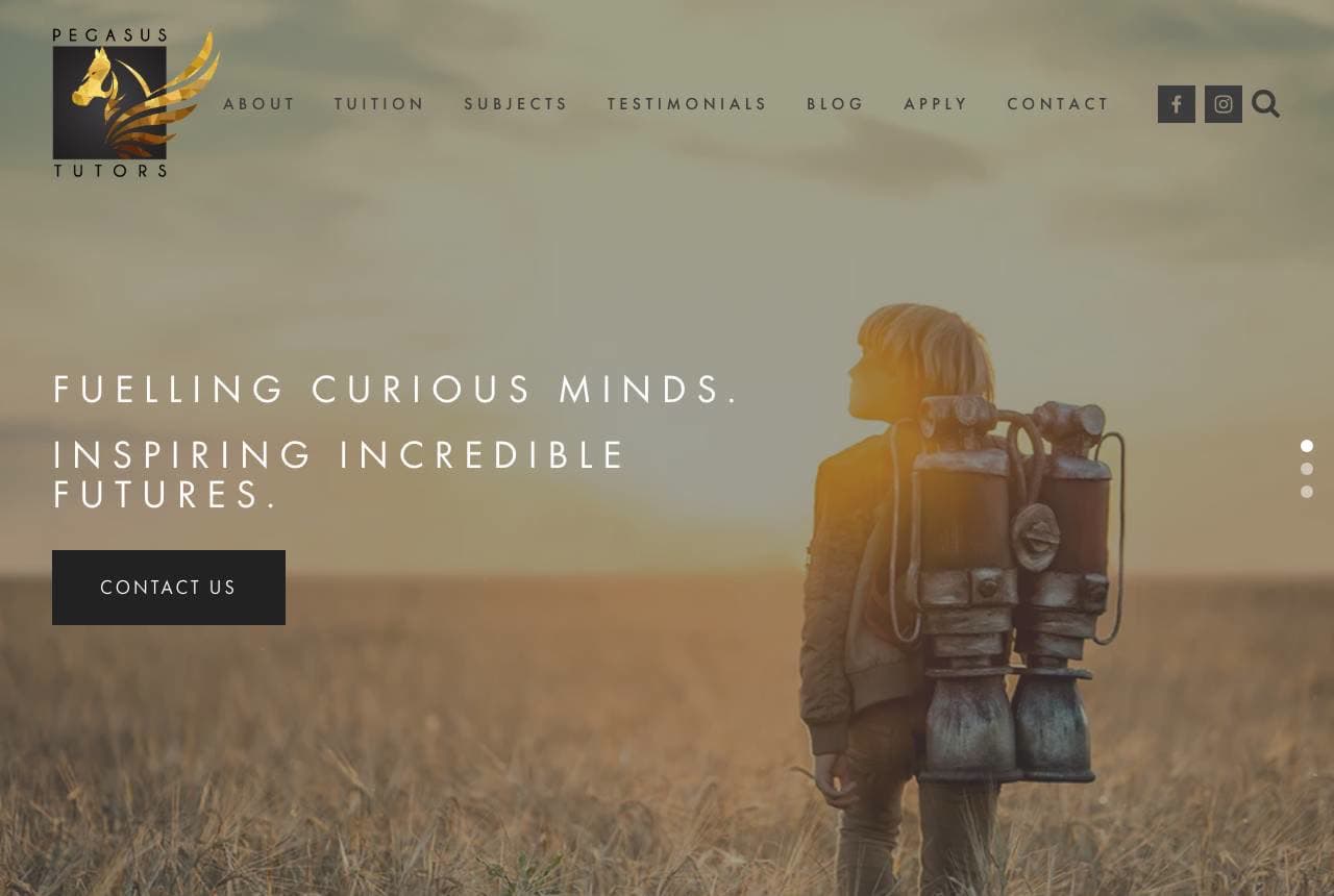
The Best Tutoring Website Examples, Explained
The best tutoring websites share a few moves: they earn trust fast, lead with strong visuals of the work, point to one clear action, and match the design to how their customers decide. Each example below calls out the specific choice worth stealing for your own tutoring website.
Browse the gallery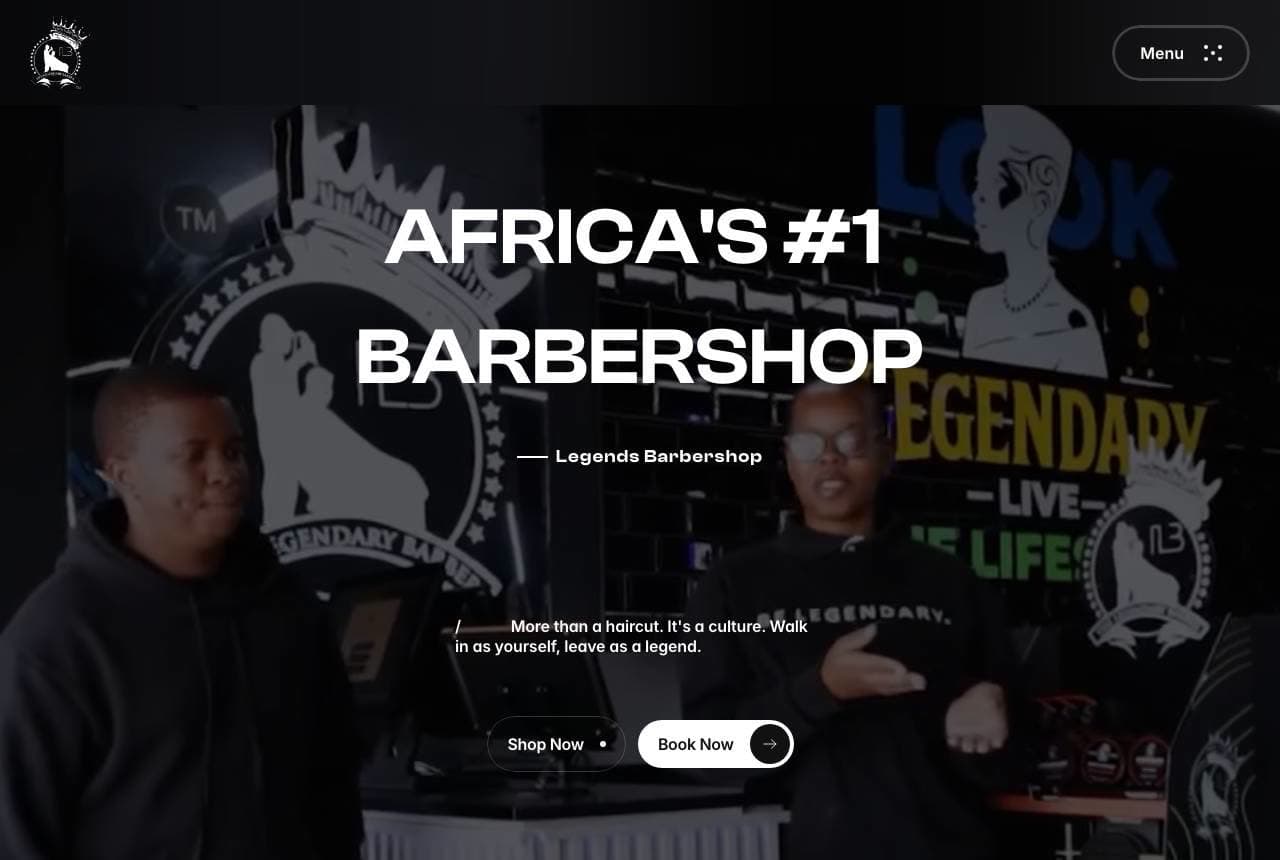
The Best Barber Website Examples, Explained
The best barber websites share a few moves: they earn trust fast, lead with strong visuals of the work, point to one clear action, and match the design to how their customers decide. Each example below calls out the specific choice worth stealing for your own barber website.
Browse the gallery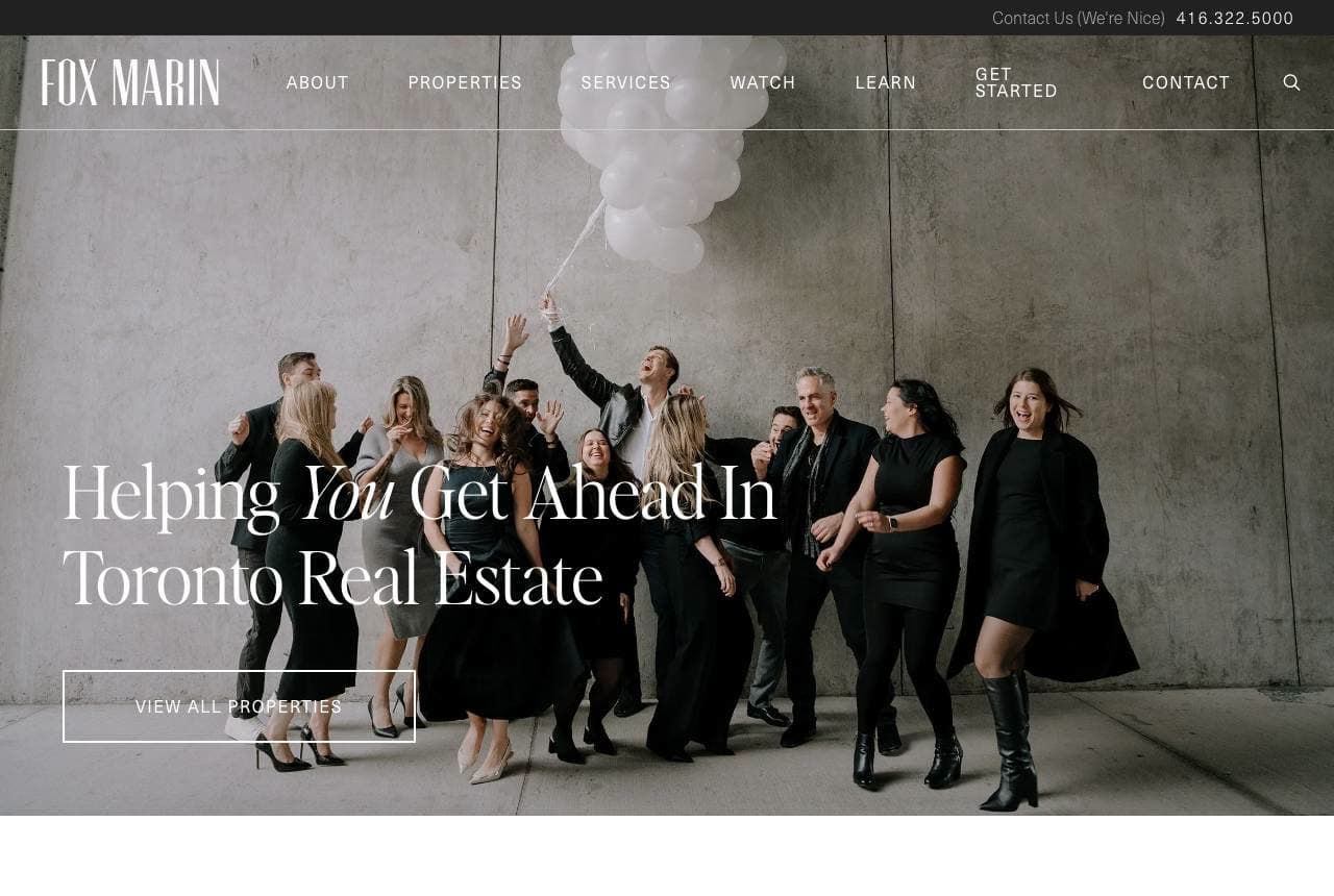
The Best Real Estate Website Examples, Explained
The best real estate websites share a few moves: they earn trust fast, lead with strong visuals of the work, point to one clear action, and match the design to how their customers decide. Each example below calls out the specific choice worth stealing for your own real estate website.
Browse the gallery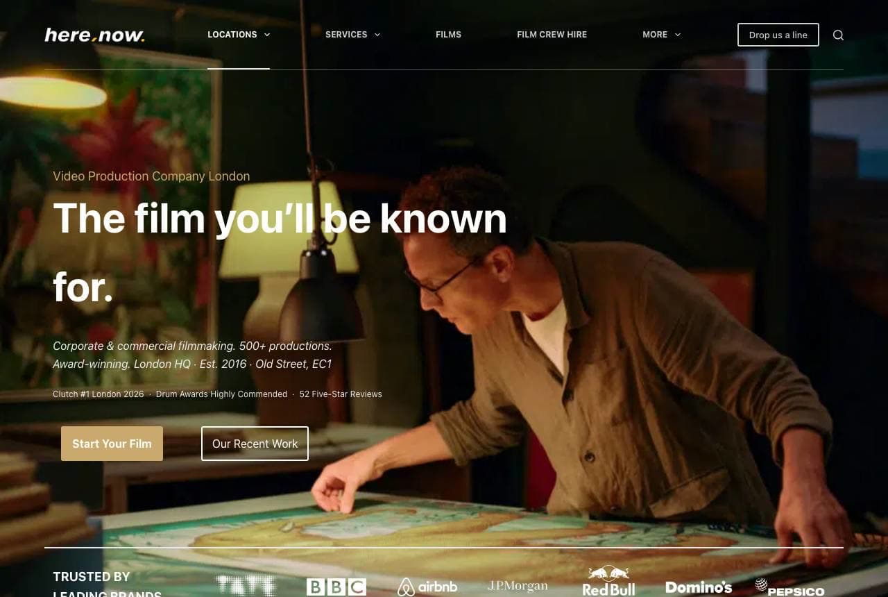
The Best Videography Website Examples, Explained
The best videography websites share a few moves: they earn trust fast, lead with strong visuals of the work, point to one clear action, and match the design to how their customers decide. Each example below calls out the specific choice worth stealing for your own videography website.
Browse the gallery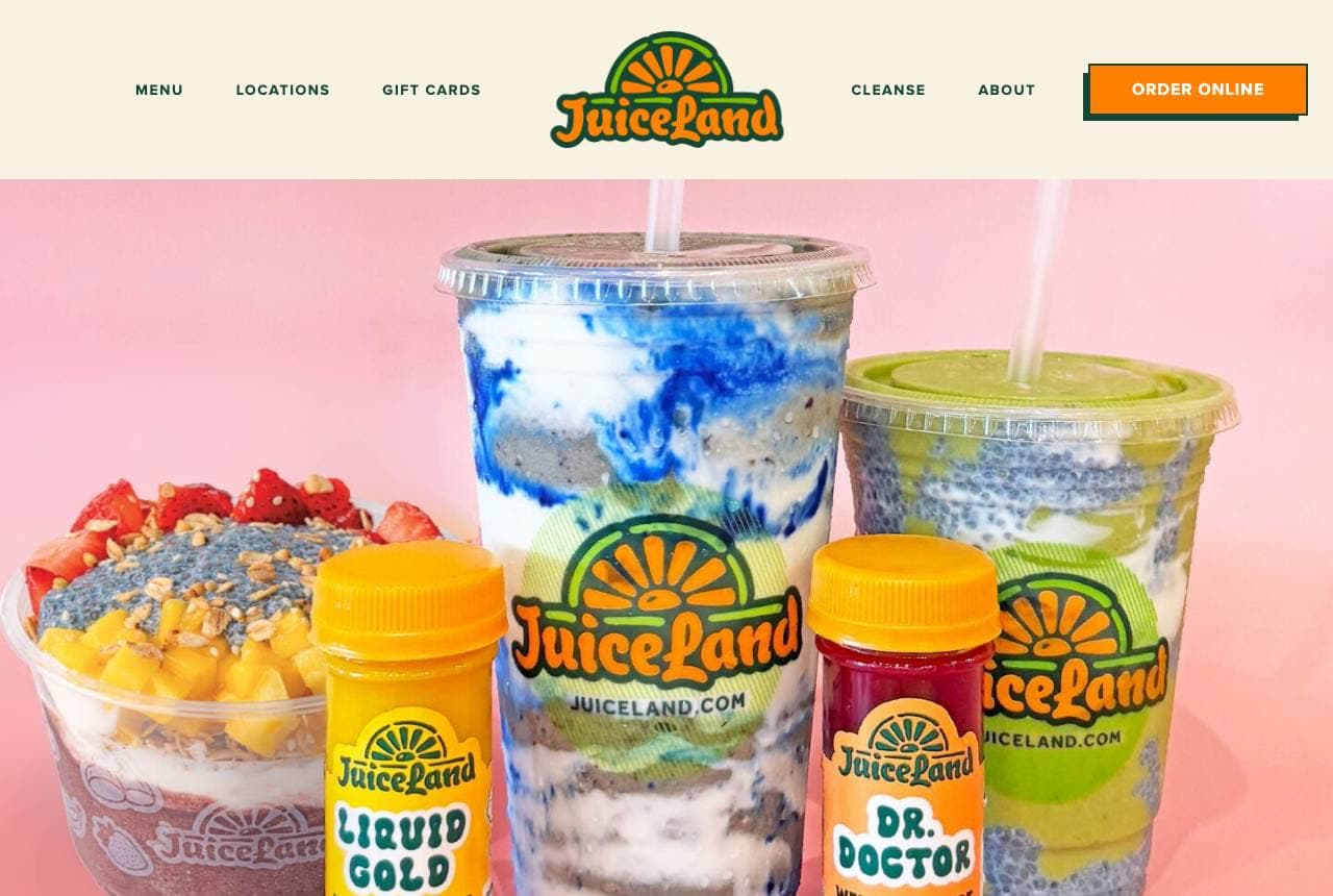
The Best Juice Bar Website Examples, Explained
The best juice bar websites share a few moves: they earn trust fast, lead with strong visuals of the work, point to one clear action, and match the design to how their customers decide. Each example below calls out the specific choice worth stealing for your own juice bar website.
Browse the gallery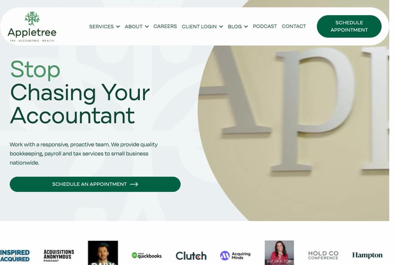
The Best Accounting Website Examples, Explained
The best accounting websites share a few moves: they earn trust fast, lead with strong visuals of the work, point to one clear action, and match the design to how their customers decide. Each example below calls out the specific choice worth stealing for your own accounting website.
Browse the gallery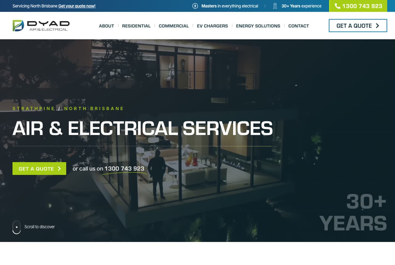
Electrician Website Design: The Best Examples, Explained
Look at the electrician sites that win the call and the same elements repeat: a tap-to-call number on every screen and a clear note on emergency and after-hours work; your license number and insurance stated up front, because electrical work is the trade homeowners check; services grouped by the job a homeowner has (panel upgrades, EV chargers, lighting, rewiring, generators, troubleshooting) rather than one long list; real photos of your vans and your work, not a stock lightning bolt; reviews near the top; the towns you cover; and, if you offer it, financing mentioned beside the big-ticket jobs like a panel upgrade or a whole-home rewire. Each example below calls out the specific choice worth stealing for your own electrician website.
Browse the gallery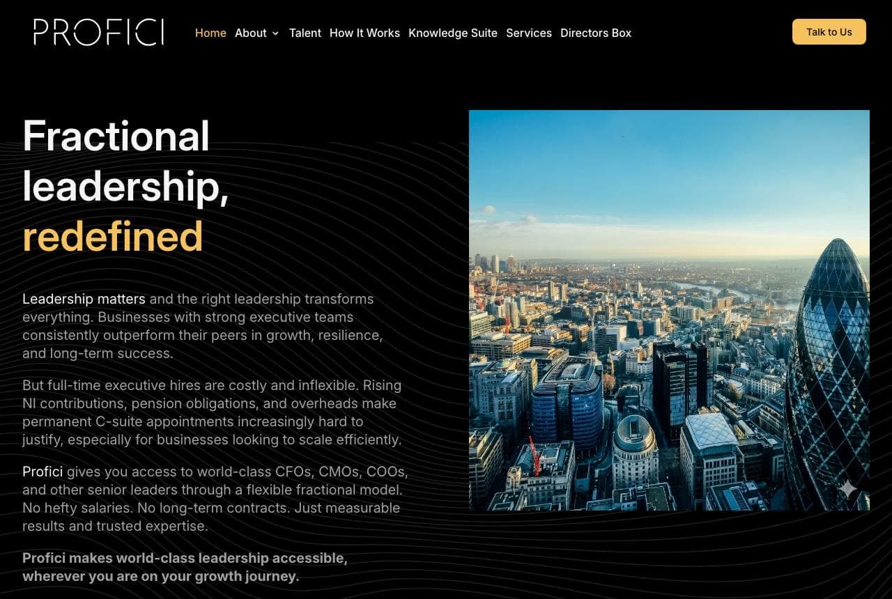
The Best Consultant Website Examples, Explained
The best consultant websites share a few moves: they earn trust fast, lead with strong visuals of the work, point to one clear action, and match the design to how their customers decide. Each example below calls out the specific choice worth stealing for your own consultant website.
Browse the gallery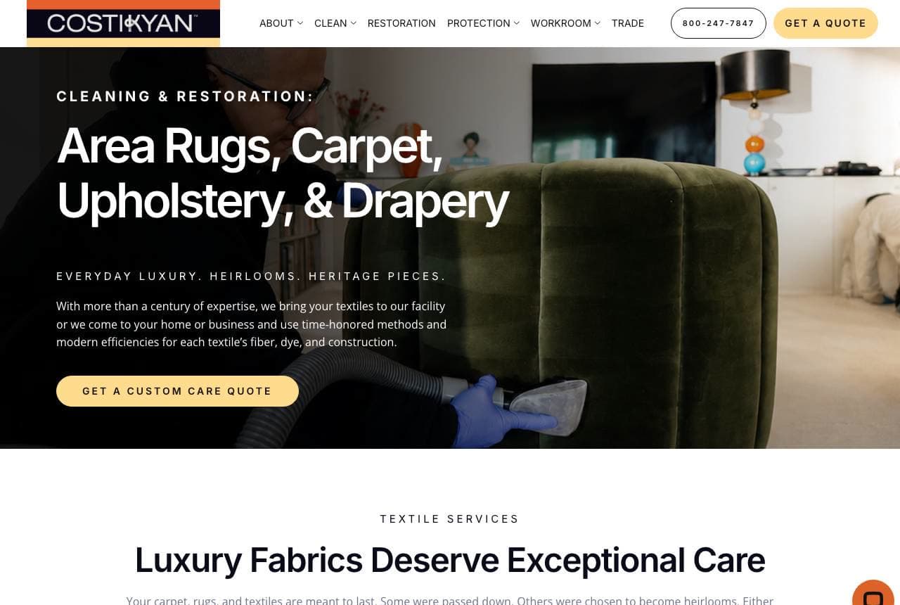
The Best Carpet Cleaning Website Examples, Explained
The best carpet cleaning websites share a few moves: they earn trust fast, lead with strong visuals of the work, point to one clear action, and match the design to how their customers decide. Each example below calls out the specific choice worth stealing for your own carpet cleaning website.
Browse the gallery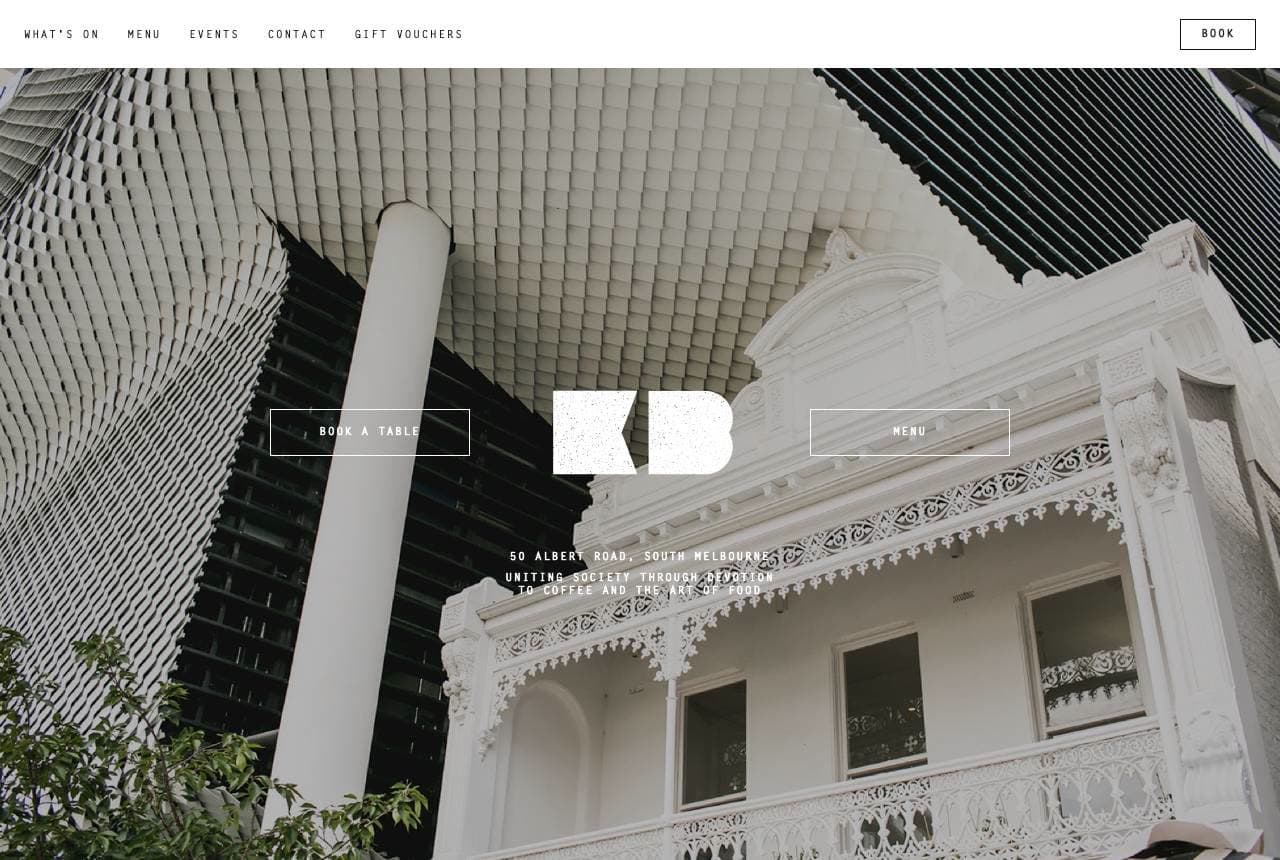
The Best Coffee Shop Website Examples, Explained
The best coffee shop websites share a few moves: they earn trust fast, lead with strong visuals of the work, point to one clear action, and match the design to how their customers decide. Each example below calls out the specific choice worth stealing for your own coffee shop website.
Browse the gallery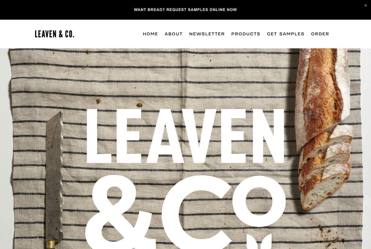
The Best Bakery Website Examples, Explained
The best bakery websites share a few moves: they earn trust fast, lead with strong visuals of the work, point to one clear action, and match the design to how their customers decide. Each example below calls out the specific choice worth stealing for your own bakery website.
Browse the gallery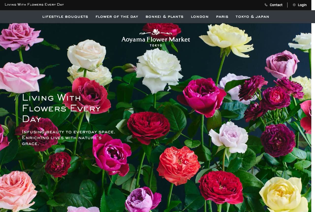
The Best Florist Website Examples, Explained
The best florist websites share a few moves: they earn trust fast, lead with strong visuals of the work, point to one clear action, and match the design to how their customers decide. Each example below calls out the specific choice worth stealing for your own florist website.
Browse the gallery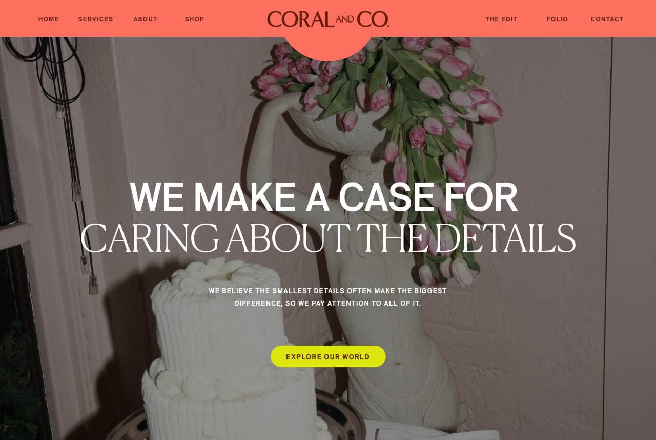
The Best Event Planner Website Examples, Explained
The best event planner websites share a few moves: they earn trust fast, lead with strong visuals of the work, point to one clear action, and match the design to how their customers decide. Each example below calls out the specific choice worth stealing for your own event planner website.
Browse the gallery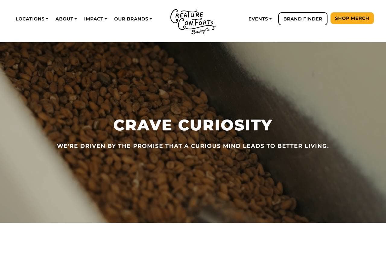
The Best Brewery Website Examples, Explained
The best brewery websites share a few moves: they earn trust fast, lead with strong visuals of the work, point to one clear action, and match the design to how their customers decide. Each example below calls out the specific choice worth stealing for your own brewery website.
Browse the gallery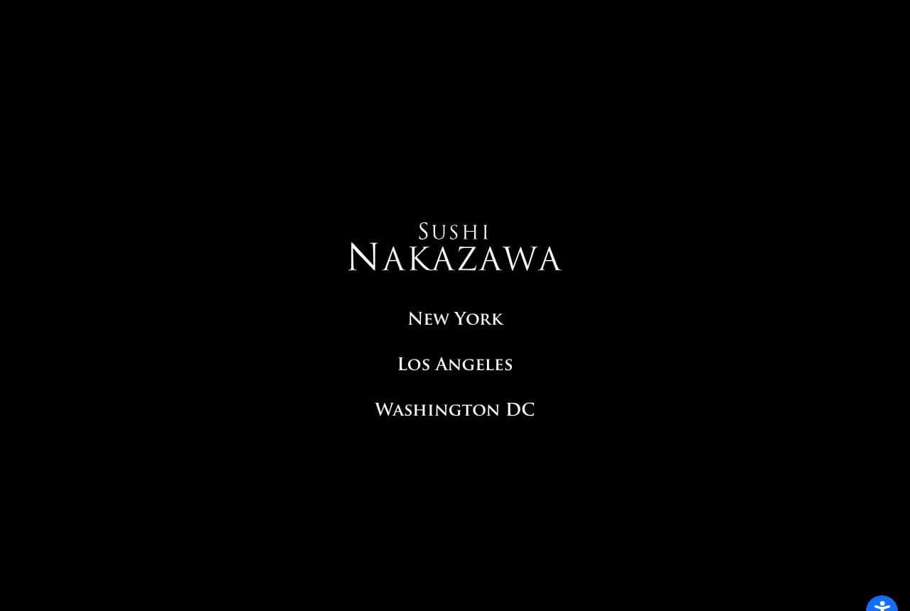
The Best Sushi Website Examples, Explained
The best sushi websites share a few moves: they earn trust fast, lead with strong visuals of the work, point to one clear action, and match the design to how their customers decide. Each example below calls out the specific choice worth stealing for your own sushi website.
Browse the gallery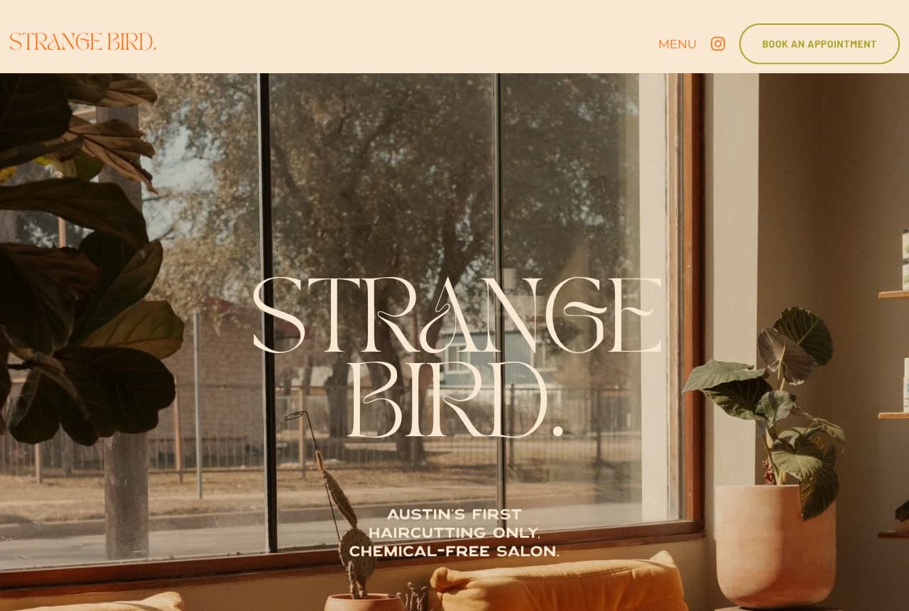
The Best Salon Website Examples, Explained
The best salon websites share a few moves: they earn trust fast, lead with strong visuals of the work, point to one clear action, and match the design to how their customers decide. Each example below calls out the specific choice worth stealing for your own salon website.
Browse the gallery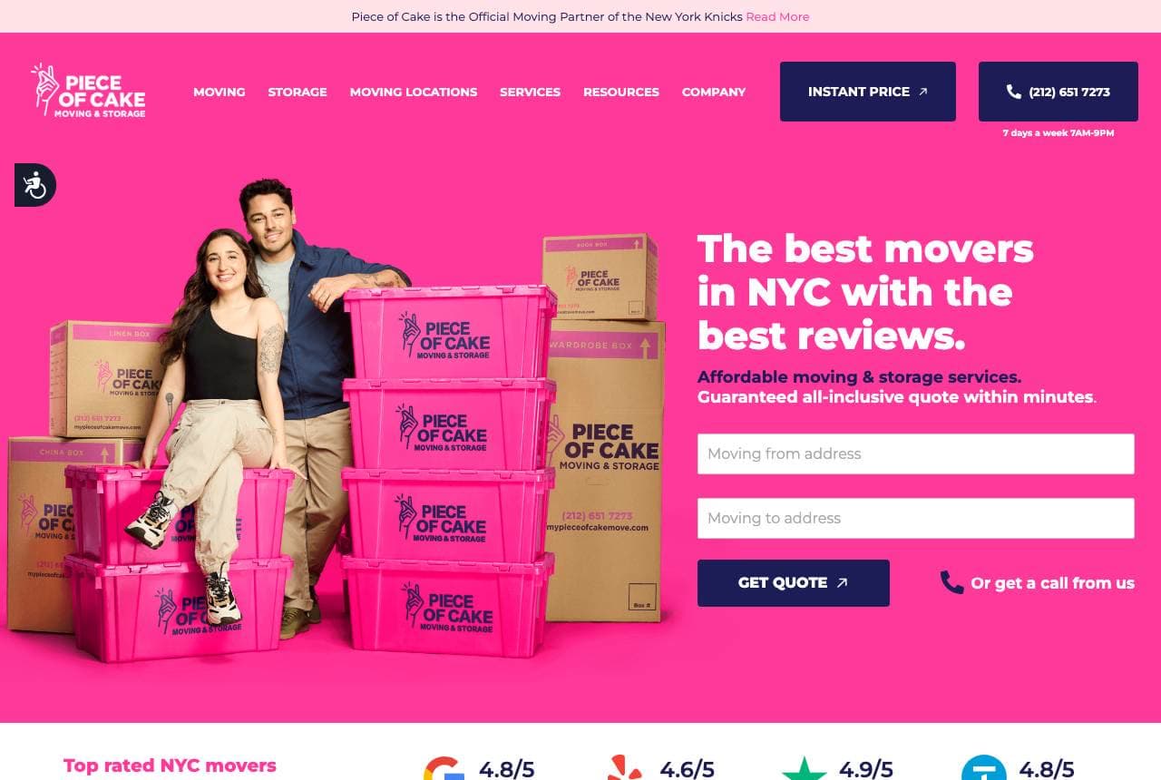
Moving Company Website Design: The Best Examples, Explained
Look at the moving company sites that win the booking and the same elements repeat: a quote form in the first screen that asks the four things a mover needs (where from, where to, the date and the size of the home), with a phone number beside it for the people who would rather talk; the moves you do (local, long-distance, office, piano, packing) each as its own line; proof the company is real and insured, with the trucks and the crew in real photos and reviews near the top; the areas you serve by name; and a plain line on how pricing works, hourly or flat rate, so nobody has to call to find out. Each example below calls out the specific choice worth stealing for your own moving company website.
Browse the gallery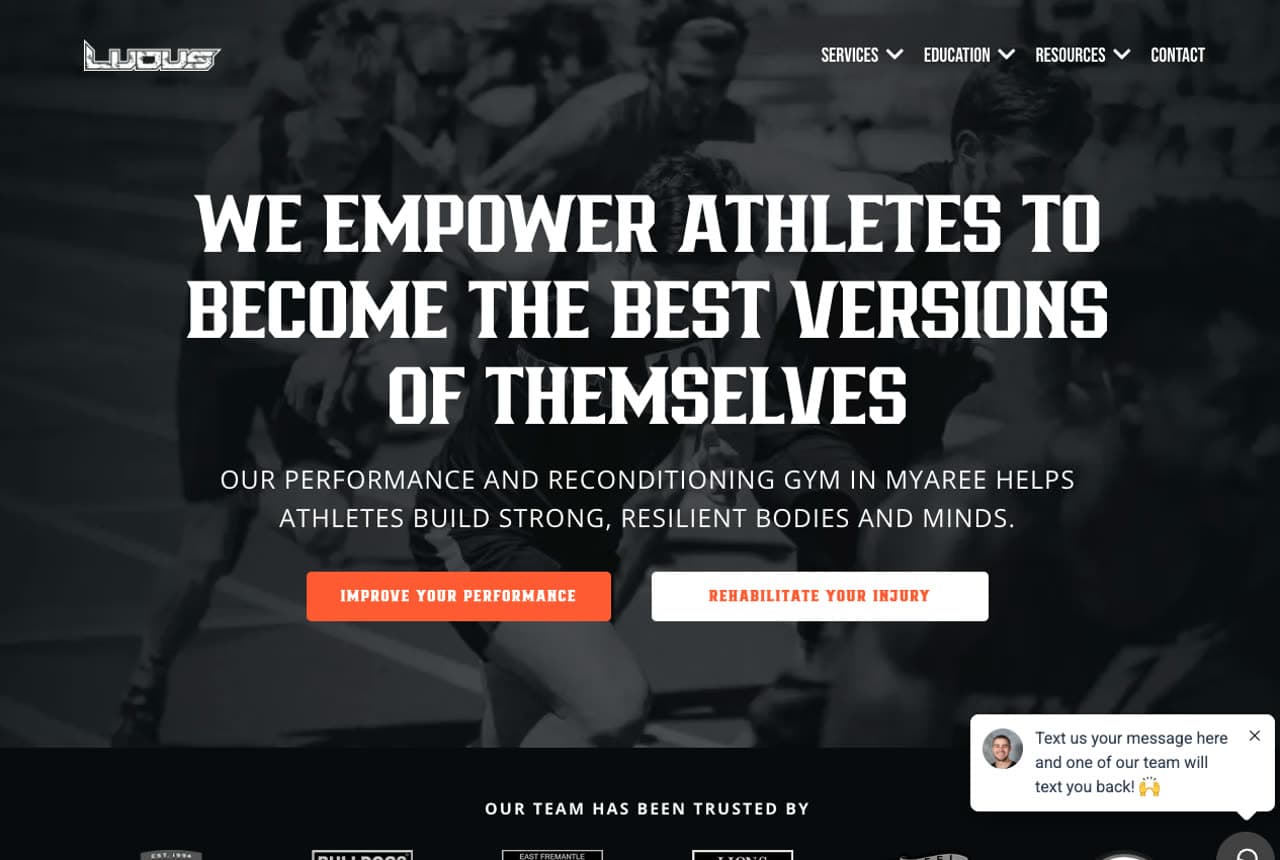
The Best Sports Coaching Website Examples, Explained
The best sports coaching websites share a few moves: they earn trust fast, lead with strong visuals of the work, point to one clear action, and match the design to how their customers decide. Each example below calls out the specific choice worth stealing for your own sports coaching website.
Browse the gallery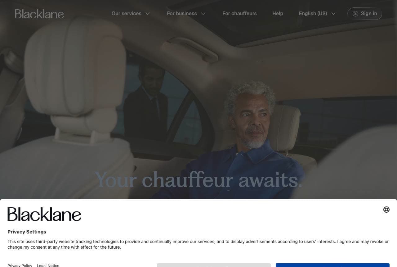
The Best Transportation Website Examples, Explained
The best transportation websites share a few moves: they earn trust fast, lead with strong visuals of the work, point to one clear action, and match the design to how their customers decide. Each example below calls out the specific choice worth stealing for your own transportation website.
Browse the gallery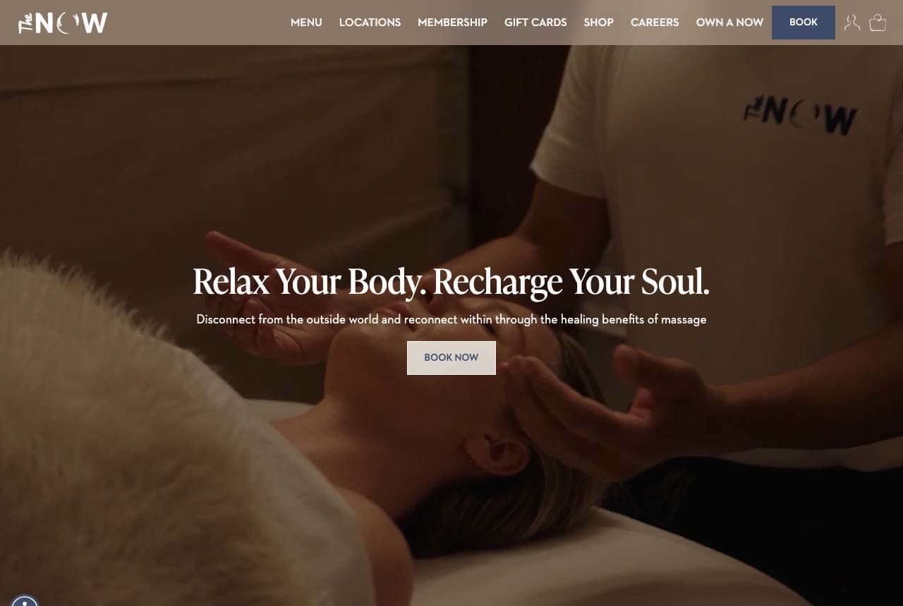
Spa Website Design: The Best Examples, Explained
Look at the spa sites that win the booking and the same elements repeat: a calm first screen, one photo of the space or a treatment rather than a collage, with soft color and room around the words; a 'Book now' button that stays in reach on a phone and opens online booking, because most spa visits are booked in the evening when nobody is at the desk; the treatment menu with durations and prices, grouped by massage, facials, body and packages; gift cards one tap away, since the holidays are a spa's biggest gift-card season; real photos of the rooms and the therapists; reviews; and the practical lines a first-time guest looks for: parking, what to wear, how early to arrive and the cancellation policy. Each example below calls out the specific choice worth stealing for your own spa website.
Browse the gallery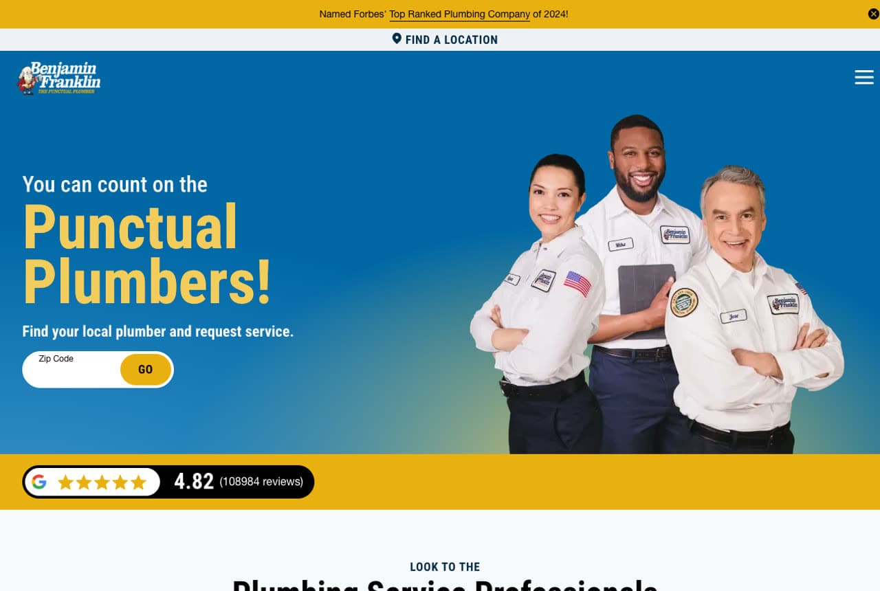
Plumber Website Design: The Best Examples, Explained
Look at the plumber sites that win the call and the same elements repeat: a tap-to-call number on every screen and a clear note on emergency and after-hours work; the towns you cover and your license number; services grouped by the problem a homeowner has (drain cleaning, water heater repair, leaks, sewer lines) rather than a single list; reviews near the top; and, if you offer it, financing mentioned on the big-ticket jobs like a new water heater or a repipe. Each example below calls out the specific choice worth stealing for your own plumber website.
Browse the gallery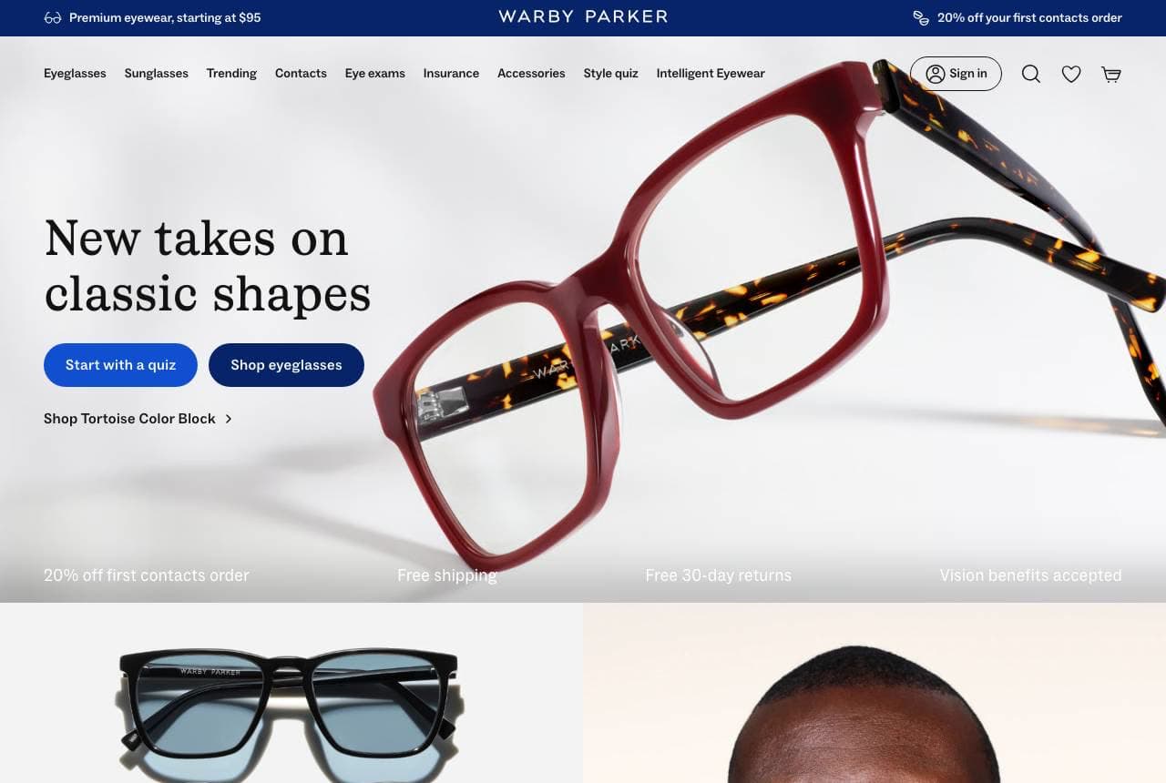
The Best Optometrist Website Examples, Explained
The best optometrist websites share a few moves: they earn trust fast, lead with strong visuals of the work, point to one clear action, and match the design to how their customers decide. Each example below calls out the specific choice worth stealing for your own optometrist website.
Browse the gallery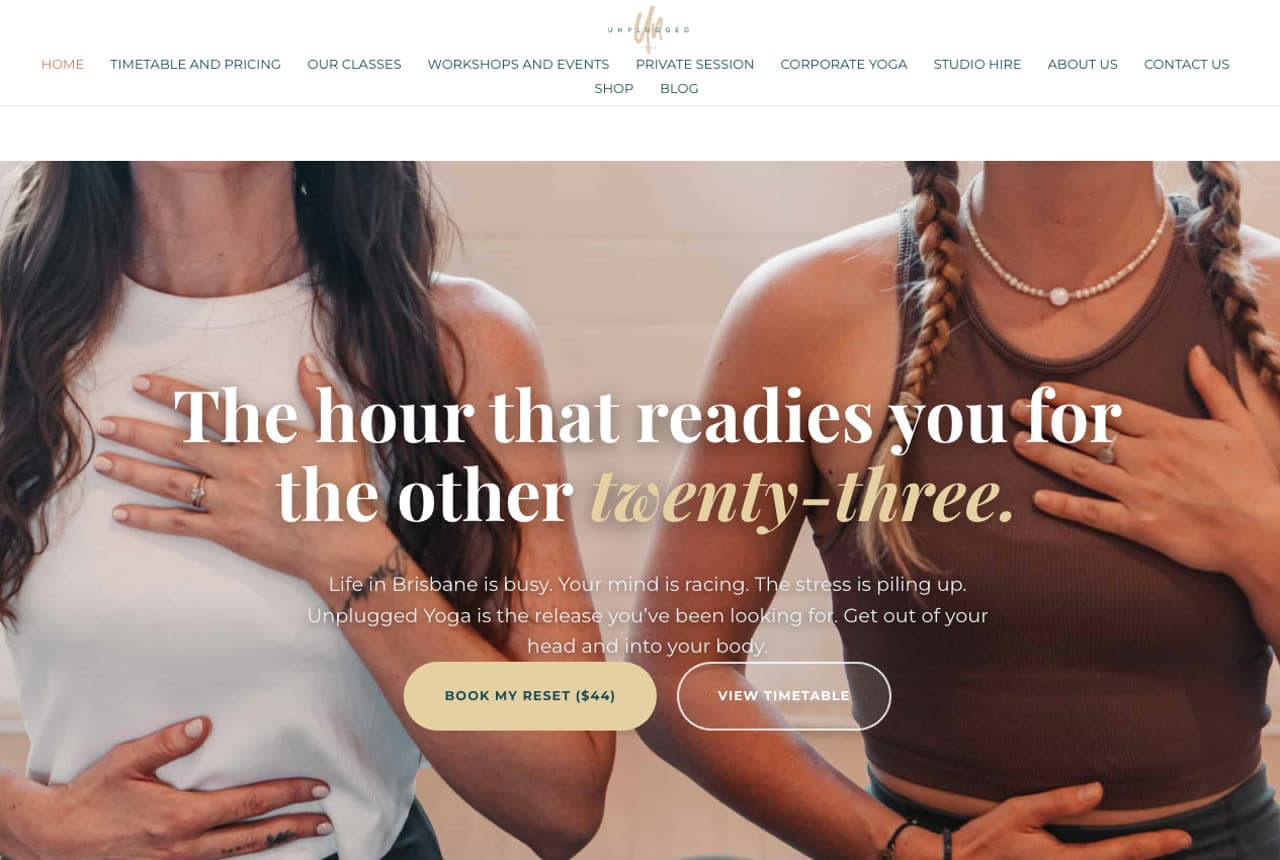
The Best Yoga Website Examples, Explained
The best yoga websites share a few moves: they earn trust fast, lead with strong visuals of the work, point to one clear action, and match the design to how their customers decide. Each example below calls out the specific choice worth stealing for your own yoga website.
Browse the gallery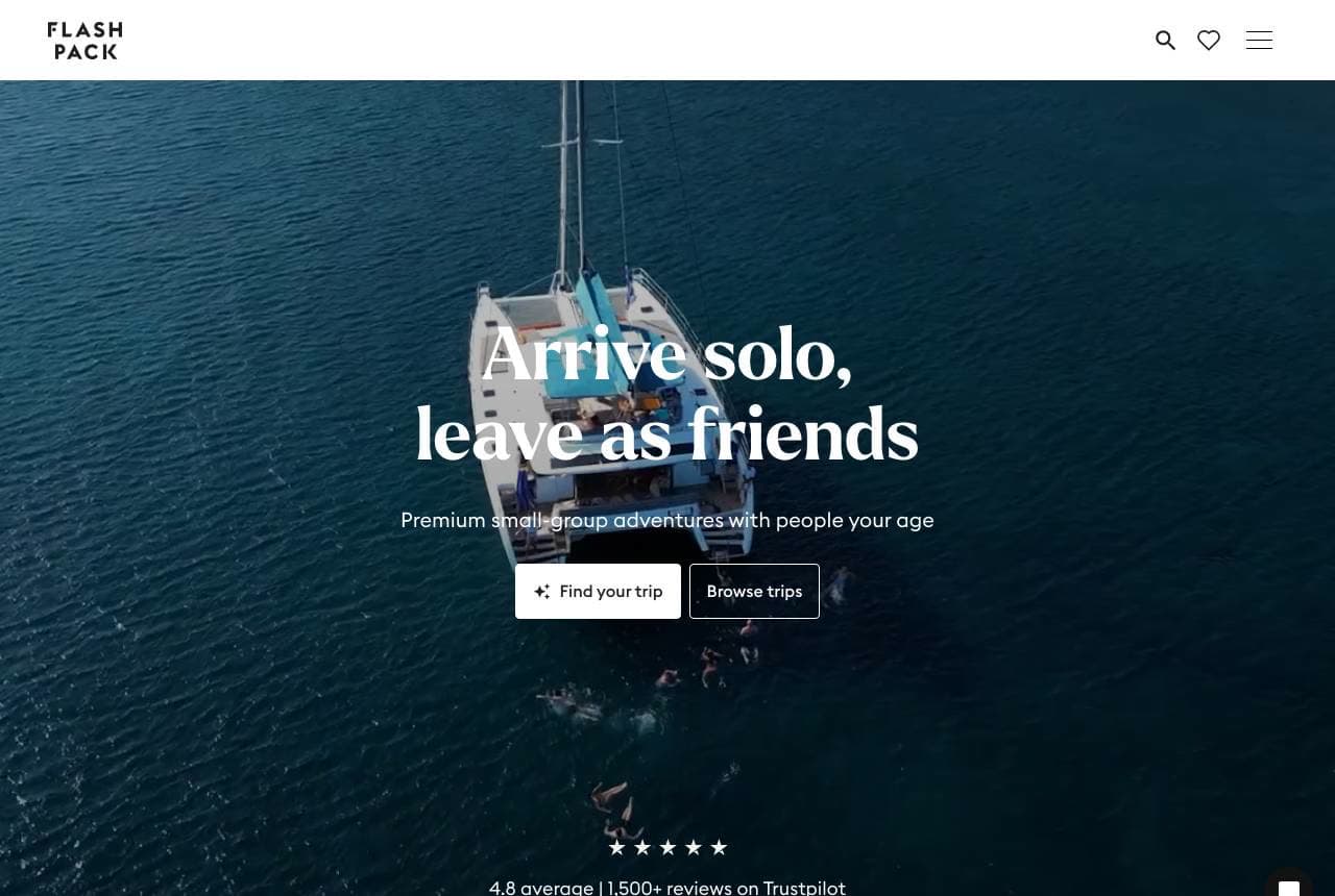
The Best Travel Agency Website Examples, Explained
The best travel agency websites share a few moves: they earn trust fast, lead with strong visuals of the work, point to one clear action, and match the design to how their customers decide. Each example below calls out the specific choice worth stealing for your own travel agency website.
Browse the gallery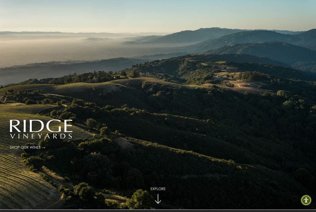
The Best Winery Website Examples, Explained
The best winery websites share a few moves: they earn trust fast, lead with strong visuals of the work, point to one clear action, and match the design to how their customers decide. Each example below calls out the specific choice worth stealing for your own winery website.
Browse the gallery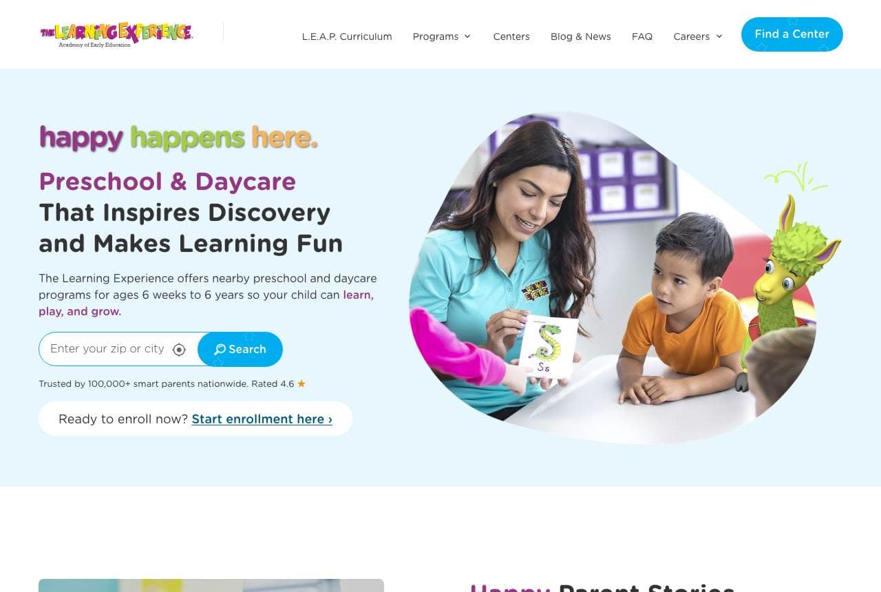
Daycare & Childcare Website Design: The Best Examples, Explained
Look at the daycare sites that win the enrollment and the same elements repeat: the ages you take and your hours in the first screen, because that is the first thing a parent checks; a 'Schedule a tour' button that stays in reach on a phone; the programs by age (infants, toddlers, preschool, before and after school) with a day's routine for each; real photos of your rooms, your staff and your outdoor space, with enrolled children's faces kept off the page unless their parents have agreed; your license and safety practices stated plainly; tuition, or at least how tuition works; reviews from parents; and a waitlist form for the months you are full. Each example below calls out the specific choice worth stealing for your own daycare website.
Browse the gallery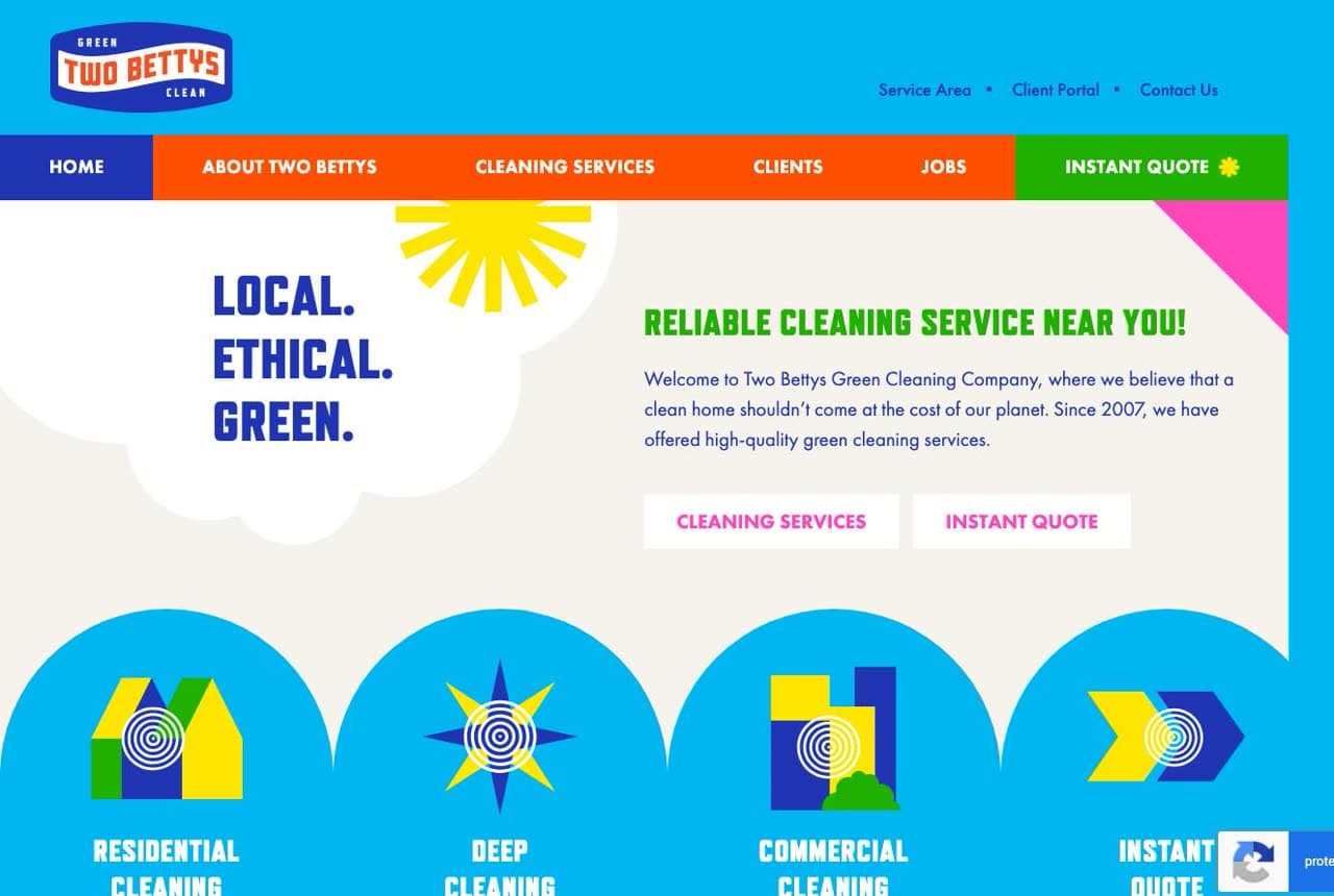
Cleaning Company Website Design: The Best Examples, Explained
Look at the cleaning company sites that win the booking and the same elements repeat: an instant quote or booking form in the first screen that asks how many bedrooms and bathrooms and how often, so a homeowner can price the job without a call; the services as a homeowner searches for them (recurring cleaning, deep cleaning, move-out, Airbnb turnovers, offices), each with what is included; 'insured and background-checked' right under the buttons; real photos of your team rather than stock gloves and spray bottles; reviews near the top; the areas you serve by name; and a satisfaction guarantee stated plainly. Each example below calls out the specific choice worth stealing for your own cleaning company website.
Browse the gallery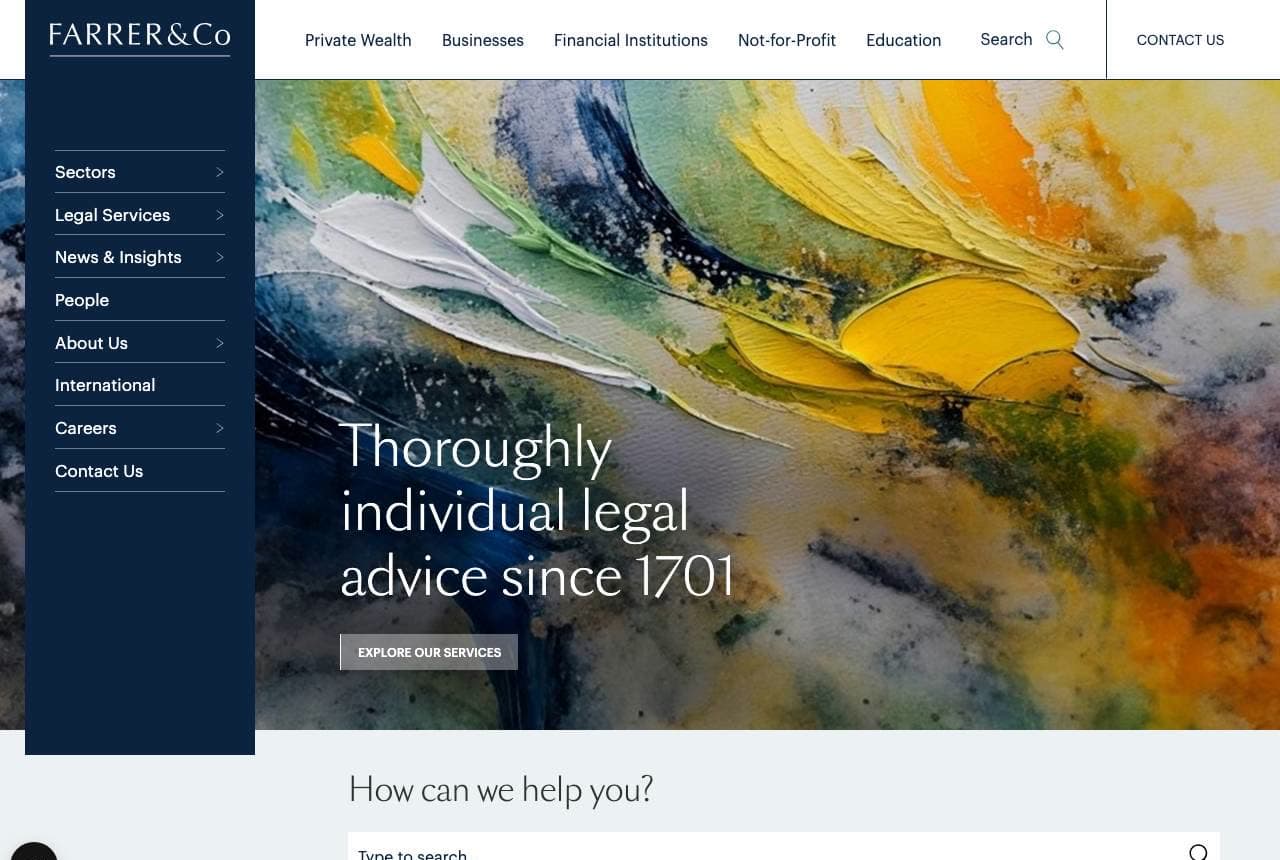
The Best Lawyer Website Examples, Explained
The best lawyer websites share a few moves: they earn trust fast, lead with strong visuals of the work, point to one clear action, and match the design to how their customers decide. Each example below calls out the specific choice worth stealing for your own lawyer website.
Browse the gallery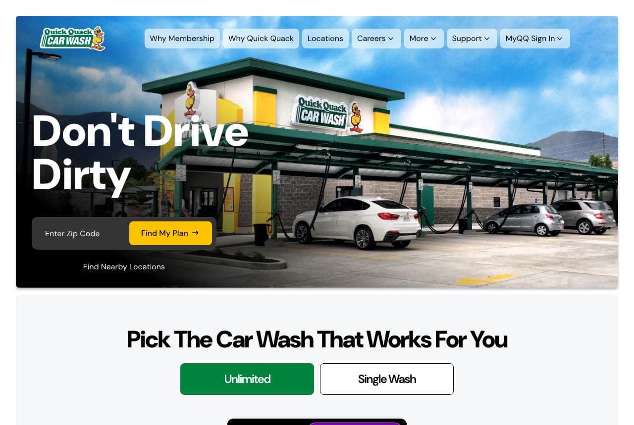
The Best Car Wash Website Examples, Explained
The best car wash websites share a few moves: they earn trust fast, lead with strong visuals of the work, point to one clear action, and match the design to how their customers decide. Each example below calls out the specific choice worth stealing for your own car wash website.
Browse the gallery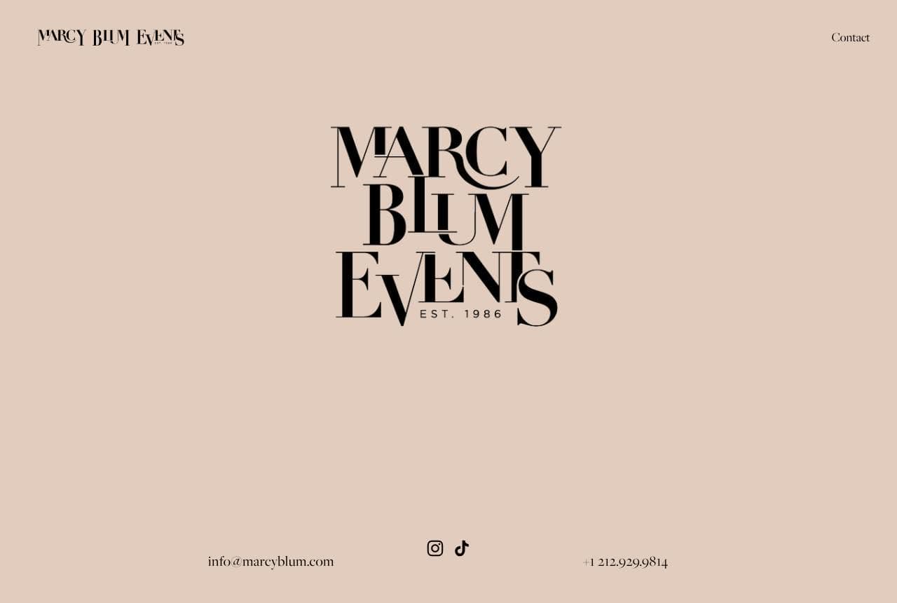
The Best Wedding Planner Website Examples, Explained
The best wedding planner websites share a few moves: they earn trust fast, lead with strong visuals of the work, point to one clear action, and match the design to how their customers decide. Each example below calls out the specific choice worth stealing for your own wedding planner website.
Browse the gallery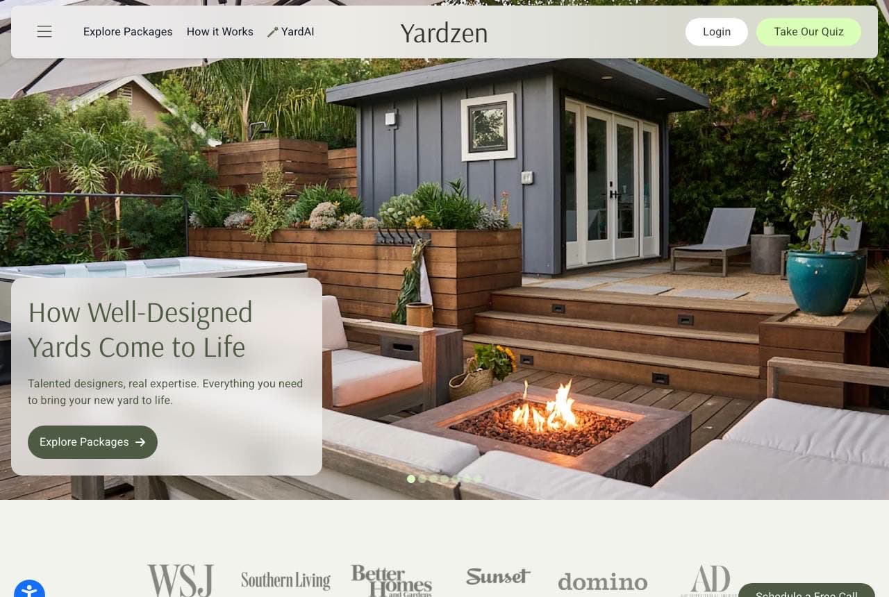
The Best Landscaping Website Examples, Explained
The best landscaping websites share a few moves: they earn trust fast, lead with strong visuals of the work, point to one clear action, and match the design to how their customers decide. Each example below calls out the specific choice worth stealing for your own landscaping website.
Browse the gallery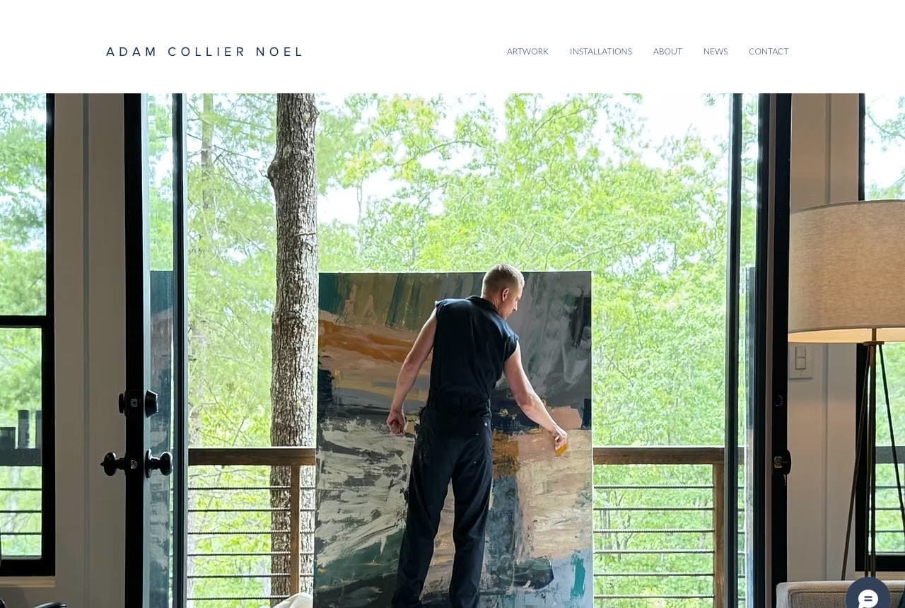
The Best Art Studio Website Examples, Explained
The best art studio websites share a few moves: they earn trust fast, lead with strong visuals of the work, point to one clear action, and match the design to how their customers decide. Each example below calls out the specific choice worth stealing for your own art studio website.
Browse the gallery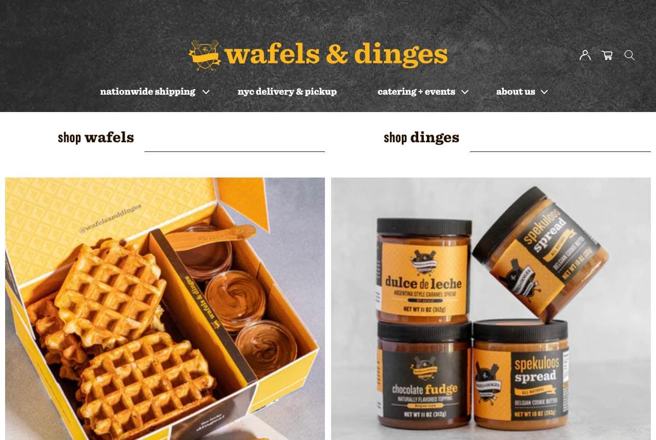
The Best Food Truck Website Examples, Explained
The best food truck websites share a few moves: they earn trust fast, lead with strong visuals of the work, point to one clear action, and match the design to how their customers decide. Each example below calls out the specific choice worth stealing for your own food truck website.
Browse the gallery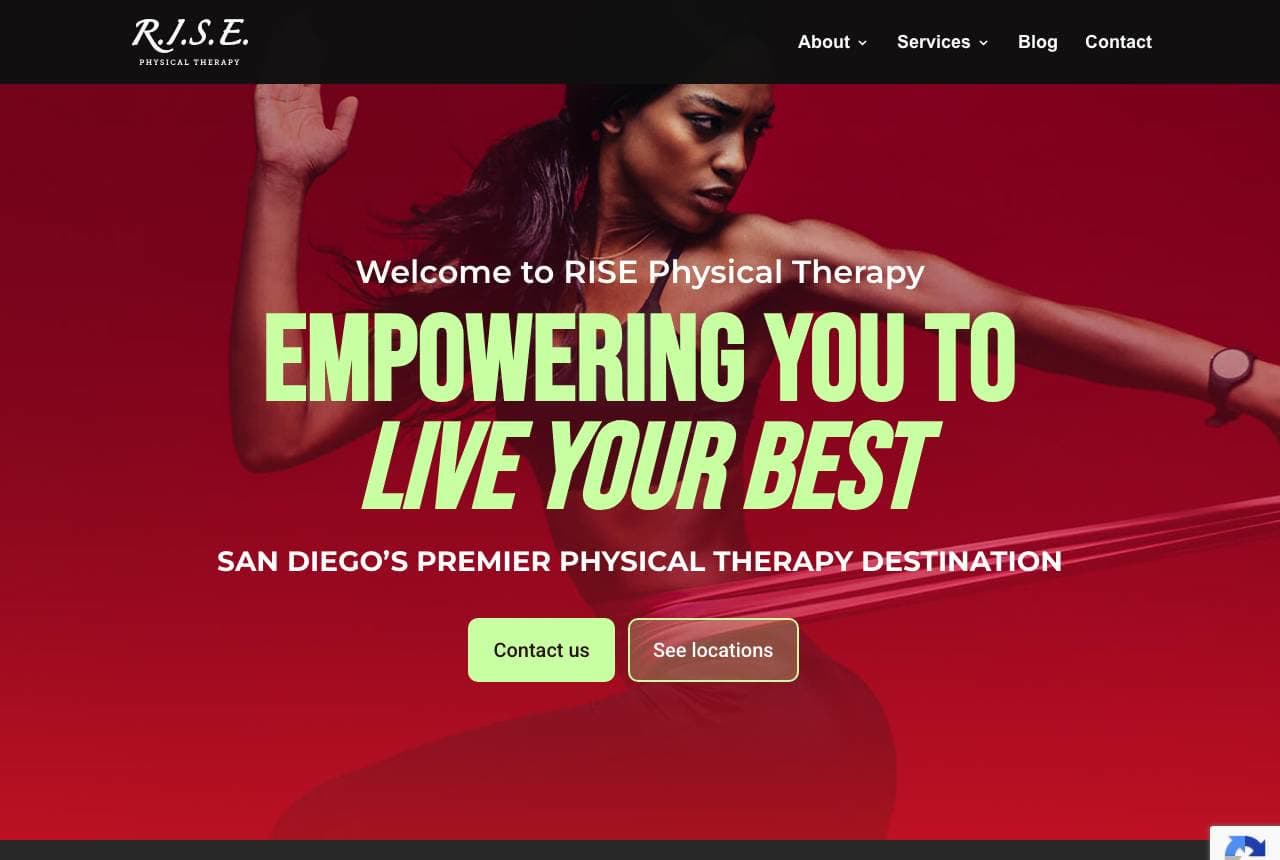
The Best Physical Therapy Website Examples, Explained
The best physical therapy websites share a few moves: they earn trust fast, lead with strong visuals of the work, point to one clear action, and match the design to how their customers decide. Each example below calls out the specific choice worth stealing for your own physical therapy website.
Browse the gallery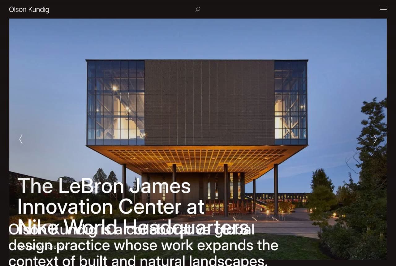
The Best Architect Website Examples, Explained
The best architect websites share a few moves: they earn trust fast, lead with strong visuals of the work, point to one clear action, and match the design to how their customers decide. Each example below calls out the specific choice worth stealing for your own architect website.
Browse the gallery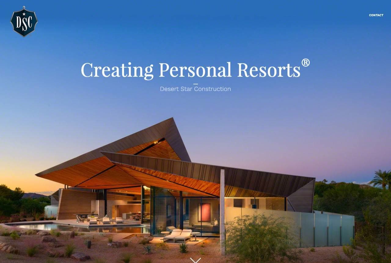
The Best Construction & Contractor Websites, Explained
The best construction websites share a few moves: they earn trust fast, lead with strong visuals of the work, point to one clear action, and match the design to how their customers decide. Each example below calls out the specific choice worth stealing for your own construction website.
Browse the gallery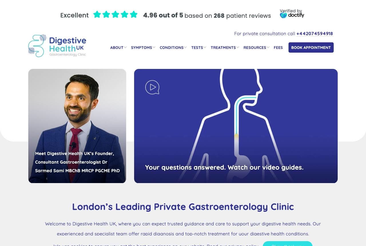
The Best Doctor Website Examples, Explained
The best doctor websites share a few moves: they earn trust fast, lead with strong visuals of the work, point to one clear action, and match the design to how their customers decide. Each example below calls out the specific choice worth stealing for your own doctor website.
Browse the gallery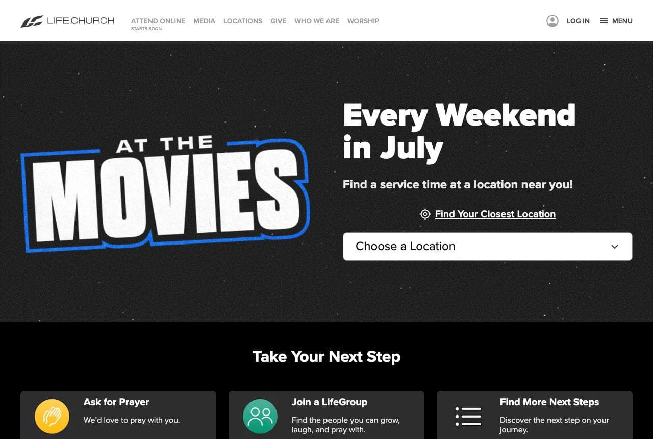
The Best Church Website Examples, Explained
The best church websites share a few moves: they earn trust fast, lead with strong visuals of the work, point to one clear action, and match the design to how their customers decide. Each example below calls out the specific choice worth stealing for your own church website.
Browse the gallery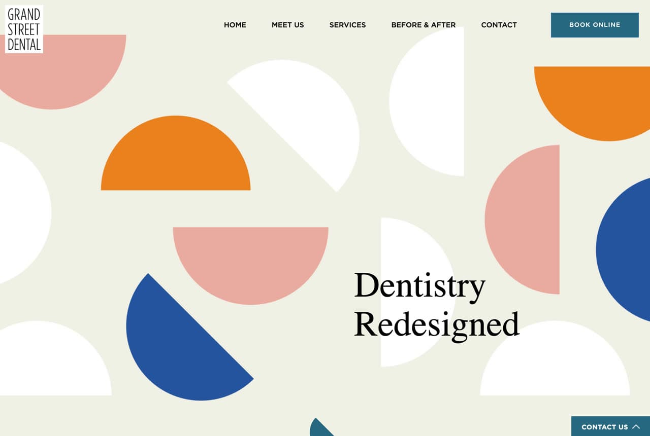
The Best Dentist Website Examples, Explained
The best dental sites do three things fast. They lower anxiety on sight — a real, calm photo and a warm palette do more than any 'we're gentle' line ever could. They prove trust immediately with a star rating, a review count, and 'accepting new patients.' And they make booking the single obvious action, ideally right in the hero. Everything below is a variation on those three moves — pick the one that fits how your patients decide.
Browse the gallery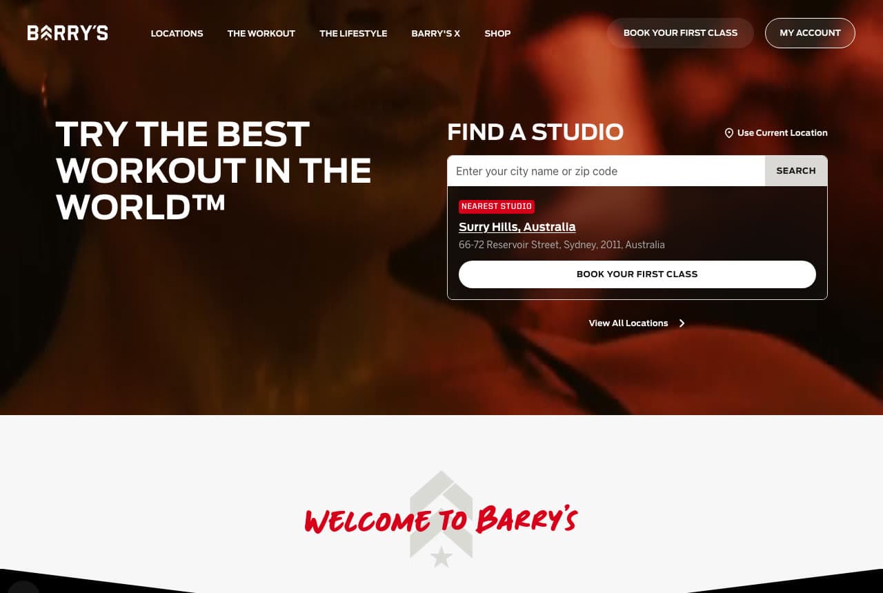
The Best Gym Website Examples, Explained
The best gym sites share a few moves: they lead with an aspirational promise or a specific niche rather than a feature list, they use real photos of actual members and trainers (not chiseled stock models) to signal belonging, they make the next step obvious — book a free class, get a day pass, request info — and they give one clear reason to choose this gym over the cheaper one down the road: community, expertise, a demographic focus, or a mission. Each example below calls out the specific choice worth stealing for your own gym website.
Browse the gallery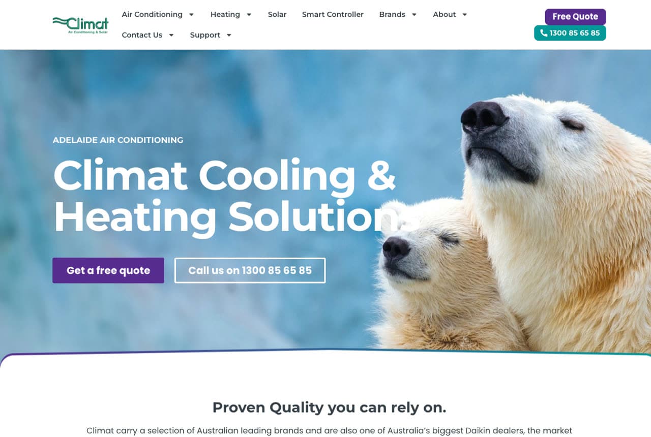
The Best HVAC Website Examples, Explained
The best HVAC sites share a few moves: they lead with instant clarity (who you serve, where, and what you fix) above the fold, they prove trust with real technicians, trucks, reviews, and years-in-business rather than stock imagery, they make the next step frictionless — call, book, or get a quote — and they give one clear reason to choose them: heritage, a distinctive brand, a specific niche (heat pumps, air quality, commercial), or a maintenance membership. Most of the category is interchangeable blue-and-red; the standouts break the mold. Each example below calls out the specific choice worth stealing for your own HVAC website.
Browse the gallery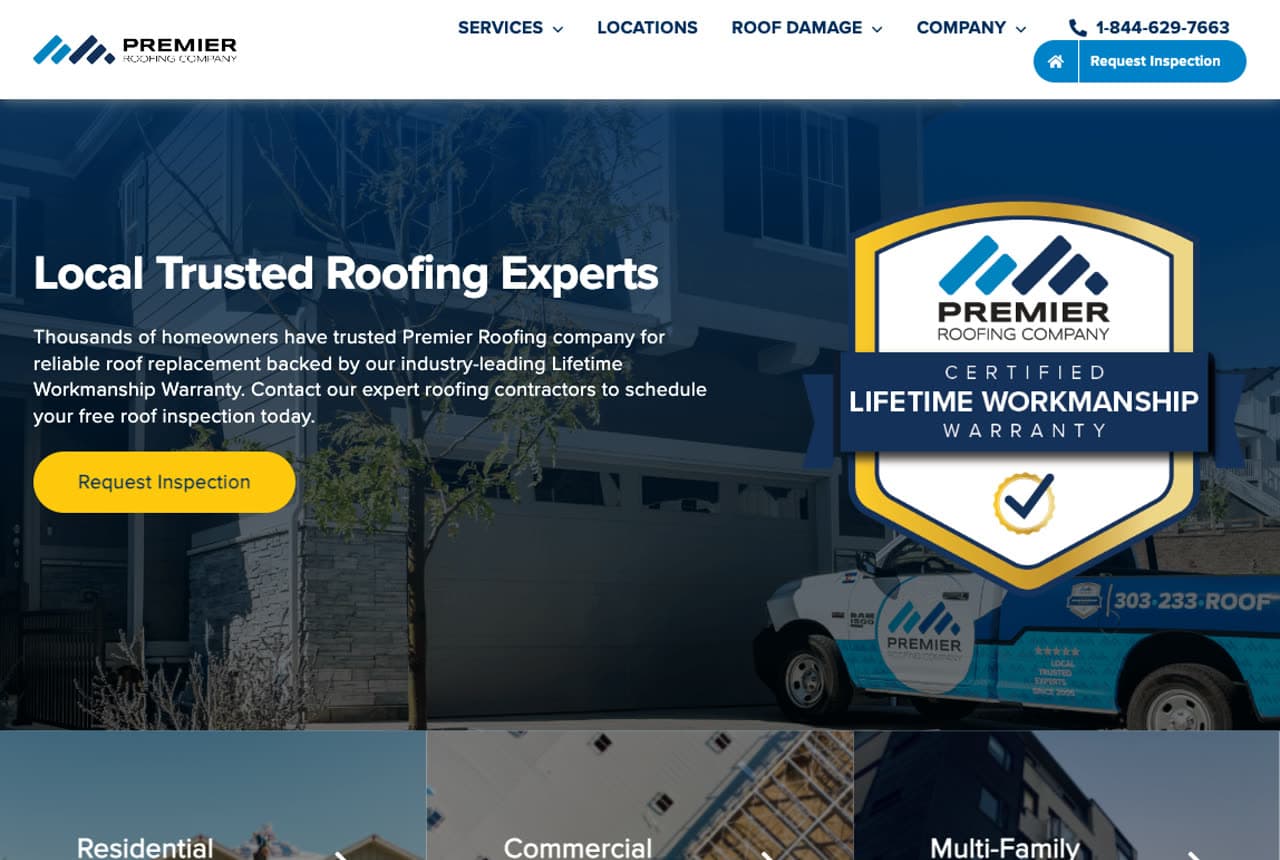
The Best Roofing Website Examples, Explained
The best roofing sites share a few moves: they lead with a trust anchor above the fold (a warranty crest, years-in-business, a real branded truck), they make the guarantee scannable instead of burying it in body copy, they remove friction from the quote — an inline form or a one-tap 'free inspection' — and they give one clear reason to choose them: heritage, a distinctive brand, a material niche (metal, tile, solar), or insurance-claim expertise. Most of the category is interchangeable navy-and-shingle-photo; the standouts break the mold with an illustration, a mascot, or a human family. Each example below calls out the specific choice worth stealing for your own roofing website.
Browse the gallery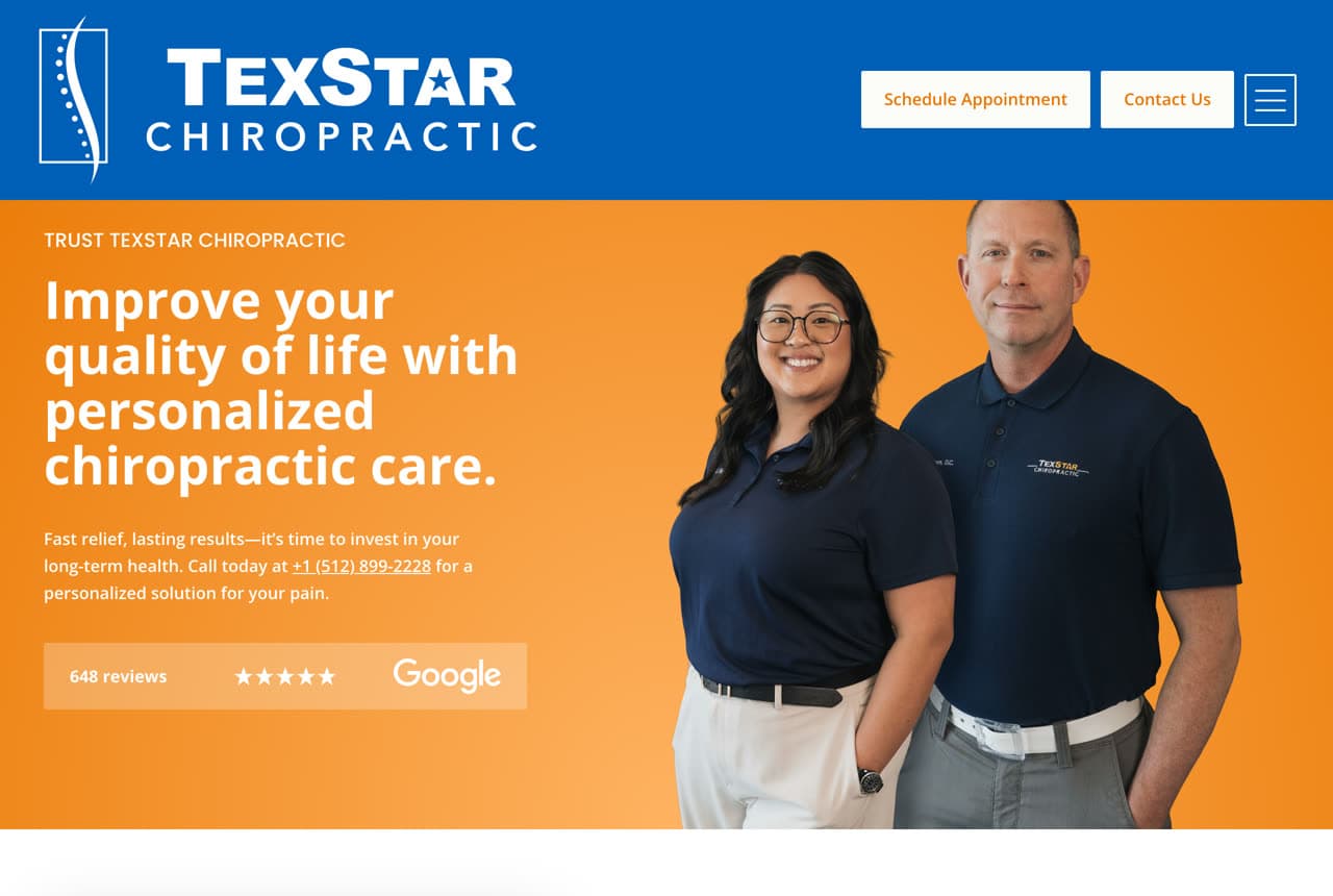
The Best Chiropractor Website Examples, Explained
The best chiropractic sites do three things fast. They build trust on sight — a real photo of the actual chiropractor and a visible star rating do more than any 'trusted care' line. They answer the specific patient: family, athlete, expectant mum, disc-pain sufferer, accident victim — each wants different proof. And they make booking the one obvious action, ideally a form or 'Book' button right in the hero. Everything below is a variation on those moves — pick the one that matches the patients you want to reach.
Browse the gallery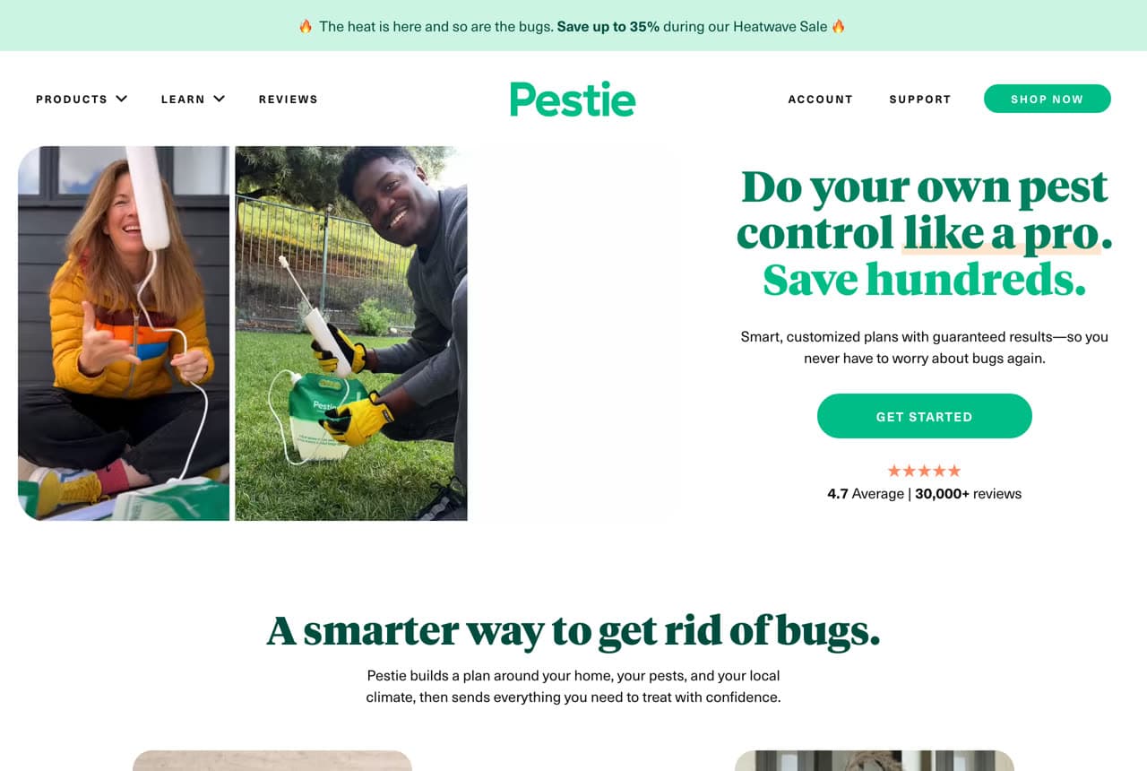
The Best Pest Control Website Examples, Explained
The best pest control sites do three things fast. They answer the safety question on sight — 'family- and pet-safe' and a real, warm image do more than any chemical spec. They prove trust immediately with reviews, certifications (GreenPro, licensing), and a local face. And they make getting a quote the one obvious action — a form or 'free inspection' button right in the hero. Everything below is a variation on those moves; pick the one that matches the customers you want, whether that's nervous families, a specific pest, or commercial facilities.
Browse the gallery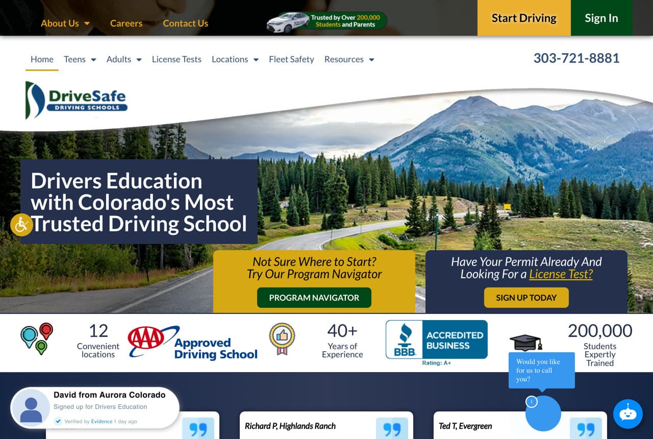
The Best Driving School Website Examples, Explained
The best driving school sites do three things fast. They build trust on sight — a visible pass rate, state licensing (TDLR, DPS, DDS), and a real instructor photo do more than any 'expert instruction' line. They speak to the specific learner: nervous teen and parent, adult with a ticket, career-bound CDL student, or an older driver refreshing skills. And they make booking the one obvious action — a 'Book a Lesson' button or package selector right in the hero. Everything below is a variation on those moves; pick the one that matches the students you want.
Browse the gallery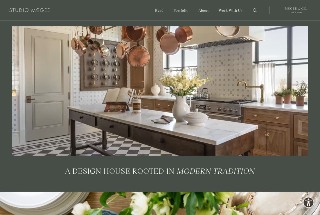
The Best Interior Design Website Examples, Explained
The best interior design sites understand that the website IS the portfolio audition. They lead with real, beautifully-shot project photography — not stock — because the work is the entire pitch. They commit to a distinctive point of view (warm-traditional, dark-luxury, maximalist, minimal) that filters in the right client and repels the wrong one. And they keep the interface quiet — restrained type, generous white space — so nothing competes with the rooms. Everything below is a variation on those moves; pick the one that matches the clients and the caliber of work you want to attract.
Browse the gallery
The Best Personal Trainer Website Examples, Explained
The best personal trainer sites do three things fast. They prove results — real transformation photos, a visible track record of happy clients, certifications (NASM, ACE) — because clients are buying belief that you can change their body. They speak to a specific person (a serious lifter, a new mom, a busy professional, someone done with dieting) rather than 'everyone.' And they make the first step tiny — a free consultation or intro call, not a big signup. Everything below is a variation on those moves; pick the one that matches the clients you want to coach.
Browse the gallery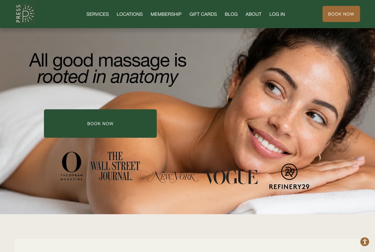
The Best Massage Website Examples, Explained
The best massage sites do three things fast. They set a calm mood on sight — a warm, uncluttered palette and a real, serene photo do more than any 'relaxing' line. They prove trust with reviews, licensing (LMT), and real photos of the actual space and therapists (not stock). And they make booking the one obvious action, since most massage bookings happen on a phone. The strongest also pick a clear identity — relaxation, sports recovery, holistic, or modern-boutique — rather than trying to be everything. Everything below is a variation on those moves; pick the one that fits the clients you want.
Browse the gallery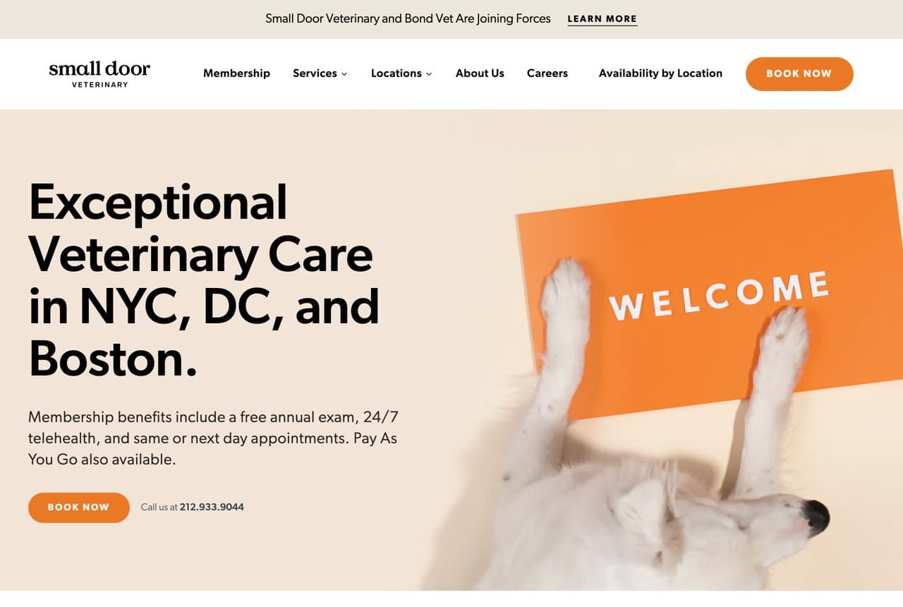
The Best Veterinarian Website Examples, Explained
The best vet sites do three things fast. They reduce anxiety on sight — a warm photo of real staff and pets, and calm colors, do more than any 'compassionate care' line. They answer the owner's real worries — access (same-day, walk-ins, hours), cost (membership, transparent pricing), and a pet's fear (Fear-Free certification). And they make booking the one obvious action, since a worried owner wants help now. The modern standouts go further and reframe the practice as a membership or whole-pet wellness brand. Everything below is a variation on those moves; pick the one that fits the clients you want.
Browse the gallery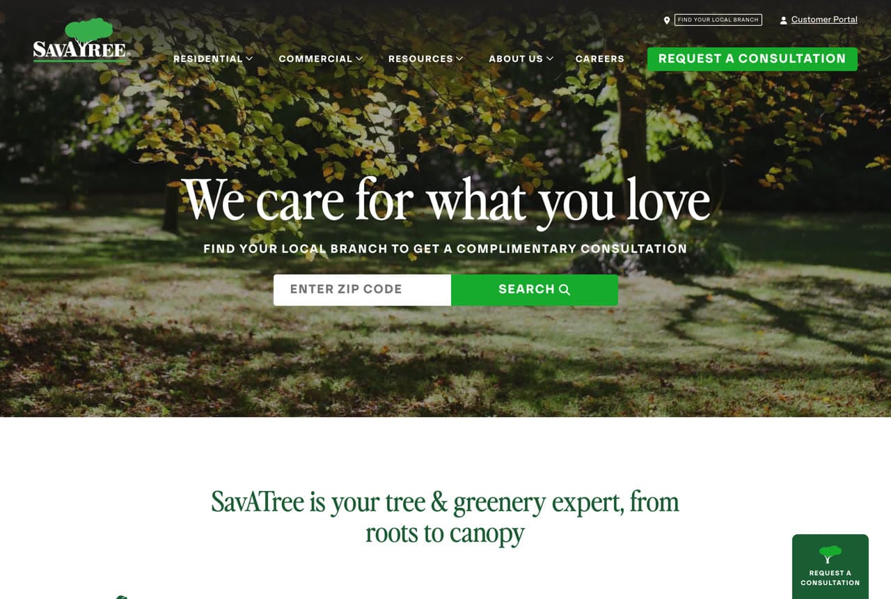
The Best Tree Service Website Examples, Explained
The best tree service sites do three things fast. They build trust for a risky job — ISA certification, 'fully insured & bonded,' years in business, and a real crew photo do more than any 'quality service' line. They defuse anxiety, since tree work is stressful (cost, risk, mess) — reassuring copy and a clean, uncluttered design signal safe hands. And they make getting a quote the one obvious action, with a 'free estimate' form or button in the hero. The strongest also break the cluttered, coupon-crammed trades-site norm with one dramatic photo and a calm, confident message. Everything below is a variation on those moves.
Browse the gallery
The Best Web Design Website Examples, Explained
A studio's own website has one job: prove the studio can do the thing it sells. The best ones commit completely to a single idea — Humaan says one sentence and lets restraint carry it, Instrument sets its own name in type so big it becomes the design, MetaLab leads with products you already know. Almost all of them earn credibility the same three ways: a plain-words statement of what they do, named clients or shipped work above the fold, and exactly one action (start a project). Copy the commitment, not the budget — every move below scales down to a one-person studio.
Browse the gallery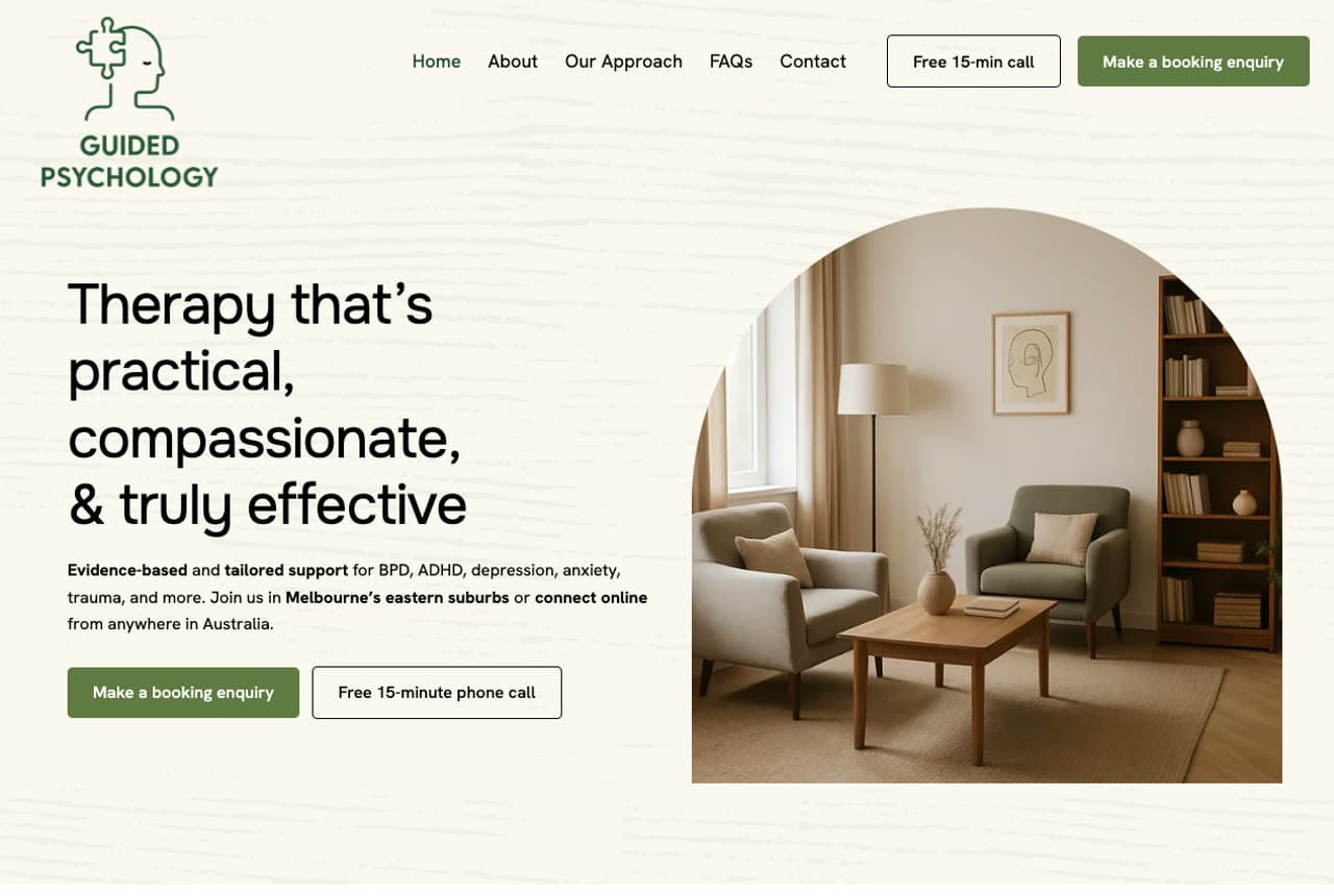
The Best Therapist Website Examples, Explained
The best therapist websites lower the cost of the first step. They speak to one kind of person in that person's own words (women who look put together but feel stuck; Latina women reclaiming their voice; couples who waited six years), they show the room or the face the visitor will actually meet, and they make the ask small — a free 15-minute call, not a commitment. Notice how much warmth is carried by shape and color rather than photography of tissues and couches: arches, creams, sage, a script eyebrow. Every example below picks a single person to reassure and reassures them in the first screen.
Browse the gallery
The Best IT Services Website Examples, Explained
Every managed-IT website is answering the same unspoken question from a business owner or CFO: if I hand you our systems, will I stop worrying? The best ones answer it with a headline that names the outcome (growth, calm, one accountable partner), proof in numbers (years, certifications, clients, response times), and a single next step that sounds like a conversation, not a sales call — a strategy session, a discovery call. Notice how the strong examples split into two moods: dark, cyber-confident (Echelon, NexusTek, Logically, CompassMSP) and bright, approachable (Rocket IT, Corsica). Both work; what matters is picking one and committing.
Browse the gallery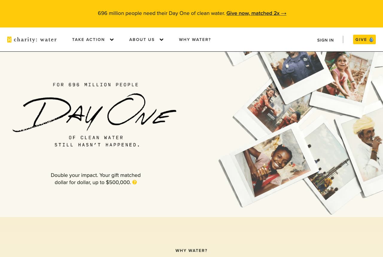
The Best Nonprofit Website Examples, Explained
The best nonprofit websites make the ask concrete and the giving effortless. They put a number on the problem (696 million people, 5 million girls, a 2027 goal), show one real face instead of a crowd, and keep the donate path within reach on every screen — often as a card with preset amounts right in the hero. The other move worth copying is emotional specificity: 'a safe place to sleep' beats 'supporting youth', and 'growing compassion together' beats 'animal welfare initiatives'. Every example below trades abstraction for a single vivid thing you can picture.
Browse the gallery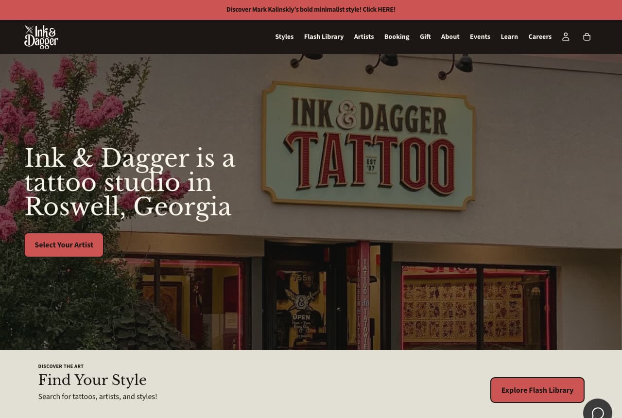
The Best Tattoo Website Examples, Explained
The best tattoo websites do three things fast: show the room or the shopfront so a first-timer knows what walking in feels like, show the artists' work so a collector can judge the hands, and make the ask one step — select your artist, book your visit, start a consultation. Dark and moody is the default (Bang Bang, Temperance, Hidden Hand), but the strongest studios pick a register and own it: Brilliance goes light and botanical, Copperplate goes umber and private, Love Always goes red script and self-care. Every example below chooses an attitude before it chooses a photo.
Browse the gallery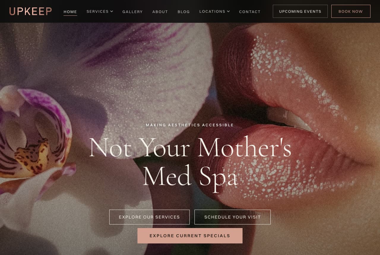
The Best Med Spa Website Examples, Explained
Every med spa website is balancing desire against credibility. The best ones put the medical proof where the eye lands — a named medical director, board certification, thousands of reviews, accreditation badges — and let the beauty come from restraint: cream grounds, serif italics, one honest photograph of a real treatment room. The second move is answering the money question early, whether with flat-rate pricing (Peachy), a first-time offer (Sanjiva), or a treatment menu you can scan in seconds (Cienega). Every example below earns permission before it sells the glow.
Browse the gallery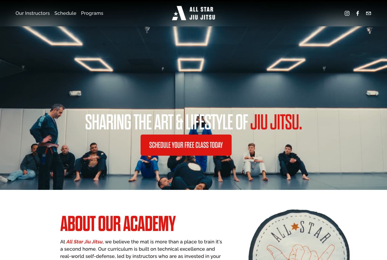
The Best Martial Arts Website Examples, Explained
The best martial arts websites make the first class feel easy to try and the school feel like a place you'd belong. Almost every strong example here offers a free class or trial in the first screen, shows real students on real mats (kids in gis, adults mid-roll) rather than stock fighters, and states plainly who it's for — all ages, beginners welcome, families. The mood splits by intent: family and community schools lean welcoming (All Star, Blue Wave, The Dojo NYC), MMA gyms and legacy academies lean dark and intense (Mission, American Combat, Anderson's, Renzo Gracie). Both convert; what matters is matching the design to the student you want walking in.
Browse the gallery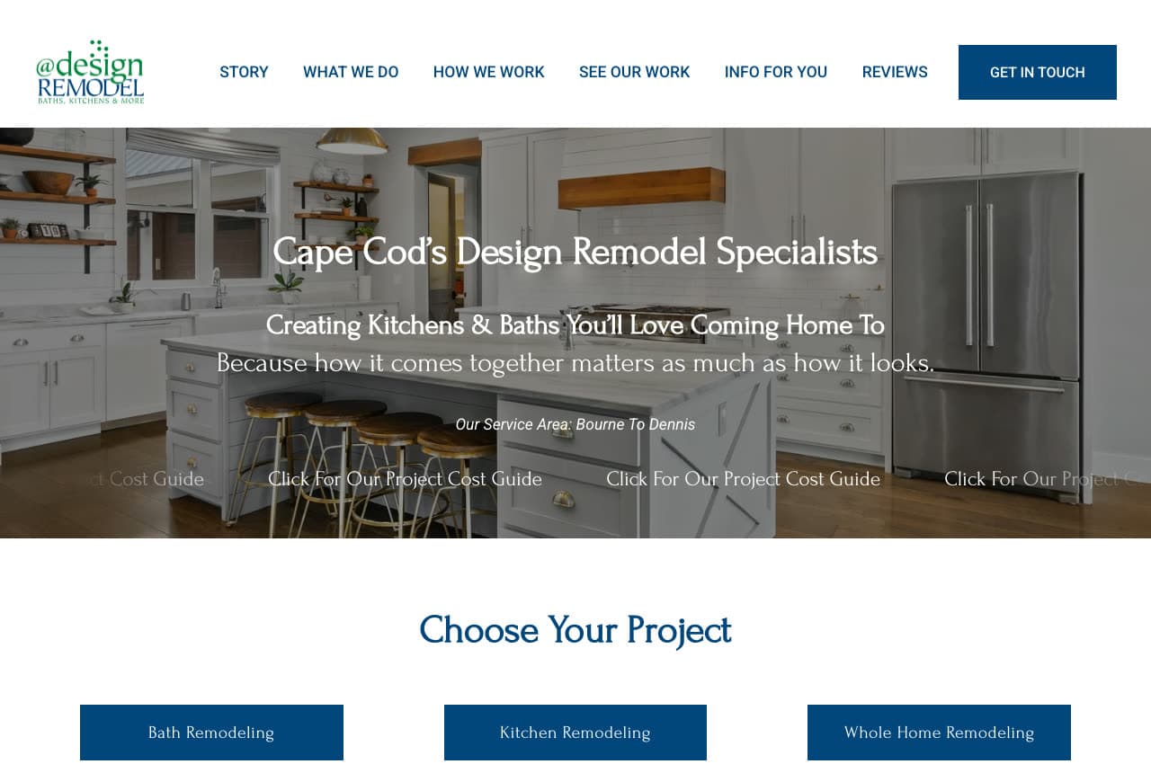
The Best Home Renovation Website Examples, Explained
The best home renovation websites show a finished room before they say a word, then say the one thing a homeowner is worried about: will this be handled? Kitchen photography is the category's currency — every strong example here leads with a real project, not a stock render — and the copy that converts is about process and reassurance (one visit, a written quote, the same crew every day) rather than superlatives. The moods split cleanly: bright and welcoming for kitchens and baths (AT Design, SF Design Build, Normandy), quiet and editorial for luxury builders (Environs), bold and modern for platforms (Block). Pick the register your clients live in.
Browse the gallery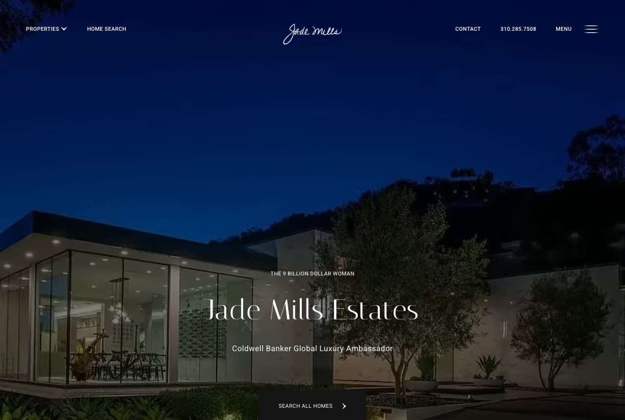
The Best Luxury Real Estate Website Examples, Explained
The best luxury real estate websites are photographed like the homes they sell and written like a private bank. Nearly every strong example here opens on a full-bleed image — a glass house at dusk, a rooftop at sunset, a barn interior — followed by a number that establishes the league (billions sold, a ranking, off-market inventory) and an invitation rather than a form. Notice what's absent: no 'search 40,000 listings', no bright buttons, no urgency. The register is discretion; the proof is scale; the ask is a conversation. Every example below sells the agent first and the inventory second.
Browse the gallery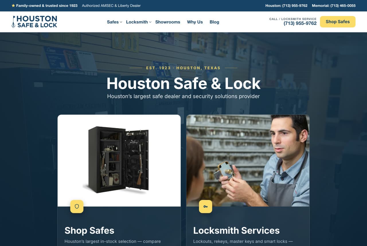
The Best Locksmith Website Examples, Explained
The best locksmith websites are built for two visitors at once: the person standing outside their car at midnight, and the property manager comparing three quotes on a Tuesday. For the first, the phone number sits in the hero as a button, the response time is a number, and the area is named. For the second, licenses, years in business and payment options do the persuading. Notice how the strongest examples state the service triangle — home, car, business — in plain words, and how the good ones (Houston Safe & Lock, Anderson Lock) lean on age and specialty rather than urgency alone. Every example below puts the number where a panicked thumb can find it.
Browse the gallery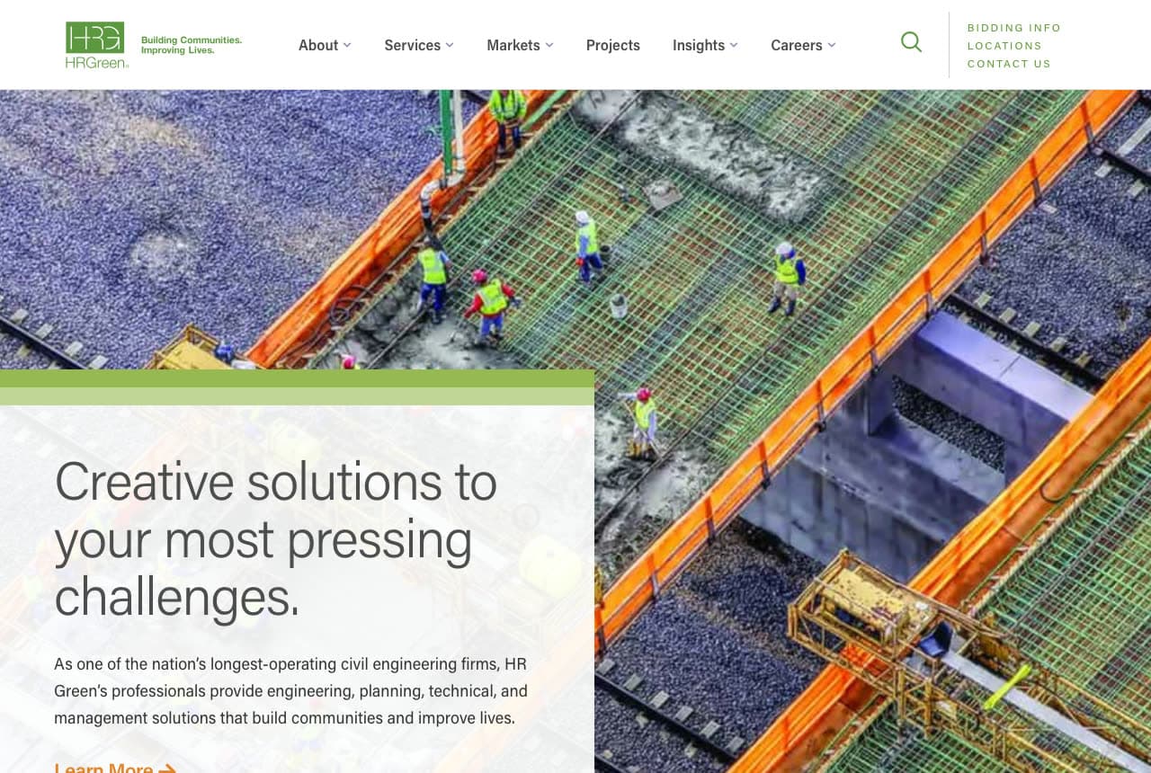
The Best Engineering Website Examples, Explained
Every engineering firm website is answering a client's quiet question: can these people be trusted with something that has to stand up? The strong examples answer with the work itself — an aerial of the pour (HR Green), a substation against a pale sky (NEI), a trench with the culvert going in (Carlson McCain) — and a headline that states the outcome in plain words rather than a list of disciplines. Proof arrives as names and numbers (the association logos under Schneider's hero, 'since 1972' under SWA's), and the ask is a proposal or a conversation, never a 'buy now'. Notice the two registers: photo-led firms that show the site, and type-led firms (Ascent, SWA) that state a promise on a clean field. Both work; what matters is that the first screen says what you engineer and for whom.
Browse the gallery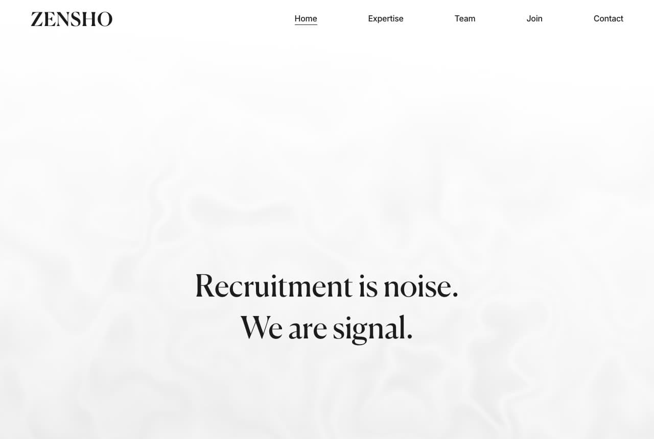
The Best Recruitment Website Examples, Explained
The best recruitment websites solve the category's structural problem in the first screen: two audiences with opposite intentions land on the same page. Clarity literally splits the hero into 'I am a job seeker' and 'I am a growing business'; Tattersall gives each visitor a button in its own color; Goodwin lines up four buttons; Aquent puts a job-search bar under the headline. Positioning does the rest — a specialism named plainly (medical sales, DevOps and cloud, executive search for VC-backed companies) beats 'we connect talent with opportunity'. Notice the moods: minimal and typographic for executive search (Zensho, Hunt Club), warm and photographic for niche firms (Tattersall, Zebra People), dark and intense for tech (Trust in SODA). Pick the visitor you serve most, and design the first screen for them.
Browse the gallery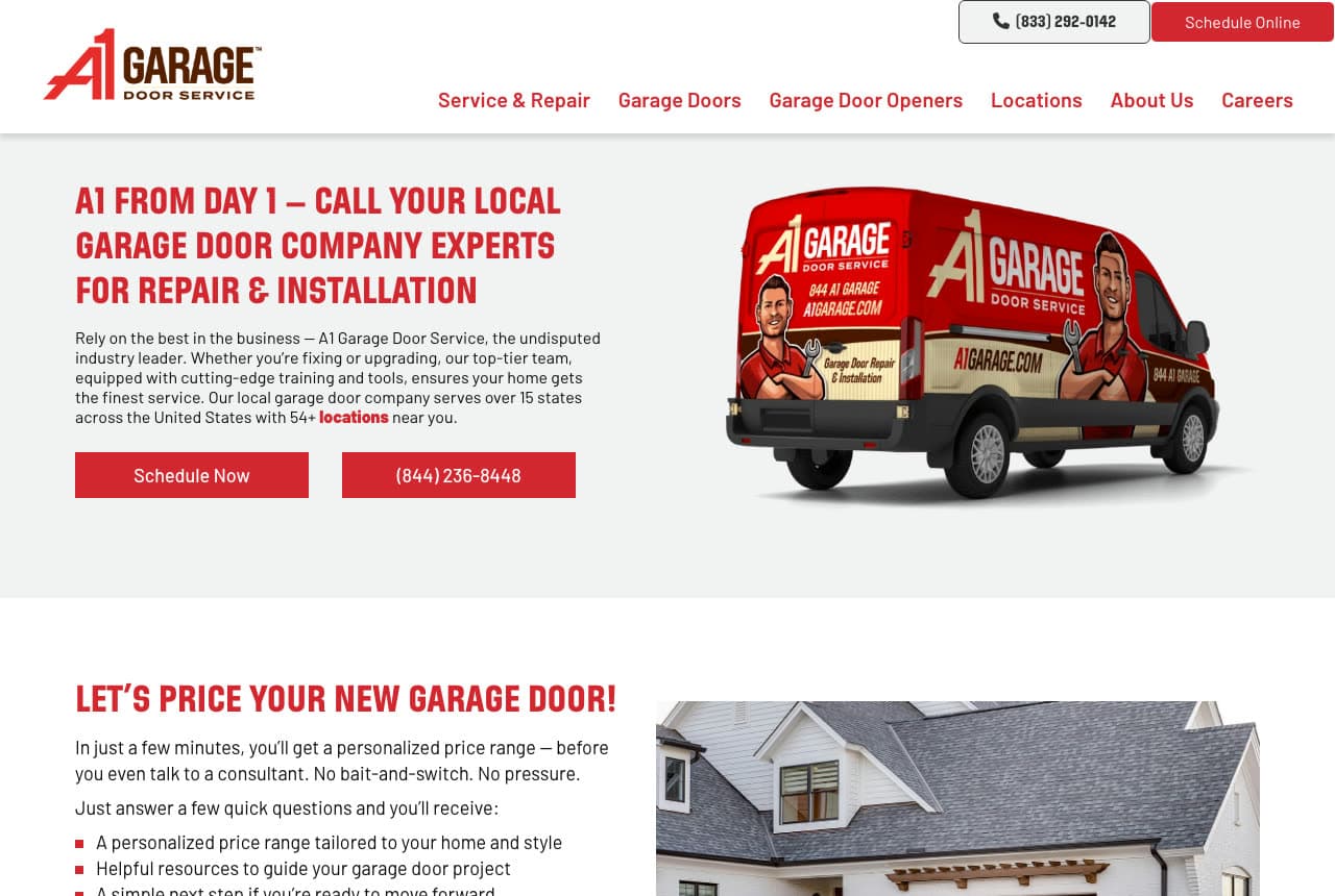
The Best Garage Door Website Examples, Explained
The best garage door websites are built for two moments: the door that won't open this morning, and the new door a homeowner has been putting off for a year. For the first, the phone number is a button, 'same day' or '24/7' sits in the first screen, and a form or online booking waits beside the headline (Garage Door Medics, Florida Garage Door Pros). For the second, the site shows doors on real houses and prices the project without a call (A1's 'Let's price your new garage door'). Proof is counted, not claimed — Stapley's 1,109 Google reviews, Four Seasons' 2,270 — and the brand is often a character: a cartoon technician, a mascot van, a name in a display face. Every example below puts the number where a stuck-outside thumb can find it.
Browse the gallery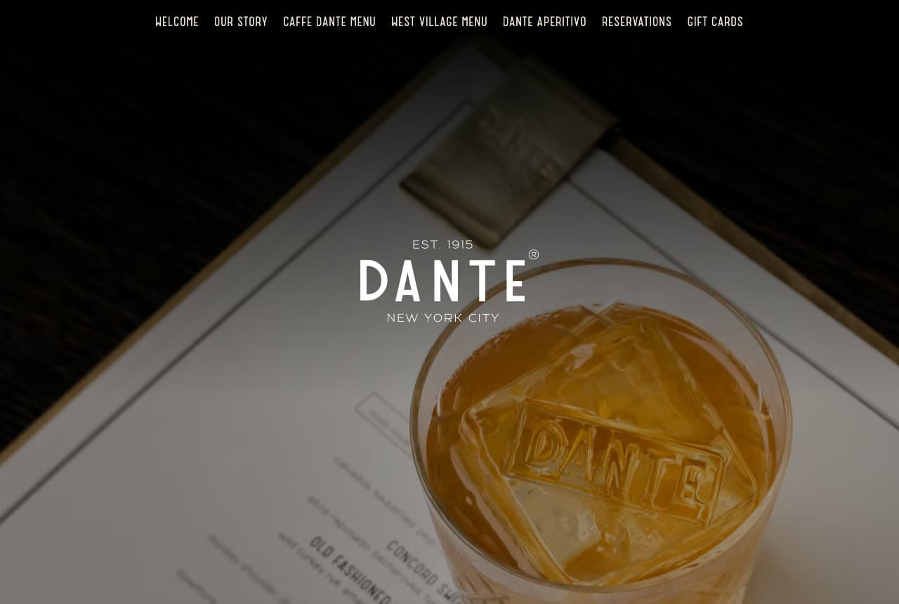
The Best Bar Website Examples, Explained
The best bar websites sell atmosphere before information: a photograph of the room or the drink fills the first screen (Smuggler's Cove's tiki rafters, Dante's ice cube stamped with the name), the wordmark carries the brand (Death & Co, The Brakeman), and the practical things — hours, address, reservations, gift cards — sit in a thin bar at the top where a phone can find them. Notice how many lead with a greeting rather than a headline ('Bienvenue', 'Fáilte Abhaile / Welcome Home') and how few use a call-to-action button at all; the menu link and the reservation link are the whole funnel. Dark is the default, but Penny Red's and The Brakeman prove a bar can be bright if the brand is loud enough. Every example below makes you want to be there before it tells you where it is.
Browse the gallery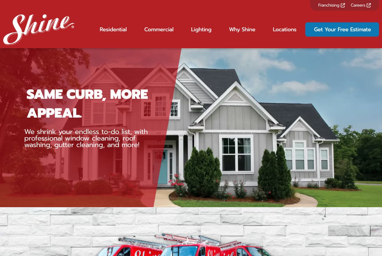
The Best Window Cleaning Website Examples, Explained
The best window cleaning websites are photographed like real-estate listings and written like a promise: a house at dusk with its glass lit (S.W.A.T., World Glass), a squeegee mid-swipe (Crystal Panes' wave, Glide's technician), or the crew itself in uniform (Window Gang, Men In Kilts). The headline is either the outcome ('A Brighter Home Starts Here', 'Enjoy a clear view') or the service list in capitals, and the proof is a counted rating — 5,000+ reviews, 4.9 across 8,679 — set beside the button. Every strong example puts the quote or the phone number in the first screen, and most add a second service (pressure washing, gutters, roof washing) in the same breath, because the visit is worth more than the windows. Franchises add a zip-code finder; single-city companies name the city in the headline.
Browse the gallery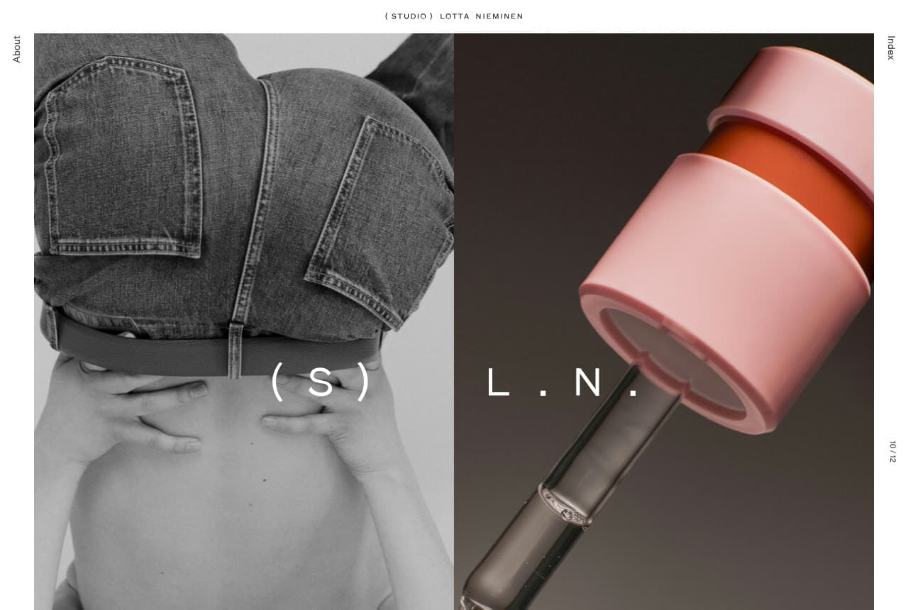
The Best Graphic Design Website Examples, Explained
The best graphic design websites make one decision in the first screen and commit to it. Some lead with the work and nothing else (Lotta Nieminen's two photographs with a two-letter monogram, Marleigh Culver's two artworks edge to edge); some lead with the person (Lauren Hom sitting in front of her mural, Snask's team in headbands); some lead with an attitude in type (van Schneider's 'I create; therefore I am', Beci Orpin's yellow field of illustrations). What none of them do is explain — there is no 'we are a full-service creative studio' paragraph, because the design is the paragraph. Notice how small the navs are and how few buttons exist; a portfolio's call to action is the work. Every example below is a site that could only belong to the person who made it.
Browse the gallery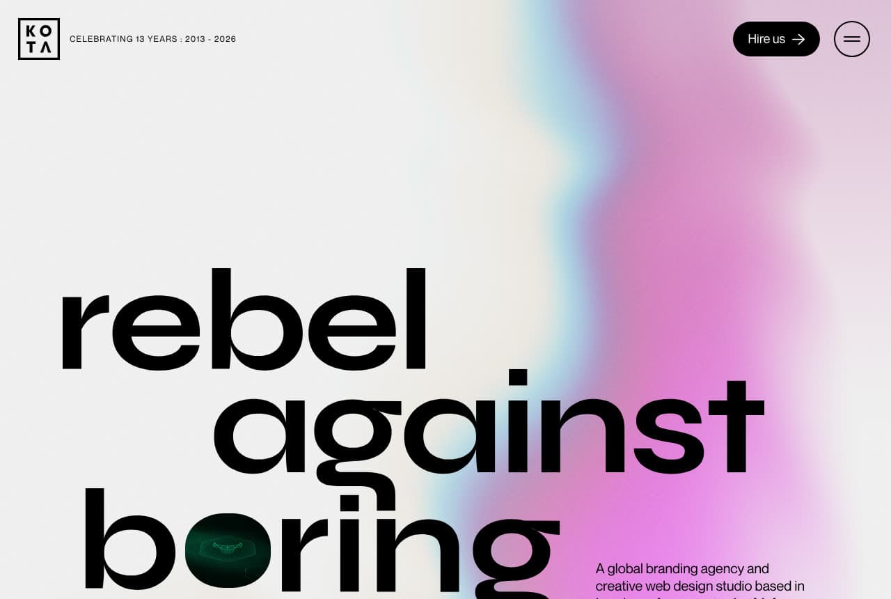
The Best Digital Marketing Website Examples, Explained
The best digital marketing websites treat the first screen as proof of craft. The headline is an attitude or a category claim, never a service list — 'rebel against boring', 'spin doctors of cultural commentary', 'Challengers wanted.' — and it's set in type the agency would be proud to sell. Two schools show up: the brand-led agencies (Kota, That Lot, Madwell, Beans) lead with color, 3D and motion and put the services one scroll down; the performance-led ones (Olivine, Skale, Animalz, Wpromote) name the specialism and the buyer in the headline ('product marketing leaders in B2B SaaS', 'organic growth engines that win in AI search') and follow with proof (Olivine's client logo row, Wpromote's CFO line). Both keep the hero to one or two buttons. Every example below would still be recognizable with the logo removed — which is the whole test for an agency site.
Browse the gallery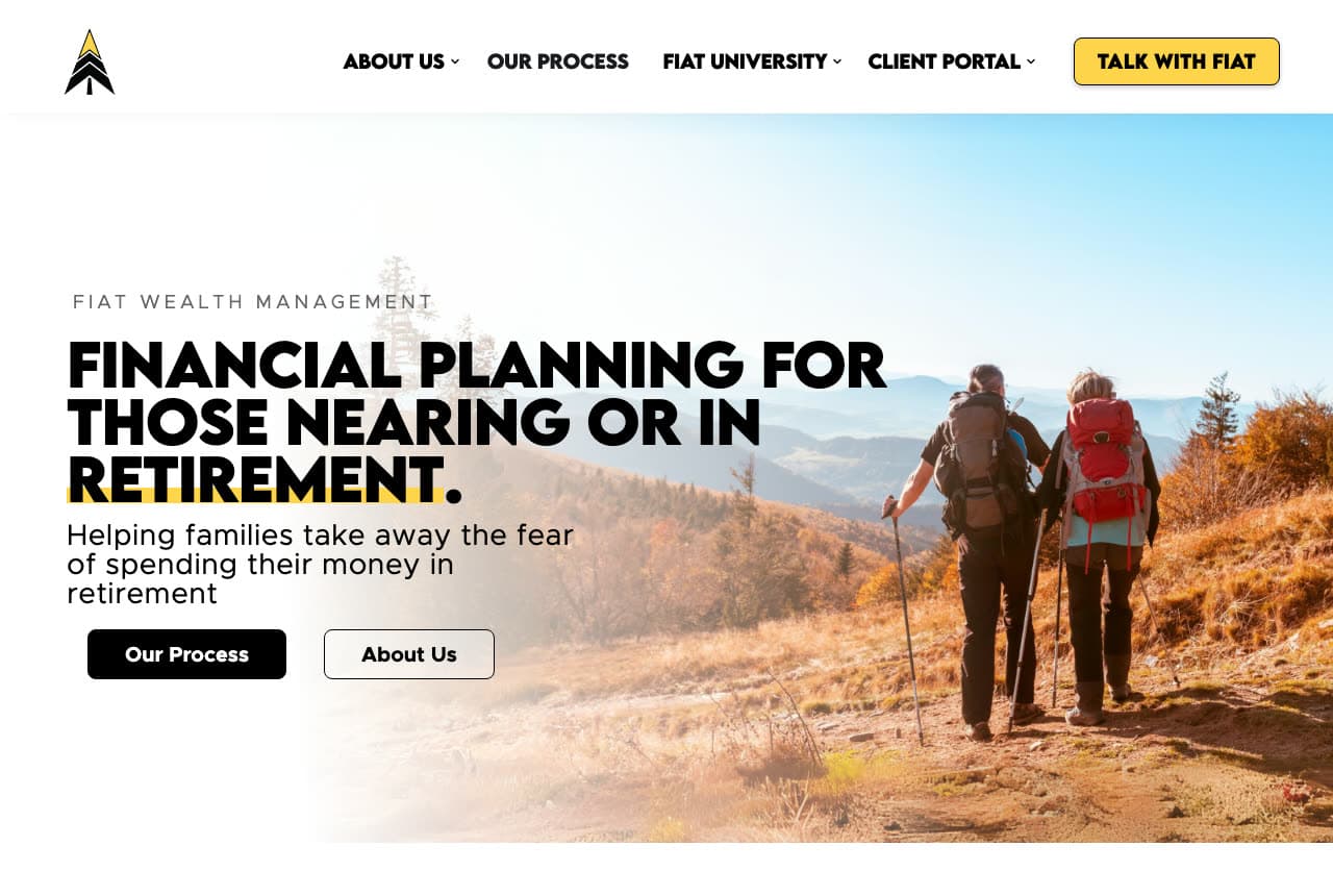
The Best Financial Advisor Website Examples, Explained
The best financial advisor websites answer 'is this for me?' in the headline. The strong examples here name a client — those nearing retirement, business-owning families, first-generation wealth, nuclear power plant professionals, correctional officials — rather than promising 'comprehensive wealth management' to everyone. The photography is the life the money is for (hikers, a harbor of sailboats, a dinner under string lights) or the advisors themselves (Archer's two partners, Capital Design's 'Meet with Andre'), never a stock handshake over a chart. Proof is quiet and specific: a client-login link in the nav, twenty years built into a logo, a logo row of the companies clients work at. And the ask is a call, not a form — 'Schedule a Call', 'Talk with Fiat', 'Book a Meeting'. Every example below sells a relationship, and the first screen is written for one kind of person.
Browse the gallery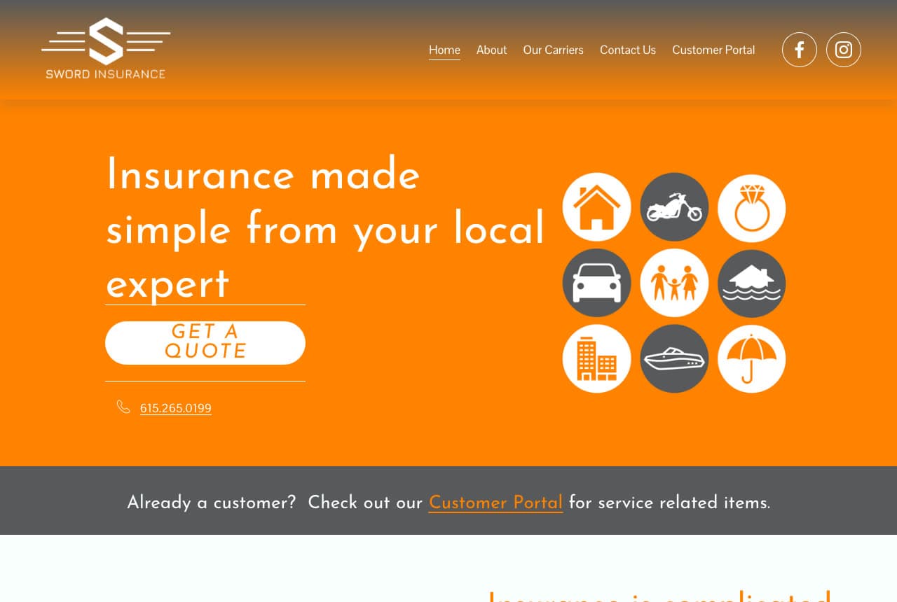
The Best Insurance Website Examples, Explained
The best insurance agency websites sell the agent, not the policy. The carriers already own 'save 15%'; an independent agency wins with the argument Gary Marshall puts in its headline — we compare the leading companies for you — and with faces: Warren's two founders on a sofa, Good Circle's staff behind a family, Heffernan's brokers at a tablet. Coverage is shown as a menu you can tap (Sword's nine circle icons, Alpine's four tiles) rather than a paragraph, the quote is one click and often a form in the hero (Heaton Bennett), and the proof is either a year (Morris & Garritano's 'since 1885') or a counted rating (Alpine's 4.9 across 418 reviews). Notice the palettes: orange, green, gold, cream — anything but carrier blue. Every example below gives the visitor a reason to call this agency instead of typing into a national site.
Browse the gallery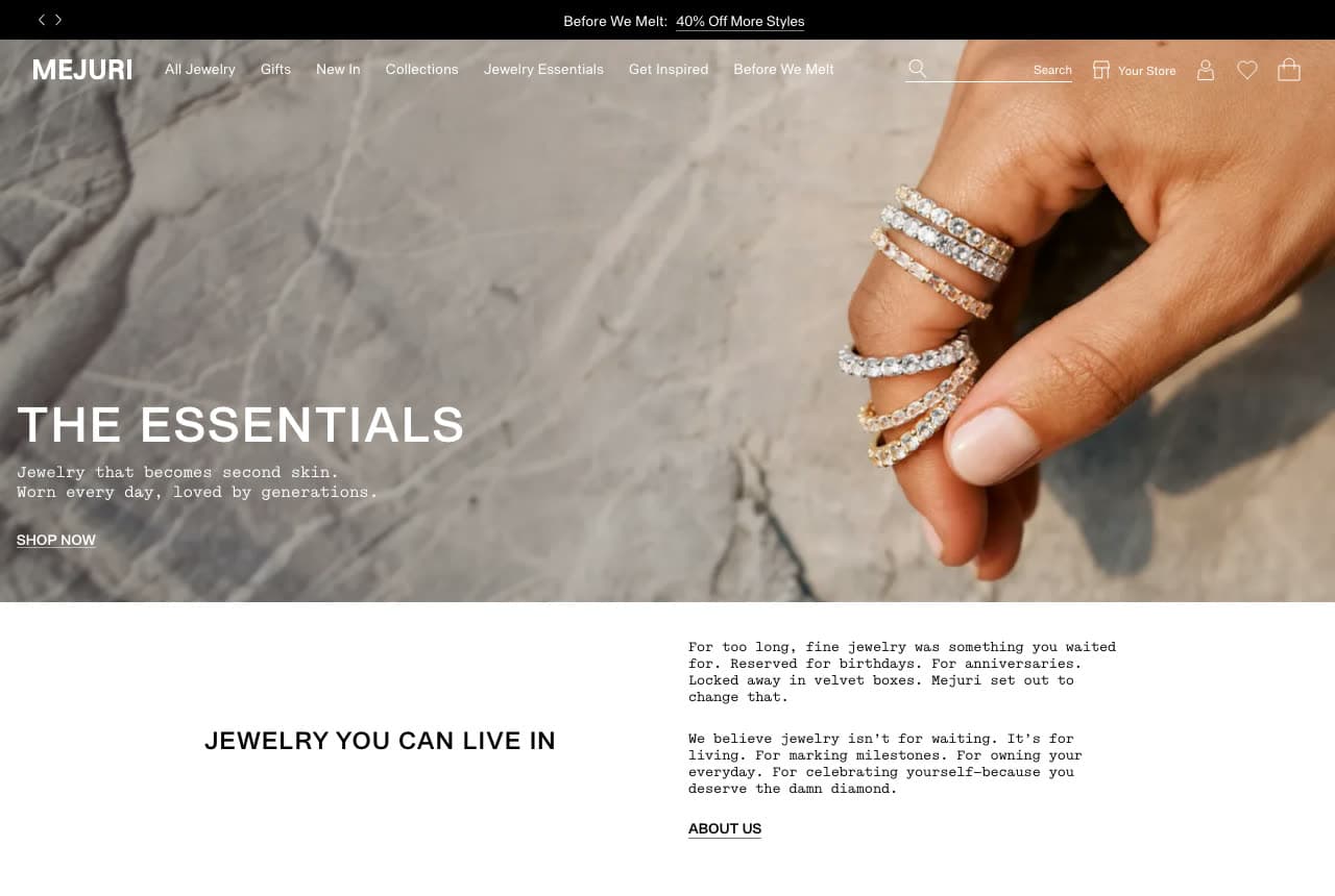
The Best Jewelry Website Examples, Explained
The best jewelry websites photograph the piece on a body and say very little. Hands wearing the rings (Mejuri, Stone and Strand), a neck with the necklace (Hortense's pearl, Bluboho's evil eye), a model in the bangles (Gorjana) — the product is shown the way a customer will see it in a mirror, and the headline is a collection name or a mood ('The Essentials', 'Most loved. Most layered.', 'Oceana'), never a list of categories. The nav does the categories; the promo bar does the offer; the hero does the desire. Notice the two registers: the fine-jewelry brands go quiet (white, serif, a single underlined link), and the personality brands go loud (Tatty Devine's marbled swirl, Dinosaur Designs' red). Every example below would make you want to try the piece on before it tells you the price.
Browse the gallery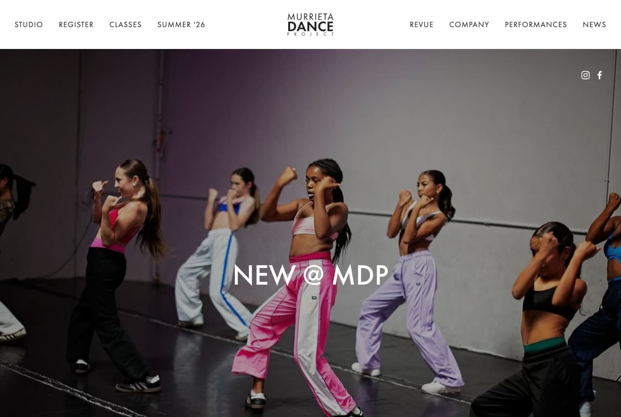
The Best Dance Studio Website Examples, Explained
The best dance studio websites photograph their own students, not stock dancers, and say who the classes are for before they say anything else. The first screen tells a parent the ages (Steps on Broadway's 'Ages 2 – 18', DC Dance of LA's '3-18+'), the styles (I Love Dance's 'K-pop & street styles', Springs Dance's 'Ballet, Tap, Jazz, Contemporary and More') and the city, then offers one of three next steps — register, book a trial class, or see the schedule — as a button. Two moods show up: the bright, community studio (Dance Academy USA, Carolina Collective) and the dark, cinematic training space (Debut Dance District, Murrieta). Both work when the photograph is real. Every example below makes a parent or a dancer feel they know what walking in will be like.
Browse the gallery
The Best Dermatologist Website Examples, Explained
The best dermatology websites make the appointment the first thing and the doctors the second. Almost every strong example puts 'Book an Appointment' in the header and a same-day or online-booking promise in the first screen (Schweiger's 'ready when you are', Cumberland's zip-code search for the nearest location), then shows the people — Metrolina's three doctors cut out on watercolor, Derm Institute's mosaic of patient faces, Metropolis's laughing group. The register splits by business: medical-first practices go calm and serif (Cumberland, Riverchase, Epstein & Tuffanelli's 'eighty years'), cosmetic-leaning practices go softer and pinker (SmarterSkin), and the boutique aesthetic clinic goes minimal (REN's reception wall). Proof is a location count, a year, a Google rating or a top-doctor badge. Every example below answers 'can I get in, and who will I see?' before the visitor has to scroll.
Browse the gallery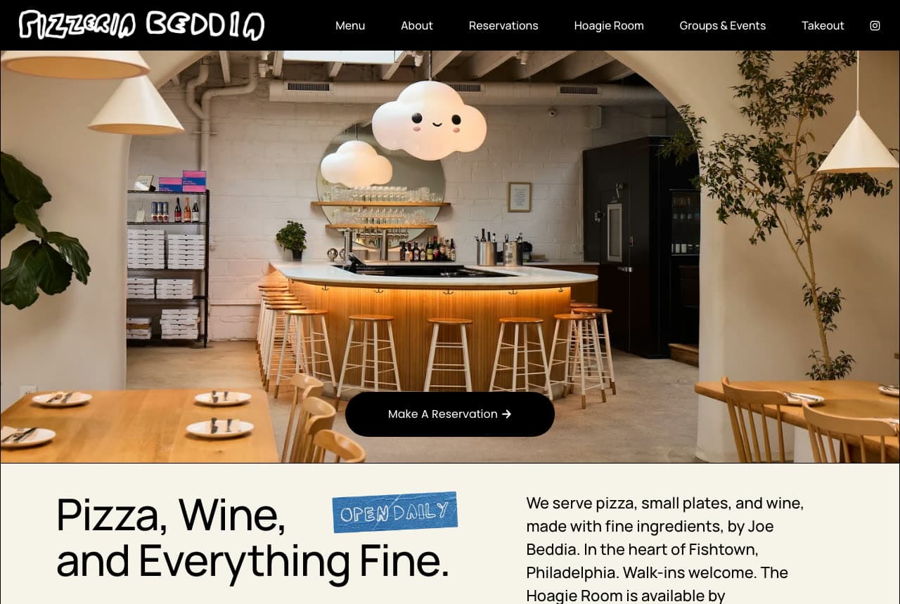
The Best Pizzeria Website Examples, Explained
The best pizzeria websites put the pie or the person on the first screen and the order button within reach of a thumb: an overhead of two pizzas on a board (L'Industrie), a hand lifting a tomato pie on a peel (De Lorenzo's), the pizzaiolo himself (Tony's, Kesté). Notice how many carry the neighborhood in the design — Di Fara's cross streets set vertically beside the photo, Home Slice's neon storefront at night, Beddia's 'In the heart of Fishtown' — and how the order path is never more than one link away ('Order Online', 'Order Delivery', 'Takeout'). Red is the default, but Beddia's cream and Stretch's orange prove a pizzeria can own another color if the type is confident. Every example below makes you hungry before it tells you where to park.
Browse the gallery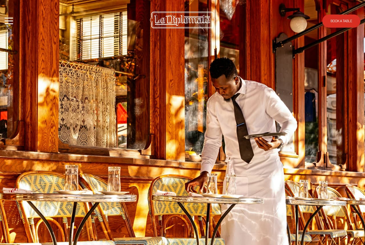
The Best Bistro Website Examples, Explained
The best bistro websites choose one thing to photograph — the room (Chez Fifi's red banquettes, Balthazar's mirrors), the plate (Petit Trois's onion soup, Bistro Jeanty's pastry-topped soup), or the people (Le Diplomate's waiter, Le Pigeon's chef at the copper pass) — and let a short nav do the rest. Notice how few carry a headline at all: Routier prints its hours and 'walk ins welcome' where a tagline would go, Buvette runs a letterpress print of its own name, and Zimmi's replaces the menu bar with objects from the table. Reservations sit in the header on nearly every one, and 'gift cards' and 'private events' ride along as links, never banners. Every example below makes you want to sit down before it tells you what's on the menu.
Browse the gallery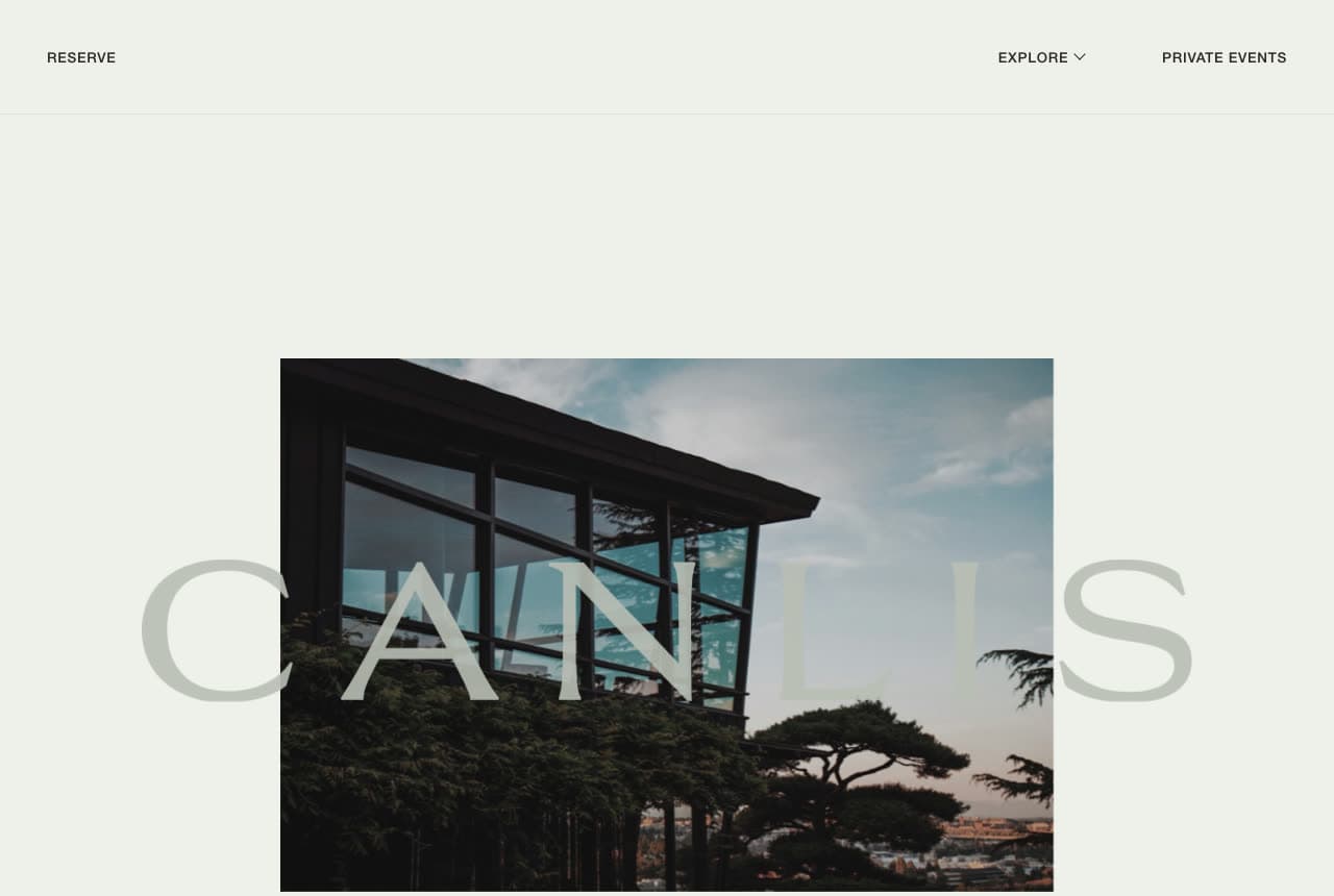
The Best Fine Dining Website Examples, Explained
The best fine-dining websites remove almost everything: one photograph — a plate (Alinea, Le Bernardin), an ingredient (Smyth's pine cones, SingleThread's squash blossom), the building (Canlis, The French Laundry) or the chef (The Inn at Little Washington) — a wordmark, and a reservations link. Notice how the credentials are shown rather than claimed: Michelin flowers in a row, Relais & Châteaux, a green star, 'Ranked #2 Restaurant in America' in a heading further down the page but not on the first screen. Notice, too, that the nav is often the positioning — Atomix's 'Chef's Counter / Bar Tasting / About Us', SingleThread's 'Farm · Restaurant · Inn'. Dark and light split evenly here; what they share is space. Every example below makes the evening feel rare before it tells you the price.
Browse the gallery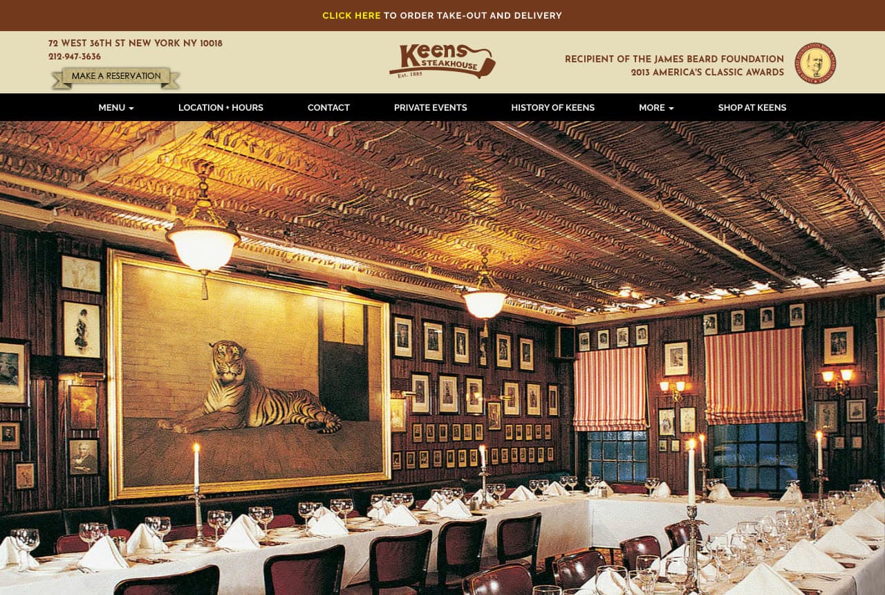
The Best Steakhouse Website Examples, Explained
The best steakhouse websites are dark, and they choose between the room and the meat: Keens and Bones photograph the dining room and the people who run it; Peter Luger, Cote and Gibsons put the cut on the table and shoot it from above; Gwen and Taste of Texas split the screen so the butcher counter sells beside the restaurant. Notice how much proof sits in the first screen — a James Beard medallion, 'Est. 1887', a New York Times quote, 'Voted Best Steakhouse in Dallas five years straight' — and how the reservation link is always in the header — red at The Bancroft, boxed at Cote, a ribbon at Keens. Notice, too, the second business: a butcher shop, a grill-at-home store, gift cards, private dining. Every example below makes the evening feel earned before it tells you the price of the ribeye.
Browse the gallery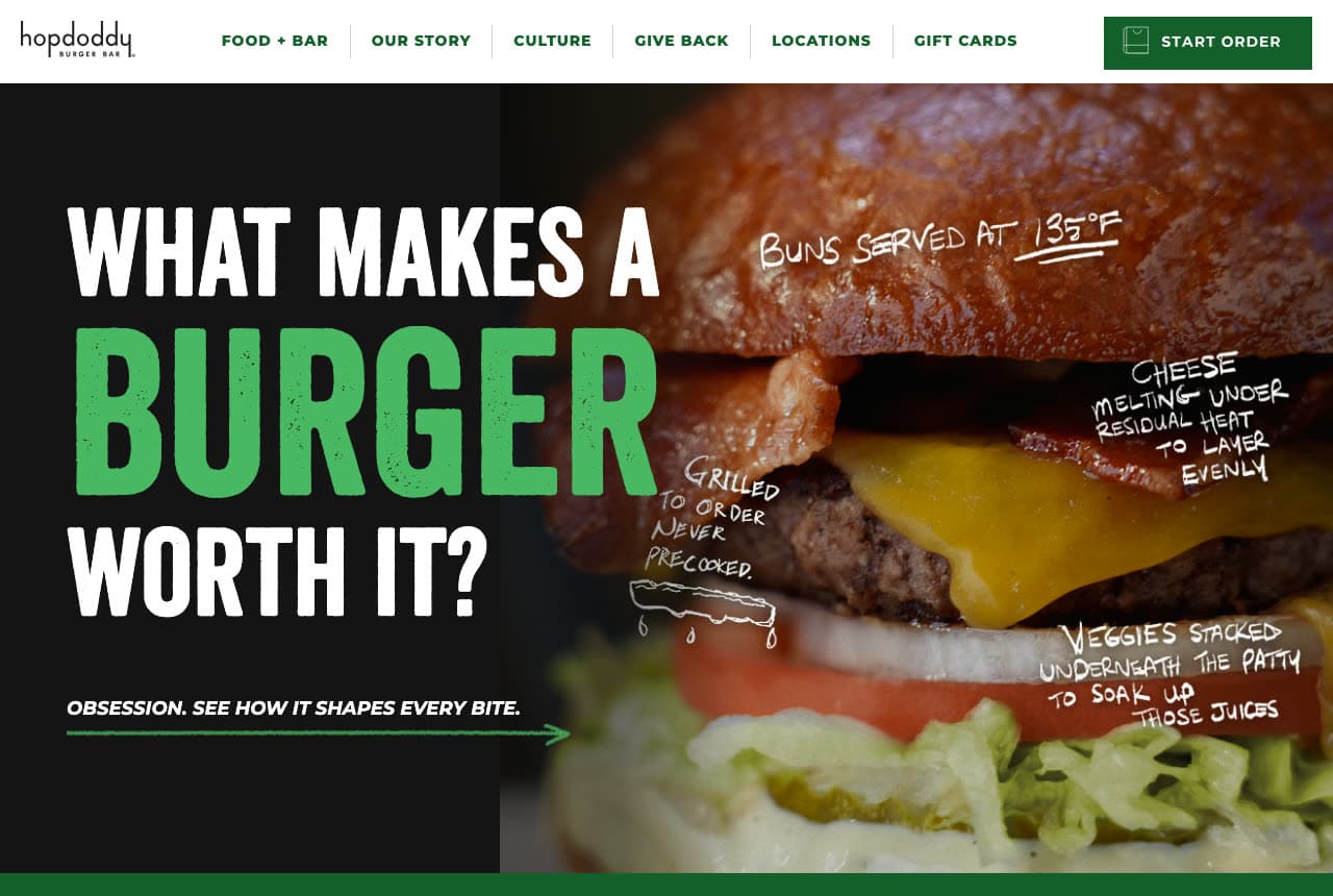
The Best Fast Food Website Examples, Explained
The best fast-food websites put the order button in the header and again in the hero, and then choose one thing to say: a value ('Slow Food Values', 'Long Live Local, 75% locally sourced'), a promise ('Fresh. Simple. Five Guys.'), a number ('15+ signature flavors'), or a boast ('The best burgers on the planet'). Notice the food is photographed close and hot — a burger in a hand, wings on paper, tacos on a tray — and the type is heavy, condensed and loud, because the screen is a phone at noon. Notice, too, that the most useful hero here isn't a photograph at all: Habit's is a pickup-or-delivery switch with a zip-code field. Every example below gets you to 'Order Now' before it tells you its story.
Browse the gallery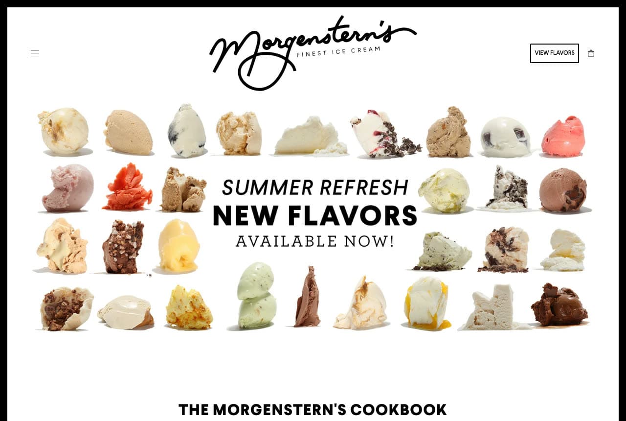
The Best Ice Cream Shop Website Examples, Explained
The best ice cream shop websites are the most colorful pages in any industry, and the color comes from the product: scoops on white (Morgenstern's), pints — from above at Wanderlust, side-on at Jeni's —, cones on plum tiles with the flavors handwritten beside them (Molly Moon's). Notice how many lead with what's new — 'Summer refresh', 'Fall just dropped', 'This Wednesday's drop' — because a scoop shop's calendar is its marketing. Notice the second business, too: pints shipped, cakes, catering, gift cards, a farm stand. Salt & Straw goes red for a collaboration; Henry's Secret goes black for scarcity; Ferris Acres shows a cow on a wooden sign. Every example below makes you want a cone before it tells you where to park.
Browse the gallery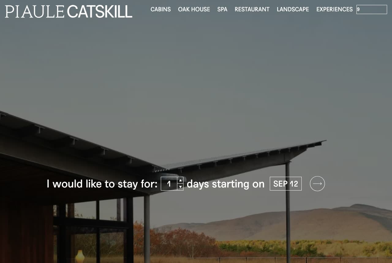
The Best Bed and Breakfast Website Examples, Explained
The best small-hotel, inn and bed-and-breakfast websites are photographs with a booking button: an aerial of the property (Post Ranch Inn on its cliff, Hotel Emma on the river), the building from the street (Palisociety), the landscape it sits in (Passalacqua's lake, Piaule's mountains), or the people who run it (Zero George's kitchen). Notice how the reservation path is built into the first screen — Piaule's 'I would like to stay for … days starting on …', The Newt's floating status pill with 'Book a Room' and the weather, The LINE's 'Check Availability' — and how little copy any of them need: an italic line, a list of cities, a season. Notice, too, the memberships and shops in the nav: a place to stay sells more than rooms. Most of the examples here run larger than a bed and breakfast, and that is the point — every one of these moves scales down to four rooms without losing anything. The three Zarla designs at the end are built for this end of the market — four rooms, six, fourteen — and each arrives with its rooms, its per-night rates and a check-dates form already in place. Every example below makes you want to arrive before it tells you the rate.
Browse the gallery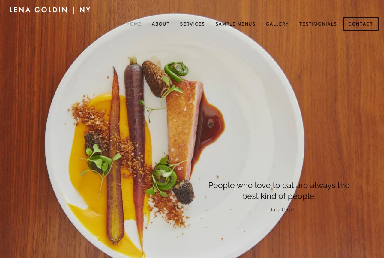
The Best Private Chef Website Examples, Explained
The best private chef websites split into two kinds and both work: the chef as the brand (Lena Goldin's plate, Amanda Pilkington and Chef Nate photographed at work) and the service as the brand (Tiny Spoon's 'Private Chef Service for Real People', Sous's booking form, The Culinistas' 'Never stress about dinner again'). Notice how the solo chefs lead with a photograph and a single line, and the services lead with a promise and a button. Notice the proof, too — review counts, a Google rating, 'background-checked', 'ServSafe-certified' — because a chef in your home is a trust decision. Every example below makes dinner feel handled before it tells you the price per head.
Browse the gallery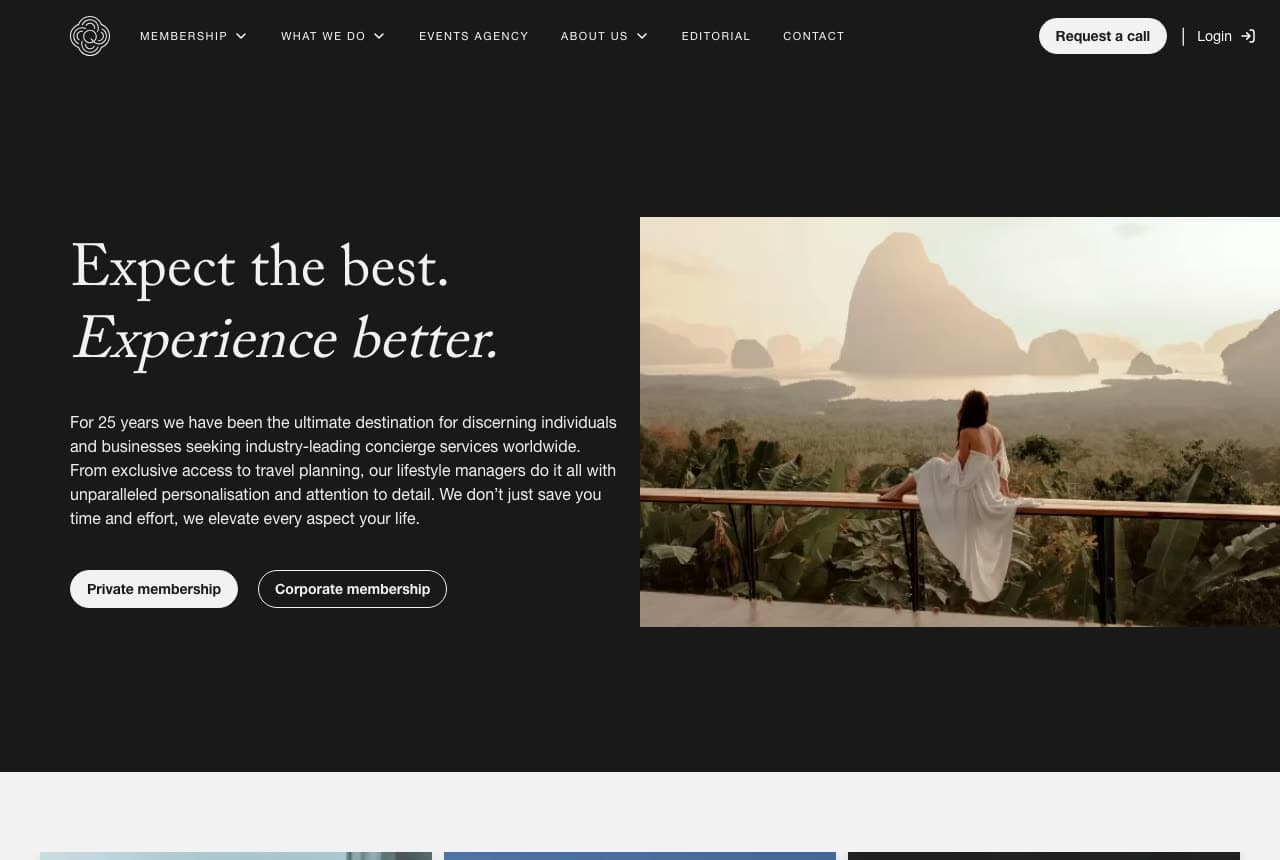
The Best Concierge Website Examples, Explained
The best concierge websites sell time, access and calm, and they split by who they serve: the membership houses (Quintessentially, Knightsbridge Circle, Sienna Charles) speak in serif over a yacht, a marble hall or a balcony, and their ask is an application or a call; the New York personal concierges (Insider, deVivre, King) speak plainly — 'a membership-based luxury lifestyle management, personal concierge, event planning, & bespoke travel agency', 'The Concierge Standard In New York City' — and their ask is a contact link or a phone number. Notice the proof is discretion rather than reviews at the top end, and a phone number or a 'Reviews' link at the neighborhood end. Notice, too, how many say what they actually do in the first screen — travel, events, lifestyle management, sourcing — because 'concierge' means nothing until it's a list. Every example below makes you feel looked after before it tells you the membership fee.
Browse the gallery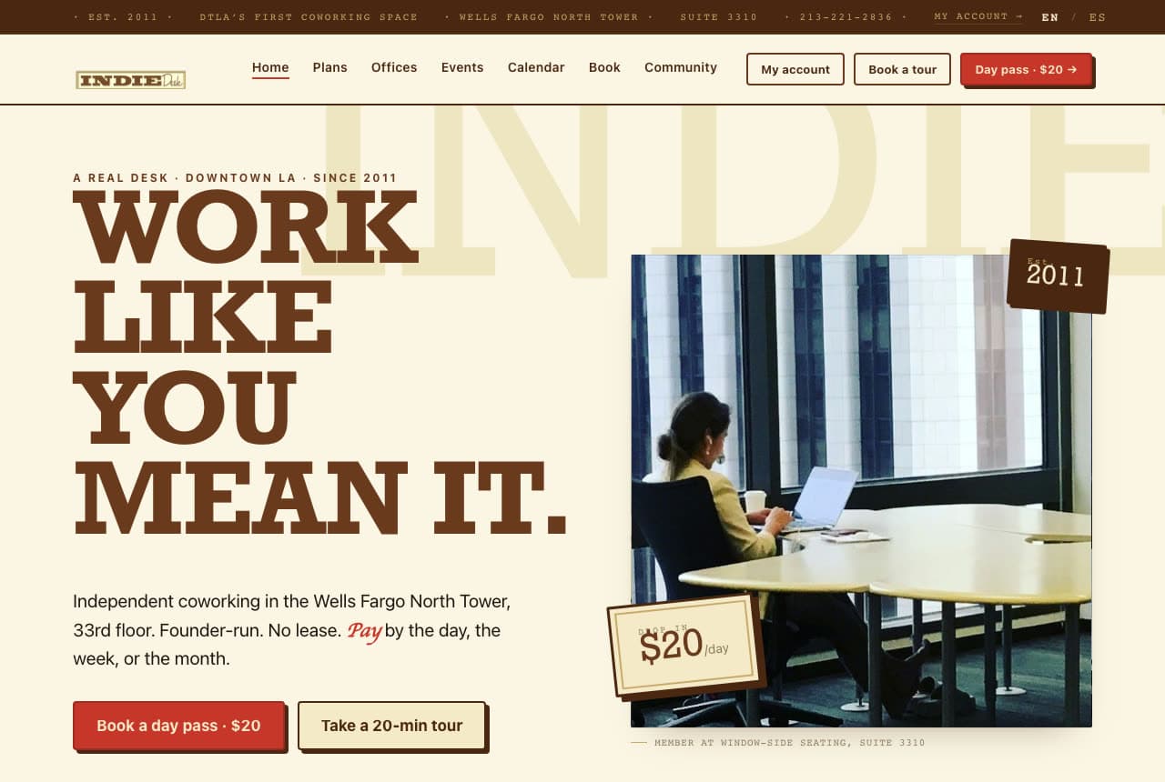
The Best Coworking Website Examples, Explained
The best coworking websites sell the seat and the people in the same screen: a photograph of members actually working or talking (Gravitate's bleacher chat, Kiln's three heads over a laptop, VIDA's member on the sofa) and a line that says what kind of place it is ('A Securus Locus', 'Workspace as creative as you', 'Independent coworking… No lease'). Notice how many put a price or a pass in the first screen — Indie Desk's $20 day pass, Workbar's 'Book by the Day' — and how often 'Book a Tour' or 'Take a Tour' is the button (Indie Desk, Workbar, Kiln, VIDA), because a tour converts better than a plan page. Notice the locations named up front — VIDA's pills, Second Home's underlined cities — and the sub-brands in the nav (incubator, podcast, events, mail services). Every example below makes you want to bring your laptop before it tells you the monthly rate.
Browse the gallery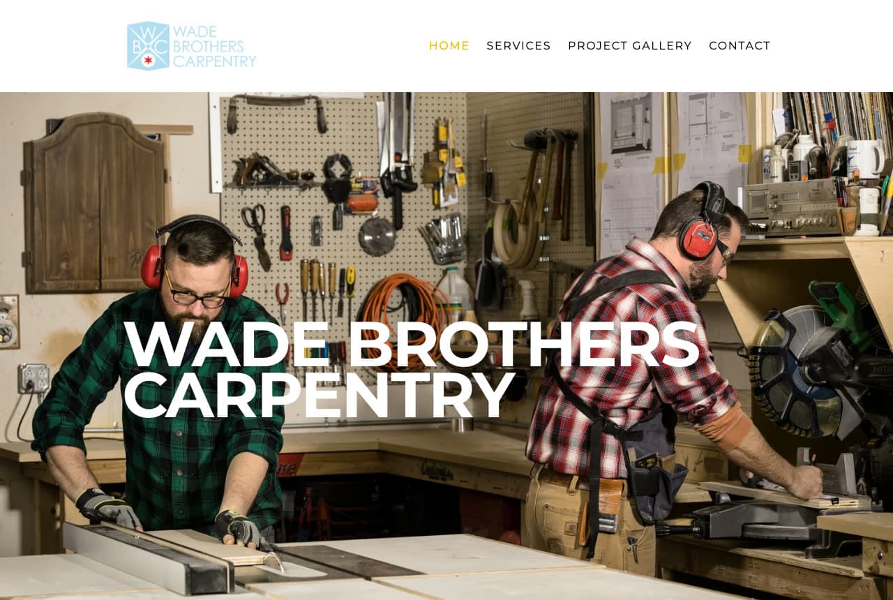
The Best Carpenter Website Examples, Explained
The best carpenter websites choose one of three heroes: the maker (Wade Brothers' two founders in plaid, Moulder & Craft's craftsman in a flat cap), the piece (Zonce Woodworking's live-edge slab with a bottle of wine, Hughes Woodworks' carved arched door, Young & Son's cedar slat ceiling with the architect credited under it), or the material itself (Bolt Woodworks' logo on a bed of shavings, Ozer's illustrated tools on ochre). Notice how few words they need — 'Where Wood Speaks', 'Inspired by Tradition', 'ARTISTRY, QUALITY, ORIGINAL DESIGN' — and how the ones that write more write to a specific buyer: Westbrook Carpentry & Millwork's 'three generations… historic windows' for period homes, Signature Finish Carpentry's 'Finished to protect your name' for builders. Every example below tells you who the carpenter is before it tells you what they charge. The five Zarla carpentry designs at the end take two of those routes and add a fourth: Thelwood & Sons puts a working bench edge to edge and Follenwood Cabinetmakers the finished kitchen, while Marchbank Joinery and Ashfen Carpentry drop the photograph altogether and let type alone carry the first screen — the nerve Ozer shows with illustration, in a form you can build.
Browse the gallery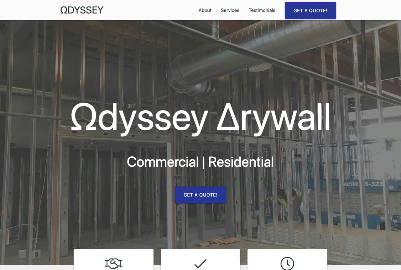
The Best Drywall Website Examples, Explained
The best drywall websites solve the invisible-product problem three ways: they show the work mid-job (Odyssey's framing and ductwork, Flow's taped room, Rival's wave-cut photo of stacked sheets), they show the people (The Wall Rebuilders' crew in whites, The Patch Boys' technician beside the wrapped SUV), or they show the finished interior the commercial buyer is paying for (Drywall Services Inc.'s marble lobby, Superior Wall Systems' tower and crane). Notice how many put the quote in the first screen — Flow's three fields with 'Send photos by text or email', A Pro Finish's circular form with a photo upload, Match All's callback card — because a patch can be priced from a picture. And notice the names doing work: Match All says texture matching, The Patch Boys says patches, and '1-844-99-PATCH' says it twice. Every example below tells you what kind of drywall company it is before you read a paragraph.
Browse the gallery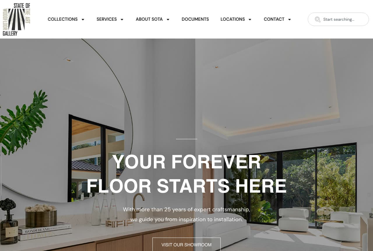
The Best Flooring Website Examples, Explained
The best flooring websites split into showrooms and contractors, and each knows which it is. The showrooms sell the visit and the choice — SOTA Floors' 'VISIT OUR SHOWROOM', Trinity Floor Company's 'ESTABLISHED 1934' badge and five product tiles, Floors By Roberts' 'Help me choose' chip and room visualizer, Best Flooring's owners inset in the hero. The contractors sell the job and the button — Unique Hardwood Flooring Chicago's five services as verbs and a big red 'GET A FREE QUOTE ›', Royal Home Flooring's shop-at-home model as a six-word headline, Midway Flooring's 'PROFESSIONAL, RESPONSIVE AND RELIABLE' for facilities buyers. Notice how many photograph a finished room rather than a floor (SOTA's white lounge, Stylish Interiors' kitchen, Petra Flooring & Blinds' hallway with the animal-print chair) and how the product range moves into the nav or a tile row so the hero can be one sentence. Every example below tells you whether to walk in or call before you scroll.
Browse the gallery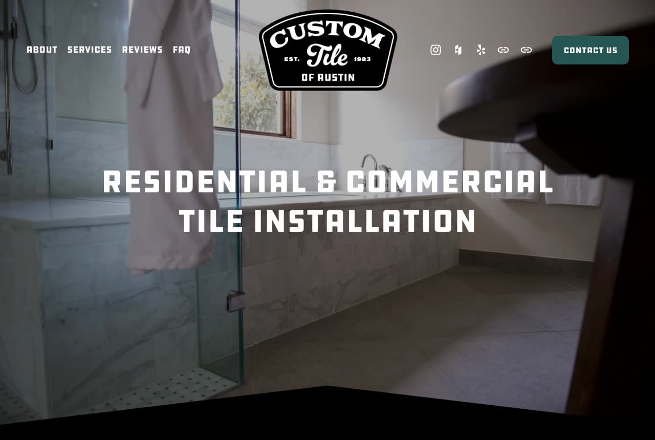
The Best Tiler Website Examples, Explained
The best tiler websites decide whether to show the finish or the craft. The finish is Custom Tile of Austin's marble shower, TK Tile's herringbone bathroom, Mr. Tile Renovations' brass fixtures and wood slats with the headline pinned to the bottom edge; the craft is The Tile Press's unglazed hexagons on the bench, Whiskey Creek's tile meeting combed thinset, Expert Touch Tiling's setter holding a tile above a band that counts 7,530 projects. Notice how the specialists name their materials — Lotus Tile lists encaustic, cement, cotto, terracotta, saltillo, zellige and talavera in the first person — and how the local installers write the search phrase as the headline (TK Tile's 'Tile Installation Seattle', Tile Pros Austin's six suburbs in one paragraph). And notice Ability Tiles turning 'one craftsman' into the promise, with the tiler's first name in the button. Every example below tells you what kind of tiler you're looking at before it asks for the job.
Browse the gallery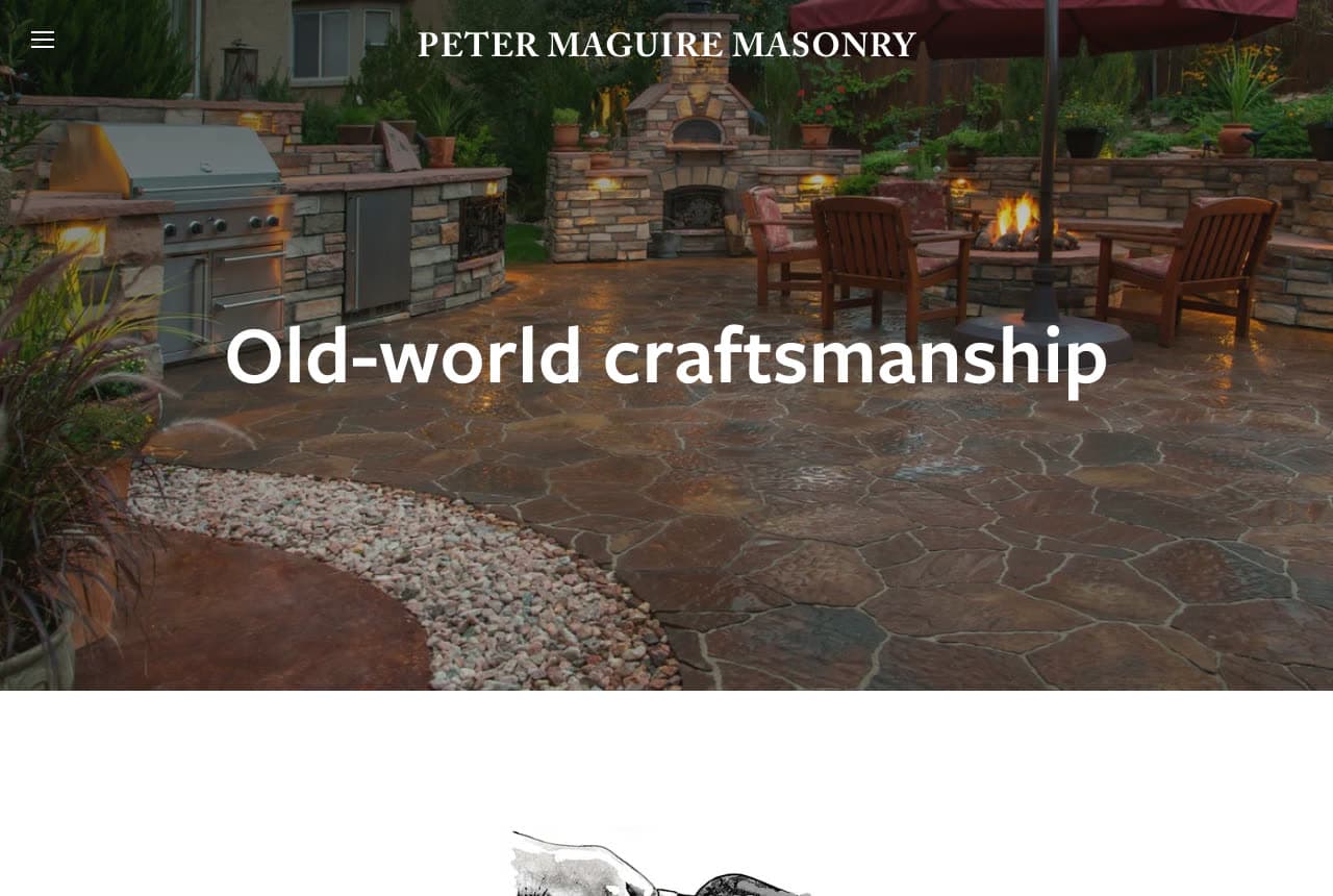
The Best Masonry & Concrete Website Examples, Explained
The best masonry websites either show the finished stone or the hands in the mortar. The finished work is Peter Maguire Masonry's patio and fireplace, Commonwealth Masonry & Paving's new driveway under a serif plaque, Boston Masonry and Hardscapes' paver patio with a named five-star review; the hands are North Shore Masonry's blue-tinted mortar close-up and Gralak Masonry Contractors' mason on a ladder grinding a joint. Notice how the years come first — 'MASONRY SINCE 1978' in North Shore's top bar, 'SINCE 1999' in Masonry Chicago's header, 'Third Generation' at Commonwealth, 'Restoring the Boston Skyline Since 2011' at JMS — because in a trade where the work is meant to outlast the customer, age is the proof. And notice the two colour-field sites, Boston Masonry Inc.'s maroon and New Era Masonry's black, which prove a mason doesn't need a photograph if the palette is brick. Every example below tells you whether it builds patios or restores façades before you read the nav.
Browse the gallery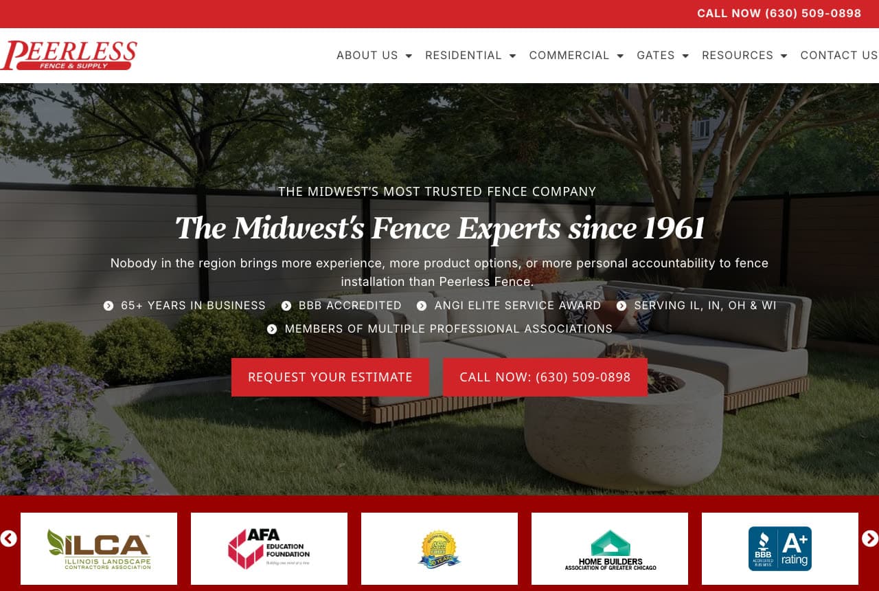
The Best Fencing Website Examples, Explained
The best fencing websites photograph the fence as a backdrop: Peerless Fence & Supply's horizontal slats behind a fire table, Bravo Fence Company's two boys and a bat in front of the cedar, Ergeon's kids running through a sprinkler. The exceptions make the fence the object — Texas State Fence & Patio's arched cedar-and-iron gate under a script tagline, Western Fence Company's steel pickets against the sky, Florida State Fence's black aluminum by the water — and they are the gate and commercial specialists, where the product is the purchase. Notice how the copy sorts the market: 'Serious Fences' and an estimating@ email for Western's facilities buyers, 'neighborly price' and 'GET FINANCING' for Bravo's families, 'Enter your city' for Ergeon's platform. And notice the small trust moves — Reliabuilt's licence number in a strip, Florida State's two city phone numbers, Peerless's row of association logos. Every example below tells you whether it builds gates for estates or privacy fences for backyards before you click.
Browse the gallery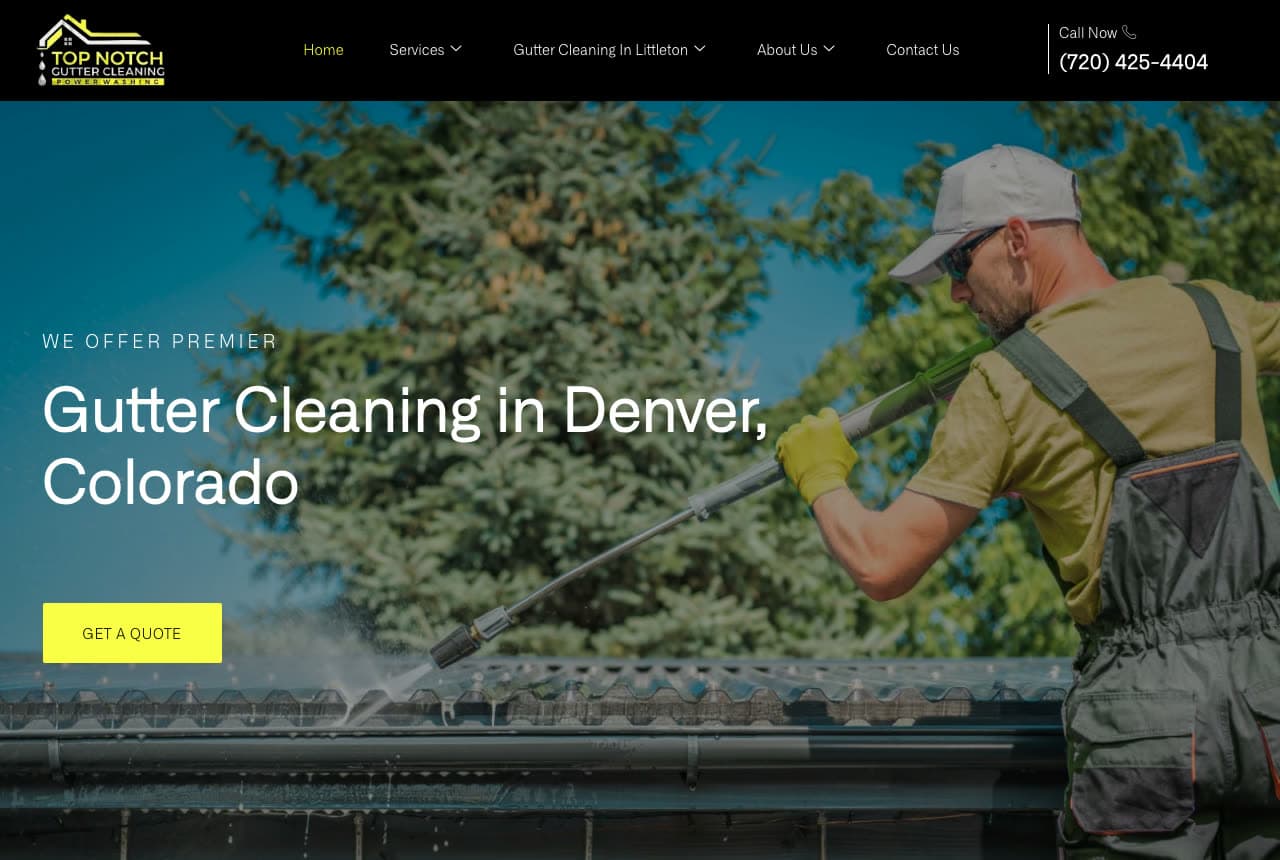
The Best Gutter Cleaning Website Examples, Explained
The best gutter cleaning websites show the job or sell the schedule. The job is Top Notch's spray leaving the gutter, Denver Gutter Cleaning's water gushing from a downspout, Gutter Guardians' hand at a downspout, AA Window, Roof & Gutter Cleaning's harnessed worker at the eave. The schedule is Gu-Wi's 'autopilot', Clear Skies Cleaning's 'recurring Maintenance Schedule' under a seasonal nudge, Shack Shine's 'Exterior House Detailing' with a van and a mascot. Notice the numbers doing the persuading — A Better Gutter Cleaning's 'quote emailed to you in 30 minutes or less', Ned's Home's '15,000+ 5-Star Reviews' and '$25 Off', AA's '3305 Reviews' badge — and the small structural moves: a parent company in a yellow strip, a suburb page in the main nav, a zip code as the only field. Every example below tells you whether it's a one-off clean or a plan before you scroll.
Browse the gallery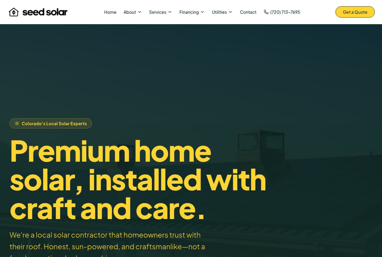
The Best Solar Website Examples, Explained
The best solar websites decide what to photograph, because a panel is not it. Seed Solar tints a roof green and lets a yellow sentence carry it; Namaste Solar photographs the crew and the van; Sunrun shows a sunlit house entrance with panels on the roof; Venture Home shows an EV charger in a car; Palmetto and Project Solar show no photograph at all, just a bill slider and a two-field instant quote. Notice how the copy fights the industry's reputation — Seed's 'not a faceless national sales machine', Project Solar's green 'No Sales Calls', Saguaro's and San Diego Solar's 'no subcontractors' — and how the pain gets coloured: Solar Source paints 'RISING ENERGY RATES' red-orange in the middle of a white headline. And notice the recurring-revenue moves that a small installer can copy: Saguaro's $23/month membership card, Venture Home's 'Plans & Services'. Every example below tells you whether it's a craftsman, a platform or a national brand before you reach the button.
Browse the gallery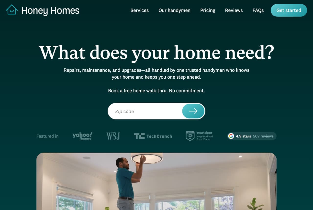
The Best Property Maintenance Website Examples, Explained
The best property maintenance websites sell one of three things: a person, a plan or a booking. The person is Honey Homes' 'one trusted handyman who knows your home' and PreFix's 'One neighborhood Home Manager'; the plan is Lion Home Service's 'LION CARE CLUB' in yellow in the nav, Murphy's Home Services' 'maintenance programs' and PreFix's '30-50%' saving; the booking is Fixer's ZIP-first card with 'No payment until work is done' and Mr. Handyman's 'Let Us Call You'. The commercial side speaks a different language — NYM Group lists three scopes in its logo, puts 'Certifications' in the nav and makes the button 'EMAIL' — while The Home Team and House Doctors prove a maintenance site can be one line and a house. Notice the proof: Mr. Handyman's 97,694 reviews, Fixer's '65,000+ JOBS COMPLETED' tile, Honey Homes' press row. Every example below tells you whether you're buying a visit, a membership or a partner before you scroll.
Browse the gallery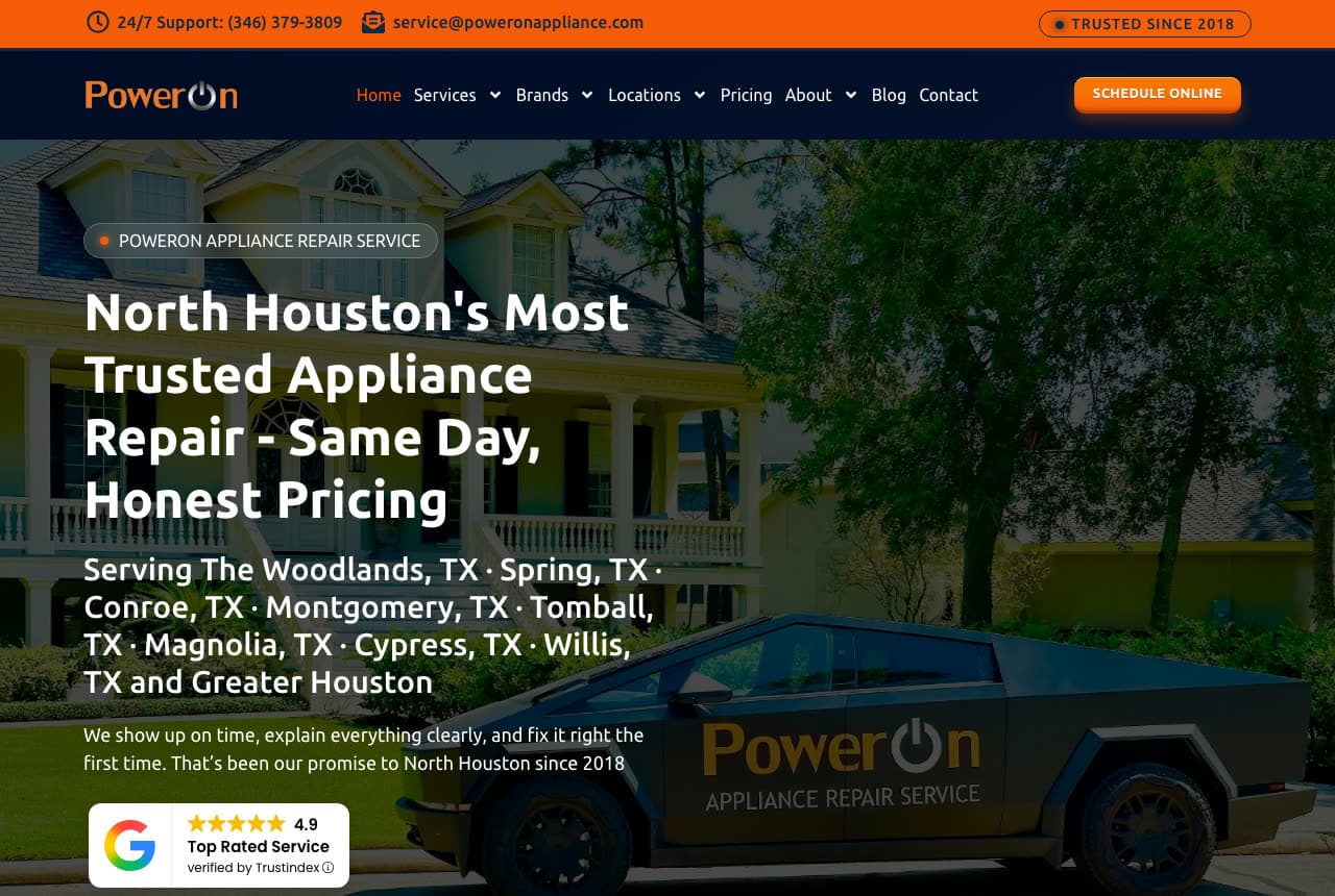
The Best Appliance Repair Website Examples, Explained
The best appliance repair websites answer the panicked visitor's questions in order. Coverage first: Guinco Service's zip-code card, Appliance Works' four regional phone numbers, PowerOn's eight suburbs in one line. Speed second: PowerOn's 'Same Day' in the headline, Appliance Cowboys' 'Same Day Service * Call before Noon' with the condition stated, ApplianceHD's '24 Hour' and 'Always On Call'. Price third: Mr. Appliance's 'no surprise fees' paragraph, PowerOn's 'Honest Pricing' backed by a Pricing page, Appliance Repair USA's '90+ Days Warranty' under the buttons. Notice the photographs — a Cybertruck, a family cooking at Best Service Company, hands in a dishwasher at Guinco, a boxed repair scene at Mr. Fix It — and how few of them are a technician holding a wrench. Every example below tells you whether it will come today, and what it will cost when it does.
Browse the gallery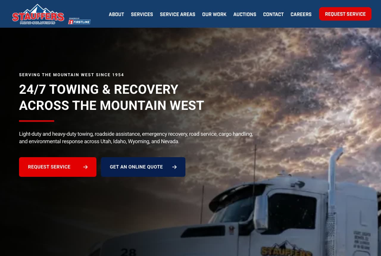
The Best Towing & Roadside Website Examples, Explained
The best towing websites photograph the trucks and keep the words for the numbers. The trucks: Stauffer's semi wrecker shot low under a gold-lit storm, Guardian Fleet Services' chrome lineup in sunlight, Priority Towing's star-spangled eagle wraps, Zore's lime-green fleet, Jonny's graffiti-liveried police-tow rigs. The numbers: Tim's Towing and Recovery's '17 trucks' and 'since 1974', Citywide's '5.0★ 281 Google reviews · 15-30 min Avg. response time · 20+ Years', Quick & Cheap's 'Over 450+ Google reviews'. Notice the phone number doing the button's job — Quick & Cheap, Guardian and Priority all make it the call to action — and the questions written in the driver's voice: 'STRANDED IN HOUSTON?', 'Need a tow right now?'. And notice the nav items that reveal scale — AUCTIONS, JOBS, PAY INVOICE, FLEET — on the operators that also run impounds and repair bays. The strongest tell you what they will send — a flatbed, a heavy wrecker or a van — before you dial.
Browse the gallery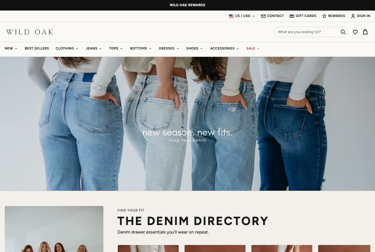
The Best Clothing Store Website Examples, Explained
The best clothing store websites let one photograph do the selling and keep the copy to a season. The photographs: Taylor Stitch's bearded man in a blue corduroy jacket among bare trees, Faherty's grey-bearded model in a patterned shirt jacket behind bamboo, Conscious Clothing's red-haired woman in blue linen among orange wildflowers at night, Big Bud Press's tie-dye trousers against a matching splatter backdrop. The words: 'Facing East', 'FALL in JAPAN', 'SUMMER, LINGERING', 'Magic Waters' — a title, not a pitch. Notice the nav doing the merchandising — Wild Oak's JEANS, TOPS, BOTTOMS, DRESSES with SALE in red; Hazel & Olive's HOMECOMING DRESSES and CONCERT CLOTHES & OUTFITS as picture tiles — and the shipping promise pinned in the top strip on almost every site. And notice Cake Plus-Size Resale, the one physical shop here, which treats its website like a shop window: a photo of the racks, then the address and the hours. Every example below tells you whether it is selling a collection or a place.
Browse the gallery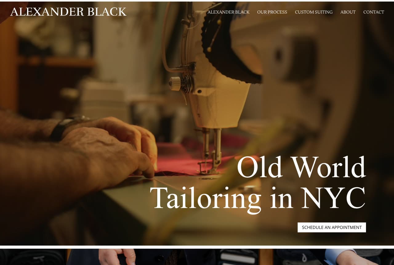
The Best Bespoke Tailor Website Examples, Explained
The best bespoke tailor websites photograph either the craft or the result and rarely both. The craft: Alexander Black's hands and machine in warm light, Alan Flusser's close-up of a blue windowpane jacket, Tailor Caid's mid-century catalogue illustration of a dozen figures in suits. The result: Alan David's two men in suits among the bookshelves, BD Tailor Made's man beside a mannequin dressed identically, Commonwealth Proper's three people against a painted wall. Notice the words doing the positioning in one line — 'AMERICAN TAILORING. UNCOMPROMISED.', 'LOUCHE TAILORING · WORN GLOBALLY', 'NEW YORK'S CUSTOM CLOTHIER FOR OVER 35 YEARS' — and the years counted where they exist: 1913 at Alan David, 35 at Alan Flusser. Notice too that the button is almost always an appointment, not a cart — 'SCHEDULE AN APPOINTMENT', 'SCHEDULE FITTING', 'BOOK NOW' — and that Tom James, which sells through fittings, still offers a MEN'S and a WOMEN'S collection. Every example below tells you whether the shop sells a suit or a relationship.
Browse the gallery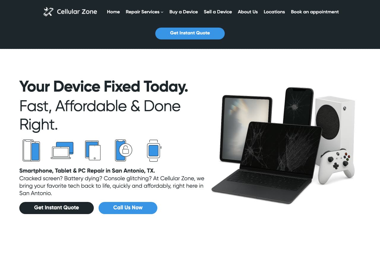
The Best Phone Repair Website Examples, Explained
The best phone repair websites promise a time and a place before they promise quality. The time: Cellular Zone's 'Your Device Fixed Today.', EZ Fix's 'Same Day Repairs, Premium Parts & Friendly Staff', URPhone Store's 'Most repairs are done same-day when parts are in stock.' The place: ATX Quick Fix's 'located inside H-E-B at South Congress & Slaughter', URPhone's '3 Orlando locations', Phone Repair and More's 'Mobile Phone Repair Services in Lakewood, CO'. Notice the buttons doing the asking — 'Get Instant Quote', 'Book a Repair', 'Start My Quote', 'Text Us' — and the proof stated as numbers: URPhone's '4.9 out of 5 · more than 1,800 reviews' and '15+ years'. Notice the photographs, too: an open phone on a blue mat, a technician in glasses at the bench, a stack of cracked devices — the job, not a stock handshake. And notice iDenver Repairs, which turns the phone itself into a diagram with prices on the parts. Every example below tells you whether the shop is one counter or a chain.
Browse the gallery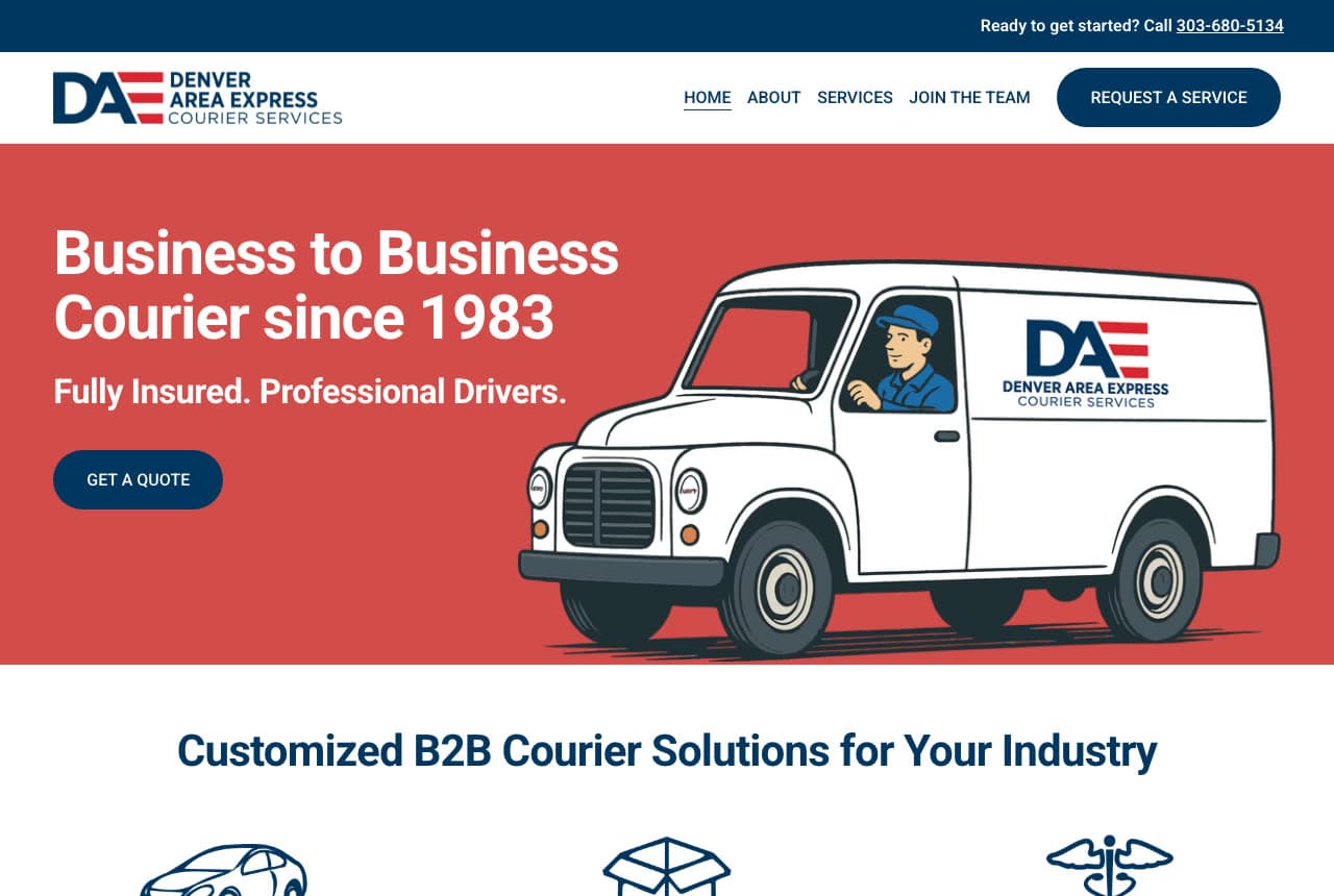
The Best Delivery & Courier Website Examples, Explained
The best courier websites say 'same day' in the first line and then prove they can. The first line: King Courier's 'Same Day Delivery & Express Delivery', Couriers Chicago's 'CHICAGO Same Day Courier & Delivery Services', Road Runner's 'Same-Day Courier & Expedited Delivery in Colorado', ASAP's 'URGENT SAME-DAY COURIER SERVICE.' The proof: Crystal Courier's team photographed in front of the office with 'Since 1949', Denver Area Express's 'since 1983', Godspeed's 'Delivering the Impossible for 24 Years', Reliable Couriers' four icons — 'Open 24/7', 'Trained Delivery Drivers', 'Real Time Tracking', 'Large Fleet of Vehicles'. Notice the vehicles chosen for the photograph — a cargo bike at Stella, a bicycle wheel at King, a white van at Reliable, a cartoon van at Denver Area Express — because the vehicle says the delivery radius. And notice the phone number pinned in the top strip on almost every site, with office hours beside it. Every example below tells you whether the company runs bikes across a city or vans across a state.
Browse the gallery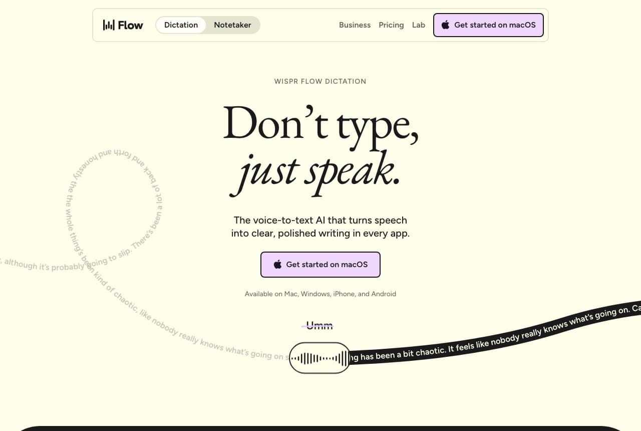
The Best Software Company Website Examples, Explained
The best software websites write one sentence a friend could repeat and then show the screen. The sentences: 'Don't type, just speak.' (Wispr Flow), 'Turn your audience into a business.' (Ghost), 'Go from 0 to $1' (Gumroad), 'Time is money. Save both.' (Ramp), 'Make anything 3D' (Spline), 'Create slides that win.' (Pitch). The screens: Ghost's dashboard with '13,041 total members', Ramp's reporting view with a phone showing a bill, Tranch's mock '$100,000 invoice' with three payment types, Homerun's tilted stack of candidate cards. Notice the buttons — 'Get Started — free', 'Start selling', 'Get started for free', 'Try free for 15 days' — and the proof set small under the headline: Ramp's 'US CORPORATE PAYMENTS PROCESSED BY RAMP: 0.877235%', Homerun's '4.7 on Capterra', Pitch's '4M+ teams'. And notice the two that decorate instead of screenshot — Gumroad's pink coins and Juno's letters stuffed with a skateboard and a suitcase — because a playful brand can afford to. Every example below tells you whether the product is a tool or a platform.
Browse the gallery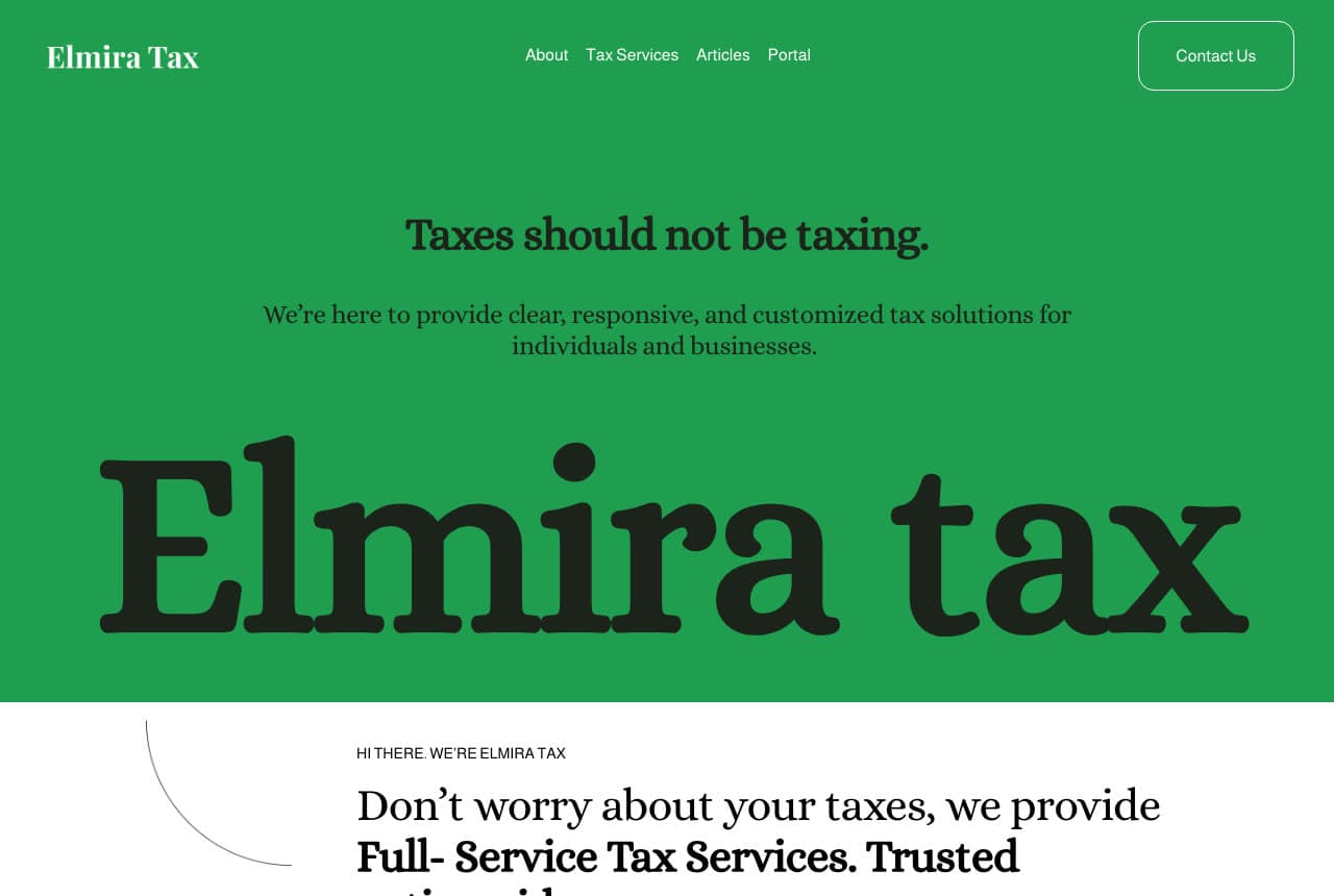
The Best Tax Service Website Examples, Explained
The best tax service websites say who the client is before they say what the firm does. Who: Dark Horse's 'Top Tax & Accounting CPAs for Small Businesses', Shay CPA's 'TECH COMPANY ACCOUNTANTS', Taxes for Expats' 'Expat tax services from trusted tax experts', David French's 'serial entrepreneurs and business leaders', Boxelder's 'Grow Your Small Business'. The tone: Elmira Tax's 'Taxes should not be taxing.', Molen & Associates' 'Proactive Strategy. True Partnership. Confident Growth.', Lutz and Carr's 'Beyond the Numbers'. Notice the buttons — 'Talk to Your CPA', 'Talk to a CPA', 'Book Your Free Discovery Call', 'Get free consultation today', 'FREE CONSULTATION' — a conversation, never a form marked 'Submit'. Notice the proof: Taxes for Expats' '50,000+ expats served over 25 years' and '2,751 reviews on Trustpilot', Lewis.cpa's street address and 'Online appointments available' in the top strip. And notice the two firms that refuse the stock handshake — Lutz and Carr's jazz players, Boxelder's St. Bernard. Every example below tells you whether the firm files returns or plans decades.
Browse the gallery
The Best Esthetician Website Examples, Explained
The best esthetician websites photograph the treatment mid-way and write in the second person. The photographs: a black mask being spread by blue-gloved hands at Shannon Lee, a white clay mask at Bespoke Aesthetics, a sage mask brushed on at Jodi Mello, a face framed by two pairs of hands at Kerry Spindler. The sentences: 'SELF LOVE ISN'T SELFISH', 'YOUR SKIN, UNDERSTOOD.', 'This is your skin's safe space.', 'Skincare, Crafted'. Notice the button — 'BOOK', 'Book an appointment', 'BOOK A SERVICE', 'Call To Book' — and how rarely there is a second one. Notice the proof where it exists: Kerry Spindler's 'TOP 10 ESTHETICIANS in MASSACHUSETTS 2026' seal, Skin by Gabby's 'Voted 2025 Best of Inland Empire' marquee, Rose + Honey's '700+ Five-Star Reviews' and 'Named a Top 10 Skincare Clinic in San Diego by Yelp'. And notice The Organic Esthetician's 'CLEAN BEAUTY ELECTRIFIED' set in decorative serif over foam — a studio that sells a philosophy sets the words like a perfume ad. Every example below tells you whether the studio treats skin or sells a feeling about it.
Browse the gallery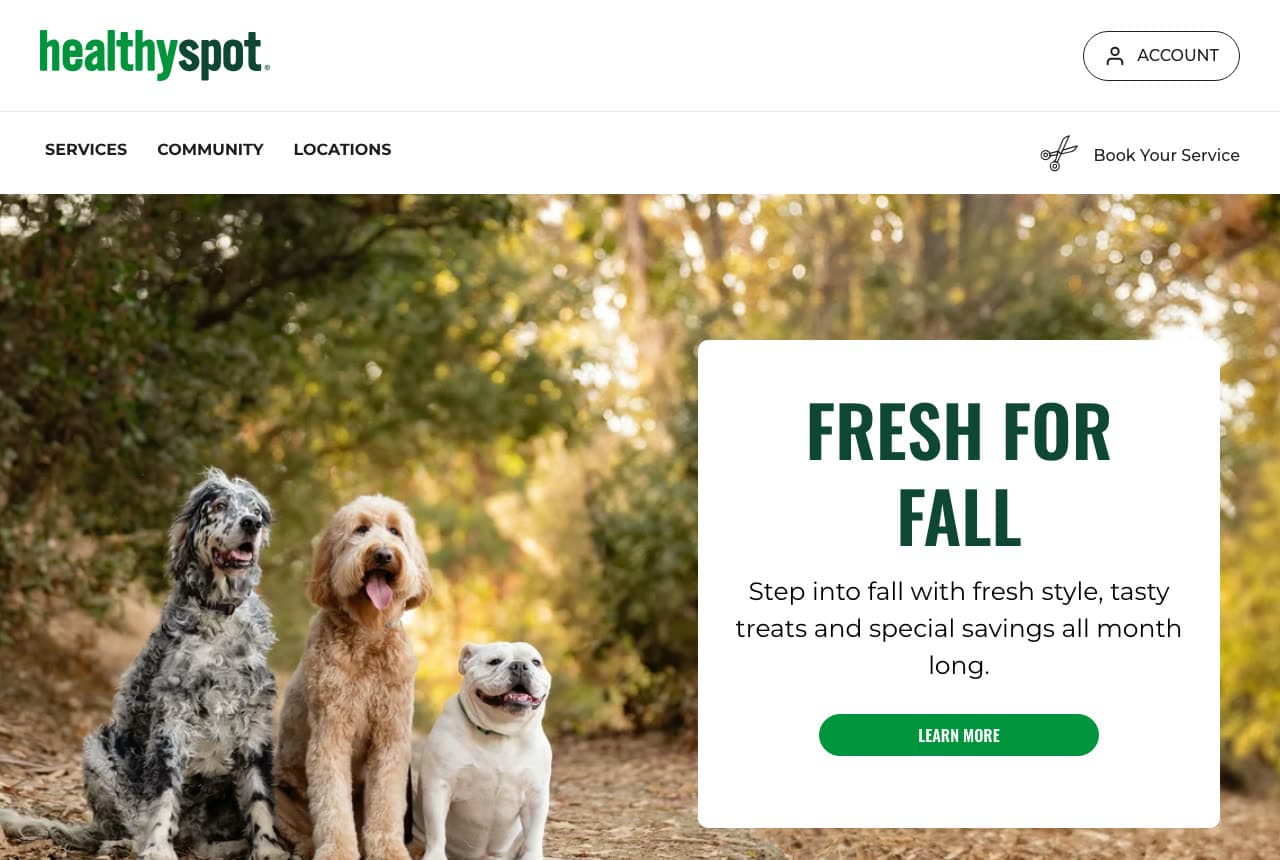
The Best Pet Store Website Examples, Explained
The best pet store websites photograph the animal, not the aisle. Healthy Spot's doodles and bulldog on a leafy path, All The Best Pet Care's golden retriever bounding through snow with a ball, Emmy's Best's black-and-white husky face, Bentley's Labrador and ginger cat, EarthWise's grinning dog and wide-eyed cat in rounded frames. Notice the second business named up front — Mutts & Co's 'SELF-SERVE DOG WASH · JUST WALK IN!', Healthy Spot's 'Book Your Service' with a scissors icon, Bentley's 'grooming and self-wash under the same roof' — because a shop that also washes and grooms has a reason to be visited that an online store can't match. Notice the counts: EarthWise's '40+ years caring for pets · 13 pet loving brands · FREE nutrition consultations', All The Best's '18 stores', Bentley's 'SINCE 2008'. And notice the buttons — 'FIND A STORE', 'Find a store near you', 'FIND YOUR LOCAL BENTLEY'S' — on the shops, against 'SHOP THE COLLECTION' and 'SHOP NOW' on the brands. Every example below tells you whether it wants you in the door or in the cart.
Browse the gallery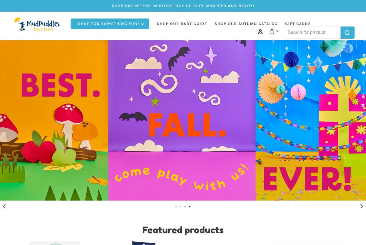
The Best Toy Store Website Examples, Explained
The best toy store websites look like the shop window. The colour: MudPuddles' orange, purple and blue paper collage, Tantrum's cream page with a multicoloured wordmark, Timbuk Toys' rainbow bubble letters over a cartoon herd, Tugooh's orange squishy collage. The window copy: 'BEST. FALL. EVER!', 'happiness for sale', 'Play brings joy!', 'For cool kids and Big Kids!', 'Hop n' Go to New Worlds!'. Notice the shop details doing quiet work — Boing!'s orange band with 'GIVE US A CALL', 'VISIT US — Store location and hours' and 'FREE SHIPPING When you spend $100+'; MudPuddles' 'SHOP ONLINE FOR IN STORE PICK UP. GIFT WRAPPED AND READY!'; Timbuk's 'Stores & Hours' and 'Birthday Club' in the nav. Notice the two that sell a place rather than a product — CAMP's 'A place where families play, create, and explore together' and Coolest Toys on Earth's illustrated checkerboard of robots and rockets. Every example below tells you whether the shop wants you to click or come in.
Browse the gallery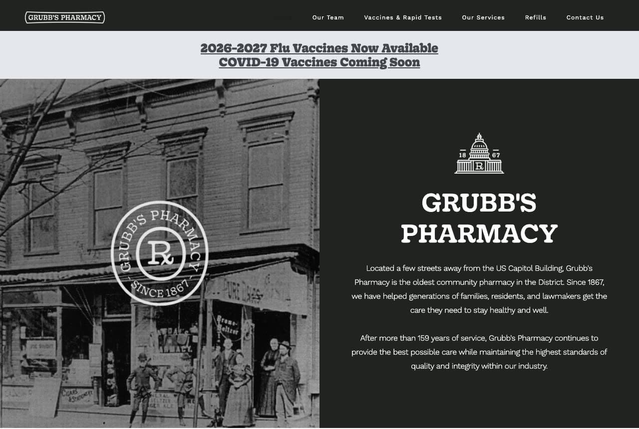
The Best Pharmacy Website Examples, Explained
The best pharmacy websites make the three tasks into buttons and the years into a headline. The tasks: Local Health's 'transfer your meds · refill your meds · find a location', Capsule's 'Check if we deliver to you' with a zip-code field, Scripx's 'Start An Online Visit', Grubb's 'Refills' in the nav, Koshland's 'REFILL RX' beside the logo. The years: Grubb's 'Since 1867', Bremo's 'SINCE 1976', Alto's 'Pharmacy reimagined' for the opposite claim. Notice the faces — Koshland's pharmacist at the counter captioned by name, Skippack's staff member in a tee reading 'HAS MY BACK' — and the drawings where a photo would be dull: Bremo's storefront street, Alto's pharmacists and phone screens, Capsule's arch and triangle. Notice the compounding pharmacies talking to two audiences at once, with 'PATIENTS' and 'DOCTORS' or 'Providers' and 'Patients' as paired nav items. Every example below tells you whether the pharmacy is a counter you walk up to or an app that comes to you.
Browse the gallery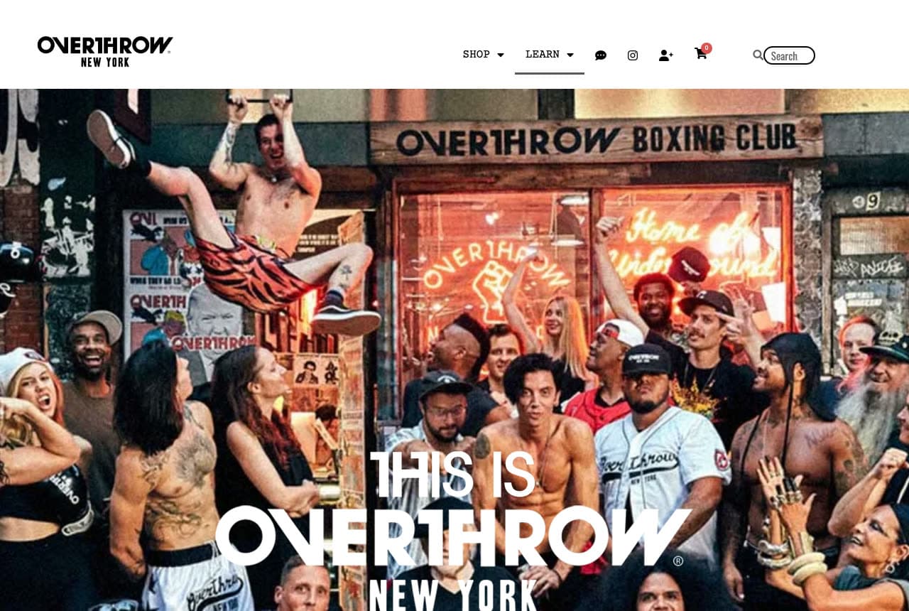
The Best Boxing Gym Website Examples, Explained
The best boxing gym websites decide in the first line whether they are a fight gym or a fitness gym. The fight gyms: Gleason's 'The Cathedral Of Boxing' over its trainers and its store, Mayweather Boxing + Fitness's 'TRAIN LIKE A CHAMP. EVERY WORKOUT IS A WIN.' beside a duotone portrait, Prime Boxing USA's 'OFFICIAL USA BOXING REGISTERED CLUB' in a hairline under the nav. The fitness gyms: Rumble's 'HIT HAPPENS. RELEASE IT AT RUMBLE.', BoxUnion's 'SCULPT. SWEAT. SHINE. — Box Your Way to a Better You', RockBox's '50-minutes of kickboxing, strength training, and pure adrenaline'. Notice the offer in the button — 'Free Class', 'Try Free Class', 'BOOK A FREE CLASS', 'FIRST TIMER OFFER', Worth The Fight's 'Try a Week for $29' — and the crowd or the coach in the photograph: Overthrow's street party, Gleason's trainers posed in the gym, Work Train Fight's woman driving a straight punch into a heavy bag. Every example below tells you which side of the ropes the gym stands on.
Browse the gallery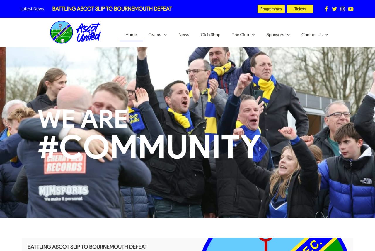
The Best Football Club Website Examples, Explained
The best football club websites know who is reading. The parents: FA Stars FC's 'Where future football stars are made' with 'ages 4–14 in Finchley & Wood Green', Foxes Club's 'THIS IS PLAY DONE PROPERLY.' with a postcode search, London Athletic FC's 'BUILDING CHAMPIONS ONE KICK AT A TIME' with a free session. The fans: Ascot United's 'WE ARE #COMMUNITY' over the terrace, FC United of Manchester's 'STRONGER UNITED — 100% fan-owned from day dot', Clapton Community FC's fixture card for the Old Spotted Dog. The players: Total Football Club's 'WHERE IT ALL BEGINS!' over a pitch corner, Hashtag United's 'MAKE FOOTBALL FUN AGAIN' with a season ticket 'FROM £45.00'. Notice the crest doing the logo's job on every site, the club shop in nearly every nav, and the buttons — 'Book Free Trial', 'BOOK A FREE SESSION', 'FIND A CLASS', 'TICKETS', 'UNITE WITH US'. Every example below tells you whether the club is selling a place in a team or a place on the terrace.
Browse the gallery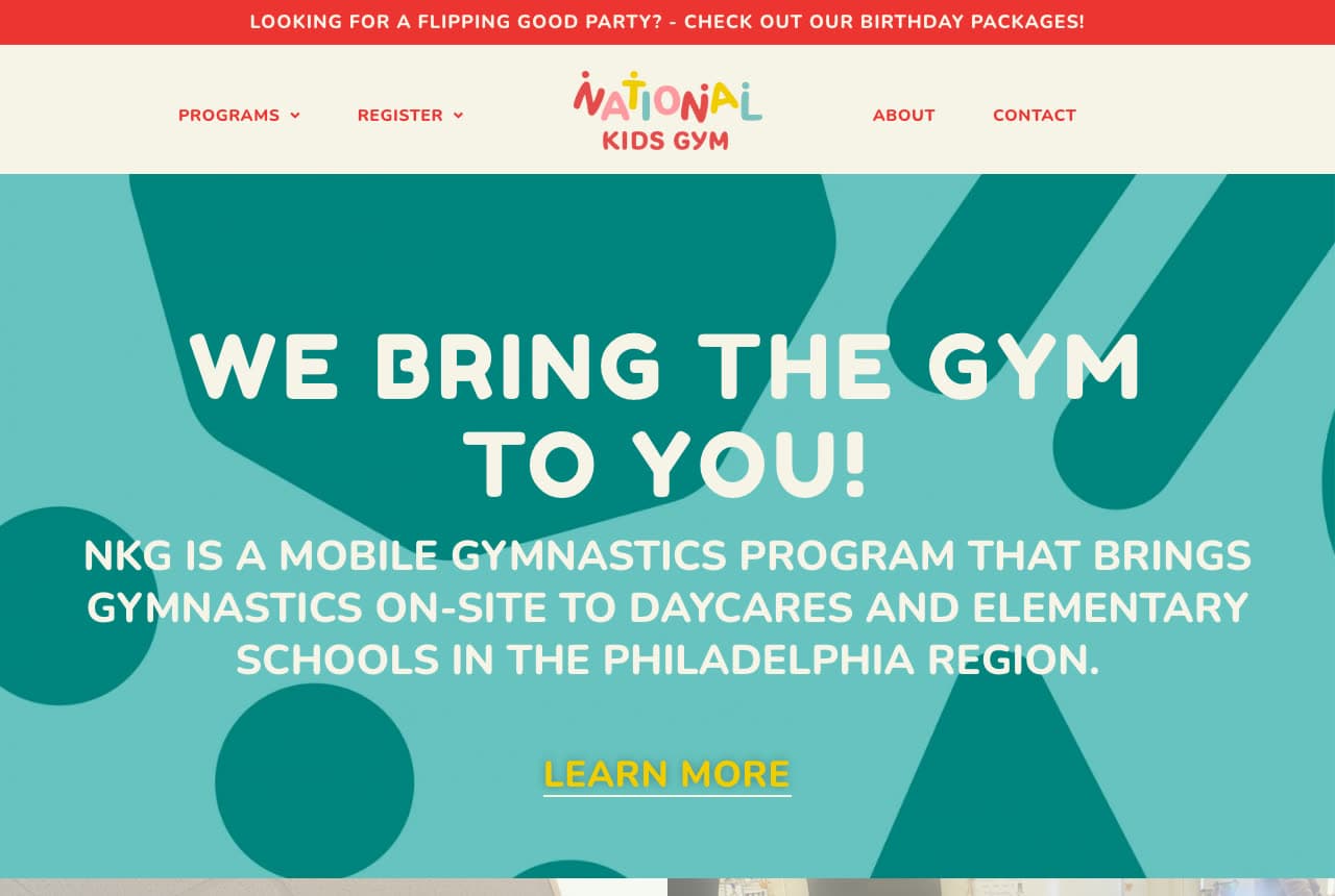
The Best Gymnastics Website Examples, Explained
The best gymnastics websites sell confidence to the parent and fun to the child. The confidence: Houston Gymnastics Academy's 'More than Sports — Confidence for Life', Gemstone Gymnastics' 'Ready to build your child's confidence?', Colorado School of Gymnastics' strip 'BUILDING CONFIDENCE ONE CARTWHEEL AT A TIME', Beyond Gymnastics' 'Building Success In The Gym And Beyond'. The fun: National Kids Gym's 'LOOKING FOR A FLIPPING GOOD PARTY?', ATA Gymnastics' 'we've taught thousands how to roll, flip, and fly', The Gymnastics Revolution's floor of blue and red mats and foam pits. Notice the trial as the button — 'Free Trial', 'Schedule a Risk-Free Trial', 'Commitment-Free Trial Class' — and the practical details pinned at the top: Philadelphia Gymnastics Center's phone, email and street address in the strip, Houston's address in the bar, Gemstone's phone. And notice the photographs: a girl on the low bar with a coach spotting, a boy climbing a foam block, seven girls posing on a beam. Every example below tells you whether the gym is selling a class or a team.
Browse the gallery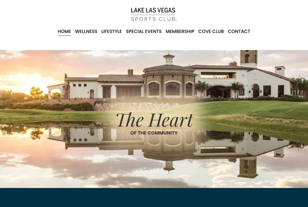
The Best Sports Club Website Examples, Explained
The best sports club websites show the members and say who the club is for in one line. The members: Old Melburnians' players lined up arm in arm with heads bowed, Battersea Ironsides' lineout with a player lifted high, Southwark Rugby's scrum with a red bus passing behind the fence, Hackney RFC's women's team in medals in front of a full stand, San Francisco Cycling Club's riders in helmets. The line: Belsize Park RFC's 'London's most central rugby club', Southwark's 'CENTRAL LONDON'S RUGBY CLUB', Washington Athletic Club's 'SEATTLE'S ORIGINAL ATHLETIC CLUB', Lake Las Vegas's 'The Heart of the Community', Waverley Judo's 'CLUB OF FRIENDS'. Notice the buttons — 'RIDE WITH US', 'BOOK A FREE TRIAL FOR TERM 3', 'JOIN THE CLUB', 'Read More', 'DONATE' — and the founding years and grounds in the strips: Belsize Park's 'Founded 1871' and 'Training Ground Coram's field'. Every example below tells you whether the club sells a membership, a sport or a place to belong.
Browse the gallery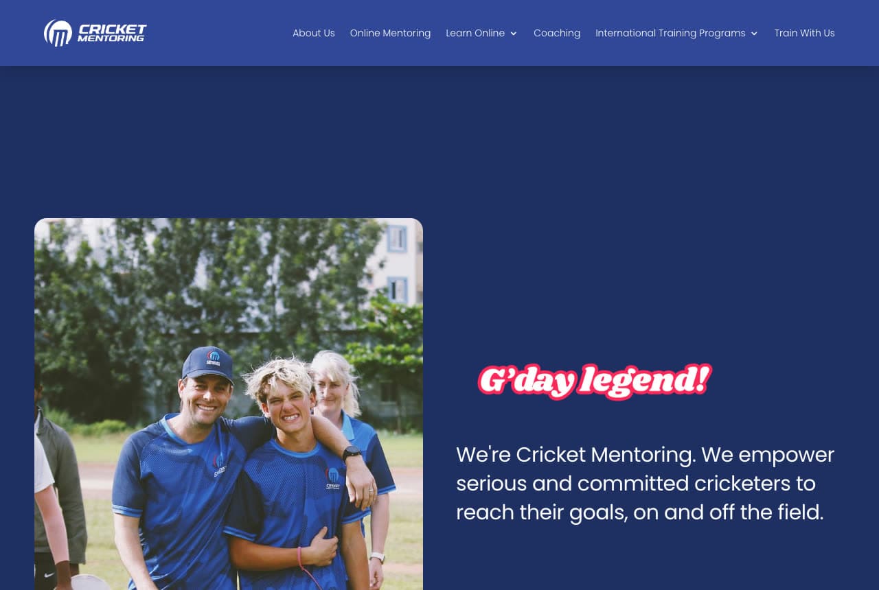
The Best Cricket Coaching Website Examples, Explained
The best cricket coaching websites sound like a coach talking. The voice: Cricket Mentoring's 'G'day legend! We're Cricket Mentoring. We empower serious and committed cricketers…', Club Cricket Academy's 'WE OFFER HIGH QUALITY … but affordable coaching', Elite Cricket Coaching's 'Expert Coaching to Help Every Cricketer Reach Their Best', Crickingdom's 'JOIN CRICKINGDOM — WHERE CHAMPIONS RISE!'. The credentials: The R66T Academy's 'Endorsed by Billy and Joe Root', Shaun Brown's Cricket Coaching's list of former Test cricketers running the camp, House Cricket Academy's '1:3 LOW COACHING RATIO' and 'PROFESSIONAL & FRANCHISE COACHES', the South Asian Cricket Academy's '19 male graduates professional contracts'. Notice the seasons — House's 'WINTER ACADEMY · OCTOBER - DECEMBER', Shaun Brown's 'Spring Holiday Cricket Camps - 20% discount ends Sep 15!', Tom Flowers' 'BOOKINGS FOR WINT…' band — because cricket coaching is sold by the term. Every example below tells you whether the site sells sessions, camps or a pathway.
Browse the gallery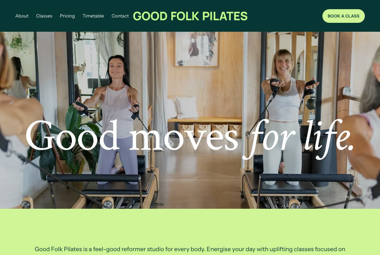
The Best Pilates Website Examples, Explained
The best Pilates websites promise a feeling in one line and show the reformer in use. The line: Good Folk's 'Good moves for life.', Like Fred's 'Pilates For Life', Pilates Vita's 'Stronger, Freer, Better Movement', East River Pilates' 'Feel Good Movement For Every Stage of…', Powerhouse Pilates' 'Your Body Is a Powerhouse. Let's Flip the Switch.', Fuse's 'Work Hard. Have Fun. See Results.' The reformer: two women in straps at Good Folk, three pairs of legs in straps at East River, a foot in a plum sock at Like Fred, springs and coloured rings at Fuse, a woman on a mat among plants at Powerhouse. Notice the buttons — 'BOOK A CLASS', 'Book a class →', 'START MY FREE TRIAL', 'BOOK YOUR FIRST CLASS', 'VIEW OUR INTRO OFFERS' — and the two studios that name their neighbourhoods: The Studio Pilates' Emory Village and West Midtown, Pilates Vita's Russian Hill. Every example below tells you whether the studio sells calm, strength or both.
Browse the gallery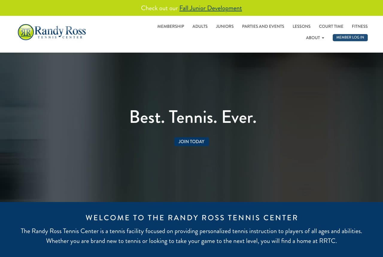
The Best Tennis Coaching Website Examples, Explained
The best tennis coaching websites choose between the result and the feeling. The result: Saviano's 'THE RESULTS — 75+ ATP & WTA PLAYERS' with the names, RPS Academies' 'INTERNATIONAL HIGH-PERFORMANCE SPORTS & EDUCATION ACADEMY', One Tennis Academy's 'DEVELOPING PLAYERS. BUILDING CHAMPIONS.', High Altitude Tennis's 'the highest rated junior tennis program in Colorado'. The feeling: Randy Ross's 'Best. Tennis. Ever.', Denver Tennis Park's 'Potential is WITHIN YOU!', OSSA Tennis Academy's 'Striving for human excellence is our focus-- not the titles.', The Denver Tennis Club's 'a welcoming community of dedicated players in a quiet urban neighborhood'. Notice the courts from the air — Denver Tennis Park's red-roofed hall and blue courts against the skyline, The Denver Tennis Club's courts among autumn trees, RPS's waterfront campus — and the buttons: 'BOOK AN EVALUATION', 'SCHEDULE AN EVALUATION', 'JOIN TODAY', 'REGISTER & BOOK', 'COURT WEBCAMS'. Every example below tells you whether the programme is selling a ranking or a Saturday.
Browse the gallery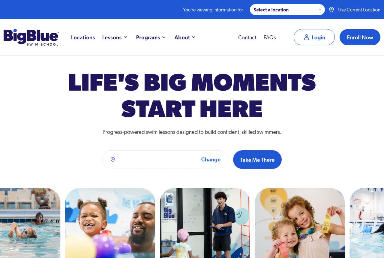
The Best Swim School Website Examples, Explained
The best swim school websites sell confidence to the parent and show the child having it. The words: Big Blue's 'LIFE'S BIG MOMENTS START HERE', British Swim School's 'Swim Lessons That Build Skills Beyond the Pool… it's learning that you can', Colorado Swim School's 'Nurturing Lifelong Swimmers', Emler's 'ONE DECISION CAN BUILD CONFIDENCE FOR A LIFETIME', Goldfish's 'YOU GOT THIS', FOSS's 'LOVE WATER'. The child: a laughing boy with floats at Sunsational, a girl in pink goggles at Emler, a baby mid-splash at Ready Go Swim, three kids kicking spray at FOSS, a toddler with a foam dumbbell at Goldfish. Notice the location finders — Big Blue's 'Take Me There', British Swim School's 'Enter your address · Find A Location', Emler's 'Pick a Location' — because a swim school is chosen by drive time; and the proof pinned at the top: British Swim School's '4.7 / 5 by 10,000+ Satisfied Swimmers', Goldfish's 'AWARDED BEST SWIM SCHOOL 10 YEARS RUNNING!'. Every example below tells you whether the school sells safety, progress or fun — and the best sell all three.
Browse the gallery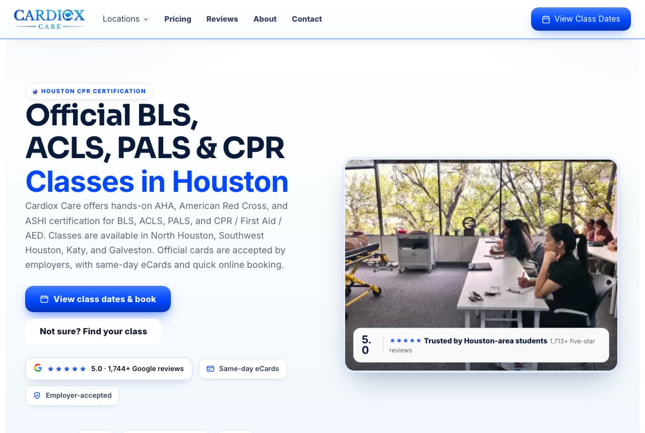
The Best CPR Training Website Examples, Explained
The best CPR training websites answer three questions in the first screen: which card, whose accreditation, and when. Which card: Cardiox Care's 'BLS, ACLS, PALS & CPR', Safety Training Seminars' 'CPR, BLS, ACLS & PALS', CPR Seattle's four pills — 'CPR, FIRST AID & AED', 'BLS/CPR, ACLS, HEALTHCARE', 'WILDERNESS & REMOTE MEDICINE', 'INSTRUCTOR TRAINING'. Whose accreditation: the American Heart Association 'AUTHORIZED TRAINING CENTER' badge on Rocky Mountain CPR, Colorado Cardiac CPR and CPRologist, 'Official AHA BLS CPR' on CPR Certification Denver, 'American Heart Association Approved' on SureFire CPR. When: CPR Certification Denver's calendar with '6:30 pm · 2 Left', Rocky Mountain's 'SEE THIS WEEK'S COURSES', Cardiox's 'View class dates & book', Safety Training Seminars' '1 Complete online course · 2 Attend skills session · 3 Receive same-day certification'. Notice the manikin in most photographs — Cardiox Care and Colorado Cardiac show the classroom instead — and the review counts — 1,744, 14,316, 23,000 — that only a high-volume class business can print. Every example below tells you whether the provider sells a seat, a group booking or a certificate by mail.
Browse the gallery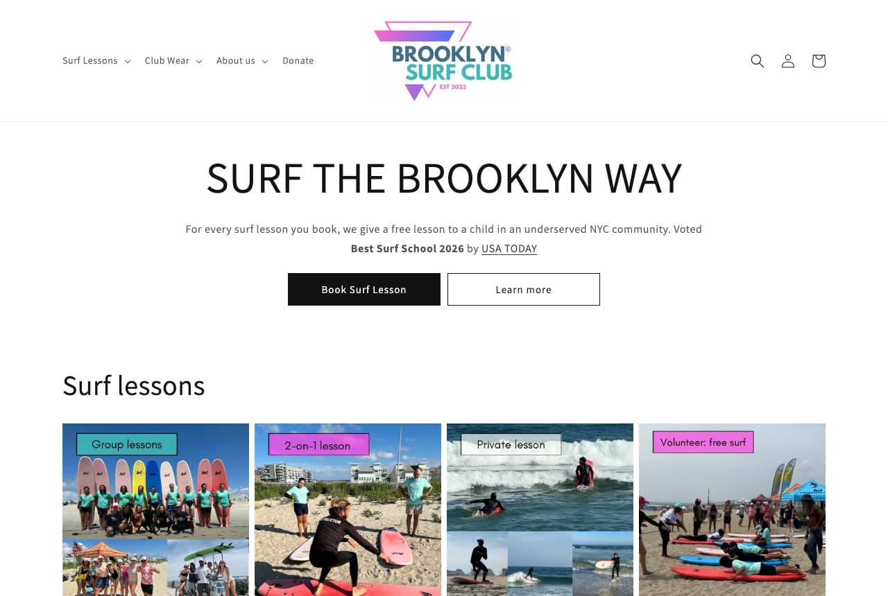
The Best Surf School Website Examples, Explained
The best surf school websites photograph the instructors and the boards, and name the beach. The photographs: Goofy Foot's five instructors in orange rash guards with a soft-top board, Club Ed's line of students holding boards upright on the sand, AquaSurf's instructor and three students walking into the waves from behind, San Diego Surf School's surfer on a yellow board, Conatus Surf Club's black-and-white grid of surfers and a vintage car with a board on the roof. The beach: 'Learn to Surf in Santa Cruz, CA', 'SURF LESSONS IN SAN DIEGO', 'Asbury Park | Bradley Beach | Belmar | Point Pleasant', 'Maui's Premier Surf School for All Ages', 'from the beaches of Los Angeles to San Diego'. Notice the buttons — 'Book Surf Lesson', 'BOOK SURF LESSON +', 'SIGN UP FOR A SURFING LESSON', 'SURF WITH US!', 'RESERVE' — and the two schools that sell more than a lesson: Brooklyn Surf Club's free lesson for a child in an underserved community for every one booked, Wavehuggers' 'surf therapy' in the nav. Every example below tells you whether the school is selling a morning, a week or a way of life.
Browse the gallery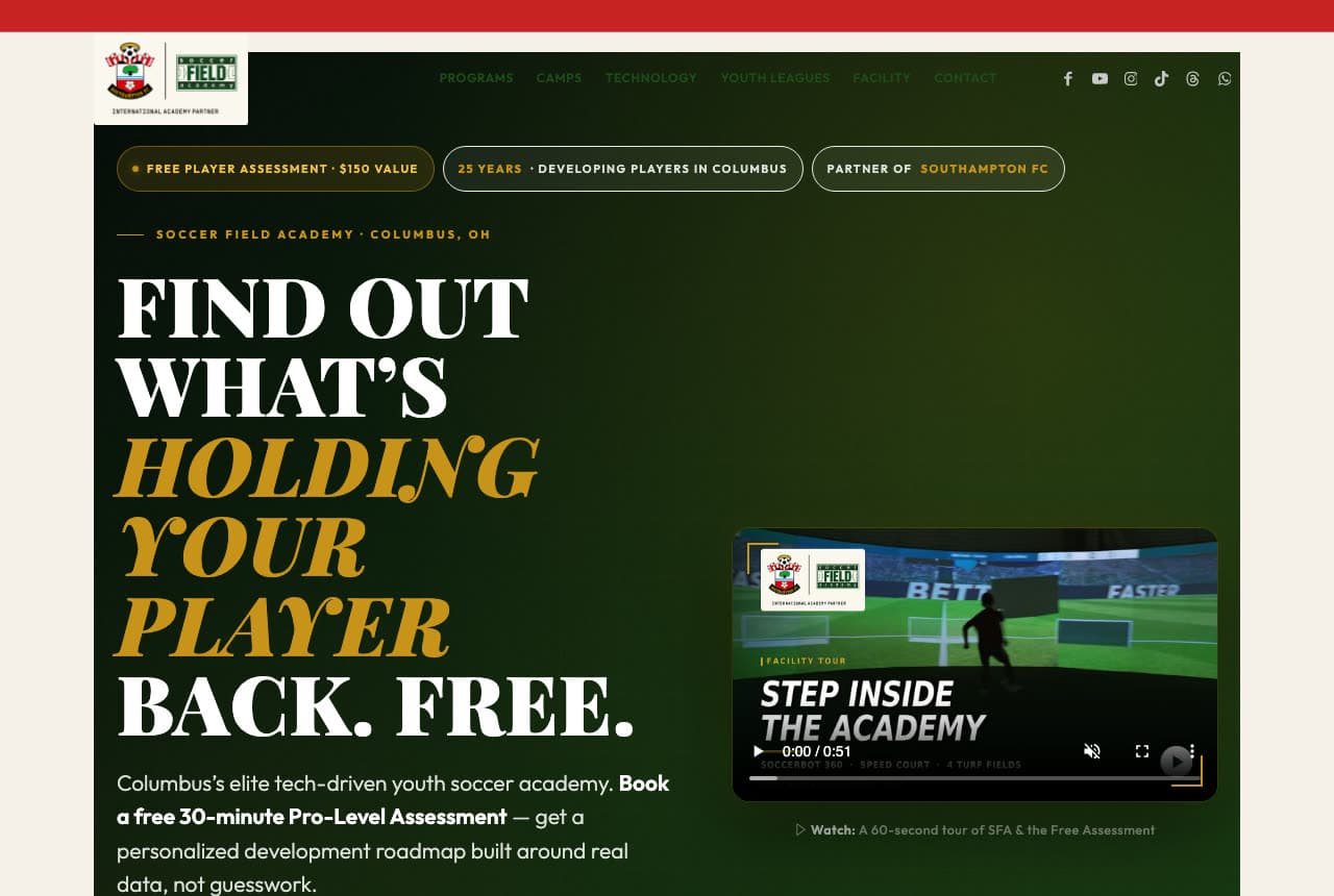
The Best Soccer Academy Website Examples, Explained
The best soccer academy websites photograph training, name the age range and offer a free first step. The photographs: Michigan Sports Academies' kids in red and green kits mid-chase, Bethesda SC's player in grey and black striding through a pass, Vedral Soccer Academy's coach bending to a boy in a numbered shirt, Challenger Sports' field of campers in red, Soccer Shots' toddler in a red jersey winding up a kick at sunset. The age range: 'Ages 4–16' at Coerver, 'ages 18 months to 8 years' at Soccer Shots, 'Boys & Girls | Birth Years 2008–2022' at IdeaSport. The free first step: Soccer Field Academy's 'FREE PLAYER ASSESSMENT · $150 VALUE', IdeaSport's 'FREE TRIAL' and 'FREE GIRLS PROGRAM' in the nav, Coerver's 'Find a Soccer Program Near You'. Notice the two that sell a place rather than a session — ISAA's 'AMERICA'S FIRST GOVERNMENT ACCREDITED SOCCER HIGH SCHOOL' with 'APPLY HERE', Bethesda SC's 'Developing Professional and Collegiate Soccer Players' since 1979. Every example below tells you whether the academy is selling a class, a team or a career.
Browse the gallery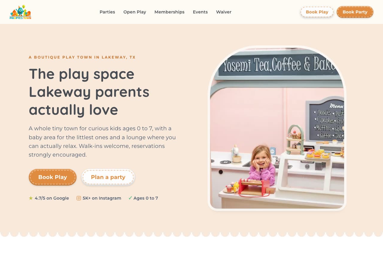
The Best Kids Activities Website Examples, Explained
The best kids activities websites show the play, name the age range and put the party button beside the play button. The play: the girl at Pikopye's Town grinning at a toy 'Yosemi Tea, Coffee & Bak…' counter, Catch Air's purple spaceship playscape with a climbing net, Mt Playmore's red-and-blue climbing frame shot from inside, Play Street Museum's miniature town with a café and a recycling truck, Kidville's girl mid-leap in a pink tutu. The age range: 'Ages 0 to 7' at Pikopye's Town, 'for little kids & their favorite grown-ups' at KidCity, 'INDOOR PLAYGROUND FOR TODDLERS' at The Big Play House. The buttons: Pikopye's Town's 'Book Play' and 'Book Party', Catch Air's 'Find a Location', Mt Playmore's 'VISIT US' and 'EVENTS', Kidville's 'Explore Services', My Gym's 'Find a My Gym'. Notice the two that ask the visitor which branch first — KidTopia's 'Welcome! Which location are you visiting?' with two tiles, Play Street Museum's 'town square · SUNSET VALLEY, TX'. Every example below tells you whether the centre is selling an afternoon, a party or a membership.
Browse the gallery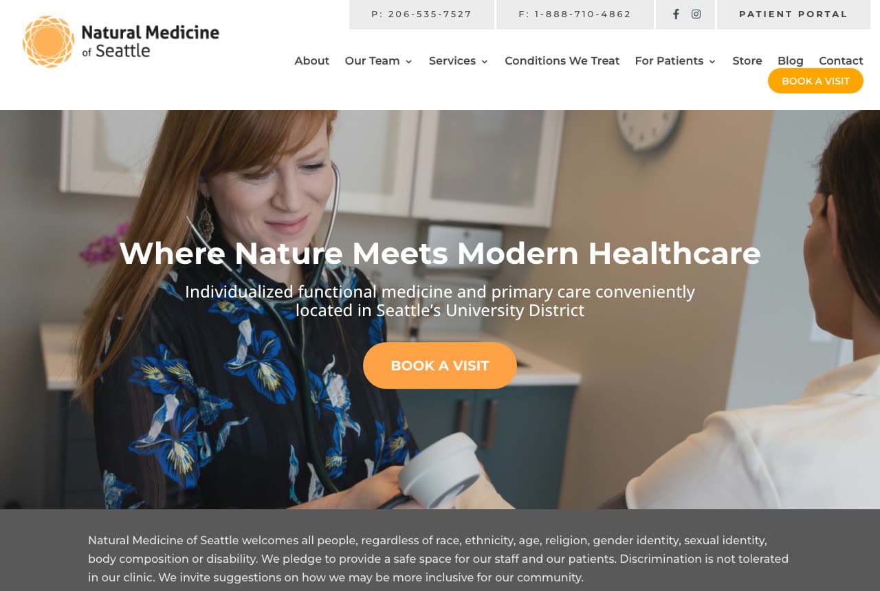
The Best Naturopath Website Examples, Explained
The best naturopath websites decide in the first line whether they are a clinic or a philosophy. The clinics: NFM Health's 'See a Naturopathic doctor who treats the root cause of illness at any of our 3 greater Seattle locations', Natural Medicine of Seattle's 'Individualized functional medicine and primary care', Pacific Clinic of Natural Medicine's four service cards — Naturopathy, Nutrition, Functional Labs, Virtual Care. The philosophies: Ground Floor Health's lowercase 'integrative family medicine' on a sage field, Neighborhood Naturopathic's 'small-town feel', Village Medicine's 'Welcome, Lovely'. Notice the photographs — a doctor with a stethoscope at Natural Medicine of Seattle and NFM Health, a microscope at Village Medicine, a forest at Roots Naturopathic Medicine, a runner's silhouette at FoRM Health, a plant bud at NW Naturopathic Medicine — and the verbs: 'BOOK A VISIT', 'Book Now', 'WORK WITH US', 'Make Your Appointment', 'Request Information', 'Schedule Now', 'Call to Schedule'. Every example below tells you whether the practice is selling a doctor, a method or a feeling.
Browse the gallery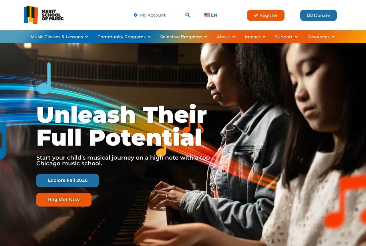
The Best Music School Website Examples, Explained
The best music school websites show a child with an instrument and make the first lesson easy. The children: Merit School of Music's two girls at a piano, Opus 1 Music Studio's violinist and singer, Meter Music School's three kids with ukuleles, Bach to Rock's small girl in a ruffled blouse holding a ukulele on a pink chair, Thrive Music School's floor of kids with a djembe, a guitar and a xylophone, Music Institute of Chicago's toddlers raising their hands on a green rug. The first lesson: Thrive's 'FIRST LESSON FREE' with a wavy underline, Opus 1's 'Trial lessons from $25 · No long-term commitment', Angeles Academy of Music's 'Back to School: 40% OFF first 4 lessons!' in a form card, Old Town School's 'Let's get you into the perfect group class.' Notice the nonprofits — Music Works Northwest's 'Donate To Support Access' beside 'Our Mission & Vision', Merit's 'Donate' beside 'Register' — and the chains: Bach to Rock's 'FIND A LOCATION NEAR YOU', Angeles Academy's '3 Locations' pill. Every example below tells you whether the school sells a lesson, a programme or a cause.
Browse the gallery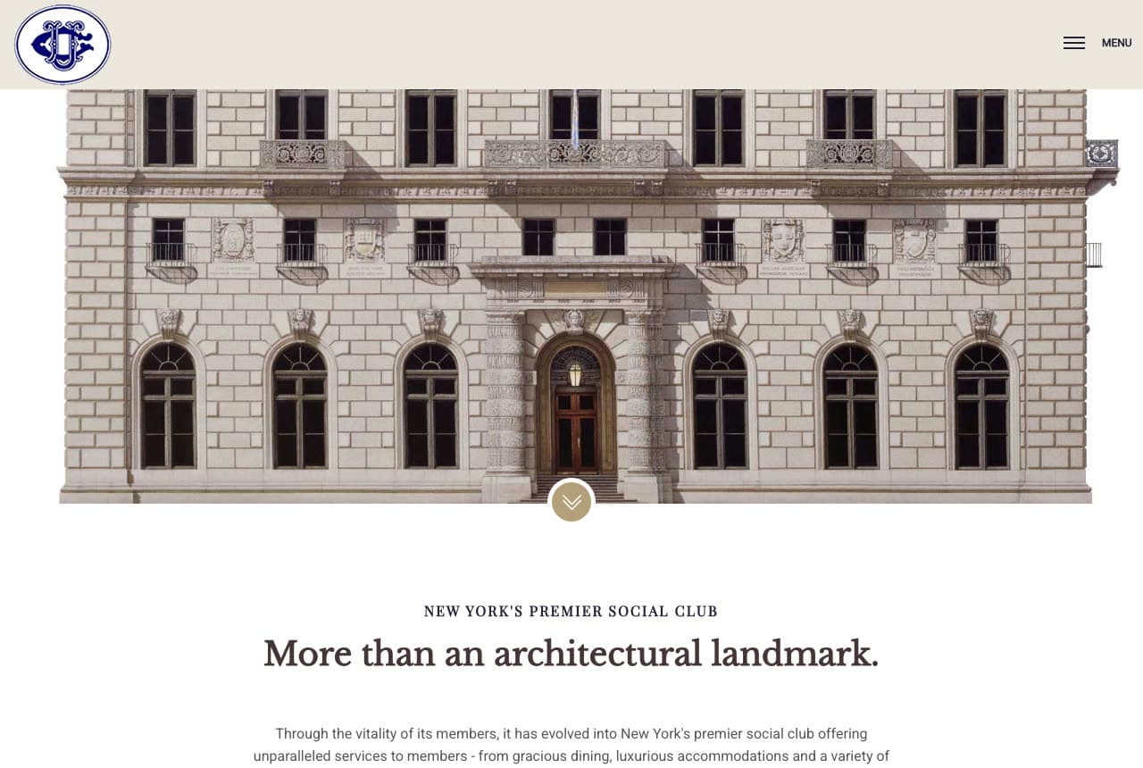
The Best Social Club Website Examples, Explained
The best social club websites show the room and say the year. The rooms: The Penn Club's fireplace lounge with a red sofa, The Montauk Club's panorama of leather armchairs and tables laid with red napkins, City of London Club's entrance with amber lanterns, The Union Club's wall of framed portraits above a yellow bar. The years: 'Since its founding in 1889' at The Montauk Club, 'EST. SOHO 1993' in The Union Club's seal. The ask: Soho House's 'Apply for membership', The Penn Club's 'APPLY NOW', City of London Club's 'BECOME A MEMBER', The Yale Club's 'Membership' as the second nav item. Notice the two that refuse to explain — Zero Bond spells its name in giant gold letters across four panels and says nothing else, The University Club shows only its façade above 'More than an architectural landmark.' — and the one that is a club without a building: The NYC Social Club's cocktail glasses raised together under 'Because your social life deserves an upgrade ;)'. Every example below tells you whether the club is selling a building, a circle or a calendar.
Browse the gallery
The Best Film & Video Production Website Examples, Explained
The best film production websites choose between showing the work and stating the claim. The work: Killshot Media's camera operator with a cinema camera on his shoulder, Bunya Productions' film still with a circular 'WATCH SHOWREEL', Vertical's two featured projects under the headline, Full Armor Films' giant neon sign on a rooftop. The claim: Tone Films' 'director-led… From 28 cities' backed by '1,652+ Five-Star Google Reviews', BluBlu Studios' 'We craft bold visuals and heartfelt stories that make brands impossible to ignore.' on solid violet, The DVI Group's 'Business Video Reimagined', Beast Films' 'FILMMAKER-LED PRODUCTION COMPANY IN LOS ANGELES'. Notice the buttons — 'Start Your Project', 'START YOUR PROJECT', 'Get started »', 'Tell Us About Your Project' — and the two sites that need none: Full Armor Films and Vertical let the nav's 'FILMS' and 'WORK' do it. Good Pictures is the odd one: an illustration instead of a frame from a film. Every example below tells you whether the company is selling a director, a crew or a reel.
Browse the gallery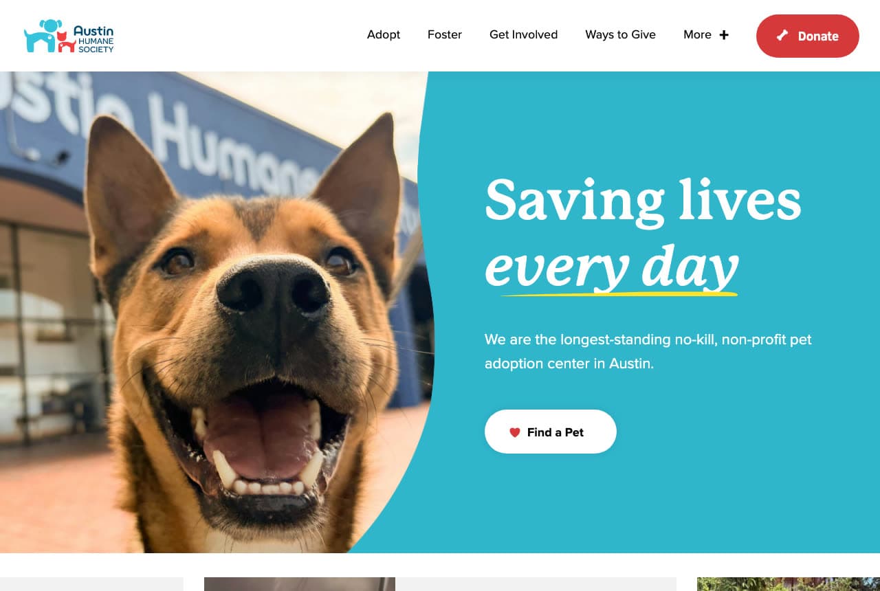
The Best Animal Rescue Website Examples, Explained
The best animal rescue websites put one face in the hero and split the ask. The faces: Austin Humane Society's shepherd mix with its mouth open, Happy Hearts Dog Rescue's pit bull in a blue bandana, Texas Humane Heroes' Saint Bernard under a stormy sky, One Tail at a Time's speckled puppy on a fleece bed, Senior Dog Rescue of Oregon's grey-muzzled dog in a red harness, Oregon Dog Rescue's white dog lying upside down on lilac. The split: Austin Humane Society's white 'Find a Pet' in the hero and red 'Donate' in the header, Texas Humane Heroes' DONATE / ADOPT / CLINIC row, Happy Hearts' FOSTER / DONATE / ADOPT tiles, Austin Pets Alive!'s 'Give Once | Give Monthly | Give in Tribute' band. Notice the two that lead with a mission sentence instead of a photograph — Stumptown Strays' illustrated pack of dogs beside 'Our mission is to rescue shelter dogs with medical needs', Austin Wildlife Rescue's serif 'Texas's largest nonprofit dedicated to native wildlife rescue, rehabilitation, and release.' Every example below tells you whether the rescue is asking you to adopt, to foster or to give.
Browse the gallery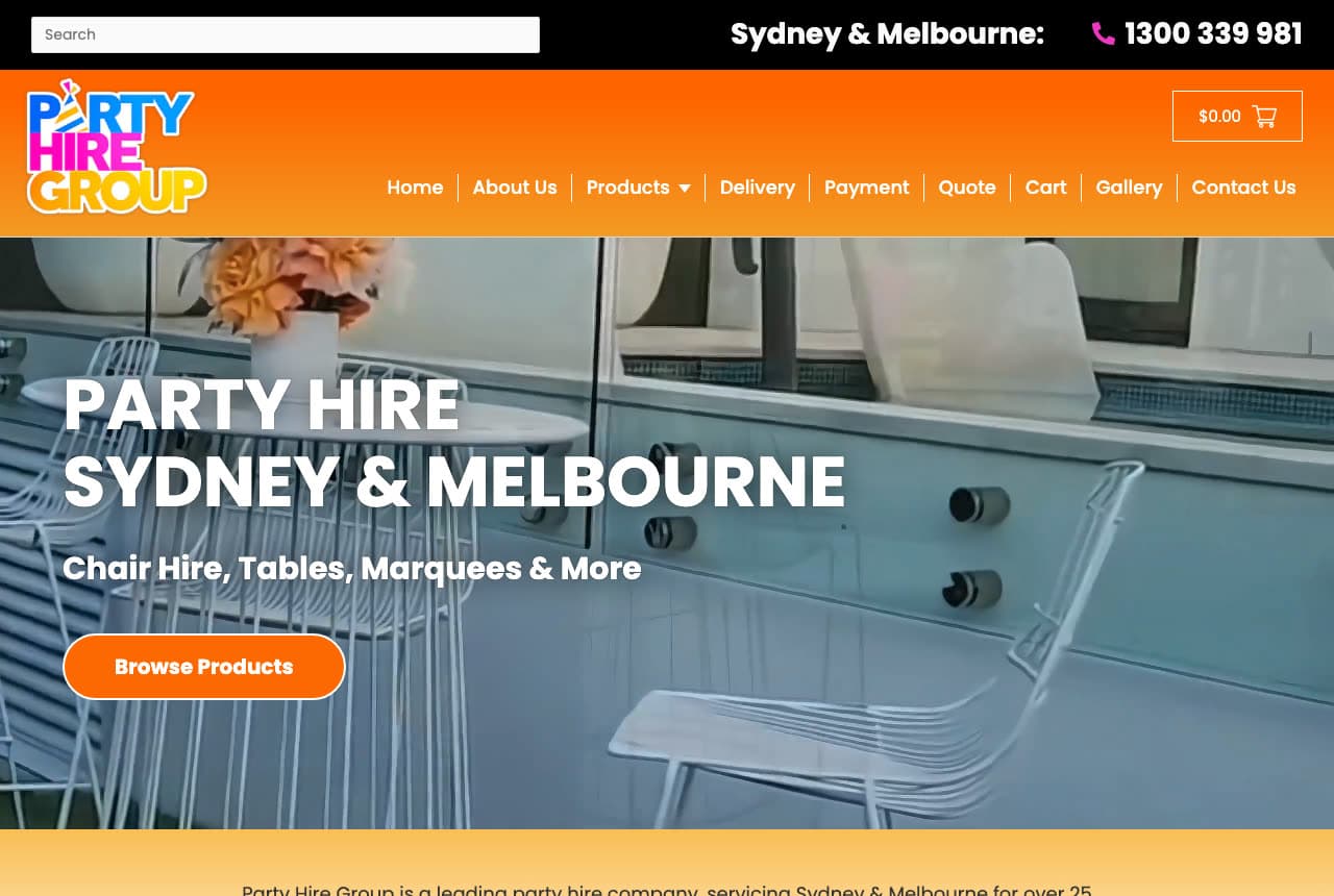
The Best Party Hire Website Examples, Explained
The best party hire websites show the goods and ask for the date. The goods: Party Hire Group's white wire chairs, NY Party Hire's ballroom of white chairs and round tables under chandeliers, Andre's Hire's four set tables with mustard and blue napkins, Aztec Events & Tents' gold cutlery on a blue charger, Elle Event Rentals' folding chair, round table and gold chiavari laid out as a sum. The date: Party Rentals of Houston's 'Check Availability & Reserve!' and 'Order By Date', Star Party Hire's 'GET A FREE QUOTE', NY Party Hire's 'Get a Quick Quote', Andre's Hire's 'Request a free quote today ››', Hyre Events' 'BUILD A QUOTE'. Notice the two that sell a mood instead of an inventory — Oliver Hire's giant lit-up '50' behind 'Stunning Events', Hyre Events' apron and bentwood chairs — and the trust lines: NY Party Hire's '4.8 Google Rating · 5000+ Events Serviced · Sydney-Wide Delivery', Aztec's 'SERVING GREATER HOUSTON FOR OVER 44 YEARS'. Every example below tells you whether the company is renting chairs, tents or a party.
Browse the gallery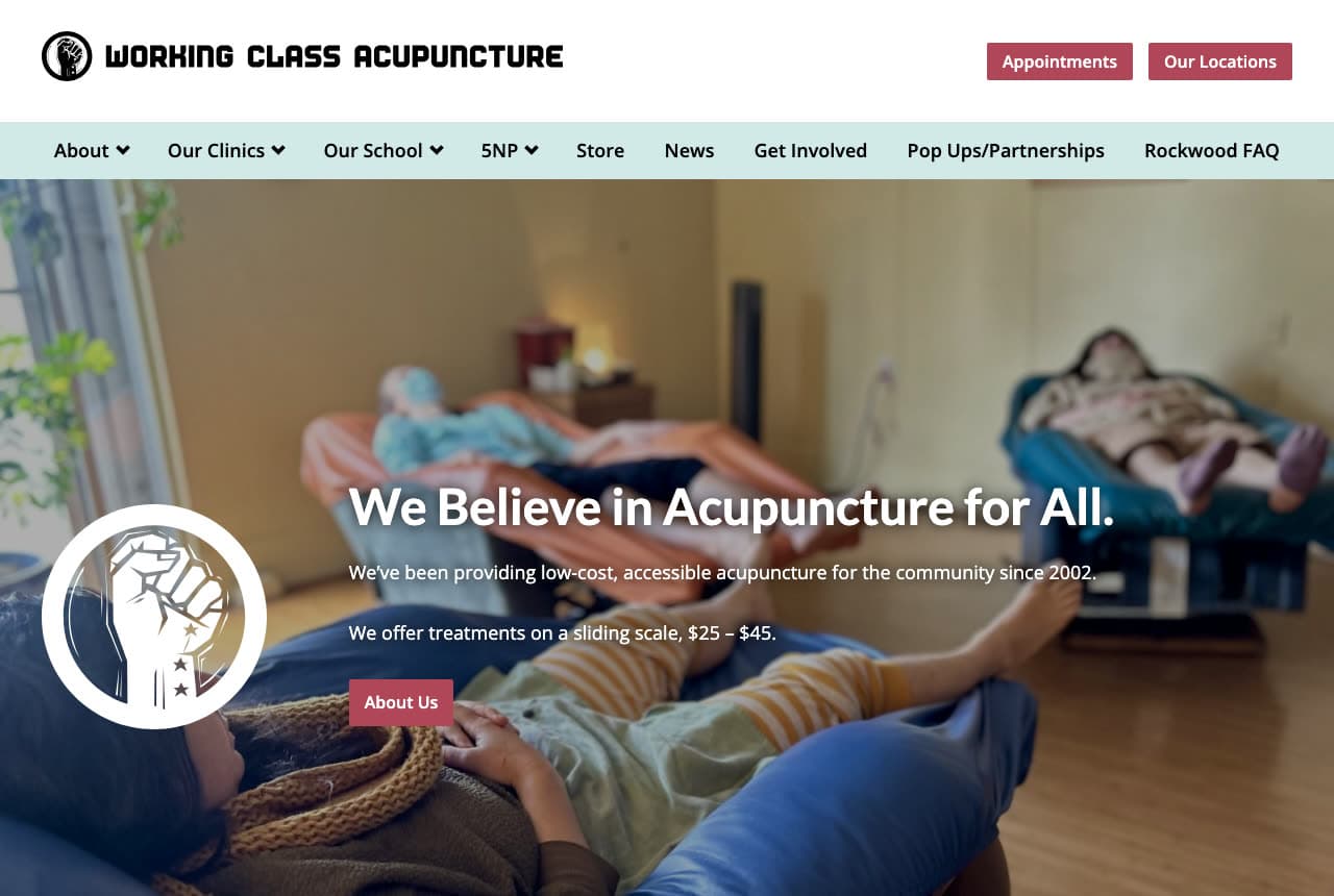
The Best Acupuncture Website Examples, Explained
The best acupuncture websites decide whether to show the needles or the calm. The needles: Honeysuckle Chinese Acupuncture Clinic's leaf-shaped photographs of needles in a scalp and an ear, Working Class Acupuncture's room of patients in recliners. The calm: Bridgetown Acupuncture's rain-wet leaves, WellBridge Clinic's rocky coastline at sunset, Acupuncture Lounge's white tiles and palm frond, Scottsdale Integrative Acupuncture's crystals and a rose-gold stethoscope. The price: Working Class Acupuncture's 'sliding scale, $25 – $45', Acupuncture Lounge's '$59 New Client Special'. The person: Betsy Gordon at her table in maroon scrubs, Acupuncture Northwest's three practitioners on a plaza. Notice how the headlines promise a feeling — 'Come for relief, find your peace.', 'RECOVER. RENEW. TRANSFORM.', 'Where New York Comes to Heal', 'Look and Feel Your Best. Naturally.' — and how nearly every site puts 'book' in the header — 'Appointments', 'BOOK NOW', 'Book a Session', 'Book Appointment', 'BOOK YOUR SESSION', 'BOOK ONLINE' — while Bridgetown puts 'Schedule Online' in the band under the hero. Every example below tells you whether the clinic is selling relief, a practitioner or a price.
Browse the gallery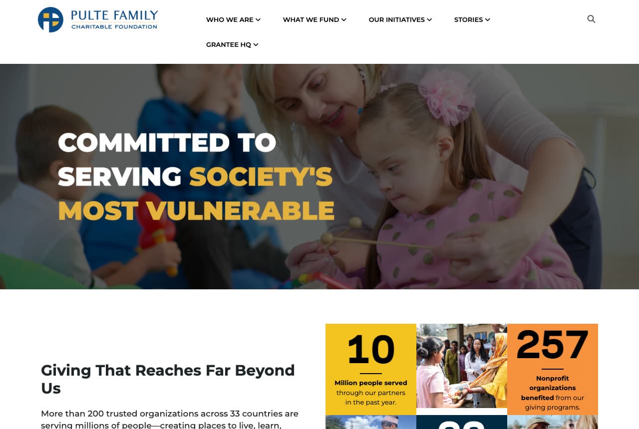
The Best Foundation Website Examples, Explained
The best foundation websites give three visitors three doors. The doors: Community Foundation of Greater Des Moines' stacked tiles — 'Donor Opportunities', 'Nonprofit Organizations', 'Professional Advisors'; Omaha Community Foundation's 'DONATE', 'OPEN A FUND', 'LOGIN'; Community Foundation for Southeast Michigan's 'GIVE', 'APPLY', 'MYCF' tabs; Community Foundation of Southern New Mexico's five pills. The proof: Pulte Family Charitable Foundation's '10 Million people served' and '257 Nonprofit organizations benefited' tiles, The Bolger Foundation's family of thirteen waving on the lawn. The place: 'Building A Better Bronx', 'A Great Place To Live, A Great Place To Give.', 'LEGACY LIVES HERE' over a Michigan main street, 'Forward Together' over six faces of Fairfield County. Notice the shortest line in the gallery — The Dayton Foundation's 'We help you help others.' — and the two buttons that are not 'donate': 'Submit Grant Application' at The Bolger Foundation, 'Access Your Fund' at The Dayton Foundation. Every example below tells you whether the foundation is talking to the giver, the grantee or the advisor first.
Browse the gallery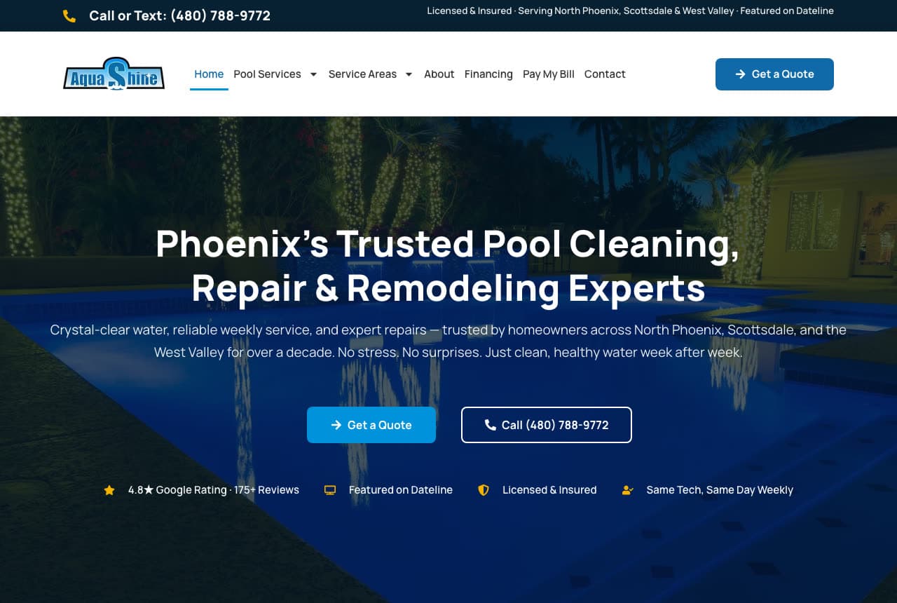
The Best Pool Service Website Examples, Explained
The best pool service websites put the quote where the water is. The quote: Love Pool Care's white form with Name, Email, Phone and 'What Services Are You Interested In?', Piranha Pool Care's 'GET YOUR QUOTE IN UNDER A MINUTE' form with a City selector, ASA Pools & Hot Tubs' 'Get a free quote' card that promises 'We reply fast, 7 days a week', A1 Hot Tubs & Swim Spas' 'Request a Quote Today', SwimHappy's 'Essentials Weekly Service' card with the monthly fee printed, Palm Breeze Pool Care's 'Instant Price Estimate' with 'No Commitment · 100% Secure · Never Shared'. The trust: Aqua Shine Pools' '4.8★ Google Rating · 175+ Reviews · Featured on Dateline · Licensed & Insured · Same Tech, Same Day Weekly', Piranha's '500+ Pools Maintained · No Contracts', Roadrunner Pool Service's '100% Satisfaction' ribbon. The place: 'Phoenix's Trusted…', 'Tampa's Most Responsive…', 'Seattle Pool & Hot Tub Service', 'Expert Hot Tub and Spa Repair in Henderson and Las Vegas', 'CHICAGO COMMERCIAL POOL CONTRACTORS', 'POOL SERVICE AND MAINTENANCE IN BRANDON, TAMPA, RIVERVIEW'. Notice the pictures that do the selling — Flawless Image Pool Service's two technicians carrying a hose and a bucket, A1's real backyard tub under fairy lights, ASA's Seattle firs, Windy City's rooftop deck at night — and the one that shows only its name: Pool Sharks of Tampa Bay in giant slanted blue letters. Every example below tells you whether the company is selling a route, a repair, a relationship or a contract.
Browse the gallery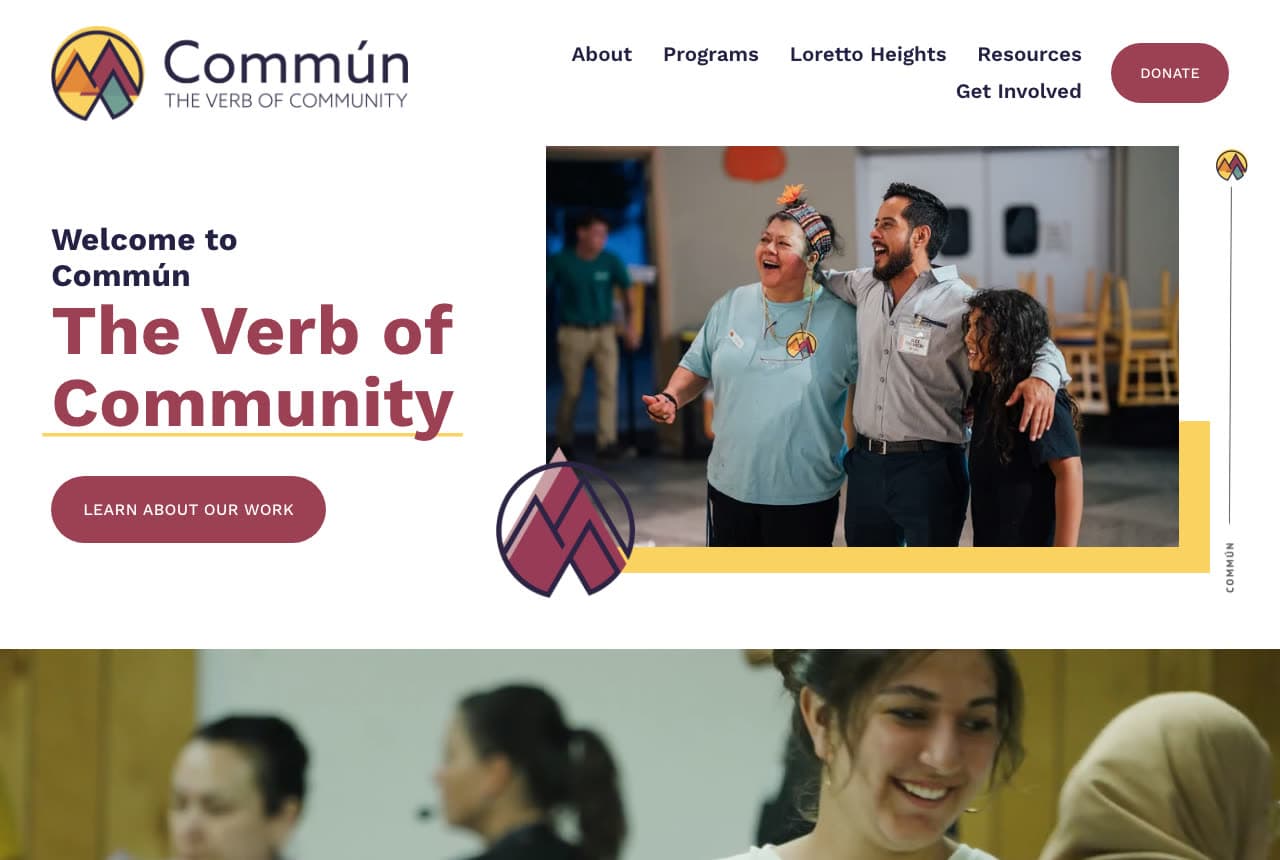
The Best Community Group Website Examples, Explained
The best community group websites show the people and split the doors. The people: St Luke's Community Centre's thirty volunteers in purple, Abbey Community Centre's eight gardeners with a fork and a watering can in the air, Commún's three friends arm in arm, Casa de Paz's living room of newcomers under a flag and painted plates. The doors: The Abbey Centre's four pills — 'Book Your Space', 'Community', 'Cafe', 'Donate' — and three more in the hero; St Luke's 'Hire a Room' and 'Become a Member'; Whittington Park Community Association's 'Room Hire' and 'Timetable'; Fitzrovia Community Centre's 'Room Hire', 'Calendar' and 'Make a Donation'. Notice how the buildings appear — The Abbey Centre's red-brick gable, Whittington Park's Victorian hall with a round window — and how two groups skip the building for a sentence: Inside Out Youth Services' 'YOU BELONG' on a rainbow of triangles, The GrowHaus's 'Providing Food Access & Wellness Education in Denver, Colorado' on a green card. Every example below tells you whether the group is offering a room, a programme or a welcome.
Browse the gallery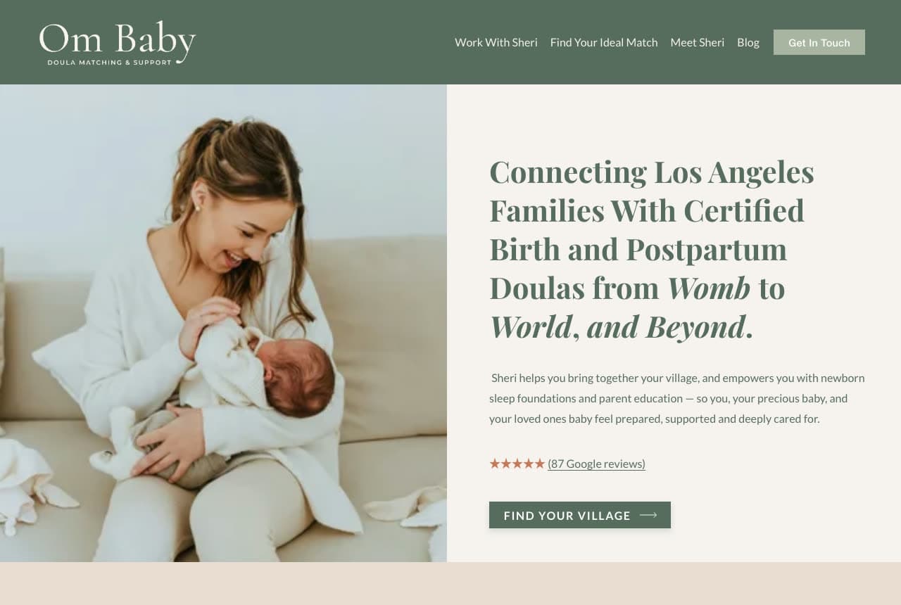
The Best Doula Website Examples, Explained
The best doula websites decide whether to show the doula or the baby. The doula: Denise Curtis in a grey blazer in front of stained glass, The Postpartum Partner's SJ Doi in a green top inside a rounded mask, Sherry Jones laughing on a garden path in a kaftan below her hero. The baby: Om Baby's newborn on a sofa, Village Birth's sleeping newborn in a pink knit blanket, Sherry Jones's newborn feet in white swaddling, Chicago Birthworks Collective's hands on a pregnant belly in a coral top. The words: 'Womb to World, and Beyond', 'From Bump to Birth and Beyond', 'unmedicated/physiological birth and VBAC', 'compassionate · evidence-based · trauma informed · culturally responsive · LGBTQ+ affirming'. The button is never 'buy' — 'FIND YOUR VILLAGE', 'Book A Discovery Call', 'Contact Me', 'FREE CONSULTATION', 'Book Your Complimentary Consultation'. Notice Chicago Volunteer Doulas, which leads with three principles — BIRTH JUSTICE, ANTI-RACISM, MARGINS-TO-CENTER — instead of a photograph, and Bini Birth, which sells the training as well as the support. Every example below tells you whether the doula is selling herself, her collective or her method.
Browse the gallery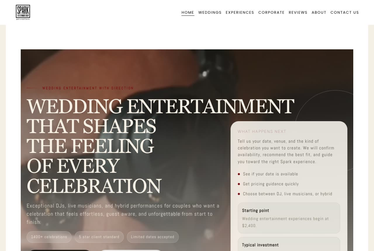
The Best DJ Website Examples, Explained
The best DJ websites decide between the dance floor and the DJ. The dance floor: Funktastic Productions' bride lifted on a chair above a crowd of men in suspenders, DLE Event Group's saxophonist and trumpeter in black suits, Groove is in the Heart DJs' man mid-jump with wild hair. The DJ: Toast & Jam's grinning DJ in headphones against a sandstone wall, DJ Graffiti's two portraits under stage lights, My DFW DJ's slipmat printed with the name. The ask: 'Check Date & Get Pricing', 'Check Availability', 'CHECK AVAILABILITY', 'Book now', 'GET YOUR FREE QUOTE', 'Get a Quote'. Notice the two that say money — Spark Entertainment Group's 'Wedding entertainment experiences begin at $2,400.' in a card, Touch of Sound's 'LIMITED 2026 DATES AVAILABLE' strip with '500+ Events | 7x Award Winner' — and the two that say attitude: 'KICK A$$ CORPORATE EVENTS', 'Sounds different. Hits different. IT'S FUNKTASTIC'. Every example below tells you whether the DJ is selling a night, a personality or a package.
Browse the gallery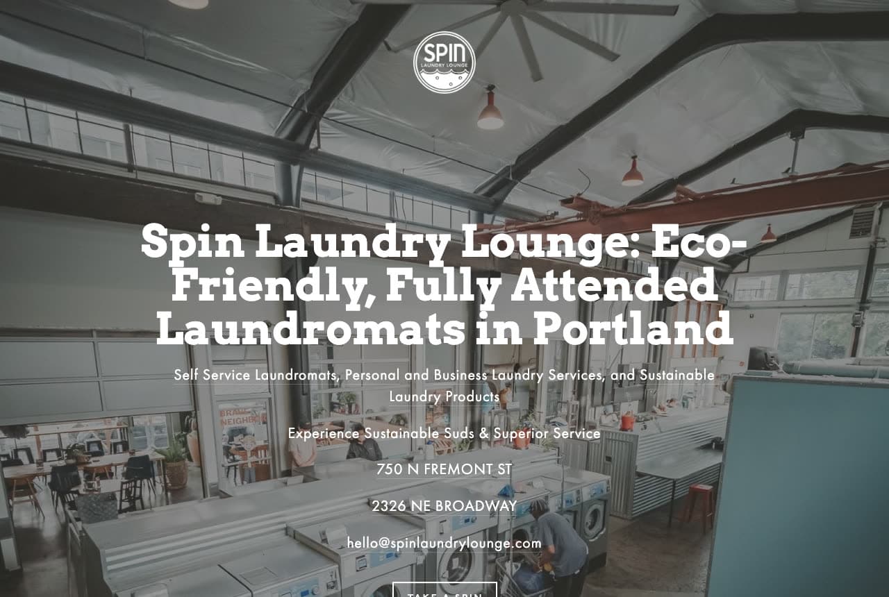
The Best Laundromat Website Examples, Explained
The best laundromat websites answer four questions fast: where you are and when you are open, what a wash costs, whether someone is on the floor, and how to hand over laundry without coming in. Notice how many of the examples below put an address, a rating or a booking field inside the hero itself — laundry customers decide in seconds, usually on a phone, often while standing next to a machine that just died at home. Each note calls out the one choice worth stealing for your own laundromat website.
Browse the gallery
The Best Virtual Assistant Website Examples, Explained
The best virtual assistant websites answer one unspoken question fast: who exactly is doing this work, and what will they take? The premium agencies answer with faces — Boldly pairs each assistant with the executive they support and labels both, Prialto insets four headshots into an orange-and-teal mosaic, Wing puts 'previously at Uber' and 'previously at J.P.Morgan' on chips under the photographs. The solo practices answer with a voice — Kayleigh's Got It lists six specific failures ('You've ghosted your email subscribers'), Virtual Creative Co. opens on 'IT'S TIME TO CLOSE THE TABS', She's A Given promises 'less time in the weeds and more time in the garden'. Then notice how many name a niche out loud instead of saying 'all-round support': Sonia Smith Creative is a 'HoneyBook Pro + Wedding Industry Virtual Assistant team', The Organised VA serves 'Health and Wellness Professionals'. Specific beats broad, because the person reading is not shopping for admin — they are hoping someone already understands their week.
Browse the gallery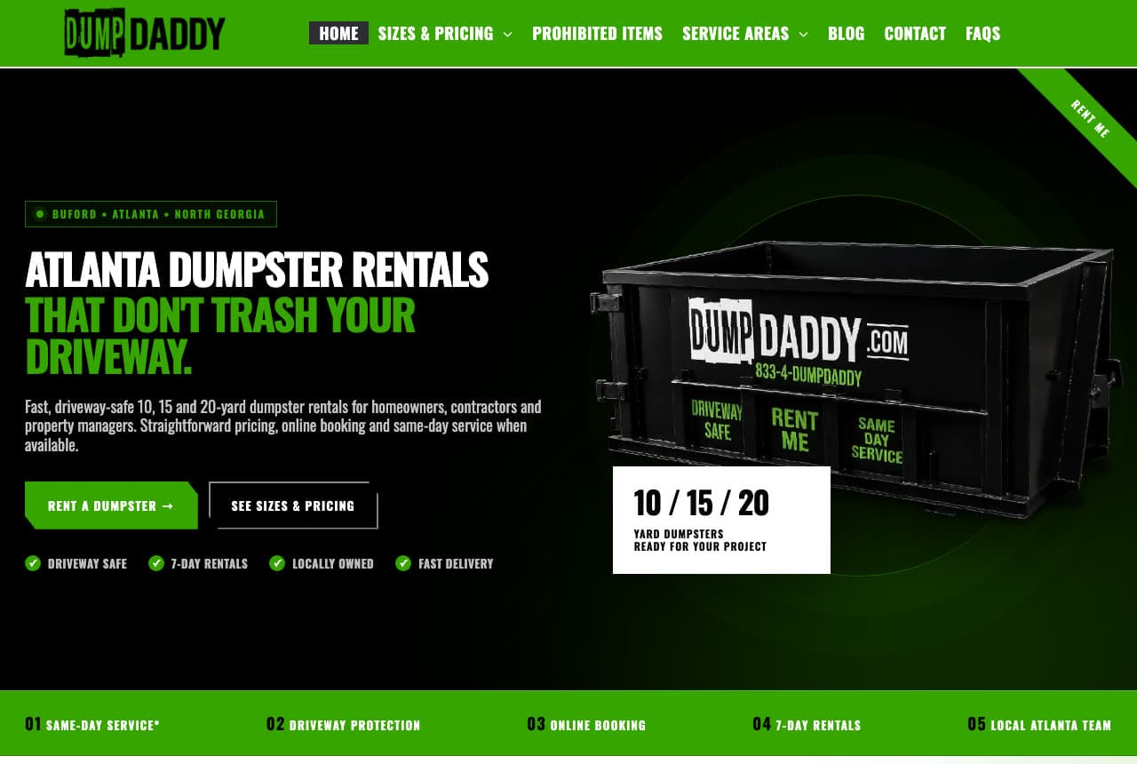
The Best Dumpster Rental Website Examples, Explained
The best dumpster rental websites are built for someone standing in a half-gutted kitchen with a phone in their hand. Watch how early each one answers the practical questions. Size: Dump Daddy pins '10 / 15 / 20' to its product shot, and Freddy's Skip Bins puts every size on screen as a tick box — with 'Unsure' for anyone who can't picture a cubic meter. Price: Trash Daddy says 'flat rate' in its headline and again in an icon line beside 'No Hidden Fees', and Hometown Waste argues that as a direct source it has none of a third-party rental company's hidden fees. Timing: Red Dog Dumpsters turns its dispatch cutoff into 'Call Before Noon For Guaranteed Same Day Service!' The driveway: Dump Daddy and MobileDumps both put it in the headline. Then notice who photographs their own equipment — Hometown's stenciled roll-off, Red Dog's lettered truck. A real truck with your name and number on it is proof a stock photo can't fake.
Browse the gallery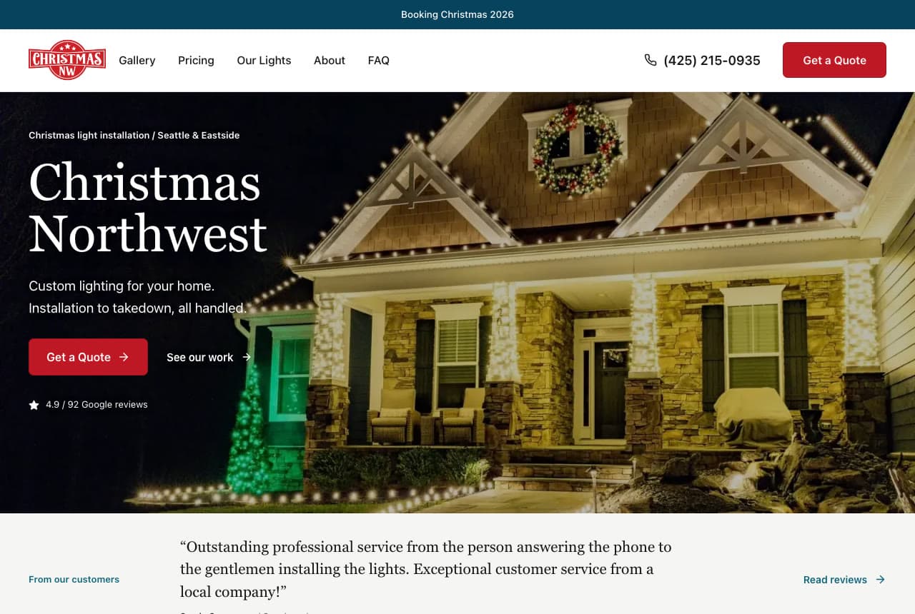
The Best Christmas Lighting Website Examples, Explained
The best Christmas lighting websites are built for a homeowner deciding in a hurry, usually in October or November and usually on a phone. Watch how early each one answers the four questions that decide the booking. When: Christmas Northwest names the season it's booking above its logo, Holiday Lights Phoenix warns that spots fill up fast, and Kessick's hero form asks for an install window. How much: LIT Christmas Lights posts a starting price in its top bar, and Renfrow prices rooflines by the foot. What's included: Holiday Lights Phoenix ticks off commercial-grade LED lights, custom design, free bulb replacement, takedown and storage in one strip. What it will look like: My Christmas Light Pro offers an AI preview of the customer's own house. Then notice the photographs — the strongest heroes show lit homes that look like the customer's street, from Phoenix palm trunks wrapped in white to a snow-covered New Jersey colonial.
Browse the gallery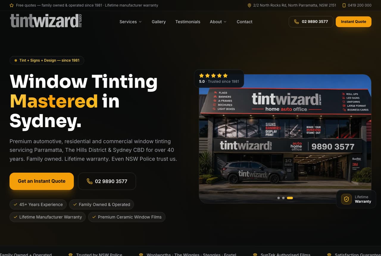
The Best Window Tinting Website Examples, Explained
The best window tinting websites answer four questions in the first screen. Who is it for: Tint Wizard's sign reads home, auto, office; Solar Tint & Graphics gives a house, an office wall and a corridor one photo each; Matt Bull Window Tinting lists Home Windows before Car Tinting in its menu. What does it cost: Granbury Window Tint's first button is a tint calculator, and Zarla's Penwright design has 'See Prices' beside the quote button. How long does it last: Sundown Window Tinting makes its lifetime residential and 10-year commercial warranties the only graphics in the hero. Can I trust you: TX Tint & PPF's headline says it is the shop your dealership uses, A-Plus Tint & PPF counts 1200+ five-star reviews above its photo, and Window Film Depot shows an installer at work above Manhattan. Then notice the photographs — the car shops show cars at their own premises; the flat-glass installers show a room or an office full of windows.
Browse the gallery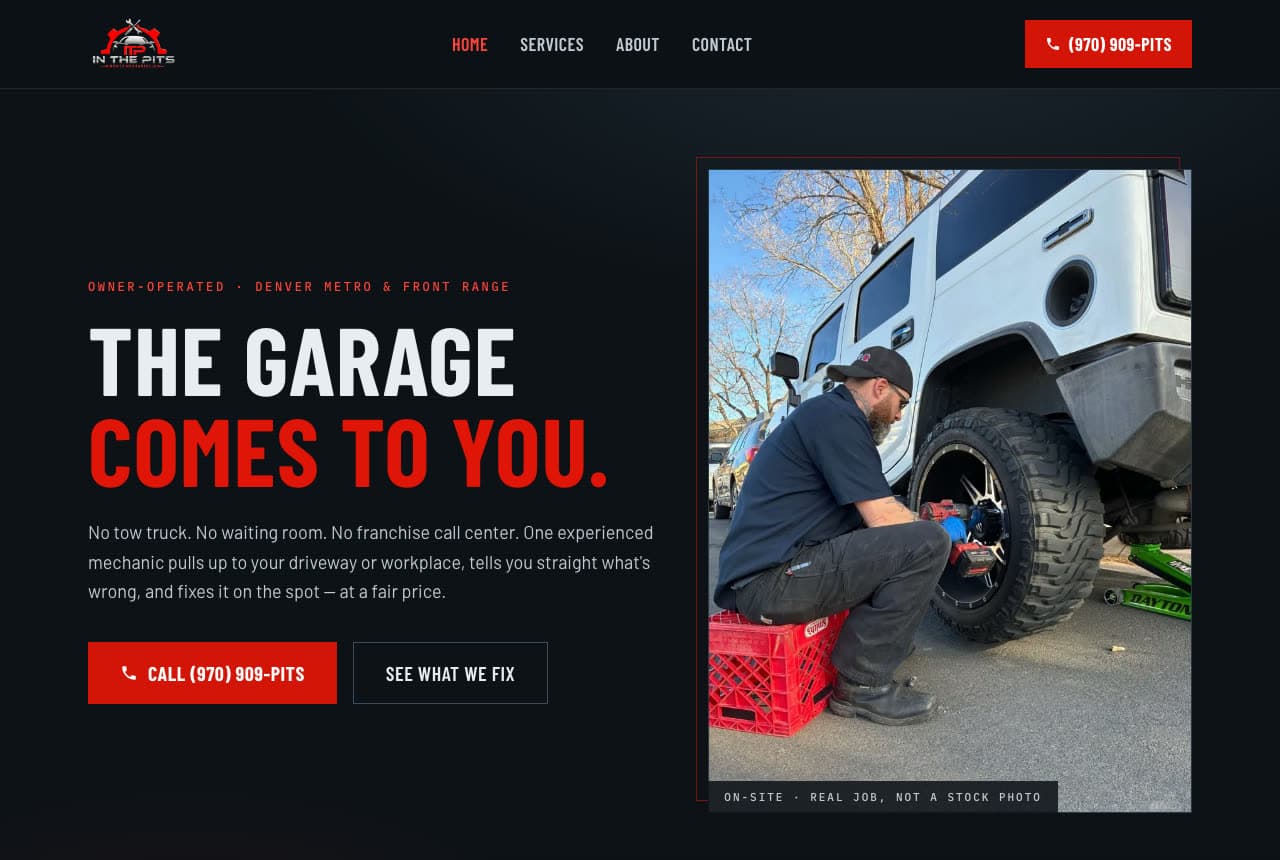
The Best Mobile Mechanic Website Examples, Explained
The best mobile mechanic websites answer four questions a workshop never has to. Who is coming: In The Pits Mobile Mechanic captions its hero 'real job, not a stock photo', and Frank's Complete Mobile Auto Care puts Frank beside his van. Where do you go: Quick Tyre Fit names the postcode areas it covers — LE, NG, DE, CV and NN — and Family Roadside Assistance's form asks 'Where should we meet you?' How fast: Quick Tyre Fit and Mobile Tyre Buddy both promise 30–45 minutes, and Diesel Road Services prints its ETA in a red box under the headline. Who is it for: Lube Mobile lets the visitor pick one of four services, Mobile Tyre Buddy splits roadside from home fitting, and A1 Fleet Service's second button is 'View Maintenance Plans'. Then notice the vehicles — Quick Mobile Tyres and TruckUp make the van or the service truck the brand.
Browse the gallery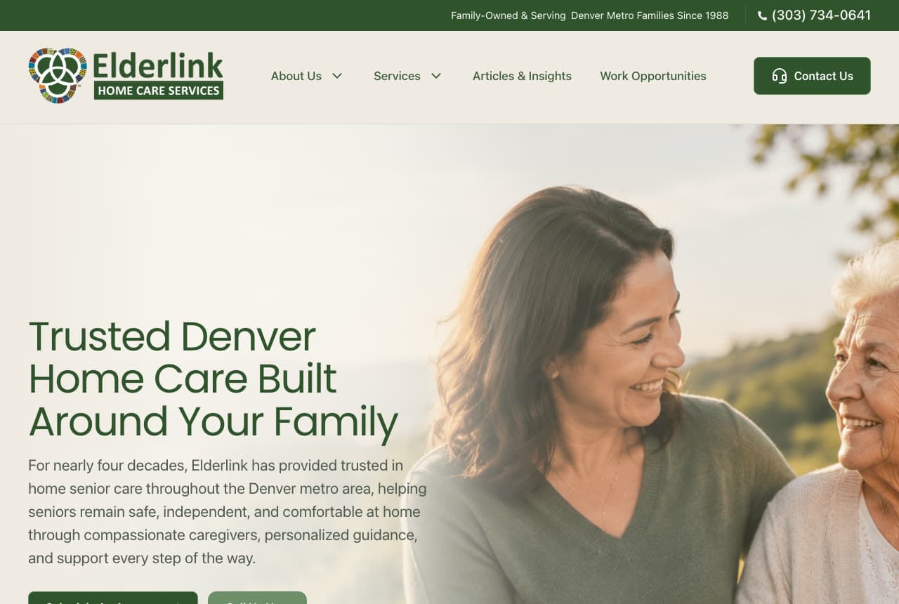
The Best Home Care Website Examples, Explained
The best home care websites answer the questions a family asks before it calls. Can we trust you: Elderlink leads with 'Since 1988', Helping Hands names its regulators ('CQC & CIW Regulated') above the headline, and TheKey Home Care prints '4,427 Five Star Reviews' under its rating. How will we pay: Carolina Home Health Care's only hero button is 'Check If Care Is Covered – Free', and Helping Hands puts 'Cost of Care' in its main menu. How do we start: Fedelta Home Care offers a '2-Min Care Assessment', and Zarla's Marlcombe design puts a call-back form in the hero. Then notice who else each site serves — EQC Home Care's 'Refer a client' and 'Find a job' strip, Abby Services' panel for caregivers, Alliance Medical & Home Care's staffing button — because a home care agency hires as hard as it sells.
Browse the gallery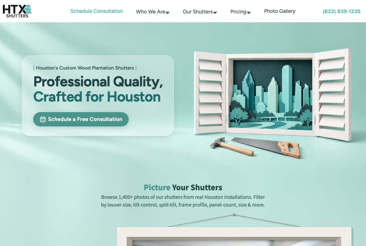
The Best Blinds & Shutters Website Examples, Explained
The best blinds and shutters websites answer four questions in the first screen. What do you sell: HTX Shutters frames the Houston skyline with a pair of plantation shutters, and Louisiana Shutters, Blinds & Shades writes all three products into its logo. How does the visit work: Stoneside's top strip reads 'Shop at Home — We Bring Our Showroom to You!', and Zarla's Fairleigh design prints its showroom days above the headline. Why now: Accent Window Fashions puts dates on its free-motorization offer, and Blinds Brothers asks Dallas–Fort Worth homeowners to book so the shade is up 'This Season'. Can I trust you: Indiana Blinds leads with 'family-owned dedication', JMR Blinds counts 'Over 5000+ Happy Clients', and Simply Shutters promises the job free if anybody beats its quote. Then notice the photographs — most of these sites show a finished room in daylight, because light through the slats is the product.
Browse the gallerySkip the inspiration — just build it
Describe your business and Zarla designs a complete, professional website in about 30 seconds.
Free to build and preview · no credit card · publish to your own domain on Premium