Inspiration · Accountant

The Best Accounting Website Examples, Explained

Looking for accounting website examples? These 15 are the best we could find — standout real accounting sites plus designs you can build with Zarla — and each comes with a breakdown of the specific design move that makes it work. Find a look you love and you can build a site in that exact style, free, in about 30 seconds.

Real sites + designs you can build with Zarla — free to build and preview, no credit card

What makes a great accounting website

The best accounting websites share a few moves: they earn trust fast, lead with strong visuals of the work, point to one clear action, and match the design to how their customers decide. Each example below calls out the specific choice worth stealing for your own accounting website.

Appletree Business Services website — Small-Biz CPA design example
Real site · United States
  • Small-Biz CPA
  • Reassuring
  • Green + cream

Appletree Business Services: A headline aimed at the last accountant

Appletree Business Services opens with the sharpest positioning in the category: 'Stop Chasing Your Accountant.' It's aimed not at people without an accountant but at people with a bad one — a much hotter buyer — and the green serif keeps it calm while the words throw the punch. The follow-through is a responsiveness promise ('work with a responsive, proactive team'), a podcast-and-press logo bar, and the page's best section: 'The Wrong Way vs The Appletree Way,' a two-column table that turns the sales argument into a checklist (trying to do your own books ✗ / clean bookkeeping every month ✓). Naming the competitor's failure mode — unreturned emails — is the whole strategy, executed politely.

  • Targets people with a BAD accountant — the hotter buyer
  • Wrong Way / Right Way table turns pitch into checklist
  • Serif + apple green keep a punchy message calm

Steal this: Write the headline at your rival's failure mode. 'Stop chasing your accountant' converts the already-burned.

Little Fish Accounting website — Boutique CPA design example
Real site · Washington, DC
  • Boutique CPA
  • Warm
  • Blush + cream

Little Fish Accounting: Clarity and calm as the deliverable

Little Fish Accounting sells a feeling most firms never mention: 'Bringing Clarity & Calm to Agencies,' with 'Agencies' set in a script flourish — niche and emotion in one line. The blush-and-cream palette with a warm circular team photo reads more like a boutique studio than a CPA firm, which is precisely the differentiation: their clients are creative service businesses who find traditional accounting sites cold. Forbes 'Recognized By' badges anchor credibility, and the services section — 'Support That Evolves With You' — ladders offerings from Financial Manager to Fractional CFO, letting a growing agency see its own future on the pricing page. Design warmth plus a named niche: the combination filters and converts at the same time.

  • 'Clarity & Calm' names the emotional product, not the tasks
  • Blush palette + real team photo breaks the navy-suit mold
  • Service ladder shows clients their next stage of growth

Steal this: Ladder your services by client growth stage. Clients buy the tier above them when they can see the path.

Crunch website — Online Accountants design example
Real site · Brighton, UK
  • Online Accountants
  • SaaS-Like
  • Magenta + navy

Crunch: Accountancy productized into two cards

Crunch turns accounting into software packaging: 'Online accountants and software for small businesses,' then two side-by-side product cards — Software Only versus Accountants & Software — each with its own description and CTA, exactly like a SaaS pricing page. Compliance reassurances (HMRC Recognised, Making Tax Digital compatible) ride as checkmarks under the headline, and the collage below mixes real product UI screenshots with photos of actual accountants, annotated with hand-drawn 'award winning software' notes — humanizing the platform without hiding it. The £10/month banner makes the entry price impossible to miss. For any firm moving to subscriptions, this is the reference: name the packages, show the interface, publish the price.

  • Two-card choice architecture — self-serve vs full service
  • UI screenshots + real staff faces humanize a platform
  • Compliance badges ride as checkmarks, not an afterthought page
Anders CPA website — Regional Firm design example
Real site · St. Louis, MO
  • Regional Firm
  • Aspirational
  • Blue + steel

Anders CPA: Client dreams, firm's proof

Anders CPA leads with a trademarked ambition — 'The Power to Dream Big™' over a wide-open warehouse shot — and immediately grounds it: 'You know your dream. Anders knows how to get you there.' The structure that follows is the part worth copying: 'Dreaming with Anders' is a client-story carousel where a named CEO (Cosmos) explains in his own words that 'Anders has freed us up to do what we do best.' The firm's growth pitch is delivered entirely through the client's outcome, with a video testimonial beside it. The vertical icon-rail navigation keeps the page chrome minimal so the stories carry. Accounting firms sell futures; this design lets the clients who got theirs do the selling.

  • Client-story carousel makes customers the sales force
  • Named CEO + company beats anonymous testimonial cards
  • Icon-rail nav clears the stage for the stories
Orbit Accountants website — Small-Biz Accountants design example
Real site · Sydney, AU
  • Small-Biz Accountants
  • Human
  • Charcoal + white

Orbit Accountants: A sentence that sounds like a person

Orbit Accountants opens with a headline that reads like the first line of a conversation: 'We're passionate and approachable Sydney small business accountants with one big aim…' — the ellipsis pulling you down the page, the underline on 'big aim' adding a hand-made touch. Behind it, a warm photo of actual people laughing in a real office (not a boardroom stock shot) makes 'approachable' believable before the copy claims it. The lowercase 'orbit.' wordmark with a full stop carries quiet confidence. Most accounting sites write like an engagement letter; Orbit writes like a person you'd actually call — and in a trade bought on trust and rapport, sounding human on the homepage is the audition.

  • First-person voice auditions the client relationship
  • Real laughing-in-office photo makes 'approachable' true
  • Ellipsis headline pulls the reader down the page
Fusion Accountants website — Chartered Firm design example
Real site · London, UK
  • Chartered Firm
  • Energetic
  • Magenta + navy

Fusion Accountants: Badges stacked where eyes land

Fusion Accountants runs the credibility-density play: 'Accounting Made Simple' beside a genuinely warm portrait, and then a badge wall doing the persuasion — ICAEW Chartered Accountants, software-partner logos, and a Google rating spelled out as '4.7 based on 195 reviews.' Below, a 'Mid-Size Firm of the Year — Xero Awards' tile and a West London Business Awards finalist mark keep the trophies coming. The magenta diagonal gives an otherwise conventional layout some energy, and the triple CTA row (Our Prices / Request a Callback / Chat With Us) meets three different buyer temperaments at once. Note 'Our Prices' as a primary button: fee transparency is rare in accounting, and offering it up front is itself a trust signal.

  • Review count written out — '195 reviews' beats five stars alone
  • 'Our Prices' as a primary CTA signals fee transparency
  • Three CTAs for three buyer temperaments
Beyond Accountancy website — Virtual Accountants design example
Real site · Australia
  • Virtual Accountants
  • Direct

Beyond Accountancy: The overdue-returns lifeline, above the fold

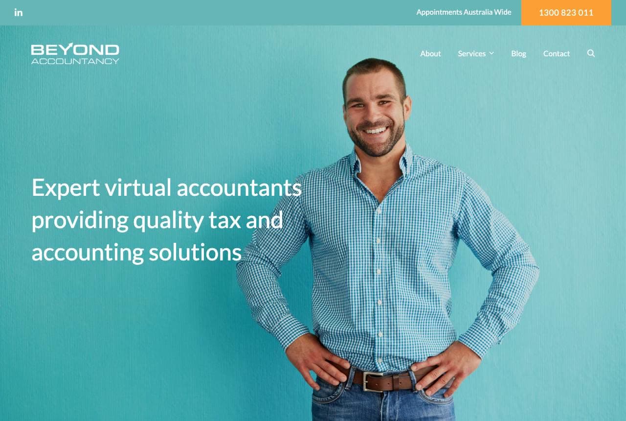
Beyond Accountancy's teal hero does the standard virtual-accountant pitch competently — confident portrait, 'expert virtual accountants, Australia-wide appointments' — but the design decision worth studying sits just below: a dedicated callout asking 'Late or multiple tax returns outstanding?' with its own orange button. That's a segment most firms are too polite to address on the homepage, yet it's exactly the visitor most likely to convert tonight: someone in trouble, searching at 11pm, ashamed to call. Naming the situation without judgment — 'we can deal with the tax office for you' — turns shame into relief. One empathetic sentence for the highest-anxiety segment can outperform an entire services menu.

ProVision Wealth website — Tax Strategy design example
Real site · United States
  • Tax Strategy
  • Editorial

ProVision Wealth: Strategy language, not compliance language

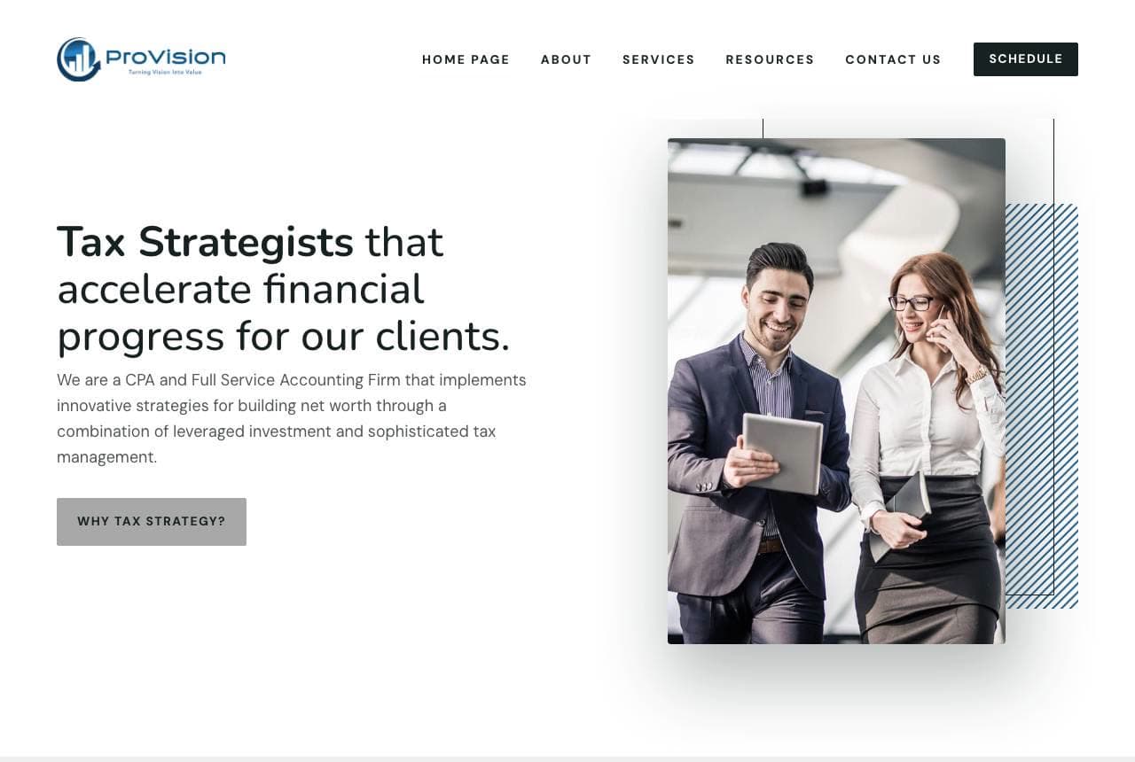
ProVision Wealth positions above the tax-return trade entirely: 'Tax Strategists that accelerate financial progress for our clients' — strategist, not preparer — and the copy holds that altitude, talking 'leveraged investment and sophisticated tax management' instead of deadlines and lodgements. The layout is disciplined editorial: generous white space, a single offset photo with a thin rule, and a 'Why Tax Strategy?' ghost button inviting the skeptic. Then the smart routing move: 'What service are you looking for?' with four dark buttons (Full Service Accounting, Tax Strategies, Tax Consulting, Tax Preparation) that let each visitor self-sort. Vocabulary is positioning — call yourself a strategist and structure the page like advice, and the fee expectations follow.

Whitfield & Corey CPAs — CPA Firm website design you can build with Zarla
Build this with Zarla
  • CPA Firm
  • Trustworthy

Whitfield & Corey CPAs: The full-service firm, sold on trust and results

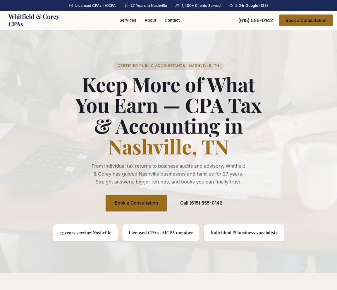
Whitfield & Corey CPAs nails the register a full-service firm wants: trustworthy, established, and outcome-focused. 'Keep More of What You Earn — CPA Tax & Accounting in Nashville, TN' in a cream, serif palette that reads professional without being stuffy, with copy that names the whole offer and the client's real want — 'from individual returns to business audits and advisory, guided Nashville businesses and families for 27 years. Straight answers, bigger refunds, and books you can finally trust.' A 27-years, AICPA, 1,400-client trust strip seals it. The lesson is leading with tenure and outcome for a trust-heavy service: an accounting client is handing over their money and their compliance risk, so 'straight answers, bigger refunds, books you can trust' plus decades of proof beats any list of services.

See this template
Redwood Tax Co — Tax Preparation website design you can build with Zarla
Build this with Zarla
  • Tax Preparation
  • Results-led

Redwood Tax Co: Bigger refund, zero stress, form in the hero

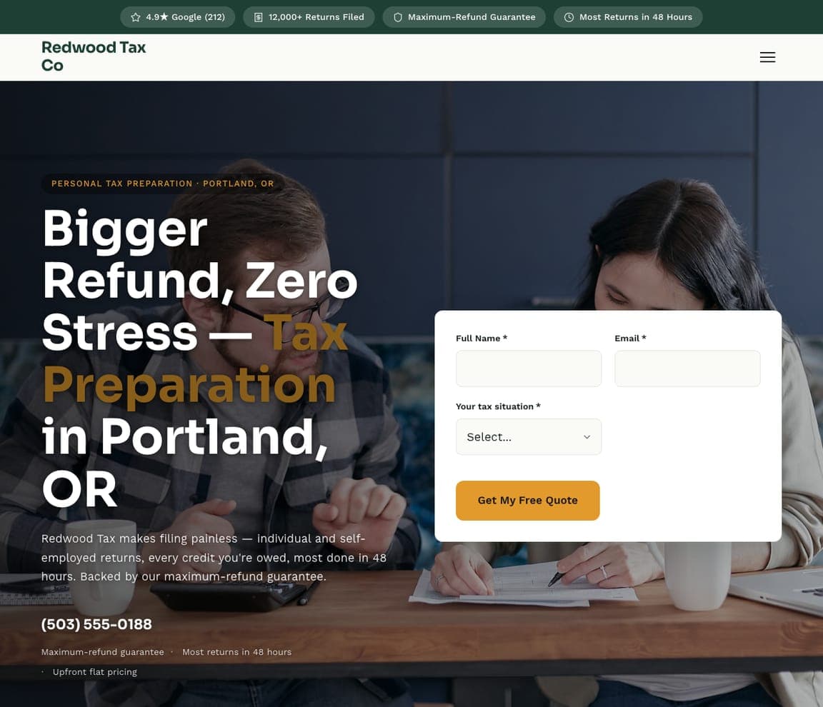
Redwood Tax Co sells tax prep on the two things a filer actually feels — the refund and the dread. 'Bigger Refund, Zero Stress — Tax Preparation in Portland, OR' over a dark hero with a 'get my free quote' form (name, email, tax situation) right in it, capturing the lead while they're motivated. The copy is concrete — 'individual and self-employed returns, every credit you're owed, most done in 48 hours, backed by a maximum-refund guarantee.' The lesson is naming the emotional payoff and the friction at once: nobody enjoys taxes, so leading with 'bigger refund' (the reward) and 'zero stress / 48 hours / guarantee' (killing the dread), plus an in-hero form, converts the anxious filer immediately.

See this template
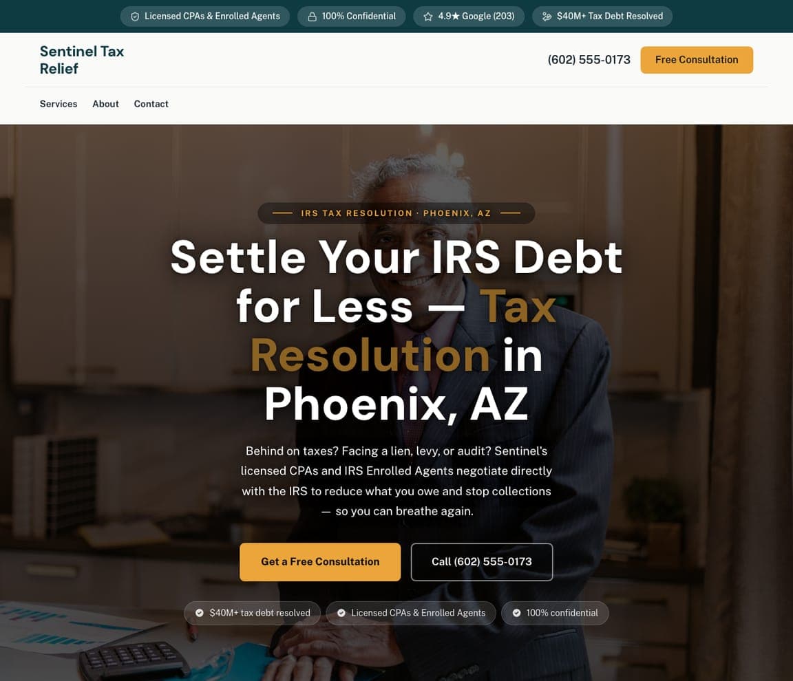
Sentinel Tax Relief — Tax Resolution website design you can build with Zarla
Build this with Zarla
  • Tax Resolution
  • Urgent

Sentinel Tax Relief: Speak to fear for a high-anxiety service

Sentinel Tax Relief designs for a client in genuine distress — someone facing the IRS. 'Settle Your IRS Debt for Less — Tax Resolution in Phoenix, AZ' over a serious dark palette, with copy that meets the panic head-on: 'Behind on taxes? Facing a lien, levy, or audit? Our licensed CPAs and IRS Enrolled Agents negotiate directly with the IRS to reduce what you owe and stop collections — so you can breathe again.' A '$40M+ tax debt resolved, 100% confidential' strip builds credibility and safety. The lesson is designing for acute anxiety: a tax-resolution client isn't comparison-shopping, they're scared and want relief now, so the template names the exact fears (lien, levy, audit), promises relief ('breathe again'), and reassures on confidentiality.

See this template
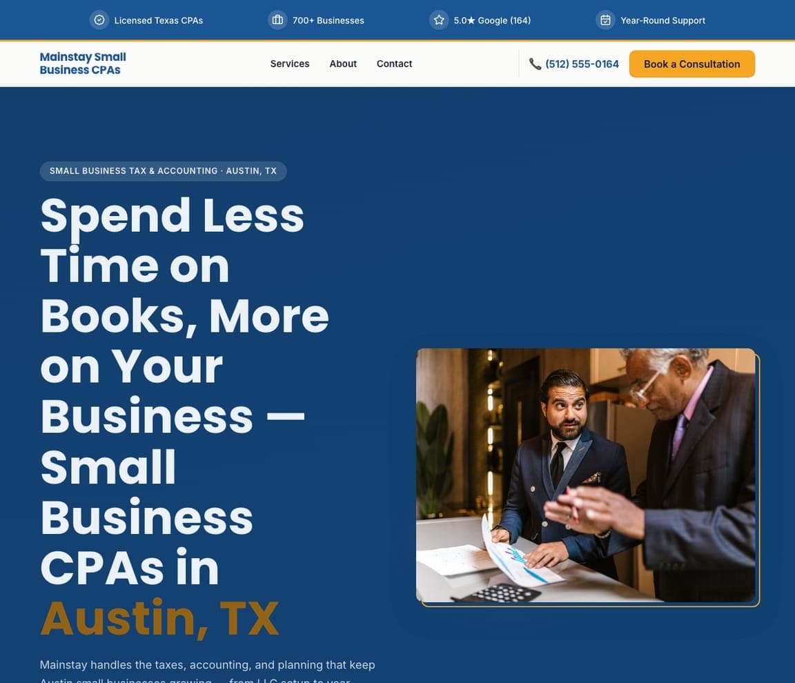
Mainstay Small Business CPAs — Small Business CPA website design you can build with Zarla
Build this with Zarla
  • Small Business CPA
  • Practical

Mainstay Small Business CPAs: Sell the time back, not the accounting

Mainstay Small Business CPAs sells the outcome a busy owner actually wants — their time back. 'Spend Less Time on Books, More on Your Business — Small Business CPAs in Austin, TX' in a confident blue over a real business photo, framing the whole value as freeing the owner to run their company instead of wrestling spreadsheets. 'Handles the taxes, accounting, and planning' plus '700+ businesses, year-round support' signal a reliable partner, not a once-a-year filer. The lesson is selling the benefit to a time-poor buyer: a small-business owner doesn't want 'accounting services,' they want fewer hours on books and more on growth, so leading with 'spend less time on books, more on your business' speaks to their real pain far better than a service list.

See this template
Cadence Startup CPAs — Startup CPA website design you can build with Zarla
Build this with Zarla
  • Startup CPA
  • Modern

Cadence Startup CPAs: Speak founder, look like a startup

Cadence Startup CPAs proves an accounting firm can look as modern as its clients. 'Startup & Tech CPAs in San Jose, CA' in a bold purple-and-lime palette that feels more SaaS than CPA, with copy in the founder's own language — 'the finance team behind Silicon Valley founders: R&D credits, QSBS, clean cap tables, and investor-ready books. We speak founder and move at startup speed.' The lesson is matching your design and vocabulary to a specialized clientele: a startup founder can tell instantly whether a firm 'gets' their world (QSBS, cap tables, R&D credits) or is a generalist, so the modern palette and insider terminology signal genuine fit — and win the high-growth client a beige traditional firm never could.

See this template
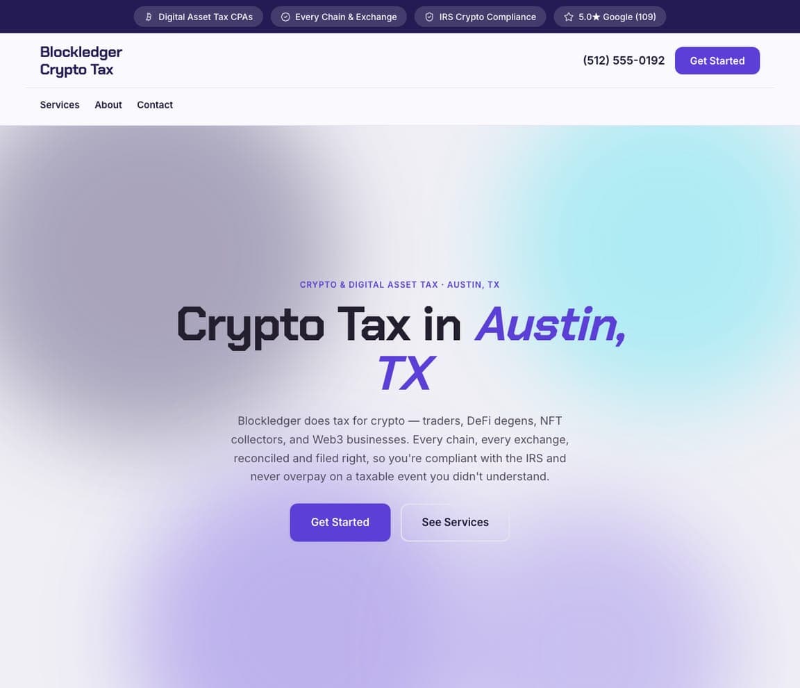
Blockledger Crypto Tax — Crypto CPA website design you can build with Zarla
Build this with Zarla
  • Crypto CPA
  • Niche

Blockledger Crypto Tax: Own an emerging, confusing niche

Blockledger Crypto Tax claims a niche most accountants avoid — crypto — and speaks its language fluently. 'Crypto Tax in Austin, TX' over a modern blue-purple gradient, with copy that names the exact client and their pain: 'tax for crypto — traders, DeFi degens, NFT collectors, and Web3 businesses. Every chain, every exchange, reconciled and filed right, so you're compliant with the IRS and never overpay on a taxable event you didn't understand.' The lesson is owning an emerging, complex niche: crypto tax is genuinely confusing and underserved, so a firm that uses the culture's own terms (DeFi, NFT, Web3) and promises to handle 'every chain, every exchange' instantly signals it's one of the few who actually gets it — and captures a niche generalists can't touch.

See this template
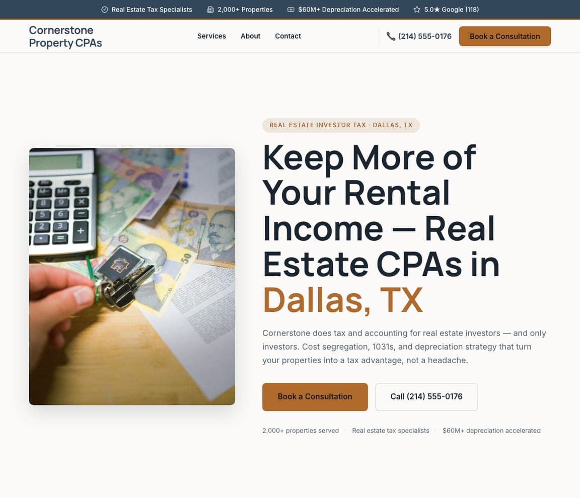
Cornerstone Property CPAs — Real Estate CPA website design you can build with Zarla
Build this with Zarla
  • Real Estate CPA
  • Specialist

Cornerstone Property CPAs: Specialize hard, name the strategies

Cornerstone Property CPAs wins the real-estate investor by being exclusively theirs. 'Keep More of Your Rental Income — Real Estate CPAs in Dallas, TX' with copy that draws a hard line: 'tax and accounting for real estate investors — and only investors. Cost segregation, 1031s, and depreciation strategy that turn your properties into a tax advantage, not a headache.' Naming the specific strategies (cost seg, 1031, depreciation) proves genuine expertise to a client who knows those terms. The lesson is that exclusive specialization plus insider strategy language commands trust: a real-estate investor with a serious portfolio wants a CPA who does nothing but real estate and can name the exact tactics, so 'only investors' and 'cost segregation, 1031s' win the high-value client over any generalist.

See this template

Frequently asked

Where can I find good accounting website examples?

Right here — this page curates accounting website examples two ways: standout real businesses (each linked, so you can explore the live site) and professionally designed Zarla templates you can clone and make your own. Every example comes with a note on why the design works — trust signals, layout, calls to action — so you can copy the move, not just the look.

What makes a good accounting website?

A good accounting website earns trust in the first few seconds, leads with strong visuals of the work, gives visitors one obvious action, and loads fast on a phone. Every design below leads with proof and a single clear call to action rather than a wall of text.

How much does a accounting website cost?

A custom accounting website from a designer typically runs into the thousands up front, and template builders charge roughly $16–$30 per month. An AI builder generates a complete, editable design for free and only charges (on the Premium plan) when you publish to your own domain — so you can build and preview before spending anything.

Do I need a designer to build a accounting website?

No. Several designs on this page were generated by Zarla and are fully editable — you describe your business and get a complete, professionally designed site in about 30 seconds, then refine it by chatting. Building and previewing is free; publishing to your own domain needs the Premium plan.

What pages does a accounting website need?

Most accounting businesses need just a few: a home page that proves trust and points to one clear action, an about page that puts a face to the business, a services or work page that shows what you do, and a contact page with a form and a phone number. Local businesses also benefit from location or service-area pages that help them show up in nearby searches.

How do I get more customers from my accounting website?

Lead with proof in the first few seconds (reviews, real photos, results), make one action obvious on every screen (call, book, or enquire), and keep it fast on mobile — most visitors arrive on a phone. The designs above each do this differently, but they all earn trust early and remove friction from the next step.

You've seen what works. Now make it yours.

Describe your business and Zarla designs a complete, professional website in about 30 seconds — built to convert, just like the ones above.

Free to build and preview · no credit card · publish to your own domain on Premium