Inspiration · Barber

The Best Barber Website Examples, Explained

Looking for barber website examples? These 15 are the best we could find — standout real barber sites plus designs you can build with Zarla — and each comes with a breakdown of the specific design move that makes it work. Find a look you love and you can build a site in that exact style, free, in about 30 seconds.

Real sites + designs you can build with Zarla — free to build and preview, no credit card

What makes a great barber website

The best barber websites share a few moves: they earn trust fast, lead with strong visuals of the work, point to one clear action, and match the design to how their customers decide. Each example below calls out the specific choice worth stealing for your own barber website.

Legends Barbershop website — Culture Brand design example
Real site · South Africa
  • Culture Brand
  • Bold
  • Black + gold

Legends Barbershop: National pride as brand identity

Legends Barbershop claims territory most shops wouldn't dare: 'Africa's #1 Barbershop,' set beside a graffiti-style lion mural and backed by the line that actually carries the brand — 'Born in the Community. Built for the Continent.' The design language is streetwear, not salon: illustrated art, badge marks, team photos shot like an album cover, and both a Shop Now and a Book Now button because the brand sells culture alongside cuts. What transfers is the ambition ladder — 'more than a haircut, it's a culture' turns a service business into something people want to belong to, and the merch, the murals and the crew photography all exist to make that sentence true. Community-first positioning, executed wall to wall.

  • 'Built for the Continent' — a mission, not a service list
  • Streetwear art direction: murals, badges, album-cover crew shots
  • Shop + Book dual CTAs monetize the culture, not just the chair
Long & Short Barber Co website — Neighborhood Shop design example
Real site · Australia
  • Neighborhood Shop
  • Warm
  • Black + gold

Long & Short Barber Co: A grin instead of a growl

Long & Short Barber Co breaks the industry's one aesthetic rule — barbershops must brood — by leading with a client mid-laugh, head back, draped in the cape. Over him, a thin-line lettermark and a single gold Book Now. The choice does real strategic work: every competitor's hero is a moody fade photographed from behind, so a genuine grin owns the emotion the haircut is actually for — walking out feeling great. Below, the site keeps discipline: a plain-English services intro, a 'read our cancellation policy before booking' line that quietly signals a shop busy enough to need one, and a Meet Our Barbers section. Warmth in the photo, seriousness in the systems. That's the mix.

  • A laughing client owns the feeling every fade photo misses
  • Cancellation-policy note signals a fully-booked shop
  • One gold CTA on black keeps the warmth from going soft

Steal this: Photograph the after-feeling, not the technique. One genuine client grin outsells ten moody fade shots.

Imperium Barbershop website — Award-Led Shop design example
Real site · Toronto, ON
  • Award-Led Shop
  • Regal
  • Black + gold

Imperium Barbershop: Crest, gold, and a superlative

Imperium Barbershop stacks its claims like a monarchy: a gold laurel-and-lion crest, 'Toronto's Best Cuts' as the subtitle, 'most award-winning barbershop, trusted by countless celebrities' as the proof line, and a section literally titled 'Discover Why We Are Ranked #1.' On paper that's bravado; on screen the black-and-gold consistency makes it feel earned — every element, from the serif crest to the amber Book Appointment button, holds the same regal register. The masterstroke is small: 'Walk-ins welcome' sits right next to the booking button, catching both the planner and the impulse customer. Claim your city by name and back it with awards — specificity ('Queen Street's oldest') beats generic excellence every time.

  • Crest + black-and-gold holds one regal register throughout
  • 'Toronto's Best Cuts' — city-claim specificity beats vague excellence
  • Book button and walk-ins-welcome catch both customer types

Steal this: Put your city in the headline claim. 'Toronto's best cuts' ranks and resonates where 'best cuts' does neither.

Barber Barber website — Product Brand design example
Real site · UK
  • Product Brand
  • Streetwear
  • Black + yellow

Barber Barber: The shop that became a product brand

Barber Barber's homepage isn't selling a chair — it's selling 'Nine to Five,' a matte clay pitched as 'probably the best you'll ever use,' photographed like a streetwear drop on black and acid yellow. The whole site runs e-commerce-first: shop-by-category product tiles (hair styling, hair care, bundles, gift cards), a 'Barber Made, Barber Grade' manifesto band in lime, and the barbershop locations tucked into the nav. That inversion is the lesson: a busy shop's credibility is a product moat — 'made by working barbers' is a claim Unilever can't make. Even a single-chair shop can run the small version of this: your recommendation shelf is a revenue line that earns while the chair sleeps.

  • Acid yellow + black gives product shots streetwear energy
  • 'Barber Made, Barber Grade' — the moat big brands can't claim
  • Retail-first homepage monetizes reputation beyond the chair

Steal this: Sell your shelf online. 'Made/chosen by working barbers' is a product pitch no big brand can copy.

Maloney's Barber Shop website — Culture Shop design example
Real site · Auckland, NZ
  • Culture Shop
  • Editorial
  • Black + white

Maloney's Barber Shop: A magazine grid, not a menu

Maloney's Barber Shop lays its homepage out like a culture zine: a black-and-white tile mosaic where 'WALK ON IN...' headlines one cell, an artist-collab apparel drop (Maloney's X Otis Frizzell) fills another, opening hours get their own tile, a barber portrait anchors 'Meet the Crew,' and an Instagram strip runs underneath. No hero, no headline formula — the grid itself says 'we're part of the scene.' The monochrome treatment keeps ten different content types feeling like one brand, which is the hard part of magazine layouts. It suits a shop whose customers follow it socially between cuts; the site becomes the printed version of the feed. When your shop is a scene, structure the site like the scene's magazine.

  • Tile mosaic mixes hours, merch, crew and feed as one surface
  • Strict black-and-white unifies ten content types
  • Artist collabs make the shop part of the city's culture
Backstage Barbers website — Experience Shop design example
Real site · Edinburgh, Scotland
  • Experience Shop
  • Atmospheric
  • Neon + charcoal

Backstage Barbers: Neon script sets the green-room mood

Backstage Barbers builds its whole identity on one metaphor — the theatre green room — and the hero commits: a neon-sign script 'Backstage' glowing over a dim shop interior, framed by a thin gold deco border, with 'A Barbering Experience Like No Other' in clean caps beneath. The copy pays the metaphor off ('a personalized experience designed just for you… reminiscent of the excitement found in the world of performance') and the welcome section keeps the warm-dark palette going with street photography. One strong theme, executed in lighting, type and language, does what a dozen generic 'premium grooming' claims can't: it makes a haircut appointment feel like a night out. Pick a metaphor your customers want to live in, then art-direct everything to it.

  • Neon script + deco frame commits fully to the theatre theme
  • Copy pays the metaphor off instead of abandoning it
  • Warm-dark palette makes an appointment feel like a night out
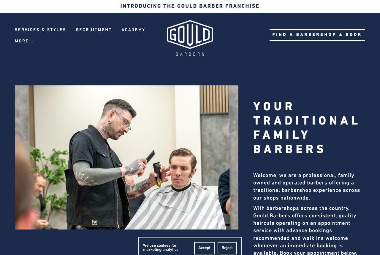
Gould Barbers website — Barber Franchise design example
Real site · UK
  • Barber Franchise
  • Traditional

Gould Barbers: Franchise systems, family voice

Gould Barbers scales a family trade across the UK without losing the plot: 'Your Traditional Family Barbers' leads, and the franchise machinery — 'Introducing the Gould Barber franchise,' a Find a Barbershop & Book button, recruitment and academy nav links — stays subordinate to it. The deep navy canvas with thin-line illustrations of clippers and combs gives the brand a crafted, almost letterpress feel that photography alone wouldn't, and the roundel logo stamps every location with the same mark. It's the rare multi-site trades brand that reads warmer, not colder, as it grows. The transferable move: lead with what the customer buys (a traditional cut from family barbers) and let the empire-building live in the navigation.

Master Barbers LA website — Heritage Shop design example
Real site · Los Angeles, CA
  • Heritage Shop
  • Vintage

Master Barbers LA: A wordmark big enough to be the hero

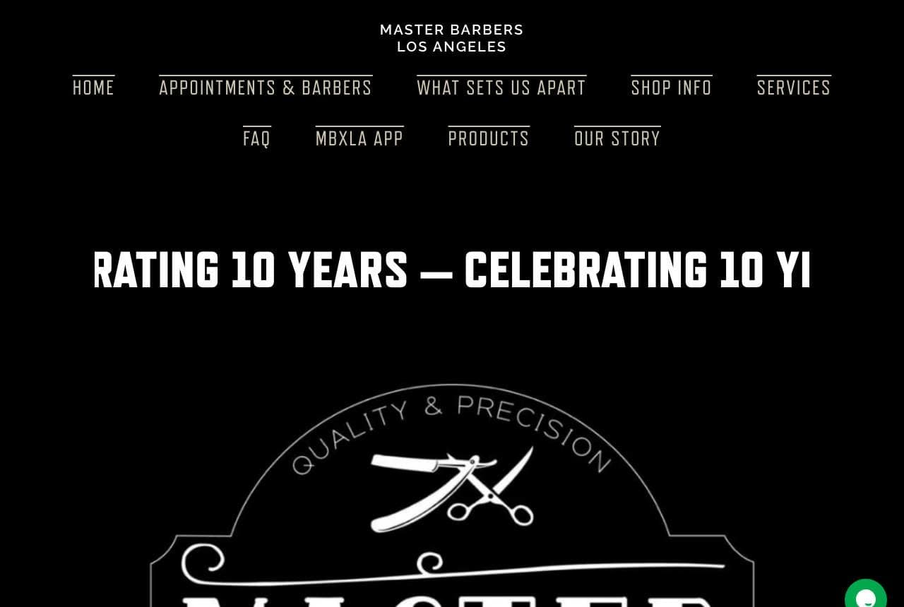
Master Barbers LA skips photography entirely and lets a giant Victorian-style crest — 'MASTER BARBERS, Los Angeles,' ringed with 'Quality & Precision' and crossed scissors — fill the opening screen like a chalkboard sign, while a marquee ticker scrolls 'Celebrating 10 Years' across the top. It's pure sign-painting heritage translated to the web, and it works because barbering is one of the few trades whose visual tradition (poles, crests, hand-lettering) customers actually recognize and trust. No hero photo means no stock-photo risk and instant differentiation from every moody-interior competitor. If your trade has an iconography, typography alone can carry the brand — provided you commit to it at poster scale.

Ironside & Crowe Barber Co — Heritage Barbershop website design you can build with Zarla
Build this with Zarla
  • Heritage Barbershop
  • Confident

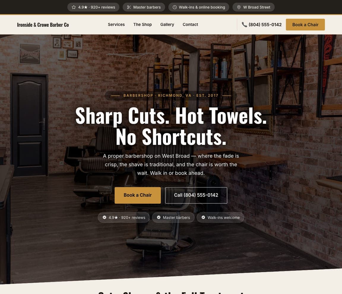
Ironside & Crowe Barber Co: Hot towels and a priced menu

Ironside & Crowe Barber Co is Zarla's barbershop template, and it opens on the dark-showcase hero with the cadence of a straight razor: 'Sharp Cuts. Hot Towels. No Shortcuts.' Charcoal and brass set the same heritage register as the best shops on this page, but the template's real advantage is structural — a priced service menu up front (the single thing barbershop customers hunt for and most shop sites hide), a hot-towel-shave section that sells the premium ritual, a fresh-cuts gallery, and an online booking form to close. Everything a walk-in-or-book shop needs, nothing it doesn't. Clone it, set your prices, drop in your cuts, and the site's live in about 30 seconds.

See this template
Beacon & Blade Shave Parlor — Shave Parlor website design you can build with Zarla
Build this with Zarla
  • Shave Parlor
  • Ritual

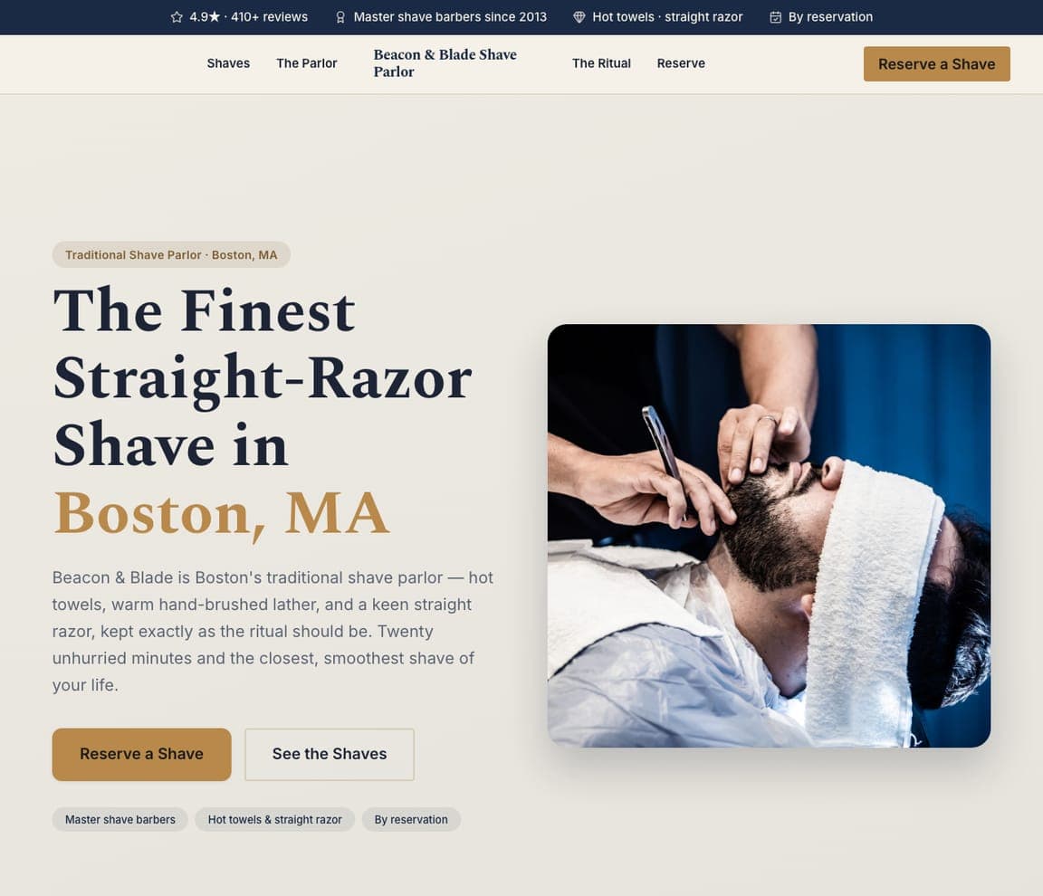
Beacon & Blade Shave Parlor: The shave as a twenty-minute ritual

Beacon & Blade Shave Parlor sells an experience, not a haircut: 'The Finest Straight-Razor Shave in Boston, MA,' beside a hot-towel shave in progress, promising 'hot towels, warm hand-brushed lather, and a keen straight razor, kept exactly as the ritual should be — twenty unhurried minutes and the closest, smoothest shave of your life.' Where a barbershop sells speed, a shave parlor sells slowness — the ritual, the pampering, the escape — so the warm cream-and-serif design and 'by reservation' framing position it as a premium, appointment-only indulgence, not a walk-in trim. For a barber who wants higher tickets and a distinct brand, spinning off a traditional shave as its own experience — named, unhurried, reservation-only — commands a price and a loyalty a $30 cut never will. Sell the twenty minutes, not the blade.

See this template
Fade Theory — Skin-Fade Specialist website design you can build with Zarla
Build this with Zarla
  • Skin-Fade Specialist
  • Modern

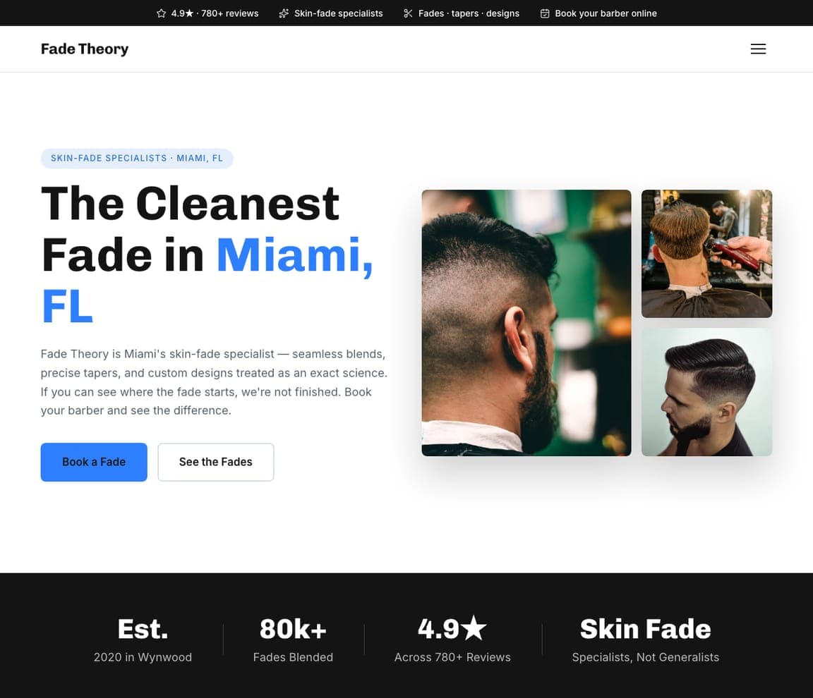
Fade Theory: If you can see where it starts, we're not done

Fade Theory narrows to the single most-requested cut and owns it: 'The Cleanest Fade in Miami, FL,' with a grid of crisp fade shots and the mic-drop standard — 'if you can see where the fade starts, we're not finished… specialists, not generalists.' Naming one cut and treating it as 'an exact science' (seamless blends, precise tapers) is a magnet for the young, style-conscious client who cares intensely about that specific detail and will travel for the barber who nails it. The bright-blue modern design and '80k+ fades blended' stat back the claim. For a barber, choosing a signature cut and going all-in — one thing, done better than anyone — beats being one more shop that 'does everything.' The specialist wins the customer who knows exactly what they want.

See this template
Little Legends Barbershop — Kids Barbershop website design you can build with Zarla
Build this with Zarla
  • Kids Barbershop
  • Playful

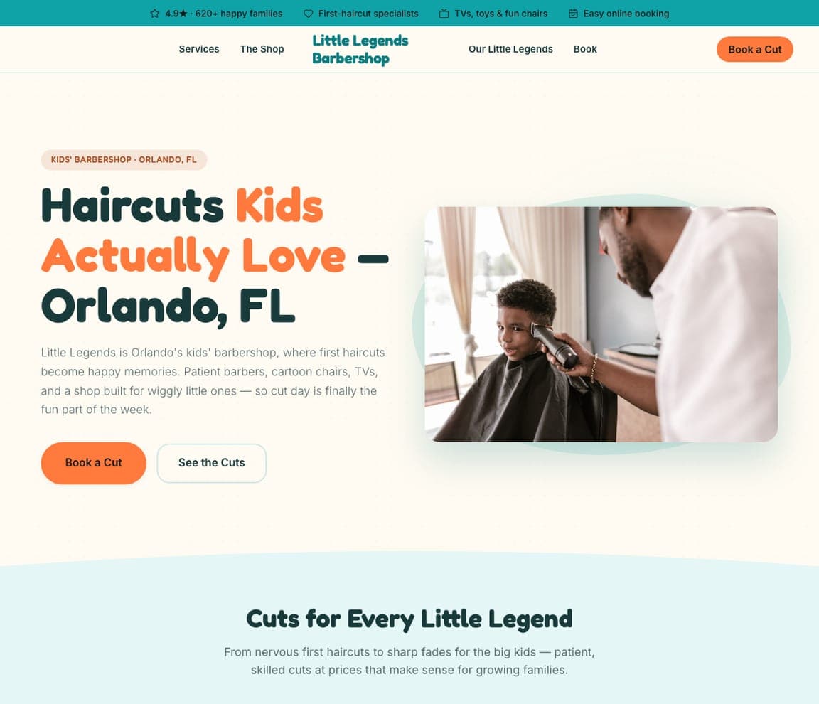
Little Legends Barbershop: Haircuts kids actually love

Little Legends Barbershop solves a real parental headache: 'Haircuts Kids Actually Love — Orlando, FL,' promising 'patient barbers, cartoon chairs, TVs, and a shop built for wiggly little ones — so cut day is finally the fun part of the week,' where 'first haircuts become happy memories.' A kids' barbershop is a completely different business from a men's shop — the customer is really the parent, and the fear is a screaming toddler and a bad cut — so the playful orange-and-mint design, the 'first-haircut specialists' badge, and the empathetic 'happy memories' copy speak straight to that. For a barber, carving out a kids-and-families niche — with the patience, the distractions, and the warm branding to match — owns a loyal, referral-heavy audience that the cool grown-up shops actively avoid.

See this template
Crown & Kings Barbershop — Black-Owned Barbershop website design you can build with Zarla
Build this with Zarla
  • Black-Owned Barbershop
  • Cultural

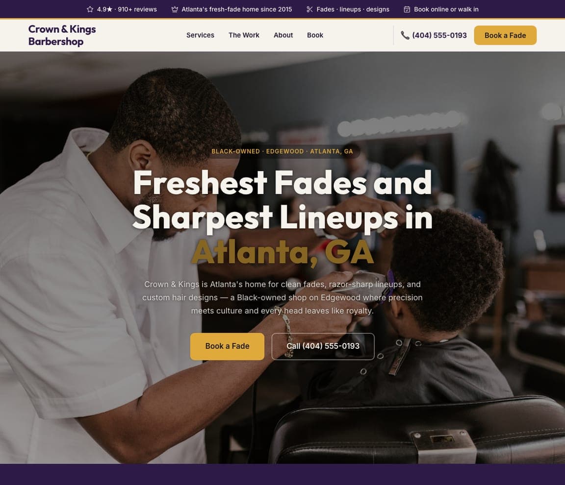
Crown & Kings Barbershop: Where precision meets culture

Crown & Kings Barbershop leads with identity and craft together: 'Freshest Fades and Sharpest Lineups in Atlanta, GA,' over a warm shop scene, as 'a Black-owned shop on Edgewood where precision meets culture and every head leaves like royalty.' The barbershop is a cornerstone of Black community and culture, so naming that heritage explicitly — and pairing it with the technical pride (clean fades, razor-sharp lineups, custom designs) — signals both belonging and skill to the exact clientele it serves. The dark-and-gold palette reads proud and premium. For a shop whose community and culture are central to who it is, leading with that identity isn't limiting — it's the strongest possible connection with the customers looking for exactly their shop. Representation and craft, stated together, is the pitch.

See this template
Sterling & Cole Executive Grooming — Executive Grooming website design you can build with Zarla
Build this with Zarla
  • Executive Grooming
  • Corporate

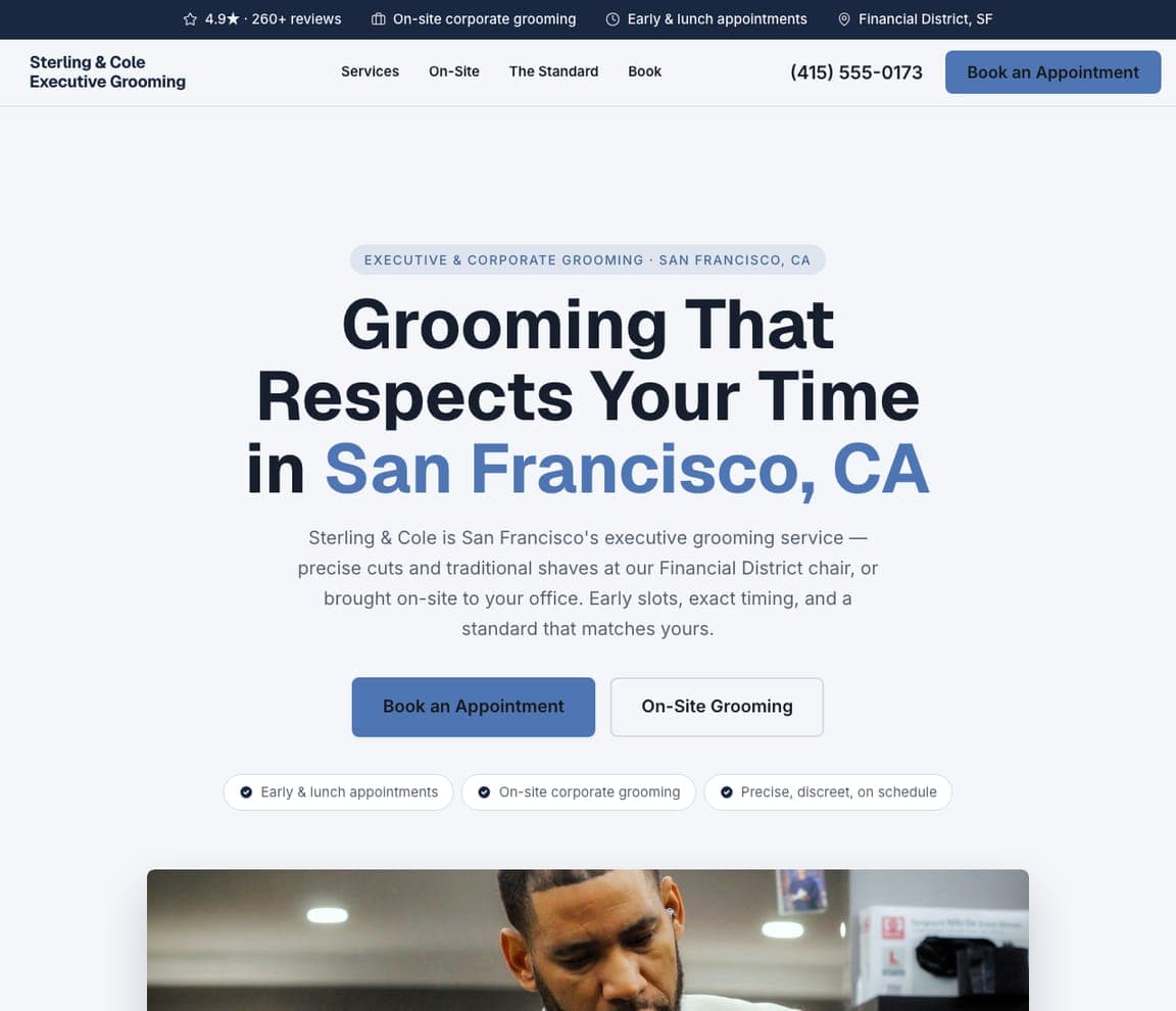
Sterling & Cole Executive Grooming: Grooming that respects your time

Sterling & Cole Executive Grooming targets the busy professional, not the weekend walk-in: 'Grooming That Respects Your Time in San Francisco, CA,' offering 'precise cuts and traditional shaves at our Financial District chair, or brought on-site to your office — early slots, exact timing.' The executive client's real constraint isn't money, it's time, so leading with 'respects your time,' 'early & lunch appointments,' and on-site corporate grooming speaks to exactly what they value — efficiency and discretion — and the clean, corporate-blue design looks like the professional world they live in. For a barber chasing higher-value professional clients, positioning around time and convenience (on-schedule, on-site, early slots) rather than style pre-qualifies for premium rates from customers who'll happily pay to not waste an afternoon at the barbershop.

See this template
Curbside Cuts — Mobile Barber website design you can build with Zarla
Build this with Zarla
  • Mobile Barber
  • Convenient

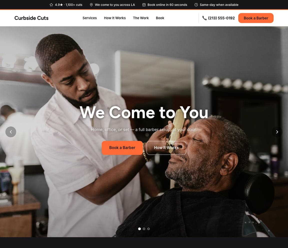
Curbside Cuts: The barber comes to you

Curbside Cuts removes the trip entirely: 'We Come to You,' with 'a full barber setup at your door — home, office, or set,' and 'book online in 60 seconds, same-day when available.' Mobile is a genuinely different value proposition from a shop — the customer is buying convenience above all (no drive, no wait, cut in your own space), whether that's a busy parent, a film set, or someone who just wants it easy — so leading with 'we come to you' and frictionless booking is the whole pitch. For a barber, going mobile trades the overhead of a storefront for a premium-convenience position, and a website that leads with the door-to-door promise (plus 60-second booking) converts the customer who values their time over the traditional barbershop hang.

See this template

Frequently asked

Where can I find good barber website examples?

Right here — this page curates barber website examples two ways: standout real businesses (each linked, so you can explore the live site) and professionally designed Zarla templates you can clone and make your own. Every example comes with a note on why the design works — trust signals, layout, calls to action — so you can copy the move, not just the look.

What makes a good barber website?

A good barber website earns trust in the first few seconds, leads with strong visuals of the work, gives visitors one obvious action, and loads fast on a phone. Every design below leads with proof and a single clear call to action rather than a wall of text.

How much does a barber website cost?

A custom barber website from a designer typically runs into the thousands up front, and template builders charge roughly $16–$30 per month. An AI builder generates a complete, editable design for free and only charges (on the Premium plan) when you publish to your own domain — so you can build and preview before spending anything.

Do I need a designer to build a barber website?

No. Several designs on this page were generated by Zarla and are fully editable — you describe your business and get a complete, professionally designed site in about 30 seconds, then refine it by chatting. Building and previewing is free; publishing to your own domain needs the Premium plan.

What pages does a barber website need?

Most barber businesses need just a few: a home page that proves trust and points to one clear action, an about page that puts a face to the business, a services or work page that shows what you do, and a contact page with a form and a phone number. Local businesses also benefit from location or service-area pages that help them show up in nearby searches.

How do I get more customers from my barber website?

Lead with proof in the first few seconds (reviews, real photos, results), make one action obvious on every screen (call, book, or enquire), and keep it fast on mobile — most visitors arrive on a phone. The designs above each do this differently, but they all earn trust early and remove friction from the next step.

You've seen what works. Now make it yours.

Describe your business and Zarla designs a complete, professional website in about 30 seconds — built to convert, just like the ones above.

Free to build and preview · no credit card · publish to your own domain on Premium