Inspiration · Bistro

The Best Bistro Website Examples, Explained

Looking for bistro website examples? These 12 are the strongest we found — Le Diplomate's waiter setting a sunlit terrace table, Balthazar's gilded border around a photograph of the room at full tilt, Zimmi's menu book, bowl, plate and grapevine mask standing in for a nav — plus bistro designs you can build with Zarla, each with a breakdown of the specific move that turns a weeknight search into a reservation. A bistro's website has one job most business sites don't: it has to feel like a table is waiting. Find an approach you love and you can build a site in that spirit, free, in about 30 seconds.

Real sites + designs you can build with Zarla — free to build and preview, no credit card

What makes a great bistro website

The best bistro websites choose one thing to photograph — the room (Chez Fifi's red banquettes, Balthazar's mirrors), the plate (Petit Trois's onion soup, Bistro Jeanty's pastry-topped soup), or the people (Le Diplomate's waiter, Le Pigeon's chef at the copper pass) — and let a short nav do the rest. Notice how few carry a headline at all: Routier prints its hours and 'walk ins welcome' where a tagline would go, Buvette runs a letterpress print of its own name, and Zimmi's replaces the menu bar with objects from the table. Reservations sit in the header on nearly every one, and 'gift cards' and 'private events' ride along as links, never banners. Every example below makes you want to sit down before it tells you what's on the menu.

Le Diplomate website — Parisian Brasserie design example
Real site · Washington, DC
  • Parisian Brasserie
  • Sunlit
  • Wood + brass

Le Diplomate: A waiter setting the sunlit terrace, and one red button

Le Diplomate opens on service: a photograph of the sidewalk terrace in late-afternoon light — a waiter in a white shirt, dark tie and long apron laying a marble bistro table, wicker-back chairs, lace café curtains and brass lamps in the windows behind him. Over the photo sit only the essentials: a hamburger menu top-left, the 'Le Diplomate' logo top-center, and a red 'BOOK A TABLE' button in the top-right corner. There is no headline in the first screen; the sentence that follows — 'A Parisian brasserie, reimagined for Washington.' — waits until you scroll. The picture does the positioning, because a waiter who sets a table that carefully is the promise. Le Diplomate shows a brasserie how to sell hospitality instead of décor: photograph a person doing the job well, keep the button red and small, and say nothing until the second screen.

  • A photograph of service — the waiter, not the plate — as the hero
  • One red 'Book a Table' in the corner; nothing else over the photo
  • The positioning sentence held for the second screen

Steal this: Photograph your best server mid-task in good light and make that the home page — one small booking button, no headline.

Visit Le Diplomate

Opens a similar Zarla design you can make yours.

Balthazar website — Grand Brasserie design example
Real site · New York, NY
  • Grand Brasserie
  • Classic
  • Cream + red

Balthazar: A gilded border around the room at full tilt

Balthazar frames itself like a menu card: a cream page with an ornate gold border, the 'BALTHAZAR RESTAURANT' logo in red with flourishes, and a sidebar drawn as a decorative panel — the reservations phone number, the Spring Street address, a 'Reservations' button, the nav as a list (Home, About Us, Menus, Bakery, Private Events, Hours & Location), a 'GIFT CARDS' button and a 'DOORDASH-CAVIAR DELIVERY' button beneath. To the right, a photograph of the dining room at full tilt — red banquettes, mirrors, waiters in white with aprons, a tower of bread — and under it a heading in condensed caps, 'BALTHAZAR NEW YORK', with the founding line: 'opened in SoHo in the spring of 1997. The bustling, romantic brasserie serves traditional French fare from breakfast through supper every day'. Balthazar shows a grand brasserie how to look like itself online: borrow the menu's ornament, print the phone number where a regular would look, and photograph the room busy.

  • The whole page drawn as a bordered menu card
  • Phone, address and 'Reservations' in a sidebar panel — the regulars' view
  • The room photographed full, with the staff in it

Steal this: If your menu has a look — a border, a flourish, a typeface — build the home page out of it, and photograph the room at its busiest.

Visit Balthazar

Opens a similar Zarla design you can make yours.

Zimmi's website — Neighborhood Bistro design example
Real site · New York, NY
  • Neighborhood Bistro
  • Playful
  • Cream + green

Zimmi's: A menu book, a bowl, a plate and a grapevine mask as the nav

Zimmi's replaces the menu bar with things from the table: on a plain cream ground, under a thin serif 'ZIMMI'S' and an Instagram icon, four objects sit at staggered heights with small-caps labels beneath — a green leather menu book embossed with the name ('RESERVE'), a scalloped copper bowl ('ABOUT'), a white plate with a slice of terrine and radicchio ('MENU'), and a dark bronze mask of a bearded face crowned with grapes ('CONTACT'). No headline, no photograph of the room, no button; the objects are the site. It reads like a still life and works like a nav, and the restraint says West Village more clearly than a photo of the block would. Zimmi's shows a small neighborhood bistro how to be charming with almost nothing: choose four objects that mean the four things a visitor wants, photograph them cleanly, and label them.

  • Four photographed objects doing the nav's job
  • The menu book embossed with the name as the 'Reserve' link
  • Cream ground, one serif, no headline — restraint as personality

Steal this: Photograph four objects from your restaurant on one background and make them your menu — the plate is 'Menu', the book is 'Reserve'.

Visit Zimmi's

Opens a similar Zarla design you can make yours.

Buvette website — Gastrothèque Group design example
Real site · New York, NY
  • Gastrothèque Group
  • Typographic
  • White + blue

Buvette: A letterpress print of the name, cropped tight

Buvette leads with its own print: a thin red small-caps nav across the top that is also the list of cities — 'BUVETTE · NEW YORK · LONDON · TOKYO · SEOUL' — and then a full-width close-up photograph of a letterpress poster, the name set in blue wood-type capitals on white, cropped and tilted so only 'BUVE' and the top of 'TTE' fit the screen, a red printed flourish curling in at the corner. The ink is uneven, the paper is grained; it looks pulled by hand, which is the point. No headline, no photo of a plate, no button in the first screen — the name, the cities and the print. Buvette shows a bistro with a strong graphic identity how to use it: put the print on the page at poster scale, let the crop do the drama, and let the city list say how far it has traveled.

  • A letterpress print of the wordmark as the hero, cropped mid-letter
  • The city list doubling as the nav
  • Blue ink, red flourish, white paper — a palette from the press

Steal this: If you have printed matter — a poster, a menu, a matchbook — photograph it close and tilted and let the crop cut the name; the texture is the brand.

Visit Buvette

Opens a similar Zarla design you can make yours.

Petit Trois website — Chef-Driven Bistro design example
Real site · Los Angeles, CA
  • Chef-Driven Bistro
  • Appetizing
  • Green + gold

Petit Trois: French onion soup, cheese spilling over the rim

Petit Trois puts the dish on the page at the size of the screen: a dark green header with 'PETIT TROIS' in pale tracked capitals, a nav that lists the locations as items (Home, About, L'Original, Le Valley, Aspen, Shop, Events, Careers, Press), an Instagram icon and an outlined 'Reservations' pill, then a close photograph of a crock of French onion soup — the gratinéed cheese browned and blistered, spilling over the rim onto a blue-banded plate. Nothing is written over it. The green frame around the photograph makes the gold of the cheese louder, and the soup is the argument: this is the bistro classic, done properly. Petit Trois shows a bistro with a famous dish how to lead with it: one plate, photographed close and warm, framed by a single brand color, reservations one click to the right.

  • One signature dish photographed close, nothing written over it
  • Locations named in the nav ('L'Original', 'Le Valley', 'Aspen')
  • A dark green frame that makes the gold of the food louder

Steal this: Pick the one dish people drive across town for, photograph it close enough to see the texture, and frame it in your brand color.

Visit Petit Trois

Opens a similar Zarla design you can make yours.

Le Pigeon website — Chef's-Counter Bistro design example
Real site · Portland, OR
  • Chef's-Counter Bistro
  • Intimate
  • Copper + wood

Le Pigeon: The chef at the copper pass, stools waiting

Le Pigeon shows where you'll sit and who's cooking: under a slim dark header — 'CANARD', 'FLOR WINES', 'RESERVATIONS', 'SHOP' on the left, the 'LEPIGEON' wordmark centered — a photograph of the open kitchen from the counter: steel pots hanging under a copper hood, a chef in a white tee and cap working at the pass, plates stacked, framed awards and wallpaper on the wall, and four wooden stools pulled up to the copper-fronted counter with water glasses set. No headline; the H1 lower on the page says 'we'd love to see you'. The header also names the sister businesses (Canard, Flor Wines), which tells you this is a small group with one address. Le Pigeon shows a chef's-counter bistro how to sell the seat: photograph the counter from the guest's side, with the cook in frame, and keep the type to a wordmark.

  • The kitchen photographed from the guest's stool, chef in frame
  • Sister businesses named in the header — a small group, plainly
  • 'we'd love to see you' as the only headline

Steal this: If guests sit at the counter, photograph the counter from a stool with the cook working — the seat sells itself.

Visit Le Pigeon

Opens a similar Zarla design you can make yours.

Routier website — Neighborhood Restaurant design example
Real site · San Francisco, CA
  • Neighborhood Restaurant
  • Minimal

Routier: Hours and 'walk ins welcome' set in serif on marble

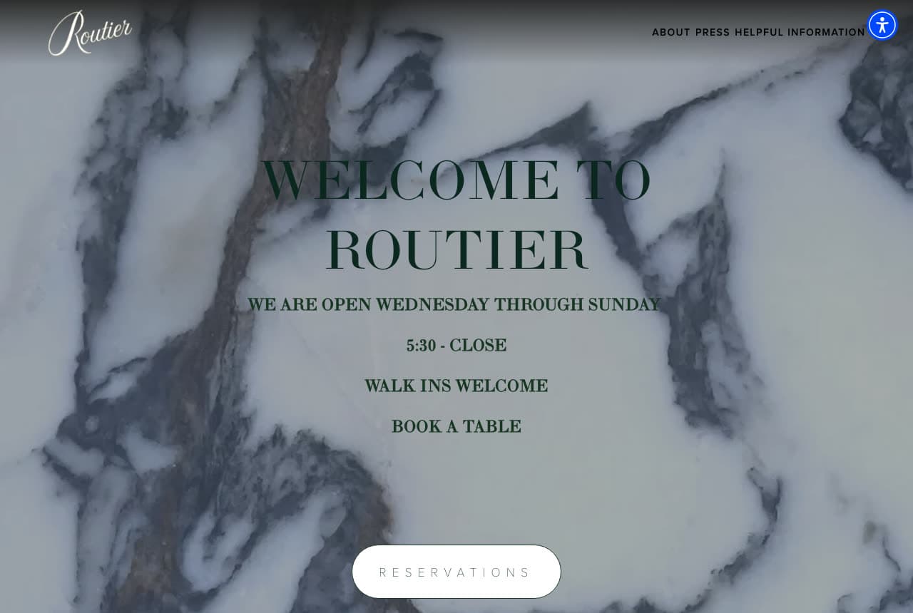
Routier writes the practical facts where a tagline would go: over a full-bleed photograph of white-and-grey marble, a 'Routier' script logo top-left and a tiny nav top-right (About, Press, Helpful Information), the headline in dark green serif capitals — 'WELCOME TO ROUTIER' — and beneath it, in smaller tracked caps, the whole operating story: 'WE ARE OPEN WEDNESDAY THROUGH SUNDAY / 5:30 - CLOSE / WALK INS WELCOME / BOOK A TABLE', then a white pill, 'RESERVATIONS'. No photograph of food or room; the marble is the texture and the type is the design. It answers the two questions a neighborhood diner asks — are you open, do I need to book — before anything else. Routier shows a small restaurant how to be useful and elegant at once: put the hours in the headline, say 'walk-ins welcome' in capitals, and let one material carry the mood.

Visit Routier

Opens a similar Zarla design you can make yours.

Bistro Jeanty website — Country French Bistro design example
Real site · Yountville, CA
  • Country French Bistro
  • Homely

Bistro Jeanty: Tomato soup under a pastry dome, and a bicycle in the logo

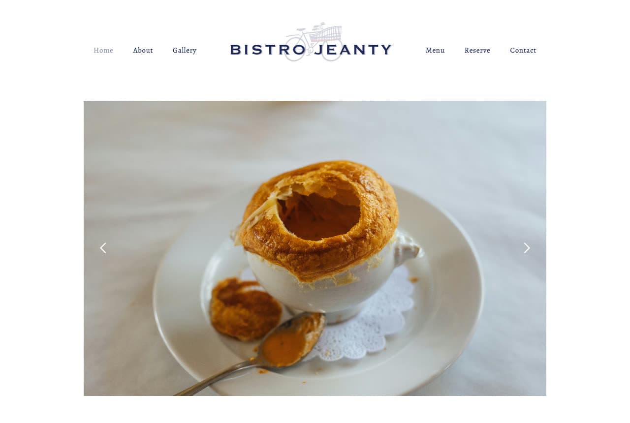
Bistro Jeanty keeps the page white and puts the famous bowl in the middle: a centered nav split around the logo — Home, About, Gallery on the left, 'BISTRO JEANTY' in navy capitals with a small bicycle drawn above the name, Menu, Reserve, Contact on the right — and a slideshow photograph of the tomato soup en croûte, a crock capped with a golden puff-pastry dome, a spoon and a doily beside it. The H1 beneath begins 'Bienvenue à Bistro Jeanty — Welcome to your neighborhood bistro', which is the whole positioning for a Napa Valley institution that could have claimed more. The bicycle in the logo says French countryside; the soup says why people come. Bistro Jeanty shows a destination bistro how to stay a neighborhood one: white page, the signature dish, a greeting in two languages, and reservations in the nav.

Visit Bistro Jeanty

Opens a similar Zarla design you can make yours.

Chez Fifi website — Classic French Bistro design example
Real site · New York, NY
  • Classic French Bistro
  • Atmospheric

Chez Fifi: Wood panels, red banquettes, floral curtains — the room as the page

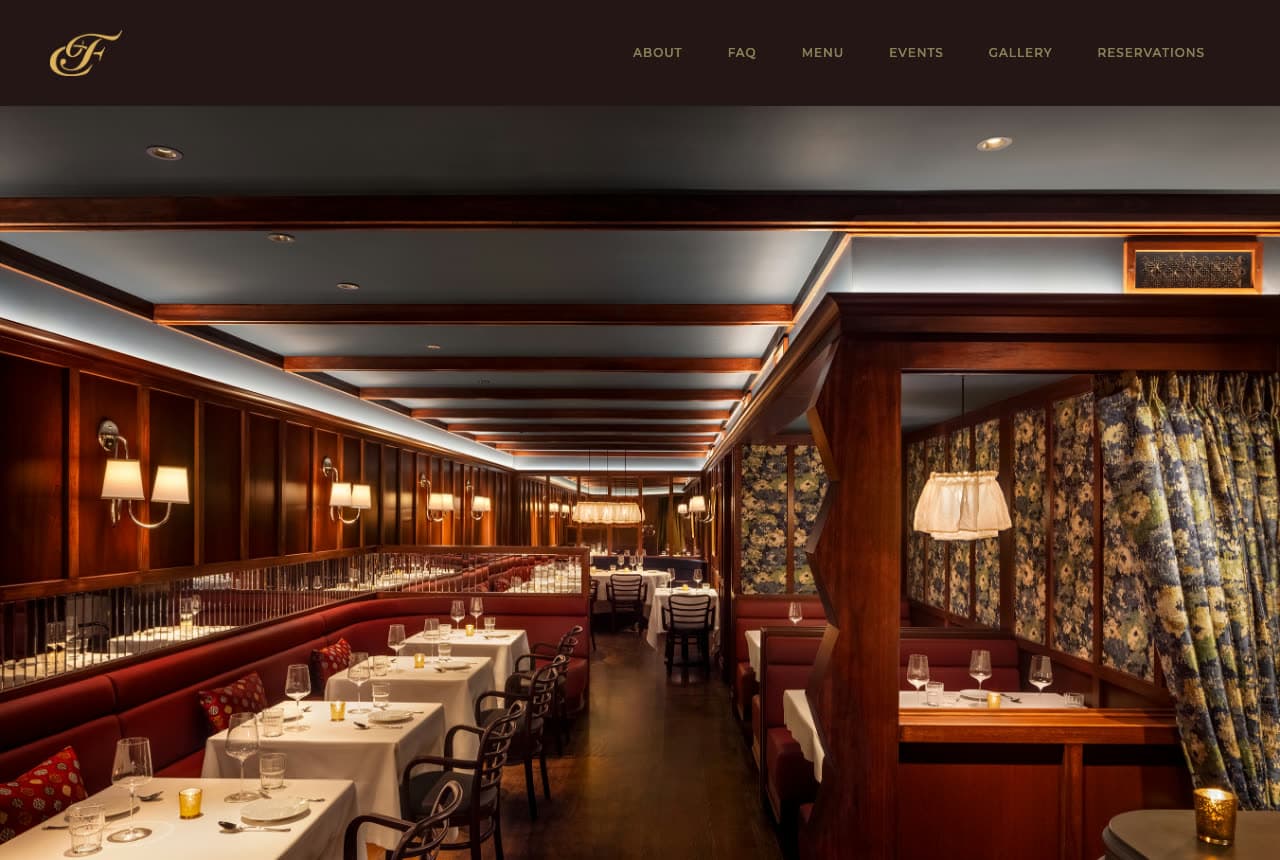
Chez Fifi lets the room speak: a dark brown header with a gold script 'F' monogram and a small-caps nav (About, FAQ, Menu, Events, Gallery, Reservations), then a photograph of the dining room with the lamps on — polished wood panelling, red leather banquettes, white tablecloths set with glassware, brass sconces, a pendant lamp over a booth framed by floral-print curtains, a candle on a corner table. No headline, no paragraph, no button in the first screen. The photograph is lit like a film still, and the monogram in gold is the only ornament the header needs. Chez Fifi shows an uptown bistro how to sell atmosphere without a word: photograph the room empty and lit, keep the header dark and quiet, and put 'Reservations' last in the nav where the eye ends.

Visit Chez Fifi

Opens a similar Zarla design you can make yours.

Chez Odette — Adaptable Template website design you can build with Zarla
Build this with Zarla
  • Adaptable Template
  • Warm

Chez Odette: 'A Little Corner of Paris' beside the dark dining room

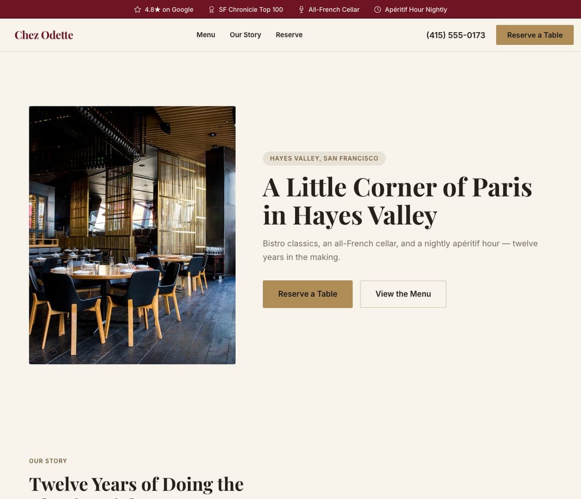
Chez Odette is the Zarla French-bistro template: a cream ground, a photograph of a dim dining room — gold slat screens, a lit wine fridge, black chairs — on the left, and on the right an eyebrow that names the neighborhood ('HAYES VALLEY, SAN FRANCISCO'), a serif headline — 'A Little Corner of Paris in Hayes Valley' — a one-line description ('Bistro classics, an all-French cellar, and a nightly apéritif hour — twelve years in the making') and a gold 'Reserve a Table' beside 'View the Menu'. The top strip carries the Google rating, a Chronicle Top 100 listing, the all-French cellar and the apéritif hour. It's Chez Fifi's room with Balthazar's founding line and a button. Clone it, name your neighborhood, and the strip becomes your listings.

See this template
Bluebird Kitchen — Adaptable Template website design you can build with Zarla
Build this with Zarla
  • Adaptable Template
  • Bright

Bluebird Kitchen: 'Brunch, All Day, Every Day' over a brunch table

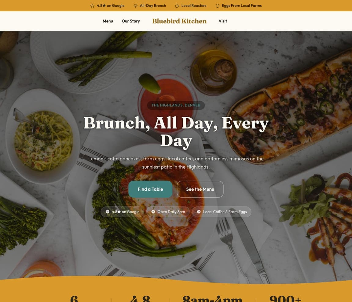
Bluebird Kitchen is the all-day brunch template, and the closest catalog match to the dish-first bistros here (Petit Trois, Bistro Jeanty): a darkened overhead photograph of a brunch table — asparagus, a plate of pasta, a flatbread, broccolini, a bloody mary — an eyebrow in a green pill ('THE HIGHLANDS, DENVER'), a white serif headline — 'Brunch, All Day, Every Day' — a one-line description that lists the pancakes, the eggs, the coffee and the mimosas, a teal 'Find a Table' beside an outlined 'See the Menu', and three chips beneath (the rating, 'Open Daily 8am', 'Local Coffee & Farm Eggs'). The top strip repeats the rating and the sourcing. Clone it for a daytime bistro, and the chips become your hours and your farms.

See this template
Field Note — Adaptable Template website design you can build with Zarla
Build this with Zarla
  • Adaptable Template
  • Seasonal

Field Note: 'A Season on a Plate' with the farms counted

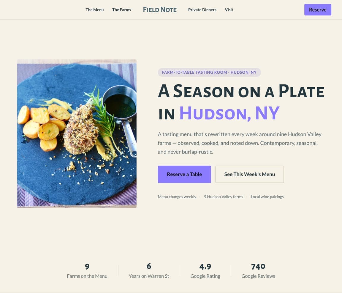
Field Note is the farm-to-table template, and the closest catalog match to the chef-led rooms here (Le Pigeon, Routier): a cream ground, a photograph of a plated course on the left, an eyebrow ('FARM-TO-TABLE TASTING ROOM · HUDSON, NY'), a small-caps serif headline — 'A SEASON ON A PLATE IN HUDSON, NY' with the town in violet — a paragraph about a menu rewritten weekly around nine Hudson Valley farms ('Contemporary, seasonal, and never burlap-rustic'), a violet 'Reserve a Table' beside 'See This Week's Menu', and a line of small print (menu changes weekly, nine farms, local wine pairings). Clone it for a seasonal bistro, and the farm count becomes yours.

See this template

Frequently asked

Where can I find good bistro website examples?

Right here — this page curates bistro website examples across the spectrum: a grand SoHo brasserie (Balthazar), a Parisian brasserie in Washington (Le Diplomate), West Village neighborhood rooms (Zimmi's, Buvette), a Los Angeles French bistro (Petit Trois), a chef's-counter bistro in Portland (Le Pigeon), a walk-ins-welcome room in San Francisco (Routier), a Napa Valley institution (Bistro Jeanty) and an uptown Manhattan dining room (Chez Fifi) — each linked so you can explore the live site — plus professionally designed Zarla French-bistro, brunch-cafe and farm-to-table templates you can clone and make your own. Every example includes a note on why the design works — the photograph, the nav, the reservation path — so you can copy the thinking, not just the look.

What makes a good bistro website?

It feels like the room and answers three questions in five seconds: what kind of place, when are you open, can I book. The strong examples above open on one photograph — the dining room, a signature dish, or the staff at work — keep 'Reservations' in the header, print the hours somewhere a phone can find them, and write almost nothing else. The copy is a greeting ('Bienvenue', 'Welcome to Routier'), a founding line ('opened in SoHo in the spring of 1997'), or a plain description ('Welcome to your neighborhood bistro'), and the photography is of your tables, not stock.

How much does a bistro website cost?

A custom site from a hospitality agency typically runs from a couple of thousand dollars up, restaurant-platform builders charge a monthly fee for the site plus reservations, and general template builders are roughly $16–$30 per month. An AI website builder generates a bistro site — menu, hours, reservations link, private events, gift cards — from a short description in seconds, then lets you edit it in plain language. Spend the money you save on one photo session of the room with the lamps on and a plate in the foreground.

Should a bistro website show the room, the food or the people?

Whichever one your regulars would photograph. The sites above split three ways on purpose: rooms with character lead with the room (Chez Fifi, Balthazar), kitchens with a signature dish lead with the plate (Petit Trois, Bistro Jeanty), and places known for their service or their chef lead with a person (Le Diplomate, Le Pigeon). Pick one for the first screen and put the other two a scroll below — a hero that tries to show all three shows none of them.

What pages does a bistro website need?

Most bistros need five: a home page with the mood, hours and address, a menu page (dinner, brunch and bar as pages, not PDFs), a reservations page or link straight to your booking system, a private-events page (the highest-margin thing a bistro sells), and a contact page with a map. Add gift cards and a shop if you have them — Balthazar, Petit Trois and Le Pigeon all put them in the nav because they sell.

How do bistros get more customers from their website?

Make booking a table one tap from the first screen, print the hours and 'walk-ins welcome' if it's true, and give private events their own page with a form. The converting pattern above: Le Diplomate's red 'Book a Table' in the corner of the photograph, Routier's hours and 'walk ins welcome' as the headline, Balthazar's reservations phone number and button in the sidebar, Zimmi's 'RESERVE' as the first object on the page. Then let the photography do the marketing — a bistro that looks like this gets shared.

You've seen what works. Now make it yours.

Describe your business and Zarla designs a complete, professional website in about 30 seconds — built to convert, just like the ones above.

Free to build and preview · no credit card · publish to your own domain on Premium