Inspiration · Coworking

The Best Coworking Website Examples, Explained

Looking for coworking website examples? These 12 are the strongest we found — Indie Desk's 'Work Like You Mean It.' in slab capitals beside a $20 day-pass stamp, Gravitate's 'wifi& coffee& people& space.', Workbar's 'We saved you a seat.' — plus coworking designs you can build with Zarla, each with a breakdown of the specific move that turns a 'coworking near me' search into a tour. A coworking space's website has one job most business sites don't: it has to make a stranger want to sit down among strangers. Find an approach you love and you can build a site in that spirit, free, in about 30 seconds.

Real sites + designs you can build with Zarla — free to build and preview, no credit card

What makes a great coworking website

The best coworking websites sell the seat and the people in the same screen: a photograph of members actually working or talking (Gravitate's bleacher chat, Kiln's three heads over a laptop, VIDA's member on the sofa) and a line that says what kind of place it is ('A Securus Locus', 'Workspace as creative as you', 'Independent coworking… No lease'). Notice how many put a price or a pass in the first screen — Indie Desk's $20 day pass, Workbar's 'Book by the Day' — and how often 'Book a Tour' or 'Take a Tour' is the button (Indie Desk, Workbar, Kiln, VIDA), because a tour converts better than a plan page. Notice the locations named up front — VIDA's pills, Second Home's underlined cities — and the sub-brands in the nav (incubator, podcast, events, mail services). Every example below makes you want to bring your laptop before it tells you the monthly rate.

Indie Desk website — Independent Coworking design example
Real site · Los Angeles, CA
  • Independent Coworking
  • Direct
  • Cream + brown

Indie Desk: 'WORK LIKE YOU MEAN IT.' beside a $20 day-pass stamp

Indie Desk prints its terms like a ticket: a thin strip across the top lists the facts (Est. 2011 · DTLA's first coworking space · Wells Fargo North Tower · Suite 3310 · the phone number · EN/ES), a cream header carries the 'INDIE' stamp logo, a nav (Home, Plans, Offices, Events, Calendar, Book, Community), 'My account', 'Book a tour' and a red 'Day pass · $20 →', and the hero says the rest in brown slab capitals — 'WORK LIKE YOU MEAN IT.' — under an eyebrow ('A REAL DESK · DOWNTOWN LA · SINCE 2011') and over a paragraph with the model in it: 'Independent coworking in the Wells Fargo North Tower, 33rd floor. Founder-run. No lease. Pay by the day, the week, or the month.' Two buttons — a red 'Book a day pass · $20' and a cream 'Take a 20-min tour' — and a photograph of a member at a window desk with a '2011' tag and a '$20/day' ticket stamped over it. Indie Desk shows an independent space how to beat the chains: state the floor, the year and the price, and make the day pass the first button.

  • The price in the header and the hero — 'Day pass · $20'
  • 'Founder-run. No lease.' — the model stated as a virtue
  • A 20-minute tour as the second button, with the minutes in it

Steal this: Put your day-pass price in the header and in the first button, and say the floor, the year and 'no lease' in the paragraph — specifics beat adjectives.

Visit Indie Desk

Opens a similar Zarla design you can make yours.

Gravitate Coworking website — Community Coworking design example
Real site · Des Moines, IA
  • Community Coworking
  • Warm
  • Cream + yellow

Gravitate Coworking: 'wifi& coffee& people& space.' beside a photo of the bleachers

Gravitate says who it's for before it shows the room: a cream page with the 'gravitate COWORKING' logo, a lowercase nav (locations, workspace, meetings, mail services, more) and an outlined 'VISIT US', then one bold sentence centered across the top of the hero — 'A community space full of freelancers, entrepreneurs, remote workers and startup team members who work independently, but don't want to work alone' — and beneath it a photograph of a dozen members chatting on tiered bleacher seating in front of a green wall, a yellow glow behind the frame, with the offer stacked beside it in heavy black: 'wifi& / coffee& / people& / space.™'. 'explore your space' begins below. The four-word list is the whole product, and 'people' is third on purpose. Gravitate shows a community-first space how to open: name the members in a sentence, photograph them talking, and list what you sell as four ampersands.

  • The members named in one sentence — freelancers, entrepreneurs, remote workers, startup teams
  • 'wifi& coffee& people& space.' — the offer as a four-word stack
  • A photograph of members talking, not working

Steal this: Describe your members in one honest sentence and reduce what you sell to four words with ampersands — it reads faster than a plan table.

Visit Gravitate Coworking

Opens a similar Zarla design you can make yours.

Workbar website — Coworking Network design example
Real site · Boston, MA
  • Coworking Network
  • Friendly
  • Cream + navy

Workbar: 'We saved you a seat.' with the open floor in an arch

Workbar greets rather than pitches: a pale-blue bar at the top offers free months, a white header carries the '·WORKBAR·' wordmark, a nav (Locations, Memberships, Office Space, Book by the Day, Why Workbar), a navy 'Book a Tour' and an outlined 'Contact Us', and the hero sets a serif line on cream — 'We saved you a seat.' — with 'Coworking & private office space' beneath and a paragraph that repeats the welcome ('We're here, we're Workbar, and we saved you a seat. Join our network inspiring workspaces in and around Boston'). To the right, inside a big arch shape, a photograph of the open floor with members at long desks under skylights; a navy 'Compare All Solutions' closes the copy. 'Book by the Day' in the nav says you can try it once. Workbar shows a coworking network how to sound hospitable: a sentence a host would say, the floor photographed busy, and a day option in the nav.

  • 'We saved you a seat.' — hospitality as the headline
  • 'Book by the Day' in the nav — a try-once option
  • The open floor photographed busy, framed in an arch

Steal this: Write your headline as something a host would say at the door — 'we saved you a seat' — and put a day option in the nav so the promise costs nothing to test.

Visit Workbar

Opens a similar Zarla design you can make yours.

Second Home website — Creative Workspace design example
Real site · London, UK
  • Creative Workspace
  • Playful
  • Cream + pink

Second Home: 'Workspace as creative as you' in typewriter type, three cities underlined

Second Home looks like the rooms it rents: a cream header with a circular logo, a pink 'Enquire now' and a hamburger, then a photograph of a lounge under a transparent roof — yellow beams, a red curtain, a cream armchair, a pink-legged plant stand, mid-century chairs — with the headline in a typewriter face, 'Workspace as creative as you', and three underlined links beneath it: Spitalfields, Holland Park, Lisbon. Under the hero, three small photographs — a bright roof, a disco ball in blue light, a garden with string lights — say events and nights as much as desks. No plan, no price, no tour button; an enquiry, a room that looks like nowhere else, and the neighborhoods as links. Second Home shows a design-led workspace how to sell by taste: photograph the strangest room, set the headline in a face nobody else uses, and let the cities be the nav.

  • The most distinctive room as the hero — a glass roof, a red curtain, pink legs
  • A typewriter headline: the type as the brand
  • The cities as underlined links under the headline

Steal this: If your space looks like nowhere else, photograph the strangest corner and set the headline in a typeface your competitors would never pick.

Visit Second Home

Opens a similar Zarla design you can make yours.

Kiln website — Boutique Office Network design example
Real site
  • Boutique Office Network
  • Polished
  • Cream + black

Kiln: 'A world within your workplace.' over three heads and one laptop

Kiln photographs collaboration and writes one serif line: a cream header with the 'kiln.' wordmark, a nav (Locations, Solutions, Meeting & Event Spaces, More) and a black 'Book a Tour', then a photograph of three people leaning over one laptop — a man grinning, a woman explaining, a third listening — with an eyebrow that lists the formats ('Coworking, Office, Meeting & Event Space'), a serif headline, 'A world within your workplace.', and a black 'Book a Tour →' beneath. Nothing else in the first screen: the sentence claims the culture, the photograph proves it, the button asks for a visit. Kiln shows a boutique office network how to stay premium: a warm photograph of real collaboration, one serif line about the world inside, and the tour as the only ask.

  • Three people over one laptop — collaboration as the photograph
  • The formats listed as the eyebrow: coworking, office, meeting and event space
  • 'Book a Tour' in the header and the hero — the only ask

Steal this: Photograph two or three real members solving something together and write one line about the world inside — then ask for a tour and nothing else.

Visit Kiln

Opens a similar Zarla design you can make yours.

VIDA Coworking website — Neighborhood Coworking design example
Real site · Portland, OR
  • Neighborhood Coworking
  • Bright
  • Green + coral

VIDA Coworking: 'Curated Coworking Spaces in Portland, Oregon' with three location pills

VIDA leads with a member and the map: a coral bar at the top announces the next opening ('VIDA is coming to NW PDX in October! Learn More →'), a white header carries the coral 'vida' circle, a nav (Locations, Membership, Book a Space, Community, About) and a coral 'Take A Tour', and the hero is a photograph of a member on a sofa among monstera leaves — laptop open, smiling, hand to her ear — with a light headline that is also the search phrase, 'Curated Coworking Spaces in Portland, Oregon', and three coral pills beneath it: 'NW PDX LOCATION', 'NE PDX LOCATION', 'BEAVERTON LOCATION'. The pills do what a locations page does, one tap earlier; the plants and the smile do the rest. VIDA shows a neighborhood chain how to convert on the first screen: the city in the headline, the neighborhoods as buttons, and a person who looks glad to be there.

  • The neighborhoods as three pills under the headline
  • The search phrase as the headline — 'Coworking Spaces in Portland, Oregon'
  • A next-opening announcement in the top bar

Steal this: Put your locations as pills directly under the headline — the visitor's first question is 'which one is near me', so answer it before the scroll.

Visit VIDA Coworking

Opens a similar Zarla design you can make yours.

The Hivery website — Coworking + Incubator design example
Real site · Mill Valley, CA
  • Coworking + Incubator
  • Welcoming

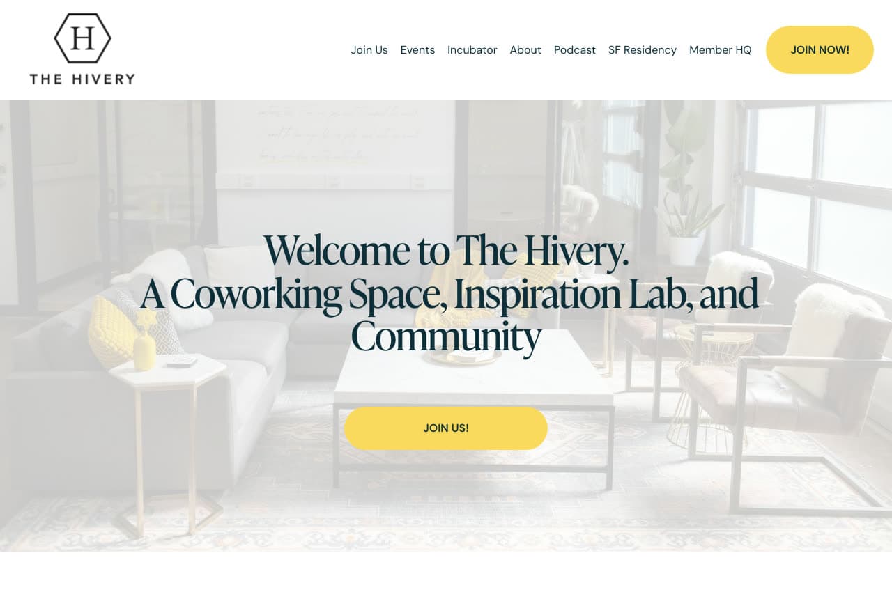
The Hivery: 'A Coworking Space, Inspiration Lab, and Community' over the lounge

The Hivery names its three jobs in the headline: a white header with a hexagonal 'H' and 'THE HIVERY', a nav that shows how much the place does (Join Us, Events, Incubator, About, Podcast, SF Residency, Member HQ) and a yellow 'JOIN NOW!', then a photograph of the lounge — a grey sofa, a black coffee table, a yellow cushion, plants, tall windows — with a serif headline centered over it, 'Welcome to The Hivery. A Coworking Space, Inspiration Lab, and Community', and a yellow 'JOIN US!' pill. The headline is a definition, and the nav backs it up: an incubator, a podcast, a residency. The Hivery shows a community with more than desks how to introduce itself: say the three things you are in one sentence, list the programs in the nav, and make the button an invitation.

Visit The Hivery

Opens a similar Zarla design you can make yours.

Highland City Club website — Business Club design example
Real site · Boulder, CO
  • Business Club
  • Refined

Highland City Club: 'A Securus Locus' — a business club in Latin on white

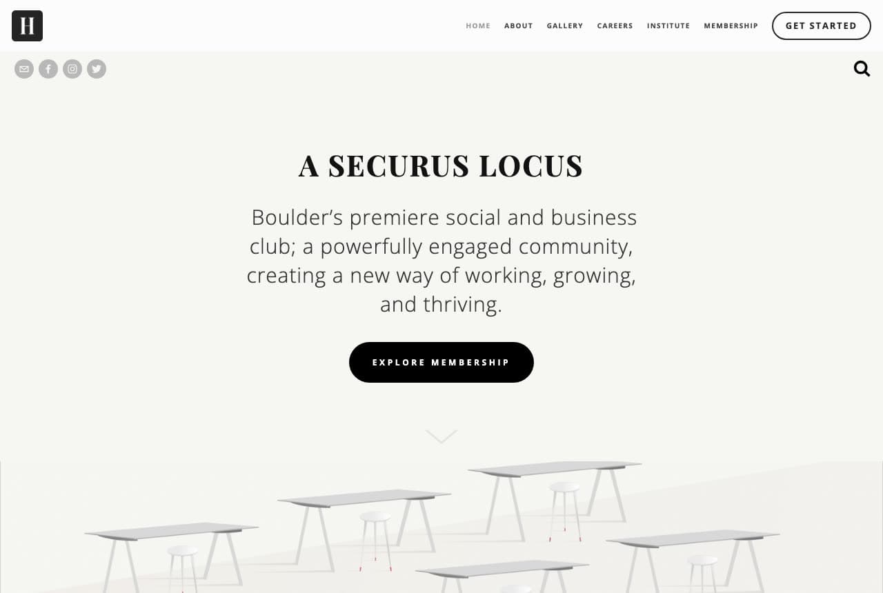
Highland City Club dresses coworking as a club: a white page with a small square 'H' logo, social icons, a tracked small-caps nav (Home, About, Gallery, Careers, Institute, Membership) and an outlined 'GET STARTED', then a centered serif headline in Latin — 'A SECURUS LOCUS' — over a paragraph that translates it into the offer: 'Boulder's premiere social and business club; a powerfully engaged community, creating a new way of working, growing, and thriving.' A black pill, 'EXPLORE MEMBERSHIP', a small chevron, and beneath it a pale rendering of white desks fading into the page. No photographs of people in the first screen, no price; 'Membership' and 'Institute' in the nav say this is a club with a program, not a room with wifi. Highland City Club shows a premium space how to position above the category: a Latin motto, a serif, 'membership' instead of 'plans', and a room drawn rather than photographed.

Visit Highland City Club

Opens a similar Zarla design you can make yours.

The Farm SoHo website — Coworking & Events design example
Real site · New York, NY
  • Coworking & Events
  • Lead-Led

The Farm SoHo: Coworking and event spaces in NYC, with the inquiry form in the hero

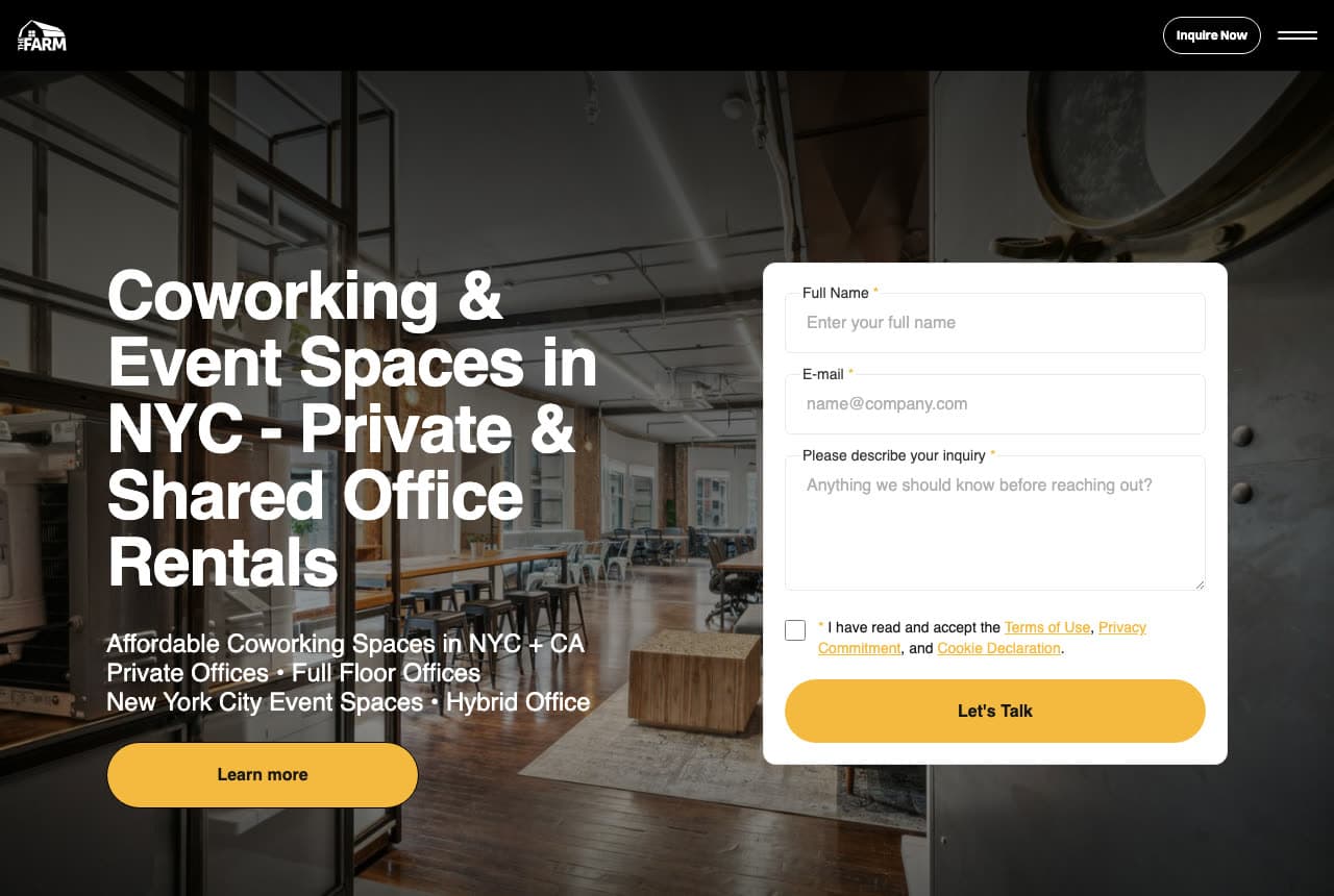
The Farm SoHo asks for the lead on the first screen: a black header with the barn logo, an 'Inquire Now' pill and a hamburger, then a darkened photograph of a loft — exposed brick, wood floors, long tables under industrial windows — with a bold white headline that reads like the search results it wants ('Coworking & Event Spaces in NYC - Private & Shared Office Rentals'), three lines of offers beneath it ('Affordable Coworking Spaces in NYC + CA / Private Offices • Full Floor Offices / New York City Event Spaces • Hybrid Office') and a yellow 'Learn more'. At the right, a white card holds the form: full name, e-mail, 'Please describe your inquiry', a consent checkbox and a yellow 'Let's Talk'. The hero is a landing page, which for a space that rents floors and event nights is the honest shape. The Farm SoHo shows a coworking-and-events business how to capture the enquiry: the keyword headline, the offers as bullets, and the form beside them.

Visit The Farm SoHo

Opens a similar Zarla design you can make yours.

Longform Coffee & Work — Adaptable Template website design you can build with Zarla
Build this with Zarla
  • Adaptable Template
  • Bold

Longform Coffee & Work: 'Cafe & Coworking in Raleigh, NC' in type the size of the room

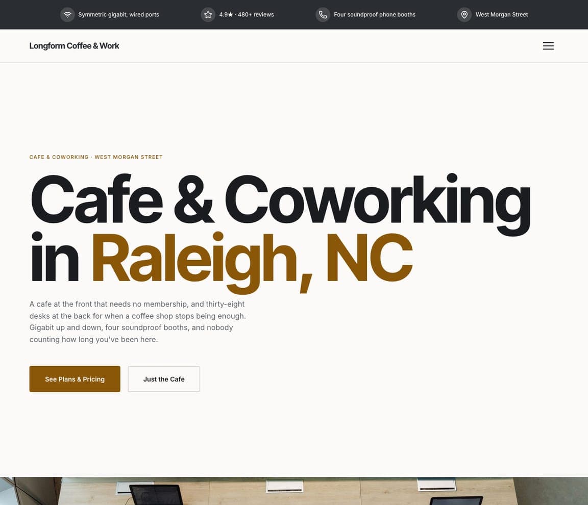
Longform Coffee & Work is the Zarla cafe-coworking template: a white ground, a huge headline with the city in brown — 'Cafe & Coworking in Raleigh, NC' — under a brown eyebrow ('CAFE & COWORKING · WEST MORGAN STREET'), a paragraph that explains the two halves ('A cafe at the front that needs no membership, and thirty-eight desks at the back for when a coffee shop stops being enough. Gigabit up and down, four soundproof booths, and nobody counting how long you've been here'), a brown 'See Plans & Pricing' beside 'Just the Cafe', a header of just the wordmark and a hamburger, and a dark top strip that counts the gigabit line, the reviews, the four phone booths and the street. It's Indie Desk's plain-facts instinct at poster scale. Clone it, name your street, and 'Just the Cafe' becomes your day-pass door.

See this template
Quadrangle Coffee — Adaptable Template website design you can build with Zarla
Build this with Zarla
  • Adaptable Template
  • Structured

Quadrangle Coffee: '48 seats, all with power' — the bento register for a study space

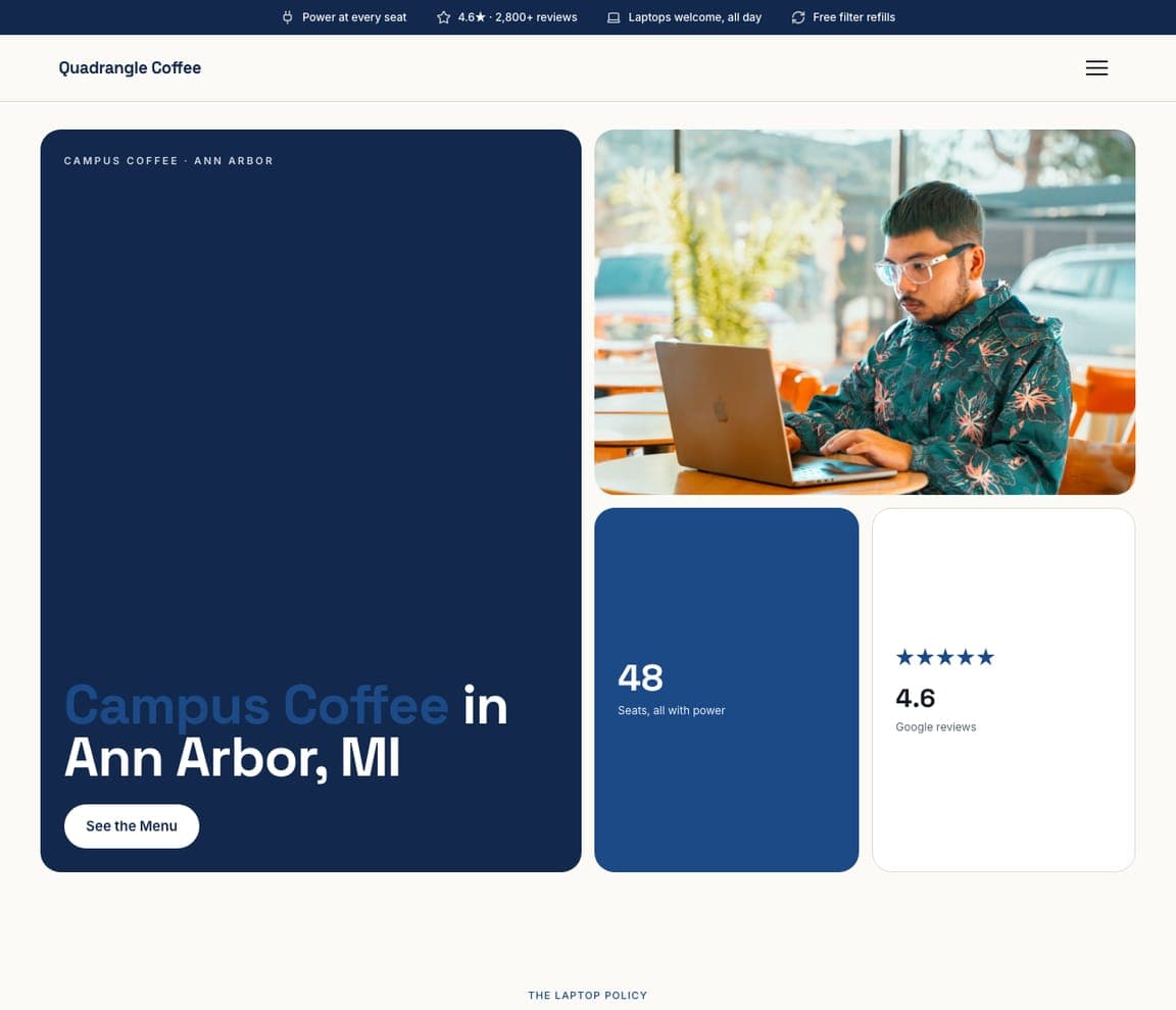
Quadrangle Coffee is the campus-cafe template, and the closest catalog match to the community-first spaces here (Gravitate, VIDA): a navy mosaic of tiles — the headline tile ('Campus Coffee in Ann Arbor, MI', with 'Campus Coffee' in light blue under an eyebrow 'CAMPUS COFFEE · ANN ARBOR'), a photograph tile of a student on a laptop, a stat tile ('48 seats, all with power'), a rating tile ('4.6 Google reviews') — with a 'See the Menu' button beneath and a top strip that promises power at every seat, laptops welcome all day and free filter refills. The tiles let a space list what members ask about — seats, power, hours, rating — as facts rather than paragraphs. Clone it for a coworking space, and the stat tiles become your desks, your booths and your hours.

See this template
Brenner & Vale Commercial Real Estate — Adaptable Template website design you can build with Zarla
Build this with Zarla
  • Adaptable Template
  • Professional

Brenner & Vale Commercial Real Estate: 'Commercial Real Estate in Houston, TX' on navy, with the numbers in a strip

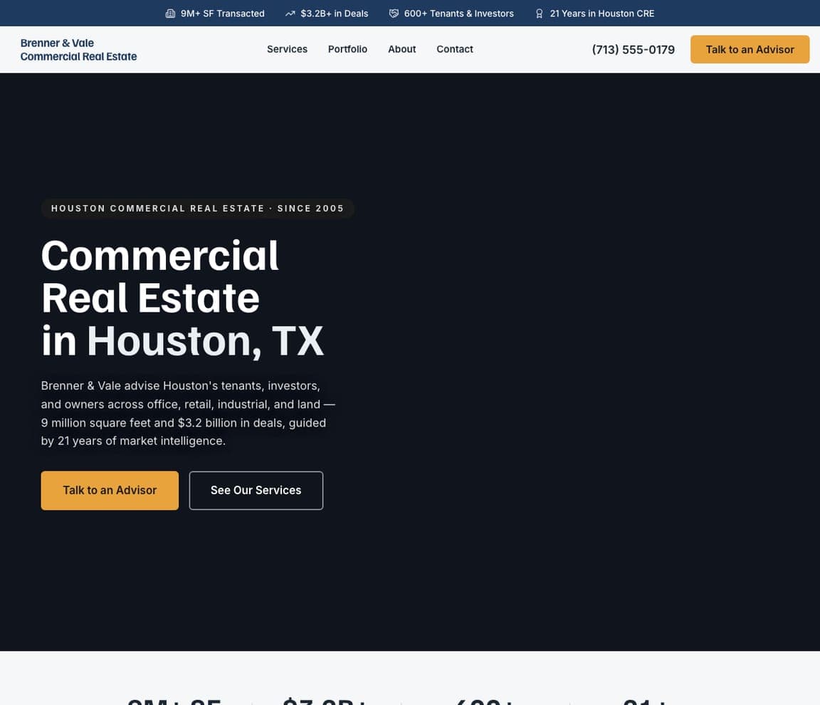
Brenner & Vale is the commercial-property template, and the closest catalog match to the office-forward networks here (Workbar, Kiln, Highland City Club, The Farm SoHo): a dark navy ground, an eyebrow ('HOUSTON COMMERCIAL REAL ESTATE · SINCE 2005'), a white headline — 'Commercial Real Estate in Houston, TX' — a paragraph about advising tenants, investors and owners across office, retail, industrial and land, a gold 'Talk to an Advisor' beside an outlined 'See Our Services', a nav of Services, Portfolio, About and Contact, and a top strip that counts the square feet, the deals, the tenants and the years. Clone it for a space that leases private offices and floors — 'See Our Services' becomes your plans, 'Talk to an Advisor' becomes 'Book a Tour', and the strip becomes your desks and your members.

See this template

Frequently asked

Where can I find good coworking website examples?

Right here — this page curates coworking website examples across the spectrum: an independent downtown space with a day pass (Indie Desk), a community-first Iowa network (Gravitate), a Boston network with private offices (Workbar), a London creative studio (Second Home), a boutique office network (Kiln), a Portland neighborhood chain (VIDA), a coworking-and-incubator community (The Hivery), a Boulder business club (Highland City Club) and a New York coworking-and-events loft (The Farm SoHo) — each linked so you can explore the live site — plus professionally designed Zarla cafe-coworking, campus-cafe and commercial-property templates you can clone and make your own. Every example includes a note on why the design works — the photograph, the line, the tour button — so you can copy the thinking, not just the look.

What makes a good coworking website?

It shows the people, names the deal, and offers a tour. The strong examples above photograph members working or talking rather than empty desks, say in one line what kind of place it is, put a price or a pass where a visitor can see it ('Day pass · $20', 'Book by the Day'), list the locations as buttons, and make 'Book a Tour' the primary action. The copy is short and specific — the floor, the founding year, the neighborhoods — and the proof is the community: events, a podcast, an incubator, members' faces.

How much does a coworking website cost?

A custom site from an agency typically runs from a couple of thousand dollars up, coworking-management platforms charge a monthly fee for the site plus member billing and room booking, and general template builders are roughly $16–$30 per month. An AI website builder generates a coworking site — plans, day passes, locations, meeting rooms, events, a tour-booking form — from a short description in seconds, then lets you edit it in plain language. Spend the money you save on one photo session with real members in the space on a busy afternoon.

Should a coworking website show the space or the members?

The members in the space. Empty desks photograph like an office listing; people at those desks photograph like a community, which is what a coworking space actually sells. Gravitate's group on the bleachers, Kiln's three people over one laptop and VIDA's member on the sofa all do the work that a square-footage number can't. Show the empty room on the meeting-rooms page, where capacity matters.

What pages does a coworking website need?

Most coworking spaces need six: a home page with the people, the line and the tour button; a plans page (day pass, flex desk, dedicated desk, private office) with prices; a locations page with each space, its hours and a map; a meeting-and-event-spaces page with capacities and a booking link; a community or events page; and a book-a-tour page with a short form. Add mail services, a member login and a podcast or blog if you have them — Gravitate, Indie Desk and The Hivery all put them in the nav.

How do coworking spaces get more members from their website?

Sell the day pass, make the tour one tap away, and show the price before the plan page. The converting pattern above: Indie Desk's red 'Book a day pass · $20' in the header and the hero, Workbar's 'Book a Tour' in navy beside 'Contact Us', VIDA's three location pills under the headline, The Farm SoHo's inquiry form inside the hero. Then let the people do the marketing — a room full of members at work is the reason someone joins.

You've seen what works. Now make it yours.

Describe your business and Zarla designs a complete, professional website in about 30 seconds — built to convert, just like the ones above.

Free to build and preview · no credit card · publish to your own domain on Premium