Inspiration · Dermatologist

The Best Dermatologist Website Examples, Explained

Looking for dermatologist website examples? These 12 are the strongest we found — Cumberland Skin's serif 'Expert dermatology. Close to home.' with a zip search, Metropolis Dermatology's 'Do. Derm. Differently.' beside a laughing crowd, Riverchase's 'Dermatology, Reimagined.' on a beach — plus practice designs you can build with Zarla, each with a breakdown of the specific move that turns a worried search into a booked appointment. A dermatology website has to be clinical enough to trust with a diagnosis and warm enough to book a cosmetic consult. Find an approach you love and you can build a site in that spirit, free, in about 30 seconds.

Real sites + designs you can build with Zarla — free to build and preview, no credit card

What makes a great dermatologist website

The best dermatology websites make the appointment the first thing and the doctors the second. Almost every strong example puts 'Book an Appointment' in the header and a same-day or online-booking promise in the first screen (Schweiger's 'ready when you are', Cumberland's zip-code search for the nearest location), then shows the people — Metrolina's three doctors cut out on watercolor, Derm Institute's mosaic of patient faces, Metropolis's laughing group. The register splits by business: medical-first practices go calm and serif (Cumberland, Riverchase, Epstein & Tuffanelli's 'eighty years'), cosmetic-leaning practices go softer and pinker (SmarterSkin), and the boutique aesthetic clinic goes minimal (REN's reception wall). Proof is a location count, a year, a Google rating or a top-doctor badge. Every example below answers 'can I get in, and who will I see?' before the visitor has to scroll.

SmarterSkin Dermatology website — Cosmetic + Medical design example
Real site
  • Cosmetic + Medical
  • Soft
  • Blush + teal

SmarterSkin Dermatology: A treatment lamp, a script welcome, one line of scope

SmarterSkin Dermatology photographs the treatment rather than the doctor: a woman reclines under a white examination lamp, a gloved hand at her temple, her face lit from above, and over the photograph a handwritten script line says 'Welcome To SmarterSkin Dermatology' before a row of tracked capitals states the scope in six words — 'COSMETIC AND MEDICAL SKIN CARE NEEDS' — and a blush 'MAKE AN APPOINTMENT' closes it. The header is white with a teal-and-grey wordmark, a seven-item nav that ends in 'SPECIALS', and a thin top bar with the phone number and the social links. Cosmetic comes first in the sentence and in the palette. SmarterSkin shows a practice that leans aesthetic how to say so without losing the medical half: a clinical photograph, a soft script, both words in the scope line, and the appointment in pink.

  • The treatment photographed — a lamp and a gloved hand, not a stock smile
  • 'Cosmetic and medical' in one six-word scope line
  • A blush appointment button: the cosmetic lean in one color

Steal this: State the scope in one line with both words — 'cosmetic and medical' — so neither patient has to guess whether they belong.

Visit SmarterSkin Dermatology

Opens a similar Zarla design you can make yours.

Cumberland Skin Surgery & Dermatology website — Dermatology Group design example
Real site
  • Dermatology Group
  • Calm
  • White + navy

Cumberland Skin Surgery & Dermatology: 'Close to home' with a zip search under it

Cumberland Skin Surgery & Dermatology solves the multi-location problem in the hero: on white, a serif headline in two short sentences — 'Expert dermatology. Close to home.' — a paragraph that explains the promise ('With experienced providers and locations near you, Cumberland Skin Surgery & Dermatology makes trusted skin care easier to reach'), and directly beneath it a search field: 'Search zip/city/state…' with a black button. To the right, a rounded photograph of a clinician and a patient walking a corridor, and above it a close-up of a dermatoscope on skin. The header is a floating pill with the logo, five menus and a teal 'Schedule Appointment'. No hero button — the search is the action. Cumberland shows a regional group how to be both expert and local: the promise in serif, the nearest office one zip code away.

  • 'Expert dermatology. Close to home.' — two sentences, the whole position
  • A zip/city search as the hero's action, not a button
  • A floating pill header with 'Schedule Appointment'

Steal this: If you have more than one office, make the hero's action a zip-code search — 'find the location near you' is the question a patient is really asking.

Opens a similar Zarla design you can make yours.

Metropolis Dermatology website — Brand-Led Dermatology design example
Real site
  • Brand-Led Dermatology
  • Youthful
  • Navy + orange

Metropolis Dermatology: 'Do. Derm. Differently.' beside a laughing crowd

Metropolis Dermatology makes a dermatology practice feel like a brand for young adults: an orange bar across the top lists five locations (Downtown LA, Brentwood, Pasadena, Costa Mesa, San Jose), each with 'BOOK A VISIT' beneath it; the name is set enormous in a wide grotesque — 'METROPOLIS DERMATOLOGY' — over a nav that splits Medical, Cosmetic, Spa and Clinical Trials; and the hero pairs a three-word headline in navy capitals, 'DO. DERM. DIFFERENTLY.', with a photograph of a dozen young people laughing into the camera. The paragraph explains the name ('A metropolis exudes youthful urban energy…'), and two navy buttons follow, 'BOOK A VISIT' and 'MESSAGE US'. A social sidebar rides the left edge. Metropolis shows a city practice how to be a brand: a slogan with rhythm, a crowd instead of a clinician, and every location bookable from the top bar.

  • 'Do. Derm. Differently.' — a slogan with rhythm, in navy capitals
  • Five locations with 'Book a Visit' in the top bar
  • A laughing crowd instead of a white coat

Steal this: Put every location in a bar above the nav with its own 'Book a Visit' — the visitor books before they've read a word.

Visit Metropolis Dermatology

Opens a similar Zarla design you can make yours.

Riverchase Dermatology website — Dermatology Group design example
Real site
  • Dermatology Group
  • Warm
  • Sand + navy

Riverchase Dermatology: 'Dermatology, Reimagined.' on a beach with a dog

Riverchase Dermatology photographs the life its patients want to keep: a couple laughing on a sunlit beach with a golden retriever between them, the sea behind, and over the sand a serif headline in navy — 'Dermatology, Reimagined.' — with a one-line reason ('Because you deserve the best in skin science and technology with sincere, customized care') and a white 'Book Appointment ›'. The header is white with a serif monogram, a nav that leads with About and Providers, a 'Shop' item, and the phone number in a box beside a blue button. It's a slideshow, and the dots and arrows are visible; this frame is the brand. Riverchase shows a sun-state dermatology group how to sell prevention as pleasure: a beach instead of a clinic, one promise in serif, and the appointment in white.

  • A beach, a couple and a dog — the life skin care protects
  • 'Reimagined' as the one-word promise
  • The phone number boxed in the header beside the booking button
Visit Riverchase Dermatology

Opens a similar Zarla design you can make yours.

Epstein & Tuffanelli Dermatology website — Medical Dermatology design example
Real site · San Francisco, CA
  • Medical Dermatology
  • Classic
  • Orange + sky

Epstein & Tuffanelli Dermatology: The Golden Gate and eighty years

Epstein & Tuffanelli Dermatology leads with place and time: a photograph of the Golden Gate Bridge in warm afternoon light fills the hero as a slideshow, and beneath it, on white, a single tracked line — 'THE HIGHEST STANDARD OF DERMATOLOGY' — with the claim that matters in small type: 'Specializing in the Art of Medical Dermatology for 80 years.' The header is an orange bar with 'Call Today' and the number, then the logo — the two founders' names stacked with 'Dermatology and Psoriasis Center' — and a six-item nav (Home, About Us, Meet Our Doctors, Services, Patient Information, Contact Us). No button in the hero; the phone is the ask. The design is plain and the sentence is not. Epstein & Tuffanelli shows a long-established medical practice how to use its history: name the city with one photograph, state the years, and let the doctors' names be the logo.

  • The city's landmark as the photograph — place as trust
  • 'Medical dermatology for 80 years' as the only claim
  • The founders' names as the logo

Opens a similar Zarla design you can make yours.

REN Dermatology & Aesthetics website — Aesthetic Dermatology design example
Real site
  • Aesthetic Dermatology
  • Minimal
  • White + black

REN Dermatology & Aesthetics: The reception wall as the hero

REN Dermatology & Aesthetics photographs its own front desk: a white wall with 'REN' in black letters, a white counter with a black stone top, a lamp, a framed sketch, a hint of a warm-lit hallway to the right. The header is white and centered — the nav splits around the wordmark ('REN DERMATOLOGY'), with Medical, Cosmetics, Weight Loss and Lasers on the left and Spa, Shop, Patient Resources and About on the right — and there is no headline, no button, no copy on the photograph. The room says what the practice is: calm, designed, aesthetic-led. REN shows a boutique clinic how to look like a boutique: photograph the space you built, split the nav around the name, and let the absence of copy be the confidence.

  • The clinic's own reception as the photograph
  • A nav split around the wordmark — medical left, lifestyle right
  • No headline, no button: the room is the positioning

Opens a similar Zarla design you can make yours.

Derm Institute of Chicago website — Dermatology Institute design example
Real site · Chicago, IL
  • Dermatology Institute
  • Inclusive

Derm Institute of Chicago: A mosaic of patient faces beside a serif welcome

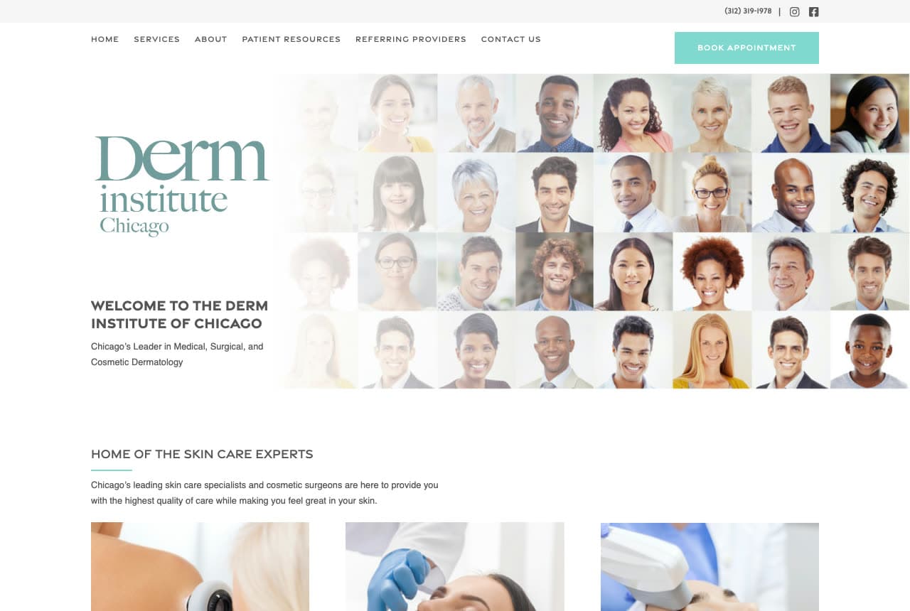
Derm Institute of Chicago fills half the screen with the people it treats: a grid of some fifty portrait tiles — every age, every skin tone, every expression — and beside it a serif logo in green ('Derm institute Chicago'), a small caps welcome ('WELCOME TO THE DERM INSTITUTE OF CHICAGO'), the positioning in one line ('Chicago's Leader in Medical, Surgical, and Cosmetic Dermatology') and a teal 'BOOK APPOINTMENT' in the header. Under the mosaic, 'HOME OF THE SKIN CARE EXPERTS' introduces three treatment photographs. The nav includes 'Referring Providers', a tell that this is a medical institute as much as a clinic. Derm Institute shows a practice how to say 'everyone' without writing it: a wall of faces, a serif name, three disciplines in a line.

Visit Derm Institute of Chicago

Opens a similar Zarla design you can make yours.

Schweiger Dermatology Group website — Dermatology Group design example
Real site
  • Dermatology Group
  • Efficient

Schweiger Dermatology Group: Same-day access under a 4.9 rating, with the numbers beneath

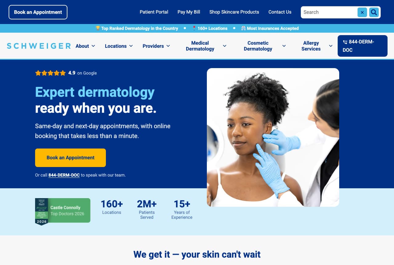
Schweiger Dermatology Group sells access like a service business: on a deep blue field, five stars and '4.9 on Google' sit above a two-tone headline — 'Expert dermatology' in light blue, 'ready when you are.' in white — a promise about time ('Same-day and next-day appointments, with online booking that takes less than a minute'), a yellow 'Book an Appointment' and a line offering the phone ('Or call 844-DERM-DOC'). A rounded photograph of a dermatologist examining a patient's cheek sits to the right, and a pale band beneath carries a Castle Connolly Top Doctors badge and three numbers — 160+ locations, 2M+ patients served, 15+ years of experience. A thin bar above the nav repeats the scale. Schweiger shows a large group how to convert on convenience: rating first, time promise second, numbers third, one yellow button.

Visit Schweiger Dermatology Group

Opens a similar Zarla design you can make yours.

Metrolina Dermatology website — Mohs + Medical design example
Real site
  • Mohs + Medical
  • Clinical

Metrolina Dermatology: Three doctors cut out on watercolor skin

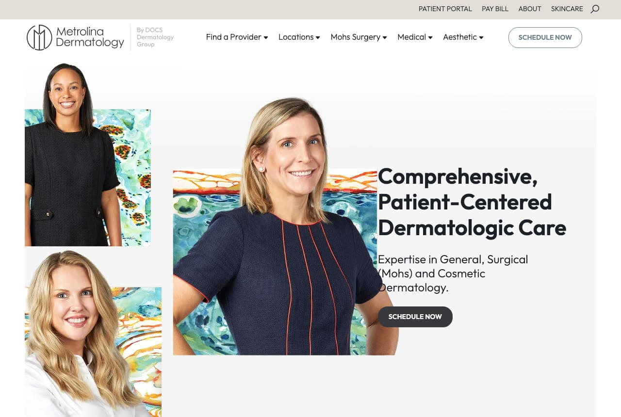
Metrolina Dermatology puts its physicians on the page like portraits in a gallery: three doctors, photographed against white and cut out, stand in front of painted panels — watercolor renderings of skin cells in teal, orange and blue — arranged as a stepped collage; beside the largest portrait a bold black headline reads 'Comprehensive, Patient-Centered Dermatologic Care', a sub-line names the three disciplines ('Expertise in General, Surgical (Mohs) and Cosmetic Dermatology'), and a black 'SCHEDULE NOW' pill follows. The nav is organized by what a patient needs (Find a Provider, Locations, Mohs Surgery, Medical, Aesthetic), with the portal, bill pay and skincare in a thin bar above. The watercolor is the only color on the page. Metrolina shows a physician-led group how to make credentials warm: real doctors, a painted texture of the thing they treat, and the disciplines in one sentence.

Visit Metrolina Dermatology

Opens a similar Zarla design you can make yours.

Vela Dermatology — Dermatology Practice website design you can build with Zarla
Build this with Zarla
  • Dermatology Practice
  • Calm

Vela Dermatology: 'Healthy skin. Beautifully confident.' in serif

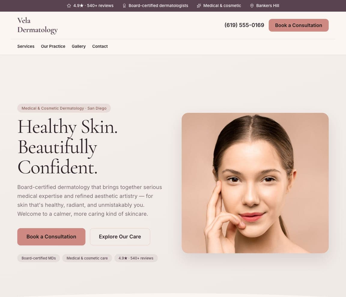
Vela Dermatology is the Zarla dermatology template: a cream ground, an eyebrow that names the scope and the city ('Medical & Cosmetic Dermatology · San Diego'), a serif headline — 'Healthy Skin. Beautifully Confident.' — a paragraph about board-certified expertise and 'a calmer, more caring kind of skincare', a 'Book a Consultation' beside 'Explore Our Care', a portrait of a patient with her hand at her cheek, and a top strip counting the reviews and the board-certified dermatologists. It's Cumberland's calm with SmarterSkin's warmth. Clone it, name your city, and the strip becomes your credentials.

See this template
Aldwyn Aesthetics — Adaptable Template website design you can build with Zarla
Build this with Zarla
  • Adaptable Template
  • Luxe

Aldwyn Aesthetics: Botox and filler in pink on plum

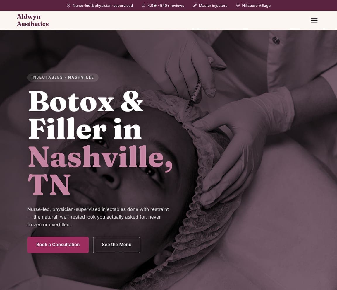
Aldwyn Aesthetics is a med-spa injectables template, and the closest catalog match to the aesthetic-led practices here (REN, Metropolis): a dark plum photograph of a treatment in progress, an eyebrow ('Injectables · Nashville'), an oversized headline — 'Botox & Filler in Nashville, TN' with the city in pink — a line about nurse-led, physician-supervised care and natural results, and a pink button. The top strip carries the supervision, the rating and the injector credentials. For a dermatology practice whose cosmetic side deserves its own front door, clone it as the aesthetics page.

See this template
Halstead Laser & Skin — Adaptable Template website design you can build with Zarla
Build this with Zarla
  • Adaptable Template
  • Clinical

Halstead Laser & Skin: Sun damage named in the headline, treatment photographed

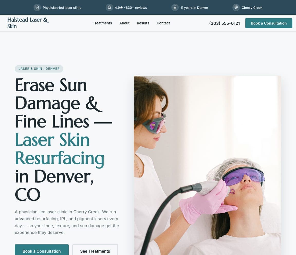
Halstead Laser & Skin is the laser-clinic template: a white ground, an eyebrow ('Laser & Skin · Denver'), a headline that names the complaint and the treatment — 'Erase Sun Damage & Fine Lines — Laser Skin Resurfacing in Denver, CO' with the treatment in teal — a paragraph, a teal 'Book a Consultation', a photograph of a patient under laser goggles, and a strip counting the reviews and the years. It's Schweiger's efficiency applied to one procedure. For a practice that wants a page per treatment — the pattern that ranks — clone it once per laser.

See this template

Frequently asked

Where can I find good dermatologist website examples?

Right here — this page curates dermatologist website examples across the spectrum: multi-location groups (Schweiger Dermatology Group, Cumberland Skin, Riverchase Dermatology, Metrolina Dermatology), city practices (Metropolis Dermatology, Derm Institute of Chicago, SmarterSkin Dermatology), an eighty-year-old medical practice (Epstein & Tuffanelli) and a boutique aesthetic clinic (REN Dermatology) — each linked so you can explore the live site — plus professionally designed Zarla dermatology and aesthetics templates you can clone and make your own. Every example includes a note on why the design works — the booking path, the doctors, the proof — so you can copy the thinking, not just the look.

What makes a good dermatologist website?

It makes booking obvious and the doctors visible. The strong examples above keep 'Book an Appointment' in the header, promise something about access in the first screen (same-day, online booking, a location near you), show real providers or real patients rather than stock models, separate medical from cosmetic in the nav so both visitors find their page, and keep the patient portal and bill-pay links one click away for current patients. Proof is specific — a Google rating, a location count, a year founded, a top-doctor badge — and the palette is clean: white, navy, teal, with warmth added by photography rather than color.

How much does a dermatologist website cost?

Medical-marketing agencies typically charge several thousand dollars for a practice site plus a monthly fee for hosting and patient-scheduling integration, and general template builders are roughly $16–$30 per month before any booking tool. An AI website builder generates a dermatology site — medical and cosmetic services, providers, locations, a book-an-appointment button, patient resources — from a short description in seconds, then lets you edit it in plain language. Budget separately for the two things that convert: real photographs of your providers and an online scheduler that takes under a minute.

Should a dermatology website separate medical and cosmetic?

Yes — in the nav and in the copy. A patient with a suspicious mole and a patient researching Botox arrive with different anxieties, and the sites above give each their own door: Schweiger's 'Medical Dermatology' and 'Cosmetic Dermatology' menus, Metrolina's 'Mohs Surgery' beside 'Aesthetic', REN's 'Medical' / 'Cosmetics' / 'Lasers'. The home page can serve both with one line ('Cosmetic and medical skin care needs', SmarterSkin) as long as the nav splits them.

What pages does a dermatologist website need?

Most practices need eight: a home page with the booking button and the providers, a medical dermatology page (conditions), a cosmetic page (treatments), a providers page with real photographs and credentials, a locations page (with a search if you have several), a patient-resources page (forms, insurance, portal, bill pay), a skin-cancer or Mohs page if you offer it, and a contact page that books. Practices with a shop add a skincare page — Schweiger, Metropolis and REN all put 'Shop' in the nav.

How do dermatologists get more patients from their website?

Promise access in the first screen, put the booking button in the header, and show the doctors. The converting pattern above: Schweiger's 'Same-day and next-day appointments, with online booking that takes less than a minute' under a 4.9 Google rating, Cumberland's zip-code search under 'Close to home', Metropolis's five-location 'Book a Visit' bar above the nav. Then build a page per condition and per treatment — 'acne', 'psoriasis', 'laser resurfacing' — so each search lands on an answer with a booking button beside it.

You've seen what works. Now make it yours.

Describe your business and Zarla designs a complete, professional website in about 30 seconds — built to convert, just like the ones above.

Free to build and preview · no credit card · publish to your own domain on Premium