Inspiration · Fast Food

The Best Fast Food Website Examples, Explained

Looking for fast food website examples? These 14 are the strongest we found — Hopdoddy's cheeseburger annotated in handwriting ('buns served at 135°F'), Super Duper's storefront under 'Fast Food Burgers. Slow Food Values.', Habit's 'Ready to order? Start here' with the pickup-or-delivery switch built into the hero — plus quick-service designs you can build with Zarla, each with a breakdown of the specific move that turns a lunchtime search into an order. A fast-food website has one job most business sites don't: it has to take the order in the first screen. Find an approach you love and you can build a site in that spirit, free, in about 30 seconds.

Real sites + designs you can build with Zarla — free to build and preview, no credit card

What makes a great fast food website

The best fast-food websites put the order button in the header and again in the hero, and then choose one thing to say: a value ('Slow Food Values', 'Long Live Local, 75% locally sourced'), a promise ('Fresh. Simple. Five Guys.'), a number ('15+ signature flavors'), or a boast ('The best burgers on the planet'). Notice the food is photographed close and hot — a burger in a hand, wings on paper, tacos on a tray — and the type is heavy, condensed and loud, because the screen is a phone at noon. Notice, too, that the most useful hero here isn't a photograph at all: Habit's is a pickup-or-delivery switch with a zip-code field. Every example below gets you to 'Order Now' before it tells you its story.

Hopdoddy Burger Bar website — Craft Burger Bar design example
Real site · Austin, TX
  • Craft Burger Bar
  • Obsessive
  • Black + green

Hopdoddy Burger Bar: A cheeseburger annotated in handwriting: buns at 135°F, cheese melting evenly

Hopdoddy explains the burger on the burger: a white header with the logo, a green nav (Food + Bar, Our Story, Culture, Give Back, Locations, Gift Cards) and a dark green 'START ORDER', then a hero split in two — a black panel with the question in tall condensed capitals, 'WHAT MAKES A BURGER WORTH IT?' with 'BURGER' in green, and a small italic line, 'OBSESSION. SEE HOW IT SHAPES EVERY BITE.' with an arrow — beside a close photograph of a cheeseburger annotated in white handwriting: 'Buns served at 135°F', 'Cheese melting under residual heat to layer evenly', 'Grilled to order never precooked', 'Veggies stacked underneath the patty to soak up those juices'. The annotations turn a food photo into an argument, and the argument is the brand. Hopdoddy shows a burger bar how to sell craft at fast-food speed: ask the question in big type, answer it on the photograph, keep the order button green and to the right.

  • Handwritten annotations on the burger — the method as the picture
  • 'WHAT MAKES A BURGER WORTH IT?' in condensed capitals, one word in green
  • 'Start Order' in dark green at the end of the nav

Steal this: Photograph your best item close and write your standards on it by hand — temperatures, timing, order of assembly — the annotations are the pitch.

Visit Hopdoddy Burger Bar

Opens a similar Zarla design you can make yours.

Super Duper Burgers website — Better-Burger Chain design example
Real site · San Francisco, CA
  • Better-Burger Chain
  • Honest
  • Orange + white

Super Duper Burgers: 'Fast Food Burgers. Slow Food Values.' in brush script over the storefront

Super Duper puts its whole position in six words: a white header with the orange badge logo, a plain nav (Menus, Locations, Gift Cards, About) and an outlined 'ORDER NOW', then a darkened photograph of a restaurant's glass front — umbrellas, people at outdoor tables, the orange sign on the wall — and across it, in white brush script, 'Fast Food Burgers. / Slow Food Values.' No photograph of a burger, no button on the photo; the sentence is the hero and the storefront is the proof that it's a real place. The script softens what would otherwise be a claim, and the contrast — fast and slow — is the whole brand in one line. Super Duper shows a better-burger chain how to say what it stands for: one sentence with a turn in it, hand-lettered, over a photograph of the shop.

  • A six-word position with a turn in it — fast food, slow values
  • Brush script over a photograph of the storefront
  • An outlined 'Order Now' in the header, nothing on the photo

Steal this: Write your position as one sentence with a contradiction in it, hand-letter it, and set it over a photograph of the actual shop.

Visit Super Duper Burgers

Opens a similar Zarla design you can make yours.

Five Guys website — Burger Chain design example
Real site
  • Burger Chain
  • Straightforward
  • Red + kraft

Five Guys: 'Fresh. Simple. Five Guys.' beside a double cheeseburger in a hand

Five Guys keeps it to three words and a burger: a black band with the red square logo and a red 'ORDER NOW' with a bag icon, a white nav row (The Menu, About Our Food, The Crew, Locations, Our Story, Franchising, Search), then a photograph of a hand holding a double cheeseburger with fries on brown paper behind it, and to the right, in heavy white capitals with a black shadow, 'FRESH. SIMPLE. FIVE GUYS.' A paragraph beneath does the plain talk — 'The burgers are made to order, the fries are hand-cut, the toppings are prepared fresh each morning… Real – it's who we are and what we do, since 1986' — and a red 'START YOUR ORDER' closes it. Nothing clever: a promise in three words, the reasons in one paragraph, the button in red. Five Guys shows a national chain how to stay legible: heavy type, one photograph, and the order button in the same red as the logo.

  • Three words, three periods: the promise as the headline
  • A burger in a hand — the food at eating distance
  • 'Start Your Order' in the brand red, with the bag icon

Steal this: Say your promise in three words with periods between them, photograph the food in a hand, and make the order button the same red as your logo.

Visit Five Guys

Opens a similar Zarla design you can make yours.

Raising Cane's website — Chicken-Fingers Chain design example
Real site
  • Chicken-Fingers Chain
  • Cheerful
  • Red + white

Raising Cane's: Smiling crew and customers in a video, combos in a row beneath

Raising Cane's leads with people and follows with the menu: a white header with the Cane's logo, a nav (Our Menu, Locations, Careers, Who We Are, Community Partnerships, Gift Cards & Gear) and a red 'Order Now', then a video still in a rounded frame — a customer in a cap grinning as he takes his cup, three young customers laughing over boxes of chicken fingers and Cane's cups — with a '30 YEARS · Est. 1996' badge in the corner, a pause button, and a red 'Order Now' pill bottom-left. Directly beneath, a carousel of combo cards: 'The Box Combo', 'The Caniac Combo', 'The 3 Finger Combo', 'The Sandwich Combo', each with its photograph. The hero sells the mood; the row sells the order. Cane's shows a chicken chain how to be warm and fast at once: real faces in the video, the anniversary as a badge, and the combos one scroll away.

  • Customers laughing — people, not product, in the hero
  • '30 Years · Est. 1996' as a badge on the video
  • A combo carousel directly under the hero

Steal this: Film your crew and regulars actually enjoying the place, badge your anniversary on it, and put your combos in a row right underneath.

Visit Raising Cane's

Opens a similar Zarla design you can make yours.

Burgerville website — Sourcing-Led Burger Chain design example
Real site · Vancouver, WA
  • Sourcing-Led Burger Chain
  • Loud
  • Red + white

Burgerville: 'LONG LIVE LOCAL — 75% LOCALLY SOURCED' warped across a red field

Burgerville shouts its sourcing: a white header with a hamburger icon, the red 'BURGERVILLE' wordmark, a location pin and a red 'ORDER NOW', then a solid red field with a single cup — a dark soda topped with whipped cream, the Burgerville mark on the cup — and across it, in warped white block capitals, 'LONG LIVE LOCAL' with '75% LOCALLY SOURCED' beneath. A red circle in the corner reads 'SEASONALS'. No burger, no room; a number, a slogan and a drink. The percentage is the honest part — not 'local' but 'seventy-five percent' — and the warped type makes it feel like a stadium banner. Burgerville shows a regional chain how to own a value: state it as a number, set it loud, and keep the whole screen your color.

  • A sourcing claim as a number — '75% locally sourced'
  • Warped block capitals on a solid brand-red field
  • 'Seasonals' as a corner button — the rotating menu as a feature

Steal this: Turn your best value into a percentage and set it in warped capitals on a field of your brand color — a number is a claim people believe.

Visit Burgerville

Opens a similar Zarla design you can make yours.

Wings Over website — Wing Chain design example
Real site
  • Wing Chain
  • Punchy
  • Navy + orange

Wings Over: '15+ Signature Flavors. From Mild to Face-Melting.' over saucy wings

Wings Over sells the count: a dark navy header with a hamburger, 'LOCATION' in orange, 'REWARDS', the orange 'WINGSOVER' logo centered, 'MENU', 'SHOP' and an orange 'Order Now', then a close photograph of glossy, saucy wings piled on paper, and over them two lines in heavy tracked capitals — '15+ SIGNATURE FLAVORS.' and, smaller, 'FROM MILD TO FACE-MELTING.' — with an orange 'GET YOUR FLAVOR' button. Below the photo a dark strip carries the proof as the page's H1: 'Voted 2025 Best Wings in Athens, Chapel Hill, Columbus, Happy Valley…' — a list of college towns. The number is the hook, the range is the joke, the button names the choice. Wings Over shows a wing brand how to make a menu into a headline: count the flavors, describe the ends of the scale, and call the button what the customer is really doing.

  • The flavor count as the headline, the heat range as the sub-line
  • 'Get Your Flavor' — the button named for the choice
  • A 'Voted best wings' list of towns as the strip beneath

Steal this: If your menu is a range, put the count in the headline and the two extremes in the sub-line — then name the button after the choice, not the transaction.

Visit Wings Over

Opens a similar Zarla design you can make yours.

Qué Vida Tacos website — Taco Shop design example
Real site · California
  • Taco Shop
  • Friendly

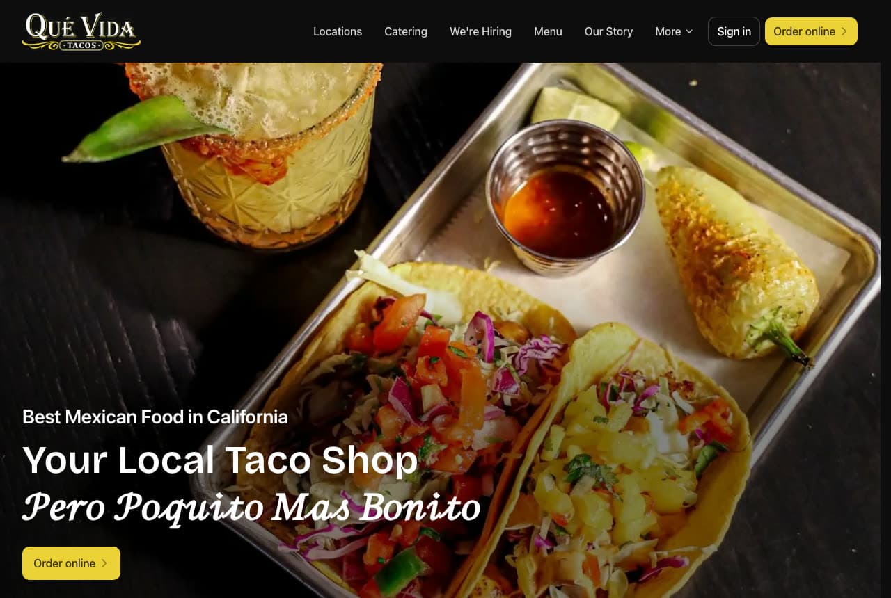
Qué Vida Tacos: 'Your Local Taco Shop — Pero Poquito Mas Bonito' over a tray of tacos

Qué Vida Tacos speaks both languages in the headline: a dark header with the gold script logo, a nav (Locations, Catering, We're Hiring, Menu, Our Story, More), a 'Sign in' and a yellow 'Order online ›', then a photograph of two tacos on a metal tray — cabbage, salsa fresca, a cup of red salsa, a roasted chile, a chili-rimmed margarita beside it — and bottom-left the copy: an eyebrow, 'Best Mexican Food in California', a bold white headline, 'Your Local Taco Shop', an italic second line, 'Pero Poquito Mas Bonito' ('but a little prettier'), and a yellow 'Order online ›'. The eyebrow claims the state, the headline claims the neighborhood, the Spanish line claims the personality. Qué Vida shows a taco shop how to be local and proud: the tray at eating distance, one bilingual line, the order button in the brand yellow.

Visit Qué Vida Tacos

Opens a similar Zarla design you can make yours.

Kuma's Corner website — Metal Burger Bar design example
Real site · Chicago, IL
  • Metal Burger Bar
  • Brash

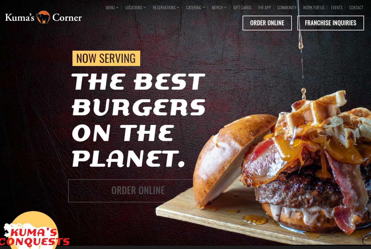
Kuma's Corner: 'THE BEST BURGERS ON THE PLANET.' on black leather, waffle on the bun

Kuma's Corner boasts and backs it with a burger: a black header with the bear logo, a long row of tiny links (Menu, Locations, Reservations, Catering, Merch, Gift Cards, The App, Community, Work For Us, Events, Contact) and two outlined buttons, 'ORDER ONLINE' and 'FRANCHISE INQUIRIES', then a dark leather-textured hero: a yellow tag reading 'NOW SERVING', the claim in white italic capitals — 'THE BEST BURGERS ON THE PLANET.' — an outlined 'ORDER ONLINE' beneath, and to the right a burger stacked with bacon and a waffle on a wooden board, a 'KUMA'S CONQUESTS' badge in the corner. The register is a metal bar — black, leather, capitals — and the food photo is as over-the-top as the sentence. Kuma's shows a themed burger bar how to sound like itself: make the boast in italics, tag it 'now serving' like a bill, and put the franchise button next to the order button because both are real.

Visit Kuma's Corner

Opens a similar Zarla design you can make yours.

The Habit Burger Grill website — Charburger Chain design example
Real site
  • Charburger Chain
  • Functional

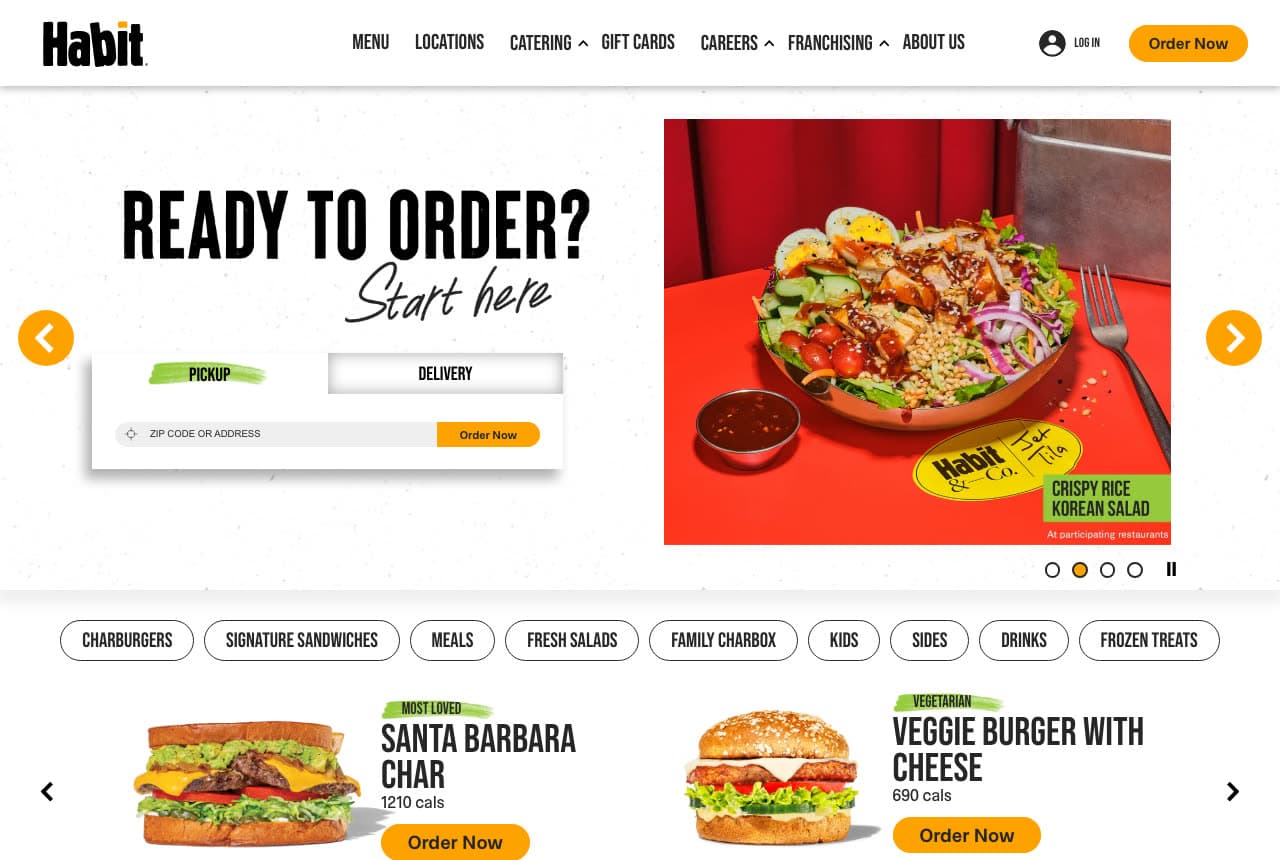
The Habit Burger Grill: 'Ready to order? Start here' — a pickup-or-delivery switch as the hero

The Habit Burger Grill makes the hero an order form: a white header with the Habit logo, a nav (Menu, Locations, Catering, Gift Cards, Careers, Franchising, About Us), 'Log in' and a yellow 'Order Now', then a slideshow whose second panel is a widget — 'READY TO ORDER?' in condensed capitals, 'Start here' in script, a card with 'PICKUP' (highlighted green) and 'DELIVERY' tabs, a zip-code field and an 'Order Now' button — beside a photograph of a Crispy Rice Korean Salad in a bowl on red. Under the hero, the menu begins immediately: category chips (Charburgers, Signature Sandwiches, Meals, Fresh Salads, Family Charbox, Kids, Sides, Drinks, Frozen Treats) and item cards with a photograph, a label ('Most Loved', 'Vegetarian'), the calories and an 'Order Now' each. No slogan, no story; the site behaves like the app. Habit shows a chain with repeat customers how to design for them: the switch first, the menu second, the story nowhere near the top.

Visit The Habit Burger Grill

Opens a similar Zarla design you can make yours.

Maíz Fiero — Adaptable Template website design you can build with Zarla
Build this with Zarla
  • Adaptable Template
  • Loud

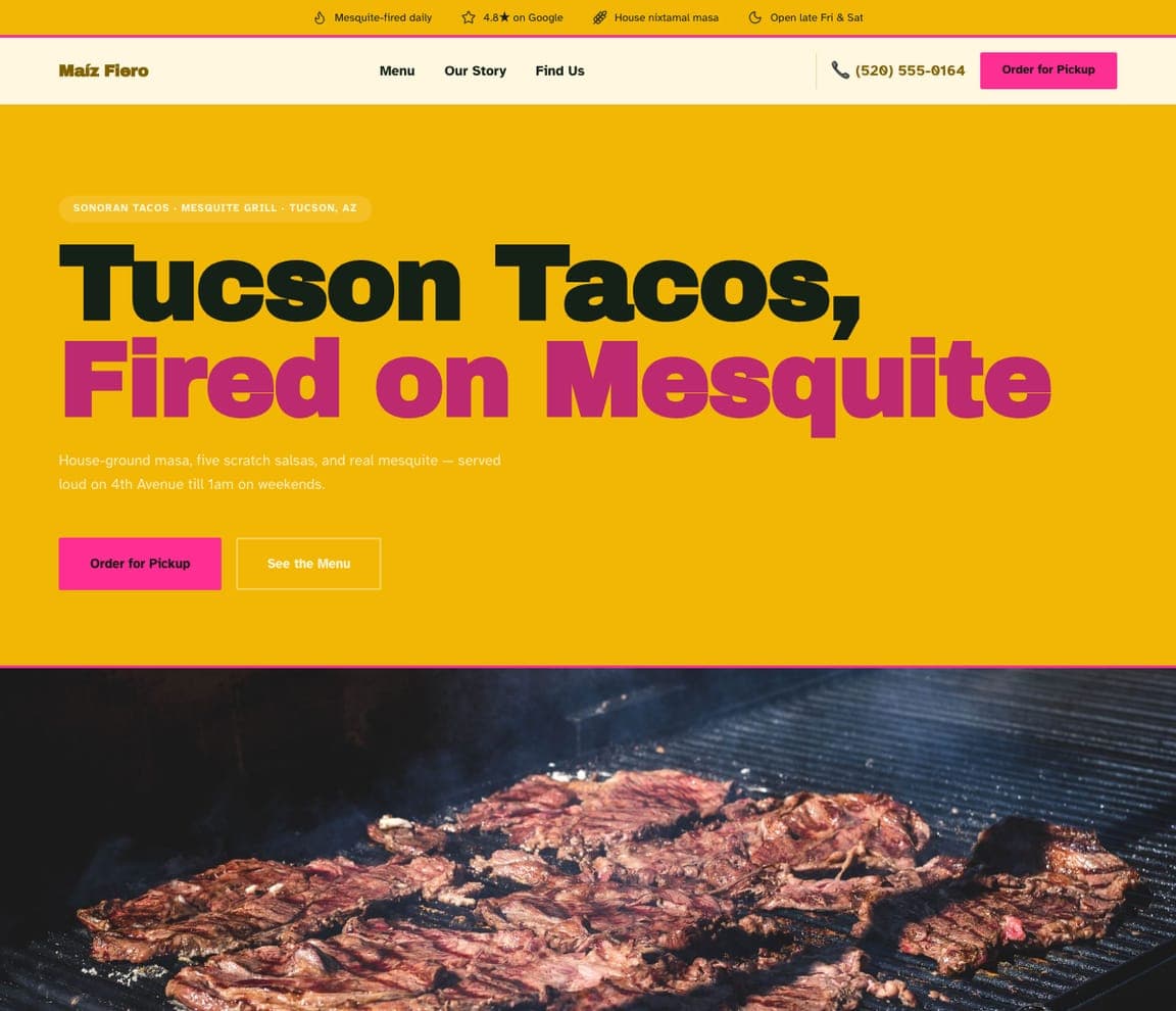
Maíz Fiero: 'Tucson Tacos, Fired on Mesquite' in magenta on yellow

Maíz Fiero is the taqueria template, and the closest catalog match to the loud, color-first sites here (Burgerville, Qué Vida): a solid yellow field, an eyebrow that names the style, the grill and the city ('SONORAN TACOS · MESQUITE GRILL · TUCSON, AZ'), a heavy headline — 'Tucson Tacos, Fired on Mesquite' with the second line in magenta — a two-line description ('House-ground masa, five scratch salsas, and real mesquite — served loud on 4th Avenue till 1am on weekends'), a magenta 'Order for Pickup' beside an outlined 'See the Menu', and a header strip with the chips (mesquite-fired daily, the Google rating, house nixtamal masa, open late Fri & Sat). Clone it, name your street, and the chips become your hours and your rating.

See this template
Tumbleweed Tacos — Adaptable Template website design you can build with Zarla
Build this with Zarla
  • Adaptable Template
  • Sunny

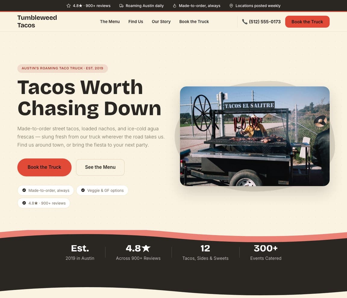
Tumbleweed Tacos: 'Tacos Worth Chasing Down' beside the truck

Tumbleweed Tacos is the food-truck template, and the closest catalog match to the storefront-led sites here (Super Duper): a cream ground, an eyebrow ('AUSTIN'S ROAMING TACO TRUCK · EST. 2019'), a bold headline — 'Tacos Worth Chasing Down' — a paragraph that says where to find it and offers the truck for parties, a red 'Book the Truck' beside 'See the Menu', three chips (made-to-order, veggie and gluten-free options, the rating) and a photograph of the truck at the right. The header strip repeats the reviews and the roaming schedule. Clone it for a truck or a walk-up window, and 'Book the Truck' becomes your catering sale.

See this template
Current Bowl — Adaptable Template website design you can build with Zarla
Build this with Zarla
  • Adaptable Template
  • Clean

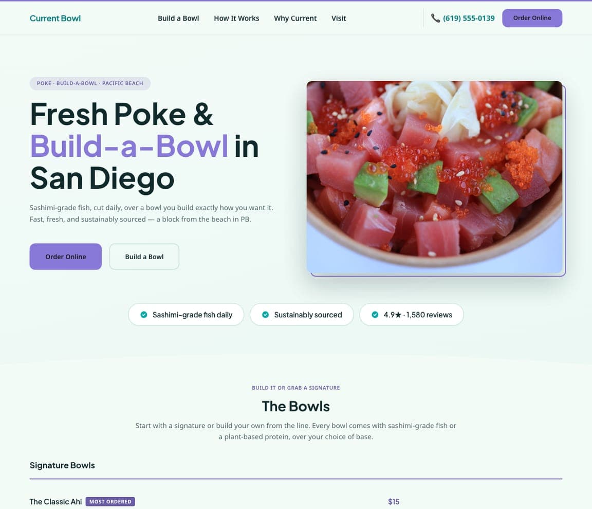
Current Bowl: 'Fresh Poke & Build-a-Bowl' with the bowl beside it

Current Bowl is the build-a-bowl template, and the closest catalog match to the clean, photo-and-button sites here (Five Guys): a white ground, an eyebrow ('POKE · BUILD-A-BOWL · PACIFIC BEACH'), a headline with the format in violet — 'Fresh Poke & Build-a-Bowl in San Diego' — a two-line description about sashimi-grade fish cut daily and sustainable sourcing, a violet 'Order Online' beside 'Build a Bowl', a photograph of the bowl at the right and three chips beneath (sashimi-grade daily, sustainably sourced, the rating and review count). Clone it for any assemble-your-own concept, and 'Build a Bowl' becomes your configurator link.

See this template
Northbound Coffee — Adaptable Template website design you can build with Zarla
Build this with Zarla
  • Adaptable Template
  • Brisk

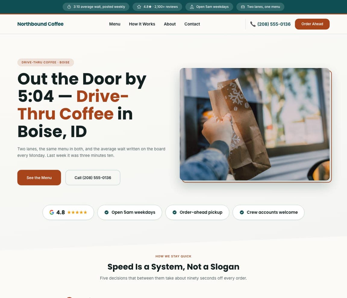
Northbound Coffee: 'Out the Door by 5:04' — the wait time as the headline

Northbound Coffee is the drive-thru template, and the closest catalog match to the order-first sites here (Habit, Cane's): a white ground, an eyebrow ('DRIVE-THRU COFFEE · BOISE'), a headline that promises a time — 'Out the Door by 5:04 — Drive-Thru Coffee in Boise, ID' with the format in rust — a paragraph that explains the two lanes and the average wait written on the board every Monday, a rust 'See the Menu' beside 'Call', a photograph of a bag handed through a window, and four chips (the Google rating, open at 5am on weekdays, order-ahead pickup, crew accounts welcome). Clone it for any quick-service window, and the wait time becomes your promise.

See this template
Assembly 8 — Adaptable Template website design you can build with Zarla
Build this with Zarla
  • Adaptable Template
  • Bold

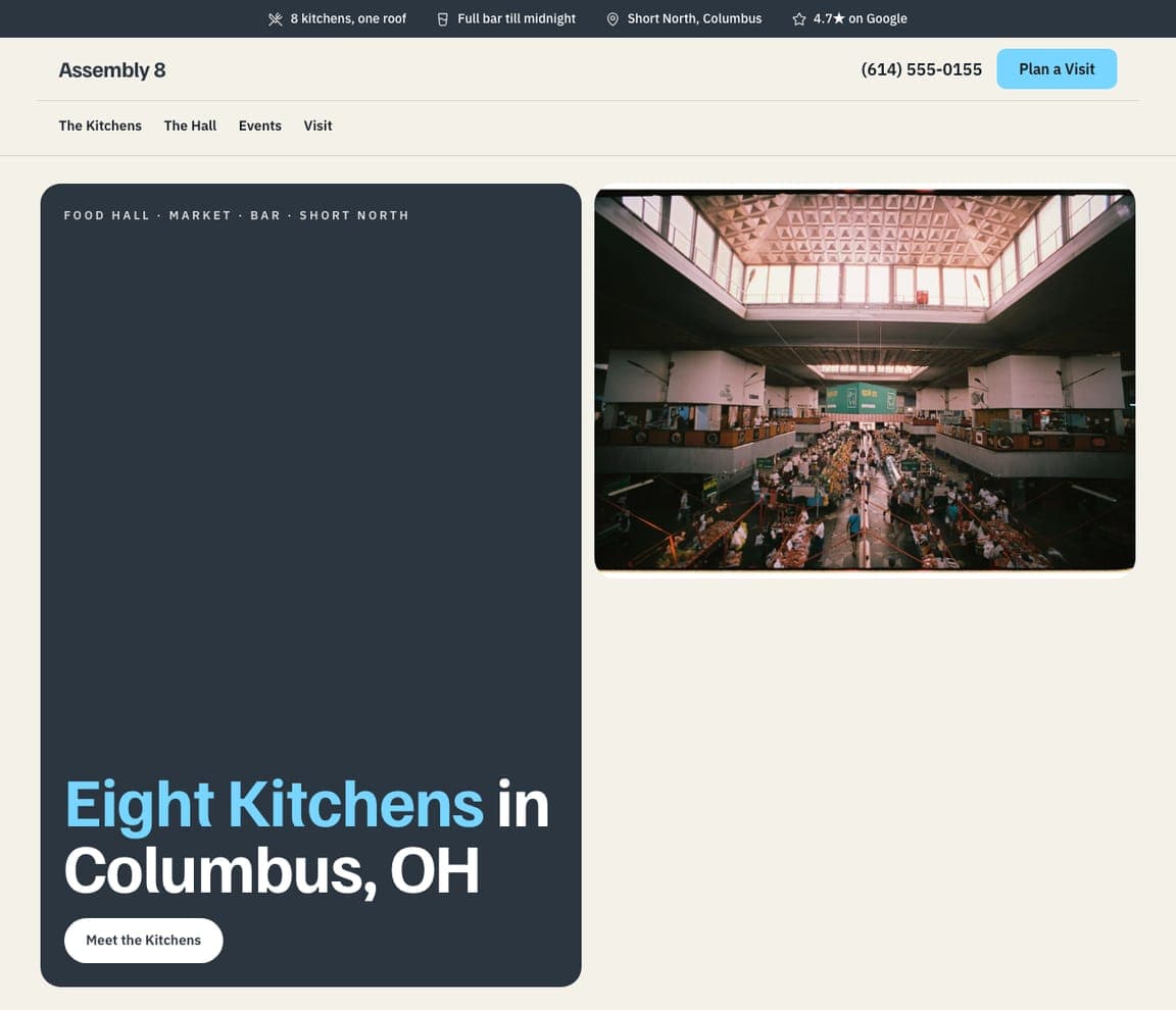
Assembly 8: '8 kitchens, one roof' — a navy card beside the hall

Assembly 8 is the food-hall template, and the closest catalog match to the dark, bold sites here (Hopdoddy, Kuma's Corner, Wings Over): a cream page, a header strip with the chips (eight kitchens under one roof, a full bar till midnight, the neighborhood, the rating), a nav (The Kitchens, The Hall, Events, Visit) and a light-blue 'Plan a Visit', then a navy card that carries the eyebrow ('FOOD HALL · MARKET · BAR · SHORT NORTH') and the headline, beside one photograph of the hall — skylights, long tables, a crowd. Clone it for a multi-concept space or a ghost-kitchen brand, and the chips become your kitchens and your closing time.

See this template

Frequently asked

Where can I find good fast food website examples?

Right here — this page curates fast food website examples across the spectrum: an obsessive burger bar (Hopdoddy), a better-burger chain with values (Super Duper), two national names that keep it plain (Five Guys, Raising Cane's), a regional chain built on local sourcing (Burgerville), a wing brand that sells flavors (Wings Over), a California taco shop (Qué Vida Tacos), a metal-themed burger bar (Kuma's Corner) and a charburger chain whose home page is an ordering widget (The Habit Burger Grill) — each linked so you can explore the live site — plus professionally designed Zarla taqueria, food-truck, build-a-bowl, drive-thru and food-hall templates you can clone and make your own. Every example includes a note on why the design works — the photograph, the line, the order path — so you can copy the thinking, not just the look.

What makes a good fast food website?

It takes the order. The strong examples above keep 'Order Now' in the header and repeat it in the hero, photograph the food close and hot, say one thing in heavy type, and make locations, catering and gift cards one tap away. The copy is a line — a value, a promise, a number — and the design assumes a phone at lunchtime: big buttons, short words, the menu categories as chips. If your hero doesn't get someone to the menu in one tap, it's a poster, not a website.

How much does a fast food website cost?

A custom site from a restaurant agency typically runs from a couple of thousand dollars up, ordering-platform builders charge a monthly fee for the site plus a cut of online orders, and general template builders are roughly $16–$30 per month. An AI website builder generates a quick-service site — menu, locations, online-ordering link, catering, gift cards, careers — from a short description in seconds, then lets you edit it in plain language. Spend the money you save on one photo session of your best three items under bright light.

Should a fast food website lead with a photo or the order button?

Both, in that order of size. Most sites above lead with a close photograph and put the order button inside it (Five Guys, Wings Over, Kuma's Corner); Habit flips it and makes the ordering switch the hero with the photograph beside it, which works when most visitors already know they want you. If you're new in town, lead with the food; if you're a habit, lead with the button.

What pages does a fast food website need?

Most quick-service restaurants need five: a home page with the food, the line and the order button; a menu page organized by category chips (burgers, sandwiches, salads, kids, sides, drinks) with prices and calories; an order-online link that goes straight to your ordering system with pickup and delivery; a locations page with hours and a map; and a catering or group-orders page with a form. Add gift cards, rewards and careers if you have them — Cane's, Wings Over and Habit all put them in the header because they sell or hire.

How do fast food restaurants get more customers from their website?

Put the order button in the header and the hero, offer pickup and delivery on the first screen, and give catering its own page. The converting pattern above: Habit's pickup-or-delivery switch with a zip-code field in the hero, Five Guys's red 'Start Your Order' under the promise, Cane's combo cards directly under the video, Wings Over's 'Get Your Flavor' under the count. Then let the photography do the marketing — food that looks this close and hot gets ordered.

You've seen what works. Now make it yours.

Describe your business and Zarla designs a complete, professional website in about 30 seconds — built to convert, just like the ones above.

Free to build and preview · no credit card · publish to your own domain on Premium