Inspiration · Financial Advisor

The Best Financial Advisor Website Examples, Explained

Looking for financial advisor website examples? These 12 are the strongest we found — Fiat Wealth Management's 'financial planning for those nearing or in retirement' beside two hikers, Shorepoint's serif 'Complete & Connected Planning' over a harbor, Town Capital's planning firm for nuclear power plant professionals — plus advisory designs you can build with Zarla, each with a breakdown of the specific move that turns a cautious first visit into a scheduled call. A financial advisor's website has to do what the advisor does: name who it's for and make the first conversation feel safe. Find an approach you love and you can build a site in that spirit, free, in about 30 seconds.

Real sites + designs you can build with Zarla — free to build and preview, no credit card

What makes a great financial advisor website

The best financial advisor websites answer 'is this for me?' in the headline. The strong examples here name a client — those nearing retirement, business-owning families, first-generation wealth, nuclear power plant professionals, correctional officials — rather than promising 'comprehensive wealth management' to everyone. The photography is the life the money is for (hikers, a harbor of sailboats, a dinner under string lights) or the advisors themselves (Archer's two partners, Capital Design's 'Meet with Andre'), never a stock handshake over a chart. Proof is quiet and specific: a client-login link in the nav, twenty years built into a logo, a logo row of the companies clients work at. And the ask is a call, not a form — 'Schedule a Call', 'Talk with Fiat', 'Book a Meeting'. Every example below sells a relationship, and the first screen is written for one kind of person.

Fiat Wealth Management website — Retirement Planning design example
Real site
  • Retirement Planning
  • Confident
  • White + yellow

Fiat Wealth Management: The client named in the headline, two hikers beside it

Fiat Wealth Management writes the headline for exactly one reader: over a soft fade from white into a photograph of two hikers with packs on a mountain trail in autumn, a small eyebrow gives the firm's name and the headline says whom it serves in heavy black capitals — 'FINANCIAL PLANNING FOR THOSE NEARING OR IN RETIREMENT.' The sub-line names the fear the firm removes ('Helping families take away the fear of spending their money in retirement'), and two buttons follow, a black 'Our Process' and an outlined 'About Us'. The nav carries 'Fiat University' and a client portal, and a yellow 'TALK WITH FIAT' — the only saturated color on the page. Fiat shows an advisory practice how to convert by exclusion: name the life stage, name the fear, and put the process before the pitch.

  • 'For those nearing or in retirement' — the client in the headline
  • 'Take away the fear of spending' — the emotional job stated plainly
  • 'Our Process' as the first button, 'Talk with Fiat' in yellow in the nav

Steal this: Name the fear your clients actually have in the sub-line — 'the fear of spending their money in retirement' beats 'personalized wealth strategies'.

Visit Fiat Wealth Management

Opens a similar Zarla design you can make yours.

Shorepoint Advisory Group website — Comprehensive Planning design example
Real site
  • Comprehensive Planning
  • Calm
  • Harbor blue + white

Shorepoint Advisory Group: A serif philosophy over a harbor of sailboats

Shorepoint Advisory Group photographs the life the planning protects: an aerial of a harbor — sailboats at anchor, a motorboat cutting a white wake, a bridge in the corner — and over it a serif headline that states a philosophy rather than a service, 'Complete & Connected Planning', with a two-line explanation ('True financial well-being isn't about isolated decisions — it's about having a clear, complete picture where every piece supports your life'). One blue 'Schedule A Call' follows. The header keeps a lighthouse mark, a 'Client Login' link and the phone above a three-item nav (About Us, How We Help, News & Insights) and a second 'Schedule A Call'. Shorepoint shows a planning firm how to sound thoughtful: a serif line, a sentence about the whole picture, a harbor, and one call to action repeated twice.

  • A philosophy as the headline: 'Complete & Connected Planning'
  • The harbor aerial — the life, not the ledger
  • 'Schedule A Call' twice: nav and hero, nothing else

Steal this: Write the headline as your planning philosophy in three words, then explain it in one sentence — it reads as a point of view, not a menu.

Visit Shorepoint Advisory Group

Opens a similar Zarla design you can make yours.

Archer Investment Management website — Fee-Only Advisor design example
Real site
  • Fee-Only Advisor
  • Approachable
  • Green + peach

Archer Investment Management: Two advisors and the companies their clients work at

Archer Investment Management makes the people the proof: on a deep green field, a serif headline — 'Get A Strong Plan For Your Financial Future' — a sub-line that lists what a plan does in plain words ('Set goals, lower your taxes, plan for retirement, and more with our friendly and detail-oriented team'), a peach 'Get Started', and, to the right, a photograph of the two partners, cut out against the green. A white card overlaps the bottom of the hero: 'Our Clients Work At Companies Like These' above a scrolling row of logos — Microsoft, IBM, Intel, Indeed, Cisco — which tells a prospect exactly whom the firm serves without saying 'tech professionals'. The nav opens with 'Why Archer' and includes 'Process & Pricing', two words most advisors hide. Archer shows a fee-only practice how to earn trust fast: real faces, plain benefits, the clients' employers as the credential.

  • The partners photographed, not a stock couple
  • 'Our clients work at companies like these' — a logo row as the niche
  • 'Process & Pricing' in the nav: fees acknowledged up front

Steal this: If your clients cluster at a few employers or in one profession, show those logos with 'Our clients work at companies like these' — it names the niche without a label.

Opens a similar Zarla design you can make yours.

Sapphire Wealth Management website — Wealth Management design example
Real site
  • Wealth Management
  • Personal
  • Navy + gold

Sapphire Wealth Management: 'It's personal' in a navy card over a mountain

Sapphire Wealth Management puts its one-line position in a card and the rest of the screen into a landscape: a photograph of two hikers climbing a golden hillside under a blue sky fills the hero, and in the lower-right a navy card with a thin gold top edge reads 'It's not just a strategy. It's personal.' in serif, followed by a paragraph that argues against cookie-cutter planning ('no two clients should have the same, cookie-cutter financial strategy') and a gold 'LET'S TALK'. The header is white with a '20 years' badge built into the logo and a serif nav that includes 'Client Center'. The card is the whole pitch; the mountain is the mood. Sapphire shows a small firm how to make an ordinary promise feel considered: a serif sentence in a navy card, a gold accent, twenty years in the logo.

  • The pitch contained in one navy card with a gold rule
  • '20 years' built into the logo mark
  • Hikers on a golden hill — the same aspiration Fiat uses, framed differently
Visit Sapphire Wealth Management

Opens a similar Zarla design you can make yours.

Family Wealth & Legacy website — Family Business Advisory design example
Real site
  • Family Business Advisory
  • Warm
  • Blue + orange

Family Wealth & Legacy: A blue card for business-owning families

Family Wealth & Legacy builds the hero as a single blue card on white: inside it, a headline with a typing cursor after the second line — 'Guiding families through legacy / without losing what matters.' — a paragraph that names the client with precision ('business-owning families navigate generational transition, ownership complexity, and long-term legacy'), an orange 'DISCUSS YOUR NEXT CHAPTER' and three small checks (Clarity, Confidence, Continuity). To the right inside the card, a black-and-white photograph of three generations of men laughing in a brewery. The header is white with 'Client Login' in blue and 'Let's Chat' in orange. The card is the design; everything the firm wants to say fits inside it. Family Wealth & Legacy shows a niche advisory how to sound like a family office: name the transition, photograph the family, keep the promise to three words.

  • 'Business-owning families' — the client named in the first sentence
  • A black-and-white photograph of three generations, not a couple on a beach
  • Three one-word checks: Clarity, Confidence, Continuity
Visit Family Wealth & Legacy

Opens a similar Zarla design you can make yours.

Capital Design Private Wealth website — Two-Advisor Practice design example
Real site
  • Two-Advisor Practice
  • Personal
  • Teal + white

Capital Design Private Wealth: 'Meet with Andre', 'Meet with Hilton' — the advisors as the offer

Capital Design Private Wealth skips the headline and offers the people: a dark teal band across the top carries the logo (a stand of pine trees) and a photograph of a figure on a rocky shore, and directly under it, on white, two serif invitations side by side — 'Meet with Andre' and 'Meet With Hilton' — each above a studio portrait of the advisor, jacket and open collar, warm-lit. There is no promise, no service list, no button in the first screen; the portraits are the call to action. It is the most literal expression of what an advisory practice sells: a person you'll trust. Capital Design shows a two-advisor firm how to convert on faces alone — name them, photograph them well, and let 'meet with' be the only verb on the page.

  • 'Meet with Andre' / 'Meet with Hilton' — advisors as the first screen
  • Studio portraits instead of stock lifestyle
  • No headline, no services: the person is the offer

Opens a similar Zarla design you can make yours.

Town Capital website — Niche Advisory design example
Real site
  • Niche Advisory
  • Specific

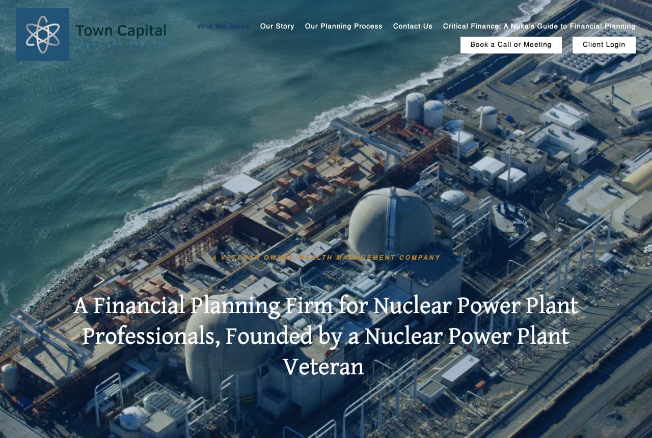
Town Capital: A niche so specific it needs an aerial of the plant

Town Capital commits to a client no other firm would put in a headline: over an aerial photograph of a nuclear power plant on the coast — containment domes, cooling structures, the sea beside them — a serif headline states the whole business, 'A Financial Planning Firm for Nuclear Power Plant Professionals, Founded by a Nuclear Power Plant Veteran', with a gold eyebrow above it ('A VETERAN OWNED WEALTH MANAGEMENT COMPANY'). The logo is an atom; the nav includes 'Critical Finance: A Nuke's Guide to Financial Planning', a 'Book a Call or Meeting' button and a client login. Nothing about the page would work for anyone else, which is exactly why it works for its reader. Town Capital shows the extreme of niche positioning: photograph the client's workplace, put their job title in the headline, and speak their language in the nav.

Visit Town Capital

Opens a similar Zarla design you can make yours.

Investably website — Fiduciary Advisor design example
Real site
  • Fiduciary Advisor
  • Modern

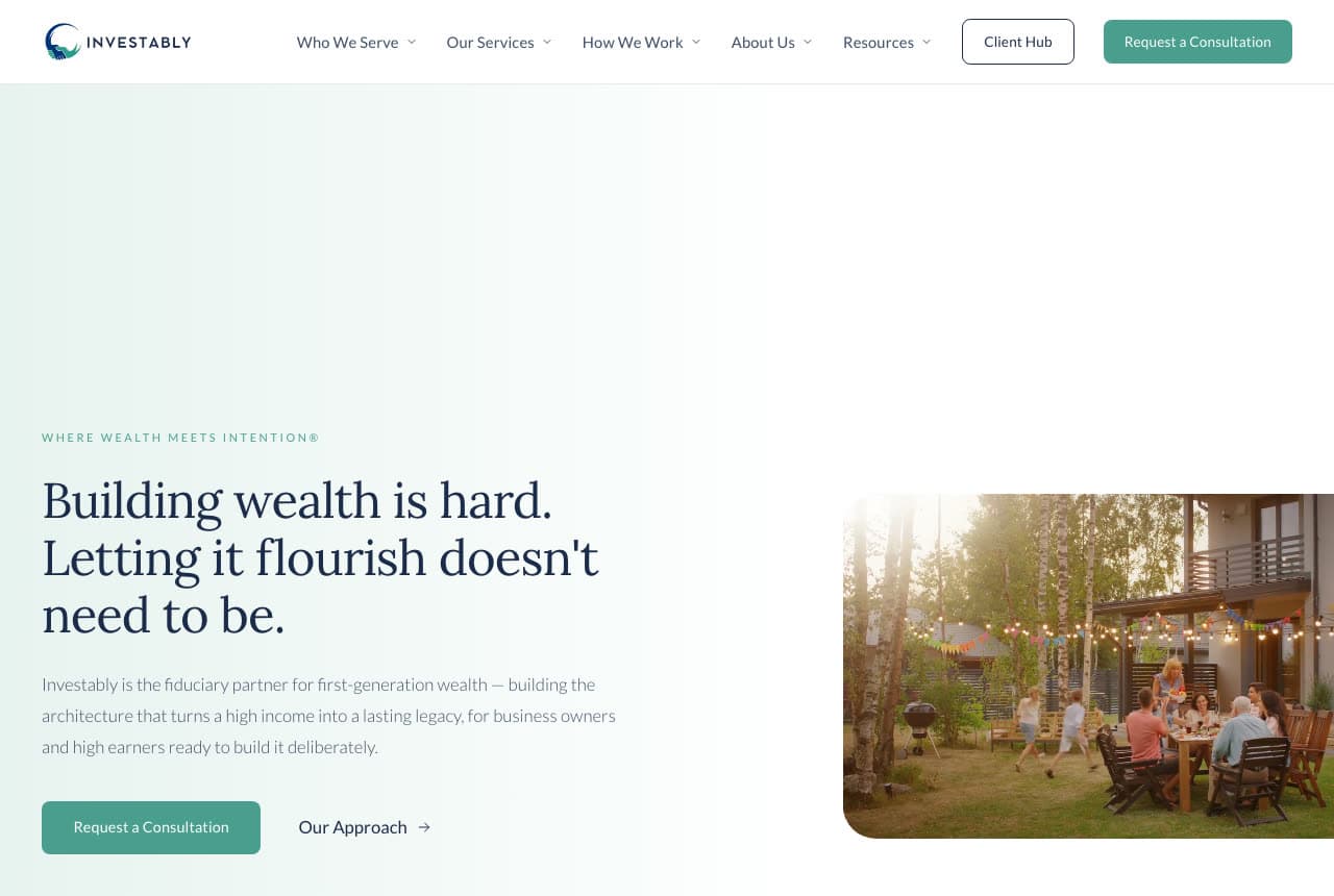
Investably: A hard truth in serif on a mint gradient

Investably opens with an admission instead of a promise: on a pale mint gradient, a tiny green eyebrow ('WHERE WEALTH MEETS INTENTION') sits above a serif headline in two sentences — 'Building wealth is hard. Letting it flourish doesn't need to be.' — and a paragraph that names the client precisely ('the fiduciary partner for first-generation wealth… for business owners and high earners ready to build it deliberately'). A teal 'Request a Consultation' sits beside an 'Our Approach →' link, and to the right a rounded photograph of a family dinner under string lights on a deck does the aspiration. The nav has five items, a 'Client Hub' and the teal button again. Investably shows a fiduciary how to sound modern: acknowledge the difficulty, name the generation, photograph the evening the money buys.

Visit Investably

Opens a similar Zarla design you can make yours.

PATH Financial Partners website — Niche Advisory design example
Real site
  • Niche Advisory
  • Human

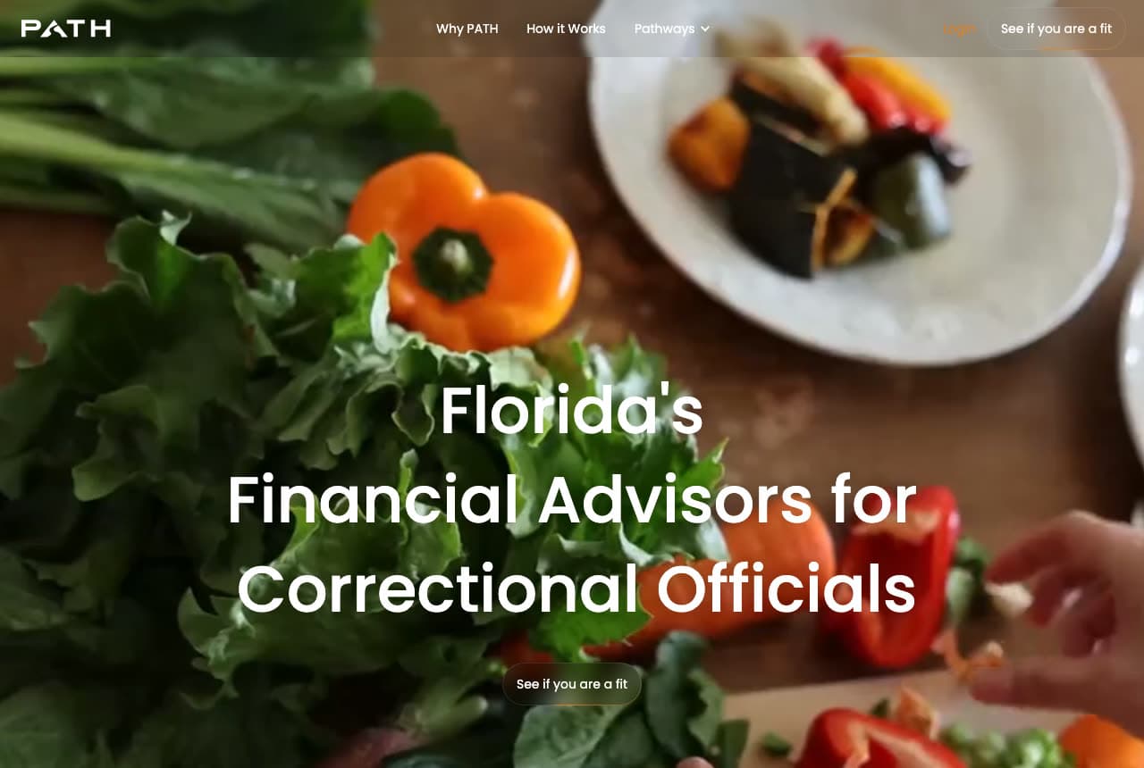
PATH Financial Partners: One profession in the headline, dinner in the photo

PATH Financial Partners writes the narrowest headline in this gallery and photographs something unexpected behind it: over a warm, close photograph of vegetables being prepared — peppers, greens, a plate of roasted squash — three centered lines in white say 'Florida's / Financial Advisors for / Correctional Officials', with one small outlined button beneath, 'See if you are a fit'. The nav is three items (Why PATH, How it Works, Pathways) and a 'Login'. There is no explanation of the photograph, and it doesn't need one; the meal is the ordinary life the pension is for, and the button's wording ('see if you are a fit') filters as much as it invites. PATH shows a firm built for one profession how to talk to it: state the job in the headline, keep the ask humble, and let the picture be human.

Visit PATH Financial Partners

Opens a similar Zarla design you can make yours.

Wexford Wealth Partners — Wealth Management website design you can build with Zarla
Build this with Zarla
  • Wealth Management
  • Calm

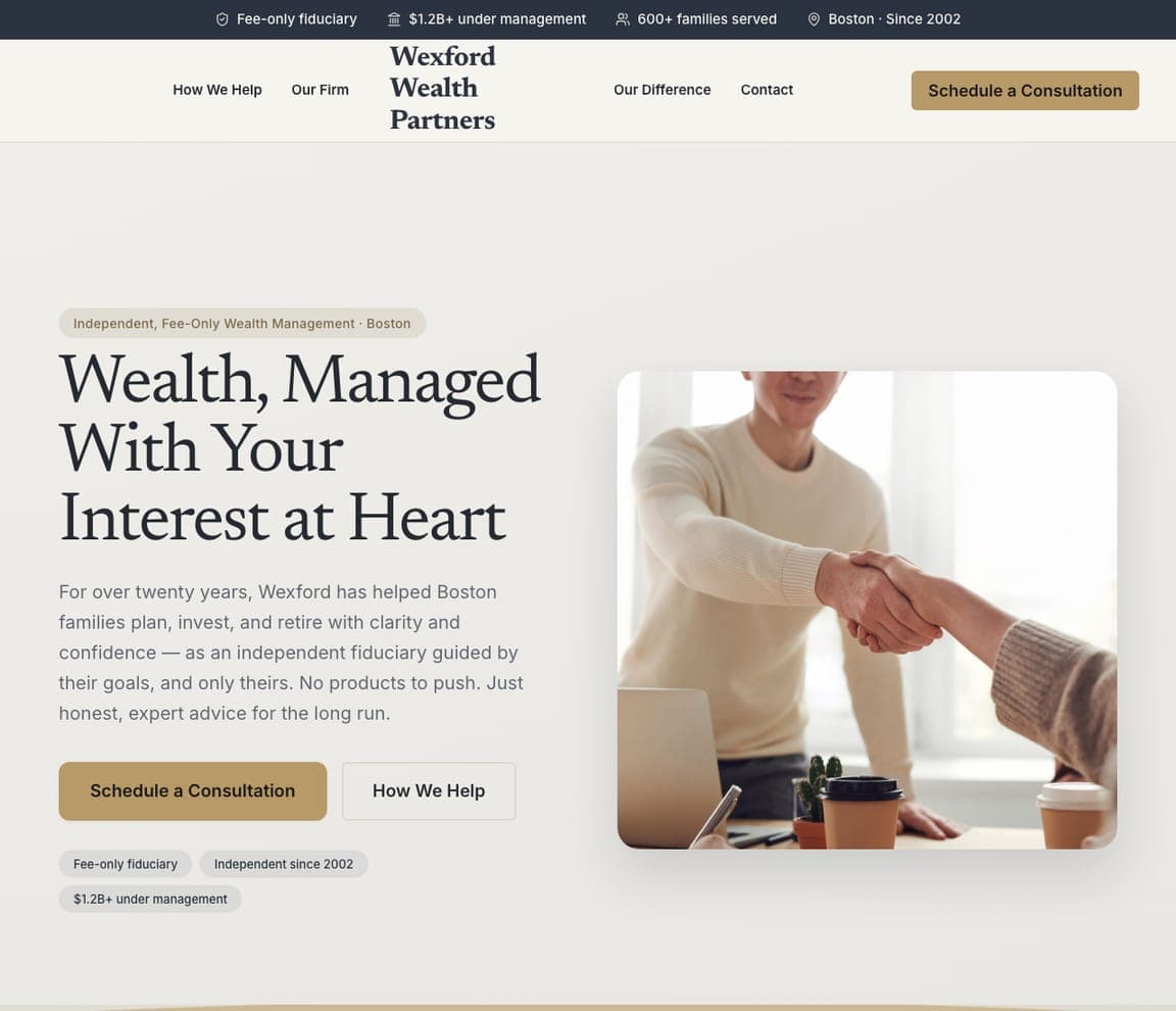
Wexford Wealth Partners: Interest at heart, in serif, with a handshake

Wexford Wealth Partners is the Zarla wealth-management template: a cream ground, an eyebrow that names the model and the city ('Independent, Fee-Only Wealth Management · Boston'), a serif headline — 'Wealth, Managed With Your Interest at Heart' — a paragraph about twenty years as an independent fiduciary ('No products to push. Just honest, expert advice for the long run'), a gold 'Schedule a Consultation' beside 'How We Help', and a photograph of a handshake across a desk. The top strip states the fee-only status, the assets under management, the families served and the founding year. It's Shorepoint's calm and Archer's plain benefits in one screen. Clone it, and the strip becomes your fiduciary facts.

See this template
Mainstay Small Business CPAs — Adaptable Template website design you can build with Zarla
Build this with Zarla
  • Adaptable Template
  • Professional

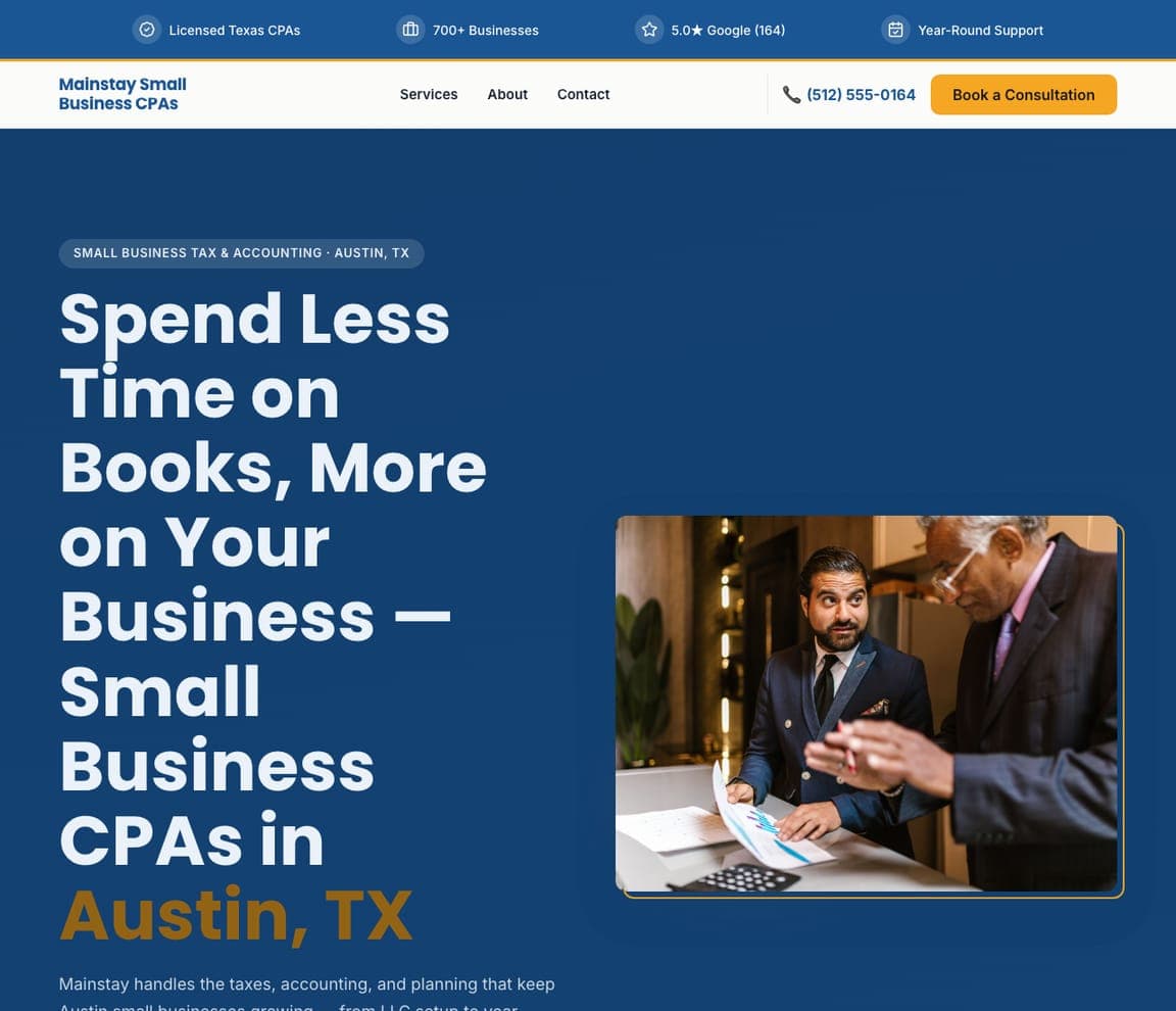
Mainstay Small Business CPAs: Books off the desk — for the business-owner client

Mainstay Small Business CPAs is an accounting template, not an advisory one — but its hero is the closest catalog match to Family Wealth & Legacy's business-owner audience: a navy ground, an eyebrow ('Small Business Tax & Accounting · Austin, TX'), a headline set large in white — 'Spend Less Time on Books, More on Your Business — Small Business…' — a photograph of an advisor with a client, and a trust strip counting the licensed CPAs, the businesses served and the rating. Swap 'books' for 'the plan' and it is a business-owner planning practice. Clone it, describe your firm, and the copy rewrites itself around advice.

See this template
Redwood Tax Co — Adaptable Template website design you can build with Zarla
Build this with Zarla
  • Adaptable Template
  • Direct

Redwood Tax Co: A quote form in the hero, for the tax-season practice

Redwood Tax Co is the conversion-first accounting template: a dark photograph of an advisor at a desk, an eyebrow ('Personal Tax Preparation · Portland, OR'), a headline with the promise and the service — 'Bigger Refund, Zero Stress — Tax Preparation in Portland, OR' with the service in amber — and a 'Get My Free Quote' form card standing in the hero with a tax-situation dropdown. The top strip counts the returns filed and the 48-hour turnaround. For an advisory practice that also prepares taxes, or one that wants a lead form rather than a scheduling link, clone it and the dropdown becomes your intake question.

See this template

Frequently asked

Where can I find good financial advisor website examples?

Right here — this page curates financial advisor website examples across the spectrum: retirement specialists (Fiat Wealth Management), comprehensive planners (Shorepoint Advisory Group, Archer Investment Management, Sapphire Wealth Management), family-business advisors (Family Wealth & Legacy), a two-advisor practice (Capital Design Private Wealth), a fiduciary for first-generation wealth (Investably) and two niche firms (Town Capital for nuclear professionals, PATH for correctional officials) — each linked so you can explore the live site — plus professionally designed Zarla wealth-management and accounting templates you can clone and make your own. Every example includes a note on why the design works — the client named, the photography, the call-to-action — so you can copy the thinking, not just the look.

What makes a good financial advisor website?

It names the client and makes the first call easy. The strong sites above put the niche in the headline ('for those nearing or in retirement', 'for nuclear power plant professionals'), show the advisors' real faces or the life the money is for, keep the compliance-heavy detail one click away, and make the ask a conversation — 'Schedule a Call', 'Book a Meeting' — rather than a long intake form. A client login in the nav signals an established practice; a 'how we work' or process page answers the question every prospect has but rarely asks: what happens after I call?

How much does a financial advisor website cost?

Advisor-specialist platforms and agencies typically charge a monthly fee plus a setup cost, custom builds run into the thousands, and general template builders are roughly $16–$30 per month plus your time. An AI website builder generates an advisory site — who you serve, services, process, team, a schedule-a-call button — from a short description in seconds, then lets you edit it in plain language. Whatever you use, budget for compliance review of the copy and for real photographs of the team; those two things, not the platform, are what make an advisor site convert.

Should a financial advisor website state a niche?

Yes — the niche is the headline. The most distinctive sites above are the narrowest: Town Capital serves nuclear power plant professionals, PATH serves correctional officials, Family Wealth & Legacy serves business-owning families, Fiat serves people nearing retirement. A specific headline makes the right visitor feel found and lets the wrong visitor leave quickly, which is what a referral-driven practice wants. If your practice is genuinely broad, name the life stage or the question you're best at rather than listing every service.

What pages does a financial advisor website need?

Most practices need six: a home page that names the client and the next step, a 'who we serve' page (one section or page per niche), a services page, a 'how we work' or process page with fees stated as plainly as compliance allows, an about page with real photographs and credentials, and a contact page that schedules a call. Add a client-login link in the header (Shorepoint, Sapphire and Family Wealth & Legacy all do) and an insights or blog section if you'll keep it current — an abandoned blog reads worse than none.

How do financial advisors get more clients from their website?

Write the headline for one kind of client, show the advisors' faces, and make scheduling a call the only ask. The converting pattern above: Archer's 'Get A Strong Plan For Your Financial Future' beside the two partners and a row of the companies their clients work at, Shorepoint's 'Schedule A Call' under a one-line philosophy, Fiat's yellow 'Talk with Fiat' in the nav. Then add a page per niche you serve — 'financial planning for physicians', 'for business owners' — so each referral and each search lands on the story written for them.

You've seen what works. Now make it yours.

Describe your business and Zarla designs a complete, professional website in about 30 seconds — built to convert, just like the ones above.

Free to build and preview · no credit card · publish to your own domain on Premium