smythchicago.com
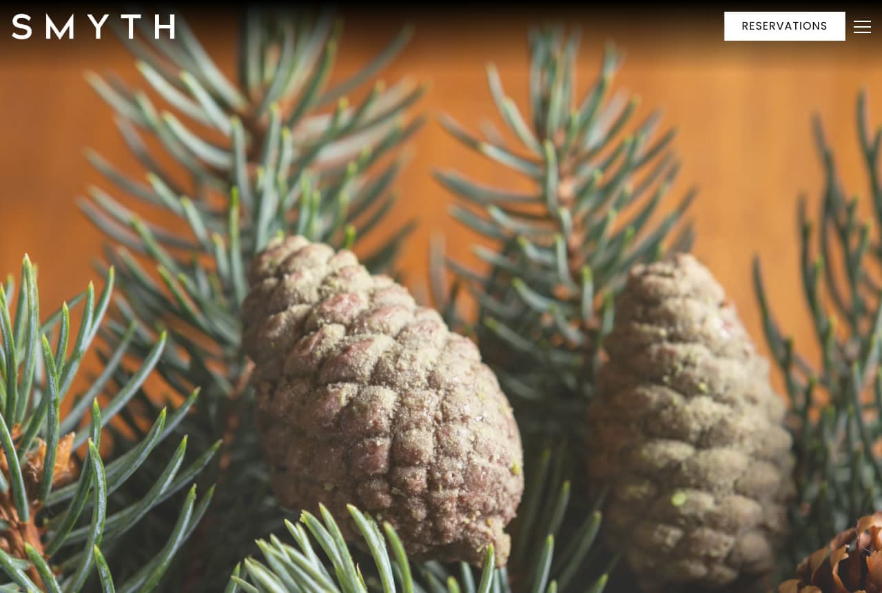
Smyth: Pine cones on a branch: the ingredient as the hero
Smyth photographs the forest instead of the plate: a dark header with 'SMYTH' in wide tracked white capitals, a white 'RESERVATIONS' button and a hamburger, and then a close photograph of two pine cones on a spruce branch against warm wood — needles sharp, cones dusted with resin. Nothing is written over it and nothing follows in the first screen. For a tasting menu built on foraged and farmed ingredients, the raw material is the truthful image, and it looks nothing like every other restaurant's plate. The wide wordmark and the single white button are the only type. Smyth shows a tasting-menu restaurant how to signal its point of view in one frame: photograph the ingredient before the kitchen touches it, keep the header dark, and make 'Reservations' the only button.
Opens a similar Zarla design you can make yours.
cosmenyc.com
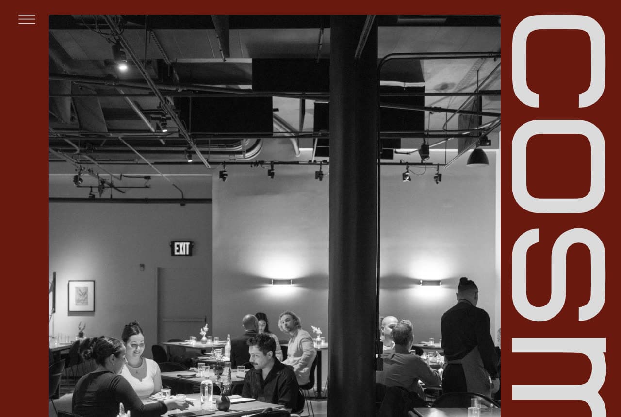
Cosme: 'cosme' set vertical and enormous down a maroon page
Cosme turns its name sideways: a deep maroon page, a hamburger top-left, a black-and-white photograph of the dining room framed at the left — exposed ductwork and spotlights overhead, diners at tables, a server standing — and down the right edge, in a wide rounded sans so large only 'cos' and the top of 'm' fit, the wordmark 'cosme' running vertically. No headline, no button, no menu link in the first screen; the H1 further down simply says 'About'. The maroon is the brand color, the monochrome room keeps the food out of it, and the vertical type makes the page feel like a poster. Cosme shows a modern Mexican dining room how to be graphic instead of appetizing: one bold color, one black-and-white photograph, and the name at a scale that has to be cropped.
Opens a similar Zarla design you can make yours.
thomaskeller.com
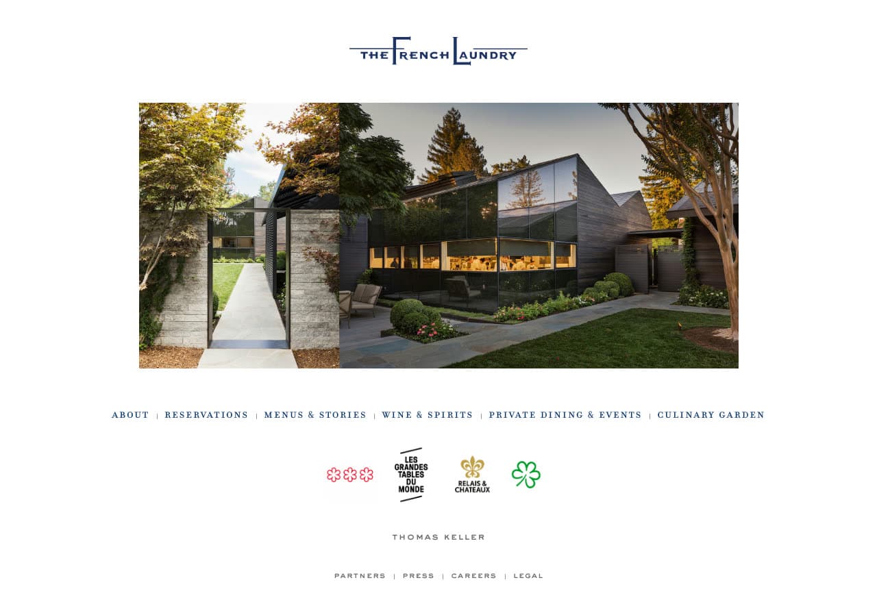
The French Laundry: The kitchen building across the garden, and a row of credentials
The French Laundry keeps the classic form: a white page, the logo in navy serif with its bracket rules — 'THE FRENCH LAUNDRY' — a photograph of the glass-and-stone kitchen building seen across the garden path in evening light, a single navy small-caps nav line beneath it (About, Reservations, Menus & Stories, Wine & Spirits, Private Dining & Events, Culinary Garden), and then the credentials as a row of marks: three red Michelin flowers, Les Grandes Tables du Monde, Relais & Châteaux, the green star. 'THOMAS KELLER' sits in tracked capitals under them, with a small footer row (Partners, Press, Careers, Legal). No headline, no button; the photograph, the nav and the marks are the page, centered like a printed card. The French Laundry shows a restaurant with the credentials to prove it how to present them: as symbols in a row, under one photograph of the place, on white.
Opens a similar Zarla design you can make yours.
aureum.com
- Adaptable Template
- Elegant
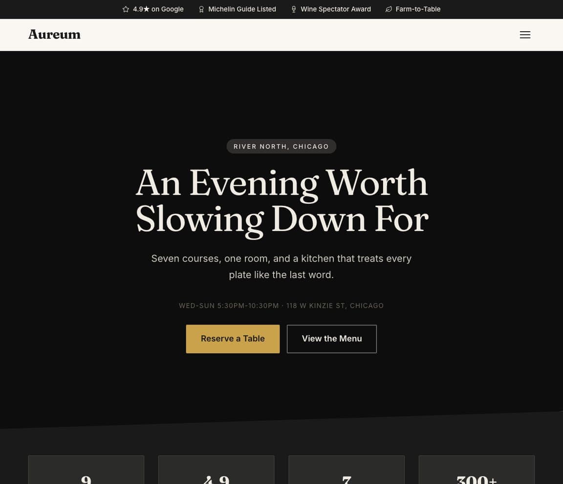
Aureum: 'An Evening Worth Slowing Down For' on black
Aureum is the Zarla fine-dining template: a black field, an eyebrow that names the neighborhood ('RIVER NORTH, CHICAGO'), a white serif headline that sells the evening — 'An Evening Worth Slowing Down For' — a two-line description ('Seven courses, one room, and a kitchen that treats every plate like the last word'), a line of hours and the street address in small tracked caps, and a gold 'Reserve a Table' beside 'View the Menu'. The top strip carries the Google rating, a Michelin Guide listing, a Wine Spectator award and 'Farm-to-Table'. It's Smyth's dark header with Canlis's calm and a button. Clone it, name your street, and the strip becomes your listings.
seattwelve.com
- Adaptable Template
- Intimate
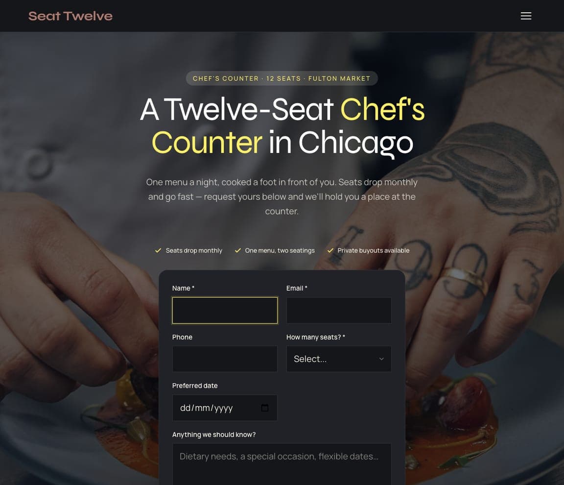
Seat Twelve: 'A Twelve-Seat Chef's Counter' with a request form
Seat Twelve is the chef's-counter template, and the closest catalog match to the counter restaurants here (Atomix, Smyth): a dimmed photograph of tattooed hands plating a course, an eyebrow that states the format ('CHEF'S COUNTER · 12 SEATS · FULTON MARKET'), a headline with the format in yellow — 'A Twelve-Seat Chef's Counter in Chicago' — a paragraph that explains the booking window ('One menu a night, cooked a foot in front of you. Seats drop monthly and go fast — request yours below'), three checks (seats drop monthly, one menu with two seatings, private buyouts) and a request form with name, email, phone, party size and preferred date. Clone it for a counter with a waiting list, and the form becomes your seat requests.
tideledger.com
- Adaptable Template
- Coastal
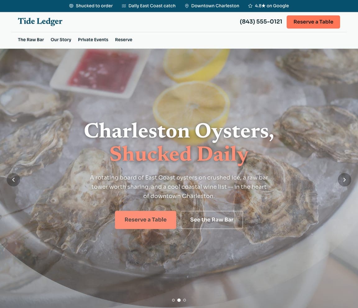
Tide Ledger: 'Charleston Oysters, Shucked Daily' over the ice
Tide Ledger is the raw-bar template, and the closest catalog match to the seafood room here (Le Bernardin): a photograph of oysters on crushed ice filling the screen, a header with the name, a phone number and a coral 'Reserve a Table', a nav (The Raw Bar, Our Story, Private Events, Reserve), a white serif headline with the promise in coral — 'Charleston Oysters, Shucked Daily' — a two-line description ('A rotating board of East Coast oysters on crushed ice, a raw bar tower worth sharing, and a cool coastal wine list'), and a coral 'Reserve a Table' beside 'See the Raw Bar'. The top strip states 'shucked to order' and the daily catch. Clone it for a seafood-led room, and the strip becomes your boats.


