Inspiration · Martial Arts

The Best Martial Arts Website Examples, Explained

Looking for martial arts website examples? These 12 are the strongest we found — All Star Jiu Jitsu's 'sharing the art & lifestyle', Mission MMA's 'Step Beyond Your Limit' with a free-trial form beside it, Renzo Gracie Academy's plain 1996-established page — plus school designs you can build with Zarla, each with a breakdown of the specific move that turns a curious parent or beginner into a free first class. A martial arts website sells two things: the discipline and the welcome. Find an approach you love and you can build a site in that spirit, free, in about 30 seconds.

Real sites + designs you can build with Zarla — free to build and preview, no credit card

What makes a great martial arts website

The best martial arts websites make the first class feel easy to try and the school feel like a place you'd belong. Almost every strong example here offers a free class or trial in the first screen, shows real students on real mats (kids in gis, adults mid-roll) rather than stock fighters, and states plainly who it's for — all ages, beginners welcome, families. The mood splits by intent: family and community schools lean welcoming (All Star, Blue Wave, The Dojo NYC), MMA gyms and legacy academies lean dark and intense (Mission, American Combat, Anderson's, Renzo Gracie). Both convert; what matters is matching the design to the student you want walking in.

All Star Jiu Jitsu website — BJJ Academy design example
Real site
  • BJJ Academy
  • Welcoming
  • White + red

All Star Jiu Jitsu: Lifestyle in the headline, students on the wall

All Star Jiu Jitsu opens with a photograph of its own academy — students in gis sitting along a whitewashed wall under a neon-lit ceiling — and a headline in condensed capitals that sells the culture, not the technique: 'SHARING THE ART & LIFESTYLE OF JIU JITSU.' One red button underneath: 'Schedule Your Free Class Today'. Below, an 'About Our Academy' section in the same red opens with the line every family school wants to earn ('more than a place to train, it's a second home') beside the circular crest. The design is athletic without being aggressive — white, red, and the blue of the gis. All Star shows how a jiu-jitsu school sells belonging first and belts second.

  • 'Art & lifestyle' frames the school as a community, not a class
  • Real students on the academy's own wall — no stock fighters
  • One red free-class button carries the entire first screen

Steal this: Photograph your students sitting together, not sparring — belonging sells more first classes than intensity.

Visit All Star Jiu Jitsu

Opens a similar Zarla design you can make yours.

Mission MMA & Fitness website — MMA Gym design example
Real site · Chicago, IL
  • MMA Gym
  • Intense
  • Black + red

Mission MMA & Fitness: The free-trial form sits beside the headline

Mission MMA & Fitness makes the ask impossible to miss: a washed-out grey photograph of the empty gym, darkened on the left, a two-line headline in condensed capitals — 'STEP BEYOND' in white, 'YOUR LIMIT.' in red — a sub-line that names the offer precisely ('Chicago's Premier Brazilian Jiu-Jitsu Academy · Muay Thai & MMA'), and a 'Claim your free trial' form card standing right beside it, no scrolling required. The paragraph earns trust with lineage: led by a second-degree IBJJF black belt, with world-class Muay Thai and strength coaching alongside. A red 'Claim Your Free Class' and an outlined 'View Programs' sit under the copy, and a red eyebrow above the headline lists the three locations (Chicago · West Town · West Loop). Mission shows the fight-gym formula at its most efficient: intensity in the type, proof in the paragraph, the form in the hero.

  • A trial form in the first screen — the conversion path is the hero
  • 'Step beyond your limit' in red: intensity as the brand voice
  • Lineage (a second-degree IBJJF black belt) named in the first paragraph

Steal this: Put the free-trial form beside the headline — a fight gym's visitor is decisive; don't make them scroll to say yes.

Visit Mission MMA & Fitness

Opens a similar Zarla design you can make yours.

Renzo Gracie Academy website — BJJ Academy design example
Real site · New York, NY
  • BJJ Academy
  • Plain
  • Black + blue

Renzo Gracie Academy: A famous name, set plainly

Renzo Gracie Academy has one of the most recognizable names in the sport and treats it accordingly: a black page, the name set large in a plain white sans, one line of what and where — 'Brazilian Jiu-Jitsu, Muay Thai, and MMA in NYC.' — and a short paragraph that begins with the credential that matters, 'Established in 1996… in Midtown Manhattan, continues being one of the world's leading schools in martial arts'. The only button is for the visitor who isn't in New York: 'Find an Affiliate Academy!' in blue. A quote below reframes the whole enterprise: 'We are not in the business of martial arts. We are in the business of building confidence.' Renzo Gracie shows that a legacy school can skip the theatrics; the name and the year do the persuading.

  • Established year and location in the first paragraph, not the footer
  • A plain black layout lets a famous name carry the page
  • The one button serves the out-of-town visitor — smart for a global brand

Steal this: If your school has history, lead with the year — 'established' is the credential parents trust most.

Visit Renzo Gracie Academy

Opens a similar Zarla design you can make yours.

Ironwood Martial Arts Academy — Family School website design you can build with Zarla
Build this with Zarla
  • Family School
  • Bright
  • White + green

Ironwood Martial Arts Academy: Kids, adults and a promise about character

Ironwood Martial Arts Academy is the Zarla martial arts template: a photograph of an instructor guiding a young student, a four-word headline about the outcome parents actually buy — 'Strength. Respect. Confidence. For Life.' — and a paragraph that spans the audience ('confident, focused, respectful kids and adults through traditional martial arts'). A green 'Claim a Free Intro Class' and an outlined 'See Our Programs' sit below, with the practical facts in small type (ages 3 to adult, certified black-belt instructors, years in the neighborhood) and trust chips above the nav. It's the buildable version of the family-school register that Blue Wave and All Star use. Clone it, change the city and the art, and the free-intro funnel is already wired.

  • The headline sells character outcomes — what parents are really buying
  • Ages, instructors and years stated in plain small type
  • Clone → change the art and city → the free-intro path is ready
See this template
Gentle Art Dojo website — BJJ Network design example
Real site · Aventura, FL
  • BJJ Network
  • Serious
  • Black + white

Gentle Art Dojo: The homepage is a location picker

Gentle Art Dojo solves the multi-location problem in the first screen instead of the footer: on a black field under the name and the line 'Find a School Near You', three location tiles — GAD Aventura, GAD Davie, GAD Hallandale — each with its city and its programs (BJJ, kids classes, all levels), with giant ghosted numerals 01, 02, 03 behind them. There's no hero photograph and no generic mission statement; the design assumes the visitor's first question is 'which one is mine?' and answers it immediately. The dark palette and condensed type keep it feeling like a serious academy rather than a chain. Gentle Art Dojo shows a small multi-school brand how to route visitors before it sells to them.

  • Location tiles replace the hero — the first question answered first
  • Ghosted numerals turn a list into a design
  • Programs listed per location, so nobody clicks into the wrong school
Visit Gentle Art Dojo

Opens a similar Zarla design you can make yours.

Blue Wave Brazilian Jiu Jitsu website — Family School design example
Real site · Nashua, NH
  • Family School
  • Trustworthy
  • Teal + white

Blue Wave Brazilian Jiu Jitsu: Review badges above a room full of kids

Blue Wave Brazilian Jiu Jitsu is the family-school formula done with total clarity: a photograph of a packed kids' class in white gis, and above the headline two badges — a Google 5.0 rating and a Facebook 5.0 rating — so the social proof is literally the first thing on screen. The headline states the positioning in capitals: 'NASHUA'S PREMIER MARTIAL ARTS FACILITY FOR ALL AGES', and a paragraph explains the belief that discipline leads to 'transformative growth and self-discovery'. A teal 'Schedule & Pricing' button and a teal wave logo carry the brand color. Nothing is clever and everything is answered. Blue Wave shows what a parent wants from a school website: ratings, real kids, the city, the price — in that order.

  • Google and Facebook ratings sit above the headline
  • A room full of real students in gis — the class you'd be joining
  • The city and 'all ages' in the headline for local parents

Opens a similar Zarla design you can make yours.

The Dojo NYC website — Dojo design example
Real site · New York, NY
  • Dojo
  • Minimal

The Dojo NYC: An empty mat and two black words

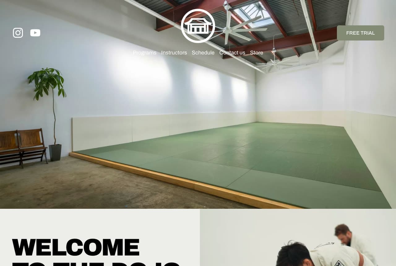
The Dojo NYC photographs its space empty — green mats, white walls, a single plant, daylight — and lets that stillness be the brand, with a circular crest floating over the image and a small 'Free Trial' button in the corner. Below, the headline arrives in heavy black grotesque: 'WELCOME TO THE DOJO', beside a photograph of training. The restraint is the point: a room with nothing in it says discipline more clearly than a highlight reel, and the black-on-cream type reads as design-studio, not fight-club. The nav (Instructors, Schedule, Contact, Store) keeps it practical. The Dojo shows that the calmest image in the category can be the most confident.

Visit The Dojo NYC

Opens a similar Zarla design you can make yours.

Anderson's Martial Arts Academy website — Martial Arts Academy design example
Real site · New York, NY
  • Martial Arts Academy
  • Serious

Anderson's Martial Arts Academy: Champions in the headline, everybody in the ghost text

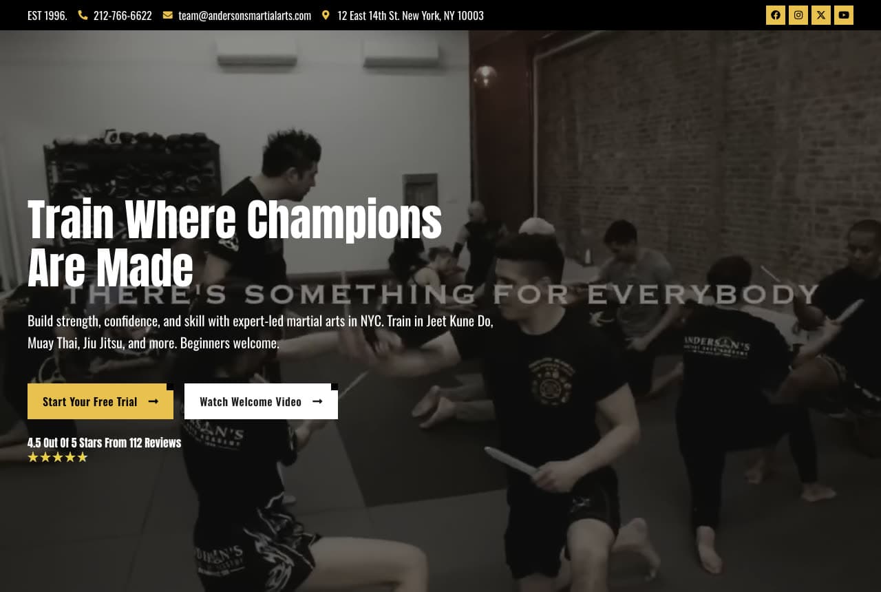
Anderson's Martial Arts Academy runs two messages at once: the headline says 'Train Where Champions Are Made', and behind it, in large ghosted capitals, the design whispers the reassurance — 'THERE'S SOMETHING FOR EVERYBODY'. A dark photograph of a class in session fills the screen; a yellow 'Start Your Free Trial' and an outlined 'Watch Welcome Video' sit under the copy, with '4.5 out of 5 stars from 112 reviews' in small type. The top bar carries the practical proof (established 1996, a phone number, an address on East 14th Street). The palette is black and gold, the mood is serious, and the ghost text keeps the beginner from feeling excluded. Anderson's shows how to sound elite and inclusive in the same frame.

Opens a similar Zarla design you can make yours.

American Combat Gym website — MMA Gym design example
Real site · Deerfield Beach, FL
  • MMA Gym
  • Cinematic

American Combat Gym: Three numbers under a champion's headline

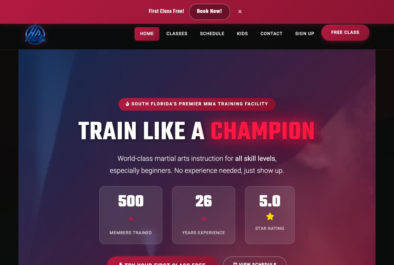
American Combat Gym looks like a fight promotion and reads like a welcome mat: a dark purple-to-black field with a red glow, an eyebrow that positions the gym (South Florida's premier MMA training facility), a condensed headline — 'TRAIN LIKE A CHAMPION' with 'Champion' in red — and a sub-line that immediately turns toward the nervous visitor: 'World-class martial arts instruction for all skill levels, especially beginners. No experience needed, just show up.' Three stat tiles follow (members trained, a count, a 5.0 star rating). The design proves that intensity and inclusivity aren't opposites when the copy does the reassuring. American Combat shows an MMA gym how to keep the dark drama and still say 'beginners welcome' in the first breath.

Visit American Combat Gym

Opens a similar Zarla design you can make yours.

Neutral Ground Academy website — Community Gym design example
Real site · Milwaukee, WI
  • Community Gym
  • Straightforward

Neutral Ground Academy: The gym's name on the wall, in the photo, in the type

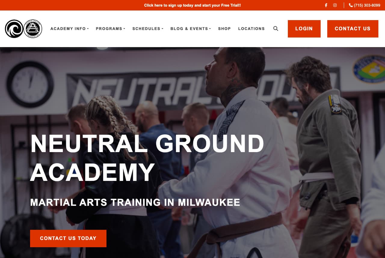
Neutral Ground Academy lets its own signage do the branding: the hero photograph shows students training in front of a wall that reads 'Neutral Ground', and the headline repeats it in heavy white capitals — 'NEUTRAL GROUND ACADEMY' — over a one-line descriptor, 'Martial Arts Training in Milwaukee'. A red 'Contact Us Today' button, red Login and Contact buttons in the nav, and a thin red bar at the top offering a free trial sign-up complete a strictly two-color system. It's a working academy's site rather than a marketing site, and that honesty reads as confidence: real people, real gym, the city named. Neutral Ground shows that repetition — the name in the photo, the headline and the nav — builds recognition faster than a slogan.

Visit Neutral Ground Academy

Opens a similar Zarla design you can make yours.

Calloway Boxing Club — Fight Gym website design you can build with Zarla
Build this with Zarla
  • Fight Gym
  • Intense

Calloway Boxing Club: The dark fight-gym hero, built to convert

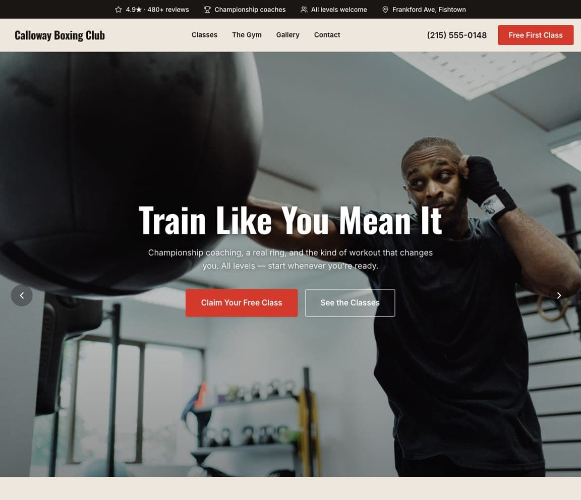
Calloway Boxing Club is the Zarla fight-gym template: a dark photograph of the gym floor, a five-word headline about attitude — 'Train Like You Mean It' — and a sub-line that promises the two things a boxing gym sells ('Championship coaching, a real community, and the kind of workout that changes you'). A red 'Claim Your Free Class' and an outlined 'See the Classes' sit centered under the copy, with the neighborhood, phone and trust chips (a 4.9★ from 480+ reviews, championship coaches, all levels welcome) carrying the proof. It's the buildable version of Mission MMA's and Anderson's dark register. Clone it, swap boxing for your art, and the free-class funnel comes ready.

See this template
Anvil CrossFit — Adaptable Template website design you can build with Zarla
Build this with Zarla
  • Adaptable Template
  • Energetic

Anvil CrossFit: Community in the headline, the city in orange

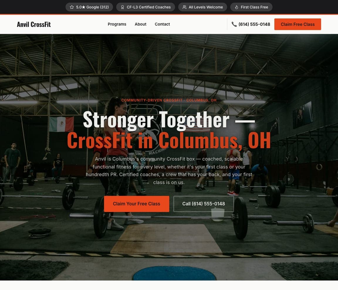
Anvil CrossFit is a Zarla template for a CrossFit box, not a dojo — but its hero is the closest catalog match to the community-first schools in this gallery: a photograph of members mid-workout, a headline that leads with belonging — 'Stronger Together — CrossFit in Columbus, OH' with the second line in orange — and copy that promises coaching for 'every level, whether it's your first class or your hundredth PR'. An orange 'Claim Your Free Class' and a phone number sit under it; trust chips carry a 5.0★ from 312 Google reviews, CF-L3 certified coaches, and 'first class free'. Clone it, describe your school, and the AI turns WODs into classes while the community framing and the free-class ask stay. Anvil suits a school whose strength is the people on the mat.

See this template

Frequently asked

Where can I find good martial arts website examples?

Right here — this page curates martial arts website examples across the spectrum: world-famous academies like Renzo Gracie, family jiu-jitsu and karate schools like All Star, Blue Wave and Gentle Art Dojo, and MMA gyms like Mission MMA and American Combat Gym (each linked so you can explore the live site), plus professionally designed Zarla martial arts and fight-gym templates you can clone and make your own. Every example includes a note on why the design works — the welcome, the proof, the free-class path — so you can copy the thinking, not just the look.

What makes a good martial arts website?

It lowers the fear of walking in. That means a free first class or trial offered in the first screen, real photographs of your own students and mats, a clear statement of who the school is for (kids, beginners, competitors, families), instructor credentials with lineage, and the schedule and pricing one click away. The examples above lead with the welcome and back it with proof — reviews, years established, black-belt instructors.

How much does a martial arts website cost?

A custom site from an agency typically runs into the thousands up front, and template builders charge roughly $16–$30 per month. An AI builder generates a complete, editable school site for free and only charges (on the Premium plan) when you publish to your own domain — so you can build and preview before spending anything.

Should a martial arts website look tough or welcoming?

Match the student you want. Family and beginner schools convert with bright photos of kids in gis and words like 'all ages' and 'community' — Blue Wave and All Star are the model. MMA and competition gyms convert with dark, intense design and words like 'step beyond your limit' — Mission MMA and American Combat show that register. The mistake is mixing them: a kids' program under a snarling fighter photo loses the parents.

What pages does a martial arts website need?

Most schools need six: a home page with the free-class offer and who it's for, a programs page (kids, adults, competition, specific arts), a schedule page, a pricing or membership page, an instructors page with lineage and credentials, and a contact page with a trial-class form. Multi-location schools add a location picker up front, the way Gentle Art Dojo does.

How do martial arts schools get more students from their website?

Offer the free class in the first screen, show your own students, and make the form short. The converting pattern in the examples above: a headline about the outcome (confidence, lifestyle, community), a red or bright 'claim your free class' button, review badges beside it, and a trial form that asks for a name and a phone number and nothing else. Follow up fast — a lead answered within minutes is the one that shows up.

You've seen what works. Now make it yours.

Describe your business and Zarla designs a complete, professional website in about 30 seconds — built to convert, just like the ones above.

Free to build and preview · no credit card · publish to your own domain on Premium