Inspiration · Pizzeria

The Best Pizzeria Website Examples, Explained

Looking for pizzeria website examples? These 12 are the strongest we found — Pizzeria Beddia's dining room with a reservation pill floating over it, Tony's black-and-white photograph of a pizzaiolo tossing dough, Di Fara's 'A BROOKLYN LEGEND' in red block capitals — plus pizzeria designs you can build with Zarla, each with a breakdown of the specific move that turns a hungry search into an order. A pizzeria's website has one job most business sites don't: make someone order in the next five minutes. Find an approach you love and you can build a site in that spirit, free, in about 30 seconds.

Real sites + designs you can build with Zarla — free to build and preview, no credit card

What makes a great pizzeria website

The best pizzeria websites put the pie or the person on the first screen and the order button within reach of a thumb: an overhead of two pizzas on a board (L'Industrie), a hand lifting a tomato pie on a peel (De Lorenzo's), the pizzaiolo himself (Tony's, Kesté). Notice how many carry the neighborhood in the design — Di Fara's cross streets set vertically beside the photo, Home Slice's neon storefront at night, Beddia's 'In the heart of Fishtown' — and how the order path is never more than one link away ('Order Online', 'Order Delivery', 'Takeout'). Red is the default, but Beddia's cream and Stretch's orange prove a pizzeria can own another color if the type is confident. Every example below makes you hungry before it tells you where to park.

Pizzeria Beddia website — Chef-Driven Pizzeria design example
Real site · Philadelphia, PA
  • Chef-Driven Pizzeria
  • Warm
  • Cream + black

Pizzeria Beddia: The dining room first, with a reservation pill floating over it

Pizzeria Beddia sells the evening before the pie: a black header with the name hand-lettered in white and a plain nav (Menu, About, Reservations, Hoagie Room, Groups & Events, Takeout), then a photograph of the room itself — pale walls, an arch, a curved wooden bar with stools, pendant lamps, a fig tree and a smiling cloud-shaped lamp — with a black pill button floating over it, 'Make A Reservation →'. Beneath, on cream, the positioning reads 'Pizza, Wine, and Everything Fine.' beside a blue 'OPEN DAILY' sticker and a paragraph that names the chef and the neighborhood ('by Joe Beddia. In the heart of Fishtown, Philadelphia. Walk-ins welcome'). No pizza in the first screen, and none needed — the room is the argument. Beddia shows a chef-driven pizzeria how to look like a restaurant: photograph the space, float the reservation over it, keep the copy to one warm sentence.

  • The room as the hero, with 'Make A Reservation' floating over it
  • 'Pizza, Wine, and Everything Fine.' — positioning in six words
  • Chef and neighborhood named in the first paragraph

Steal this: If you take reservations, photograph the room at golden hour and float one pill button over it — the pizza can wait one scroll.

Visit Pizzeria Beddia

Opens a similar Zarla design you can make yours.

Tony's Pizza Napoletana website — Champion Pizzaiolo design example
Real site · San Francisco, CA
  • Champion Pizzaiolo
  • Cinematic
  • Black + red

Tony's Pizza Napoletana: The pizzaiolo tossing dough, in black and white

Tony's Pizza Napoletana puts the man on the page: a red header with the cartoon-chef logo ('TONY'S PIZZA NAPOLETANA') and a small-caps nav (About, Menu, Delivery, Shop, Gift Cards, Gallery, Location) beside a white 'ORDER' button, then a full-width black-and-white photograph of Tony Gemignani mid-toss — hands up, tattooed forearms, eyes on the dough — in front of a tiled oven with the name across it. Below, a dark band carries two words in a green serif, 'CRAFTING PERFECTION', beside a color photograph of a pizza. The monochrome makes the moment feel like a documentary still; the red logo and the green serif are the only color. Tony's shows a pizzeria with a famous owner how to use him: one photograph of the craft in motion, the awards implied rather than listed, and the order button in the corner where it belongs.

  • A black-and-white action photograph of the owner as the hero
  • 'Crafting Perfection' — two words in a green serif on dark
  • Shop and gift cards in the nav: the brand sells beyond the room

Steal this: Photograph the person making the pizza — mid-toss, mid-stretch — and run it in black and white so the craft, not the toppings, is the story.

Visit Tony's Pizza Napoletana

Opens a similar Zarla design you can make yours.

Kesté website — Neapolitan Pizzeria design example
Real site · New York, NY
  • Neapolitan Pizzeria
  • Confident
  • Red + white

Kesté: A red field, a chef holding two pizzas, two buttons

Kesté reads like a template that got everything right: a red strip across the top with the phone, the email, the Fulton Street address and 'Catering Service', a white nav with the KESTÉ logo, and a red 'RESERVATION' beside an outlined 'ORDER ONLINE'. Then the hero on solid red — an eyebrow ('Made with Love'), a big white serif headline that is also the keyword, 'Authentic Neapolitan Pizza in NYC', a paragraph that names the master pizzaiolo (Roberto Caporuscio) and promises every pizza in a gluten-free version, three bullets (Premium Imported Ingredients, Long Natural Fermentation, Mastercrafted — Regular & Gluten-Free), and a cut-out photograph of the chef in black holding a pizza in each hand. Two white pill buttons close it: 'RESERVE A TABLE →' and 'ORDER ONLINE'. Kesté shows a pizzeria how to say the whole pitch in one screen: the keyword as the headline, the proof as bullets, the maker as the photo, the two actions as buttons.

  • 'Authentic Neapolitan Pizza in NYC' — the search phrase as the headline
  • The pizzaiolo cut out on a red ground, a pizza in each hand
  • Three proof bullets and two buttons — the pitch in one screen

Steal this: Write the headline the way people search ('Authentic Neapolitan Pizza in NYC') and put the maker beside it — keyword and credibility in one frame.

Visit Kesté

Opens a similar Zarla design you can make yours.

Di Fara website — Heritage Pizzeria design example
Real site · Brooklyn, NY
  • Heritage Pizzeria
  • Bold
  • White + red

Di Fara: 'A BROOKLYN LEGEND' in red block capitals

Di Fara lets its reputation set the type: a white page, the 'DI FARA EST. 1965' logo, a small nav (Restaurants, Grocery, Story, Press, Contact, cart), and then the headline in enormous red block capitals — 'A BROOKLYN' above a photograph and 'LEGEND' below it — with the cross streets set vertically on either side, 'AVE J' and '15 ST'. The photograph itself is not the pizza but a couple sharing a slice on a stoop beside terracotta planters, which is exactly the claim: this is the neighborhood's pizza. No button in the first screen; 'Restaurants' and 'Grocery' in the nav are the funnel. Di Fara shows a sixty-year-old pizzeria how to use its age: state the legend in type the size of a storefront sign, print the corner it stands on, and photograph the people rather than the pie.

  • 'A BROOKLYN LEGEND' split around the photograph in huge red type
  • The cross streets ('AVE J', '15 ST') set vertically as decoration
  • A stoop photograph of customers instead of a pizza

Steal this: If you've earned a reputation, set it in type the size of a sign and print your corner beside it — the address is part of the brand.

Visit Di Fara

Opens a similar Zarla design you can make yours.

Home Slice Pizza website — Neighborhood Institution design example
Real site · Austin, TX
  • Neighborhood Institution
  • Nostalgic
  • Night + neon

Home Slice Pizza: The neon storefront at night as the whole hero

Home Slice Pizza opens on its own sign: a full-bleed photograph of the shop after dark — 'HOME SLICE PIZZA' in red and yellow neon across the roofline, 'Queen of Pies' in yellow script beside it, 'Authentic N.Y. Style Pizza' and an 'OPEN' sign in the windows, people on stools at the take-out window and a woman walking past, all lit by the sign. There is no headline and no copy in the first screen; the nav is a red bar pinned to the bottom (Locations & Menu, Order Online, Catering, About, Jobs, Shop) with the crown logo in the corner. The design is the storefront, which is the smartest thing an institution can do when the storefront is famous. Home Slice shows a landmark pizzeria how to be itself online: photograph the sign at night with the regulars in frame, and put the nav where it won't touch the photo.

  • A night photograph of the neon sign and the take-out window
  • Nav pinned to a red bar at the bottom — nothing over the photo
  • 'Queen of Pies' and 'Authentic N.Y. Style' read straight off the building

Steal this: If people photograph your storefront, make that photograph the home page — neon on, customers in frame, nav tucked below.

Visit Home Slice Pizza

Opens a similar Zarla design you can make yours.

Stretch Pizza website — Slice Shop design example
Real site · New York, NY
  • Slice Shop
  • Playful
  • Orange + white

Stretch Pizza: One word stacked seven times beside a photograph of dough

Stretch Pizza turns its name into the design: a white sidebar card on the left stacks the word 'STRETCH' seven times in orange wide capitals, each line shifted so the letters seem to pull apart, with a black 'ORDER ONLINE' pill directly beneath and the nav as a plain list (Locations & Menus, About, Gift Cards, Events, Order Catering, Press, Jobs, Contact, Newsletter!). Everything to the right is a photograph of dough being stretched by hand, in warm close-up, with slideshow arrows. No headline, because the wordmark is the headline; no color but orange and black, because the dough supplies the warmth. Stretch shows a slice-shop brand how to be memorable with almost nothing: pick one word, make the type do what the word says, and keep the order button touching it.

  • The wordmark repeated seven times, letters pulling apart
  • 'ORDER ONLINE' pinned directly under the name
  • A close-up of dough being stretched as the only photograph

Steal this: Make your name behave like your product — stretched, stacked, sliced — and put the order button right under it.

Visit Stretch Pizza

Opens a similar Zarla design you can make yours.

L'Industrie Pizzeria website — Destination Slice Shop design example
Real site · Brooklyn, NY
  • Destination Slice Shop
  • Energetic

L'Industrie Pizzeria: Two pies overhead and a red marquee: 'TAKE OUT · WHOLE PIES · SLICE SHOP'

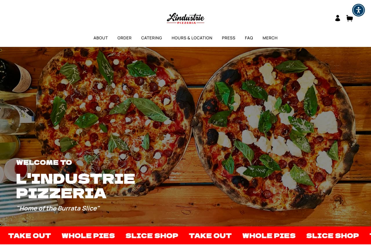
L'Industrie Pizzeria shows the product from above: a white header with the script logo, a small-caps nav (About, Order, Catering, Hours & Location, Press, FAQ, Merch) and account and cart icons, then a full-width overhead photograph of two pizzas on a wooden board — basil, torn mozzarella, a wine bottle at the edge — with the welcome set in white bottom-left ('WELCOME TO / L'INDUSTRIE PIZZERIA / "Home of the Burrata Slice"'). Under the photo a red marquee strip repeats the three ways to buy: 'TAKE OUT · WHOLE PIES · SLICE SHOP'. The tagline names the signature (the burrata slice), the strip names the formats, and the photograph does the rest. L'Industrie shows a slice shop that became a destination how to keep both audiences: the overhead for the pilgrims, the marquee for the regulars.

Visit L'Industrie Pizzeria

Opens a similar Zarla design you can make yours.

De Lorenzo's Tomato Pies website — Family Tomato-Pie House design example
Real site · Robbinsville, NJ
  • Family Tomato-Pie House
  • Classic

De Lorenzo's Tomato Pies: 'EST. 1947' on a peel: the wordmark over the pie

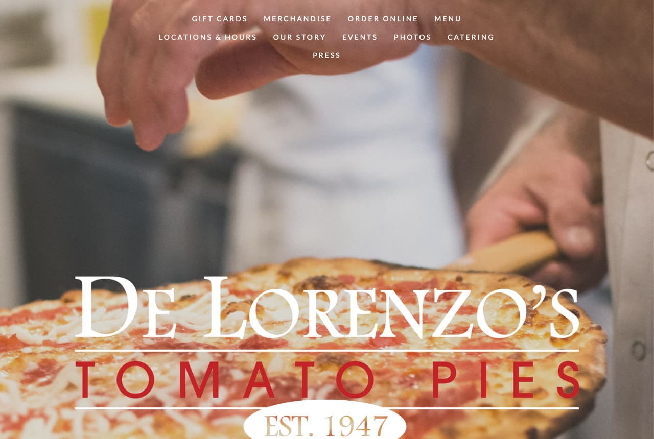
De Lorenzo's Tomato Pies sets its name like a sign over a photograph of the work: a close shot of hands lifting a tomato pie on a wooden peel, and across it the wordmark in two registers — 'DE LORENZO'S' in tall white serif capitals, 'TOMATO PIES' in red spaced capitals beneath, and 'EST. 1947' in a white oval badge at the bottom. The nav sits centered at the top in small tracked caps, three rows deep (Gift Cards, Merchandise, Order Online, Menu / Locations & Hours, Our Story, Events, Photos, Catering / Press). No headline beyond the name, no button; the year and the pie are the pitch. De Lorenzo's shows a family pizzeria with a founding date how to wear it: put the year in a badge, keep the type classic, and let the hands in the photograph say the recipe hasn't changed.

Visit De Lorenzo's Tomato Pies

Opens a similar Zarla design you can make yours.

Pizzana website — Neo-Neapolitan Group design example
Real site · Los Angeles, CA
  • Neo-Neapolitan Group
  • Dark

Pizzana: Squares on slate, a wide wordmark, a loyalty club in the top bar

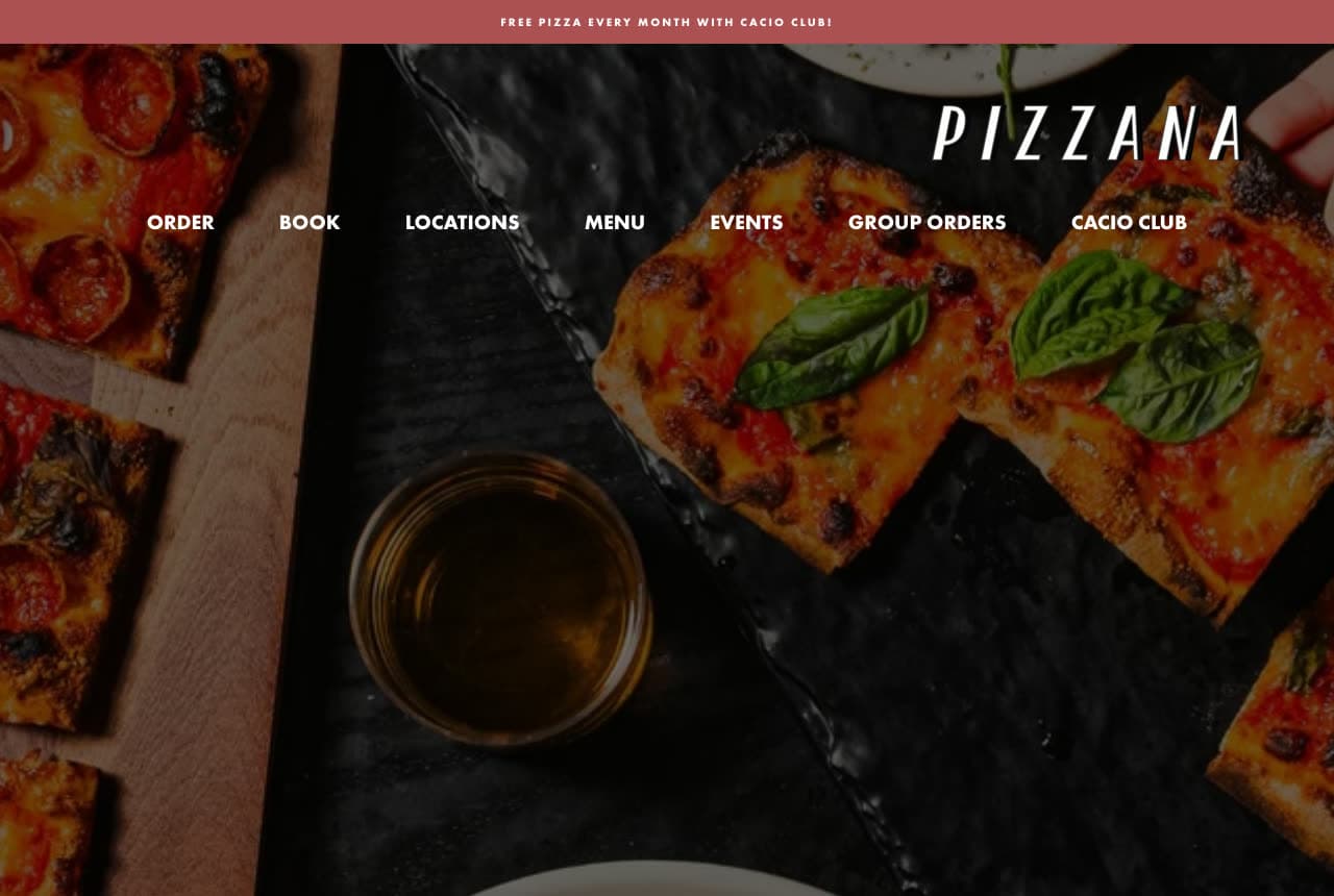
Pizzana leads with an offer and a dark photograph: a thin maroon bar across the top reads 'FREE PIZZA EVERY MONTH WITH CACIO CLUB!', then the hero — squares of pizza with basil on a black slate, a glass of beer, more slices on a board at the edge — darkened so the wordmark reads: 'PIZZANA' in wide white capitals, with the nav as a single row beneath it (Order, Book, Locations, Menu, Events, Group Orders, Cacio Club). No headline, no paragraph; the name, the photograph and the seven links are the screen. 'Book' beside 'Order' says it's both a restaurant and a delivery brand; 'Group Orders' and 'Cacio Club' say it sells at scale. Pizzana shows a multi-location pizzeria how to stay premium: a dark, close photograph, a wide geometric wordmark, and the loyalty offer confined to a slim bar.

Visit Pizzana

Opens a similar Zarla design you can make yours.

Lievito — Adaptable Template website design you can build with Zarla
Build this with Zarla
  • Adaptable Template
  • Confident

Lievito: 'Naples Came to Williamsburg' on a deep red ground

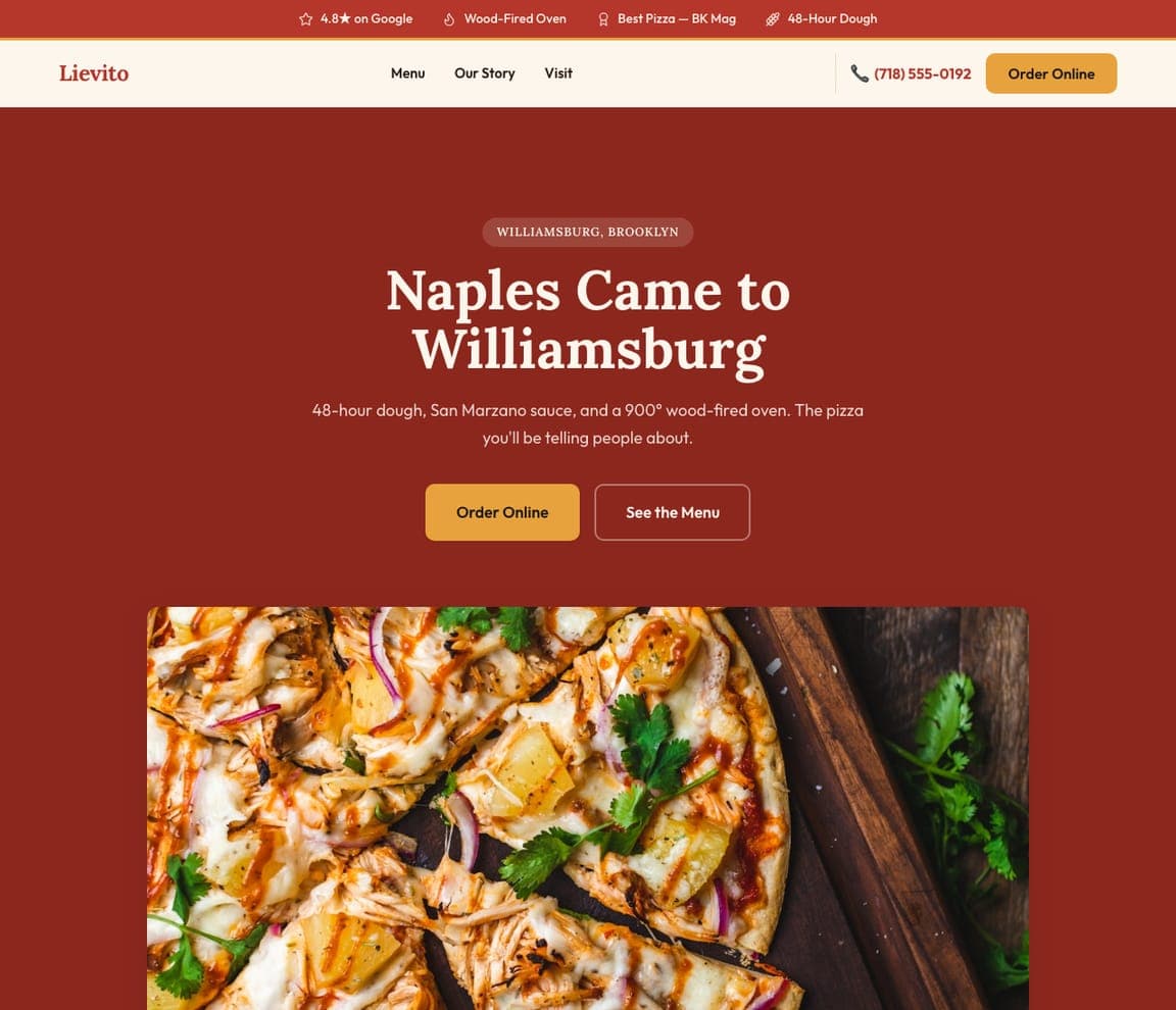
Lievito is the Zarla pizzeria template: a deep red field, an eyebrow that names the neighborhood ('WILLIAMSBURG, BROOKLYN'), a white serif headline with a story in it — 'Naples Came to Williamsburg' — a two-line description ('48-hour dough, San Marzano sauce, and a 900° wood-fired oven. The pizza you'll be telling people about.'), an orange 'Order Online' beside 'See the Menu', and a photograph of a pizza below. The top strip carries the Google rating, the wood-fired oven, a 'Best Pizza' press mention and the 48-hour dough. It's Kesté's red-ground confidence with Beddia's warmth in the copy. Clone it, name your neighborhood, and the strip becomes your rating and your oven.

See this template
Onda Forno — Adaptable Template website design you can build with Zarla
Build this with Zarla
  • Adaptable Template
  • Bold

Onda Forno: 'ROMAN SLICE BAR IN MIAMI' in type the size of the pan

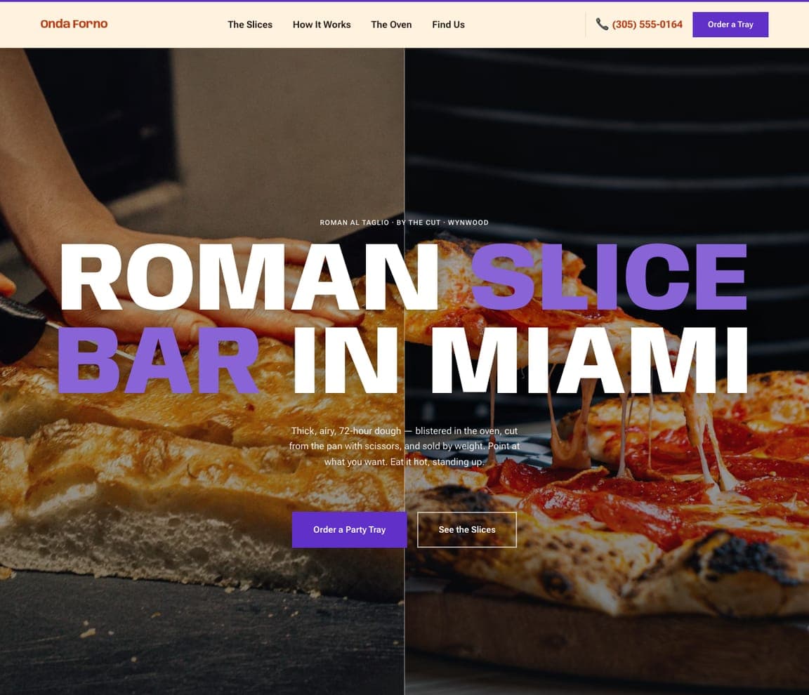
Onda Forno is the Roman slice-bar template, and the closest catalog match to the typographic pizzerias here (Di Fara, Stretch): two dark photographs side by side — a pan pizza being cut on the left, a pepperoni pie on the right — an eyebrow ('ROMAN AL TAGLIO · BY THE CUT · WYNWOOD'), a headline set enormous in a wide grotesque — 'ROMAN SLICE BAR IN MIAMI' with 'SLICE BAR' in violet — a paragraph about 72-hour dough cut with scissors and sold by weight, and a violet 'Order a Party Tray' beside 'See the Slices'. The header carries a violet 'Order a Tray' at the right, beside the phone number in orange. Clone it for a slice shop, and the giant words become your neighborhood and your cut.

See this template
Osteria Solviero — Adaptable Template website design you can build with Zarla
Build this with Zarla
  • Adaptable Template
  • Atmospheric

Osteria Solviero: 'A Taste of Italy' over the dining room

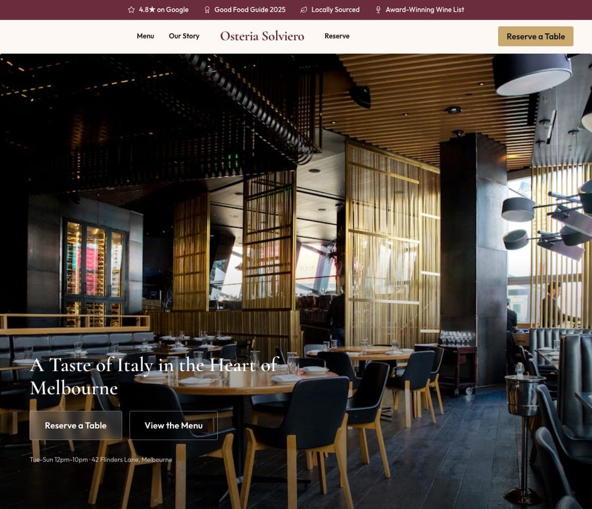
Osteria Solviero is the Italian-restaurant template, and the closest catalog match to the sit-down pizzerias here (Beddia, Tony's): a dark photograph of the dining room — wood, low light, set tables — with a white serif headline bottom-left, 'A Taste of Italy in the Heart of Melbourne', a plain nav (Menu, Our Story, Reserve) and a gold 'Reserve a Table' at the right. The top strip counts the Google rating, a Good Food Guide listing, local sourcing and the wine list. It's Beddia's room-first instinct with the reservation button already in the header. Clone it, swap the city, and the strip becomes your guide listings.

See this template

Frequently asked

Where can I find good pizzeria website examples?

Right here — this page curates pizzeria website examples across the spectrum: a chef-driven Neapolitan room (Pizzeria Beddia), a world-champion pizzaiolo's flagship (Tony's Pizza Napoletana), a Neapolitan institution with a gluten-free promise (Kesté), a 1965 Brooklyn legend (Di Fara), an Austin neon landmark (Home Slice), a slice-shop brand built on one word (Stretch), the home of the burrata slice (L'Industrie), a 1947 tomato-pie dynasty (De Lorenzo's) and an award-winning LA neo-Neapolitan (Pizzana) — each linked so you can explore the live site — plus professionally designed Zarla pizzeria, Roman slice-bar and Italian-restaurant templates you can clone and make your own. Every example includes a note on why the design works — the photograph, the order path, the way the neighborhood shows up — so you can copy the thinking, not just the look.

What makes a good pizzeria website?

It makes you hungry in one screen and lets you act on it in one tap. The strong examples above open on a photograph of the pizza or the person who makes it, keep 'Order Online' in the header (and often a second time in the hero), state the neighborhood so locals know it's theirs, and put hours, locations and catering one click away. The copy is short — a tagline ('Home of the Burrata Slice'), a founding year ('Est. 1947'), a promise ('Made with Love') — and the photography is of your pie, not stock.

How much does a pizzeria website cost?

A custom site from a restaurant agency typically runs from a couple of thousand dollars up, restaurant-platform builders charge a monthly fee for the site plus online ordering, and general template builders are roughly $16–$30 per month. An AI website builder generates a pizzeria site — menu, hours, locations, online-ordering link, catering, gift cards — from a short description in seconds, then lets you edit it in plain language. Spend the money you save on one photo session of your pizza under good light.

Should a pizzeria website show the pizza or the room first?

The pizza, unless the room is the story. Most sites above lead with the pie — L'Industrie's overhead, De Lorenzo's peel, Pizzana's squares on slate — because a pizzeria sells a craving. The exceptions are deliberate: Beddia shows its dining room because it takes reservations and sells the evening, and Home Slice shows its storefront because the neon sign is the brand. Pick the thing people come for.

What pages does a pizzeria website need?

Most pizzerias need five: a home page with the pizza, the neighborhood and the order button; a menu page (as a page, not a PDF, with the specials named); an order-online or delivery link that goes straight to your ordering system; a catering or group-orders page (the highest-margin thing a pizzeria sells); and a locations-and-hours page with a map. Add gift cards, merch and a club or newsletter if you have them — Pizzana, Stretch and De Lorenzo's all put them in the nav because they sell.

How do pizzerias get more customers from their website?

Make ordering one tap from the first screen, name the neighborhood so you rank for it, and give catering its own page with a form. The converting pattern above: Kesté's 'Reserve a Table' beside 'Order Online' under the headline, L'Industrie's red 'TAKE OUT · WHOLE PIES · SLICE SHOP' strip, Pizzana's 'Cacio Club' loyalty offer in the top bar, Stretch's 'Order Online' pinned above the whole nav. Then let the photography do the marketing — a pizza that looks this good gets shared.

You've seen what works. Now make it yours.

Describe your business and Zarla designs a complete, professional website in about 30 seconds — built to convert, just like the ones above.

Free to build and preview · no credit card · publish to your own domain on Premium