Inspiration · Small Business

The Best Small Business Website Designs (and Why They Work)

These are some of the best small business website designs we could find — a mix of standout real businesses and designs you can build with Zarla — and instead of just showing them off, we explain why each one wins customers. Look for the patterns that repeat: clear trust signals up top, one obvious next step, and real proof. Then make any of the Zarla designs yours, free, in about 30 seconds.

Real sites + designs you can build with Zarla — free to build and preview, no credit card

What makes a great small business website

The best small business sites do three things fast: they prove you're trustworthy before the visitor scrolls (reviews, years in business, real photos), they point to one clear action (call, book, quote), and they let real photos and customer words carry the selling. Everything below is a variation on those three moves — pick the one that fits how your customers decide.

Austin Dental Company website — Dentist design example
Real site · Austin, TX
  • Dentist
  • Modern
  • Navy + cream

Austin Dental Company: A hero photo that kills dental anxiety in one shot

Austin Dental Company makes one brilliant choice: its hero shows a patient calmly watching Netflix during treatment. Before a word is read, the fear is answered — this place is relaxed, modern, and on your side. The brand backs it with genuinely stylish vintage-style typography, a Texas-outline logo, and an 'ATX — USA' mark that makes a dentist feel like a boutique label rather than a clinic. The dark-navy-and-cream palette is more boutique hotel than healthcare, and 'Quality Dentistry, Honestly Delivered' sets a trustworthy tone. It's the strongest example here of using a single, specific hero image to neutralize a category's core anxiety — far more convincing than writing 'we're gentle.'

  • One hero photo answers the category's core fear
  • Boutique branding makes a clinic feel premium
  • A hospitality palette beats clinical white

Steal this: Show your anxiety-killer, don't claim it — a photo beats 'we're gentle.'

Thornbury & Vance Legal — Lawyer website design you can build with Zarla
Build this with Zarla
  • Lawyer
  • Professional
  • Navy + bone

Thornbury & Vance Legal: Credentials front and center

Thornbury & Vance opens with a centered, credentials-first hero and a stats bar — cases won, years practicing, client rating — before it says a word about services. For a law firm, that ordering is the strategy: establish authority first, then explain. The muted navy and warm off-white feel expensive without trying, and a practice-area selector lets each visitor route to their exact situation. It's a clean demonstration that for a high-trust profession, leading with proof of expertise — not a friendly hello — is what makes a nervous client pick up the phone.

  • Stats bar turns abstract 'experience' into concrete numbers
  • Centered hero with no clutter signals confidence
  • Off-white background reads more premium than stark white
See this template
Reliant Plumbing website — Plumbing design example
Real site · Austin, TX
  • Plumbing
  • Professional
  • Navy + gold

Reliant Plumbing: A plumber's site engineered for one thing: booking

Reliant Plumbing's homepage is a lead-generation machine wearing a friendly face. The navy-and-gold palette feels established and calm, but every section pushes toward action: 24/7 availability stated up top, online booking front and center, a zip-code checker that instantly confirms 'yes, we serve you,' and a service-area map that removes doubt. A founder quote adds a human face, and a comprehensive service grid catches every search. Nothing is decorative — it's all in service of converting an anxious homeowner who needs a plumber now. For a trade where the buyer is mid-emergency, this is the template: prove trust fast, then make booking the path of least resistance.

  • A zip-code checker removes 'do you serve me?' doubt
  • 24/7 + online booking suit an emergency buyer
  • Navy + gold reads dependable, not flashy
Urban Betty website — Hair Salon design example
Real site · Austin, TX
  • Hair Salon
  • Playful
  • Mint + coral

Urban Betty: A stylist-matchmaker quiz that books the nervous client

Urban Betty, a multi-location 'Best of Austin' salon, solves the scariest part of trying a new salon — 'who do I even book with?' — with a 'Mya' matchmaker quiz that pairs each visitor with the right stylist per location. That single tool turns hesitation into a booking. The brand is confident and joyful: a mint-teal, coral, and yellow palette that feels nothing like the moody salons everyone else builds, press logos (Forbes, Salon Today) for authority, plus its own product line and a 'Betty Bootcamp' program signaling it's more than a chair. It's a masterclass in removing friction with a smart tool while keeping a personality bright enough to remember.

  • A stylist-match quiz converts the hesitant first-timer
  • A bright multi-color palette defies the moody-salon norm
  • Press logos + own products signal authority
Cenco Roofing website — Roofing design example
Real site · Denver, CO
  • Roofing
  • Professional
  • Green + slate

Cenco Roofing: A free-inspection offer that lowers the first step

Cenco Roofing is built to convert a cautious homeowner. Its standout move is the offer — a 'Free 72-Point Inspection' — which replaces the scary 'get a quote' ask with a no-risk, high-value first step that's easy to say yes to. Local trust is everywhere: a 'here today, here tomorrow' promise, review scores pulled from multiple platforms, and service pricing cards that name real numbers (rare and disarming in roofing). Quick-link service buttons sit right in the hero, and a quote form closes the page. The takeaway: a generous, specific free offer converts better than a generic 'contact us' because it changes what the visitor is actually agreeing to.

  • A free, specific offer beats a generic 'get a quote'
  • Multi-platform review scores prove local trust
  • Naming prices disarms a high-cost category

Steal this: Replace 'get a quote' with a free, valuable first step.

Voltora Melbourne website — Electrician design example
Real site · Melbourne, AU
  • Electrician
  • Bold
  • Orange + navy

Voltora Melbourne: A 'Real Talk, no hidden costs' promise that disarms

Voltora leads with the thing every homeowner fears about tradies — surprise bills — and turns it into the brand. Its 'Real Talk' positioning promises clarity and no hidden costs, which disarms the visitor before they've even read a service. The orange-and-dark-blue palette is energetic but still professional, a distinctive service-icon navigation in the header lets people jump straight to what they need, and a Google review pulled right into the hero proves the promise isn't just talk. The whole page flows in clear, well-labelled sections. It's a smart reminder that addressing your category's biggest objection head-on — in the hero — builds more trust than any list of services.

  • Naming the category's #1 fear builds instant trust
  • A Google review in the hero proves the promise
  • Service-icon nav speeds people to what they need

Steal this: Address your industry's biggest objection in the hero, not the FAQ.

Human Nature Landscapes website — Landscaping design example
Real site · Brisbane, AU
  • Landscaping
  • Professional

Human Nature Landscapes: An aerial drone hero that sells the dream

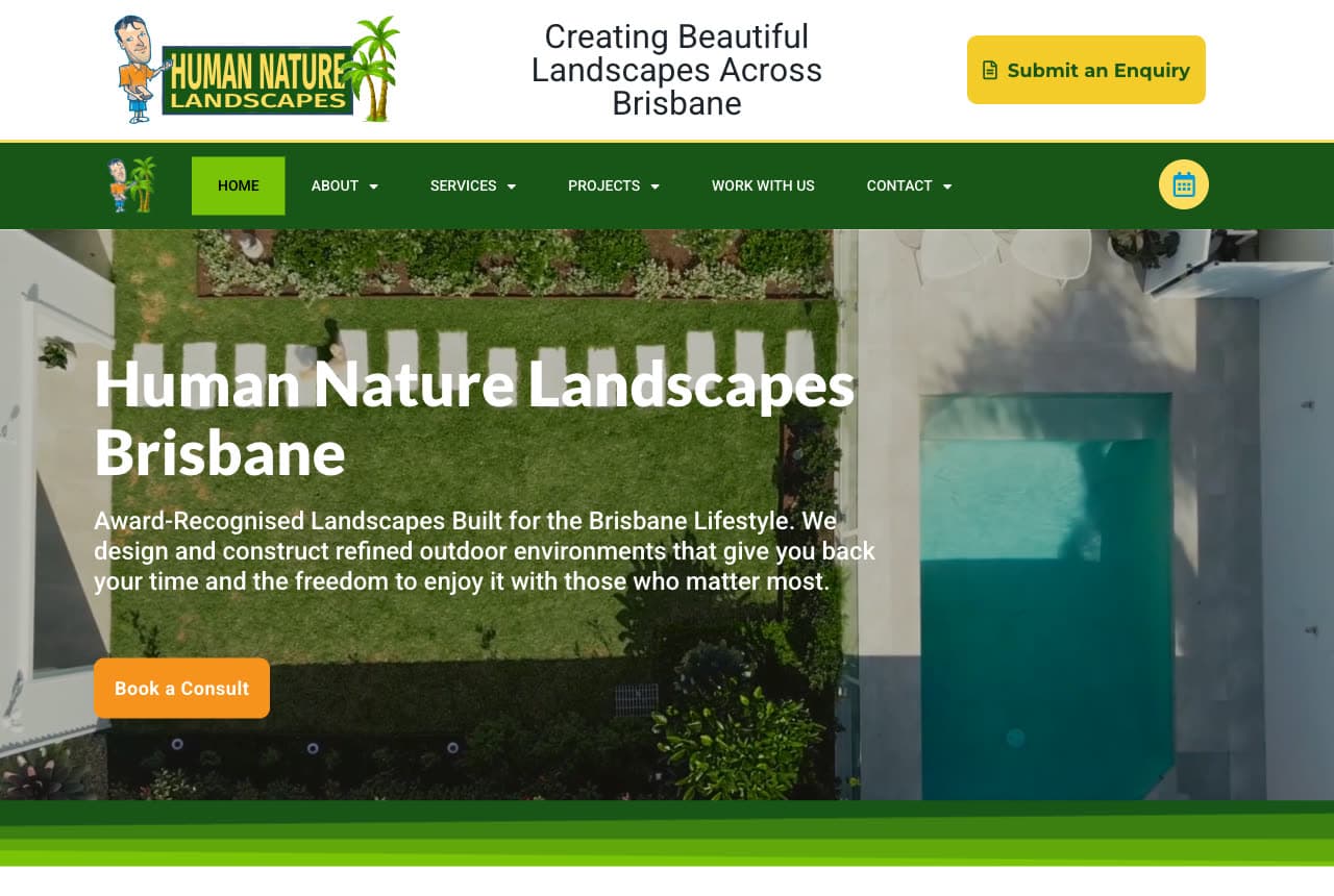
Human Nature Landscapes opens with a stunning aerial drone shot of a finished pool-and-garden project, and that single image does the entire sales pitch — it shows the dream a homeowner is buying, from an angle they've never seen their own yard. The green-and-gold palette ties the brand to the outcome, and a carousel of five Landscape Queensland award badges stacks credibility for a premium-priced service. The page is deliberately content-rich (twelve service cards, multiple testimonials, a video, a project gallery) because a big landscaping job is a considered purchase and buyers want to see everything first. For visual trades, the proof is the portfolio — and the drone shot is the hook.

Mt. Tabor CrossFit website — CrossFit Gym design example
Real site · Portland, OR
  • CrossFit Gym
  • Bold

Mt. Tabor CrossFit: Community-first messaging that fights gym intimidation

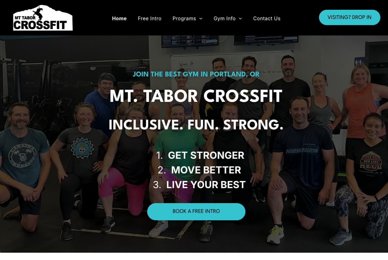
CrossFit scares newcomers, and Mt. Tabor's whole site is engineered to dissolve that fear. The hero is a real group photo — not chiseled models — with an 'Inclusive. Fun. Strong.' tagline and a plain numbered list (Get Stronger, Move Better, Live Your Best). A 'Legends Class' for the over-55s and a clear three-step getting-started process tell an intimidated beginner 'people like you train here, and here's exactly how to begin.' The black-and-cyan palette with alternating dark and light action sections keeps energy high without the macho cliché. It's the right answer for any business where the barrier to entry is emotional, not financial: show belonging first, intensity second.

Blue Wheelers website — Dog Grooming design example
Real site · Australia
  • Dog Grooming
  • Playful

Blue Wheelers: A mascot that makes a franchise feel friendly

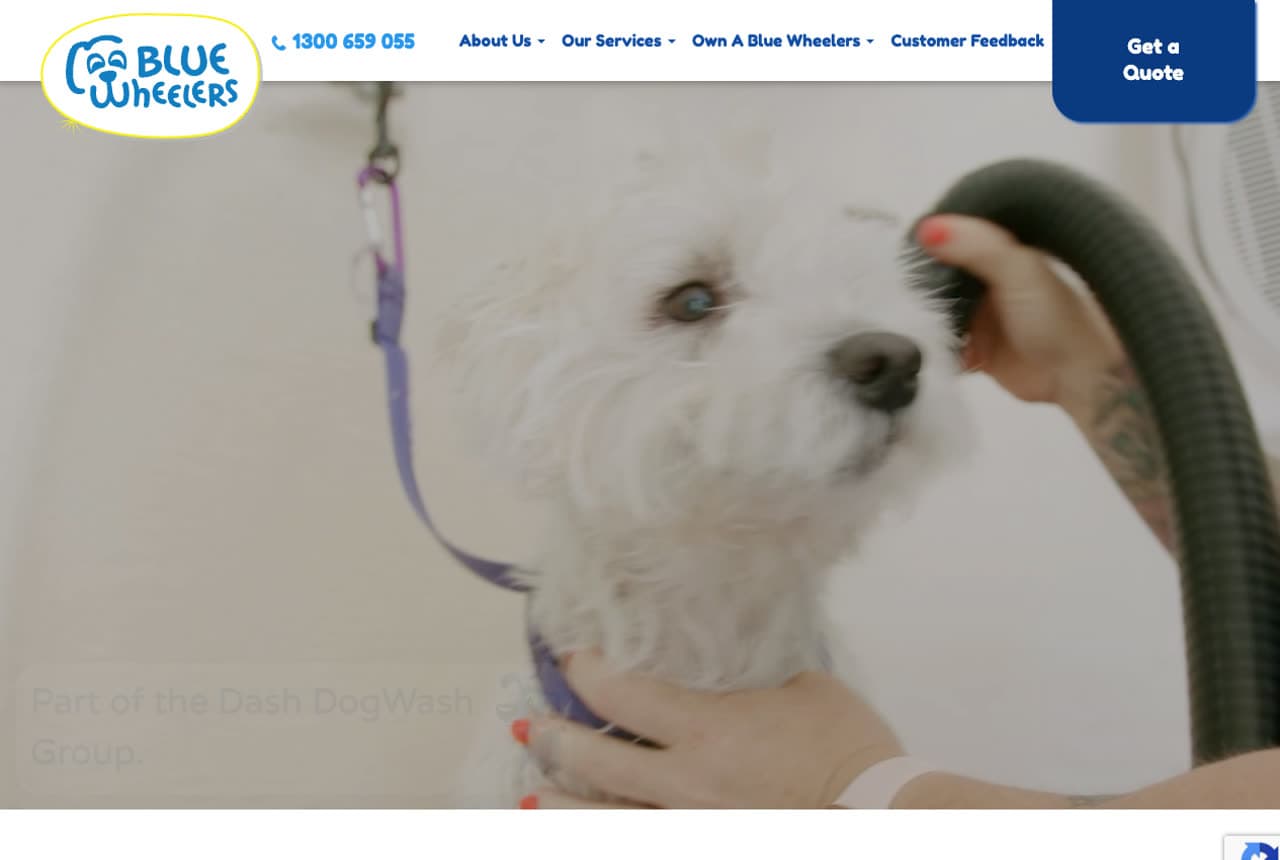
Blue Wheelers is Australia's biggest mobile dog-grooming franchise, but it never feels corporate, because a cheerful blue cartoon-dog mascot runs through the entire site. A video hero of a fluffy white dog being groomed sells the service instantly, a scrolling marquee rotates playful taglines, and animated stat counters make the scale feel impressive rather than impersonal. Cleverly, the design serves two audiences at once — 'Get a Quote' for pet owners and a separate path for franchise buyers — without confusing either. The lesson for any pet or kids' business: a strong character does heavy lifting, turning a large operation into something that feels local, warm, and fun to hand your dog to.

Ascend Business Consulting website — Business Consulting design example
Real site · Brisbane, AU
  • Business Consulting
  • Elegant

Ascend Business Consulting: A provocative headline plus self-selection paths

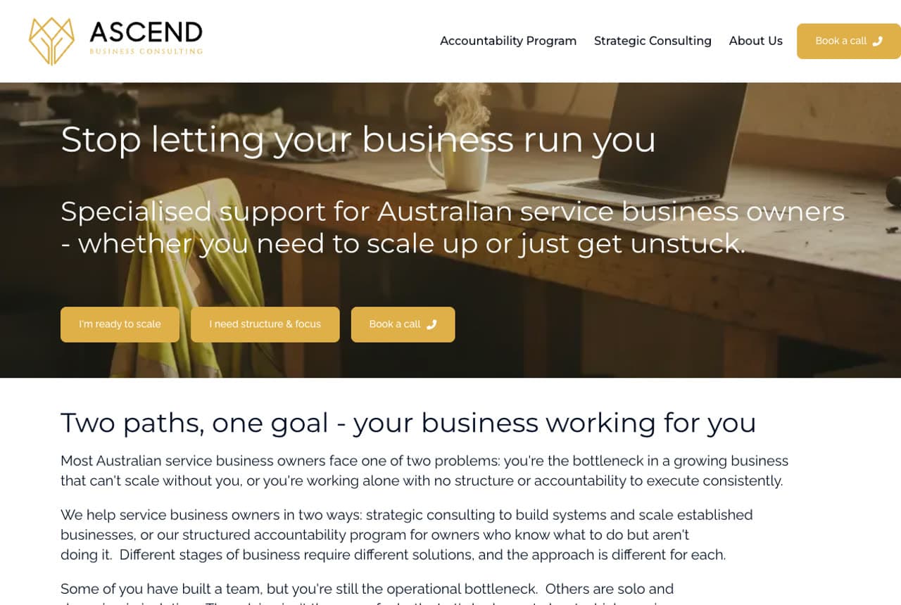
Ascend opens with a line that stops a stressed business owner cold — 'Stop letting your business run you' — naming the pain before pitching the solution. Then it does something most consultants avoid: three self-selection CTAs send each visitor down the path that fits, and a side-by-side comparison of its two programs lays out 'who it's for,' 'what changes,' and even transparent pricing. For a high-trust, high-cost service, that openness is the differentiator — most consulting sites hide the price and stay vague, which reads as evasive. The gold-and-dark palette keeps it premium. It's a clean demonstration that naming the customer's pain and being radically transparent beats polished-but-vague every time.

Best Luxury Detailing website — Auto Detailing design example
Real site · Australia
  • Auto Detailing
  • Bold

Best Luxury Detailing: Dark, premium, and proof-stacked for a luxury service

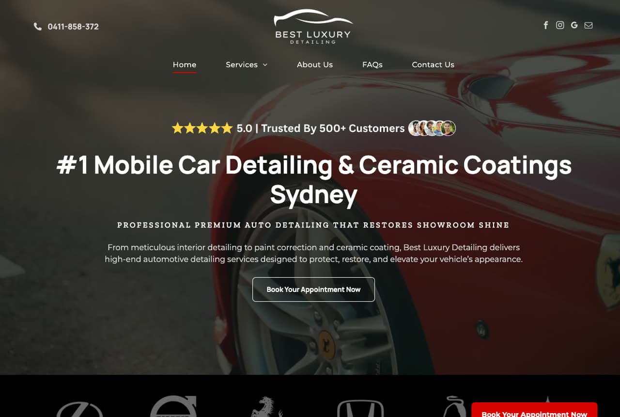
Best Luxury Detailing sells a premium service and the design never lets you forget it. A black-and-red theme with a close-up Porsche-wheel hero signals 'high-end' on sight, and a social-proof bar — '5.0, trusted by 500+ customers' with a stack of customer avatars — does the convincing. A marquee of luxury car logos (Ferrari, Lamborghini, Lexus) borrows their prestige, while the conversion machinery is all there: a 20% first-time discount, an inline quote form with a photo-upload so customers show their car's condition, and a comparison table that justifies the price tier. It's a strong example of matching visual luxury to functional conversion — the page looks expensive and still makes quoting effortless.

Ironclad Air & Heating — HVAC website design you can build with Zarla
Build this with Zarla
  • HVAC
  • Bold

Ironclad Air & Heating: A booking form right inside the hero

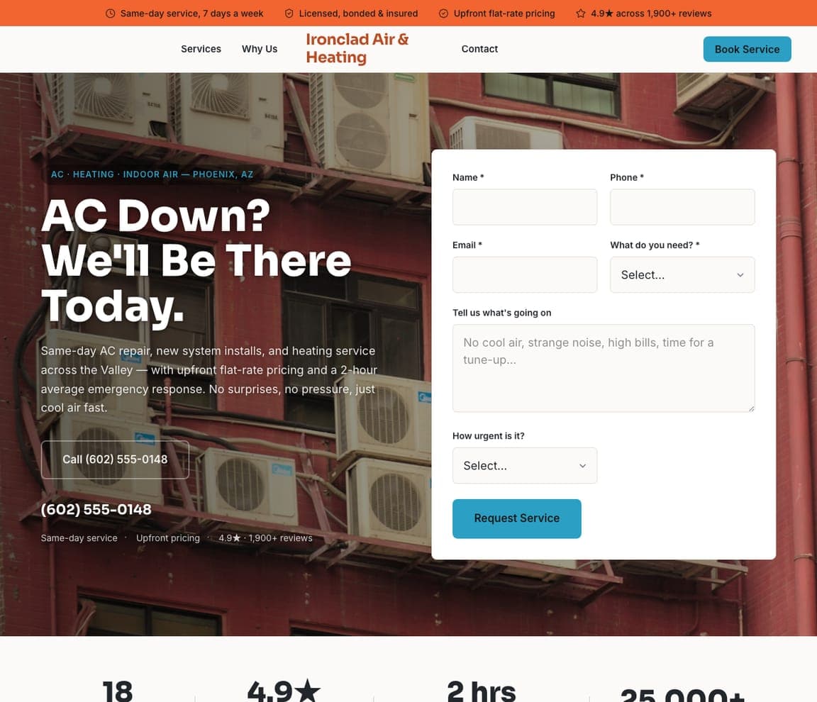
Ironclad Air & Heating puts a quote form directly in the hero ('AC down? We'll be there today') in a form-split layout, paired with an urgent orange. For an emergency service, every extra click loses the job — so the form is the first thing you see, not a page away. An inline stats row proves response time at a glance, and the rest of the page reads as fast and no-nonsense as the promise. It's the clearest case for a simple rule: if you sell urgency, capture the lead in the hero rather than sending an anxious customer hunting for a contact page.

See this template
Hearthstone Realty Group — Real Estate website design you can build with Zarla
Build this with Zarla
  • Real Estate
  • Elegant

Hearthstone Realty Group: One promise, split down the middle

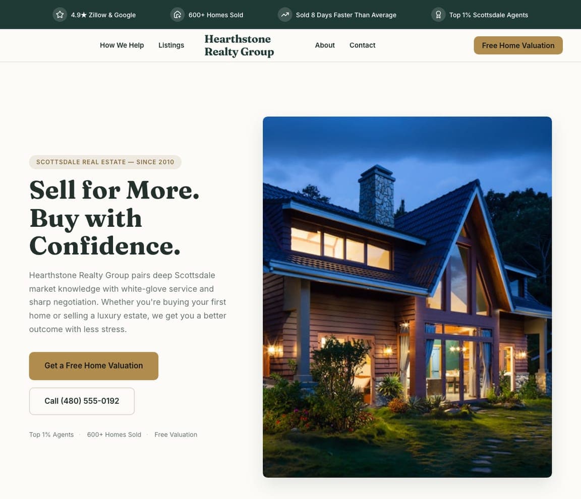
Hearthstone Realty splits its hero — a confident promise ('Sell for more. Buy with confidence.') beside a warm property photo — and an elegant forest-green palette gives it a boutique feel. Separate buyer and seller paths further down mean two very different visitors each find their lane fast, instead of wading through one generic pitch. It's a tidy lesson in respecting opposite intents: when your audience splits cleanly in two, the homepage should split with them rather than averaging into something that speaks to neither.

See this template
Ironhill Construction — Builder website design you can build with Zarla
Build this with Zarla
  • Builder
  • Bold

Ironhill Construction: Before-and-after proof you can't argue with

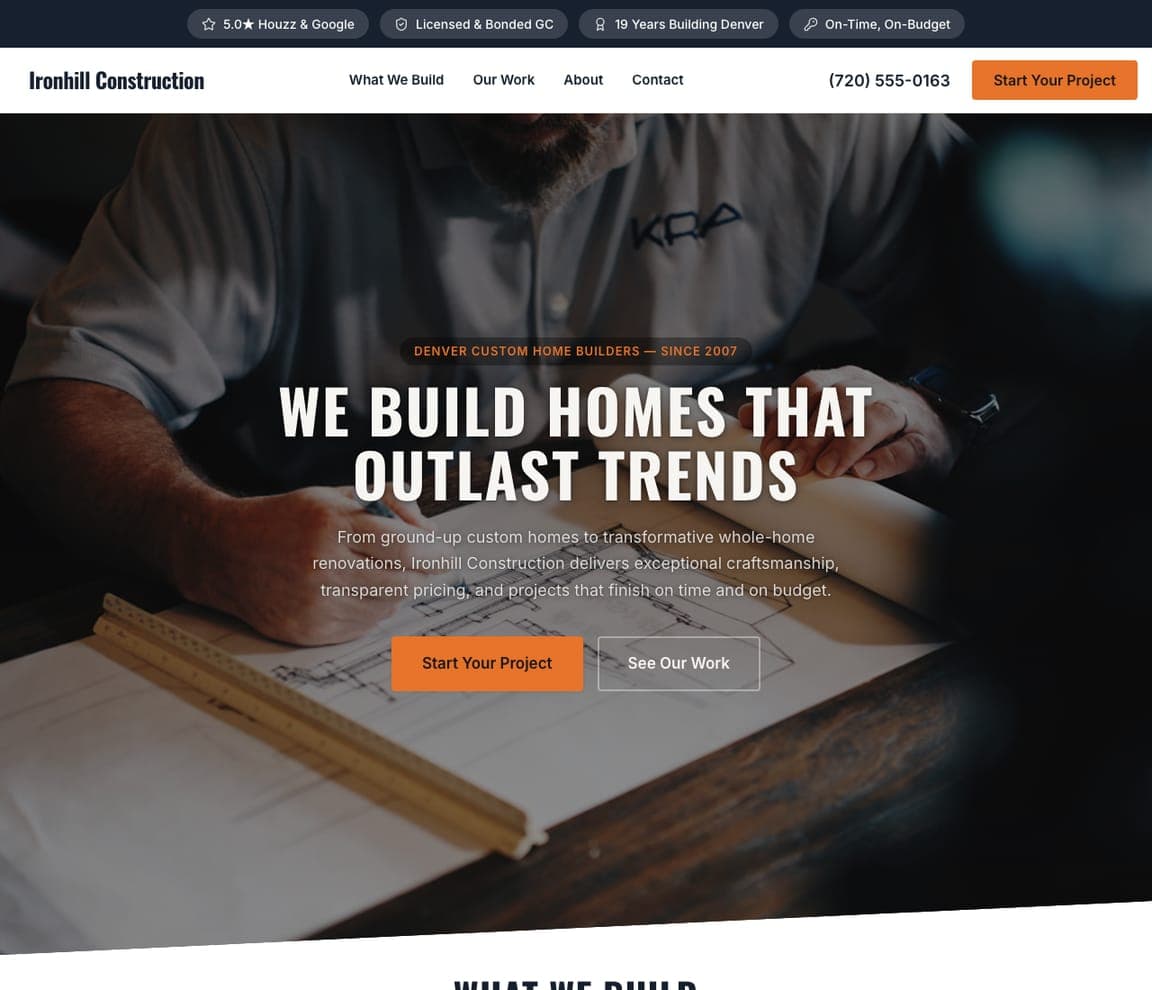
Ironhill Construction goes full-bleed — a cinematic overlay hero ('We build homes that outlast trends') over a finished build — then drops a before-and-after gallery and a stats band. For a big-ticket purchase, that visible proof of craftsmanship does more than any list of services. The slate-and-white palette stays out of the way so the work is the star. It's a reminder that for high-consideration trades, the most persuasive section isn't copy at all — it's a slider that lets the buyer watch the transformation happen.

See this template

Frequently asked

What makes a good small business website?

A good small business website earns trust in the first few seconds (star rating, years in business, a real photo), gives the visitor one obvious action (call, book, or request a quote), loads fast on a phone, and backs up its claims with genuine reviews. Notice how every design below leads with proof and a single clear call to action rather than a wall of text.

How much does a small business website cost?

A custom small business website from a freelancer or agency typically runs $2,000–$10,000 up front, and template builders like Wix or Squarespace charge roughly $16–$30 per month. An AI builder generates a complete, editable design for free and only charges (on the Premium plan) when you publish to your own domain — so you can build and preview the whole thing before spending anything.

What pages does a small business website need?

Most small businesses need just five: a home page that proves trust and points to one action, an about page that puts a face to the business, a services page that explains what you do and what it costs, a contact page with a form and a phone number, and (for local businesses) location or service-area pages that help you show up in nearby searches.

You've seen what works. Now make it yours.

Describe your business and Zarla designs a complete, professional website in about 30 seconds — built to convert, just like the ones above.

Free to build and preview · no credit card · publish to your own domain on Premium