Inspiration · Social Club

The Best Social Club Website Examples, Explained

Looking for social club website examples? These 12 are the strongest we found — The University Club's stone façade with 'More than an architectural landmark.' beneath it, The Yale Club's bulldog on a rug in front of a fireplace with 'Your Social Respite Awaits', The Penn Club's lounge seen through open doors with 'Welcome to The Penn Club of New York' in script — plus members-club, speakeasy and chef's-counter designs you can build with Zarla, each with a breakdown of the specific move that turns a 'social club near me' search into a membership enquiry. A club's site is read by someone deciding whether they belong, so the best ones here show the room, say the year and make the button 'apply' or 'enquire', never 'buy'. Find an approach you love and you can build a site in that spirit, free, in about 30 seconds.

Real sites + designs you can build with Zarla — free to build and preview, no credit card

What makes a great social club website

The best social club websites show the room and say the year. The rooms: The Penn Club's fireplace lounge with a red sofa, The Montauk Club's panorama of leather armchairs and tables laid with red napkins, City of London Club's entrance with amber lanterns, The Union Club's wall of framed portraits above a yellow bar. The years: 'Since its founding in 1889' at The Montauk Club, 'EST. SOHO 1993' in The Union Club's seal. The ask: Soho House's 'Apply for membership', The Penn Club's 'APPLY NOW', City of London Club's 'BECOME A MEMBER', The Yale Club's 'Membership' as the second nav item. Notice the two that refuse to explain — Zero Bond spells its name in giant gold letters across four panels and says nothing else, The University Club shows only its façade above 'More than an architectural landmark.' — and the one that is a club without a building: The NYC Social Club's cocktail glasses raised together under 'Because your social life deserves an upgrade ;)'. Every example below tells you whether the club is selling a building, a circle or a calendar.

The University Club website — Private Social Club design example
Real site · New York, NY
  • Private Social Club
  • Stately
  • Cream + navy

The University Club: A stone façade with a lantern over the door, then 'More than an architectural landmark.'

The University Club is the cover because it lets the building make the argument. The cream header sets a round navy crest at the left and a hamburger with 'MENU' at the right — no nav, no button. The hero is a straight-on image of the club's stone façade: three rows of windows, small balconies, carved plaques between them, arched ground-floor windows and a wooden double door with a lantern hanging in its arch; a gold circle with a down-chevron sits at the bottom edge of the image. Beneath, on cream, the small tracked capitals 'NEW YORK'S PREMIER SOCIAL CLUB', the dark serif 'More than an architectural landmark.' and a paragraph that begins 'Through the vitality of its members, it has evolved into New York's premier social club offering unparalleled services to members - from gracious dining, luxurious accommodations and a variety of…' before the crop. There is no button in the first screen. The headline concedes the building is famous and then says the members matter more. Clone the façade-then-sentence structure if your clubhouse is the brand.

  • The façade as the whole hero
  • A headline that argues with the building
  • No nav, no button — a menu and a chevron

Steal this: Photograph the front door straight on and write one sentence under it that says what the building can't — 'More than an architectural landmark.'

Visit The University Club

Opens a similar Zarla design you can make yours.

The Yale Club website — University Alumni Club design example
Real site · New York, NY
  • University Alumni Club
  • Amused
  • Photo + gold

The Yale Club: A bulldog on a rug in front of a fireplace, with 'Your Social Respite Awaits' in italic

The Yale Club puts its mascot on the rug and lets it host. The dark, transparent header sets a monogram beside 'THE YALE CLUB' at the left, a nav — The Club, Membership, Club Life, Guest Rooms, Dining, Athletics, Private Events — and a user icon with a small lock at the right. The hero is a photograph of an English bulldog lying on a patterned rug in front of a brick fireplace, mouth open, looking at the camera; at the bottom left, a thin gold vertical rule and the italic 'Your Social Respite Awaits'. A pale panel follows with the serif 'Experience a Vibrant Community that Celebrates…' cut by the crop. 'Guest Rooms', 'Dining' and 'Athletics' in the nav are the three things a city club sells; the dog is the fourth. Clone the mascot hero if your club has one.

  • The mascot as the host
  • One italic line at the bottom of the photo
  • Guest Rooms, Dining and Athletics in the nav

Steal this: Put the mascot in the hero and one italic line in the corner — 'Your Social Respite Awaits' says more about the club than a paragraph would.

Visit The Yale Club

Opens a similar Zarla design you can make yours.

The Penn Club website — University Alumni Club design example
Real site · New York, NY
  • University Alumni Club
  • Clubbable
  • Photo + navy

The Penn Club: The lounge through open doors — a fireplace, a red sofa — with 'Welcome to The Penn Club of New York' in script

The Penn Club opens the doors and shows the fire lit. The hero is a photograph of the clubhouse lounge seen through open wooden doors: dark panelling, a fireplace with a fire burning, a red sofa with patterned cushions, blue-and-white vases and lamps on the mantel, armchairs and a glass table with yellow flowers. The nav runs across the top of the photograph in white capitals — THE CLUB, MEMBERSHIP, AMENITIES, the Penn Club crest centred, PRIVATE EVENTS, APPLY NOW, CONTACT US, LOGIN — with thin red-and-blue underlines. At the bottom of the photograph, the italic script 'Welcome to The Penn Club of New York' and a small chevron. Beneath, on pale grey, the blue tracked serif capitals 'A PLACE TO ENJOY AND FOSTER LASTING FRIENDSHIPS IN THE HEART OF NEW YORK.' and two columns of body text beginning 'Welcome to The Penn Club of New York, University of…' and 'Our historic landmark clubhouse, located in midtown Manhattan,…'. 'APPLY NOW' is in the nav where 'book' would be on a hotel. Clone the through-the-doors photograph.

  • The lounge photographed through open doors
  • 'APPLY NOW' in the nav
  • A script welcome at the foot of the photo

Steal this: Shoot the main room through its open doors with the fire lit — the visitor is being let in, and the photograph says so.

Visit The Penn Club

Opens a similar Zarla design you can make yours.

The Montauk Club website — Private Social Club design example
Real site · Brooklyn, NY
  • Private Social Club
  • Historic
  • Photo + maroon

The Montauk Club: A panorama of the club's dining room, then 'A PRIVATE SOCIAL CLUB LOCATED IN BROOKLYN… SINCE ITS FOUNDING IN 1889'

The Montauk Club shows the whole room at once and dates itself in the first line. The maroon header sets a monogram with 'THE MONTAUK CLUB' left and a two-row nav right — Home, About, Membership, Weddings & Events, Dining, Calendar, Contact, then Reciprocal Clubs, Member Login, FAQ. The hero is a panoramic photograph of the interior, bent as a 360-degree capture: a brass chandelier, leather armchairs and a round wooden table on a red rug at the left, carved wooden columns and arches, round tables laid with white cloths and red napkins at the right, stained arched windows along the far wall. Beneath, on white, two sentences in grey capitals — 'THE MONTAUK CLUB IS A PRIVATE SOCIAL CLUB LOCATED IN BROOKLYN.' in dark grey, then 'SINCE ITS FOUNDING IN 1889, THE MONTAUK CLUB HAS BEEN A VIBRANT PART OF THE PARK SLOPE COMMUNITY.' in lighter grey. No button; 'Weddings & Events' and 'Reciprocal Clubs' in the nav say how the club earns and whom it trades with. Clone the two-sentence definition.

  • A 360-degree panorama as the hero
  • The definition and the year in two sentences
  • 'Reciprocal Clubs' in the nav

Steal this: Write your definition in two capitalised sentences under the photograph — what you are, then when you began — and let the nav carry the rest.

Visit The Montauk Club

Opens a similar Zarla design you can make yours.

The Union Club website — Members Club design example
Real site · London, England
  • Members Club
  • Bohemian
  • Cream + maroon

The Union Club: 'Welcome to The Union Club. Soho's best kept secret.' in thin serif on cream, ending 'Why not be our guest?'

The Union Club writes a welcome instead of showing a room. The cream page sets a round monogram seal — 'THE UNION CLUB · EST. SOHO 1993' — at the centre of the header with the nav split around it: The Club, Membership, Hire, Workspaces, Food & Drink to the left; Reciprocal Clubs, Weddings, What's on, Careers, Shop to the right. Centred beneath, the thin serif 'Welcome to The Union Club.' / 'Soho's best kept secret.' and three short paragraphs: 'We are a friendly, bohemian members' Club located at the heart of our much-beloved Soho.' / 'Since 1993, we have been providing a unique and charming setting for dining, drinking, meeting, mingling, working (if one must!), weddings & events.' / 'Why not be our guest?'. A maroon rule leads to a photograph of a wall of framed portraits and photographs above a yellow-panelled bar. No button in the first screen — 'Why not be our guest?' is the ask. 'Working (if one must!)' is the club's voice in three words. Clone the welcome-letter hero.

  • A welcome letter instead of a photograph
  • 'working (if one must!)' — the voice
  • 'Why not be our guest?' as the ask

Steal this: Write the hero as a three-paragraph welcome in your own voice and end on a question — 'Why not be our guest?' invites without a button.

Visit The Union Club

Opens a similar Zarla design you can make yours.

Soho House website — Members Club Brand design example
Real site
  • Members Club Brand
  • Aspirational
  • Photo + cream

Soho House: 'A home for the world's creatives to come together' over a sun-flared figure among trees, with 'Apply for membership'

Soho House says who it is for and nothing about where. The cream header sets a small grid icon and a nav — About, Membership, Houses, Bedrooms, Health Club, Book, News, Shop — with 'Sign In' and 'Membership' at the right. The hero is a soft, sun-flared photograph of a person seen from behind in a white shirt, among trees at golden hour, a lens flare across their shoulder; centred over it, the thin white serif 'A home for the world's creatives to come together' on three lines and a white pill 'Apply for membership'. There is no place name in the first screen because 'Houses' in the nav is plural. 'Health Club' and 'Bedrooms' in the nav say the membership includes a gym and a bed. Clone the one-line, one-button hero if your audience is a kind of person rather than a postcode.

  • The audience named, the place not
  • One line, one pill
  • 'Houses' plural in the nav
Visit Soho House

Opens a similar Zarla design you can make yours.

The NYC Social Club website — Events Social Club design example
Real site · New York, NY
  • Events Social Club
  • Upbeat

The NYC Social Club: The club's name in giant capitals over cocktail glasses raised together, ending 'Because your social life deserves an upgrade ;)'

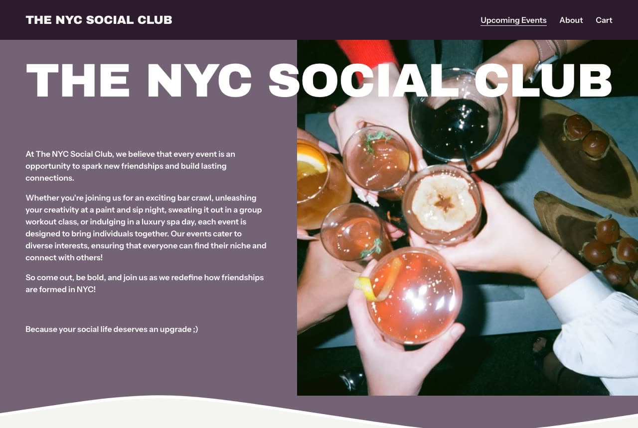
The NYC Social Club is a club without a building, so it shows the people. The plum header sets 'THE NYC SOCIAL CLUB' left and a three-item nav — Upcoming Events (underlined), About, Cart. The hero is a mauve panel with the giant white bold 'THE NYC SOCIAL CLUB' running across its top and over a photograph of six cocktail glasses raised together — an orange slice, herb sprigs, a dried citrus wheel, a lemon twist — above a wooden board of appetisers; left, three paragraphs: 'At The NYC Social Club, we believe that every event is an opportunity to spark new friendships and build lasting connections.' / 'Whether you're joining us for an exciting bar crawl, unleashing your creativity at a paint and sip night, sweating it out in a group workout class, or indulging in a luxury spa day, each event is designed to bring individuals together…' / 'So come out, be bold, and join us as we redefine how friendships are formed in NYC!' and, in bold, 'Because your social life deserves an upgrade ;)'. A cream wave closes the panel. 'Cart' in the nav means events are bought, not applied for. Clone the events-list paragraph if your club is a calendar.

Visit The NYC Social Club

Opens a similar Zarla design you can make yours.

City of London Club website — Private Members Club design example
Real site · London, England
  • Private Members Club
  • Dignified

City of London Club: A royal-blue sidebar with the crest and 'BECOME A MEMBER', beside an entrance lit by three amber lanterns

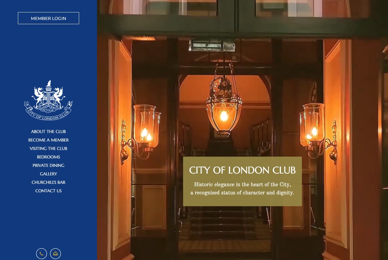
City of London Club runs its nav down a blue sidebar and gives the rest of the screen to the door. The sidebar is royal blue: an outlined 'MEMBER LOGIN' at the top, the club's white crest, and a caps nav — ABOUT THE CLUB, BECOME A MEMBER, VISITING THE CLUB, BEDROOMS, PRIVATE DINING, GALLERY, CHURCHILL'S BAR, CONTACT US — with phone and mail icons at the foot. The right three-quarters is a photograph of the entrance: glass doors, a hanging lantern and two wall lamps glowing amber, a staircase beyond; an olive translucent box carries 'CITY OF LONDON CLUB' and the serif 'Historic elegance in the heart of the City, a recognised status of character and dignity.' No button — 'BECOME A MEMBER' is second in the nav. 'CHURCHILL'S BAR' as a nav item is the kind of detail only an old club can list. Clone the sidebar if your nav is your brochure.

Visit City of London Club

Opens a similar Zarla design you can make yours.

Zero Bond website — Private Members Club design example
Real site · New York, NY
  • Private Members Club
  • Withholding

Zero Bond: The name spelled in giant gold letters across four dark panels — and nothing else

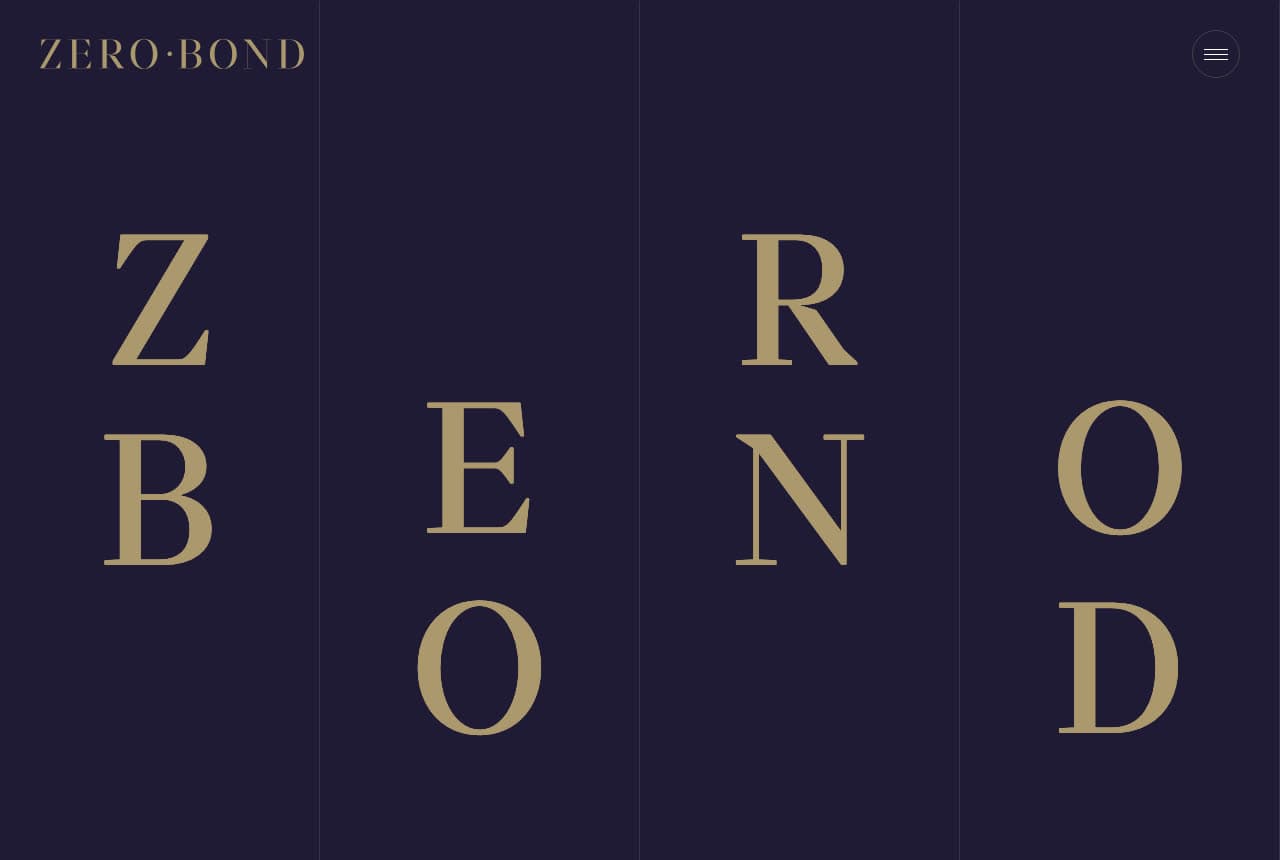
Zero Bond is the most withholding page in this gallery, and that is the design. The page is near-black navy divided by thin rules into four vertical panels. The header sets the gold 'ZERO·BOND' wordmark at the left and a round hamburger at the right. The hero is the name itself, set in giant gold serif capitals and staggered — Z over B in the first panel, E over O in the second, R over N in the third, O over D in the fourth — so that ZERO reads along the top and BOND along the bottom. There is no photograph, no sentence, no button, no nav. A visitor who does not already know what Zero Bond is learns nothing, which is the point of a club that does not advertise. Clone the letters-only hero only if your name is the whole invitation.

Visit Zero Bond

Opens a similar Zarla design you can make yours.

The Blackwood Grooming Club — Members Club Template website design you can build with Zarla
Build this with Zarla
  • Members Club Template
  • Discreet

The Blackwood Grooming Club: 'The Standard of Grooming in New York, NY' over a washed-out interior, with 'Request Membership' as the button

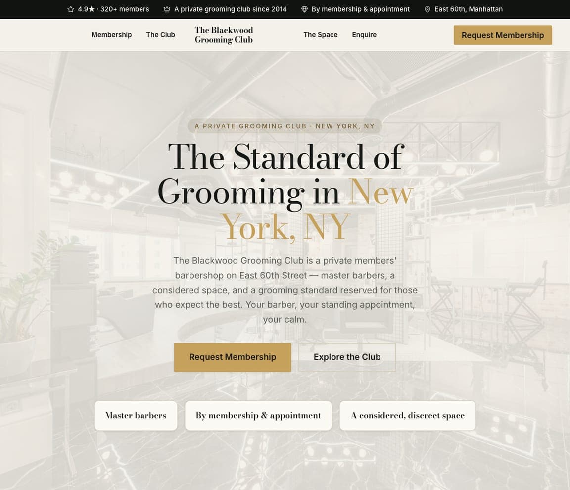
The Blackwood Grooming Club is the Zarla members-barbershop-club template — the closest thing in the catalog to a private members' club page, because its whole vocabulary is membership. A black top strip carries '4.9★ · 320+ members', 'A private grooming club since 2014', 'By membership & appointment', 'East 60th, Manhattan'. The cream header sets Membership and The Club left, a serif 'The Blackwood Grooming Club' centred, The Space and Enquire right, and a gold 'Request Membership'. The hero is a washed-out pale photograph of an industrial interior; centred over it, a pill — 'A PRIVATE GROOMING CLUB · NEW YORK, NY' — the huge serif 'The Standard of Grooming in New York, NY' with 'New York, NY' in gold, a paragraph ('The Blackwood Grooming Club is a private members' barbershop on East 60th Street — master barbers, a considered space, and a grooming standard reserved for those who expect the best. Your barber, your standing appointment, your calm.') a gold 'Request Membership' beside an outlined 'Explore the Club', and three serif pills — 'Master barbers', 'By membership & appointment', 'A considered, discreet space'. Swap the barbers for your dining room and keep 'Request Membership' and 'Enquire'.

See this template
Afterimage — Speakeasy Bar Template website design you can build with Zarla
Build this with Zarla
  • Speakeasy Bar Template
  • After-Dark

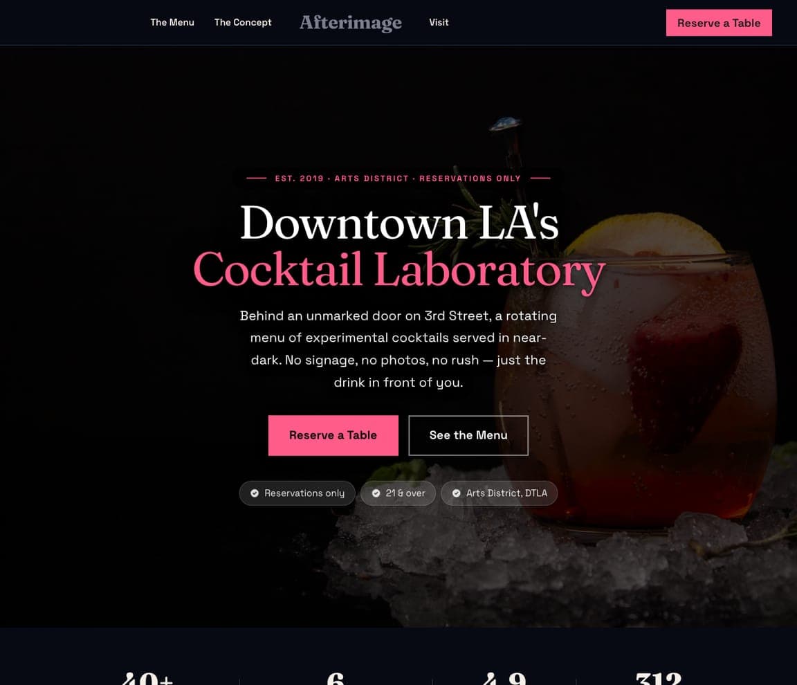
Afterimage: 'Downtown LA's Cocktail Laboratory' over a near-black cocktail, with 'Reservations only' in a pill

Afterimage is the Zarla cocktail-speakeasy template — a social club borrows it for the after-dark, reservations-only mood of a club bar. The black header sets The Menu and The Concept left, a grey serif 'Afterimage' centred, Visit right, and a pink 'Reserve a Table'. The hero is a near-black photograph of a cocktail with rosemary and a lemon slice at the right; centred over it, a pink tracked eyebrow with dashes — 'EST. 2019 · ARTS DISTRICT · RESERVATIONS ONLY' — the white serif 'Downtown LA's' over the pink 'Cocktail Laboratory', a paragraph ('Behind an unmarked door on 3rd Street, a rotating menu of experimental cocktails served in near-dark. No signage, no photos, no rush — just the drink in front of you.') and a pink 'Reserve a Table' beside an outlined 'See the Menu', then three dark pills: 'Reservations only', '21 & over', 'Arts District, DTLA'. 'No signage, no photos, no rush' is the members' bar promise. Swap the cocktail for your club room and keep the three pills.

See this template
Seat Twelve — Chef's Counter Template website design you can build with Zarla
Build this with Zarla
  • Chef's Counter Template
  • Exclusive

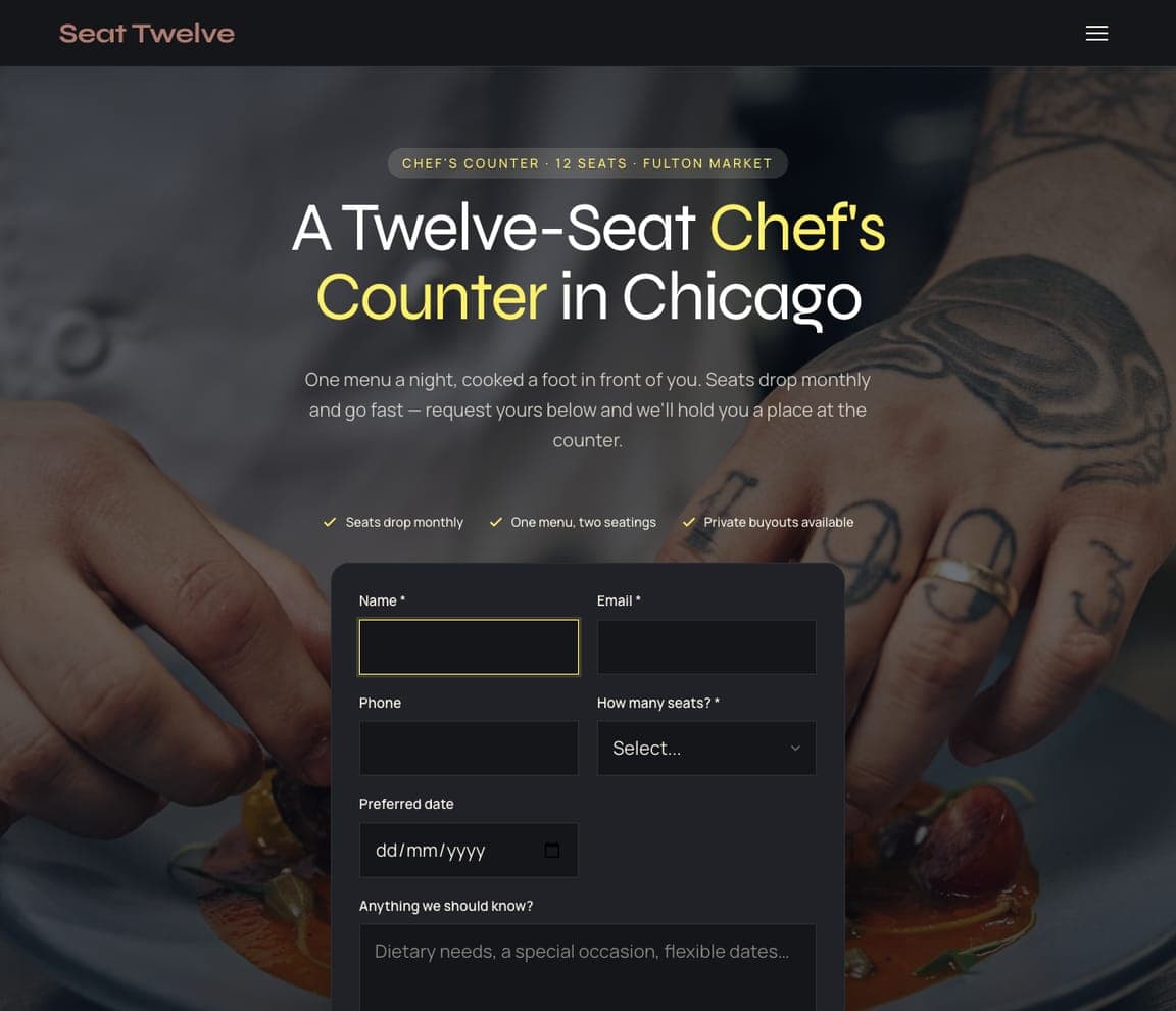
Seat Twelve: 'A Twelve-Seat Chef's Counter in Chicago' over a chef's hands, with a request-a-seat form in the hero

Seat Twelve is the Zarla supper-club template — it is a chef's counter, not a club, but its request-a-seat form is the move a dining club with a waiting list can borrow. The black header sets a rose 'Seat Twelve' and a hamburger. The hero is a dark photograph of a tattooed chef's hands; centred over it, a pill — 'CHEF'S COUNTER · 12 SEATS · FULTON MARKET' — the white 'A Twelve-Seat Chef's Counter in Chicago' with 'Chef's Counter' in yellow, a paragraph ('One menu a night, cooked a foot in front of you. Seats drop monthly and go fast — request yours below and we'll hold you a place at the counter.'), three yellow ticks ('Seats drop monthly', 'One menu, two seatings', 'Private buyouts available') and a dark form with Name, Email, Phone and 'How many seats?'. Scarcity is the whole page: twelve seats, one menu, request yours. Swap the counter for your monthly dinner and the form for a membership enquiry.

See this template

Frequently asked

What should a social club website show first?

The building or the room. The University Club shows its stone façade — three rows of windows, balconies, a wooden door with a lantern. The Penn Club shows the lounge through open doors: a fireplace, a red sofa, blue-and-white vases. The Montauk Club shows a panorama of its dining room with tables laid in white and red. City of London Club shows the entrance with three amber lanterns. The Yale Club shows a bulldog on the rug instead — the mascot as the room's host. Soho House shows a person among trees at golden hour, because its 'houses' are many.

How should a social club site say what it is?

In one sentence, with the year. The Montauk Club: 'THE MONTAUK CLUB IS A PRIVATE SOCIAL CLUB LOCATED IN BROOKLYN. SINCE ITS FOUNDING IN 1889…'. The Union Club: 'We are a friendly, bohemian members' Club located at the heart of our much-beloved Soho.' with 'EST. SOHO 1993' in the seal. The Penn Club: 'A PLACE TO ENJOY AND FOSTER LASTING FRIENDSHIPS IN THE HEART OF NEW YORK.' City of London Club: 'Historic elegance in the heart of the City, a recognised status of character and dignity.' The University Club: 'NEW YORK'S PREMIER SOCIAL CLUB' as an eyebrow.

What should the button on a social club website say?

Apply or enquire — not book, never buy. Soho House: 'Apply for membership' under the headline and 'Membership' in the header. The Penn Club: 'APPLY NOW' in the nav. City of London Club: 'BECOME A MEMBER' in the sidebar. The Yale Club puts 'Membership' second in the nav and a lock icon at the far end; The Montauk Club lists 'Membership' third with 'Member Login' in its second row; The Union Club puts 'Membership' second and has no login at all. Several have no hero button at all — The University Club, The Montauk Club, The Union Club, City of London Club — because a club that wants you to apply does not need to shout.

Can a social club website say almost nothing?

Zero Bond does: a near-black page, the gold 'ZERO·BOND' wordmark, and the name spelled in giant gold serif letters staggered across four vertical panels — Z, E, R, O along the top, B, O, N, D along the bottom — with a round hamburger and nothing else. The University Club is nearly as spare: the façade, a gold chevron, and 'More than an architectural landmark.' The Union Club goes the other way and writes three warm paragraphs ending 'Why not be our guest?'. Both work; the spare page says exclusivity, the warm page says welcome.

How does a club without a building present itself?

With the people and the calendar. The NYC Social Club's hero is a photograph of six cocktail glasses raised together over a board of appetisers, the club's name in giant white capitals across the top, and three paragraphs that list its events — 'an exciting bar crawl… a paint and sip night… a group workout class… a luxury spa day' — ending 'Because your social life deserves an upgrade ;)'. The nav has three items — Upcoming Events, About, Cart — and 'Upcoming Events' is underlined. No membership, no application: the calendar is the club.

Can I build a social club website like these with Zarla?

Yes. Every real site here has a 'Build a site like this' button that opens the closest Zarla template in the editor — The Blackwood Grooming Club for a membership-first page with 'Request Membership' as the button, the University Club, Penn Club and Union Club spirit; Afterimage for a near-black, reservations-only mood like The Yale Club, Soho House, City of London Club and Zero Bond; Seat Twelve for a request-a-seat form and a scarcity story like The Montauk Club and The NYC Social Club — and you swap in your room, your year and your application form. The room photographed, the founding year in the first sentence and 'apply' as the only button is the Penn Club pattern, and it takes about 30 seconds.

You've seen what works. Now make it yours.

Describe your business and Zarla designs a complete, professional website in about 30 seconds — built to convert, just like the ones above.

Free to build and preview · no credit card · publish to your own domain on Premium