Inspiration · Sports Coaching

The Best Sports Coaching Website Examples, Explained

Looking for sports coaching website examples? These 8 are the best we could find — standout real sports coaching sites plus designs you can build with Zarla — and each comes with a breakdown of the specific design move that makes it work. Find a look you love and you can build a site in that exact style, free, in about 30 seconds.

Real sites + designs you can build with Zarla — free to build and preview, no credit card

What makes a great sports coaching website

The best sports coaching websites share a few moves: they earn trust fast, lead with strong visuals of the work, point to one clear action, and match the design to how their customers decide. Each example below calls out the specific choice worth stealing for your own sports coaching website.

Ludus Sports Performance website — Sports Performance design example
Real site · Perth, AU
  • Sports Performance
  • Serious
  • Charcoal + orange

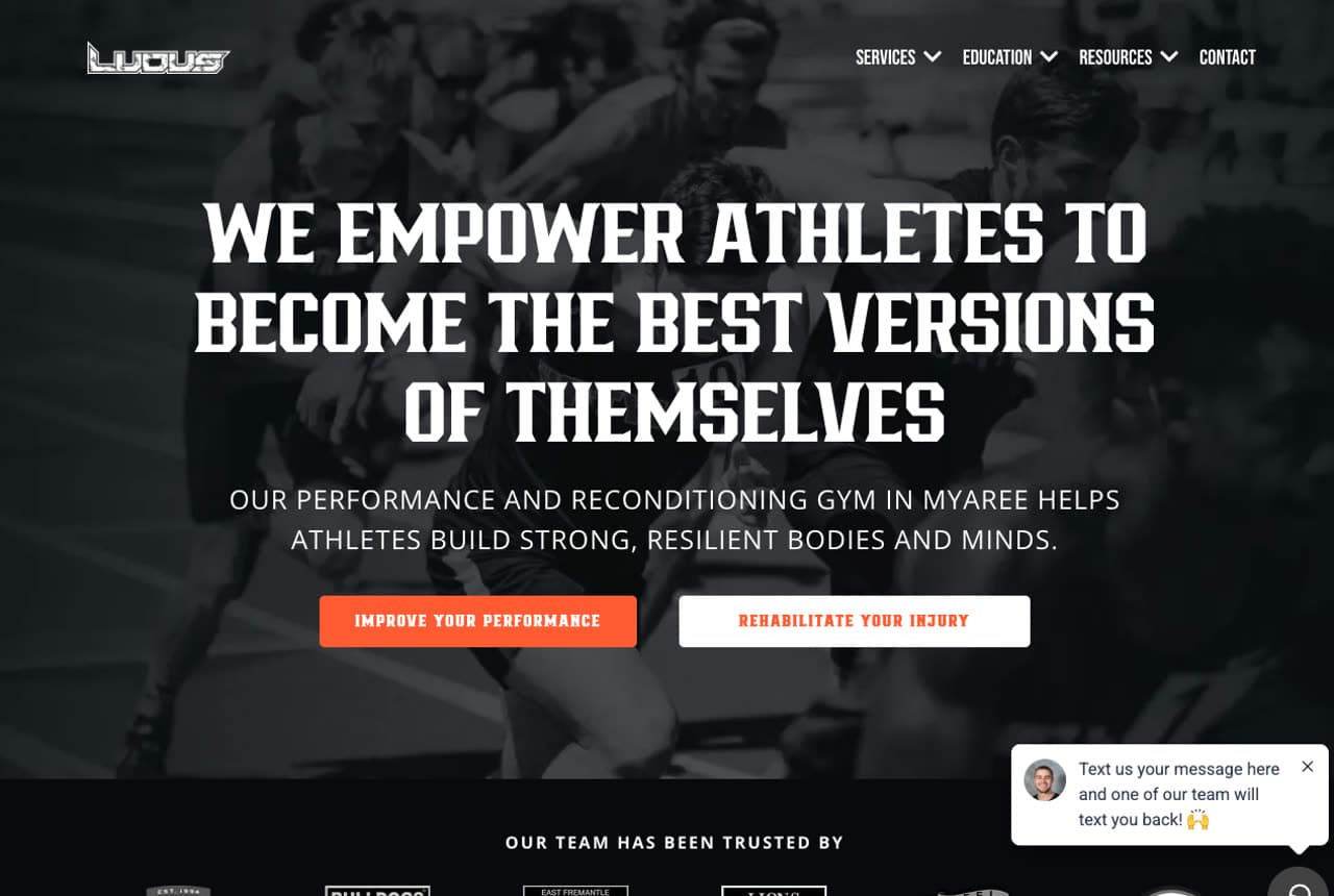
Ludus Sports Performance: 'Built for athletes' as the whole thesis

Ludus Sports Performance draws a hard line between itself and a regular gym: 'We Empower Athletes to Become the Best Versions of Themselves,' over moody training photography, with a pull-quote deeper down — 'Not Your Typical Gym, It Was Built for Athletes.' Two clear doors (Improve Your Performance / Rehabilitate Your Injury) split the two athlete needs, and a logo bar of trusted pro clubs (Dockers, Bulldogs, Sharks, Lions) borrows elite credibility that a suburban performance gym couldn't otherwise claim. The dark, serious art direction filters out the casual fitness crowd and speaks to the committed athlete. Positioning against 'typical gyms' and proving it with real club logos is how a performance facility charges more than the $10 chain down the road. Define yourself by who you're NOT for.

  • 'Built for athletes, not a typical gym' is the whole position
  • Pro-club logo bar borrows elite credibility
  • Two doors split performance vs rehab athlete needs

Steal this: Position against the thing you're not ('not a typical gym'). Defining who you're NOT for sharpens who you're perfect for.

Mt. Tabor CrossFit website — CrossFit Box design example
Real site · Portland, OR
  • CrossFit Box
  • Inclusive
  • Charcoal + teal

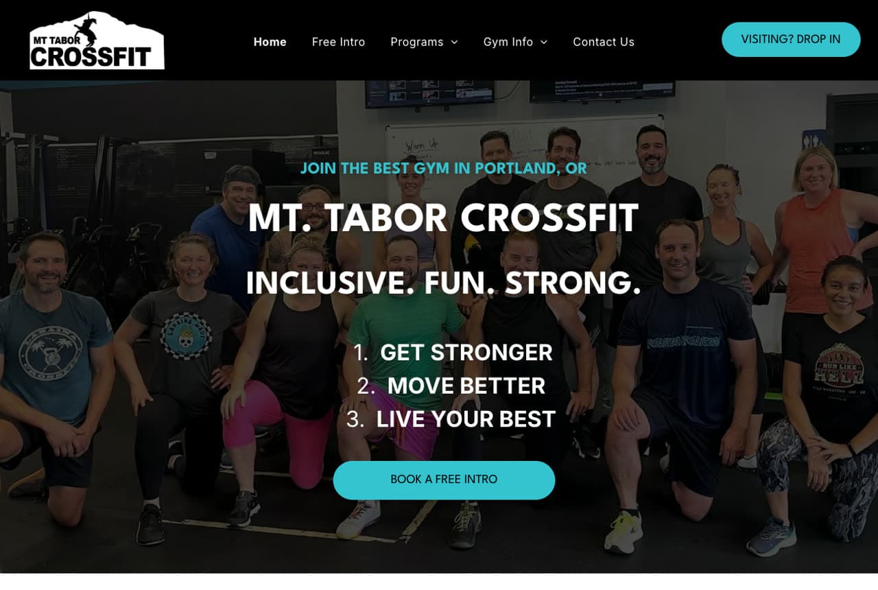
Mt. Tabor CrossFit: A real team photo beats any stock shot

Mt. Tabor CrossFit leads with the single most disarming thing a gym can show: a photo of its actual members — a big, mixed-age, mixed-ability group grinning together — under 'Inclusive. Fun. Strong.' and a numbered promise (1. Get Stronger 2. Move Better 3. Live Your Best). CrossFit intimidates newcomers, so leading with real, non-intimidating people and the word 'inclusive' directly disarms the fear that keeps beginners away. 'Book a Free Intro' lowers the first step, and a three-card row (All Fitness Levels Welcome / Support & Accountability / Workouts That Are Fun) reframes CrossFit as community rather than competition. The genuine group photo is the conversion asset — it says 'people like you already train here' more convincingly than any polished model ever could.

  • A real, mixed-ability member photo disarms newcomer fear
  • 'Inclusive' + free intro lowers the intimidating first step
  • Reframes CrossFit as community, not competition

Steal this: Lead with a real photo of your actual members, mid-laugh. 'People like you already train here' beats any stock model.

VC CrossFit website — CrossFit Box design example
Real site · Portland, OR
  • CrossFit Box
  • Welcoming
  • Dark + purple

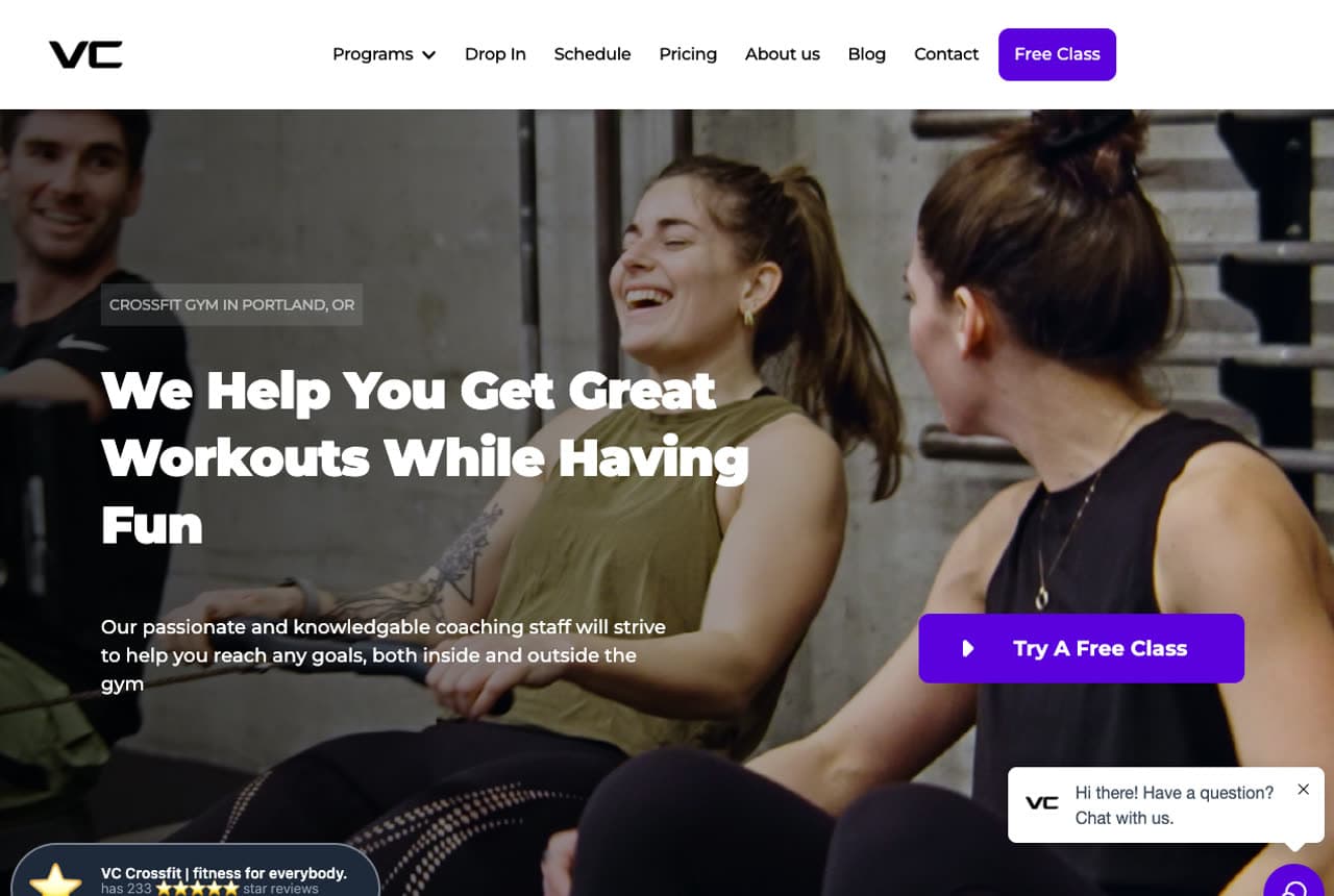
VC CrossFit: Fun-first, with benefit cards to match

VC CrossFit sells enjoyment over intensity: 'We Help You Get Great Workouts While Having Fun,' over a photo of two women laughing mid-session, with a 'Try a Free Class' CTA and a verified 233-review rating badge for instant trust. Beneath, three benefit cards (Everyone is welcome / Like-minded fitness community / Look & feel your best) translate the vibe into concrete promises. Where a stereotypical CrossFit box leads with barbells and grimaces, VC leads with smiles and belonging — a deliberate counter-position aimed at the beginner who assumes CrossFit isn't for them. The clean card layout and warm photography keep it approachable. Same sport as the hardcore boxes, opposite emotional pitch: proof that in a crowded category, the feeling you lead with is the differentiator.

  • Laughing-members photo leads with fun, not intensity
  • 233-review badge gives instant third-party trust
  • Benefit cards turn the welcoming vibe into concrete promises
Integra Fitness website — Personal Training Studio design example
Real site · Nashville, TN
  • Personal Training Studio
  • Premium
  • Charcoal + red

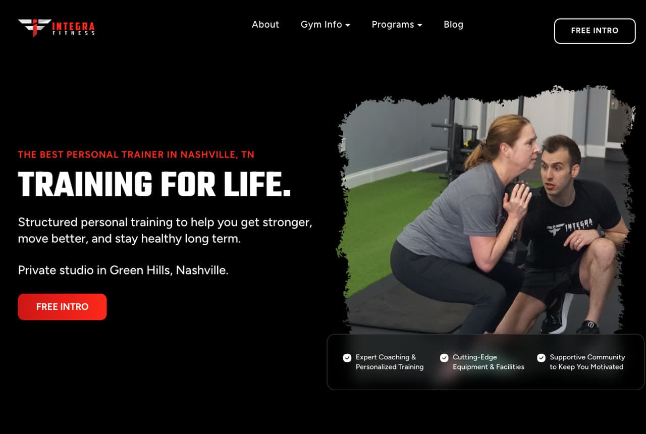
Integra Fitness: A private studio's long-term promise

Integra Fitness positions as the antidote to the crowded chain gym: 'The Best Personal Trainer in Nashville, TN' and 'Training for Life' over a photo of a coach one-on-one with a client, with 'Private studio in Green Hills, Nashville' as the key qualifier. The word 'private' and the phrase 'Training for Life' do the positioning — this is unhurried, personal, long-horizon coaching for the client who wants attention, not a treadmill in a warehouse. A three-point value row (Expert Coaching & Personalized Training / Cutting-Edge Equipment / Supportive Community) covers the bases, and the dark, focused palette reads premium and serious. For a personal trainer, 'private studio' plus a longevity promise ('for life,' 'long term') is exactly the language that justifies premium rates over a big-box membership. Sell the attention, not the equipment.

  • 'Private studio' + 'training for life' justify premium rates
  • One-on-one coaching photo sells attention over equipment
  • Dark, focused palette reads premium and serious
CrossFit Mayhem website — Elite Coaching Brand design example
Real site · Cookeville, TN
  • Elite Coaching Brand
  • Bold
  • Navy + red

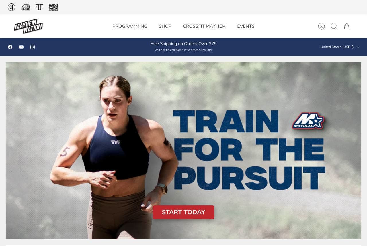
CrossFit Mayhem: A champion's brand, built into media

CrossFit Mayhem (Rich Froning's gym) turns a coaching brand into a media empire: 'Train for the Pursuit' over an athlete shot, a 'Start Today' CTA, and — the real engine — a 'What's Happening at Mayhem?' video row (Road to the Games, the Rich Froning Podcast) plus a merch shop. The programming, the gym, the content and the store all reinforce one champion narrative, so 'Mayhem' becomes a movement people buy into remotely, not just a local box. For an elite coaching brand with a recognizable figure at its centre, the website's job is to convert that fame into subscriptions, programming sales and merch — audience monetization beyond the four walls. Even without a celebrity, the lesson holds: content plus community turns a gym into a brand people follow.

  • Programming + podcast + merch reinforce one champion narrative
  • Content row converts fame into a followable movement
  • Monetizes an audience far beyond the local box
Burn Boot Camp website — Women's Fitness Franchise design example
Real site · Cornelius, NC
  • Women's Fitness Franchise
  • Energetic
  • Black + cyan

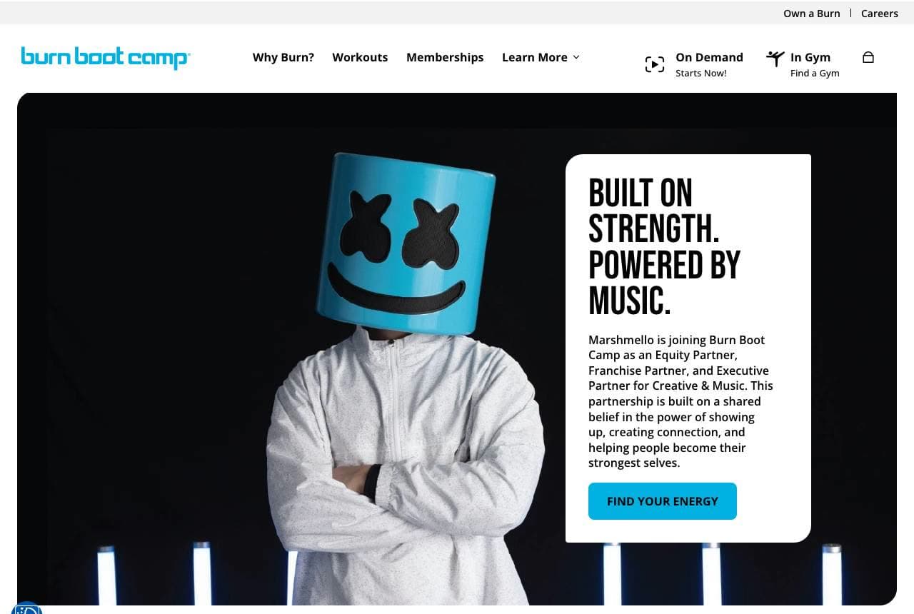
Burn Boot Camp: A franchise built around one audience

Burn Boot Camp knows exactly who it serves and builds everything around her: 'Stronger Together — Burn Boot Camp brings women and families together to train with purpose,' with a four-card row that nails the specific audience's real barriers — 45-Minute Camps (time-poor), Personalized Training, Free Childwatch (the childcare barrier that stops mothers from working out), and Focus Meetings (accountability). 'Free Childwatch' is the standout: naming and solving the single biggest obstacle for its core customer is worth more than any fitness claim. The bright, energetic design and a celebrity partnership (Marshmello) add reach, but the real strength is audience precision. When you build the offer — and the website — around one customer's actual life obstacles, you own that customer completely.

  • 'Free Childwatch' solves its core customer's biggest barrier
  • Every card maps to a specific obstacle of one audience
  • Audience precision beats generic fitness claims

Steal this: Name and solve your core customer's real life-obstacle on the page ('free childwatch'). Precision owns the audience.

IYCA website — Coach Certification design example
Real site · United States
  • Coach Certification
  • Mission-Led

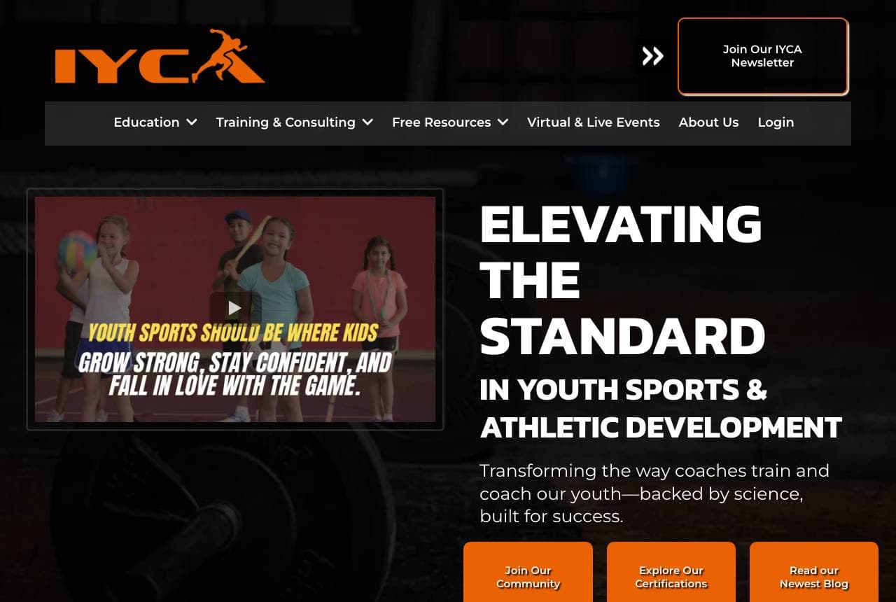
IYCA: Selling to the coaches, not the athletes

The IYCA (International Youth Conditioning Association) serves a different customer than everyone else in this gallery — the coaches themselves — and the design reflects it: 'Elevating the Standard in Youth Sports & Athletic Development,' with a mission-driven tone ('backed by science, built for success') and an impact stat row (3,200+ certified coaches globally, 1,738,550 athletes impacted, a 2-million-athlete 2030 goal). It's a certification and education body, so it sells belonging to a movement and professional credibility rather than a workout, and the stats plus 'Explore our Certifications' path do that job. The lesson generalizes to any B2B-in-a-B2C-category business: when your customer is the practitioner, lead with mission, impact numbers and professional credibility — the things that make a coach want to be associated with you.

Mara Quinn Personal Training — Personal Trainer website design you can build with Zarla
Build this with Zarla
  • Personal Trainer
  • Capable

Mara Quinn Personal Training: A coach who has a plan for you

Mara Quinn Personal Training is Zarla's sports-coaching template, and its credentials-centered hero lands the promise that converts wavering clients: 'Train With Someone Who Actually Has a Plan for You.' The navy-and-gold palette reads capable and premium (echoing Integra's private-studio positioning), and the credentials-centered layout puts qualifications and trust up front — exactly how a personal trainer or coach earns the first booking. The structure carries a services/programs breakdown, an about-the-coach story, and a free-intro CTA, mirroring the free-class hook the best boxes in this gallery use. The headline's dig at cookie-cutter programs sells personalized attention, the real product of good coaching. Swap in your own photos and credentials and it's a credible coaching site in about 30 seconds, no designer required.

See this template

Frequently asked

Where can I find good sports coaching website examples?

Right here — this page curates sports coaching website examples two ways: standout real businesses (each linked, so you can explore the live site) and professionally designed Zarla templates you can clone and make your own. Every example comes with a note on why the design works — trust signals, layout, calls to action — so you can copy the move, not just the look.

What makes a good sports coaching website?

A good sports coaching website earns trust in the first few seconds, leads with strong visuals of the work, gives visitors one obvious action, and loads fast on a phone. Every design below leads with proof and a single clear call to action rather than a wall of text.

How much does a sports coaching website cost?

A custom sports coaching website from a designer typically runs into the thousands up front, and template builders charge roughly $16–$30 per month. An AI builder generates a complete, editable design for free and only charges (on the Premium plan) when you publish to your own domain — so you can build and preview before spending anything.

Do I need a designer to build a sports coaching website?

No. Several designs on this page were generated by Zarla and are fully editable — you describe your business and get a complete, professionally designed site in about 30 seconds, then refine it by chatting. Building and previewing is free; publishing to your own domain needs the Premium plan.

What pages does a sports coaching website need?

Most sports coaching businesses need just a few: a home page that proves trust and points to one clear action, an about page that puts a face to the business, a services or work page that shows what you do, and a contact page with a form and a phone number. Local businesses also benefit from location or service-area pages that help them show up in nearby searches.

How do I get more customers from my sports coaching website?

Lead with proof in the first few seconds (reviews, real photos, results), make one action obvious on every screen (call, book, or enquire), and keep it fast on mobile — most visitors arrive on a phone. The designs above each do this differently, but they all earn trust early and remove friction from the next step.

You've seen what works. Now make it yours.

Describe your business and Zarla designs a complete, professional website in about 30 seconds — built to convert, just like the ones above.

Free to build and preview · no credit card · publish to your own domain on Premium