Inspiration · Steakhouse

The Best Steakhouse Website Examples, Explained

Looking for steakhouse website examples? These 12 are the strongest we found — Keens's dining room with hundreds of clay pipes on the ceiling, Peter Luger's porterhouse photographed from above with 'Established in 1887' beneath it, The Bancroft's two Victorian butchers fading behind the name — plus steakhouse designs you can build with Zarla, each with a breakdown of the specific move that turns a birthday-dinner search into a reservation. A steakhouse website has one job most business sites don't: it has to feel like an occasion. Find an approach you love and you can build a site in that spirit, free, in about 30 seconds.

Real sites + designs you can build with Zarla — free to build and preview, no credit card

What makes a great steakhouse website

The best steakhouse websites are dark, and they choose between the room and the meat: Keens and Bones photograph the dining room and the people who run it; Peter Luger, Cote and Gibsons put the cut on the table and shoot it from above; Gwen and Taste of Texas split the screen so the butcher counter sells beside the restaurant. Notice how much proof sits in the first screen — a James Beard medallion, 'Est. 1887', a New York Times quote, 'Voted Best Steakhouse in Dallas five years straight' — and how the reservation link is always in the header — red at The Bancroft, boxed at Cote, a ribbon at Keens. Notice, too, the second business: a butcher shop, a grill-at-home store, gift cards, private dining. Every example below makes the evening feel earned before it tells you the price of the ribeye.

Keens Steakhouse website — Heritage Chophouse design example
Real site · New York, NY
  • Heritage Chophouse
  • Storied
  • Amber + wood

Keens Steakhouse: Clay pipes on the ceiling, a tiger on the wall, a medallion in the header

Keens opens on the room no other steakhouse has: a photograph of the dining room with hundreds of clay churchwarden pipes hung from the ceiling, a huge painting of a reclining tiger, walls covered in framed photographs, red-striped curtains, white tablecloths and lit candles. The header is as dense as the walls — a tan band with the address and phone at the left over a ribbon reading 'MAKE A RESERVATION', the Keens logo with its pipe in the middle ('Est. 1885'), and 'RECIPIENT OF THE JAMES BEARD FOUNDATION 2013 AMERICA'S CLASSIC AWARDS' beside a medallion on the right — then a black nav (Menu, Location + Hours, Contact, Private Events, History of Keens, More, Shop at Keens). No headline; the room and the medal are the pitch. Keens shows a storied steakhouse how to be itself online: photograph the room's oddities in full, put the award in the header, and give history its own nav item.

  • The room photographed with every pipe and picture in frame
  • A James Beard medallion and the founding year in the header
  • 'History of Keens' as a nav item — the story sells

Steal this: If your room is famous for something strange, photograph the strange thing in full and let it be the whole first screen — awards go in the header, not the headline.

Visit Keens Steakhouse

Opens a similar Zarla design you can make yours.

Peter Luger Steak House website — Legendary Steakhouse design example
Real site · Brooklyn, NY
  • Legendary Steakhouse
  • Classic
  • Dark + porterhouse

Peter Luger Steak House: The porterhouse from above, 'Established in 1887' in small caps beneath

Peter Luger shoots the steak the way regulars see it: a thin row of links at the top (Gift Certificates, Reservations, Menus, Pickup/Delivery, House Accounts), a dark header with the logo ('Est. 1887') and a nav (Our Story, Locations, Butcher Shop, Gift Shop, Gallery), then an overhead photograph of a sliced porterhouse on an oval plate with the sides around it — creamed spinach, bacon, a bottle of wine — and 'PETER LUGER STEAK HOUSE' in white serif capitals across the middle. Below, on white, one paragraph set in small capitals does the history: 'Established in 1887 at the foot of the Williamsburg Bridge, Peter Luger Steak House has been New York's top steakhouse for decades. A family-owned and operated American classic, our USDA Prime beef is hand-selected and dry-aged to perfection on site.' Peter Luger shows a legendary steakhouse how to stay plain: one overhead of the signature cut, the name across it, and the credentials in a single paragraph of small caps.

  • The signature cut photographed from directly above, sides in frame
  • The name in serif capitals across the photograph
  • The history as one paragraph in small caps — founding year, family, dry-aging

Steal this: Photograph your signature cut straight down with the sides around it, set your name across it, and put the founding year and the dry-aging in one small-caps paragraph.

Visit Peter Luger Steak House

Opens a similar Zarla design you can make yours.

The Bancroft website — Modern Steakhouse design example
Real site · Burlington, MA
  • Modern Steakhouse
  • Vintage
  • Sepia + red

The Bancroft: Two Victorian butchers fading behind the name

The Bancroft borrows a century it doesn't have: a black nav (Menus, Private Events, Contact, Blog, 'Careers' in red), then a sepia photograph of two mustachioed butchers in long aprons holding knives, faded almost to black, and over them the name set in wide white capitals — 'THE BANCROFT' — with 'EST 2014' in a small badge beneath, the address and phone in tracked caps ('15 THIRD AVE BURLINGTON, MA 01803'), and two buttons: a red 'MAKE A RESERVATION' and an outlined 'BUY A GIFT CARD'. The joke is quiet — a 2014 steakhouse styled like an 1890s butcher — and it works because the type is modern and the photograph is treated like a memory. The Bancroft shows a new steakhouse how to look established: a vintage photograph faded behind, a founding year stated honestly, the reservation button in red.

  • A sepia photograph of butchers, faded to near-black, behind the name
  • 'Est 2014' stated plainly under a vintage-styled hero
  • 'Make a Reservation' in red beside 'Buy a Gift Card'

Steal this: Fade an old photograph to near-black behind your name and put your real founding year under it — the contrast reads as confidence, not costume.

Visit The Bancroft

Opens a similar Zarla design you can make yours.

Cote Korean Steakhouse website — Korean Steakhouse design example
Real site · New York, NY
  • Korean Steakhouse
  • Modern
  • Black + gold

Cote Korean Steakhouse: Marbled cubes on the grill, banchan all around, gold corners on the nav

Cote shoots the table from above: a green bar at the top announces a new room ('COTE 550 reservations are now live!'), then a black header framed by thin gold art-deco corner lines, with a gold crest, the nav split either side of it (Menus, Locations, About Us | Groups & Events, What's New, Order Online) and a boxed 'BOOK A TABLE' centered beneath. The hero is the meal: a tabletop grill in the middle with cubes of marbled beef on the grate, and around it eight or so small bowls — kimchi, pickles, lettuce, seaweed, radish — photographed straight down so the whole ritual is one picture. No headline over the food; the DOM's H1 is an emoji sum (steak plus fire plus a cocktail equals a smile), which tells you how the brand talks. Cote shows a modern steakhouse with a format how to sell it: photograph the format from above, frame the nav in gold, and put 'Book a Table' in a box under the crest.

  • The tabletop grill and banchan photographed straight down
  • Gold art-deco corners framing a black nav with a crest
  • 'Book a Table' in a box under the crest — the button as part of the frame

Steal this: If your steakhouse has a ritual — a grill at the table, a tableside cart — photograph the whole ritual from above and let it be the first screen.

Visit Cote Korean Steakhouse

Opens a similar Zarla design you can make yours.

Gwen website — Butcher & Restaurant design example
Real site · Los Angeles, CA
  • Butcher & Restaurant
  • Refined
  • White + green

Gwen: A ribeye in a hand beside the chandeliered room: butcher shop and restaurant, side by side

Gwen splits its first screen into its two businesses: on white, under a script 'gwen' logo and a nav (About, Restaurant, Butcher Shop, Gift Card, Events, Menu, Reservations), two photographs sit side by side — a hand holding a thick, heavily marbled ribeye on butcher paper, captioned 'Exceptional meals start with exceptional raw materials' with a green 'BUTCHER SHOP' button, and the dining room with crystal chandeliers and a copper hood, captioned 'Gwen, a Michelin-starred dining experience in the heart of Hollywood' beside a Michelin flower and a green 'RESTAURANT' button. Beneath, a serif line — 'Primal Elegance' — and its italic subtitle, 'World-class butcher meets elegant fine dining'. Gwen shows a steakhouse with a counter how to give each half its door: two photographs, two captions, two buttons, and one line that names the pairing.

  • Two photographs, two captions, two buttons — the butcher shop and the restaurant as equals
  • A Michelin flower beside the restaurant caption
  • 'Primal Elegance' — the pairing named in two words

Steal this: If you sell meat as well as dinner, split the first screen in two and give each half its own photograph, caption and button.

Visit Gwen

Opens a similar Zarla design you can make yours.

Taste of Texas website — Steakhouse + Butcher Shop design example
Real site · Houston, TX
  • Steakhouse + Butcher Shop
  • Texan
  • Maroon + beef

Taste of Texas: 'Restaurant' and 'Grill-At-Home Store' as two halves of the screen

Taste of Texas makes the shop as big as the dining room: a maroon bar at the top with 'RESERVATIONS', a header with 'LOCATION & HOURS' boxed at the left, the 'TASTE OF TEXAS' logo with a star ('Est. 1977') in the middle and account icons at the right, then a nav (Menu, Visit Us, To-Go, Shop, About Us, News and Events, and a brown 'CORPORATE GIFT GUIDE' button). The hero is split down the middle: the dining room — stone walls, wine racks, lamps — labelled 'Restaurant' in italic serif with a 'DINE-IN & TO-GO' button, and raw steaks on butcher paper labelled 'Grill-At-Home Store' with 'SHOP NOW'. Below, 'STAY CONNECTED' and a row of social icons. For a steakhouse that ships beef, the split is honest: half the visitors are here to eat, half to cook. Taste of Texas shows a restaurant with a retail arm how to serve both at once: two photographs, two labels, two buttons, and the gift guide in the nav.

  • A split hero: the dining room on one side, raw steaks on the other
  • 'Dine-In & To-Go' and 'Shop Now' as the two buttons
  • 'Corporate Gift Guide' as a nav button — the B2B sale in plain sight

Steal this: If you ship your beef, split the home page down the middle — eat here on the left, cook at home on the right — and put the gift guide in the nav.

Visit Taste of Texas

Opens a similar Zarla design you can make yours.

Y.O. Ranch Steakhouse website — Ranch Steakhouse design example
Real site · Dallas, TX
  • Ranch Steakhouse
  • Proof-Led

Y.O. Ranch Steakhouse: 'Voted Best Steakhouse in Dallas — Five Years Straight' with the newspaper cited

Y.O. Ranch leads with the verdict: a black bar with the Ross Avenue address, social icons and the phone number, a header with the ranch logo ('Ranching since 1880'), a white 'RESERVATIONS' button and a hamburger, then a dark photograph of hands at work blurred behind the copy. The copy is the hero — 'VOTED BEST STEAKHOUSE IN DALLAS' in tracked serif capitals, 'FIVE YEARS STRAIGHT*' in italics, five gold stars, and the footnote that makes it real: '*The Dallas Morning News: Best steak house in Dallas – Fort Worth, 2021-2025', followed by 'The Food Network called this authentic Texas steakhouse "one of the nation's finest steakhouses".' Below, four framed Dallas Morning News badges in a row. No dish, no room; a claim, its source and its receipts. Y.O. Ranch shows a steakhouse with awards how to use them: state the biggest one as the headline, cite it in the next line, and frame the proof beneath.

Visit Y.O. Ranch Steakhouse

Opens a similar Zarla design you can make yours.

Bones website — Classic Steakhouse design example
Real site · Atlanta, GA
  • Classic Steakhouse
  • Gracious

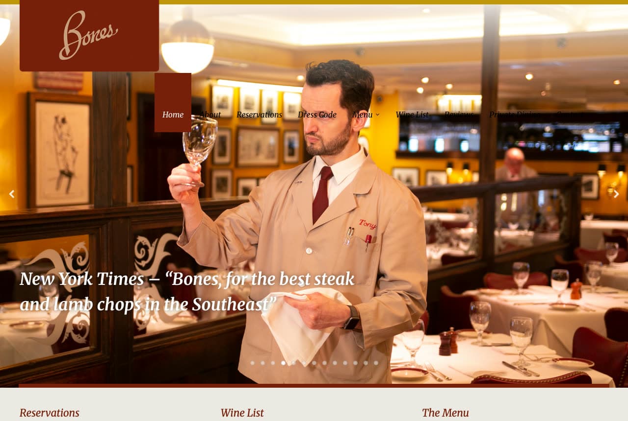
Bones: A waiter checking a wine glass against the light, and a Times quote

Bones photographs its service: a maroon tab in the corner carries the script 'Bones' logo, and the photograph fills the rest — a waiter in a tan jacket and burgundy tie holding a wine glass up to the light in the dining room, framed sketches on the yellow walls, red banquettes and set tables behind him. The nav runs across the photograph as a row with 'Home' in a maroon tab (About, Reservations, Dress Code, Menu, Wine List, Reviews, Private Dining), and the only copy is an italic white quote: 'New York Times – "Bones, for the best steak and lamb chops in the Southeast"'. Slideshow dots sit under the photo; beneath it, three links in serif — Reservations, Wine List, The Menu. 'Dress Code' in the nav says what kind of room this is. Bones shows a classic steakhouse how to sell hospitality with a press clipping: a person doing the job, the newspaper's sentence, and the three links a guest actually needs.

Visit Bones

Opens a similar Zarla design you can make yours.

Gibsons Bar & Steakhouse website — Multi-Location Steakhouse design example
Real site · Chicago, IL
  • Multi-Location Steakhouse
  • Hearty

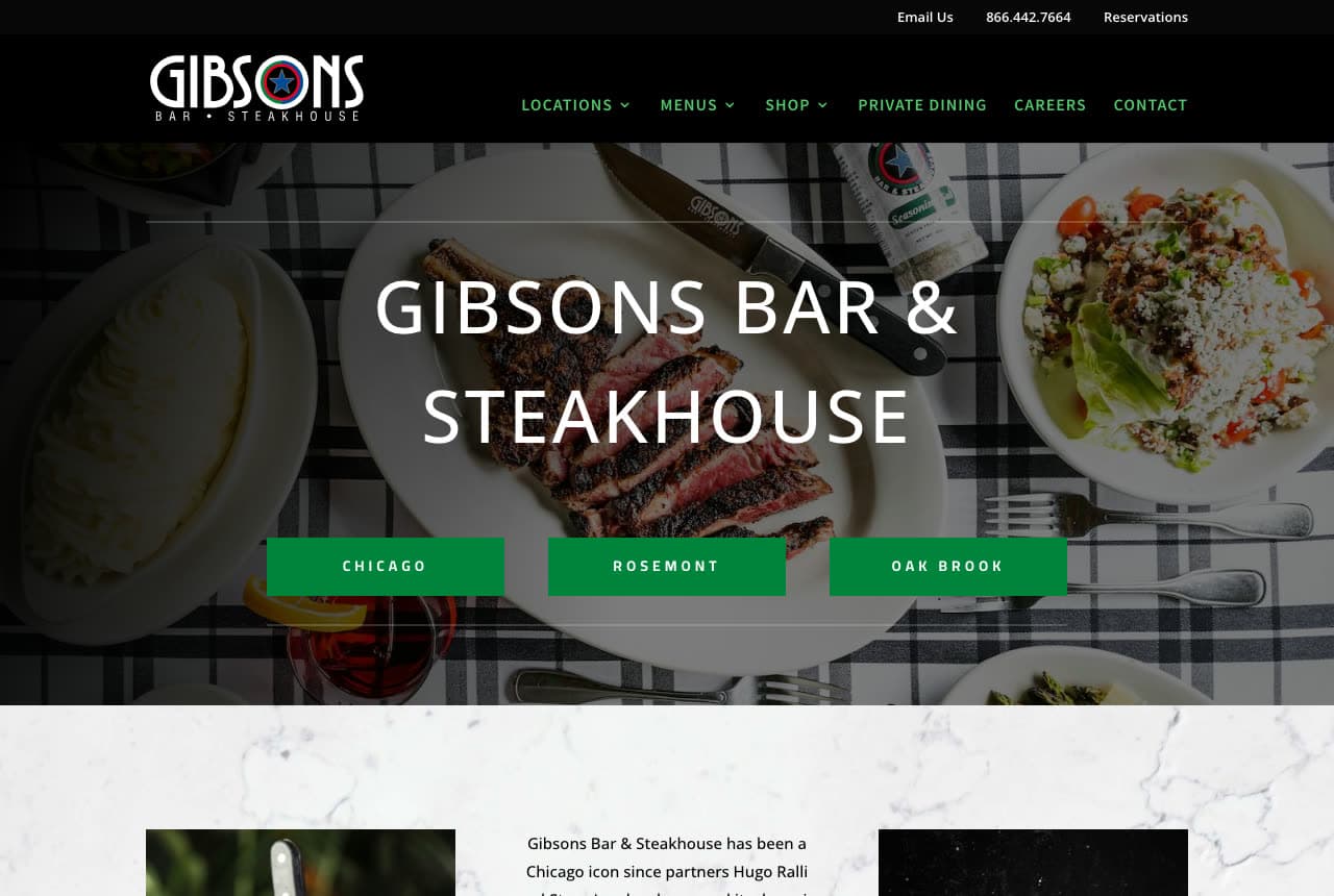
Gibsons Bar & Steakhouse: Steak on a check cloth, and three green location buttons

Gibsons gets the visitor to the right door: a black bar with email, phone and 'Reservations', a black header with the star logo and a green nav (Locations, Menus, Shop, Private Dining, Careers, Contact), then a darkened overhead photograph of the table — sliced steak on a plate, a steak knife, mashed potatoes, a wedge salad, all on a black-and-white check cloth — with 'GIBSONS BAR & STEAKHOUSE' in white capitals and, directly beneath, three green buttons: 'CHICAGO', 'ROSEMONT', 'OAK BROOK'. Below the photo, on marble, the story begins: 'Gibsons Bar & Steakhouse has been a Chicago icon since partners Hugo Ralli…'. The buttons are the design decision — a three-location restaurant makes the location the first choice, not the menu. Gibsons shows a multi-location steakhouse how to open: the food from above, the name across it, and the locations as the only buttons.

Visit Gibsons Bar & Steakhouse

Opens a similar Zarla design you can make yours.

Thorne & Ash Steakhouse — Adaptable Template website design you can build with Zarla
Build this with Zarla
  • Adaptable Template
  • Dramatic

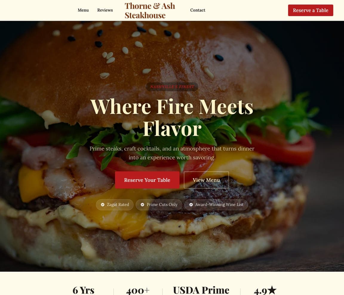
Thorne & Ash Steakhouse: 'Where Fire Meets Flavor' in cream serif over a darkened burger

Thorne & Ash Steakhouse is the Zarla steakhouse template: a darkened close-up of a bacon cheeseburger behind everything, a cream header with the name in rust serif, a plain nav (Menu, Reviews, Contact) and a red 'Reserve a Table', a red eyebrow pill ('NASHVILLE'S FINEST'), a cream serif headline — 'Where Fire Meets Flavor' — a two-line description ('Prime steaks, craft cocktails, and an atmosphere that turns dinner into an experience worth savoring'), a red 'Reserve Your Table' beside an outlined 'View Menu', and three chips beneath (Zagat rated, prime cuts only, award-winning wine list). It's Peter Luger's darkness with Y.O. Ranch's proof as chips. Clone it, swap the burger for your cut, and the chips become your ratings.

See this template
Blackline Smoke Works — Adaptable Template website design you can build with Zarla
Build this with Zarla
  • Adaptable Template
  • Bold

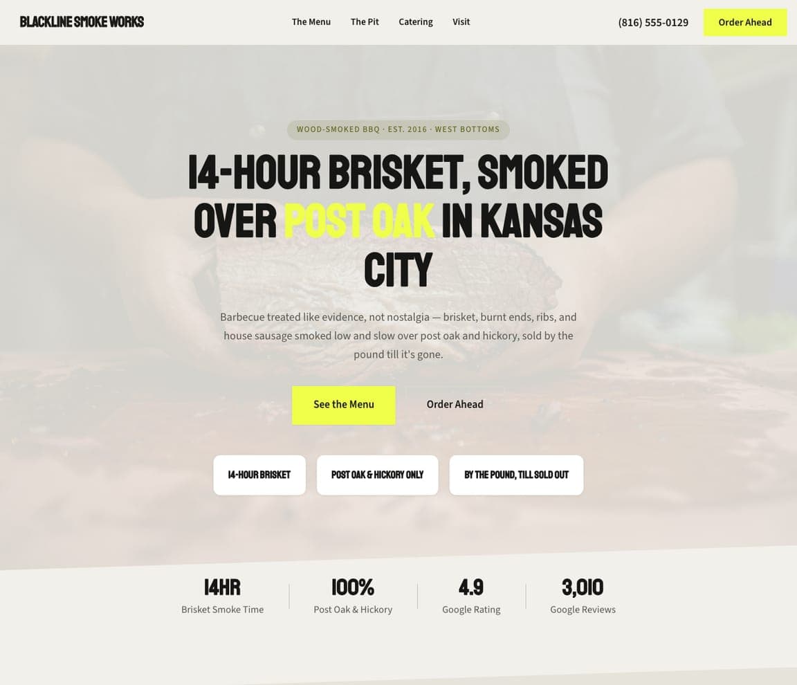
Blackline Smoke Works: '14-Hour Brisket, Smoked Over Post Oak' in condensed capitals

Blackline Smoke Works is the smokehouse template, and the closest catalog match to the Texas rooms here (Taste of Texas, Y.O. Ranch): a pale, washed-out photograph as the ground, an eyebrow ('WOOD-SMOKED BBQ · EST. 2016 · WEST BOTTOMS'), a headline in tall black condensed capitals — '14-HOUR BRISKET, SMOKED OVER POST OAK IN KANSAS CITY' with 'POST OAK' in yellow — a paragraph that treats barbecue 'like evidence, not nostalgia' and sells by the pound till it's gone, a yellow 'See the Menu' beside 'Order Ahead', and three white cards (14-hour brisket, post oak and hickory only, by the pound till sold out). Clone it for a meat-first room, and the cards become your wood and your hours.

See this template
Ember Seoul — Adaptable Template website design you can build with Zarla
Build this with Zarla
  • Adaptable Template
  • Energetic

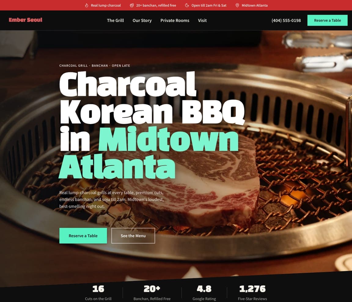
Ember Seoul: 'Charcoal Korean BBQ in Midtown Atlanta' over the grill

Ember Seoul is the Korean-BBQ template, and the closest catalog match to Cote: a dark photograph of a tabletop grill with marbled beef on it, a header with chips (real lump charcoal, twenty-plus banchan refilled free, open till 2am on weekends, Midtown Atlanta), a nav (The Grill, Our Story, Private Rooms, Visit) and a mint 'Reserve a Table', an eyebrow ('CHARCOAL GRILL · BANCHAN · OPEN LATE'), a heavy headline — 'Charcoal Korean BBQ in Midtown Atlanta' with the neighborhood in mint — a paragraph that promises 'Midtown's loudest, best-smelling night out', and a mint 'Reserve a Table' beside 'See the Menu'. Clone it for a grill-at-the-table room, and the chips become your charcoal and your closing time.

See this template

Frequently asked

Where can I find good steakhouse website examples?

Right here — this page curates steakhouse website examples across the spectrum: two New York institutions (Keens, Peter Luger), a modern New England steakhouse (The Bancroft), a Korean steakhouse with tabletop grills (Cote), a Michelin-starred butcher-and-restaurant (Gwen), a Houston steakhouse with a grill-at-home store (Taste of Texas), a proof-led Dallas ranch steakhouse (Y.O. Ranch), an Atlanta classic (Bones) and a three-location Chicago icon (Gibsons) — each linked so you can explore the live site — plus professionally designed Zarla steakhouse, smokehouse and Korean-BBQ templates you can clone and make your own. Every example includes a note on why the design works — the photograph, the proof, the reservation path — so you can copy the thinking, not just the look.

What makes a good steakhouse website?

It looks like the room feels — dark, warm, confident — and it puts the reservation one tap away. The strong examples above open on one photograph (the dining room, the cut, or the people who serve it), keep 'Reservations' in the header, show their proof as objects rather than adjectives (a founding year, a medallion, a newspaper quote, five stars), and give private dining and gift cards their own links because they sell. The copy is short — a founding line, a quote, a claim you can verify — and the photography is of your beef, not stock.

How much does a steakhouse website cost?

A custom site from a hospitality agency typically runs from a few thousand dollars up, reservation-platform builders charge a monthly fee for the site plus bookings, and general template builders are roughly $16–$30 per month. An AI website builder generates a steakhouse site — menu, reservations link, private dining, wine list, gift cards, butcher shop — from a short description in seconds, then lets you edit it in plain language. Spend the money you save on one photo session of the cut under warm light and the room with the candles lit.

Should a steakhouse website show the room or the steak first?

Whichever is the reason people book. Institutions with a famous room show the room — Keens's pipes and tiger, Bones's waiter checking a glass in the dining room. Restaurants known for the cut show the cut, usually from above — Peter Luger's porterhouse, Cote's marbled cubes on the grill, Gibsons's steak on a check cloth. Places with a butcher counter split the screen (Gwen, Taste of Texas). Pick one for the first screen and let the other follow a scroll below.

What pages does a steakhouse website need?

Most steakhouses need six: a home page with the mood, the proof and the reservation link; a menu page (cuts, sides and the wine list as pages, not PDFs); a reservations page or a link straight to your booking system; a private-dining page with rooms, capacities and a form (the highest-margin thing you sell); a story page with the founding year and the people; and a contact page with hours, parking and a map. Add gift cards, a butcher or grill-at-home shop and a dress-code note if you have them — Keens, Peter Luger and Taste of Texas all put the shop in the nav.

How do steakhouses get more customers from their website?

Make the reservation button visible on the first screen, print the proof where the eye lands, and give private dining its own page with a form. The converting pattern above: Keens's 'Make a Reservation' ribbon under the address, The Bancroft's red 'Make a Reservation' next to 'Buy a Gift Card', Y.O. Ranch's five-years-straight claim with the newspaper cited, Gibsons's three location buttons under the headline. Then let the second business earn: a butcher shop or a grill-at-home store turns a website visit into a sale on a night nobody is dining out.

You've seen what works. Now make it yours.

Describe your business and Zarla designs a complete, professional website in about 30 seconds — built to convert, just like the ones above.

Free to build and preview · no credit card · publish to your own domain on Premium