Inspiration · Tennis Coaching

The Best Tennis Coaching Website Examples, Explained

Looking for tennis coaching website examples? These 12 are the strongest we found — Randy Ross Tennis Center's 'Best. Tennis. Ever.' over a court at night, Saviano High Performance Tennis's '75+ ATP & WTA PLAYERS' under 'THE RESULTS', ProWorld's 'SHAPED BY SPORT. PREPARED FOR LIFE.' with a marquee of enrolment dates — plus coaching designs you can build with Zarla, each with a breakdown of the specific move that turns a 'tennis lessons near me' search into an evaluation or a court booking. A tennis coach's site is read by a parent, a junior with a ranking or an adult who wants to play on Saturday, so the best ones here say which of the three they're for, show the courts, and make the button an evaluation, a booking or a join. Find an approach you love and you can build a site in that spirit, free, in about 30 seconds.

Real sites + designs you can build with Zarla — free to build and preview, no credit card

What makes a great tennis coaching website

The best tennis coaching websites choose between the result and the feeling. The result: Saviano's 'THE RESULTS — 75+ ATP & WTA PLAYERS' with the names, RPS Academies' 'INTERNATIONAL HIGH-PERFORMANCE SPORTS & EDUCATION ACADEMY', One Tennis Academy's 'DEVELOPING PLAYERS. BUILDING CHAMPIONS.', High Altitude Tennis's 'the highest rated junior tennis program in Colorado'. The feeling: Randy Ross's 'Best. Tennis. Ever.', Denver Tennis Park's 'Potential is WITHIN YOU!', OSSA Tennis Academy's 'Striving for human excellence is our focus-- not the titles.', The Denver Tennis Club's 'a welcoming community of dedicated players in a quiet urban neighborhood'. Notice the courts from the air — Denver Tennis Park's red-roofed hall and blue courts against the skyline, The Denver Tennis Club's courts among autumn trees, RPS's waterfront campus — and the buttons: 'BOOK AN EVALUATION', 'SCHEDULE AN EVALUATION', 'JOIN TODAY', 'REGISTER & BOOK', 'COURT WEBCAMS'. Every example below tells you whether the programme is selling a ranking or a Saturday.

Randy Ross Tennis Center website — Tennis Center design example
Real site
  • Tennis Center
  • Confident
  • Dark + navy

Randy Ross Tennis Center: 'Best. Tennis. Ever.' over a dark court, then 'WELCOME TO THE RANDY ROSS TENNIS CENTER' on navy

Randy Ross Tennis Center is the cover because it wins with three words. A lime strip reads 'Check out our Fall Junior Development'; the white header sets the 'Randy Ross TENNIS CENTER' logo and a small caps nav — MEMBERSHIP, ADULTS, JUNIORS, PARTIES AND EVENTS, LESSONS, COURT TIME, FITNESS, ABOUT — with a navy 'MEMBER LOG IN'. The hero is a dark, blurred photograph of a court at night; centred over it, the white 'Best. Tennis. Ever.' and a small navy 'JOIN TODAY'. A navy band follows: the tracked 'WELCOME TO THE RANDY ROSS TENNIS CENTER' and a paragraph — 'The Randy Ross Tennis Center is a tennis facility focused on providing personalized tennis instruction to players of all ages and abilities. Whether you are brand new to tennis or looking to take your game to the next level, you will find a home at RRTC.' The nav does the explaining — adults, juniors, court time, fitness — so the hero can afford three words. Clone it if your programme list is long and your confidence is high.

  • Three words and full stops
  • The programme list in the nav, not the hero
  • 'Fall Junior Development' sold in the strip

Steal this: When your nav lists everything you do, let the headline be three words — 'Best. Tennis. Ever.' says the attitude the nav can't.

Visit Randy Ross Tennis Center

Opens a similar Zarla design you can make yours.

Saviano High Performance Tennis website — High-Performance Tennis Academy design example
Real site · Davie, FL
  • High-Performance Tennis Academy
  • Proven
  • Black + red

Saviano High Performance Tennis: 'THE RESULTS — 75+ ATP & WTA PLAYERS' with the names, beside three coaches on court

Saviano High Performance Tennis leads with the scoreboard. A lime strip reads 'FULL-TIME REGISTRATION IS OPEN — TRAIN WITH NICK SAVIANO · SIGN UP →'; the black header sets the 'SAVIANO HIGH PERFORMANCE TENNIS' logo, a nav — Programs, College Placement, The Academy, Nick Saviano, Online Training — and a red 'BOOK AN EVALUATION'. The hero splits: on the left, a photograph of three people on a court — a man in red, a woman in grey, a man in a bucket hat — over a tracked caption, 'DAVIE, FLORIDA — FOUNDED BY NICK SAVIANO', and an outlined 'HIGH PERFORMANCE…' running under the fold; on the right, a red rule, the tracked red 'THE RESULTS', the huge white '75+ ATP & W…' / 'PLAYERS' and a line — 'Sloane Stephens · Amanda Anisimova · Coco Gauff — trus… the game's best'. 'College Placement' in the nav is the outcome most parents actually buy, and the founder has his own nav item. Clone the results-first hero if you have a number that big.

  • The result counted before the pitch
  • The players named as the proof
  • 'College Placement' as a nav item

Steal this: Put the number of players you've produced in the hero and name three of them — a count with names is the only credential a high-performance parent trusts.

Opens a similar Zarla design you can make yours.

ProWorld website — Personalized Sports Academy design example
Real site · Delray Beach, FL
  • Personalized Sports Academy
  • Slick
  • Black + lime

ProWorld: 'SHAPED BY SPORT. PREPARED FOR LIFE.' with a lime marquee of enrolment dates

ProWorld writes two lines and runs its calendar underneath. The black header sets 'PROWORLD™' left, a pink-to-orange gradient pill — 'COME TRY IT OUT' — and a hamburger. The hero is a dark photograph of a player in a patterned shirt; over it, a pill — 'A PERSONALIZED SPORTS ACADEMY · DELRAY BEACH, FLORIDA' — the heavy italic 'SHAPED BY SPORT.' in white over 'PREPARED FOR LIFE.' in lime, a paragraph ('ProWorld builds one player at a time. An individual player assessment creates your player's plan: tennis, fitness, and mental performance, connected in one plan, on one campus.') and a lime 'EXPLORE PROGRAMS ›' beside a gradient 'BOOK A MEETING'. A lime marquee runs beneath — '…SOCCER · ENROLLING NOW · FALL SEMESTER STARTS AUGUST 10 · FULL TIME · AFTERSCHOOL · 10 & UNDER · SOCCER · ENROLLING NOW ·' — and below, a lime pill 'START HERE', the italic 'PICK YOUR STARTING POINT.' and 'Four doors into the same connected system. Everything else lives one click deeper, on each program's own page.' The marquee is the enrolment calendar as decoration. Clone it for an academy with semesters.

  • Enrolment dates as a marquee
  • 'One player at a time' — the method in five words
  • 'PICK YOUR STARTING POINT.' — four doors named

Steal this: Run your enrolment dates as a marquee under the hero — 'FALL SEMESTER STARTS AUGUST 10 · ENROLLING NOW' is a deadline the visitor reads without meaning to.

Visit ProWorld

Opens a similar Zarla design you can make yours.

One Tennis Academy website — Tennis Academy design example
Real site
  • Tennis Academy
  • Determined
  • Blue + orange

One Tennis Academy: 'DEVELOPING PLAYERS. BUILDING CHAMPIONS.' in a frosted card shot through the net

One Tennis Academy puts its welcome in a frosted card over the net. The blue header sets the round 'ONE' logo left and a caps nav — HOME, PROGRAMS, CAMP, OUR TEAM, ACADEMICS, ABOUT. The hero is a photograph shot through a tennis net with a 'ONE TENNIS ACADEMY' banner hanging behind it; centred over it, a frosted white card with a light-blue label, 'WELCOME TO ONE TENNIS ACADEMY', the white capitals 'DEVELOPING PLAYERS.' / 'BUILDING CHAMPIONS.', the line 'TENNIS DEVELOPMENT FROM BEGINNER TO ADVANCED LEVELS' and 'info@onetennisacademy.com - +1 (561) 706-1601'. A pale-blue chevron shape beneath carries an orange 'SCHEDULE AN EVALUATION', and three photograph thumbnails begin at the fold. 'ACADEMICS' in the nav says the academy schools its players as well as coaches them. Clone the frosted-card hero if your court photo is busy.

  • A frosted card over a photo shot through the net
  • Beginner to advanced named in the line
  • 'ACADEMICS' in the nav

Steal this: Shoot your hero through the net with your own banner behind it — the mesh frames the card and the banner puts your name in the photograph.

Visit One Tennis Academy

Opens a similar Zarla design you can make yours.

Denver Tennis Park website — Non-Profit Tennis Park design example
Real site · Denver, CO
  • Non-Profit Tennis Park
  • Uplifting
  • Photo + lime

Denver Tennis Park: 'Potential is WITHIN YOU!' over an aerial of the courts with the Denver skyline behind

Denver Tennis Park shows the whole facility from the air and writes to the player, not the parent. The white header sets the 'DENVER tennis park' logo, an 'EN' selector, a nav — ABOUT, OUR APPROACH, PLAY WITH US, EVENTS, DONATE, More — and two outlined buttons, 'REGISTER & BOOK' and 'EMAIL SIGN UP'. The hero is an aerial photograph: a red-roofed indoor hall, rows of blue outdoor courts with players on them, a running track, and the Denver skyline and mountains along the horizon; over it, the white 'Potential is' / 'WITHIN YOU!', a lime line — 'Since 2018, we have believed that physical and mental fitness have the power to transform lives.' — and a white 'OUR MISSION'. DONATE in the nav and 'OUR MISSION' as the button say this is a non-profit; the aerial says it is a serious one. Clone the aerial hero if your facility is your argument.

  • The facility from the air with the city behind
  • 'DONATE' in the nav — a non-profit park
  • A founding year in the first line

Steal this: Photograph your courts from a drone with the city on the horizon — the skyline places you and the rows of courts count themselves.

Visit Denver Tennis Park

Opens a similar Zarla design you can make yours.

The Denver Tennis Club website — Members’ Tennis Club design example
Real site · Denver, CO
  • Members’ Tennis Club
  • Welcoming
  • Photo + green

The Denver Tennis Club: 'The Denver Tennis Club' over courts among autumn trees, with 'COURT WEBCAMS' as the button

The Denver Tennis Club gives members the button they actually want. The white header sets the green crest — 'DENVER TENNIS CLUB · Est. 1928' — a nav of HOME, WHO WE ARE, EVENTS, two social icons and a green 'MEMBER LOGIN'. The hero is an aerial photograph of blue courts set among trees turning red and gold, houses around them and the Denver skyline and mountains behind; over the left, the white 'The Denver Tennis Club', a paragraph — 'A premier tennis facility providing a welcoming community of dedicated players in a quiet urban neighborhood — where enjoyment of the game, instruction, competition and recreational play are encouraged.' — and a green 'COURT WEBCAMS'. Below, 'FEATURED PROGRAMS' and 'Adult Tennis Programs' begin beside a photograph. The founding year is in the crest, the neighbourhood is in the paragraph, and the webcam button answers 'is a court free?' before a member calls. Clone the webcam button if your courts are the product.

  • 'COURT WEBCAMS' as the hero button
  • The founding year in the crest
  • Autumn trees and the skyline in one aerial

Steal this: Give members a 'court webcams' button — a live look at the courts is worth more to a player than any paragraph about community.

Visit The Denver Tennis Club

Opens a similar Zarla design you can make yours.

High Altitude Tennis website — Junior Tennis Programme design example
Real site · Denver, CO
  • Junior Tennis Programme
  • Friendly

High Altitude Tennis: '- Who is HAT? -' in typewriter type with a parent's quote in a yellow-outlined box

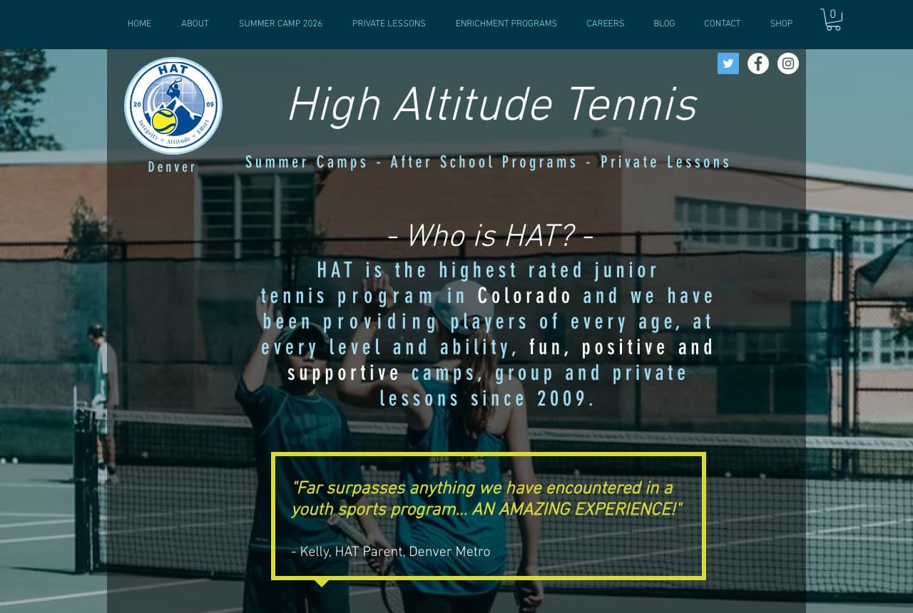
High Altitude Tennis writes its page like a letter to parents. The dark teal header runs a small caps nav — HOME, ABOUT, SUMMER CAMP 2026, PRIVATE LESSONS, ENRICHMENT PROGRAMS, CAREERS, BLOG, CONTACT, SHOP — with a cart. The hero is a teal-tinted photograph of two children at the net, seen from behind; at the top, a round 'HAT' badge, the italic 'High Altitude Tennis', 'Denver' beneath it and a line — 'Summer Camps - After School Programs - Private Lessons' — with three social icons. Centred below, the italic '- Who is HAT? -' and a typewriter-set paragraph: 'HAT is the highest rated junior tennis program in Colorado and we have been providing players of every age, at every level and ability, fun, positive and supportive camps, group and private lessons since 2009.' A yellow-outlined box holds a parent's words — '"Far surpasses anything we have encountered in a youth sports program... AN AMAZING EXPERIENCE!" - Kelly, HAT Parent, Denver Metro'. The question-and-answer heading and the quote box are a conversation, not a pitch. Clone the quoted parent if your customers are parents.

Visit High Altitude Tennis

Opens a similar Zarla design you can make yours.

OSSA Tennis Academy website — Boutique Tennis Academy design example
Real site
  • Boutique Tennis Academy
  • Thoughtful

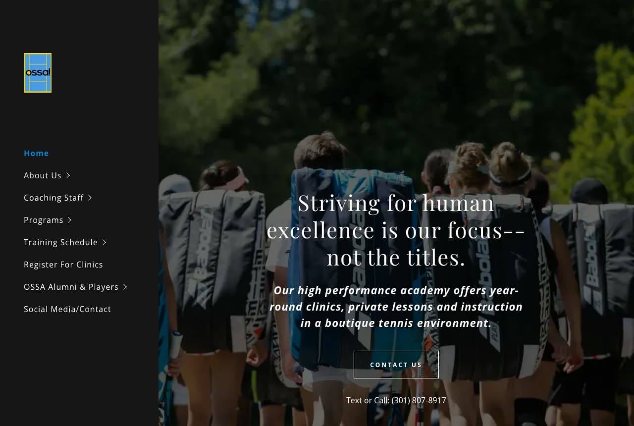
OSSA Tennis Academy: 'Striving for human excellence is our focus-- not the titles.' over players walking onto court with racquet bags

OSSA Tennis Academy says what it is not chasing. The layout is a dark sidebar: a small 'ossa' logo and a stacked nav — Home in blue, About Us, Coaching Staff, Programs, Training Schedule, Register For Clinics, OSSA Alumni & Players, Social Media/Contact. The hero fills the rest: a photograph from behind of players carrying racquet bags onto a court under trees; centred over it, the white serif 'Striving for human excellence is our focus--' / 'not the titles.', the italic 'Our high performance academy offers year-round clinics, private lessons and instruction in a boutique tennis environment.', an outlined 'CONTACT US' and 'Text or Call: (301) 807-8917'. 'Boutique' is the word the whole page earns — a sidebar, a serif, a small group walking on together. Clone the sidebar-and-serif layout if your academy is small on purpose.

Visit OSSA Tennis Academy

Opens a similar Zarla design you can make yours.

RPS Academies website — Sports & Education Academy design example
Real site
  • Sports & Education Academy
  • Ambitious

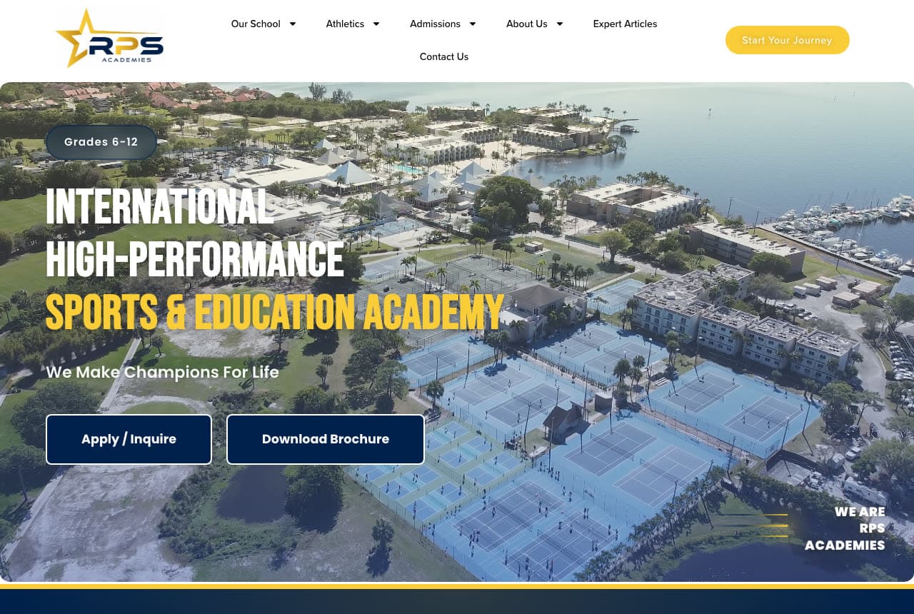
RPS Academies: 'INTERNATIONAL HIGH-PERFORMANCE SPORTS & EDUCATION ACADEMY' over a waterfront campus with rows of blue courts

RPS Academies sells a school as much as a sport. The white header sets the star 'RPS ACADEMIES' logo, a nav — Our School, Athletics, Admissions, About Us, Expert Articles, Contact Us — and a yellow 'Start Your Journey'. The hero is an aerial photograph of a campus on the water — white buildings, palms, a marina, and rows of blue tennis courts; over the left, a pill — 'Grades 6-12' — the condensed white 'INTERNATIONAL' / 'HIGH-PERFORMANCE' over the yellow 'SPORTS & EDUCATION ACADEMY', a line — 'We Make Champions For Life' — and two navy buttons, 'Apply / Inquire' and 'Download Brochure'. Lower-right, a small 'WE ARE RPS ACADEMIES' with rules. 'Admissions' and 'Download Brochure' are a school's words; the courts in the photograph are the tennis. Clone the grades pill and the two school buttons if your academy is also a school.

Visit RPS Academies

Opens a similar Zarla design you can make yours.

Mara Quinn Personal Training — Personal Trainer Template website design you can build with Zarla
Build this with Zarla
  • Personal Trainer Template
  • Personal

Mara Quinn Personal Training: 'Train With Someone Who Actually Has a Plan for You' centred on navy

Mara Quinn Personal Training is the Zarla personal-trainer template — the one-coach page a tennis pro can publish under their own name. A navy top strip carries 'NASM-Certified', '4.9★ · 410+ reviews', '600+ clients coached', 'Studio & Online'. The white header centres 'Mara Quinn Personal Training' between Coaching, About Mara and Results, Contact, with a gold 'Free Consultation'. The hero is solid navy with no photograph: a centred pill — 'PERSONAL TRAINING & COACHING · AUSTIN' — the heavy white 'Train With / Someone Who / Actually Has a / Plan for You' with 'a Plan for You' in gold, a paragraph ('NASM-certified coaching, in studio or online, built entirely around your body, your goals, and your real life. No fads, no guesswork — just a clear plan and a coach in your corner.'), and a gold 'Book a Free Consultation' beside an outline 'See the Coaching'. 'About Mara' in the nav is the coach as the brand; a tennis coach's site should say 'About' with a first name too.

See this template
TwoFold Training — Partner Training Template website design you can build with Zarla
Build this with Zarla
  • Partner Training Template
  • Upbeat

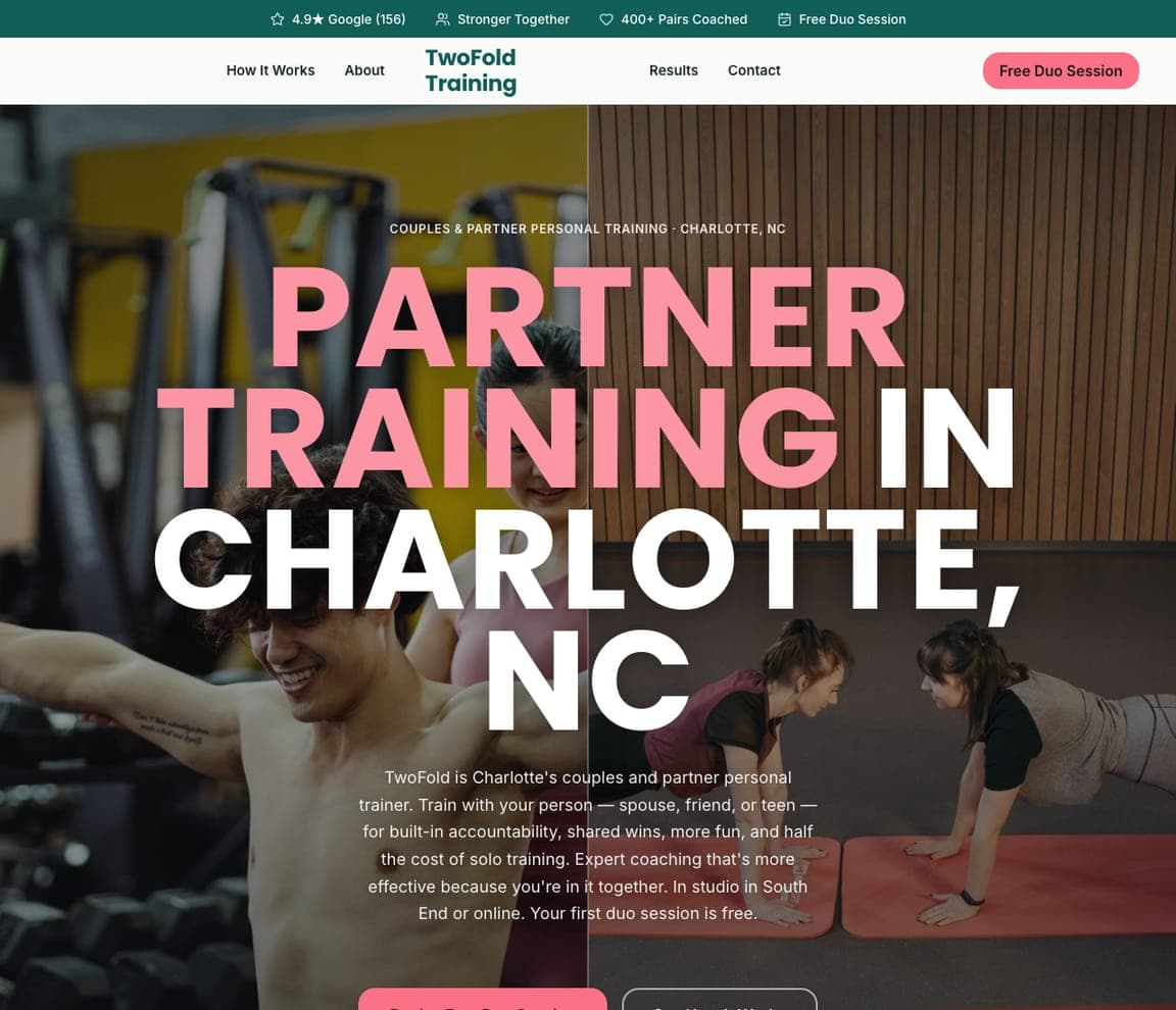
TwoFold Training: 'PARTNER TRAINING IN CHARLOTTE, NC' in giant pink-and-white capitals over a man with arms outstretched and two women planking

TwoFold Training is the Zarla partner-training template — doubles coaching and hitting-partner sessions have the same shape. A teal top strip carries '4.9★ Google (156)', 'Stronger Together', '400+ Pairs Coached', 'Free Duo Session'. The white header centres a teal two-line 'TwoFold Training' between How It Works, About and Results, Contact, with a pink 'Free Duo Session'. The hero is a dimmed photograph of a smiling man with his arms outstretched, a woman behind him and two women planking on mats, in front of wood panelling; over it, a small caps eyebrow — 'COUPLES & PARTNER PERSONAL TRAINING · CHARLOTTE, NC' — and the giant heavy capitals 'PARTNER / TRAINING IN / CHARLOTTE, / NC' with 'PARTNER TRAINING' in pink. '400+ Pairs Coached' counts in the unit the service is sold in; a doubles coach counts pairs too.

See this template
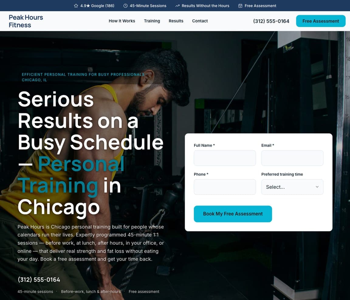
Peak Hours Fitness — Busy-Professional Training Template website design you can build with Zarla
Build this with Zarla
  • Busy-Professional Training Template
  • Efficient

Peak Hours Fitness: 'Serious Results on a Busy Schedule — Personal Training in Chicago' beside an assessment form

Peak Hours Fitness is the Zarla busy-professional template — lunchtime and early-morning tennis lessons are the same promise. A navy top strip carries '4.9★ Google (186)', '45-Minute Sessions', 'Results Without the Hours', 'Free Assessment'. The white header sets a two-line 'Peak Hours Fitness' against How It Works, Training, Results, Contact, the phone and a cyan 'Free Assessment'. The hero is a dark gym photograph of a man in a yellow vest on a cable machine; on the left, a cyan caps eyebrow — 'EFFICIENT PERSONAL TRAINING FOR BUSY PROFESSIONALS · CHICAGO, IL' — and the heavy white 'Serious / Results on a / Busy Schedule / — Personal / Training in / Chicago' with 'Personal Training' in cyan; on the right, a white card asks for Full Name, Email, Phone and a 'Preferred training time' before a cyan 'Book My Free Assessment'. 'Preferred training time' in the form is the field a coach with a court calendar needs.

See this template

Frequently asked

What should a tennis coaching website show first?

Either the results or the courts. Saviano High Performance Tennis opens with 'THE RESULTS — 75+ ATP & WTA PLAYERS' and names Sloane Stephens, Amanda Anisimova and Coco Gauff; Denver Tennis Park and The Denver Tennis Club both open with an aerial photograph of their courts with the Denver skyline and mountains behind; RPS Academies shows its waterfront campus from the air. Randy Ross Tennis Center does neither — a dark court at night and 'Best. Tennis. Ever.'

How should a tennis academy write for juniors and parents?

Name the level and the pathway. One Tennis Academy: 'DEVELOPING PLAYERS. BUILDING CHAMPIONS. — TENNIS DEVELOPMENT FROM BEGINNER TO ADVANCED LEVELS'. High Altitude Tennis: 'the highest rated junior tennis program in Colorado… fun, positive and supportive camps, group and private lessons since 2009', with a parent's quote in a yellow box. RPS Academies: a 'Grades 6-12' pill and 'We Make Champions For Life'. Saviano puts 'College Placement' in the nav; OSSA says 'human excellence is our focus-- not the titles'.

What should the button on a tennis website say?

An evaluation for academies, a booking for centres. Saviano: 'BOOK AN EVALUATION'. One Tennis Academy: 'SCHEDULE AN EVALUATION'. ProWorld: 'BOOK A MEETING' beside 'EXPLORE PROGRAMS'. Randy Ross: 'JOIN TODAY'. Denver Tennis Park: 'REGISTER & BOOK' in the header. The Denver Tennis Club offers 'COURT WEBCAMS' — a member wants to see if a court is free more than they want a brochure. RPS: 'Apply / Inquire' and 'Download Brochure'.

How do tennis centres show the facility?

From above. Denver Tennis Park's hero is an aerial of its red-roofed indoor hall and outdoor blue courts with the city behind; The Denver Tennis Club's is its courts among autumn trees with the skyline and mountains; RPS Academies' is a campus on the water with rows of blue courts. Randy Ross keeps its court dark and blurred; One Tennis Academy shoots through the net with a branded banner; OSSA photographs players from behind carrying racquet bags onto court.

Should a tennis coaching site list programmes in the hero?

As a marquee or a line, not a menu. ProWorld runs a lime marquee — 'ENROLLING NOW · FALL SEMESTER STARTS AUGUST 10 · FULL TIME · AFTERSCHOOL · 10 & UNDER' — under its hero and then 'PICK YOUR STARTING POINT.'; High Altitude Tennis writes 'Summer Camps - After School Programs - Private Lessons' under its name; Randy Ross puts MEMBERSHIP, ADULTS, JUNIORS, PARTIES AND EVENTS, LESSONS, COURT TIME, FITNESS in the nav and keeps the hero to three words.

Can I build a tennis coaching website like these with Zarla?

Yes. Every real site here has a 'Build a site like this' button that opens the closest Zarla template in the editor — Mara Quinn Personal Training for a one-coach page with a headline written to the player, in the Randy Ross, Saviano and High Altitude spirit; TwoFold Training for a giant-capitals page with the sport in colour like One Tennis Academy, The Denver Tennis Club and OSSA; Peak Hours Fitness for a headline beside an assessment form like ProWorld, Denver Tennis Park and RPS Academies — and you swap in your courts, your results and your evaluation. Three words over the court and a 'join today' button is the Randy Ross pattern, and it takes about 30 seconds.

You've seen what works. Now make it yours.

Describe your business and Zarla designs a complete, professional website in about 30 seconds — built to convert, just like the ones above.

Free to build and preview · no credit card · publish to your own domain on Premium