Inspiration · Toy Store

The Best Toy Store Website Examples, Explained

Looking for toy store website examples? These 12 are the strongest we found — MudPuddles' paper-craft 'BEST. FALL. EVER!' in three colours, Tantrum's 'happiness for sale' in giant coral, Tugooh Toys' 'WE'RE THE SQUISHY CAPITAL of the Capital' with a hand squeezing a purple toy — plus play-space designs you can build with Zarla, each with a breakdown of the specific move that turns a 'toy store near me' search into a visit. A toy store's site is read by a parent with a birthday coming, so the best ones here use colour like a shop window, say where the shop is and when it opens, and make the button 'shop' or 'visit us' rather than 'learn more'. Find an approach you love and you can build a site in that spirit, free, in about 30 seconds.

Real sites + designs you can build with Zarla — free to build and preview, no credit card

What makes a great toy store website

The best toy store websites look like the shop window. The colour: MudPuddles' orange, purple and blue paper collage, Tantrum's cream page with a multicoloured wordmark, Timbuk Toys' rainbow bubble letters over a cartoon herd, Tugooh's orange squishy collage. The window copy: 'BEST. FALL. EVER!', 'happiness for sale', 'Play brings joy!', 'For cool kids and Big Kids!', 'Hop n' Go to New Worlds!'. Notice the shop details doing quiet work — Boing!'s orange band with 'GIVE US A CALL', 'VISIT US — Store location and hours' and 'FREE SHIPPING When you spend $100+'; MudPuddles' 'SHOP ONLINE FOR IN STORE PICK UP. GIFT WRAPPED AND READY!'; Timbuk's 'Stores & Hours' and 'Birthday Club' in the nav. Notice the two that sell a place rather than a product — CAMP's 'A place where families play, create, and explore together' and Coolest Toys on Earth's illustrated checkerboard of robots and rockets. Every example below tells you whether the shop wants you to click or come in.

MudPuddles Toys & Books website — Independent Toy & Book Shop design example
Real site
  • Independent Toy & Book Shop
  • Handmade
  • Orange + purple + blue

MudPuddles Toys & Books: A paper-craft 'BEST. FALL. EVER!' in orange, purple and blue

MudPuddles Toys & Books is the cover because its hero is a shop window made of paper. A blue strip reads 'SHOP ONLINE FOR IN STORE PICK UP. GIFT WRAPPED AND READY!'; the white header sets the 'MudPuddles toys & books' logo with a child under an umbrella, a blue 'SHOP FOR SOMETHING FUN!' dropdown, SHOP OUR BABY GUIDE, SHOP OUR AUTUMN CATALOG, GIFT CARDS, account and cart icons and a 'Search for product' field. The hero is a three-panel paper collage: an orange panel with cut-paper mushrooms, apples and grass reading 'BEST.'; a purple panel with bats, clouds and stars reading 'FALL.'; a blue panel with honeycomb fans, bunting and wrapped gifts reading 'EVER!' — and, across the lower middle on pink, 'come play with us!' in yellow. Slide arrows and dots sit beneath, then 'Featured products'. 'GIFT WRAPPED AND READY' is the whole pitch to a parent with a party on Saturday. Clone the handmade-collage hero if you'd rather be a shop than a catalogue.

  • A hero built from cut paper, not stock photos
  • 'GIFT WRAPPED AND READY' — pick-up sold in the top strip
  • Three words, three colours, three panels

Steal this: Promise 'gift wrapped and ready' in the top strip — a parent ordering for Saturday's party buys the wrapping before the toy.

Visit MudPuddles Toys & Books

Opens a similar Zarla design you can make yours.

Tantrum website — Curated Toy Boutique design example
Real site
  • Curated Toy Boutique
  • Joyful
  • Cream + coral

Tantrum: 'happiness for sale' in giant coral under four brand-tagged product tiles

Tantrum writes the best two-word slogan in the gallery and sets it huge. A coral strip reads 'FREE US SHIPPING $200+ • CALIFORNIA $60+ • FREE SF DELIVERY $30+'; the cream header sets the multicoloured 'TANTRUM' wordmark left and a lowercase nav — shop, brands, about — with search and bag right. Four rounded product tiles run across the top: a mouse family in a cardboard dollhouse, a girl in a star-print cape holding a wand, a row of painted wooden cars, two plush acorns — each with a small coral tag naming the maker. Beneath, in giant coral lowercase, 'happiness for sale', with a white 'shop favorites' block, drop-shadowed, at the right and, at the fold, 'FALL INTO ME' over a stripe of rainbow lines. The shipping tiers say who the shop is really for — San Francisco first, California second, the rest of the country last — and the tagged tiles say the shop is curated. Clone the slogan-under-tiles layout for a boutique whose brands are the draw.

  • A two-word slogan at the largest size on the page
  • Product tiles tagged with the maker's name
  • Shipping tiers that favour the neighbourhood

Steal this: Tier your shipping by distance — free locally, cheaper in-state, full price beyond — and print it in the top strip; it tells neighbours the shop is theirs.

Visit Tantrum

Opens a similar Zarla design you can make yours.

Tugooh Toys website — Squishy & Fidget Toy Shop design example
Real site
  • Squishy & Fidget Toy Shop
  • Loud
  • Orange + white

Tugooh Toys: 'WE'RE THE SQUISHY CAPITAL of the Capital' with a hand squeezing a purple toy

Tugooh Toys claims a title and photographs the proof. A rounded white bar floats at the top with a small nav — HOME, COLLECTION, SOCIALS, CONTACT, VISIT — and the 'Tugooh Toys' logo with a bear. The hero is an orange collage: a photograph of a hand squeezing a purple squishy toy in front of 'Smushers' packaging, a pencil sketch of the Capitol dome faint behind, and the bubbly white headline 'WE'RE THE SQUISHY CAPITAL' with 'of the Capital' beneath. A hand-drawn speech bubble at the lower right reads 'WHAT'S NEW? All NEW viral Smushers!', and a giant butter-stick squishy pokes in from the edge. The headline is a pun on the city and a category claim in one, the speech bubble makes stock news, and VISIT is the last word in the nav. Clone the collage-and-claim approach if your shop owns one kind of toy.

  • A category claim as a pun — 'squishy capital of the Capital'
  • A speech bubble announcing this week's toy
  • A photograph of the toy being squeezed

Steal this: Claim the category for your town — 'the squishy capital' — and put the newest toy in a speech bubble; kids will make their parents visit.

Visit Tugooh Toys

Opens a similar Zarla design you can make yours.

Coolest Toys on Earth website — Curiosity Toy Shop design example
Real site
  • Curiosity Toy Shop
  • Retro
  • Grey + red

Coolest Toys on Earth: 'For cool kids and Big Kids!' on a white card over a grey checkerboard of robots and rockets

Coolest Toys on Earth draws its shop instead of photographing it. A black strip reads 'A LOT MORE PRODUCTS COMING SOON!!!'; the white header sets the red box logo — 'COOLEST TOYS ON EARTH' in white — and a nav of Coolest, Outdoor, Think, Build, Imagine, Party and Tots, with account, search and cart icons. The hero is an illustrated checkerboard in greys: a tin robot, a rocket, a lava lamp, a unicorn, a slinky, a lever, a train, letter blocks reading L, C and R, a 'DANGER HIGH VOLTAGE' sign. Over it, left, a white card: 'COOLEST TOYS ON EARTH' in small caps, 'For cool kids' / 'and Big Kids!' in bold, 'Superior and extraordinary toys from around the world for kids and Big kids!' and a black 'Shop Our Best Sellers'. The nav is sorted by what a toy does — Think, Build, Imagine — and 'Big Kids' names the adults who buy for themselves. Clone the illustrated-backdrop card if you want a shop to feel like a place without a photo of one.

  • An illustrated toy checkerboard as the backdrop
  • A nav sorted by verbs — Think, Build, Imagine
  • 'Big Kids' — adult collectors named in the headline

Steal this: Sort your nav by what the toy does — Think, Build, Imagine, Party — rather than by age or brand; parents shop for a verb.

Visit Coolest Toys on Earth

Opens a similar Zarla design you can make yours.

Boing! Toy Shop website — Toy Shop & Events design example
Real site
  • Toy Shop & Events
  • Cheerful
  • Yellow + orange

Boing! Toy Shop: 'Play brings joy!' over children under a blue parachute, with an orange band of shop details

Boing! Toy Shop puts the practical band where a parent will find it. A yellow strip runs Shop Now, Our Mission, Giving Back, Boing! Blog, Events at Boing!, Hours and Location, Contact Us and My Favorites; the white header sets a hamburger, the red oval 'Boing! Toy Shop' logo, a 'What are you looking for?' search field, account and cart. The hero is a photograph of two children and a woman laughing under a billowing light-blue cloth inside a cardboard playhouse set, with a purple-to-orange gradient blob lower-left reading 'Play brings joy!' and 'Explore fun toys and…', and a coral 'SHOP NOW' tab at the fold. An orange band follows with four icons: 'FREE SHIPPING When you spend $100+', 'GIVE US A CALL +1 (617) 522-7800', 'CONTACT US Send us a message', 'VISIT US Store location and hours'. 'Giving Back' and 'Our Mission' in the top strip say the shop is about more than toys. Clone the four-icon band as the shop-details row under any playful hero.

  • A four-icon band — shipping, call, contact, visit
  • 'Giving Back' and 'Our Mission' in the top strip
  • A real play photograph, not a product shot

Steal this: Put shipping, phone, contact and 'visit us' in one icon band under the hero — every question a parent has before a trip, answered in one row.

Visit Boing! Toy Shop

Opens a similar Zarla design you can make yours.

Timbuk Toys website — Family Toy Store design example
Real site · Colorado
  • Family Toy Store
  • Exuberant
  • Blue + rainbow

Timbuk Toys: 'JOIN THE TIMBUK HERD TODAY!' in rainbow bubble letters over a cartoon herd with a Colorado flag

Timbuk Toys turns its loyalty programme into a cartoon. The blue header sets the rainbow 'TIMBUK TOYS — DISCOVER THE FUN!' logo, a search field with an orange 'Search', 'Hello, sign in · Account & List' and a cart; the nav beneath runs Home, Our Toys, Gift Registry, Events & Happenings, Star Points Rewards, Birthday Club, Stores & Hours, About Us, Contact Us. The hero is an illustrated banner: 'JOIN THE TIMBUK HERD TODAY!' in rainbow bubble letters at the left, a cartoon horse holding a Colorado flag, a ribbon reading 'DISCOVER OUR STAR REWARDS', and a herd of horses, zebras and unicorns galloping across a night-blue mountain sky. Slide dots sit beneath, then 'Shop Our Popular Brands' with a row of logos. 'Birthday Club', 'Gift Registry' and 'Stores & Hours' in the nav are the three things a local toy shop can offer that a marketplace can't. Clone the cartoon-loyalty hero if your customers are the kids.

  • The loyalty scheme drawn as a herd
  • A state flag in the illustration
  • Birthday Club and Gift Registry in the nav

Steal this: Give the loyalty scheme a mascot and a name kids can say — 'join the herd' beats 'earn points'.

Visit Timbuk Toys

Opens a similar Zarla design you can make yours.

The Red Balloon Toy Store website — Educational Toy Store design example
Real site
  • Educational Toy Store
  • Energetic

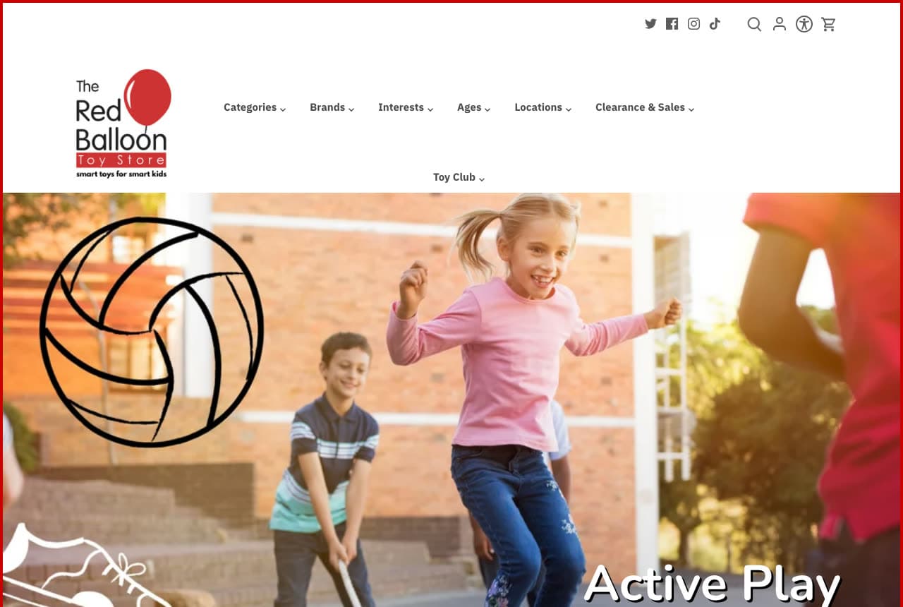
The Red Balloon Toy Store: A girl leaping mid-air with a line-drawn volleyball overlaid, labelled 'Active Play'

The Red Balloon Toy Store photographs the effect of the toy, not the toy. The white header sets a row of social icons, search, account, accessibility and cart icons, then the logo — 'The Red Balloon Toy Store — smart toys for smart kids' with a red balloon — and a nav of Categories, Brands, Interests, Ages, Locations, Clearance & Sales and Toy Club; a thin red border frames the page. The hero is a photograph of a girl in a pink top and jeans leaping mid-air outside a brick building, a boy behind her swinging a stick, with a white line drawing of a volleyball and, at the bottom-left, a sketched sneaker overlaid on the image. Lower-right, in white, 'Active Play'. 'Interests' and 'Ages' in the nav are how parents actually shop; 'Toy Club' is the loyalty scheme. The drawings on the photograph turn a stock-looking action shot into a category poster. Clone the line-drawing overlay if your photographs are ordinary.

Visit The Red Balloon Toy Store

Opens a similar Zarla design you can make yours.

CAMP website — Family Experience Store design example
Real site
  • Family Experience Store
  • Magical

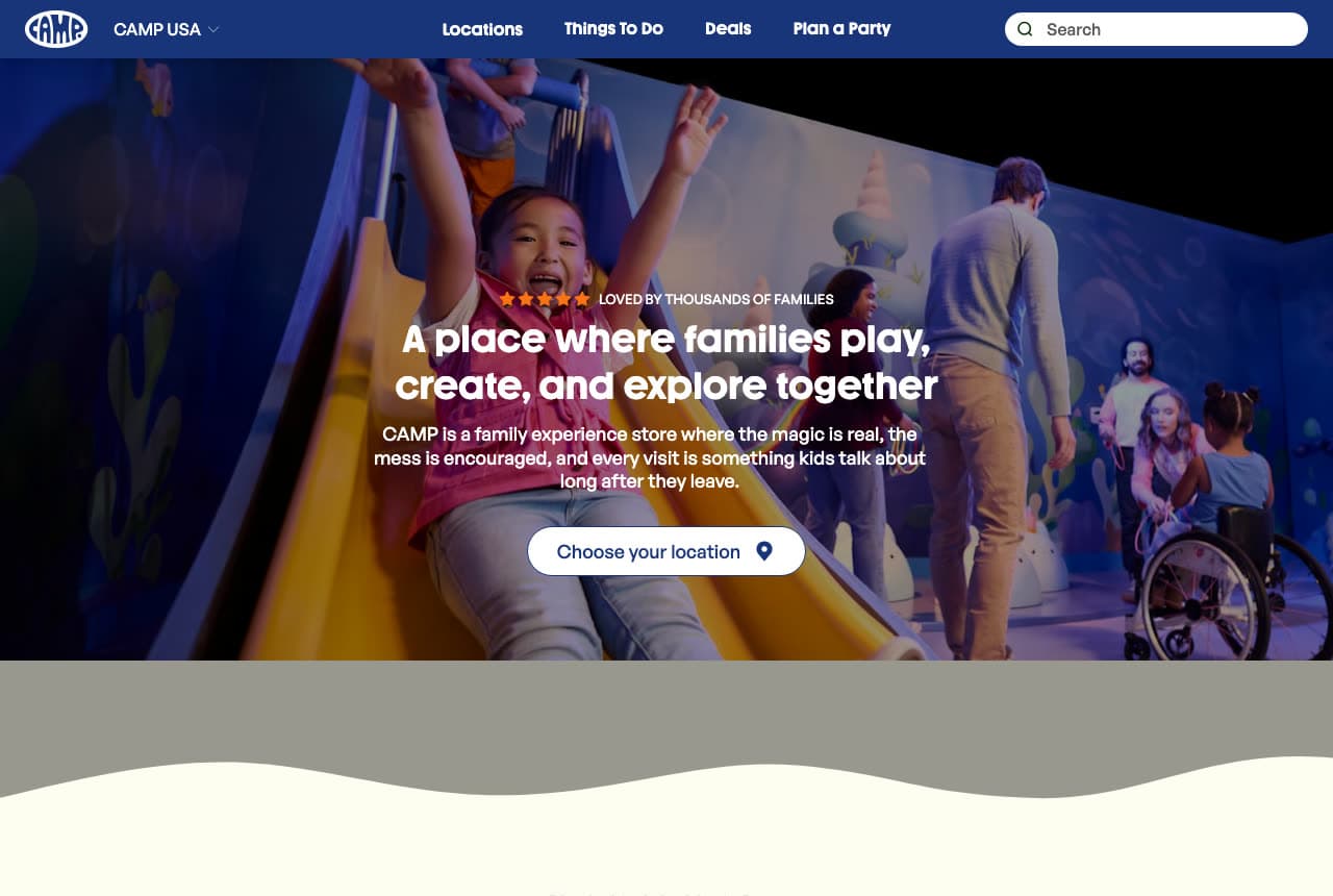
CAMP: 'A place where families play, create, and explore together' with 'Choose your location' as the button

CAMP sells a visit, and the button says so. The navy header sets the 'CAMP' badge logo, a 'CAMP USA' dropdown, a nav of Locations, Things To Do, Deals and Plan a Party, and a search field. The hero is a photograph inside a store lit blue: a girl sliding down a yellow slide with her arms up, a child in a wheelchair with a woman kneeling beside her, a man at the back. Centred over it, a row of stars with 'LOVED BY THOUSANDS OF FAMILIES', the white 'A place where families play,' / 'create, and explore together', the paragraph 'CAMP is a family experience store where the magic is real, the mess is encouraged, and every visit is something kids talk about long after they leave.' and a white 'Choose your location' with a pin. A wavy grey and cream edge closes the hero. 'Things To Do' and 'Plan a Party' in the nav are activity words, not product words, and 'the mess is encouraged' is the line every parent remembers. Clone the experience-store framing if your shop is somewhere kids go, not just somewhere parents buy.

Visit CAMP

Opens a similar Zarla design you can make yours.

HearthSong website — Outdoor & Active Play Brand design example
Real site
  • Outdoor & Active Play Brand
  • Sunny

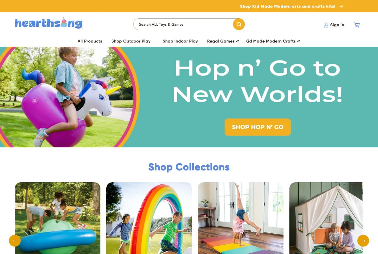
HearthSong: 'Hop n' Go to New Worlds!' on teal with a boy bouncing on an inflatable unicorn

HearthSong makes one product the headline and shows it in use. A yellow strip reads 'Shop Kid Made Modern arts and crafts kits! →'; the white header sets the blue 'hearthsong' wordmark, a 'Search ALL Toys & Games' field, 'Sign in' and a cart, and a nav beneath — All Products, Shop Outdoor Play, Shop Indoor Play, Regal Games ↗, Kid Made Modern Crafts ↗. The hero is a teal panel with a circular photograph on the left of a boy in a light-blue shirt bouncing across a lawn on an inflatable purple-and-white unicorn hopper, and on the right the white 'Hop n' Go to' / 'New Worlds!' with an orange 'SHOP HOP N' GO'. Below, 'Shop Collections' in blue and four photographs — children on a giant inflatable, a rainbow sprinkler arch, a girl doing a handstand on a mat, a play tent. The nav splits the catalogue into outdoor and indoor play, and the two arrow links point to sister brands. Clone the one-product hero if you have a toy that photographs like joy.

Visit HearthSong

Opens a similar Zarla design you can make yours.

Cartwheels Kids Club — Kids Play Space Template website design you can build with Zarla
Build this with Zarla
  • Kids Play Space Template
  • Exuberant

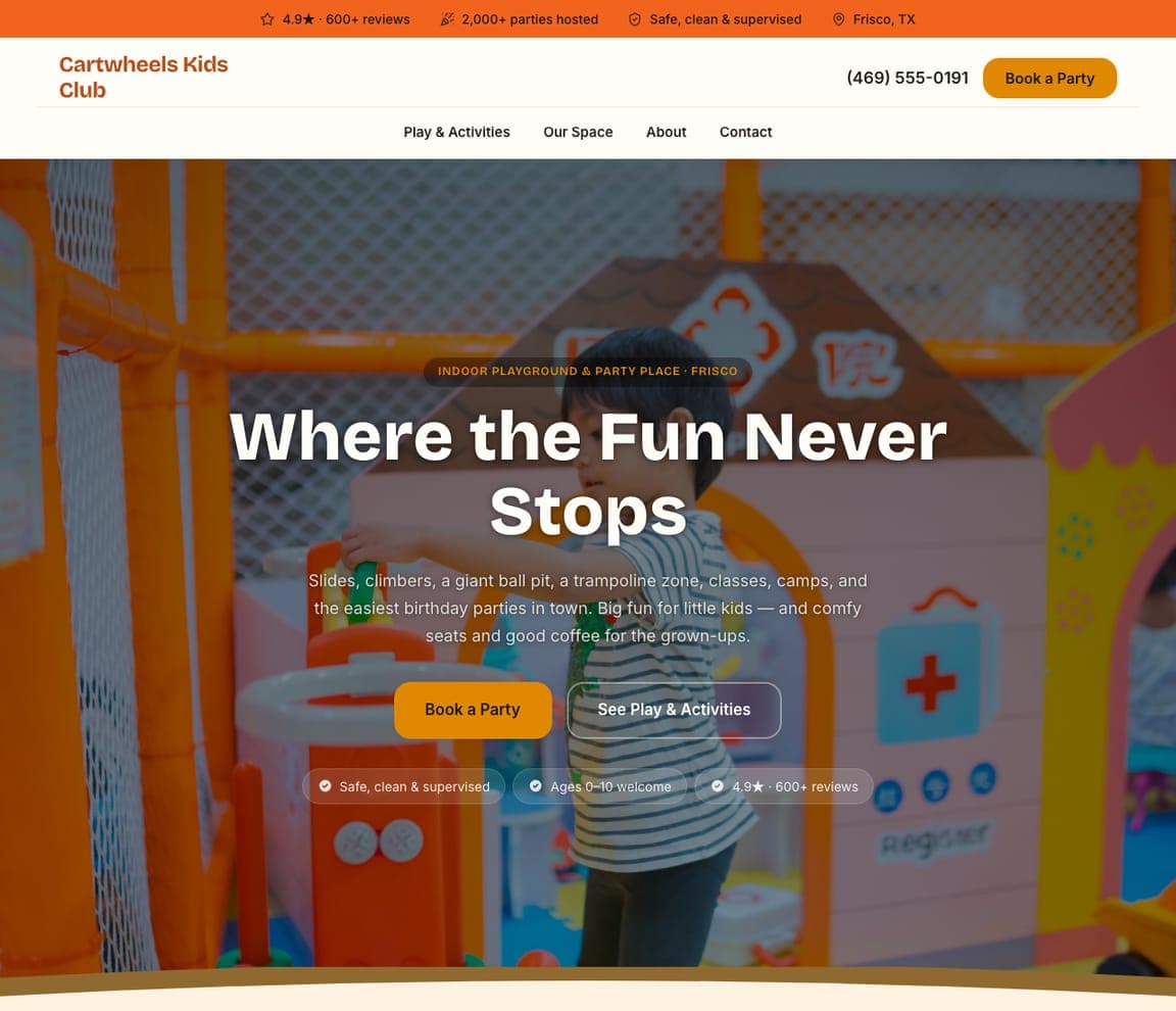
Cartwheels Kids Club: 'Where the Fun Never Stops' over an orange indoor playground

Cartwheels Kids Club is the Zarla kids-activities template and the most toy-shop-like photograph in the catalog: a bright orange indoor playground with a child mid-climb. An orange top strip carries '4.9★ · 600+ reviews', '2,000+ parties hosted', 'Safe, clean & supervised' and 'Frisco, TX'. The cream header stacks the orange wordmark, the phone and an orange 'Book a Party' over a nav row of Play & Activities, Our Space, About, Contact. Over the photograph, centred, a pill reads 'INDOOR PLAYGROUND & PARTY PLACE · FRISCO', the white bold headline says 'Where the Fun Never Stops', and the paragraph is written to two audiences at once — 'Slides, climbers, a giant ball pit, a trampoline zone, classes, camps, and the easiest birthday parties in town. Big fun for little kids — and comfy seats and good coffee for the grown-ups.' An orange 'Book a Party' and an outline 'See Play & Activities' close it. Clone it for a toy store with a play space or party room.

See this template
Tinker Yard STEM Academy — STEM Preschool Template website design you can build with Zarla
Build this with Zarla
  • STEM Preschool Template
  • Bright

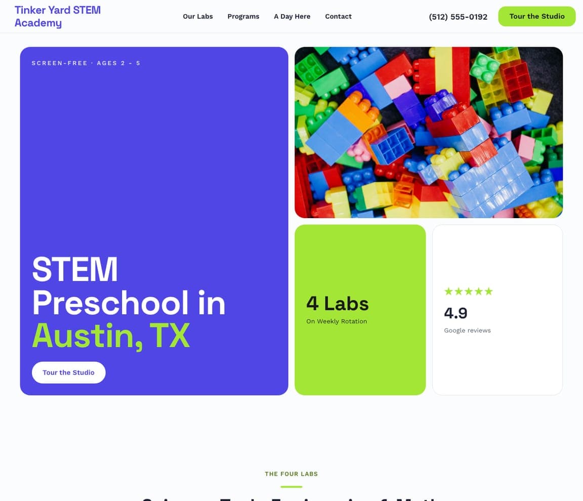
Tinker Yard STEM Academy: A violet tile, a photo of building bricks and a '4 Labs' stat in one bento

Tinker Yard STEM Academy is the Zarla STEM-preschool template, and its bento hero is a natural fit for a toy store: the hero photograph is a heap of colourful plastic building bricks. The white header sets the blue-violet wordmark against Our Labs, Programs, A Day Here, Contact, the phone and a violet 'Tour the Studio'. The first screen is four tiles: a tall violet tile on the left with the eyebrow 'SCREEN-FREE · AGES 2 – 5', the huge headline 'STEM Preschool in Austin, TX' with 'Austin, TX' in lime and a white 'Tour the Studio' button; the bricks photograph top right; a lime tile reading '4 Labs — On Weekly Rotation'; and a white tile with five stars and '4.9 Google reviews'. Nothing is a paragraph — every tile is a fact or a picture. Clone it for a toy shop that wants a modern, blocky first screen and has one great product photograph.

See this template
The Fort Afterschool & Summer Camp — After-School & Camp Template website design you can build with Zarla
Build this with Zarla
  • After-School & Camp Template
  • Bold

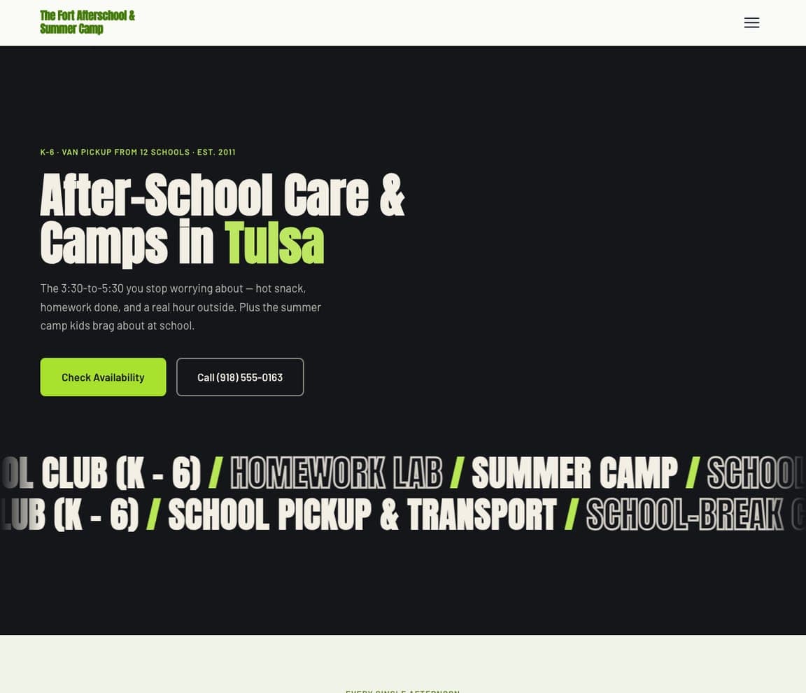
The Fort Afterschool & Summer Camp: 'After-School Care & Camps in Tulsa' in condensed cream, a marquee of giant outlined type below

The Fort Afterschool & Summer Camp is the Zarla after-school template and the loudest kids design in the catalog — a black ground, a lime condensed wordmark and a hamburger. The hero opens with a lime eyebrow, 'K-6 · VAN PICKUP FROM 12 SCHOOLS · EST. 2011', then heavy condensed cream capitals, 'After-School Care & Camps in Tulsa', with 'Tulsa' in lime. The paragraph is written like a parent talks: 'The 3:30-to-5:30 you stop worrying about — hot snack, homework done, and a real hour outside. Plus the summer camp kids brag about at school.' A lime 'Check Availability' sits beside an outline 'Call (918) 555-0163', and below the copy a marquee of giant outlined capitals scrolls the offer — '…OL CLUB (K – 6) / HOMEWORK LAB / SUMMER CAMP / SCHOO…'. The marquee is the idea to steal for a toy store: your categories in giant type, moving. Clone it for a shop with a strong, graphic brand and no hero photograph.

See this template

Frequently asked

What should a toy store website show first?

Colour and a shop-window line. MudPuddles fills the hero with a paper-craft collage in orange, purple and blue reading 'BEST. FALL. EVER!' and 'come play with us!'; Tantrum sets 'happiness for sale' in giant coral under four product tiles; Boing! Toy Shop photographs two children under a blue parachute cloth with 'Play brings joy!'; Timbuk Toys draws a rainbow 'JOIN THE TIMBUK HERD TODAY!' over cartoon horses. A parent should feel the shop before reading a word.

How should a toy shop show its hours and location online?

In a band under the hero, or the nav. Boing! runs an orange band with four items — 'FREE SHIPPING When you spend $100+', 'GIVE US A CALL +1 (617) 522-7800', 'CONTACT US Send us a message', 'VISIT US Store location and hours'; Timbuk Toys puts 'Stores & Hours' and 'Events & Happenings' in the nav; MudPuddles says 'SHOP ONLINE FOR IN STORE PICK UP. GIFT WRAPPED AND READY!' in the top strip; Tugooh's nav ends in VISIT. CAMP, with many locations, makes the button 'Choose your location'.

Should a toy store's website sell online or send people to the shop?

Both, and say which is easier. MudPuddles' top strip promises pick-up 'GIFT WRAPPED AND READY'; Tantrum's says 'FREE US SHIPPING $200+ • CALIFORNIA $60+ • FREE SF DELIVERY $30+', so locals get the best deal; Boing! offers free shipping over $100 beside 'VISIT US'; Coolest Toys on Earth is online-first with 'Shop Our Best Sellers'; The Red Balloon's nav carries Locations and a Toy Club. HearthSong, a catalogue brand, simply says 'SHOP HOP N' GO'.

How do the best toy stores use the brands they stock?

As tiles, labelled. Tantrum's hero is four product photographs each tagged with the maker's name — a mouse dollhouse, a girl in a star cape, wooden cars, plush acorns; Timbuk Toys heads its next section 'Shop Our Popular Brands' with a row of logos; Tugooh names the viral toy of the week in a speech bubble — 'WHAT'S NEW? All NEW viral Smushers!' — because for a squishy shop the brand is the news. Coolest Toys on Earth goes the other way and draws generic toys — a robot, a rocket, a slinky — so the shop, not the brand, is the hero.

Can a toy store website be about play rather than products?

Yes, and two here are. CAMP writes 'A place where families play, create, and explore together — CAMP is a family experience store where the magic is real, the mess is encouraged, and every visit is something kids talk about long after they leave.' over a photograph of a girl on a yellow slide. The Red Balloon Toy Store shows a girl leaping mid-air with a line-drawn volleyball and a sneaker overlaid and simply labels it 'Active Play'. HearthSong's hero is a boy bouncing on an inflatable unicorn.

Can I build a toy store website like these with Zarla?

Yes. Every real site here has a 'Build a site like this' button that opens the closest Zarla template in the editor — Cartwheels Kids Club for a full-bleed play photograph with a bright pill and two buttons, in the Boing! and CAMP spirit; Tinker Yard STEM Academy for a colourful bento of tiles like Tantrum and HearthSong; The Fort Afterschool & Summer Camp for a bold, dark, condensed-type page in the Coolest Toys on Earth vein — and you swap in your own shop window, your hours and your favourite toys. One colourful collage, a shop-window line and 'visit us' with the hours is the MudPuddles pattern, and it takes about 30 seconds.

You've seen what works. Now make it yours.

Describe your business and Zarla designs a complete, professional website in about 30 seconds — built to convert, just like the ones above.

Free to build and preview · no credit card · publish to your own domain on Premium