frothymonkey.com
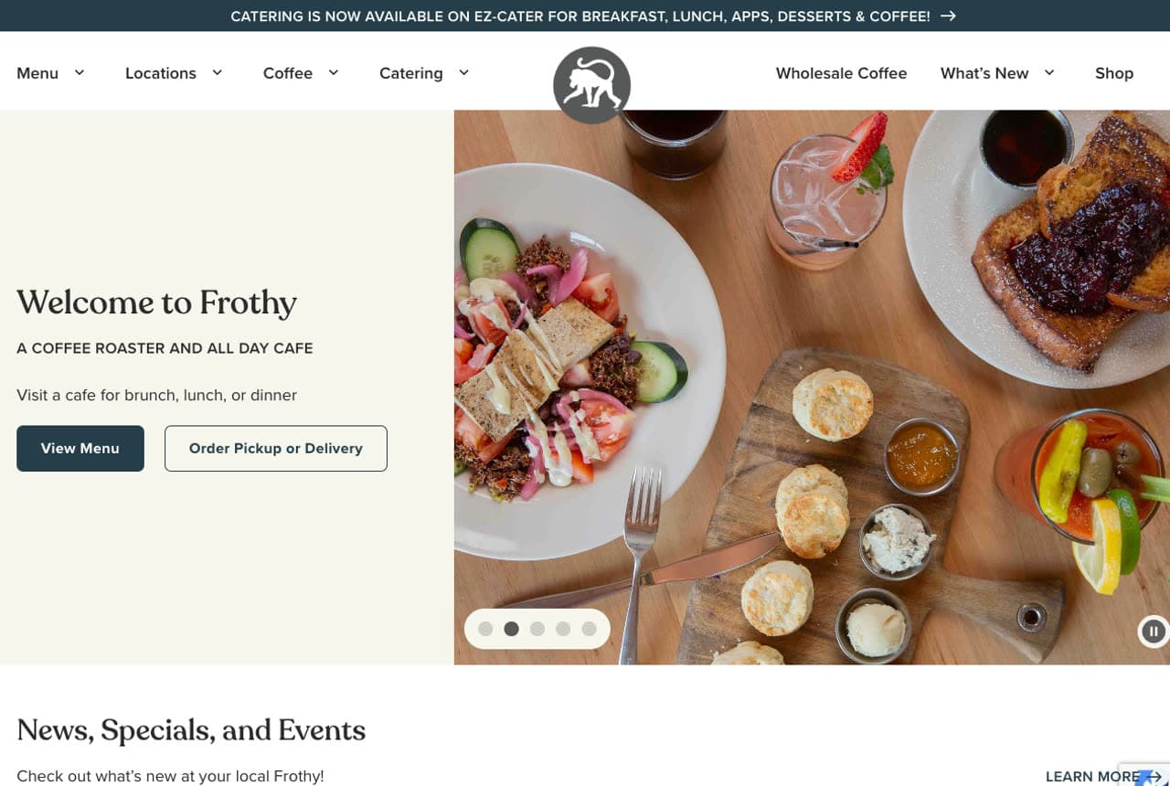
Frothy Monkey: A split hero that serves a multi-business brand
Frothy Monkey is three businesses — an all-day cafe, a coffee roaster, and a wholesale bakery across nine locations — and the homepage keeps all of it clear with a clean split hero: a welcoming line on the left, an overhead food-photo carousel on the right. Dual CTAs ('View Menu' and 'Order Pickup or Delivery') cover the two things a hungry visitor actually wants. The slate-blue palette and modern type feel current without trying hard. What's instructive is the discipline: a brand that does many things resists the urge to explain them all up top, leading instead with one warm welcome and the two most common actions. Clarity beats completeness on a homepage.
Opens a similar Zarla design you can make yours.
mountainculture.com.au
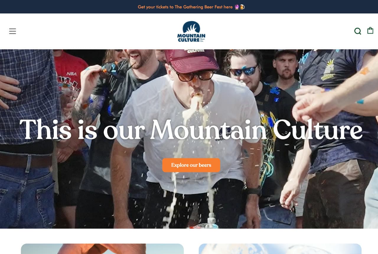
Mountain Culture Beer Co: A lifestyle video hero that sells a feeling, not a product
Mountain Culture opens not with beer but with a cockatoo in the Blue Mountains bush and the line 'This is our Mountain Culture.' The video hero sells a lifestyle and a place first, which is exactly how the best drinks brands build loyalty — you're buying into an identity, not a six-pack. A navy-and-orange palette feels rugged and outdoorsy, an 'Australia's #1 Beer' badge supplies bragging rights, and integrated Shopify plus a 'new this week' product carousel quietly turn the vibe into revenue. It's a strong example of leading with brand and atmosphere while keeping commerce one click away — the feeling pulls you in, the shop catches you when you're warm.
Opens a similar Zarla design you can make yours.
wilddesertbeauty.com
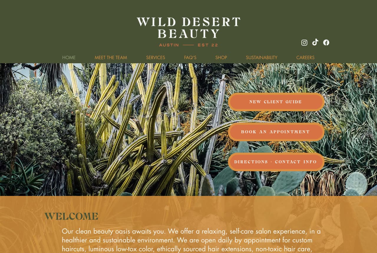
Wild Desert Beauty: A values-first brand with a palette to match
Wild Desert Beauty builds its whole identity around sustainability, and the design commits fully. An earthy desert palette — olive green, burnt orange, warm cream — with desert and cactus photography makes the eco-conscious positioning visual rather than just stated, so 'clean beauty' is something you feel on arrival. Green credentials (Gold-Level Austin Green Business Leader, 95% of waste recycled) are worn proudly as trust signals for the values-driven client it's courting. The result feels like a boutique with a point of view, not a generic salon. The lesson: when your differentiator is your values, let them drive the palette and imagery — a matching aesthetic makes the belief believable.
Opens a similar Zarla design you can make yours.
thejollyhog.com
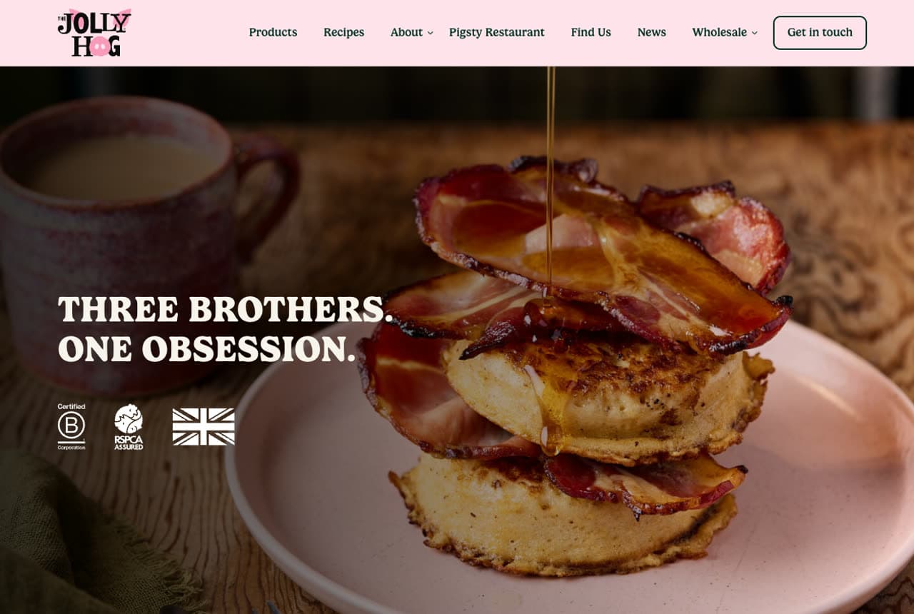
The Jolly Hog: Brand-first design that sells personality over leads
The Jolly Hog is a packaged-food brand, and its site behaves nothing like a service business — it's built to make you like the brand, not fill in a form. A bold dark-green-and-pink palette with real personality, full-bleed food photography, a product carousel, a recipe grid, and celebrity testimonials all prioritize brand affection over lead capture. B Corp and RSPCA-Assured badges fold ethics into the identity. It's a useful contrast to every trades and services site here: when you sell a product on shelves, the website's job is to build desire and recognition, so design leads with appetite and attitude. Different goal, different page — a reminder to design for the actual conversion you need.
Opens a similar Zarla design you can make yours.
merrowvane.com
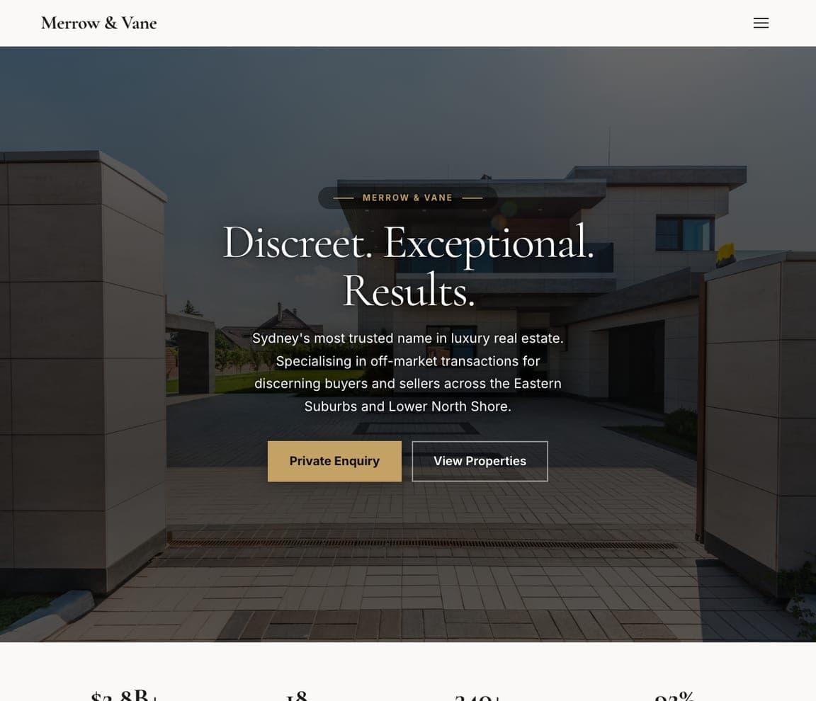
Merrow & Vane: Restraint as the luxury signal
Merrow & Vane says almost nothing — 'Discreet. Exceptional. Results.' on a dark, spacious hero — and that emptiness is the flex. Luxury real estate sells exclusivity, and exclusivity looks like white space, a tiny refined type treatment, and no clutter. Less on the page reads as more in the bank. It's the counter-move to every busy small-business homepage: when you're selling premium, the most confident thing you can do is remove elements until the page feels almost empty, then stop.
maisonnoirstudio.com
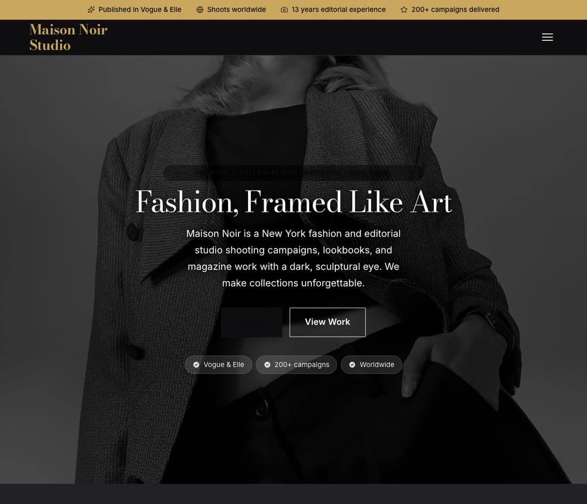
- Fashion Photographer
- Luxury
Maison Noir Studio: Gold on black, like a fashion spread
Maison Noir Studio commits fully to high fashion — gold type on near-black, a dark-showcase hero, a slideshow that moves like a print lookbook. The palette alone signals the niche before you see a single frame, and the slideshow keeps the work turning the way a magazine turns pages. It's proof that for the right business, dramatic and 'too much' is exactly enough: restraint would read as timid where the whole point is to look like the cover of a magazine. Match the intensity of the design to the intensity of the niche, and a small studio can look like a national title.


