Inspiration · Bakery

The Best Bakery Website Examples, Explained

Looking for bakery website examples? These 15 are the best we could find — standout real bakery sites plus designs you can build with Zarla — and each comes with a breakdown of the specific design move that makes it work. Find a look you love and you can build a site in that exact style, free, in about 30 seconds.

Real sites + designs you can build with Zarla — free to build and preview, no credit card

What makes a great bakery website

The best bakery websites share a few moves: they earn trust fast, lead with strong visuals of the work, point to one clear action, and match the design to how their customers decide. Each example below calls out the specific choice worth stealing for your own bakery website.

Leaven & Co website — Wholesale Bakery design example
Real site · New York, NY
  • Wholesale Bakery
  • Craft
  • Black + cream

Leaven & Co: A wordmark carved into the bread board

Leaven & Co fills the entire screen with its own name — 'LEAVEN & CO.' in heavy white letters laid over a rustic bread board, baguettes and a knife framing the type — and states its niche in the smallest line on the page: 'Craft Bakers for Chefs since 2004.' That single phrase is the whole business model: this is a wholesale bakery selling to restaurants, not walk-in retail, so the design speaks to chefs' aesthetics (spare, confident, ingredient-forward) rather than a shopper's sweet tooth. The near-black canvas makes the crust textures look artisanal and expensive, and the 'Get Samples' nav item is the B2B tell — you don't sample a cupcake, you sample a supply contract. Know exactly who you sell to and let the homepage speak only to them.

  • 'Craft Bakers for Chefs' names a wholesale-only niche
  • Type-as-hero on a bread board — ingredient-forward, chef-facing
  • 'Get Samples' CTA is the B2B supply-contract tell

Steal this: State who you sell TO in the hero ('bakers for chefs'). A named audience converts better than a broad one.

Bluebird Bakery website — Artisan Sourdough design example
Real site · York, UK
  • Artisan Sourdough
  • Rustic
  • Charcoal + cream

Bluebird Bakery: Four ingredients, told as a story

Bluebird Bakery leads with a dark, dramatic photo of crusty sourdough loaves and 'GOOD BAKED GOODS' in bold sans caps, then does what artisan bakeries do best — it tells the ingredient story as a manifesto: 'Big ideas start with tiny roots… our bread is made slowly and simply — using flour, water, salt and… time.' Naming the four ingredients (and pausing on 'time') is a craft flex that separates real sourdough from supermarket loaves, and the founder photo at the shopfront grounds the romance in a real person. The charcoal-and-cream palette lets the bread's crust be the only color that matters. For an artisan baker, process transparency IS the marketing — the fewer ingredients, the prouder you say them.

  • Names the four ingredients — process transparency as a flex
  • '…and time' pause dramatizes slow fermentation
  • Founder-at-shopfront photo grounds the craft romance

Steal this: List your few ingredients and dwell on the slow one. Simplicity, named proudly, is the artisan's whole pitch.

Beaucoup Bakery website — Pastry Destination design example
Real site · Vancouver, BC
  • Pastry Destination
  • Playful
  • Blush + cream

Beaucoup Bakery: A witty headline over a press-logo wall

Beaucoup Bakery opens with a grin — 'Summer Is Coming. Do You Have Enough Pastry?' set over an overhead spread of viennoiserie — then immediately backs the charm with authority: a 'Featured In' row carrying AFAR, Forbes, Frommer's, Lonely Planet and USA Today, and a self-description as an 'award-winning destination by way of its delicate pastries.' The combination is the lesson: playful copy earns attention, press logos earn trust, and running them back-to-back means the joke never reads as unserious. The soft, warm photography keeps it appetizing, and 'destination' is a deliberate word — it reframes a pastry shop as somewhere you travel to. Wit plus credentials is a stronger hook than either alone.

  • Playful headline earns the click; press logos earn the trust
  • 'Destination' reframes a pastry shop as a place to travel to
  • Overhead viennoiserie spread keeps it appetizing
Bobbette & Belle website — Patisserie design example
Real site · Toronto, ON
  • Patisserie
  • Elegant
  • Pastel blue + cream

Bobbette & Belle: Patisserie polish, pastel and ribboned

Bobbette & Belle presents like a luxury confectioner: a pale, airy hero of ribbon-tied cookie stacks and a single-tier cake, 'Toronto's Favourite Cakes & Pastries, Made from Scratch' in a refined serif, and a palette of soft blues and creams that feels like a gift box. The 'Made from Scratch' line is the quiet quality claim, and the navigation — Everyday Cakes & Pastries, Holidays & Special Occasions, Lifestyle & Décor — reveals a brand that has extended beyond baking into a whole aesthetic world. This is patisserie as lifestyle brand, where the packaging and styling are as much the product as the macarons. When your work photographs this beautifully, styling it like a still-life catalog is the entire strategy.

  • Ribbon-and-pastel styling reads gift, not grocery
  • 'Made from Scratch' is the understated quality claim
  • Lifestyle nav shows a bakery grown into a brand world
Magnolia Bakery website — Iconic Bakery design example
Real site · New York, NY
  • Iconic Bakery
  • Retail
  • Cream + brown

Magnolia Bakery: A famous name running limited drops

Magnolia Bakery leverages twenty-five years of NYC fame into an e-commerce machine: the hero is a rotating seasonal feature ('Now Available: Kickoff Collection' with soccer-themed cupcakes), an 'Order ASAP' button rides the nav, and a scannable product grid of its greatest hits (banana pudding, cupcakes, cookies) sits one scroll down. The design treats baked goods like a retail catalog with drops — the World Cup collection is a limited-edition release, giving regulars a reason to check back and the brand a reason to post. For an established bakery with recognition, the website's job shifts from persuasion to transaction and merchandising; Magnolia's does exactly that, turning fame into repeatable orders rather than just foot traffic.

  • Seasonal 'collections' turn baked goods into limited drops
  • Product-grid + Order ASAP: a transaction machine, not a brochure
  • Fame converted to repeatable online orders
Self Raised website — Neighborhood Bakery design example
Real site · Sydney, AU
  • Neighborhood Bakery
  • Retro
  • Orange + cream

Self Raised: Retro script for hot bread and staples

Self Raised dresses a modern multi-site bakery in warm 1970s clothing: a groovy orange script wordmark, 'Hot Bread & Other Staples' in retro display type, and a philosophy line with real conviction — 'you can't just slap a bunch of things together and expect it to be good — there's a real art to making a good sandwich.' The bread-and-sandwich flatlay is unpretentious and hungry-making, and the 'Visit Us' block gives each of its three Sydney shopfronts a photo and its own menu link. The retro palette does the differentiating — in a category of minimalist-white artisan sites, warm orange nostalgia stands out — while the staples-not-luxury positioning keeps it a genuine neighbourhood bakery. Personality plus honest everyday food is a durable position.

  • Retro orange script stands out in a white-artisan category
  • 'A real art to a good sandwich' — conviction as copy
  • Each of three shopfronts gets its own photo + menu
Tori's Bakeshop website — Vegan / GF Bakery design example
Real site · Toronto, ON
  • Vegan / GF Bakery
  • Cheerful

Tori's Bakeshop: Dietary badges worn as the value prop

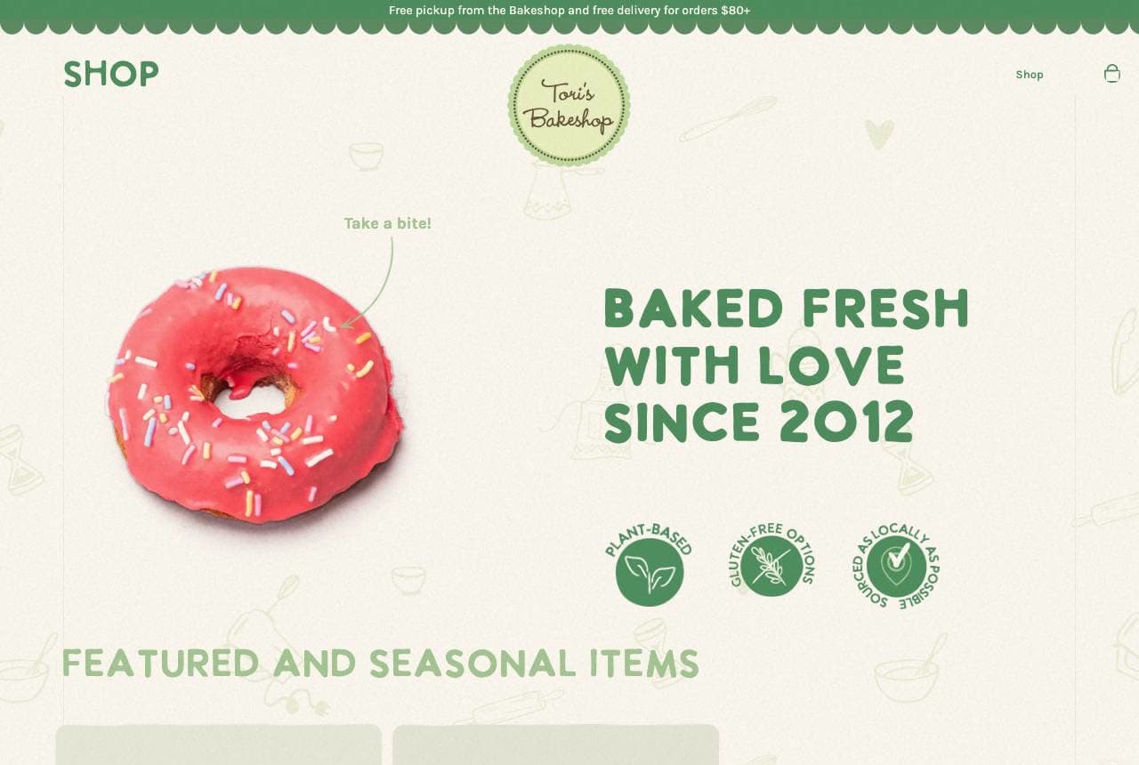
Tori's Bakeshop turns dietary restriction into the brand: 'Baked Fresh With Love Since 2012' beside a sprinkled doughnut, with plant-based, gluten-free and locally-sourced badges displayed prominently as icons rather than buried in fine print. For its audience — vegan and gluten-free customers who are usually told what they CAN'T eat — leading with the badges is a welcome mat, and the fresh mint-green palette with hand-drawn doodles keeps it cheerful instead of clinical (the trap most 'free-from' brands fall into). The 'Featured and Seasonal Items' row treats the restricted menu as abundant, not limited. When your differentiator is who you can serve that others can't, put that on the marquee, not the allergen page.

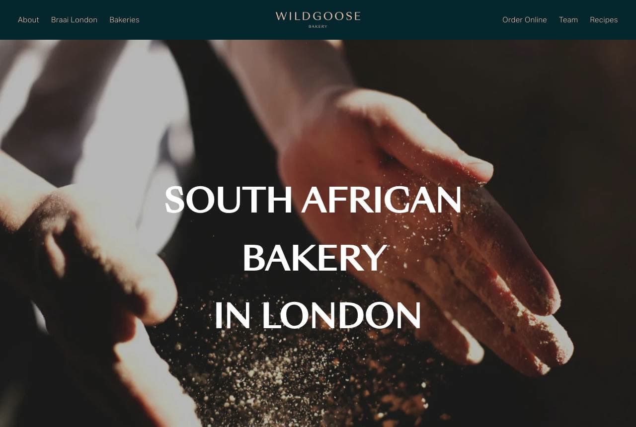
Wild Goose Bakery website — Sourdough Bakery design example
Real site · London, UK
  • Sourdough Bakery
  • Intimate

Wild Goose Bakery: Flour, hands and a change-of-life story

Wild Goose Bakery opens with an intimate, low-lit photograph — a baker's hands releasing a cloud of flour — and a quietly specific position: 'South African Bakery in London.' Below, the copy reads like a memoir rather than a menu: 'Built in a season of change. A place for sourdough, community, and food that brings people together,' explaining that founder Kirstin stepped away from high-pressure kitchens in 2014. That founder-story vulnerability is the whole brand — it turns a loaf into a chapter and gives customers a person to root for. The dark, tactile photography treats bread-making as craft and ritual. For a small independent, the origin story is an asset no chain can replicate, and Wild Goose spends it as the hero.

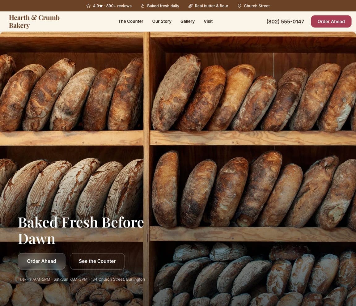
Hearth & Crumb Bakery — Neighborhood Bakery website design you can build with Zarla
Build this with Zarla
  • Neighborhood Bakery
  • Warm

Hearth & Crumb Bakery: Baked before dawn, immersively

Hearth & Crumb Bakery is Zarla's bakery template, and its immersive-food hero opens on the promise this whole gallery proves out: 'Baked Fresh Before Dawn,' set over full-bleed warm imagery in a coffee-brown and berry-red palette that reads hearth-warm and appetizing. Bakeries sell on craft and smell, so a photo-led immersive hero is the right structure — the same instinct behind Bluebird's loaves and Beaucoup's pastry spread. Beneath, the template carries a product menu, an about-the-bakery story (where the ingredient romance lives), and clear hours-and-location details. Swap in photos of your own loaves and set your hours, and you have a bakery site with genuine warmth in about 30 seconds — no photographer or designer required.

See this template
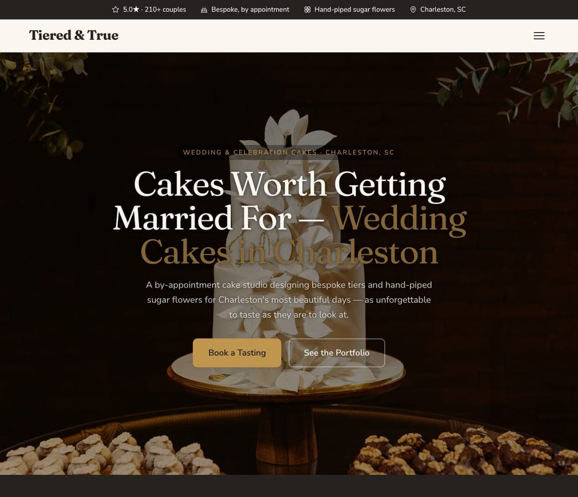
Tiered & True — Wedding Cakes website design you can build with Zarla
Build this with Zarla
  • Wedding Cakes
  • Bespoke

Tiered & True: Cakes worth getting married for

Tiered & True owns the highest-ticket job in baking: 'Cakes Worth Getting Married For — Wedding Cakes in Charleston, SC,' in a dark, elegant design around a spotlit tiered cake with hand-piped sugar flowers, positioned as 'a by-appointment cake studio designing bespoke tiers… as unforgettable to taste as they are to look at.' A wedding cake is a four-figure commission chosen months ahead, so everything here signals atelier, not counter: 'bespoke, by appointment,' a 'Book a Tasting' CTA (the actual conversion for wedding cakes), and a portfolio in place of a menu. The register echoes Bobbette & Belle's patisserie polish, tuned to a single occasion. For a cake studio, sell the ceremony — the tasting, the consultation, the one-of-a-kind design — because the couple is commissioning a centerpiece, not ordering dessert.

See this template
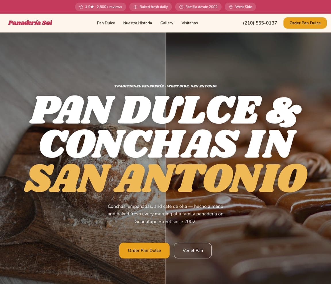
Panadería Sol — Panadería website design you can build with Zarla
Build this with Zarla
  • Panadería
  • Heritage

Panadería Sol: Pan dulce, hecho a mano since 2002

Panadería Sol leads with heritage in two languages: 'PAN DULCE & CONCHAS IN SAN ANTONIO' in huge display italics over a case of golden conchas, with 'hecho a mano and baked fresh every morning at a family panadería on Guadalupe Street since 2002' — and a 'Ver el Pan' button beside 'Order Pan Dulce.' The bilingual copy and the 'familia desde 2002' badge aren't decoration; they signal authenticity to the community the panadería serves, the same representation-is-the-pitch move Zari makes for South Asian weddings. Naming the breads themselves (conchas, empanadas, café de olla) beats generic 'baked goods' for both search and appetite. For a cultural bakery, speak the community's language literally — the customer looking for real pan dulce recognizes home in one glance.

See this template
Schmear & Co — Bagel Shop website design you can build with Zarla
Build this with Zarla
  • Bagel Shop
  • Savory-Craft

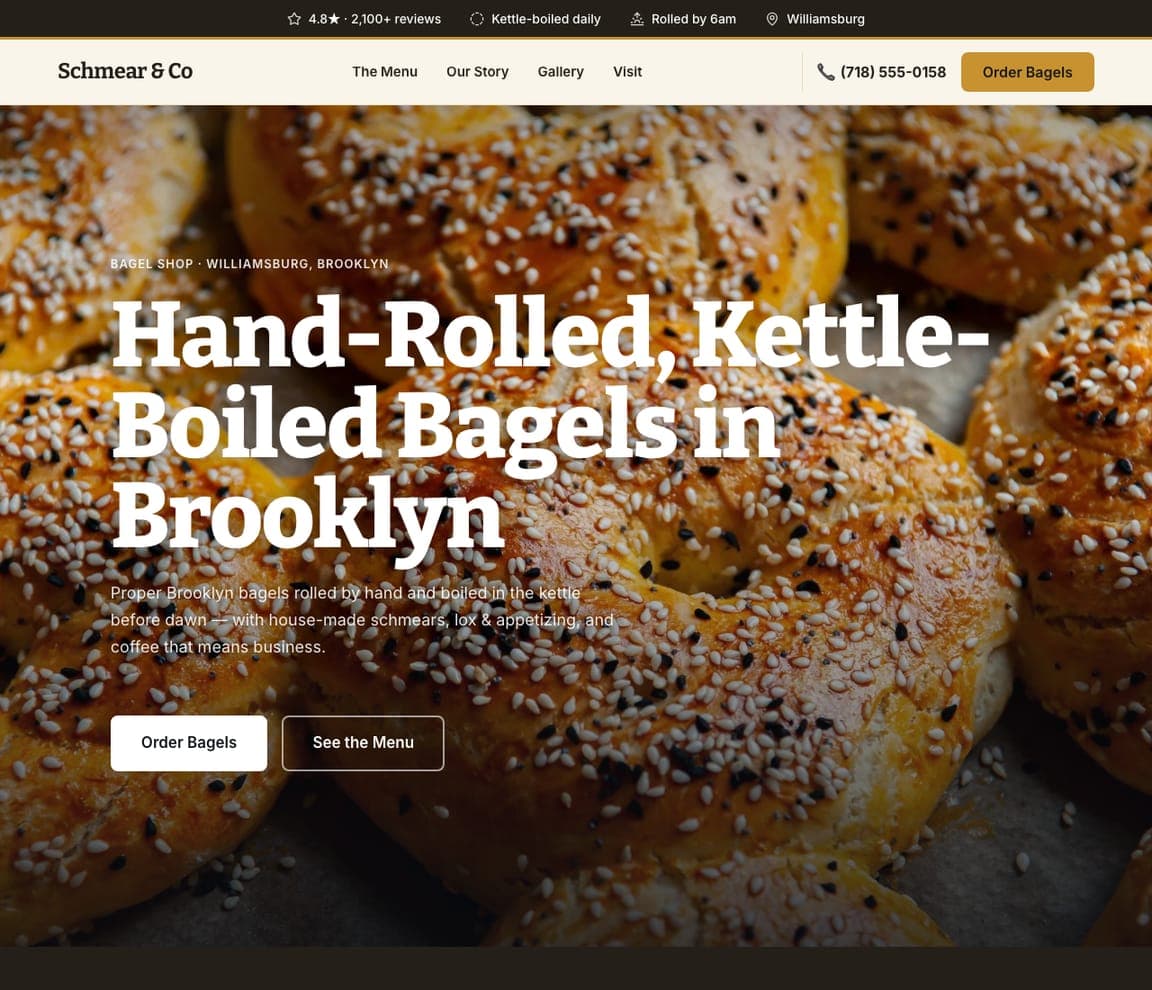
Schmear & Co: Hand-rolled, kettle-boiled, before dawn

Schmear & Co claims bagel credibility with method: 'Hand-Rolled, Kettle-Boiled Bagels in Brooklyn,' over a full-bleed tray of sesame bagels, promising 'proper Brooklyn bagels rolled by hand and boiled in the kettle before dawn — with house-made schmears, lox & appetizing, and coffee that means business.' Bagel people are process purists — hand-rolled and kettle-boiled ARE the argument, the way 'wood-fired' is for pizza — so the headline leads with technique, 'Williamsburg' grounds it in the bagel's home borough, and 'rolled by 6am' proves the morning grind. This is the savory, breakfast end of the bakery spectrum, a different daypart from every cake and pastry shop in this gallery. For any food business with a craft-defining method, put the method in the headline — the customers who care most are the ones who know the difference.

See this template
Glaze & Co — Donut Shop website design you can build with Zarla
Build this with Zarla
  • Donut Shop
  • Playful-Craft

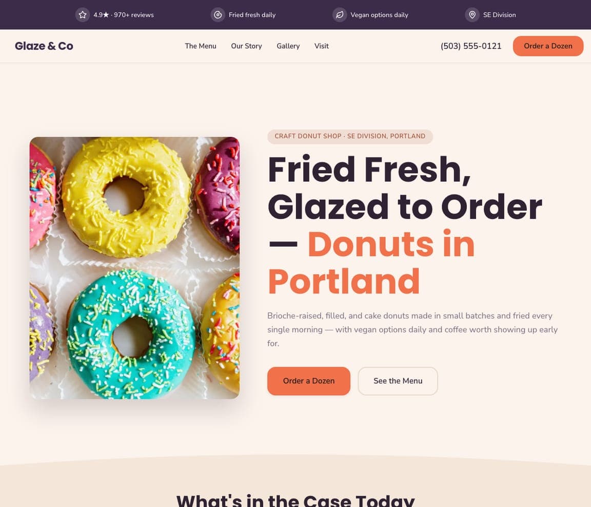
Glaze & Co: Fried fresh, glazed to order

Glaze & Co brings the fun: 'Fried Fresh, Glazed to Order — Donuts in Portland,' beside a box of brightly-sprinkled donuts on a clean white ground, from a 'craft donut shop' making 'brioche-raised, filled, and cake donuts in small batches, fried every single morning.' Donuts are an impulse of pure delight, so the design leads with color — the donuts themselves are the palette — while the copy quietly stacks craft credentials (brioche-raised, small batches, fried daily) that justify a $5 donut in a $1.50-donut world. 'Order a Dozen' is the exact transaction. Portland grounds it in craft-food culture. For a donut, ice-cream, or treat shop, let the product's own color carry the design and back the fun with just enough craft language to price above the supermarket.

See this template
Sunday Loaf Co — Sourdough Subscription website design you can build with Zarla
Build this with Zarla
  • Sourdough Subscription
  • Ritual

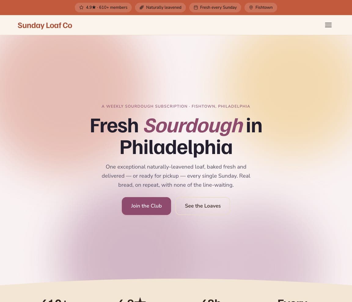
Sunday Loaf Co: One exceptional loaf, every Sunday

Sunday Loaf Co runs a bakery as a subscription business: 'Fresh Sourdough in Philadelphia' on a soft aurora gradient, offering 'one exceptional naturally-leavened loaf, baked fresh and delivered — or ready for pickup — every single Sunday,' with 'Join the Club' as the CTA and '610+ members' as the proof. The model is the story: no storefront hours, no sell-out roulette — 'real bread, on repeat, with none of the line-waiting' — which turns bread from a repeated errand into recurring revenue and a locked-in relationship (the same subscription logic Upkept applies to home maintenance). The gentle photo-free gradient keeps the focus on the ritual, and 'members' language builds belonging. For any bakery with a signature product, a weekly subscription — named like a club — converts your best customers into predictable income.

See this template
Countertop Bakehouse — Home Bakery website design you can build with Zarla
Build this with Zarla
  • Home Bakery
  • Personal

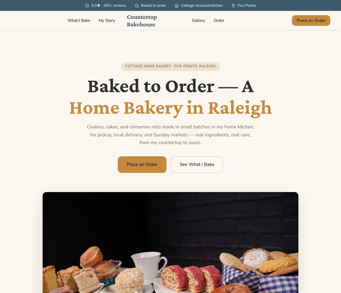
Countertop Bakehouse: From my countertop to yours

Countertop Bakehouse makes small the selling point: 'Baked to Order — A Home Bakery in Raleigh,' in warm cream and honey tones, offering 'cookies, cakes, and cinnamon rolls made in small batches in my home kitchen, for pickup, local delivery, and Sunday markets — real ingredients, real care, from my countertop to yours.' The first-person voice is the differentiator — a cottage bakery IS one person, and customers choose it precisely for that human connection over a commercial operation. 'Cottage-licensed kitchen' handles the legitimacy question, 'baked to order' explains the model (no case, no waste), and the market-day mention meets customers where they already buy. For the huge world of home bakers — exactly who's starting out — lead with yourself, your kitchen, and your care; being small isn't a limitation to hide, it's the whole appeal.

See this template

Frequently asked

Where can I find good bakery website examples?

Right here — this page curates bakery website examples two ways: standout real businesses (each linked, so you can explore the live site) and professionally designed Zarla templates you can clone and make your own. Every example comes with a note on why the design works — trust signals, layout, calls to action — so you can copy the move, not just the look.

What makes a good bakery website?

A good bakery website earns trust in the first few seconds, leads with strong visuals of the work, gives visitors one obvious action, and loads fast on a phone. Every design below leads with proof and a single clear call to action rather than a wall of text.

How much does a bakery website cost?

A custom bakery website from a designer typically runs into the thousands up front, and template builders charge roughly $16–$30 per month. An AI builder generates a complete, editable design for free and only charges (on the Premium plan) when you publish to your own domain — so you can build and preview before spending anything.

Do I need a designer to build a bakery website?

No. Several designs on this page were generated by Zarla and are fully editable — you describe your business and get a complete, professionally designed site in about 30 seconds, then refine it by chatting. Building and previewing is free; publishing to your own domain needs the Premium plan.

What pages does a bakery website need?

Most bakery businesses need just a few: a home page that proves trust and points to one clear action, an about page that puts a face to the business, a services or work page that shows what you do, and a contact page with a form and a phone number. Local businesses also benefit from location or service-area pages that help them show up in nearby searches.

How do I get more customers from my bakery website?

Lead with proof in the first few seconds (reviews, real photos, results), make one action obvious on every screen (call, book, or enquire), and keep it fast on mobile — most visitors arrive on a phone. The designs above each do this differently, but they all earn trust early and remove friction from the next step.

You've seen what works. Now make it yours.

Describe your business and Zarla designs a complete, professional website in about 30 seconds — built to convert, just like the ones above.

Free to build and preview · no credit card · publish to your own domain on Premium