Inspiration · Bar

The Best Bar Website Examples, Explained

Looking for bar website examples? These 12 are the strongest we found — Dante's 'est. 1915' wordmark over an old fashioned, Death & Co's script logo on the back bar, Penny Red's orange-and-yellow poster hero — plus bar designs you can build with Zarla, each with a breakdown of the specific move that turns a Friday-afternoon visit into a reservation. A bar's website has one job most business sites don't: it has to feel like the room. Find an approach you love and you can build a site in that spirit, free, in about 30 seconds.

Real sites + designs you can build with Zarla — free to build and preview, no credit card

What makes a great bar website

The best bar websites sell atmosphere before information: a photograph of the room or the drink fills the first screen (Smuggler's Cove's tiki rafters, Dante's ice cube stamped with the name), the wordmark carries the brand (Death & Co, The Brakeman), and the practical things — hours, address, reservations, gift cards — sit in a thin bar at the top where a phone can find them. Notice how many lead with a greeting rather than a headline ('Bienvenue', 'Fáilte Abhaile / Welcome Home') and how few use a call-to-action button at all; the menu link and the reservation link are the whole funnel. Dark is the default, but Penny Red's and The Brakeman prove a bar can be bright if the brand is loud enough. Every example below makes you want to be there before it tells you where it is.

Dante website — Cocktail Institution design example
Real site · New York, NY
  • Cocktail Institution
  • Atmospheric
  • Black + amber

Dante: A name stamped into the ice

Dante puts a century of history into one photograph: an old fashioned on a menu card, the oversized ice cube embossed with the word DANTE, and above it the wordmark — 'EST. 1915 / DANTE / NEW YORK CITY' — in thin white capitals. The nav is a single row of small caps that lists the two rooms' menus, the aperitivo, reservations and gift cards; there is no headline, no button, no tagline. The darkness around the glass is the design. Dante is the world's-best-bar-list kind of institution, and the site behaves accordingly: it tells you when it was founded and shows you the drink. For a bar with a real story, Dante shows the move — one object, the year, the name — and nothing that competes with them.

  • The brand name embossed in the ice — the product carries the logo
  • 'Est. 1915' as the only claim on the screen
  • Two menus, reservations and gift cards in a one-row nav

Steal this: Photograph one signature drink with your name literally on it — a stamped ice cube, a printed coaster — and let it be the whole first screen.

Visit Dante

Opens a similar Zarla design you can make yours.

Death & Co website — Cocktail Bar design example
Real site
  • Cocktail Bar
  • Moody
  • Black + amber

Death & Co: A script logo over the back bar

Death & Co lets the room and the logo do everything: a photograph of the bar at work — bottles glowing on the back shelves, a bartender pouring, two guests seen from behind — and over it the emblem, a coupe with crossed spoons and sprigs, above the name in flowing script, 'Death & Co'. The nav is a single hamburger in the corner. No headline, no copy, no button in the first screen, because a bar that wrote the book on modern cocktails doesn't need to introduce itself. The palette is the bar's own — wood, amber, black — and the script is the brand. Death & Co shows an established name how to be quiet: one photograph of the room doing what it does, and the logo laid over it.

  • The emblem and script over a working bar — no headline needed
  • A hamburger nav: the site defers to the photograph
  • Black, wood and amber — the room's own palette, no brand color added

Steal this: If your logo is beautiful, make it the headline — set it large over a photograph of the room at its busiest.

Visit Death & Co

Opens a similar Zarla design you can make yours.

The Brakeman website — Beer Hall design example
Real site · Detroit, MI
  • Beer Hall
  • Playful
  • White + black

The Brakeman: Illustrated wallpaper and a script wordmark

The Brakeman goes bright where bars go dark: a pale grey nav band with the name in condensed caps and eight plain links (hours and location, book a tap table, large parties, jobs, gift cards), then a white field printed like wallpaper with faint illustrations — a skeleton, a lantern, a snake, tools, glasses — and, centered, the script wordmark 'The Brakeman' over a black banner reading 'AMERICAN BEER HALL'. Two small black buttons follow: 'BOOK A BEER TAP TABLE' and 'WHAT WE'RE ABOUT'. The address runs across a thin bar at the very top. It's a beer hall's brand system rendered as a page — pattern, script, banner — and one of two photograph-free heroes in this gallery (Penny Red's is the other). The Brakeman shows that a bar can be bright and still feel like a place if the illustration and the wordmark carry the character.

  • A patterned wallpaper instead of a photograph — the brand as texture
  • 'Book a beer tap table' — the reservation named for the venue
  • Address in a thin bar at the very top

Steal this: If you have a brand illustration set, tile it as a faint wallpaper behind the wordmark — texture reads as personality without a photo shoot.

Visit The Brakeman

Opens a similar Zarla design you can make yours.

Penny Red's website — Food-Led Bar design example
Real site · Detroit, MI
  • Food-Led Bar
  • Loud
  • Orange + yellow

Penny Red's: A poster in orange and yellow

Penny Red's treats its home page like a printed poster: a solid orange field scattered with small yellow starbursts, and the name set in huge white block letters with a green shadow — 'PENNY / RED'S' — with 'BUCKETS AND BISCUITS' running between the two words. A round rooster badge sits in the corner; the nav is a single line of small caps with 'ORDER ONLINE' as an outlined green button; the address runs in green italics across the top. There is no photograph at all, and none is missed — the color and the letters are the flavor. Penny Red's shows a food-forward bar how to lead with the menu concept instead of the room: name the thing (buckets and biscuits), make the type enormous, pick two colors nobody else in the category uses.

  • The menu concept ('buckets and biscuits') inside the wordmark
  • Orange + yellow + green: a palette from the food, not the bar
  • 'Order Online' as the only button — the funnel for a food-led bar
Visit Penny Red's

Opens a similar Zarla design you can make yours.

Bisous website — Cocktail Lounge design example
Real site
  • Cocktail Lounge
  • Romantic
  • Cream + red

Bisous: 'Bienvenue' in script over a coupe

Bisous greets instead of pitching: a cream header with the name in a red serif and a two-line nav (menu, about, press, private events, merch, contact), then a dark photograph of a coupe glass with a red garnish, warm light behind it, and across the glass one word in tall handwritten script — 'Bienvenue'. Two underlined italic links sit beneath it, 'menu' and 'about', and that is the whole first screen. The French greeting sets the register (a cocktail room, not a sports bar), the script does the warmth, and the cream-and-red header keeps it from feeling like every other dark bar site. Bisous shows a small cocktail bar how to be charming in one word: choose the greeting your regulars would recognize, write it by hand, and put two quiet links under it.

  • One handwritten word as the headline
  • Cream header + red serif: warmth before the dark photograph
  • 'menu' and 'about' as underlined italics — links, not buttons
Visit Bisous

Opens a similar Zarla design you can make yours.

Smuggler's Cove website — Tiki Bar design example
Real site
  • Tiki Bar
  • Immersive
  • Black + violet

Smuggler's Cove: The rafters as the hero, the nav as a menu board

Smuggler's Cove shows the one thing no competitor can copy — its room: a photograph looking up into the tiki bar's rafters, nets and glass floats and lanterns hung between barrels, lit violet and amber. Above it, on black, the name is set in a wide serif — 'SMUGGLER'S COVE' — with the nav beneath it as a row of gold small caps: About, Crew, Book, Cocktails, Rum, Press, Store, Auctions, Contact. A row of dots under the photo says it's a slideshow; there is no headline and no button. 'Rum' and 'Auctions' in the nav tell you what kind of place this is before the copy does. Smuggler's Cove shows a themed bar how to sell the theme: photograph the ceiling, name the spirit in the nav, keep the type classic so the room can be loud.

  • A photograph of the ceiling — the room nobody else has
  • 'Rum' and 'Auctions' in the nav: the specialty as navigation
  • Classic serif + gold small caps so the room can be the color
Visit Smuggler's Cove

Opens a similar Zarla design you can make yours.

Post Haste website — Restaurant Bar design example
Real site · Philadelphia, PA
  • Restaurant Bar
  • Editorial

Post Haste: Hours in the header, dinner from above

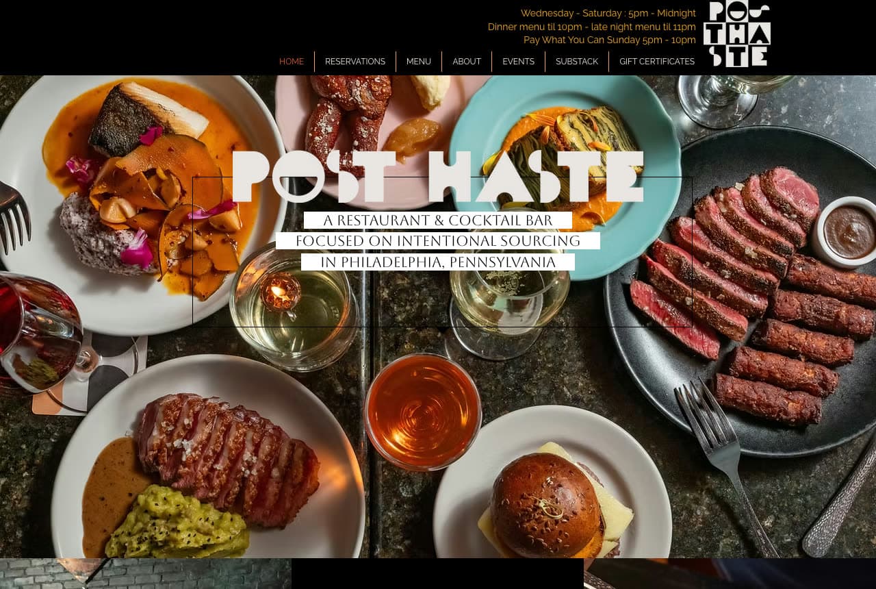
Post Haste answers the practical question before the aesthetic one: the black header prints the hours as three lines of copy ('Wednesday - Saturday : 5pm - Midnight / Dinner menu til 10pm - late night menu til 11pm / Pay What You Can Sunday 5pm - 10pm') beside a stacked wordmark, with a slim nav of outlined tabs under it. Then the hero — a flat-lay photograph of dinner from above: plates of fish and steak, a burger, wine and cocktails on a dark table — and over it the name in a stencil-cut display face, 'POST HASTE', with a one-sentence positioning in serif capitals: 'A RESTAURANT & COCKTAIL BAR FOCUSED ON INTENTIONAL SOURCING IN PHILADELPHIA, PENNSYLVANIA'. Post Haste shows a restaurant-bar how to serve both halves of its name: hours where a phone can read them, food photographed like a magazine, the bar in the sentence.

Visit Post Haste

Opens a similar Zarla design you can make yours.

The Dead Rabbit website — Irish Pub design example
Real site
  • Irish Pub
  • Warm

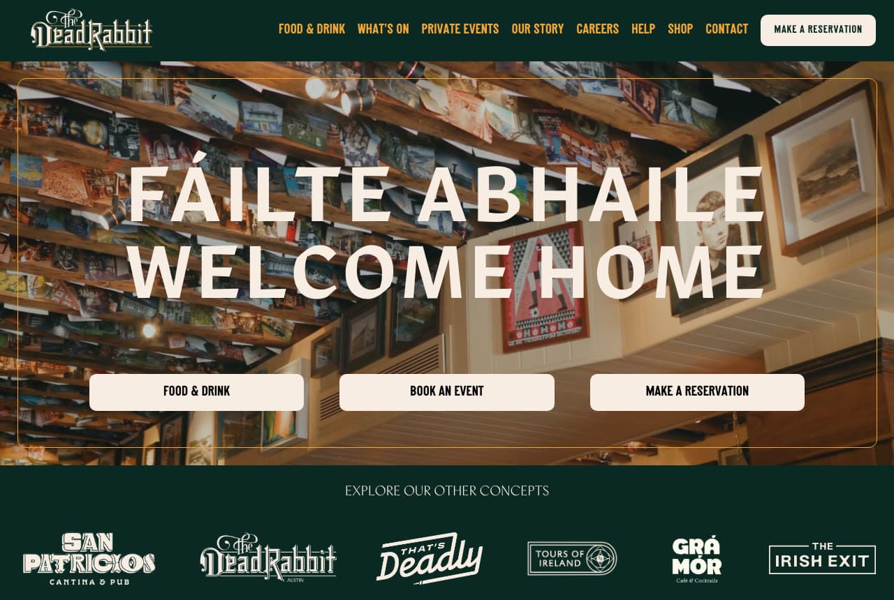
The Dead Rabbit: A greeting in two languages, three buttons under it

The Dead Rabbit welcomes and routes in one screen: a dark green nav with the name in a blackletter wordmark and a cream 'MAKE A RESERVATION' pill, then a photograph of the pub's ceiling and walls crowded with framed pictures, and over it, in tall cream capitals, 'FÁILTE ABHAILE / WELCOME HOME' — the Irish first, the English beneath. Three cream buttons follow in a row: 'FOOD & DRINK', 'BOOK AN EVENT', 'MAKE A RESERVATION'. Under the hero a green band says 'EXPLORE OUR OTHER CONCEPTS' and lines up six sibling bars' logos. The greeting does the brand, the three buttons do the business, the concept strip does the group. The Dead Rabbit shows an Irish pub how to be both a home and a hospitality company: say welcome, then offer the three things a visitor came to do.

Visit The Dead Rabbit

Opens a similar Zarla design you can make yours.

Cure website — Craft Cocktail Bar design example
Real site · New Orleans, LA
  • Craft Cocktail Bar
  • Restrained

Cure: One tracked sentence and a Resy button

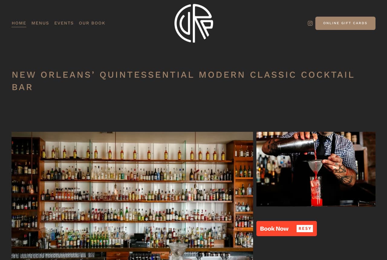
Cure writes its positioning as a single line of tracked capitals on charcoal — 'NEW ORLEANS' QUINTESSENTIAL MODERN CLASSIC COCKTAIL BAR' — under a monogram and a four-item nav (Home, Menus, Events, Our Book), with 'ONLINE GIFT CARDS' as a tan button in the corner. Beneath the sentence, two photographs: the back bar, its shelves lit white and lined with bottles, and a bartender straining a red cocktail; beside the second photo, a red 'Book Now · RESY' button. That is the whole screen — a sentence, two photographs, a reservation. The James Beard win lives in the page title, not the hero. Cure shows an award-winning bar how to be confident in small type: state the category you define, show the bar and the pour, and make booking the only colored thing on the page.

Visit Cure

Opens a similar Zarla design you can make yours.

Ember & Rye — Cocktail Bar website design you can build with Zarla
Build this with Zarla
  • Cocktail Bar
  • Moody

Ember & Rye: A serif promise about the night

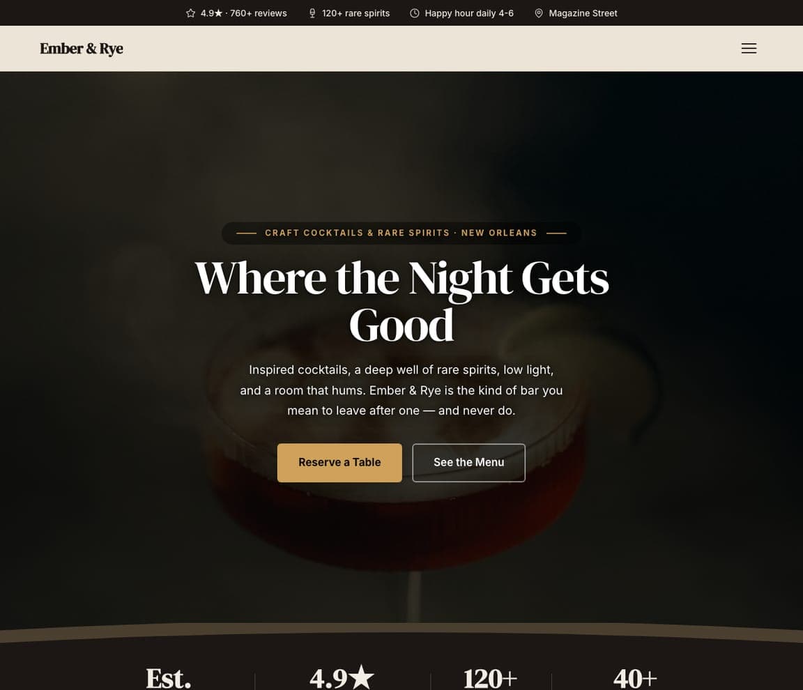
Ember & Rye is the Zarla cocktail-bar template: a near-black field, an eyebrow that names the offer and the city ('CRAFT COCKTAILS & RARE SPIRITS · NEW ORLEANS'), a serif headline that sells the evening — 'Where the Night Gets Good' — a three-line description ('inspired cocktails, a deep well of rare spirits, low light, and a room that hums') and an amber 'Reserve a Table' beside 'See the Menu'. The top strip counts the reviews and the spirits. It's Cure's restraint with a headline, and Dante's darkness with a button. Clone it, name your spirit and your street, and the reservation link becomes yours.

See this template
Afterimage — Speakeasy website design you can build with Zarla
Build this with Zarla
  • Speakeasy
  • Mysterious

Afterimage: 'Cocktail Laboratory' in pink on black

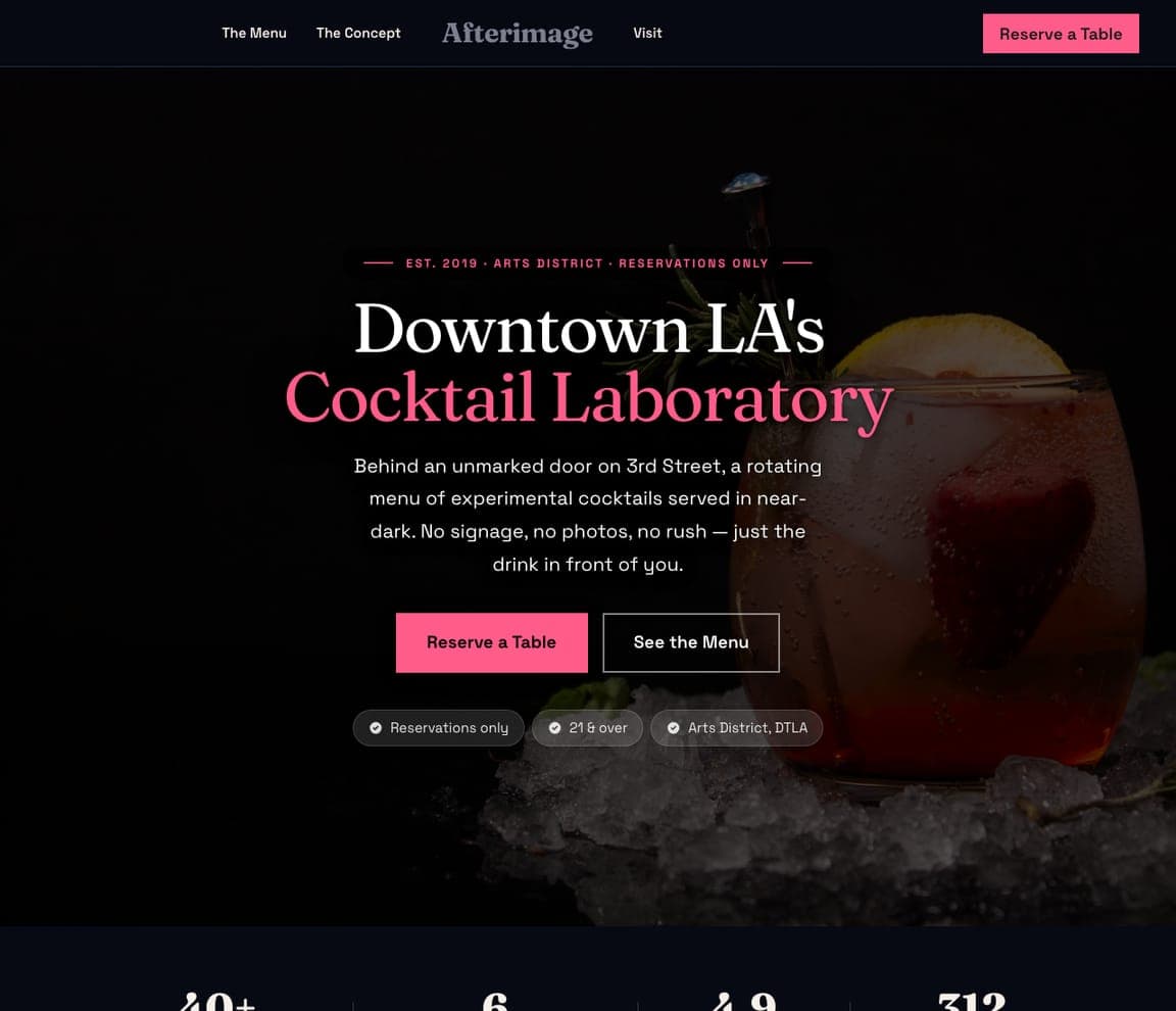
Afterimage is the speakeasy template: a black field, an eyebrow ('EST. 2019 · ARTS DISTRICT · RESERVATIONS ONLY'), a serif headline with its last two words in pink — 'Downtown LA's Cocktail Laboratory' — and a paragraph that describes the ritual ('an unmarked door on 3rd Street, a rotating menu of experimental cocktails served in near-dark. No signage, no photos, no rush'), then a pink 'Reserve a Table' beside 'See the Menu' and three chips (reservations only, 21 & over, Arts District). It's the Death & Co and Smuggler's Cove instinct — mystery as the brand — with the practical facts as chips. Clone it for a reservations-only room, and the eyebrow becomes your door.

See this template
Copperline Brewing Co. — Taproom website design you can build with Zarla
Build this with Zarla
  • Taproom
  • Friendly

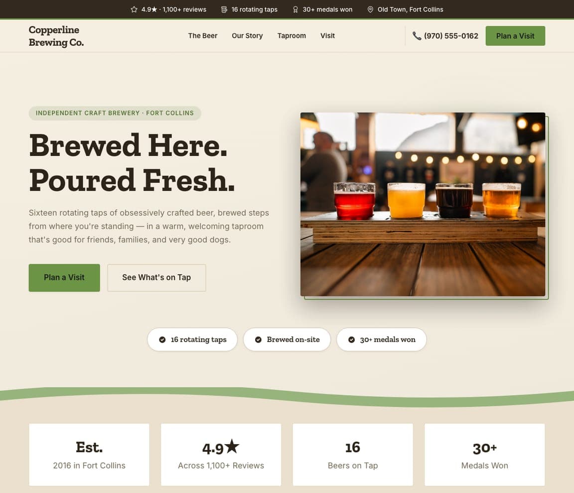
Copperline Brewing Co.: Brewed here, poured fresh — with the taproom beside it

Copperline Brewing Co. is the brewery template, and the closest catalog match to the bright beer-hall sites here: a cream ground, an eyebrow ('INDEPENDENT CRAFT BREWERY · FORT COLLINS'), a two-line headline — 'Brewed Here. Poured Fresh.' — a paragraph about sixteen rotating taps and a taproom 'good for friends, families, and very good dogs', a green 'Plan a Visit' beside 'See What's on Tap', and a framed photograph of flights on a wooden bar. Three chips count the taps, the on-site brewing and the medals. It's The Brakeman's brightness with proof numbers. Clone it, and the chips become your taps and your awards.

See this template

Frequently asked

Where can I find good bar website examples?

Right here — this page curates bar website examples across the spectrum: cocktail institutions like Dante, Death & Co, The Dead Rabbit and Cure, a tiki bar (Smuggler's Cove), a beer hall (The Brakeman), a buckets-and-biscuits joint (Penny Red's), a French-leaning cocktail room (Bisous) and a restaurant-bar (Post Haste) — each linked so you can explore the live site — plus professionally designed Zarla cocktail-bar, speakeasy and brewery templates you can clone and make your own. Every example includes a note on why the design works — the mood, the wordmark, the reservation path — so you can copy the thinking, not just the look.

What makes a good bar website?

It feels like the room and answers three questions in five seconds: are you open, where are you, can I book. The strong examples above open on one atmospheric photograph or a bold wordmark, keep the address and hours in a slim top bar, put 'Reservations' and 'Menu' in the nav, and let gift cards and private events ride along as links rather than banners. The copy is short — a greeting, a line of positioning ('New Orleans' quintessential modern classic cocktail bar') — and the photography is of your bar, not stock glassware.

How much does a bar website cost?

A custom site from a hospitality agency typically runs from a couple of thousand dollars up, restaurant-platform builders charge a monthly fee for the site plus reservations, and general template builders are roughly $16–$30 per month. An AI website builder generates a bar site — menu, hours, location, reservations link, events, gift cards — from a short description in seconds, then lets you edit it in plain language. Spend the money you save on one evening of real photography of the room with the lights on.

Should a bar website show the menu or the room first?

The room. A menu is a reason to choose you; the room is a reason to go out at all. Almost every site above leads with atmosphere — Smuggler's Cove's rafters, Cure's back bar, Dante's drink — and links the menu from the nav. The exception is a bar whose menu is the concept (Penny Red's buckets and biscuits), where the wordmark carries the food and the menu is one click away.

What pages does a bar website need?

Most bars need five: a home page with the mood, hours and address, a menu page (drinks first, food second — as a page, not a PDF), a reservations page or link to your booking system, a private-events page (the highest-margin thing a bar sells), and a contact page with a map. Add gift cards and a merch or shop page if you have them; Dante, The Brakeman and Penny Red's all put gift cards in the nav because they sell.

How do bars get more customers from their website?

Make booking a table one tap from the first screen, keep hours and address in the top bar, and give private events their own page with a form. The converting pattern above: The Dead Rabbit's three buttons under the headline ('Food & Drink', 'Book an Event', 'Make a Reservation'), Cure's Resy 'Book Now' beside the photos, Post Haste's hours printed in the header. Then let the photography do the marketing — a bar that looks like a place people want to be found in gets shared.

You've seen what works. Now make it yours.

Describe your business and Zarla designs a complete, professional website in about 30 seconds — built to convert, just like the ones above.

Free to build and preview · no credit card · publish to your own domain on Premium