Inspiration · Brewery

The Best Brewery Website Examples, Explained

Looking for brewery website examples? These 9 are the best we could find — standout real brewery sites plus designs you can build with Zarla — and each comes with a breakdown of the specific design move that makes it work. Find a look you love and you can build a site in that exact style, free, in about 30 seconds.

Real sites + designs you can build with Zarla — free to build and preview, no credit card

What makes a great brewery website

The best brewery websites share a few moves: they earn trust fast, lead with strong visuals of the work, point to one clear action, and match the design to how their customers decide. Each example below calls out the specific choice worth stealing for your own brewery website.

Creature Comforts website — Craft Brewery design example
Real site · Athens, GA
  • Craft Brewery
  • Thoughtful
  • Earth + cream

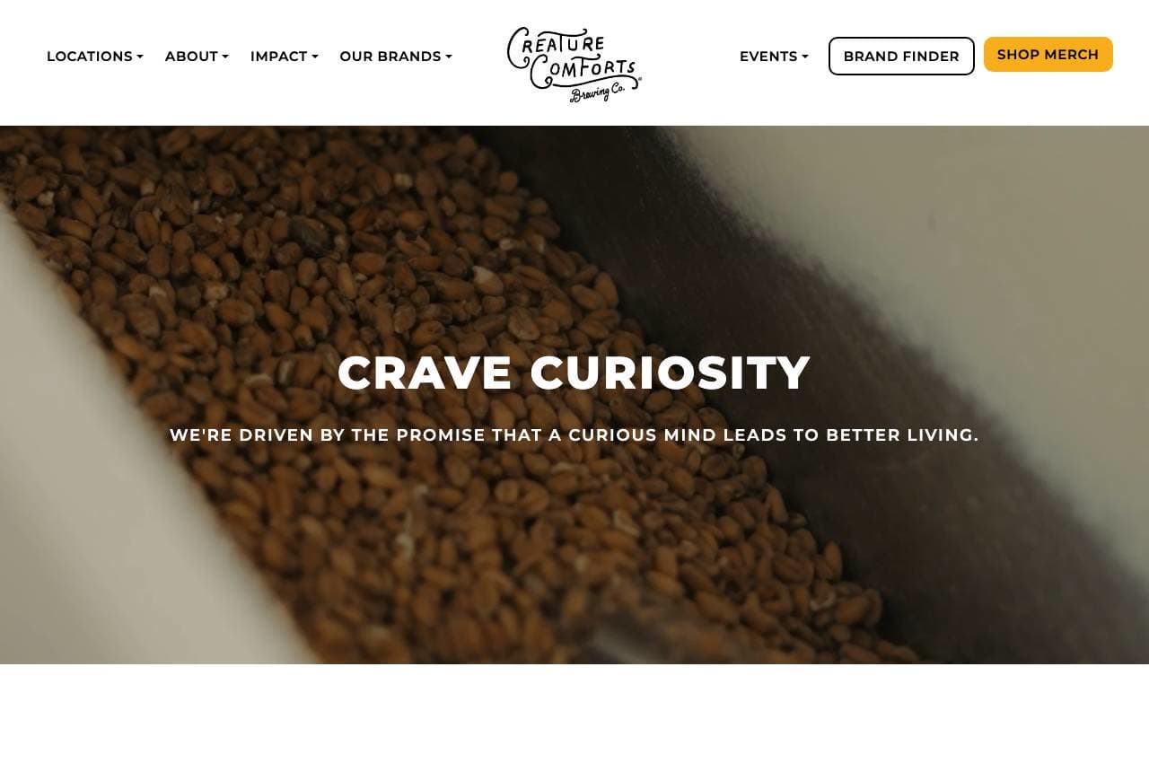
Creature Comforts: A brewery that leads with a mission

Creature Comforts opens on a macro shot of malt grains and one line — 'Crave Curiosity: we're driven by the promise that a curious mind leads to better living' — with the beers themselves nowhere in sight until you scroll. That's a deliberate bet: for a craft brewery, the brand ethos IS the product differentiator, since the liquid competes in a sea of similar IPAs. The hand-drawn logo and warm, earthy palette read artisanal and thoughtful rather than rowdy, positioning the brewery closer to a design studio than a bar. Featured beers and an 'Our Purpose and Mission' section follow, so the browsing shopper still gets what they came for. When your category is crowded with sameness, leading with a genuine point of view is how the label gets remembered.

  • Mission before product — ethos as the differentiator
  • Hand-drawn mark + earthy palette reads artisanal studio
  • Featured beers follow, so shoppers still get the goods

Steal this: Lead with your ethos, not your product shot. In a category of sameness, a point of view is what gets remembered.

Seven Brothers website — DTC Brewery design example
Real site · Salford, UK
  • DTC Brewery
  • Shoppable
  • Navy + bright

Seven Brothers: An e-commerce brewery with one loud offer

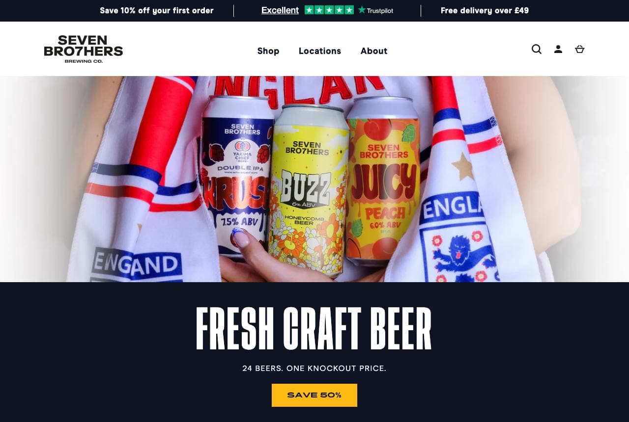
Seven Brothers runs its homepage like a beer shop, not a brochure: 'Fresh Craft Beer — 24 Beers, One Knockout Price' in bold sans over a photo of hands clutching colourful cans, a yellow 'Save 50%' button, and a 'Freshest Brews' product grid where every can shows name, style, ABV and price right on the card. A Trustpilot 'Excellent' rating and free-delivery threshold ride the top bar — the exact reassurances that get an online drinks order over the line. The navy-and-bright-can palette keeps it energetic and shoppable. For a brewery selling direct-to-consumer, the website's job is conversion, not vibes; Seven Brothers treats every beer like a product listing and leads with a bundle offer nobody can miss.

  • Product-grid cans with ABV + price — a shop, not a brochure
  • One unmissable bundle offer ('24 beers, one price')
  • Trustpilot + free-delivery bar de-risk the online order

Steal this: Treat every beer like a product listing (style, ABV, price on the card) and lead with one bundle offer.

VIVIR Tequila website — Premium Spirits design example
Real site · Jalisco, MX
  • Premium Spirits
  • Luxe
  • Black + amber

VIVIR Tequila: A category challenge as the headline

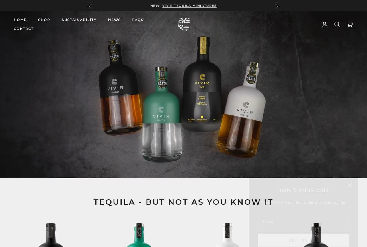
VIVIR Tequila reframes an entire spirit: 'Tequila — but not as you know it,' set over a moody dark hero with the bottle lineup lit like jewelry, positioning against the shots-and-slammers reputation and toward sipping-quality craft. The near-black palette with warm bottle glow signals premium, and the product row underneath (Café VS, Blanco, Reposado, Añejo) with prices makes it shoppable while the 'super premium, 100% Blue Weber Agave' copy justifies the tier. A 'Buy 3, get 15% off' incentive nudges basket size. It's spirits e-commerce done with restraint — the darkness does the luxury work so the copy doesn't have to shout. When your category has a cheap reputation, name it and define yourself against it in the first line.

  • 'Not as you know it' reframes tequila against its cheap rep
  • Dark palette + lit bottles do the premium work silently
  • Priced product row + bundle offer keep it shoppable
Victoria Distillers website — Craft Distillery design example
Real site · Sidney, BC
  • Craft Distillery
  • Refined
  • White + copper

Victoria Distillers: Waterfront provenance for craft gin

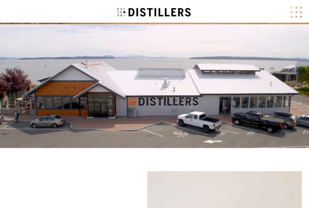
Victoria Distillers grounds its spirits in a place: an elegant thin-serif wordmark over a wide shot of its actual waterfront distillery building, then an 'Our Story' section explaining the copper pot stills and the Sidney, British Columbia location behind its award-winning gins (including the famous colour-changing Empress 1908). Showing the real building matters for spirits — provenance and craft are the whole premium justification, and a photo of the place where it's made beats any lifestyle stock shot. The restrained palette and generous white space read refined rather than rowdy, right for a gin buyer who cares about the distilling. The copy even handles logistics ('retail space is open, we offer tastings') for the visitor planning a trip. Real place, real stills, real story.

  • The actual distillery building sells provenance, not vibes
  • Copper-still + location copy justifies the craft premium
  • Refined white space suits the considered gin buyer
Bonehead Brewing website — Independent Taproom design example
Real site · Melbourne, AU
  • Independent Taproom
  • Irreverent
  • Black + multicolor

Bonehead Brewing: Can art as the whole hero

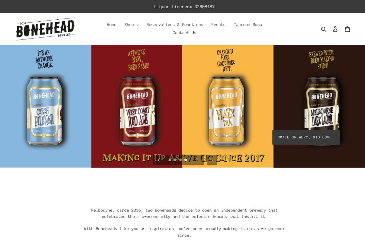
Bonehead Brewing turns its label design into the homepage: a hero slideshow of four boldly-coloured beer cans side by side — Czech Pilsner, West Coast Red, Hazy IPA, Melbourne Dark — under the perfectly self-aware tagline 'Making It Up As We Go Since 2017' and 'Small Brewery, Big Love.' The irreverent, DIY voice ('after all, we're all Boneheads') is the brand, and it's backed by real taproom substance: weekly event cards ($20 Pizza 'n Pot Fridays, BYO-instrument Sundays, live music) that turn the website into a reason to visit, not just buy. Vivid can artwork against black-and-white chrome keeps it punchy. For an independent brewery, personality is the moat the big breweries can't buy — Bonehead spends it generously and specifically.

  • Colourful can artwork IS the hero — the label sells itself
  • Self-aware DIY voice is the moat big breweries can't copy
  • Weekly event cards make the site a reason to visit
Molly Rose Brewing website — Brewpub Venue design example
Real site · Melbourne, AU
  • Brewpub Venue
  • Warm
  • Charcoal + warm

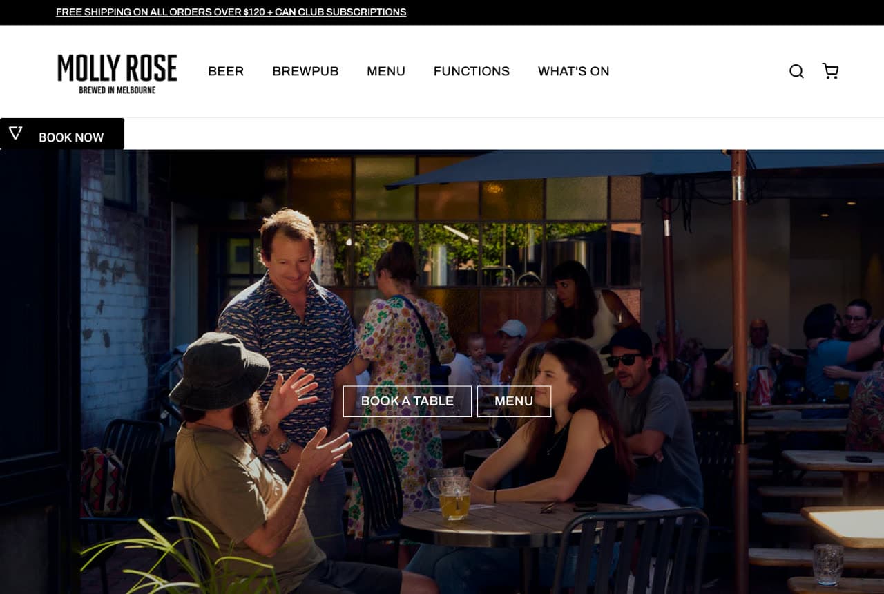
Molly Rose Brewing: The room, full, as the pitch

Molly Rose Brewing leads not with a can but with the vibe: a warm photo of its packed Collingwood brewpub — friends mid-laugh at communal tables — and the plain, inviting line 'A Backstreet Brewpub in Collingwood,' with 'Book a Table' and 'Menu' as the primary actions. The positioning is destination-first: this is a place to spend an evening (beer garden, dining hall, taproom, function space) more than a label to buy, so the design sells atmosphere and bookings over bottles. Clean type and real venue photography keep it modern and un-gimmicky. When your brewery is really a hospitality venue, photographing a full, happy room does more than any product shot — people want to be where other people are already having a good time.

  • A packed, happy room sells the destination, not the can
  • 'Book a Table' primary CTA — bookings over bottles
  • Beer garden / dining / functions framed as an evening out
Mountain Culture website — Lifestyle Brewery design example
Real site · Katoomba, AU
  • Lifestyle Brewery
  • Bold

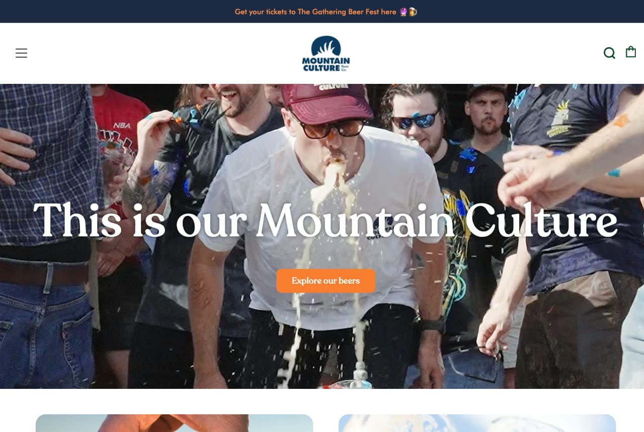
Mountain Culture: A lifestyle brand that happens to brew

Mountain Culture builds a whole identity around place and belonging: a video hero of bushland and mates raising cans, 'This is our Mountain Culture' in bold white, a navy-and-orange palette, and a 'Voted Australia's #1 Beer' badge for instant credibility. The genius is the membership framing — 'Join The Cult' turns customers into a tribe, and a venue carousel (five locations across NSW, VIC, TAS) plus a 'New This Week' product drop keep regulars engaged. Born in Katoomba in the Blue Mountains, the brand sells a lifestyle and a community that the beer is merely the entry ticket to. For a craft brewery, converting drinkers into members is the durable growth loop — Mountain Culture's homepage is engineered for exactly that belonging.

Westside Ale Works website — Taproom + Kitchen design example
Real site · Melbourne, AU
  • Taproom + Kitchen
  • Casual

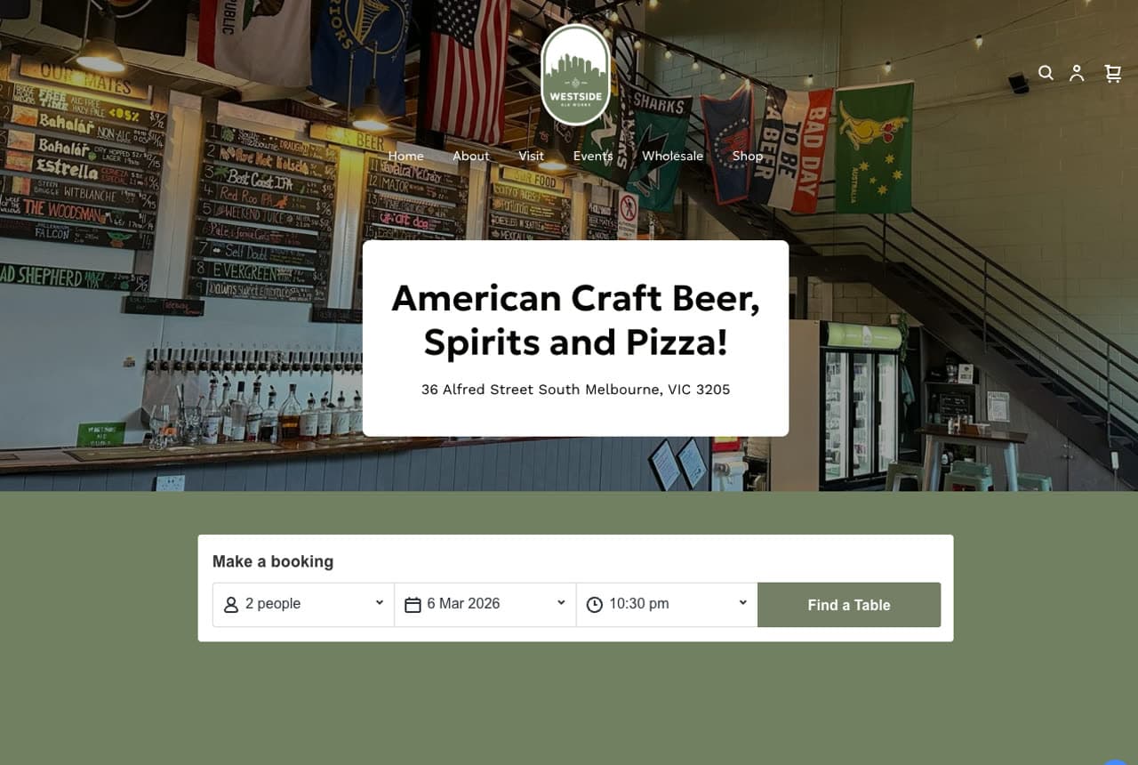
Westside Ale Works: Beer, spirits and pizza, stated plainly

Westside Ale Works knows exactly what it is and says so in one line — 'American Craft Beer, Spirits and Pizza!' over a warm shot of its taproom chalkboard and taps, with a booking widget (party size, date, time, Find a Table) sitting right in the hero. That in-hero reservation form is the smart move: this is a family-owned warehouse taproom in South Melbourne, and the primary conversion is a booked table, so the site removes every step between arriving and reserving. The 'Who We Are' copy pays homage to US West Coast microbreweries and promises 'a cozy atmosphere… for anyone who walks through our big roller door.' Naming your three things plainly (beer, spirits, pizza) beats a clever tagline when the customer is deciding where to eat and drink tonight.

Copperline Brewing Co. — Craft Brewery website design you can build with Zarla
Build this with Zarla
  • Craft Brewery
  • Earthy

Copperline Brewing Co.: Brewed here, poured fresh

Copperline Brewing Co. is Zarla's brewery template, and its proof-strip hero lands the register this gallery keeps rewarding: 'Brewed Here. Poured Fresh.' — the short, confident cadence of a taproom chalkboard — over warm imagery, with trust markers on first paint. The malt-brown and hop-green palette reads craft and earthy rather than corporate, and the structure carries what a brewery actually needs: a beer lineup, a taproom/visit section, and a hours-and-location block for the walk-in. It's the pre-built version of the Bonehead/Westside taproom playbook — personality plus a clear reason to visit. Swap in your own can art and tap list and you have a credible craft-brewery site in about 30 seconds, no photographer or designer required.

See this template

Frequently asked

Where can I find good brewery website examples?

Right here — this page curates brewery website examples two ways: standout real businesses (each linked, so you can explore the live site) and professionally designed Zarla templates you can clone and make your own. Every example comes with a note on why the design works — trust signals, layout, calls to action — so you can copy the move, not just the look.

What makes a good brewery website?

A good brewery website earns trust in the first few seconds, leads with strong visuals of the work, gives visitors one obvious action, and loads fast on a phone. Every design below leads with proof and a single clear call to action rather than a wall of text.

How much does a brewery website cost?

A custom brewery website from a designer typically runs into the thousands up front, and template builders charge roughly $16–$30 per month. An AI builder generates a complete, editable design for free and only charges (on the Premium plan) when you publish to your own domain — so you can build and preview before spending anything.

Do I need a designer to build a brewery website?

No. Several designs on this page were generated by Zarla and are fully editable — you describe your business and get a complete, professionally designed site in about 30 seconds, then refine it by chatting. Building and previewing is free; publishing to your own domain needs the Premium plan.

What pages does a brewery website need?

Most brewery businesses need just a few: a home page that proves trust and points to one clear action, an about page that puts a face to the business, a services or work page that shows what you do, and a contact page with a form and a phone number. Local businesses also benefit from location or service-area pages that help them show up in nearby searches.

How do I get more customers from my brewery website?

Lead with proof in the first few seconds (reviews, real photos, results), make one action obvious on every screen (call, book, or enquire), and keep it fast on mobile — most visitors arrive on a phone. The designs above each do this differently, but they all earn trust early and remove friction from the next step.

You've seen what works. Now make it yours.

Describe your business and Zarla designs a complete, professional website in about 30 seconds — built to convert, just like the ones above.

Free to build and preview · no credit card · publish to your own domain on Premium