Inspiration · Cafe

The Best Coffee Shop Website Examples, Explained

Looking for coffee shop website examples? These 9 are the best we could find — standout real coffee shop sites plus designs you can build with Zarla — and each comes with a breakdown of the specific design move that makes it work. Find a look you love and you can build a site in that exact style, free, in about 30 seconds.

Real sites + designs you can build with Zarla — free to build and preview, no credit card

What makes a great coffee shop website

The best coffee shop websites share a few moves: they earn trust fast, lead with strong visuals of the work, point to one clear action, and match the design to how their customers decide. Each example below calls out the specific choice worth stealing for your own coffee shop website.

The Kettle Black website — Brunch Destination design example
Real site · Melbourne, AU
  • Brunch Destination
  • Editorial
  • Black + white

The Kettle Black: A café shot like an architecture magazine

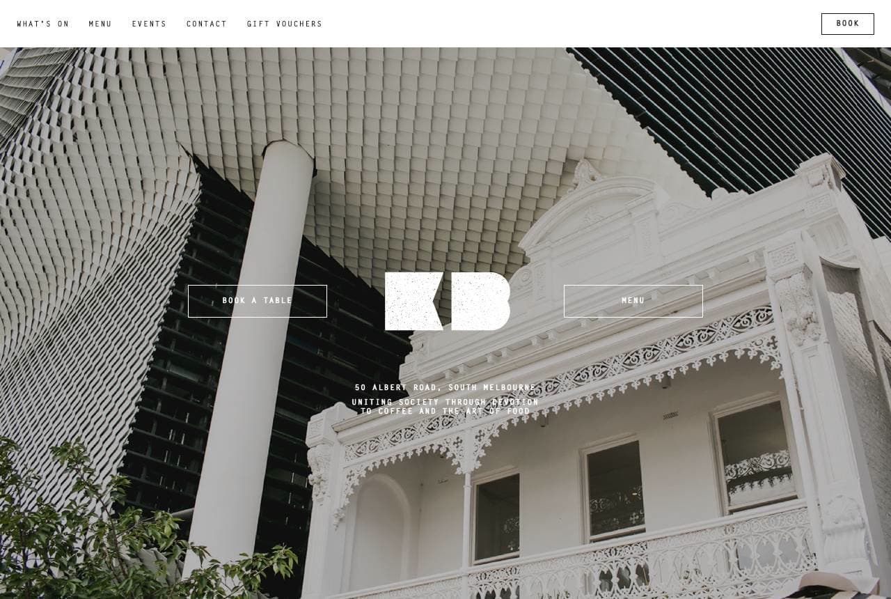
The Kettle Black opens on a black-and-white photograph of its own building — an ornate Victorian terrace beside a glass tower — with a minimal 'KB' monogram floating over it and 'Book a Table' as the only prompt. There's no latte-art close-up, no menu tease; the café is presenting itself as a piece of Melbourne, not a coffee vendor. The editorial restraint (thin type, monochrome, acres of space) signals a design-conscious brunch destination where the room is the product as much as the food. It works because Melbourne café culture rewards exactly this taste, and the follow-through — a spare contact block, a 'Darling Group' family-of-venues footer — keeps the whole page in one confident register. Sometimes the strongest food photo is the building.

  • The building IS the hero — no latte close-up needed
  • Monochrome + thin type signals a design-led destination
  • One 'Book a Table' prompt; restraint as confidence

Steal this: If your room is beautiful, photograph it in black-and-white and let it be the hero. Taste sells the table.

Kaffeine website — Specialty Coffee design example
Real site · London, UK
  • Specialty Coffee
  • Minimal
  • Black + gold

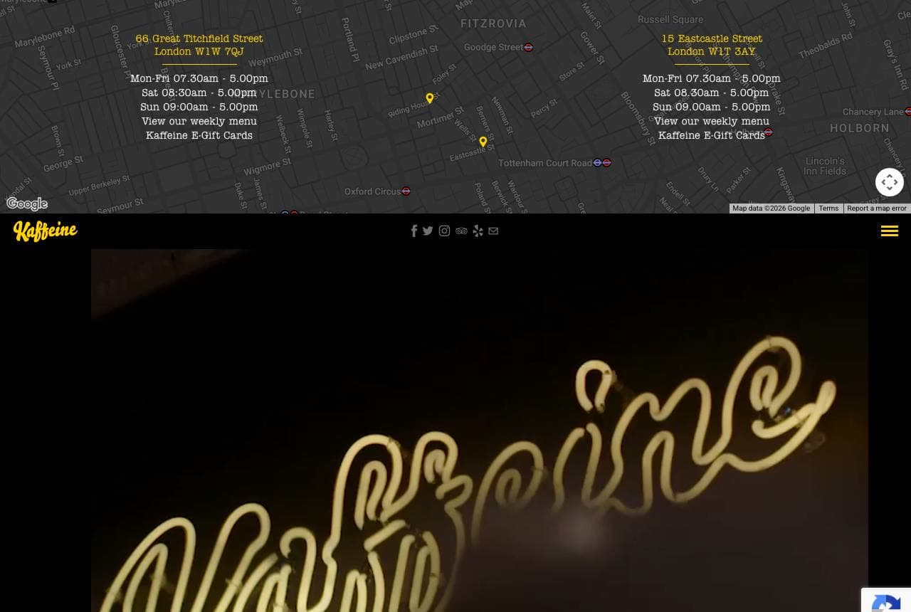
Kaffeine: A neon sign doing all the branding

Kaffeine leads with a video of its own neon sign — the cursive 'Kaffeine' glowing gold against a dark wall — and almost nothing else above the fold except two locations' opening hours in tiny type. It's a bold inversion: hours and address, the boring operational facts, get equal billing with the brand because for a neighbourhood coffee bar those ARE the conversion (am I near it, is it open). The motion of the neon gives the page life without a slideshow of flat whites, and the mustard-yellow footer picks up the sign's warmth. For a small independent whose whole identity lives in one great sign, filming that sign is a smarter hero than any stock coffee photo could ever be.

  • Films its own neon sign — motion without a slideshow
  • Hours + address given hero billing (the real conversion)
  • Mustard footer echoes the sign; one warm note repeated
Cafe Gandolfi website — Heritage Café design example
Real site · Glasgow, UK
  • Heritage Café
  • Established
  • Green + cream

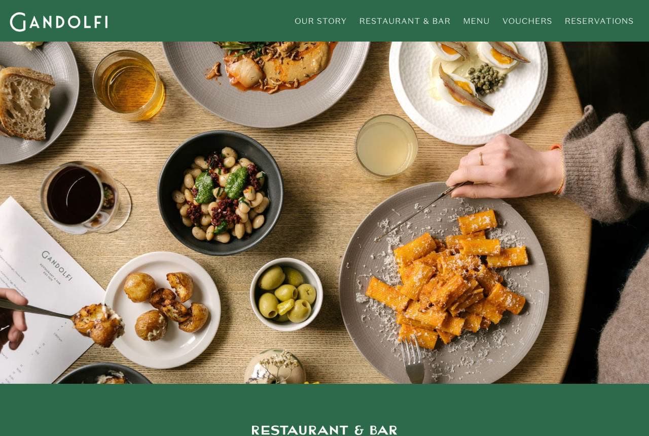
Cafe Gandolfi: Forty years of institution, tastefully worn

Cafe Gandolfi anchors on heritage — 'one of Glasgow's oldest family-run restaurants… EST 1979' — and lets an overhead spread of small plates carry the appetite while a forest-green palette carries the age. The design is confident enough to talk about furniture: the copy name-checks its Tim Stead artisan tables and its 'patronage of artists,' details that turn a café into a cultural institution with a story worth visiting for. That's the heritage café's advantage — decades of specificity a new opening simply can't manufacture — and the site spends it well, leading with the founding year and the local reputation rather than today's flat white. When you have forty years, the design job is to wear them like a good coat.

  • 'EST 1979' + local-institution copy sells time itself
  • Name-checking the Tim Stead furniture adds cultural weight
  • Forest green reads aged and warm, not dated
Lemon Jelly Café website — All-Day Breakfast design example
Real site · Dublin, IE
  • All-Day Breakfast
  • Cheerful
  • Yellow + white

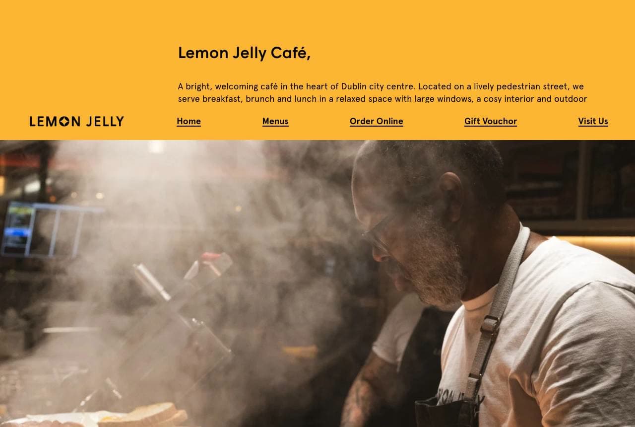
Lemon Jelly Café: Sunshine yellow and a sizzling griddle

Lemon Jelly Café makes its name a color and its color a mood: a bright lemon-yellow header, a cheerful wordmark, and then a hero photograph of a chef at a steaming griddle, eggs and toast in the foreground, that practically smells like breakfast. The copy is all warmth and utility — 'a bright, welcoming café in the heart of Dublin,' breakfast served all day, two clear menus — and the action row (Menus, Order Online, Gift Voucher, Visit Us) covers every intent a hungry local arrives with. It's unpretentious in the best way: the yellow signals happy, the griddle signals real cooking, and nothing gets between the visitor and 'where do I click to eat.' Owning a color is free brand equity most cafés leave on the table.

  • The name is a color; the site commits to it fully
  • Steaming-griddle photo sells the smell of breakfast
  • Four-button action row meets every arriving intent
Breka Bakery & Café website — Bakery Café design example
Real site · Vancouver, BC
  • Bakery Café
  • Warm
  • Tan + cream

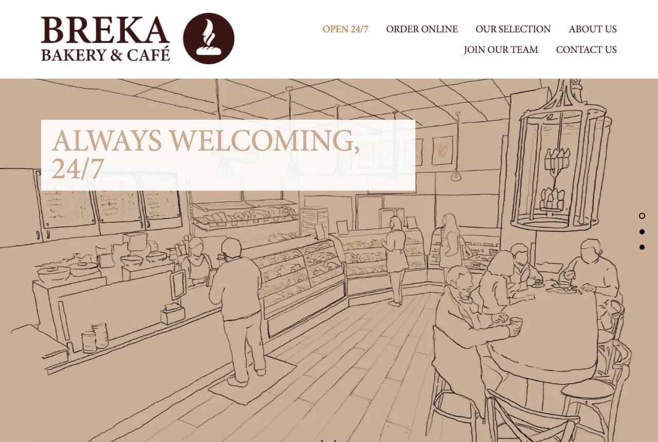
Breka Bakery & Café: Hand-drawn warmth for a 24/7 promise

Breka Bakery & Café renders its hero as a warm pen-and-ink illustration of the café interior rather than a photo, with 'Always Welcoming, 24/7' hand-set over it — and the drawn style does something a photograph can't: it makes a multi-location chain feel like a single hand-made neighbourhood spot. The tan-and-cream palette is soft and bakery-warm, the '24/7' is the genuine differentiator (a café that never closes owns the 2am student and the night-shift nurse), and the grand-opening block below keeps the brand feeling like it's growing with the community. Illustration as a brand system is a smart hedge against the sameness of stock café photography; drawn once, it applies everywhere and ages far more slowly.

  • Illustrated hero makes a chain feel hand-made and single
  • '24/7' is the real differentiator, stated as the promise
  • A drawn brand system dodges stock-photo sameness
Coffee Barker website — All-Day Café design example
Real site · Cardiff, UK
  • All-Day Café
  • Elegant
  • Amber + cream

Coffee Barker: Serif elegance over a warm-lit room

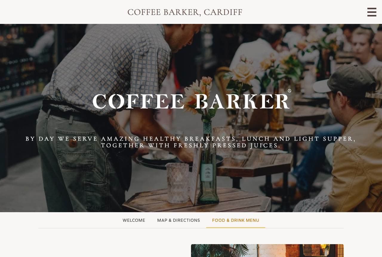
Coffee Barker sets an elegant white serif — 'COFFEE BARKER' — over a warm, amber-lit photo of its own busy room, with the location ('Coffee Barker, Cardiff') stamped small above like a boutique label. The single line beneath does efficient work: 'by day we serve amazing healthy breakfasts, lunch and light supper, together with freshly pressed juices' tells you the daypart range in one breath. Then an all-day positioning statement — 'open seven days a week, from morning through until late at night' — claims the whole clock. The serif-over-photography treatment reads more upscale bistro than corner café, nudging the price expectation up, and the interior shot sells the atmosphere that makes people stay for a second cup.

  • Serif-over-interior reads upscale bistro, lifts price expectation
  • One line establishes the full daypart range
  • Its own warm-lit room sells the reason to linger
On The Grind Cafe website — Coffee Lounge design example
Real site · United States
  • Coffee Lounge
  • Cozy

On The Grind Cafe: 'But first, coffee' in neon, on a couch

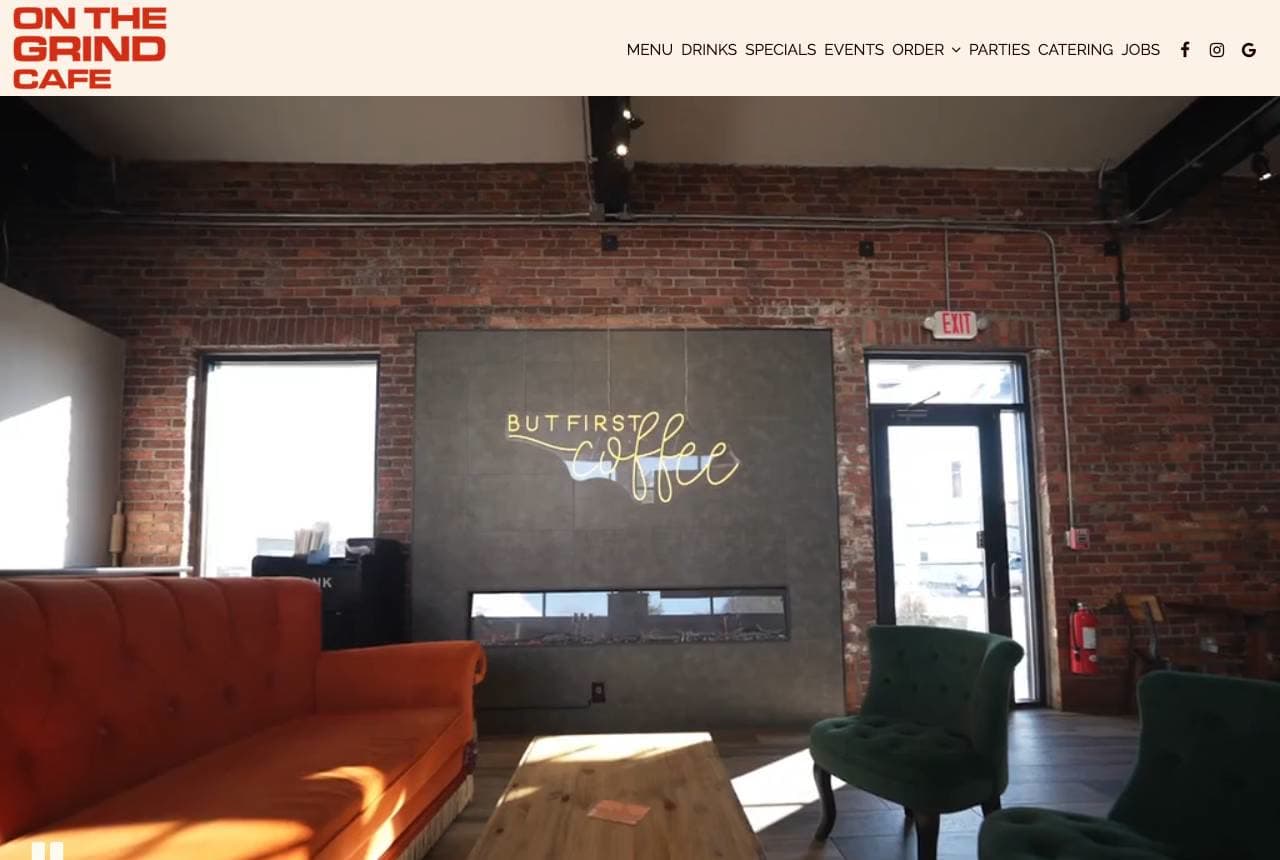
On The Grind Cafe leads with a photograph of its actual lounge — burnt-orange sofa, emerald armchair, exposed brick — with a 'but first coffee' neon sign glowing on the wall, then greets you in plain terms: 'Welcome to On The Grind Cafe: Fast, Fresh, & Friendly.' The whole page sells hangout over transaction; the furniture is the pitch, telling students and remote workers this is a place to stay, not a grab-and-go window. The peach-cream section behind the welcome line keeps it cozy, and a broad nav (Menu, Drinks, Specials, Events, Catering, Jobs) signals a community hub rather than a coffee counter. When your edge is atmosphere, photograph the seat you want people to sink into.

The Loveless Cafe website — Southern Institution design example
Real site · Nashville, TN
  • Southern Institution
  • Nostalgic

The Loveless Cafe: Red gingham and biscuits since 1951

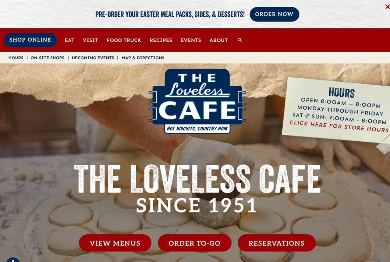
The Loveless Cafe wears its seventy years like a checkered tablecloth — literally: red-and-white gingham frames a hero of hands rolling out biscuit dough, 'THE LOVELESS CAFE, SINCE 1951' stamped across it, with menu, order and reservation buttons in matching barn-red. Below, a 'Menu Favorites' row photographs the country ham, fried chicken and pulled pork like signed portraits. Everything commits to the Southern-roadside-institution fantasy — the gingham, the vintage sign-painting, the hot-biscuits close-up — because that heritage IS the destination; people drive out of their way for it. The retail nav (Shop Online, Food Truck, Recipes) shows how a beloved café extends its brand into products the visit alone can't scale. Own your era, decorate to it.

Halstead & Crow Coffee — Neighborhood Café website design you can build with Zarla
Build this with Zarla
  • Neighborhood Café
  • Warm

Halstead & Crow Coffee: The morning ritual, immersively shot

Halstead & Crow is Zarla's café template, and its immersive-food hero opens on exactly the register this gallery keeps rewarding: 'Where Every Morning Begins — Coffee Shop in Charleston, SC,' set over full-bleed warm imagery in a mulberry-and-terracotta palette that reads cozy and grown-up rather than cutesy. Café customers decide on atmosphere and appetite, so an immersive photo-led hero is the right structure — the same instinct behind Coffee Barker's warm room and Lemon Jelly's griddle. Beneath, the layout carries a menu, an about-the-café story, a section on the back porch, and the hours-and-location details a local actually needs. Swap in your own room and beans and you have a café site with real warmth in about 30 seconds — no photographer or designer required.

See this template

Frequently asked

Where can I find good coffee shop website examples?

Right here — this page curates coffee shop website examples two ways: standout real businesses (each linked, so you can explore the live site) and professionally designed Zarla templates you can clone and make your own. Every example comes with a note on why the design works — trust signals, layout, calls to action — so you can copy the move, not just the look.

What makes a good coffee shop website?

A good coffee shop website earns trust in the first few seconds, leads with strong visuals of the work, gives visitors one obvious action, and loads fast on a phone. Every design below leads with proof and a single clear call to action rather than a wall of text.

How much does a coffee shop website cost?

A custom coffee shop website from a designer typically runs into the thousands up front, and template builders charge roughly $16–$30 per month. An AI builder generates a complete, editable design for free and only charges (on the Premium plan) when you publish to your own domain — so you can build and preview before spending anything.

Do I need a designer to build a coffee shop website?

No. Several designs on this page were generated by Zarla and are fully editable — you describe your business and get a complete, professionally designed site in about 30 seconds, then refine it by chatting. Building and previewing is free; publishing to your own domain needs the Premium plan.

What pages does a coffee shop website need?

Most coffee shop businesses need just a few: a home page that proves trust and points to one clear action, an about page that puts a face to the business, a services or work page that shows what you do, and a contact page with a form and a phone number. Local businesses also benefit from location or service-area pages that help them show up in nearby searches.

How do I get more customers from my coffee shop website?

Lead with proof in the first few seconds (reviews, real photos, results), make one action obvious on every screen (call, book, or enquire), and keep it fast on mobile — most visitors arrive on a phone. The designs above each do this differently, but they all earn trust early and remove friction from the next step.

You've seen what works. Now make it yours.

Describe your business and Zarla designs a complete, professional website in about 30 seconds — built to convert, just like the ones above.

Free to build and preview · no credit card · publish to your own domain on Premium