Inspiration · Car Detailing

The Best Car Detailing Website Examples, Explained

Car detailing websites have one job before anything else: make a car owner believe you'll treat their vehicle better than anyone else — then make booking effortless. These are some of the best car detailing website designs we could find — a mix of standout real detailers, ceramic and PPF studios, and mobile and express services, plus designs you can build with Zarla — and we break down the specific move that makes each one win bookings. Look for the patterns that repeat: dark themes that make paintwork gleam, transparent pricing that kills 'call for a quote,' and proof (reviews, the brands they service, real results). Then make any of the Zarla designs yours, free, in about 30 seconds.

Real sites + designs you can build with Zarla — free to build and preview, no credit card

What makes a great car detailing website

The best car detailing sites share a few moves: they lead with a dark, high-contrast theme that makes reflections and paintwork pop, they prove credibility fast (Google ratings, customer avatars, the calibre of cars they service), they remove the 'call for a quote' friction with transparent or productised pricing, and they make one action obvious — book online, get a quote, or call. Whether it's a concours studio or a $50 express wash, the design's job is to make the work look flawless and the booking feel easy. Each example below calls out the specific choice worth stealing for your own car detailing website.

Hyer Quality Detail website — Luxury Detailing design example
Real site
  • Luxury Detailing
  • Premium
  • Dark + teal

Hyer Quality Detail: A triptych hero that sells detailing as art

Hyer Quality Detail opens with the most striking hero in this gallery — a three-panel triptych labelled 'Refine · Protect · Enhance,' each a full-bleed close-up of detail work, so the studio's three service pillars register before you read a word. The dark theme makes every reflection pop, and the copy treats detailing as automotive art rather than a wash: an award wall (XPEL Dealer of the Year), a 10,000 sq ft climate-controlled facility with a luxury lounge, and an 'Omakase' concierge tier borrowed from fine dining ('we leave it to your care'). It even sells the waiting experience. The lesson for any premium detailer: position the work as craftsmanship and sell the whole experience, and the price stops being the conversation.

  • A triptych hero states three service pillars in one glance
  • Awards + a described facility sell craftsmanship, not a wash
  • An 'Omakase' concierge tier makes premium feel exclusive

Steal this: Sell the experience and the craft — not the wash — and price stops being the conversation.

Best Luxury Detailing website — Mobile Detailing design example
Real site · Sydney, AU
  • Mobile Detailing
  • Bold
  • Black + red

Best Luxury Detailing: Let the cars you service signal your caliber

Best Luxury Detailing leads with a tight close-up of a Porsche wheel on a black-and-red theme, then runs a scrolling marquee of the marques it services — Ferrari, Lamborghini, Lexus, Volvo. That logo strip does positioning work no adjective could: it says 'owners of cars like these trust us' without ever claiming 'premium' outright. Above it sits a '5.0 — trusted by 500+ customers' bar with a stack of real customer-avatar photos, so faces carry the social proof faster than a number would. A 20%-off-first-detail offer and an inline quote form (with a photo-upload field for an accurate estimate) keep the page relentlessly conversion-focused. The takeaway: the brands you work on are themselves a credibility signal — show them.

  • A luxury brand-logo marquee signals caliber without saying 'premium'
  • Customer-avatar stacks make social proof feel human
  • A photo-upload quote form earns more accurate leads
Marque Auto Atelier — Exotic & Collector website design you can build with Zarla
Build this with Zarla
  • Exotic & Collector
  • Elegant
  • Dark + amber

Marque Auto Atelier: Scarcity, styled — one car at a time

Marque Auto Atelier is Zarla's exotic-and-collector template, and it sells through restraint. A dark hero pairs the line 'Detailing Worthy of the Marque' with a single orange classic exotic framed like a gallery piece, and the proof points are deliberately scarce rather than loud: 'Miami · by appointment,' 'one car at a time,' 'enclosed white-glove pickup,' '14 years concours.' A masonry portfolio does the rest. For a concours or collector detailer, that exclusivity IS the product — turning customers away is the flex. The whole layout is portfolio-led, not conversion-led, because the buyer of a six-figure car isn't comparison-shopping on price. Describe your shop and you can build this appointment-only, gallery-grade site, fully editable, in about 30 seconds.

  • By-appointment + 'one car at a time' makes scarcity the selling point
  • A masonry portfolio suits buyers who judge by past work
  • Portfolio-led, not conversion-led, fits a price-insensitive buyer
See this template
WOW Auto Spa website — Auto Spa design example
Real site · Phoenix, AZ
  • Auto Spa
  • Warm
  • Red + gold

WOW Auto Spa: Approachable beats intimidating for a local wash

WOW Auto Spa is the warm counterpoint to all the dark luxury studios, and it proves you don't need 15 sections or a moody theme to convert. A red-and-gold palette with serif headings feels friendly rather than exclusive, the hero uses the actual storefront photo (so visitors recognise the place) instead of a car close-up, and a '150+ 5-star reviews on Google' badge sits right above the fold. The whole site is about nine sections — value props, a work carousel, four services, three city-attributed testimonials — and the closing CTA is refreshingly concrete: 'Call now & save up to $50,' with landmark wayfinding ('behind Big O Tires'). For a family-owned local wash, that approachability and specificity is the edge.

  • A storefront-photo hero makes a local business instantly recognisable
  • A specific '$50 off' CTA beats a generic 'contact us'
  • About nine tight sections convert without overwhelming

Steal this: Friendly and compact can out-convert polished and exhaustive — don't over-build.

Sydney Detail Studio website — Ceramic & PPF design example
Real site · Sydney, AU
  • Ceramic & PPF
  • Modern
  • Dark + cyan

Sydney Detail Studio: Sell detailing packages like products

Sydney Detail Studio does the boldest structural thing in this gallery: it turns a service business into a shop. On a dark, cyan-accented theme, the hero goes straight to 'View All Packages,' and a carousel of seven priced packages (Ceramic Paint Protection $1,099, PPF Full Front $2,300, Full Detail $400…) each lists warranty, coating brand, and inclusions with a 'Buy Now — pay 20% deposit to book' button wired to checkout. Customers comparison-shop and commit a deposit without ever calling. A categorised FAQ split into Ceramic and PPF columns and a live-chat widget with the owner's actual face round it out. The lesson: transparent, productised pricing plus a low-deposit booking removes the single biggest friction point in detailing.

  • Productised, priced packages let customers comparison-shop themselves
  • A 20% deposit lowers the barrier to commit vs full payment
  • A categorised FAQ beats one long list for multi-service shops

Steal this: Productise your services with real prices and a small deposit — kill 'call for a quote.'

Detail Mavericks ATX website — Mobile Detailing design example
Real site · Austin, TX
  • Mobile Detailing
  • Bold
  • Black + red

Detail Mavericks ATX: Full transparent pricing, by vehicle size

Detail Mavericks ATX puts its entire price list on the homepage — a rare, confident move in a category that usually hides behind 'call for a quote.' Ten packages across five categories (hand wash, interior, exterior, paint correction, ceramic) each show three price points by vehicle size (coupe / sedan / large SUV), so a visitor answers 'how much?' in seconds without a form. A branded service van anchors the hero (signalling 'we come to you'), an avatar stack carries the reviews, and an add-ons grid (pet hair, engine bay, headlight restoration) quietly upsells. On a black-and-red conversion theme, every section ends in 'Schedule.' The takeaway: full transparent, vehicle-size pricing builds trust and pre-qualifies leads before they ever reach out.

  • Vehicle-size price tiers answer 'how much?' with zero friction
  • A branded van hero signals a come-to-you mobile service
  • An add-ons grid upsells without cluttering the core packages
Royal Auto Finishes website — PPF & Coatings design example
Real site · Austin, TX
  • PPF & Coatings
  • Industrial

Royal Auto Finishes: A hazard-stripe identity that owns 'automotive'

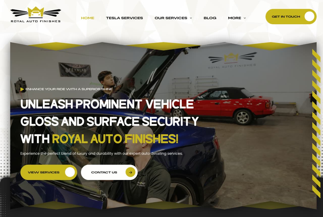
Royal Auto Finishes builds a distinctive look from one detail: yellow diagonal hazard stripes, the visual language of garages and caution tape, used as section dividers across a dark theme. It instantly reads 'automotive' without a single car photo doing the work. The About section is the other smart move — instead of opening with a company description, it leads with a five-star customer testimonial and a Google badge, so social proof comes before self-promotion. An embedded Instagram feed (3.1k followers) and a YouTube clip stress-testing their paint protection film prove the work is real and ongoing, and a dedicated 'Tesla Services' nav item targets a high-value segment. The lesson: one repeated graphic motif can carry a whole brand identity.

FastLane Express Detail — Express Detailing website design you can build with Zarla
Build this with Zarla
  • Express Detailing
  • Playful

FastLane Express Detail: A bright, fast pitch built on convenience

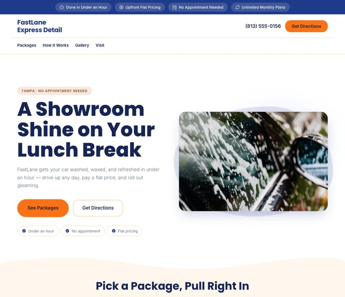
FastLane Express Detail is Zarla's express template, and it's the bright, friendly opposite of the dark detailing studios — proof the category isn't only luxury. The hero promises 'A showroom shine on your lunch break' on a clean cream layout, and a green trust strip stacks the four things an express customer actually cares about: done in under an hour, upfront flat pricing, no appointment needed, unlimited monthly plans. Flat-price packages and a 'Get Directions' CTA (not a quote form) match the drive-up model — speed and certainty over bespoke consultation. The whole mood says fast and painless. For a high-volume express wash, leading with convenience and a flat price — not craftsmanship — is exactly the right pitch. Build it in about 30 seconds.

See this template
A-Plus Tint & PPF website — Tint & PPF design example
Real site · Forest Hill, MD
  • Tint & PPF
  • Bold

A-Plus Tint & PPF: Remove the objection before it forms

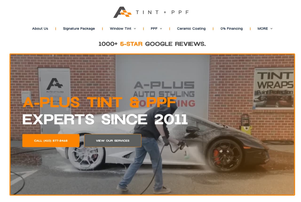
A-Plus Tint & PPF turns its navigation into an objection-handling machine. Alongside the services sit dedicated nav items for '0% financing,' 'free loaner vehicle,' and a 'hero discount' for military and first responders — so the three things that stop a customer (cost, the inconvenience of being without a car, 'is there a deal?') are answered before they're even asked. An orange-on-dark theme with diagonal stripe accents gives it an energetic, industrial feel, and a standalone '1000+ 5-star Google reviews' headline above the hero is trust at a scale most shops can't claim. An aggressive footer of city-and-service SEO pages backs the local reach. The lesson: put your strongest objection-killers in the nav, not buried in a footer.

Ceramic Coat Texas website — Ceramic Coating design example
Real site · Austin, TX
  • Ceramic Coating
  • Modern

Ceramic Coat Texas: A hero that demonstrates the product

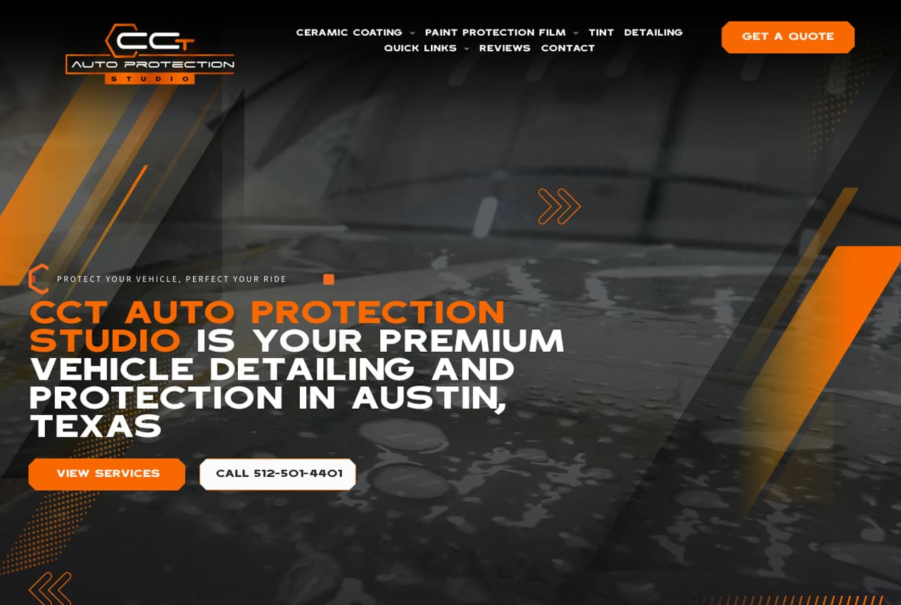
Ceramic Coat Texas leads with the single most on-message hero a coating studio could pick — an extreme close-up of water beading on a freshly coated panel, the literal proof of what ceramic does, on a black-and-orange theme. The product sells itself before any copy. Recurring orange chevron arrows act as a brand motif pulling the eye down the page, a six-tile service grid (PPF, matte PPF, color-change PPF, ceramic, paint correction, tint) covers the range compactly, and dedicated 'Tesla Ceramic' and 'Tesla PPF' nav items court a high-value niche. Honest positioning, too — 'established 2018' rather than a fake heritage claim. The takeaway: when your service has a visible result, make that result the hero image and let it do the arguing.

Sage & Steam Detailing — Eco Detailing website design you can build with Zarla
Build this with Zarla
  • Eco Detailing
  • Calm

Sage & Steam Detailing: When your values are the differentiator

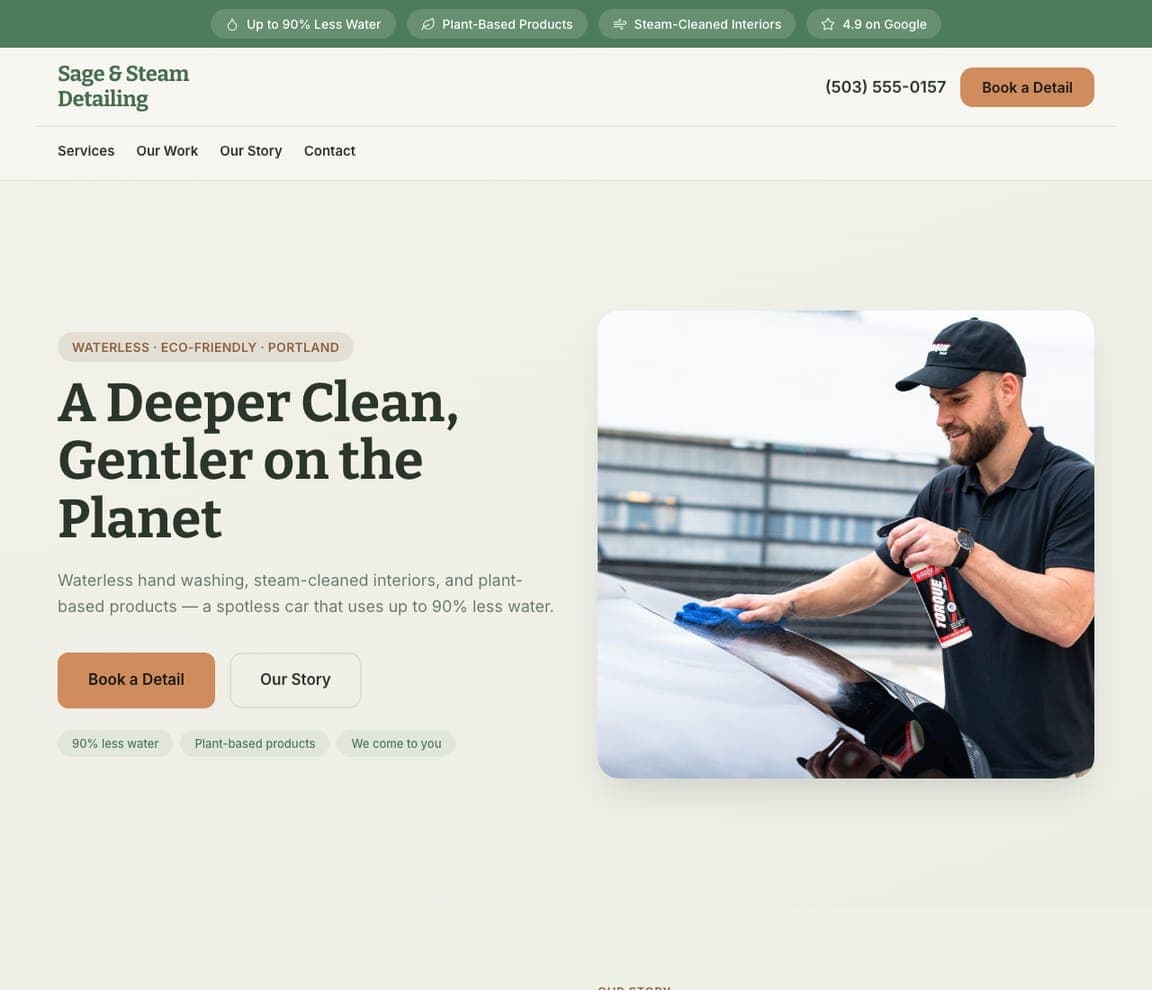
Sage & Steam Detailing is Zarla's eco-and-waterless template, and it shows a detailer can win on values instead of gloss. A warm sage-and-cream palette — calm, planty, the opposite of dark-luxury — embodies the message before you read it, and the hero says it plainly: 'A deeper clean, gentler on the planet,' backed by concrete proof (waterless hand washing, steam-cleaned interiors, plant-based products, 'up to 90% less water'). A story-led layout with a portrait-calm hero and an 'Our Story' CTA sells the mission, not just the service. For the eco-conscious customer who'd feel guilty about 50 gallons down the drain, that positioning is the whole sale. The lesson: when your difference is values, let the palette and copy live them. Buildable in about 30 seconds.

See this template
Donavon's Auto Detailing website — Mobile Detailing design example
Real site · Kyle, TX
  • Mobile Detailing
  • Trustworthy

Donavon's Auto Detailing: Risk reversal that out-promises the field

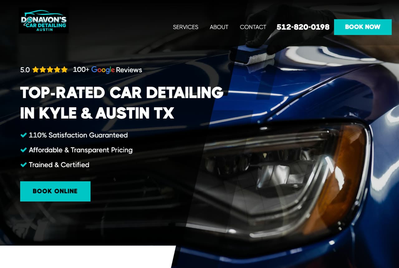
Donavon's Auto Detailing wins on risk reversal. The hero stacks three checkmark promises — '110% satisfaction guaranteed,' 'transparent pricing,' 'trained & certified' — over a blue-tinted headlight close-up on a navy-and-teal theme, and that 110% figure is a deliberate, slightly playful overpromise that says 'we'll go further than anyone.' Below, the page serves two buyer types at once: a simple three-step 'How It Works' for skimmers, and a long-form 'Our Detailing Process' article for researchers who want every step. Transparent 'starting at' package pricing and an eco-friendly steam option ('two gallons of water, not fifty') round it out. The lesson: a bold guarantee plus genuinely transparent pricing removes the fear of being overcharged — the quiet thing that stops most detailing bookings.

Ironside Fleet Detailing — Fleet Detailing website design you can build with Zarla
Build this with Zarla
  • Fleet Detailing
  • B2B

Ironside Fleet Detailing: Road-ready every week, one invoice

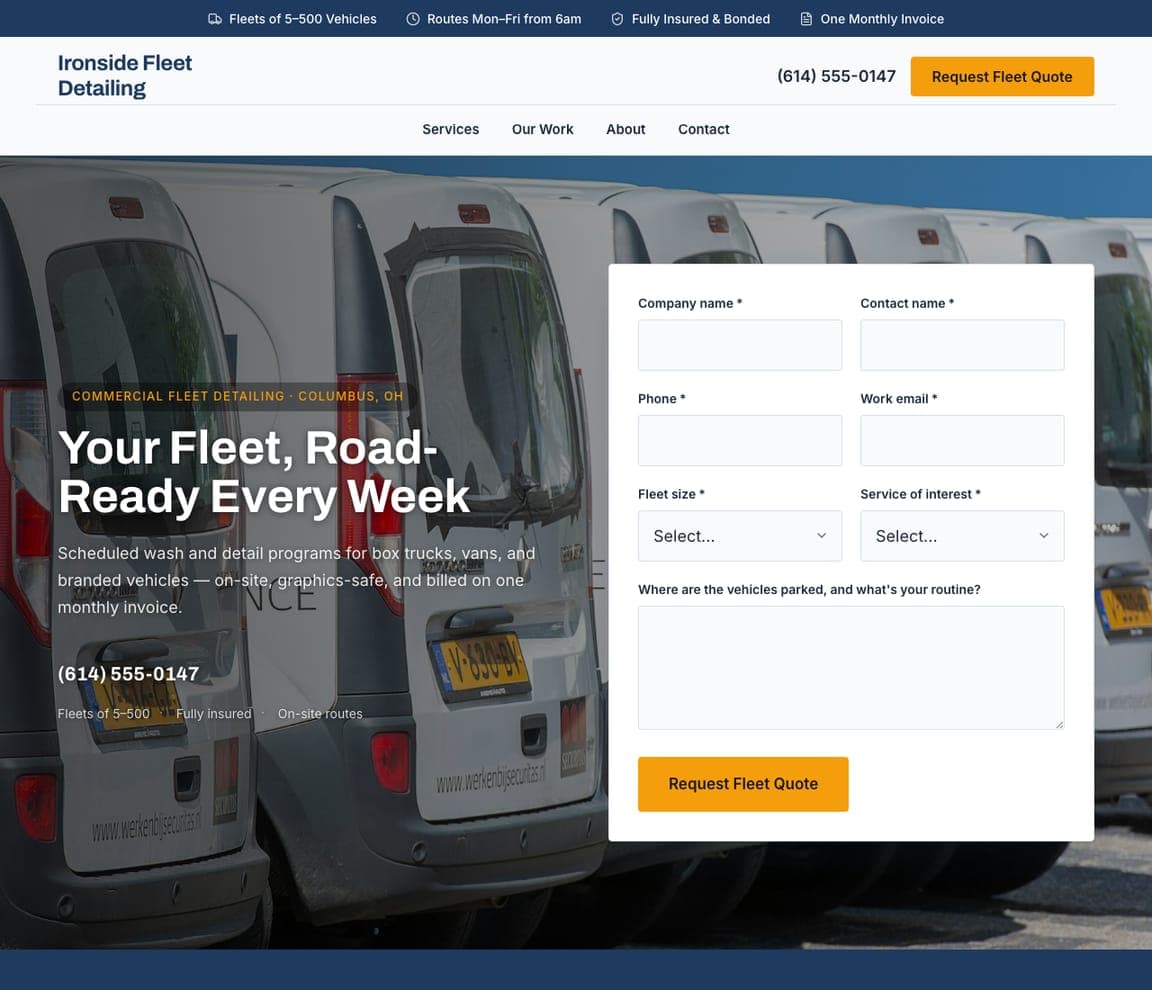
Ironside Fleet Detailing points the trade at businesses, not car lovers: 'Your Fleet, Road-Ready Every Week — Commercial Fleet Detailing in Columbus, OH,' over a row of white work vans, offering 'scheduled wash and detail programs for box trucks, vans, and branded vehicles — on-site, graphics-safe, and billed on one monthly invoice.' Every phrase serves the fleet manager: 'graphics-safe' protects the wraps that ARE the company's advertising, 'routes Mon-Fri from 6am' fits around operations, and 'one monthly invoice' fits procurement. The quote form asks fleet size (5-500) and where the vehicles park — the actual variables of the job. A dirty branded van undoes the marketing it carries, which is the entire pitch. For a detailer, fleet contracts are scheduled, recurring B2B revenue — one client, hundreds of washes — a steadier business than one shiny car at a time.

See this template
Shinepass Auto — Detailing Membership website design you can build with Zarla
Build this with Zarla
  • Detailing Membership
  • Modern

Shinepass Auto: An always-clean car, on a monthly plan

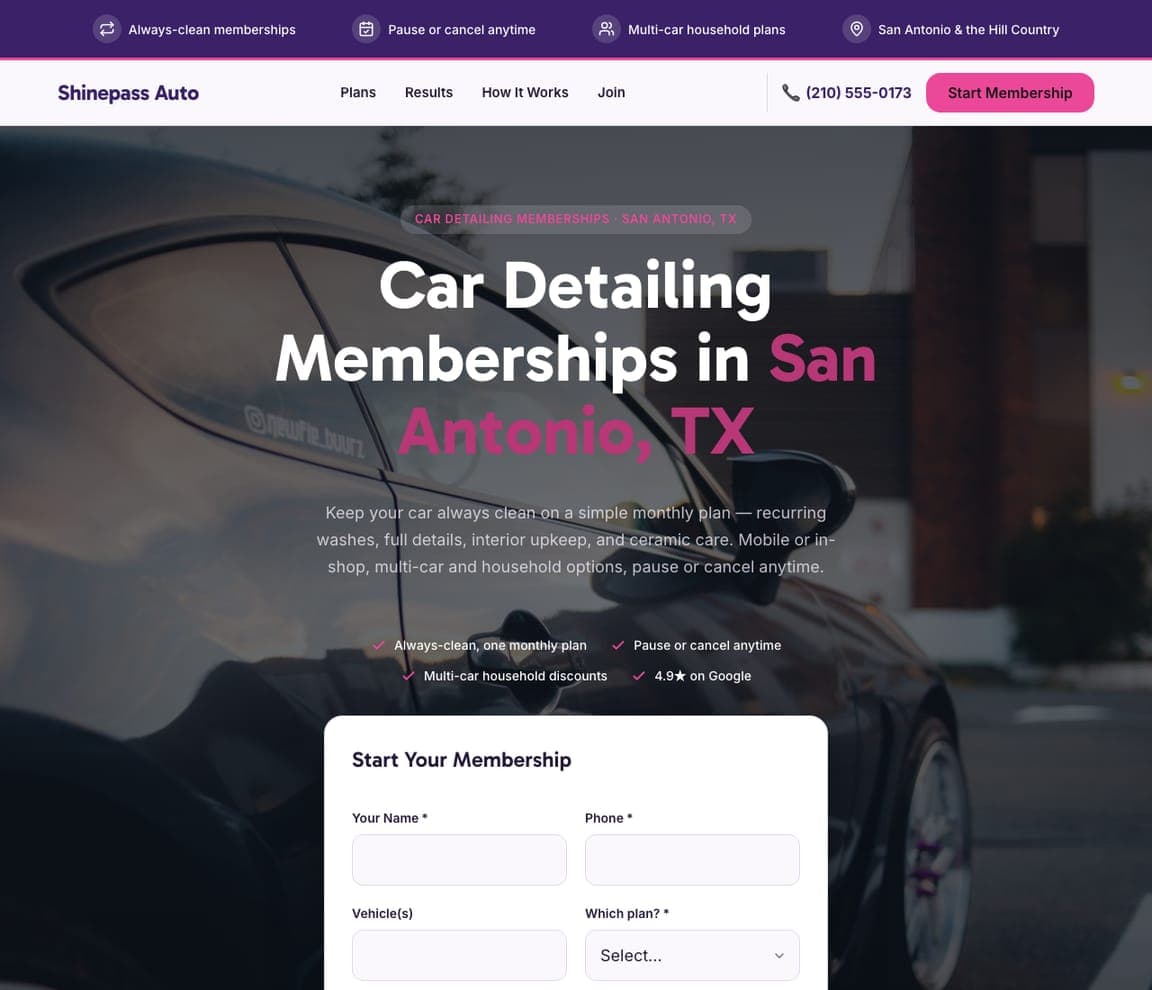
Shinepass Auto sells detailing the way gyms sell fitness: 'Car Detailing Memberships in San Antonio, TX' — 'San Antonio' in hot magenta on a dark hero — with 'keep your car always clean on a simple monthly plan… recurring washes, full details, interior upkeep, and ceramic care, pause or cancel anytime,' and a 'Start Your Membership' form asking which vehicles and which plan. The membership reframe changes what's being bought: not a wash, but the permanent state of a clean car — and multi-car household plans quietly grow the ticket. 'Pause or cancel anytime' removes the commitment fear that kills subscriptions. It's the recurring-revenue model Tidy Club runs for homes, applied to cars, and the bold magenta-on-dark design feels like a modern consumer brand, not a garage. For a detailer, members mean predictable monthly income and a full calendar — the two things one-off bookings never give you.

See this template
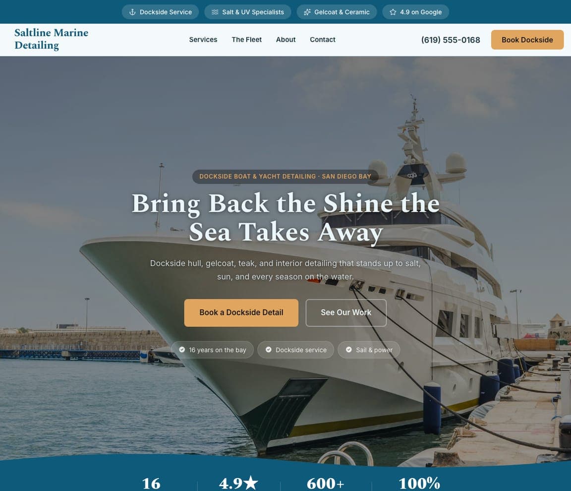
Saltline Marine Detailing — Marine & Boat website design you can build with Zarla
Build this with Zarla
  • Marine & Boat
  • Coastal

Saltline Marine Detailing: The shine the sea takes away

Saltline Marine Detailing takes the craft to the water: 'Bring Back the Shine the Sea Takes Away — Dockside Boat & Yacht Detailing, San Diego Bay,' over a gleaming yacht at its slip, offering 'dockside hull, gelcoat, teak, and interior detailing that stands up to salt, sun, and every season on the water.' The headline names the enemy — salt and UV genuinely eat boats in a way roads never touch cars — and the vocabulary (gelcoat, teak, hull) proves marine fluency the way 'terminal cleaning' proves Meridian's medical chops. 'Dockside' matters too: the service comes to the slip, because nobody trailers a yacht to a car wash. The coastal teal-and-sand palette belongs to the marina. For a detailer near the water, boats are a bigger-ticket, less-contested market than cars — speak the owner's language and meet them at the dock.

See this template

Frequently asked

What should a car detailing website include?

At minimum: high-contrast photos that make paintwork and reflections pop, a clear list of services and packages (ideally with prices), genuine reviews or a Google rating, an easy way to book or get a quote, and your service area or location. Notice how the designs below lead with strong imagery and one clear action — book, quote, or call — rather than burying the essentials in text.

What makes a good car detailing website design?

A good car detailing website makes the work look flawless and the booking feel effortless. Most lead with a dark, high-contrast theme because it makes paint, chrome, and water-beading shots gleam; they prove credibility fast with ratings and real results; and they kill the 'call for a quote' friction with transparent or packaged pricing. Every design on this page matches its look to how its customers decide — from concours luxury to a fast express wash.

How much does a car detailing website cost?

A custom car detailing website from a designer typically runs $2,000–$8,000 up front, and template builders like Wix or Squarespace charge roughly $16–$30 per month. An AI builder generates a complete, editable detailing site for free and only charges (on the Premium plan) when you publish to your own domain — so you can build and preview the whole thing, packages and gallery included, before spending anything.

Should I show detailing prices on my website?

Usually yes — and several designs above prove it converts. 'Call for a quote' is the biggest friction point in detailing; showing transparent packages (often tiered by vehicle size) or even a deposit-to-book option lets customers self-qualify and commit without a phone call. If your work is bespoke (concours, collector cars), a portfolio-and-consultation model fits better — but for mobile, express, and standard detailing, visible pricing wins more bookings than it loses.

What photos work best on a car detailing website?

Close-ups that show the result: water beading on a freshly coated panel, deep gloss and reflections, before-and-after interiors, and the calibre of cars you work on. A dark theme makes these images pop, which is why nearly every design above uses one. Real photos of your own work beat stock every time — they're proof, and a detailing buyer is buying proof that you'll make their car look flawless.

How do I get more bookings from my car detailing website?

Lead with proof in the first few seconds (a Google rating, customer faces, real before-and-afters), make pricing transparent so customers can self-qualify, and put one clear action on every screen — book online, get a quote, or call. Risk-reversal helps too: the detailers above with satisfaction guarantees and free re-cleans give nervous first-timers a reason to trust them over the shop down the road.

You've seen what works. Now make it yours.

Describe your business and Zarla designs a complete, professional website in about 30 seconds — built to convert, just like the ones above.

Free to build and preview · no credit card · publish to your own domain on Premium