Inspiration · Carpenter

The Best Carpenter Website Examples, Explained

Looking for carpenter website examples? These 14 are the strongest we found — Wade Brothers Carpentry's two brothers at the bench with the name in giant capitals, Moulder & Craft's black-and-white portrait and 'Inspired by Tradition', Ozer Custom Carpentry's ochre field of halftone tools — plus carpentry designs you can build with Zarla, each with a breakdown of the specific move that turns a 'carpenter near me' search into a call. A carpenter's website has to prove the hands before it lists the services, which is why the best ones here show a person, a piece or a workshop before they show a quote button. Find an approach you love and you can build a site in that spirit, free, in about 30 seconds.

Real sites + designs you can build with Zarla — free to build and preview, no credit card

What makes a great carpenter website

The best carpenter websites choose one of three heroes: the maker (Wade Brothers' two founders in plaid, Moulder & Craft's craftsman in a flat cap), the piece (Zonce Woodworking's live-edge slab with a bottle of wine, Hughes Woodworks' carved arched door, Young & Son's cedar slat ceiling with the architect credited under it), or the material itself (Bolt Woodworks' logo on a bed of shavings, Ozer's illustrated tools on ochre). Notice how few words they need — 'Where Wood Speaks', 'Inspired by Tradition', 'ARTISTRY, QUALITY, ORIGINAL DESIGN' — and how the ones that write more write to a specific buyer: Westbrook Carpentry & Millwork's 'three generations… historic windows' for period homes, Signature Finish Carpentry's 'Finished to protect your name' for builders. Every example below tells you who the carpenter is before it tells you what they charge.

Wade Brothers Carpentry website — Family Carpentry Shop design example
Real site
  • Family Carpentry Shop
  • Honest
  • Photo + white

Wade Brothers Carpentry: Two brothers at the bench, and the name in giant white over them

Wade Brothers Carpentry is the cover of this gallery because it does the simplest thing perfectly: the hero is a photograph of the two brothers in plaid shirts and red ear defenders at a workbench and mitre saw, a pegboard of tools behind them, and 'WADE BROTHERS CARPENTRY' set mid-frame, between the two men, in giant white capitals. The header is white and short — the blue logo, then HOME in orange, SERVICES, PROJECT GALLERY, CONTACT — and there is no button, no badge and no tagline in the first screen. Everything a customer wants to know is in the picture: it is a family business, they have a shop, they use real tools, and they look like people you'd let into your house. Clone the structure, not the photo — your own two people at your own bench, and the name big.

  • The founders at work as the entire hero
  • The business name as the only overlay copy
  • A four-item nav with 'PROJECT GALLERY' as the proof page

Steal this: Photograph the people who will do the work, in the shop, with the tools — then set the name over it in capitals and stop.

Visit Wade Brothers Carpentry

Opens a similar Zarla design you can make yours.

Moulder & Craft website — Custom Carpentry Studio design example
Real site · Portland, OR
  • Custom Carpentry Studio
  • Artisan
  • Black & white + blue

Moulder & Craft: A black-and-white craftsman in a flat cap, 'Inspired by Tradition' in blue serif

Moulder & Craft looks like a small-batch brand rather than a contractor. The white header carries a tiny 'M/C MOULDER & CRAFT CUSTOM CARPENTRY' mark and four words — Home, Projects, About, Contact — and the hero is a boxed black-and-white photograph of the craftsman himself in a flat cap and t-shirt, standing in his workshop with a pegboard of tools, a saw blade and window light behind him. The only words on the picture are 'Inspired by Tradition' in blue serif, bottom-right. No phone number, no button, no service list; the site trusts the portrait and the phrase to say 'custom, hand-made, one person accountable'. It works because the photograph is good and the restraint is total. Clone it if you are the craft — a single maker with a portfolio — and let the Projects page do the selling.

  • A monochrome portrait of the maker — editorial, not corporate
  • Three words of copy on the whole hero
  • 'Projects' second in a four-item nav: the portfolio is the pitch

Steal this: If you are a one-person craft business, one black-and-white portrait in the shop and a three-word line will position you above every 'licensed & insured' competitor.

Visit Moulder & Craft

Opens a similar Zarla design you can make yours.

Zonce Woodworking website — Live-Edge Furniture Maker design example
Real site · Clairemont, CA
  • Live-Edge Furniture Maker
  • Moody
  • Black + red

Zonce Woodworking: 'Where Wood Speaks' beside a live-edge slab and a bottle of wine

Zonce Woodworking styles its work like a product: on a black ground, the header sets a red 'Z' mark and 'ZONCE WOODWORKING' beside Home, Portfolio, Contact, About, and the hero is a boxed photograph of a live-edge slab meeting grey marble, dressed with a wine bottle, two glasses and a cutting board. Over the photo, a small 'BUILT IN STYLE' eyebrow, then 'Where Wood Speaks' in white condensed type with a rule beneath it, and the practical line — 'Clairemont, CA 92117 · Tel: 858-609-9554' — where a button would usually be. A strip of portfolio photographs begins at the fold. Three words and a styled shot do what paragraphs can't: they put the buyer at the table the maker built. Clone it for slab tables, bars and counters — anything a customer will photograph in their own home.

  • A styled product shot — wine, glasses, board — instead of a workshop
  • A three-word headline with a rule under it
  • The address and phone as the call to action, no button

Steal this: Style one finished piece the way a homeware brand would — props and all — and write three words over it.

Visit Zonce Woodworking

Opens a similar Zarla design you can make yours.

Westbrook Carpentry & Millwork website — Period Restoration Carpenter design example
Real site · Snohomish County, WA
  • Period Restoration Carpenter
  • Heritage
  • White + grey

Westbrook Carpentry & Millwork: 'Carpentry & Millwork' in serif beside a Victorian turret

Westbrook Carpentry & Millwork borrows the look of the houses it restores. The header is a blackletter 'Westbrook — BUILT TO WITHSTAND — Carpentry·Millwork' logo and a hamburger; the hero puts a photograph of a Victorian turret — white trim, grey shingles, a small balcony — on the right, and on the left an eyebrow, 'Period Architectural', over 'Carpentry & Millwork' in a serif. The paragraph is three sentences a heritage client wants: 'Dedicated to quality and craftsmanship for three generations. Master carpentry, fine millwork, and historic windows. Serving Snohomish County, King County, and NW Washington.' One outline button, 'LEARN MORE', and white space everywhere else. The typeface, the blackletter and the turret all say the same thing — old houses, done properly — which is why the site needs so few words. Clone it for restoration carpentry.

  • A serif headline and a blackletter logo: the type matches the houses
  • 'Three generations' and 'historic windows' — the two facts a period client checks
  • A turret photograph instead of a workshop or a tool

Opens a similar Zarla design you can make yours.

Bolt Woodworks website — Wood & Metal Workshop design example
Real site · Seattle, WA
  • Wood & Metal Workshop
  • Rugged
  • Photo + white

Bolt Woodworks: A diamond logo on a bed of wood shavings, four services as line icons

Bolt Woodworks makes a mark out of the mess: the hero is a close-up photograph of curled wood shavings, and centred on it is a white diamond logo — 'Bolt WOODWORKS · SEATTLE WA' with a row of pine trees — over the line 'Custom handcrafted wood & metalworks from the Pacific Northwest' and a row of Instagram, TikTok, Facebook and Pinterest icons. The header is dark, with a nav that includes INVENTORY and CARE alongside HOME, CUSTOM SERVICES, GALLERY, ABOUT and CONTACT, and a dark band at the fold spells out the four services as line icons: WOODWORK, METALWORK, LASER ENGRAVING, CNC MACHINING. Shavings are the trade's by-product and here they are the texture; the diamond does the branding; the four icons say the shop is more than a saw. Clone it for a maker who sells pieces from stock as well as commissions — 'INVENTORY' in the nav is the tell.

  • Wood shavings as the hero texture — the by-product as the brand
  • Four services as icons in one band: wood, metal, laser, CNC
  • 'INVENTORY' and 'CARE' in the nav — a shop, not just a service

Steal this: Photograph what your work leaves behind — shavings, sawdust, offcuts — and drop your logo on it; it's a texture no stock library has.

Visit Bolt Woodworks

Opens a similar Zarla design you can make yours.

Young & Son Woodworks website — Finish Carpentry Sub design example
Real site · Portland, OR
  • Finish Carpentry Sub
  • Architectural
  • Cream + orange

Young & Son Woodworks: A cedar slat ceiling with the architect credited under it

Young & Son Woodworks presents its finish carpentry the way an architecture magazine would. The cream header sets 'YOUNG & SON WOODWORKS' — the ampersand in orange — beside FINISH CARPENTRY, STAIRS, BUILT-IN CABINETRY, ABOUT and an orange 'CONTACT'. The hero is a boxed photograph of a modern room with a cedar slat wall and ceiling, a sputnik chandelier and a curved white sofa, with a second panel showing a walnut door, and under it a caption most trades never write: 'Architect: Giulietti Schouten Weber Architects | GC: Don Tankersley Construction | Credit: Ceiling and Slat Wall'. Below, two columns — 'Finish Carpentry, Stairs & Built-ins' and 'Young & Son Woodworks is a local carpentry company that specializes in finish carpentry, …'. Crediting the architect and the GC says you work on that tier of project, and 'Credit: Ceiling and Slat Wall' tells the reader exactly which part is yours. Clone it for a sub that wants architects as clients.

  • A photo caption that credits the architect and the GC
  • 'Credit: Ceiling and Slat Wall' — which part of the room is yours, stated
  • The three services as the nav: Finish Carpentry, Stairs, Built-In Cabinetry
Visit Young & Son Woodworks

Opens a similar Zarla design you can make yours.

Signature Finish Carpentry website — Finish Carpentry Subcontractor design example
Real site · St. Croix Valley, MN
  • Finish Carpentry Subcontractor
  • Premium

Signature Finish Carpentry: 'Finish carpentry built to your plans. Finished to protect your name.'

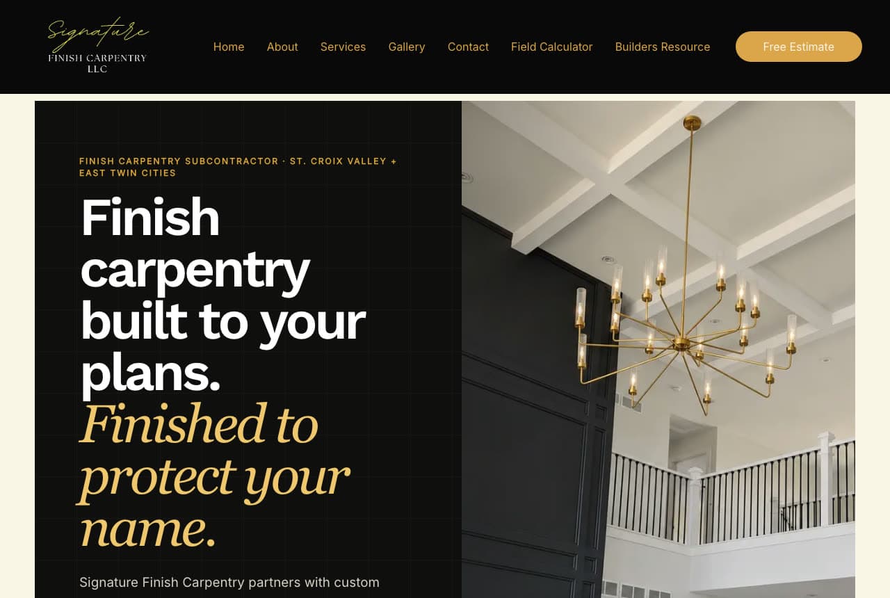
Signature Finish Carpentry writes to the builder, not the homeowner, and says so in the eyebrow: 'FINISH CARPENTRY SUBCONTRACTOR · ST. CROIX VALLEY + EAST TWIN CITIES' in gold tracked caps on a black panel. The headline is two sentences in two voices — 'Finish carpentry built to your plans.' in white bold, 'Finished to protect your name.' in gold italic serif — and the paragraph begins 'Signature Finish Carpentry partners with custom…'. The black header carries a gold script logo, a nav with Field Calculator and Builders Resource beside Home, About, Services, Gallery, Contact, and a gold pill, 'Free Estimate'. On the right, a photograph of a coffered ceiling with a brass chandelier over a black-wainscoted stair hall shows the standard. 'Protect your name' is the whole B2B pitch: the sub's finish is the builder's reputation. Clone it if your customers are contractors.

Visit Signature Finish Carpentry

Opens a similar Zarla design you can make yours.

Hughes Woodworks website — Custom Doors & Furniture design example
Real site · Montana
  • Custom Doors & Furniture
  • Artful

Hughes Woodworks: 'ARTISTRY, QUALITY, ORIGINAL DESIGN' over a carved arched door

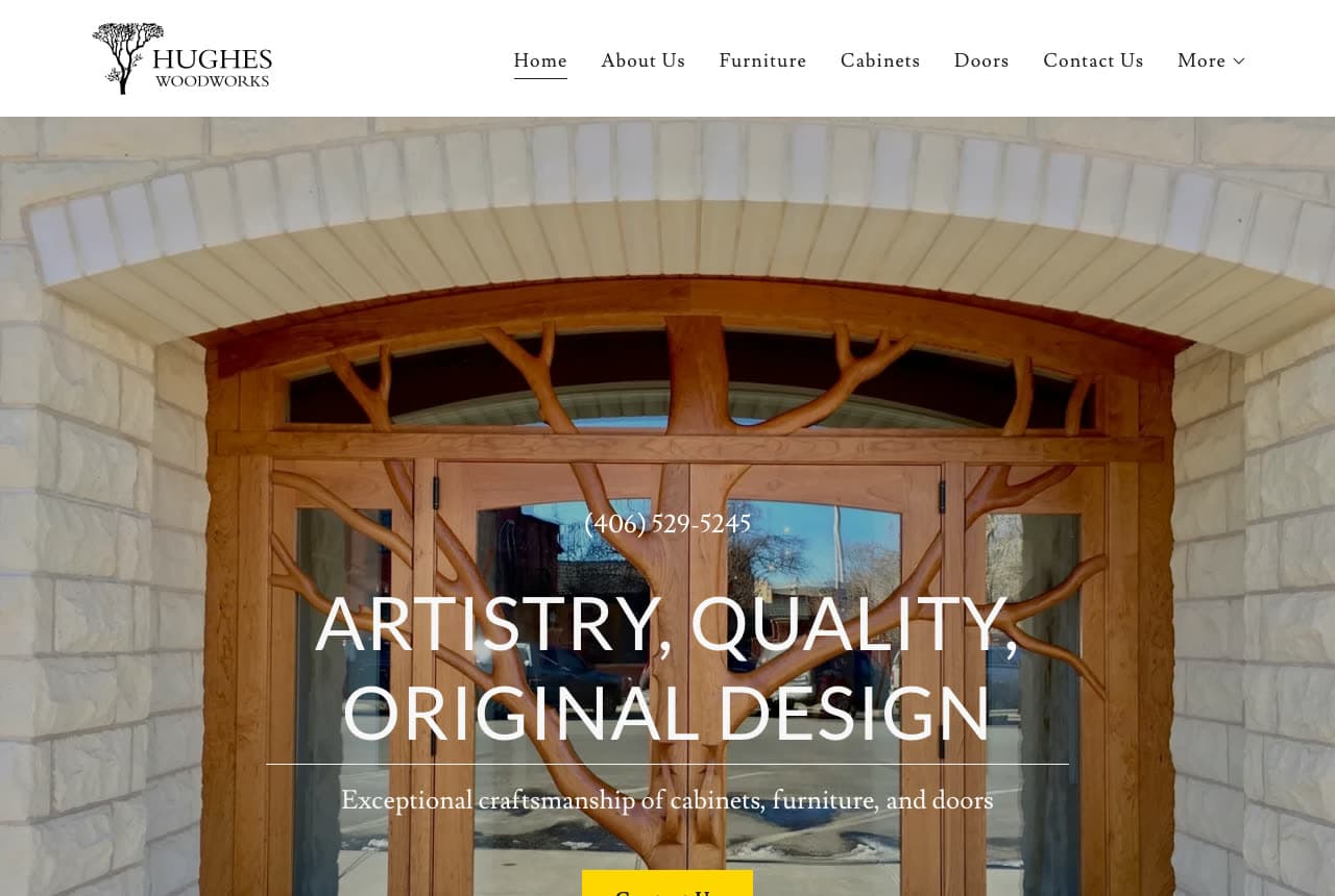
Hughes Woodworks leads with its most photogenic product: a custom arched wooden door with branch-like carved tracery, set in a stone wall, fills the hero. The white header pairs a tree logo with Home, About Us, Furniture, Cabinets, Doors, Contact Us and More, so the three product lines are the nav. Over the door, the phone number '(406) 529-5245' sits above a white line, 'ARTISTRY, QUALITY, ORIGINAL DESIGN', a rule, and 'Exceptional craftsmanship of cabinets, furniture, and doors'; a yellow button is cut by the fold. The lesson is the choice of image: not a kitchen, not a workshop, but the one piece a visitor can't stop looking at, with the three product words repeated in the nav and the subline so the search intent lands twice. Clone it for any maker whose best work is a single object.

Visit Hughes Woodworks

Opens a similar Zarla design you can make yours.

Ozer Custom Carpentry website — Design-Led Carpentry Studio design example
Real site
  • Design-Led Carpentry Studio
  • Playful

Ozer Custom Carpentry: An ochre field of halftone tools with a script 'Ozer' in the middle

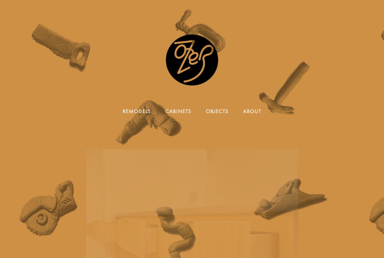
Ozer Custom Carpentry is the one site here with no photograph in the first screen and no headline either. The whole hero is a field of ochre — mustard yellow — scattered with halftone illustrations of tools: a handsaw, a drill, a hammer, two planes, a wrench. In the centre, a black circle carries a script 'Ozer', and under it four words in white capitals are the nav: REMODELS, CABINETS, OBJECTS, ABOUT. A kitchen photograph ghosts faintly through the ochre lower down. It reads like a hardware-store sign or a screen-printed tee, and that is the positioning: a maker with taste, whose 'OBJECTS' page is as important as the remodels. It is the riskiest design in the gallery and the most memorable. Clone the idea — a flat colour, an illustrated pattern of your tools, your name in a circle — if your customers buy from you because of how you see things.

Visit Ozer Custom Carpentry

Opens a similar Zarla design you can make yours.

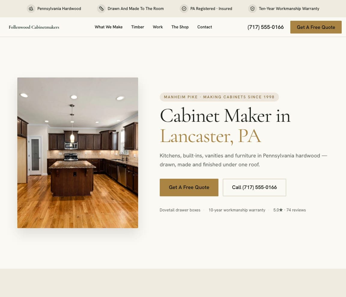
Alderline Millwork — Finish Carpentry Template website design you can build with Zarla
Build this with Zarla
  • Finish Carpentry Template
  • Considered

Alderline Millwork: 'Doors That Actually Latch' — the promise first, then the trade

Alderline Millwork is the Zarla finish-carpentry template, and it opens with the outcome a homeowner actually wants: 'Doors That Actually Latch — Interior Doors & Trim Carpentry in Eugene, OR', with the city in olive green and everything else in black slab serif on white. Above it a grey italic pill says 'EUGENE FINISH CARPENTRY · EST. 2011'; below it the paragraph explains the craft in one argument ('A door is about twenty per cent the slab and eighty per cent the opening it hangs in… the cheapest quote is usually the one that has not measured yet'), then a green 'Get A Free Measure' and an outline 'See Our Work'. The top strip carries four workshop facts — 'Every opening measured for square', 'Joints glued and pinned, not just caulked', the CCB number. Clone it and swap in the promise your customers repeat back to you.

See this template
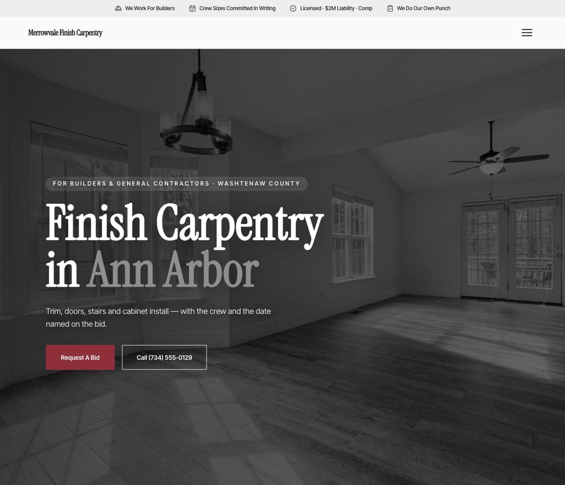
Redhollow Framing — Framing Subcontractor Template website design you can build with Zarla
Build this with Zarla
  • Framing Subcontractor Template
  • Direct

Redhollow Framing: '96% of Frames Handed Over on the Promised Date' in the top strip

Redhollow Framing is the Zarla framing-subcontractor template, and it sells schedule before craft: the black strip across the top reads '96% of Frames Handed Over on the Promised Date · 38 Carpenters, Six Crews, No Day Labour · CSLB C-5 #1078412 · Bonded · Workers' Comp · Labour-Only or Labour & Material'. The white header holds the wordmark, the phone and a dark-green 'Request a Bid', with a second nav row — Schedule, Scope, Hardware, Work, Contact — named for what a builder asks. The hero is a full-bleed photograph of a framed house under blue sky with 'Framing Contractor in Fresno, CA' in huge white sans, and a paragraph that says the quiet part: 'an on-time handover rate we publish because your schedule is the thing we're actually selling.' Clone it if you sell to builders, not homeowners.

See this template
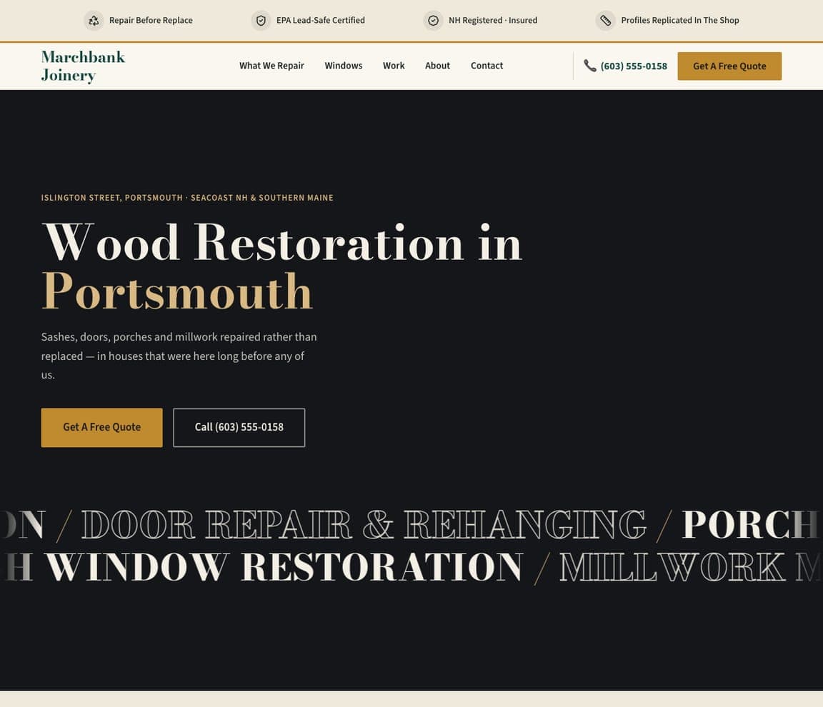
Wynstead Stairs — Stair Specialist Template website design you can build with Zarla
Build this with Zarla
  • Stair Specialist Template
  • Dramatic

Wynstead Stairs: Condensed serif on near-black, with the services scrolling underneath

Wynstead Stairs is the Zarla stair-and-railing template and the darkest design in this set: a near-black hero, a blue-grey tracked eyebrow ('SAVANNAH STAIR & RAILING SPECIALISTS · EST. 2006'), then 'Stair & Railing Remodels in' in tall condensed white serif with 'Savannah, GA' in periwinkle blue. The paragraph is one sentence — 'Built to the three numbers an inspector measures — and to the look you actually wanted' — over a blue-violet 'Get A Free Measure' and an outline 'See Our Work', and a marquee of giant condensed capitals runs along the bottom edge ('…RAILING & BALUSTER REPLACEMENT / HANDRAIL FABRICATION…'). Up top, a light strip lists 'Every riser measured, not eyeballed', 'Passes the 4-inch sphere rule', 'Built in our Bull Street shop'. Clone it for a specialist trade with a shop of its own.

See this template
Shelfworks Storage & Shelving — Built-Ins & Storage Template website design you can build with Zarla
Build this with Zarla
  • Built-Ins & Storage Template
  • Bold

Shelfworks Storage & Shelving: 'SHELVING & STORAGE IN DALLAS, TX' with one word hollow

Shelfworks Storage & Shelving is the Zarla built-ins template, and the type is the design: on a cream ground, giant condensed capitals read 'SHELVING & STORAGE IN DALLAS, TX', with 'STORAGE' rendered as a hollow outline and 'DALLAS, TX' in rust orange, under a rust tracked eyebrow ('SHELVING, STORAGE & CLOSET SYSTEMS · DALLAS, TX'). The paragraph lists the work plainly — 'Floating shelves, custom closets, garage systems, pantries, and built-ins — designed to maximize your space and built level, sturdy, and to hold real weight' — and the black strip at the top carries 'Insured · 13 years', '4.9★ · 1,100+ Dallas homes' and 'Built to hold real weight'. No photograph in the first screen; the header is a wordmark and a hamburger. Clone it when your portfolio photos are better below the fold than above it.

See this template
Halburn Decks — Deck Builder Template website design you can build with Zarla
Build this with Zarla
  • Deck Builder Template
  • Sturdy

Halburn Decks: 'Decks That Outlast the Weather in Bend, OR' beside a photo collage

Halburn Decks is the Zarla deck-builder template: a dark-green band at the top that reads 'Ledger Detailed and Photographed · 4.9★ · 260+ reviews · Permit Pulled on Every Deck Over 30" · Footings Below the 18" Frost Line', a white header with the serif wordmark, the phone and a dark-green 'Get a Deck Quote', and a nav named for the trade — Decks We've Built, The Ledger, Materials, Contact. The hero puts a grey italic pill ('CENTRAL OREGON · CCB #218447') over a huge black serif headline, 'Decks That Outlast the Weather in' with 'Bend, OR' in olive, and fills the right side with a collage of deck photographs — a covered deck with a ceiling fan, a fire-pit deck against mountains. Clone it for any outdoor carpenter whose ledger and footings are the sales pitch.

See this template

Frequently asked

What should a carpenter's website show in the first screen?

The maker, the piece or the material — not a list of services. Wade Brothers Carpentry shows the two brothers at the bench; Zonce Woodworking shows a finished live-edge slab styled with wine and glasses; Bolt Woodworks shows a bed of wood shavings with the logo on it. All three say 'hand-made by real people' faster than a paragraph could, and the services wait for the nav.

Do carpentry websites need a quote button in the hero?

Not always — several of the real sites here have none. Wade Brothers, Moulder & Craft, Zonce Woodworking and Ozer Custom Carpentry let the photograph or the illustration carry the first screen and put the contact in the nav or as a phone number. The ones that do add a button keep it quiet: Westbrook's outline 'LEARN MORE', Signature Finish Carpentry's gold 'Free Estimate' for builders, Hughes Woodworks' yellow button below the phone number.

How does a finish carpenter market to builders rather than homeowners?

Say so in the eyebrow and give them tools. Signature Finish Carpentry's hero opens 'FINISH CARPENTRY SUBCONTRACTOR · ST. CROIX VALLEY + EAST TWIN CITIES', its headline ends 'Finished to protect your name', and its nav includes a Field Calculator and a Builders Resource page. Young & Son Woodworks takes the architect route instead, captioning its hero photograph with the architect and general contractor it worked with.

What makes a carpentry site look premium instead of generic?

Restraint and typography. Moulder & Craft uses a single black-and-white portrait and three words in blue serif; Westbrook Carpentry & Millwork matches a blackletter logo and a serif headline to the Victorian houses it restores; Zonce Woodworking writes 'Where Wood Speaks' in white condensed type over a styled product shot. None of them shows a badge, a star rating or a 'licensed & insured' pill in the hero.

Should a carpenter photograph the workshop or the finished work?

Either, as long as it is yours. The workshop route is Wade Brothers (the brothers, the mitre saw, the pegboard) and Moulder & Craft (the maker among his tools); the finished-work route is Hughes Woodworks (one carved arched door) and Young & Son Woodworks (a cedar slat ceiling in a client's room). Bolt Woodworks splits the difference with a close-up of shavings — the by-product as texture.

Can I build a carpenter website like these with Zarla?

Yes. Every real site in this gallery has a 'Build a site like this' button that opens the closest Zarla template in the editor — Alderline Millwork for a finish carpenter, Redhollow Framing for a framing sub who sells to builders, Wynstead Stairs for a stair specialist, Shelfworks Storage & Shelving for built-ins, Halburn Decks for outdoor work — and you swap in your own photograph and words. A shop photo of you at the bench and the name in capitals is the Wade Brothers pattern, and it takes about 30 seconds.

You've seen what works. Now make it yours.

Describe your business and Zarla designs a complete, professional website in about 30 seconds — built to convert, just like the ones above.

Free to build and preview · no credit card · publish to your own domain on Premium