Inspiration · Catering

The Best Catering Website Examples, Explained

Looking for catering website examples? These 12 are the best we could find — standout real catering sites plus designs you can build with Zarla — and each comes with a breakdown of the specific design move that makes it work. Find a look you love and you can build a site in that exact style, free, in about 30 seconds.

Real sites + designs you can build with Zarla — free to build and preview, no credit card

What makes a great catering website

The best catering websites share a few moves: they earn trust fast, lead with strong visuals of the work, point to one clear action, and match the design to how their customers decide. Each example below calls out the specific choice worth stealing for your own catering website.

Crave Catering website — Event Catering design example
Real site · Austin, TX
  • Event Catering
  • Dramatic
  • Black + cream

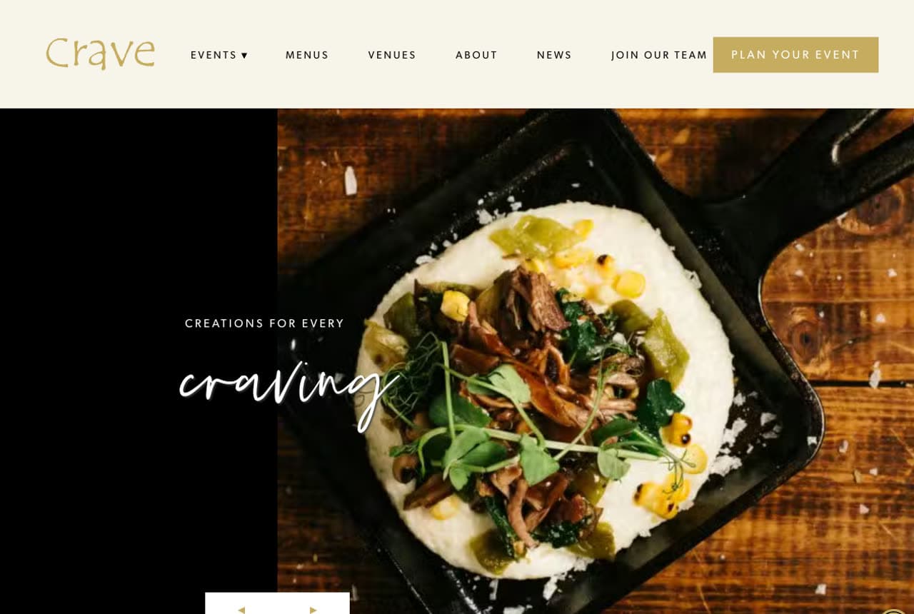
Crave Catering: Appetite first, on a near-black stage

Crave Catering opens exactly the way a caterer should: a skillet dish shot from above in dramatic light, filling most of a near-black hero, with the script line 'creations for every craving' floating over it. The darkness is doing real work — food photography saturates against it the way it never can on white. A side panel states the substance without breaking the mood: 'one-of-a-kind Austin catering and events,' est. 1999, twenty-five years of craft. The nav's 'Plan Your Event' button keeps the single conversion path visible. This is the baseline recipe for the industry: one hero dish, real photography, dark canvas, and a date that proves you've cooked for a generation.

  • Dark canvases make food photography glow
  • One skillet, shot overhead, beats a buffet montage
  • 'Est. 1999' does the trust work in seven characters

Steal this: Shoot one signature dish beautifully — a single hero plate outsells a crowded spread.

Contigo Catering website — Wedding & Event Catering design example
Real site · Austin, TX
  • Wedding & Event Catering
  • Editorial
  • Terracotta + olive

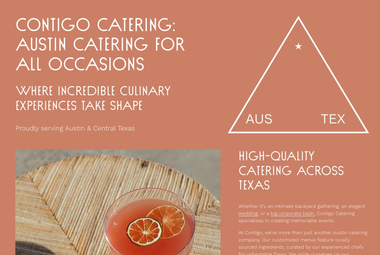
Contigo Catering: Terracotta typography over food photography

Contigo Catering makes the rarest choice in this category: it leads with graphic design instead of a buffet shot. A terracotta panel carries condensed all-caps type — 'Austin catering for all occasions / where incredible culinary experiences take shape' — beside a minimalist triangle motif marked AUS ★ TEX, with a single styled cocktail photo anchoring the corner. The palette (olive, terracotta, cream) feels borrowed from a Hill Country wedding rather than a commercial kitchen, which is precisely its market. It reads as an event-design studio that happens to cook — and for couples choosing a caterer as part of an aesthetic, that framing wins before a menu is opened.

  • A graphic-led hero stands out in a photo-led category
  • The AUS/TEX triangle is brandable, ownable geometry
  • Olive + terracotta palette matches the events it caters

Steal this: Design your site to match the events you want booked, not the kitchen you cook in.

Root Cellar Catering Co. website — Farm-to-Table Catering design example
Real site · Texas
  • Farm-to-Table Catering
  • Rustic
  • Cream + brown

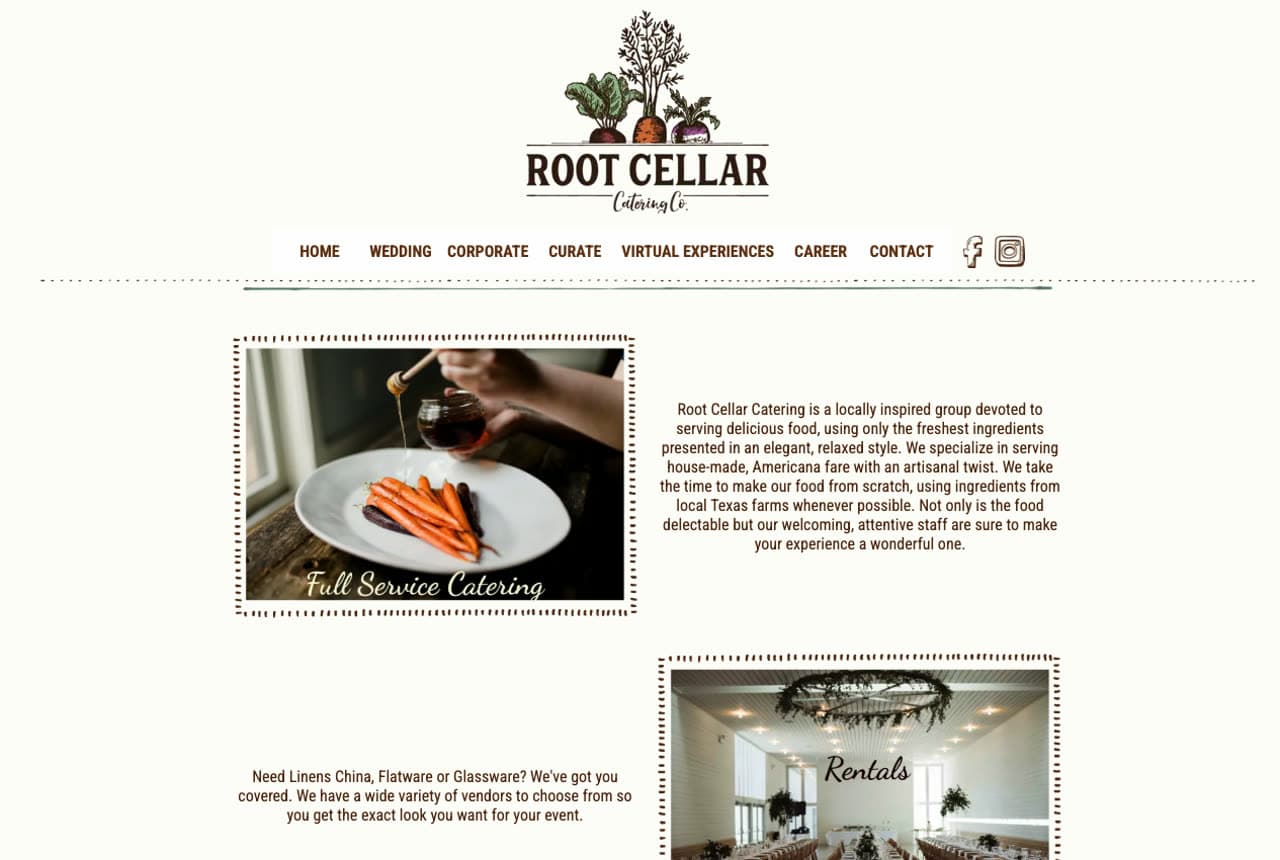
Root Cellar Catering Co.: A farmhouse scrapbook of services

Root Cellar Catering Co. lays its page out like a hand-kept recipe album: cream background, dashed-line borders around tilted photographs, and script labels naming each service — Full Service Catering, Rentals, Bar Tending — like captions under family snapshots. The carrot-bunch logo and 'locally inspired… scratch-made, ingredients from local Texas farms' copy complete a farm-to-table identity that feels lived rather than art-directed. Practical depth hides in the charm: linens, china, and TABC-certified bartenders are all covered, so the rustic wrapper carries a full-service operation. When your differentiator is homespun care, let the layout itself feel handmade — grids read corporate; scrapbooks read personal.

  • Dashed borders + script captions read like a family album
  • Farm-sourcing claims match the visual's homespun promise
  • Full-service depth (rentals, TABC bar) hides inside the charm
Lucille's Catering website — Soul Food Catering design example
Real site
  • Soul Food Catering
  • Warm
  • White + red

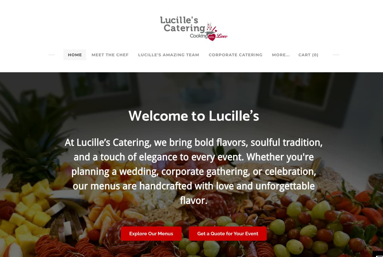
Lucille's Catering: Soul food promised in three repeated words

Lucille's Catering welcomes visitors over a sprawling charcuterie-and-fruit spread with copy that sounds like a host, not a vendor: 'bold flavors, soulful tradition, and a touch of elegance.' The masterstroke is the section below — 'Real Events. Real Flavor. Real Lucille's.' — with the word Real hammered in red three times, then an invitation to 'step behind the scenes' and follow the kitchen's Instagram for weddings, soul food pop-ups, and plated tastings. That social-first proof strategy suits food perfectly: a live feed of actual events out-persuades any static gallery. Warmth in the words, red accents for appetite, and the feed as the portfolio.

  • 'Real. Real. Real.' turns authenticity into a drumbeat
  • Instagram-as-portfolio keeps food proof perpetually fresh
  • Host-voiced copy welcomes rather than sells
Catering Project website — Corporate Catering design example
Real site · Sydney, AU
  • Corporate Catering
  • E-commerce
  • Green + cream

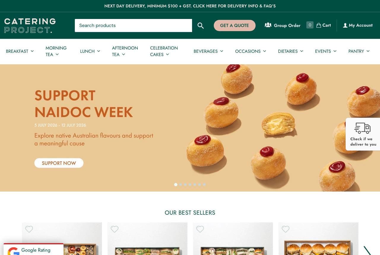
Catering Project: Catering run like an online store

Catering Project abandons the quote-request ritual entirely: its homepage is a shop. Platters carry prices and photographed-in-a-box contents (Big Break Time Platter, Cheese Burger Sliders), a next-day-delivery bar states the minimum order, best-sellers and collections rows mirror any e-commerce site, and a group-order button handles offices. Even a NAIDOC Week campaign banner slots in the way a fashion drop would. For the corporate lunch buyer — who orders weekly and hates phone tag — browsable prices ARE the customer service. The lesson generalizes: if your product is standardizable, put a price on it and sell it like retail; save the consultation flow for weddings.

  • Priced platters delete the quote-request friction entirely
  • Boxed product photography sets exact expectations
  • Group ordering serves the office buyer's real workflow
Hollis & Hickory BBQ Catering — BBQ Catering website design you can build with Zarla
Build this with Zarla
  • BBQ Catering
  • Bold
  • Char + ember

Hollis & Hickory BBQ Catering: Char and ember for crowd-scale barbecue

Hollis & Hickory BBQ Catering is Zarla's barbecue-catering template, and it smells like the pit from the first line: 'Feed a Crowd Like You Mean It — BBQ Catering in Kansas City, MO.' The dark-showcase hero chars the screen near-black with ember-orange accents, the exact palette of smoke and coals, and the headline's swagger matches how barbecue is actually bought — by the rack, for a crowd, with strong opinions. Everything a pit crew needs sits underneath: crowd-size framing, keyword-plus-city SEO structure, one bold CTA. Clone it, make Kansas City your town, and you have the confidence of a twenty-year smokehouse in about 30 seconds.

  • 'Feed a crowd like you mean it' speaks fluent barbecue
  • Char-black + ember orange is the pit's own palette
  • Crowd-scale framing matches how BBQ gets ordered
See this template
Incredible Edibles website — Fine Catering design example
Real site · Jackson Hole, WY
  • Fine Catering
  • Classic

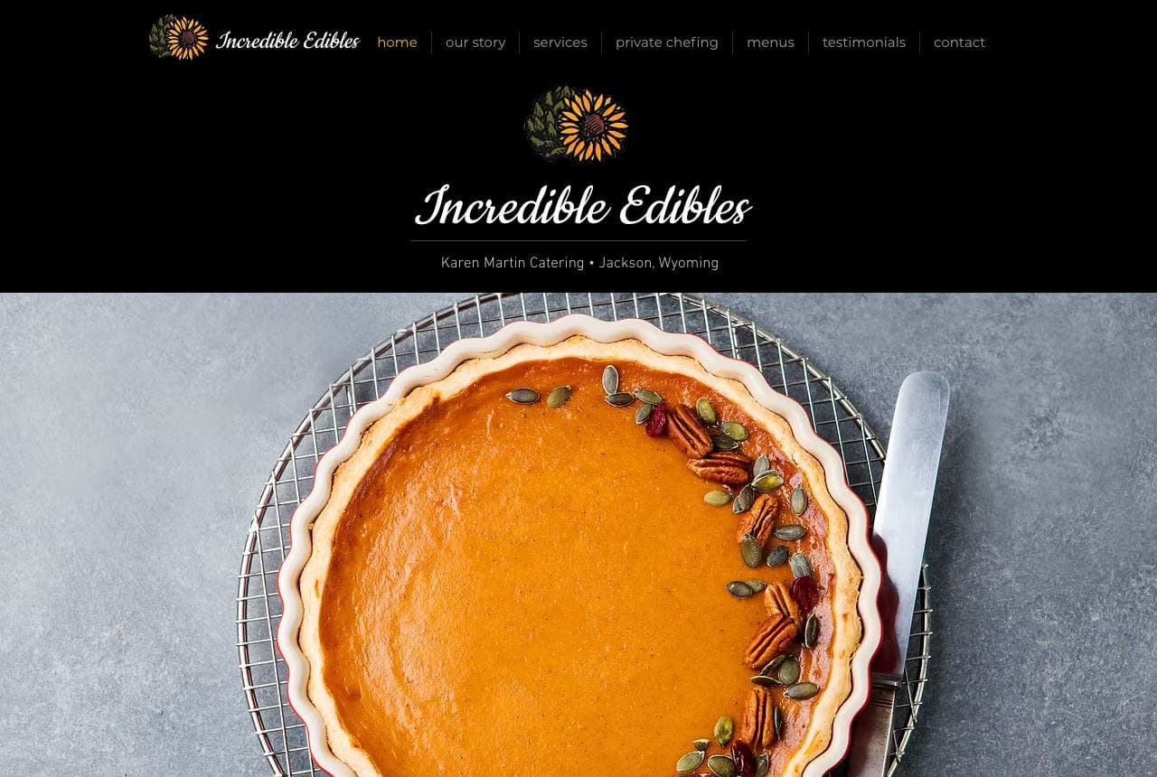
Incredible Edibles: One pie, forty years, zero clutter

Incredible Edibles — Karen Martin's Jackson Hole kitchen, catering since 1985 — frames a single overhead photograph of a pecan-ringed pumpkin pie inside a black border like a plate in a cookbook. The script wordmark above it and an 'Our Story' block beside a Teton sunset complete a page that feels edited rather than assembled. Forty years of local reputation means this site doesn't need to convince; it needs only to confirm, and the confident sparseness does exactly that. There's a stage-of-business lesson here: early on you show everything you can do; once the town knows you, you show one perfect pie and sign your name.

Sweet Cicely website — Office & Event Catering design example
Real site · Dublin, IE
  • Office & Event Catering
  • Cheerful

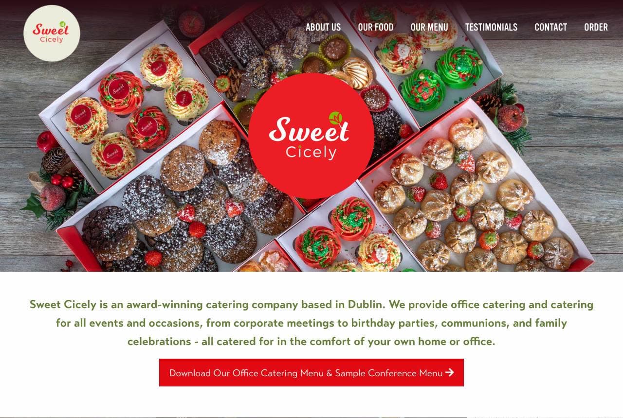
Sweet Cicely: Boxes you can picture on your own desk

Sweet Cicely photographs its catering the way customers receive it: in boxes. The hero looks straight down on a table of festive treat boxes around the red roundel logo, and the product row beneath names them like a menu of parcels — Goodies Box, Cocktail Sausages & Chicken Goujons, Mid-Morning Pastry Box. An award-winning Dublin credential opens the copy, but the page's best proof is a long, unedited customer note about an afternoon tea delivered to a grandmother — specific, sentimental, and obviously real. Box-first photography plus one genuinely human testimonial makes an office manager's decision easy: you can see exactly what arrives and how it lands.

Whitfield & Vine Wedding Catering — Wedding Catering website design you can build with Zarla
Build this with Zarla
  • Wedding Catering
  • Elegant

Whitfield & Vine Wedding Catering: Napa elegance held to the bottom edge

Whitfield & Vine Wedding Catering is Zarla's wedding-catering template on the bottom-editorial hero: a full-bleed reception photograph with the headline pinned low-left — 'From First Toast to Last Dance — Wedding Catering in Napa, CA' — the way a film poster holds its title. Forest green and champagne gold do the formalwear work, and the headline itself sells duration, not dishes: a caterer who owns the whole arc of the night. Wedding buyers shop on atmosphere first, menu second, so the imagery leads and the copy romances. Clone it, set your own region in the headline, and the template carries the black-tie confidence for you.

See this template
Fig & Thistle Grazing Co. — Grazing Tables website design you can build with Zarla
Build this with Zarla
  • Grazing Tables
  • Lush

Fig & Thistle Grazing Co.: The spread itself becomes the layout

Fig & Thistle Grazing Co. is Zarla's grazing-table template, and the fullbleed-left hero mirrors its product: abundance arranged to look effortless. The photograph bleeds edge to edge while the content unit — 'The Table Everyone Gathers Around — Grazing Tables in San Diego, CA' — holds the left, scrim-weighted so the type stays crisp over the spread. Plum and apricot tones echo fig skin and stone fruit; the whole design feels like the boards this niche builds. Grazing tables are bought from photographs more than menus — the table IS the centerpiece — so a layout that lets one lavish image run uncropped is the correct machine. Build it in about 30 seconds.

See this template
Cactus & Comal Taco Catering — Taco Catering website design you can build with Zarla
Build this with Zarla
  • Taco Catering
  • Festive

Cactus & Comal Taco Catering: A fiesta color-field, no photo required

Cactus & Comal Taco Catering is Zarla's taco-cart template on the color-field hero: 'Taco Catering in Phoenix' set huge on a chile-red panel with marigold accents — a palette that IS the cuisine, no photography needed to start. That matters practically: a new taco cart rarely has professional food photos on day one, and this design generates appetite from color and type alone. The keyword-plus-city headline keeps search intent explicit while the fiesta energy does the brand work. Add real taco photos later and the panel only gets stronger. For any food-truck-adjacent business launching fast, this is the zero-photo path to a page with genuine flavor.

See this template
Ravelle & Finch Corporate Catering — Corporate Catering website design you can build with Zarla
Build this with Zarla
  • Corporate Catering
  • Efficient

Ravelle & Finch Corporate Catering: A quote bar tuned for office admins

Ravelle & Finch Corporate Catering is Zarla's corporate template on the form-quickquote hero: 'Feed the Team Fast — Corporate Catering in Chicago, IL' above a sixty-second quote bar, navy field with a fresh green accent. The design understands who's actually booking: an office admin with a headcount, a budget, and fifteen minutes — not a bride with a mood board. So the form leads, the promise is speed, and the palette stays boardroom-calm with just enough green to signal fresh food. It pairs into the same lesson as Catering Project above: corporate buyers want transactions, not consultations. Clone it and let the quote bar answer your inbox for you.

See this template

Frequently asked

Where can I find good catering website examples?

Right here — this page curates catering website examples two ways: standout real businesses (each linked, so you can explore the live site) and professionally designed Zarla templates you can clone and make your own. Every example comes with a note on why the design works — trust signals, layout, calls to action — so you can copy the move, not just the look.

What makes a good catering website?

A good catering website earns trust in the first few seconds, leads with strong visuals of the work, gives visitors one obvious action, and loads fast on a phone. Every design below leads with proof and a single clear call to action rather than a wall of text.

How much does a catering website cost?

A custom catering website from a designer typically runs into the thousands up front, and template builders charge roughly $16–$30 per month. An AI builder generates a complete, editable design for free and only charges (on the Premium plan) when you publish to your own domain — so you can build and preview before spending anything.

Do I need a designer to build a catering website?

No. Several designs on this page were generated by Zarla and are fully editable — you describe your business and get a complete, professionally designed site in about 30 seconds, then refine it by chatting. Building and previewing is free; publishing to your own domain needs the Premium plan.

What pages does a catering website need?

Most catering businesses need just a few: a home page that proves trust and points to one clear action, an about page that puts a face to the business, a services or work page that shows what you do, and a contact page with a form and a phone number. Local businesses also benefit from location or service-area pages that help them show up in nearby searches.

How do I get more customers from my catering website?

Lead with proof in the first few seconds (reviews, real photos, results), make one action obvious on every screen (call, book, or enquire), and keep it fast on mobile — most visitors arrive on a phone. The designs above each do this differently, but they all earn trust early and remove friction from the next step.

You've seen what works. Now make it yours.

Describe your business and Zarla designs a complete, professional website in about 30 seconds — built to convert, just like the ones above.

Free to build and preview · no credit card · publish to your own domain on Premium