Inspiration · Clothing Store

The Best Clothing Store Website Examples, Explained

Looking for clothing store website examples? These 12 are the strongest we found — Wild Oak's five pairs of jeans photographed from behind under 'new season. new fits.', Petal & Pup's script 'an autumn weekend' over two women at the back of a Land Rover, Cake Plus-Size Resale's shop-interior photo with the address and opening hours printed underneath — plus shop designs you can build with Zarla, each with a breakdown of the specific move that turns a browser into a buyer. A clothing store site is judged in the first photograph, so the best ones here spend the whole first screen on one image, keep the words to a season and a button, and put the categories a shopper actually types — dresses, jeans, sale — in the nav. Find an approach you love and you can build a site in that spirit, free, in about 30 seconds.

Real sites + designs you can build with Zarla — free to build and preview, no credit card

What makes a great clothing store website

The best clothing store websites let one photograph do the selling and keep the copy to a season. The photographs: Taylor Stitch's bearded man in a blue corduroy jacket among bare trees, Faherty's grey-bearded model in a patterned shirt jacket behind bamboo, Conscious Clothing's red-haired woman in blue linen among orange wildflowers at night, Big Bud Press's tie-dye trousers against a matching splatter backdrop. The words: 'Facing East', 'FALL in JAPAN', 'SUMMER, LINGERING', 'Magic Waters' — a title, not a pitch. Notice the nav doing the merchandising — Wild Oak's JEANS, TOPS, BOTTOMS, DRESSES with SALE in red; Hazel & Olive's HOMECOMING DRESSES and CONCERT CLOTHES & OUTFITS as picture tiles — and the shipping promise pinned in the top strip on almost every site. And notice Cake Plus-Size Resale, the one physical shop here, which treats its website like a shop window: a photo of the racks, then the address and the hours. Every example below tells you whether it is selling a collection or a place.

Wild Oak website — Denim & Women’s Boutique design example
Real site
  • Denim & Women’s Boutique
  • Understated
  • White + red

Wild Oak: Five pairs of jeans photographed from behind under 'new season. new fits.'

Wild Oak is the cover because it sells denim with one photograph and five words. A black strip reads 'WILD OAK REWARDS'; a utility row carries 'US / USD', CONTACT, GIFT CARDS, REWARDS and SIGN IN; the white header sets the thin 'WILD OAK' wordmark left against a search field ('What are you looking for?'), a heart and a bag, and the nav beneath runs NEW, BEST SELLERS, CLOTHING, JEANS, TOPS, BOTTOMS, DRESSES, SHOES, ACCESSORIES and a red SALE. The hero is a photograph of five women from behind in five washes of jeans — light, mid, dark, distressed — cream tops, hands in back pockets, and over it, small and centred in white, 'new season. new fits.' with 'shop new denim' beneath. Below the fold, 'FIND YOUR FIT' introduces 'THE DENIM DIRECTORY' — 'Denim drawer essentials you'll wear on repeat.' — with a group photo and a row of thumbnails. The washes are the range and the pockets are the fit; nothing needs explaining. Clone it for a boutique with one hero category.

  • Five washes in one photograph — the range shown, not listed
  • A lowercase five-word headline: 'new season. new fits.'
  • SALE in red at the end of a ten-item nav

Steal this: Photograph your best-selling category as a lineup — five washes, five colours, five fits — and let the variety be the headline.

Visit Wild Oak

Opens a similar Zarla design you can make yours.

Petal & Pup website — Occasion & Dress Boutique design example
Real site
  • Occasion & Dress Boutique
  • Romantic
  • White + dusky pink

Petal & Pup: Script 'an autumn weekend' over two women laughing in the back of a Land Rover

Petal & Pup turns a seasonal edit into a scene. A dusky-pink strip reads 'Free shipping on orders over $80*'; the white header puts 'USD $' left, the tracked serif 'PETAL & PUP' centred, and a 'SEARCH' field with heart, account and bag icons right; the nav runs NEW, DRESSES, BEST SELLERS, CLOTHING, WEDDING, TOPS, BOTTOMS, SHOES & ACCESSORIES and a red SALE. The hero photograph is two women at the open back of a green Land Rover in a field — one in cream standing beside the tailgate, one in a tan jacket and navy sitting inside — laughing, a Queensland plate on the rear bumper. Over them, in white script, 'an autumn weekend', and beneath it in tracked capitals, 'SHOP THE FALL EDIT'. Below the fold a pink eyebrow, 'BY OCCASION', introduces the serif 'Outfits for Every Moment'. WEDDING sitting in the main nav says what this boutique sells most of. Clone the script-plus-caps pairing for any seasonal edit.

  • Script headline over tracked-caps subhead
  • A seasonal edit staged as a weekend scene
  • WEDDING in the main nav — the occasion named

Steal this: Name the edit like a weekend — 'an autumn weekend', 'a beach week' — in script, and put the instruction in tracked caps underneath.

Visit Petal & Pup

Opens a similar Zarla design you can make yours.

Hazel & Olive website — Women’s Fashion Boutique design example
Real site · Texas
  • Women’s Fashion Boutique
  • Sunny
  • White + blush

Hazel & Olive: 'DRESS WITH CONFIDENCE' over four photo tiles labelled by occasion

Hazel & Olive skips the hero photograph and goes straight to the categories. A pale-pink strip reads 'ALWAYS FAST, FREE SHIPPING FROM TX' between two arrows; the white header sets 'HAZEL & OLIVE' in grey tracked capitals, centred, with search, account and bag icons right; a pink nav row runs NEW ARRIVALS, BEST SELLERS, DRESSES, CLOTHING, TOPS, BOTTOMS, SHOES, GIFTCARD, SALE. Then, on white, 'DRESS WITH CONFIDENCE' in bold, 'Trendy Online Clothing Boutique' and 'Where Designer Fashion Meets Southern Charm' with a pink rule under 'Fashion'. Four photo tiles follow — a group of women in bright dresses, a woman on a rooftop in a white mini dress, a woman in a navy dress and red boots on a dock, a woman in a white slip with a bag — labelled NEW ARRIVALS, BEST SELLERS, CONCERT CLOTHES & OUTFITS and HOMECOMING DRESSES. The last two labels are searches, not categories. Clone it for a boutique whose customers shop by event.

  • Category tiles labelled by occasion — CONCERT, HOMECOMING
  • A three-line positioning statement instead of a hero photo
  • The shipping origin — 'FROM TX' — in the top strip

Steal this: Label your category tiles with the events your customers are dressing for — 'homecoming dresses', 'concert outfits' — not the garment type.

Visit Hazel & Olive

Opens a similar Zarla design you can make yours.

Conscious Clothing website — Made-to-Order Linen Label design example
Real site · Michigan
  • Made-to-Order Linen Label
  • Moody
  • Black + white

Conscious Clothing: 'SUMMER, LINGERING' over a night photograph of blue linen among orange wildflowers

Conscious Clothing makes a made-to-order promise into the top strip and a mood into the hero. The strip is a marquee — 'CURRENT PRODUCTION TIME: ~2 WEEKS · HANDMADE TO ORDER IN MICHIGAN' repeating with small globe icons; the white header runs SHOP, COLLECTIONS, STORIES left, a stamped, slightly rough 'CONSCIOUS CLOTHING' wordmark centred, search and cart right. The hero is a dark photograph: a red-haired woman in a blue linen jacket, hair blown across her face, a beaded necklace, standing among orange cosmos flowers at night. Across it in tracked white capitals, 'SUMMER, LINGERING', and beneath, a small outlined button, 'SHOP SENSOMMER'. Nothing else is on the screen. The production-time line does the work a 'sustainable' paragraph usually does — it says the clothes don't exist until you order them. Clone it for a maker brand with one strong image.

  • Production time and origin as the top-strip marquee
  • A two-word mood headline — 'SUMMER, LINGERING'
  • One outlined button and nothing else on the hero

Steal this: If your clothes are made to order, put the production time in the top strip — '~2 weeks, handmade in Michigan' says sustainable better than the word does.

Visit Conscious Clothing

Opens a similar Zarla design you can make yours.

Cake Plus-Size Resale website — Plus-Size Resale Shop design example
Real site · Minneapolis, MN
  • Plus-Size Resale Shop
  • Straightforward
  • White + black

Cake Plus-Size Resale: A photo of the racks, then the address and the day-by-day opening hours

Cake Plus-Size Resale is the one physical shop in the gallery and it builds its homepage like a shop window. The white header sets a bold 'CAKE' left and a small-caps nav — CAKE PLUS-SIZE RESALE, SHOP, SELLING CLOTHES TO CAKE, FAT SPLASH, MORE, CART (0). The hero is a photograph of the shop floor: racks of colourful clothes down both walls, two mannequins, a chandelier. Beneath it, centred, the heavy condensed 'CAKE PLUS-SIZE RESALE', then the address — '5155 Bloomington Ave, Minneapolis, MN 55417' — a phone number, an email and an Instagram handle in one line, and a bold hours list: 'MONDAY*: 11AM-7PM', 'TUES-WEDS: CLOSED', 'THURSDAY: 11AM-7PM', 'FRIDAY: 11AM-7PM', beside a photo of the storefront. 'SELLING CLOTHES TO CAKE' in the nav names the resale model. Clone it for any shop where the visit is the point.

  • The shop floor as the hero photograph
  • Address, phone, email and hours above the fold
  • 'SELLING CLOTHES TO CAKE' — the resale model in the nav

Steal this: If people come to your shop, put the interior photo, the address and the hours in the first screen — the website is a shop window, not a catalogue.

Visit Cake Plus-Size Resale

Opens a similar Zarla design you can make yours.

Taylor Stitch website — Menswear Brand design example
Real site
  • Menswear Brand
  • Rugged
  • Photo + white

Taylor Stitch: 'Facing East' — a bearded man in a blue corduroy jacket among bare trees

Taylor Stitch says almost nothing and sells a jacket. A black strip reads 'FREE SHIPPING & RETURNS ON EVERY DOMESTIC ORDER' between two arrows; the white header sets 'TAYLOR STITCH' left, a nav of New & Featured, Shirts & Sweaters, Bottoms, Outerwear, Accessories and Last Call, with About, Help, search, account and cart right. The hero is a photograph of a bearded man in a blue corduroy chore jacket over a tan cardigan and white tee, looking off to the left among bare winter trees under a clear blue sky. On the right, in white serif, 'Facing East', and under it a white 'SHOP NOW' button. Below the fold, a serif 'Shop by Category'. 'Last Call' is the sale, named the way a bar would. Clone the two-word serif title over a full-bleed photograph if your product photographs well outdoors.

  • A two-word serif title and one button
  • The jacket worn, outdoors, in season
  • 'Last Call' — the sale category renamed

Steal this: Retitle the sale — 'Last Call' reads like an invitation where 'SALE' reads like a markdown.

Visit Taylor Stitch

Opens a similar Zarla design you can make yours.

Big Bud Press website — Colourful Basics Label design example
Real site
  • Colourful Basics Label
  • Playful

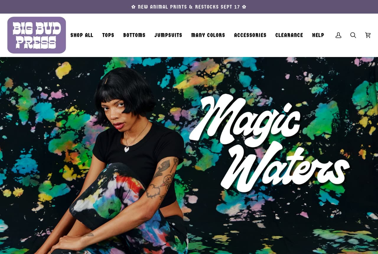
Big Bud Press: 'Magic Waters' in white script over tie-dye trousers against a matching splatter backdrop

Big Bud Press has a print and builds the whole screen out of it. A purple strip reads '✿ NEW ANIMAL PRINTS & RESTOCKS SEPT 17 ✿'; the white header sets the logo — 'BIG BUD PRESS' in bubbly retro letters inside a rounded purple rectangle — beside a bold caps nav of SHOP ALL, TOPS, BOTTOMS, JUMPSUITS, MANY COLORS, ACCESSORIES, CLEARANCE, HELP and account, search and cart icons. The hero is a photograph of a woman with a black bob and tattooed arms, in a plain black T-shirt and black trousers splattered with yellow, green, blue and pink tie-dye, against a backdrop printed with the same splatter, so the trousers almost disappear into the wall. Across the right half, in huge white script, 'Magic Waters'. 'MANY COLORS' and 'JUMPSUITS' in the nav are the brand in two words each. Clone the print-on-print hero if your product is the pattern.

Visit Big Bud Press

Opens a similar Zarla design you can make yours.

Faherty website — Coastal Casual Brand design example
Real site
  • Coastal Casual Brand
  • Warm

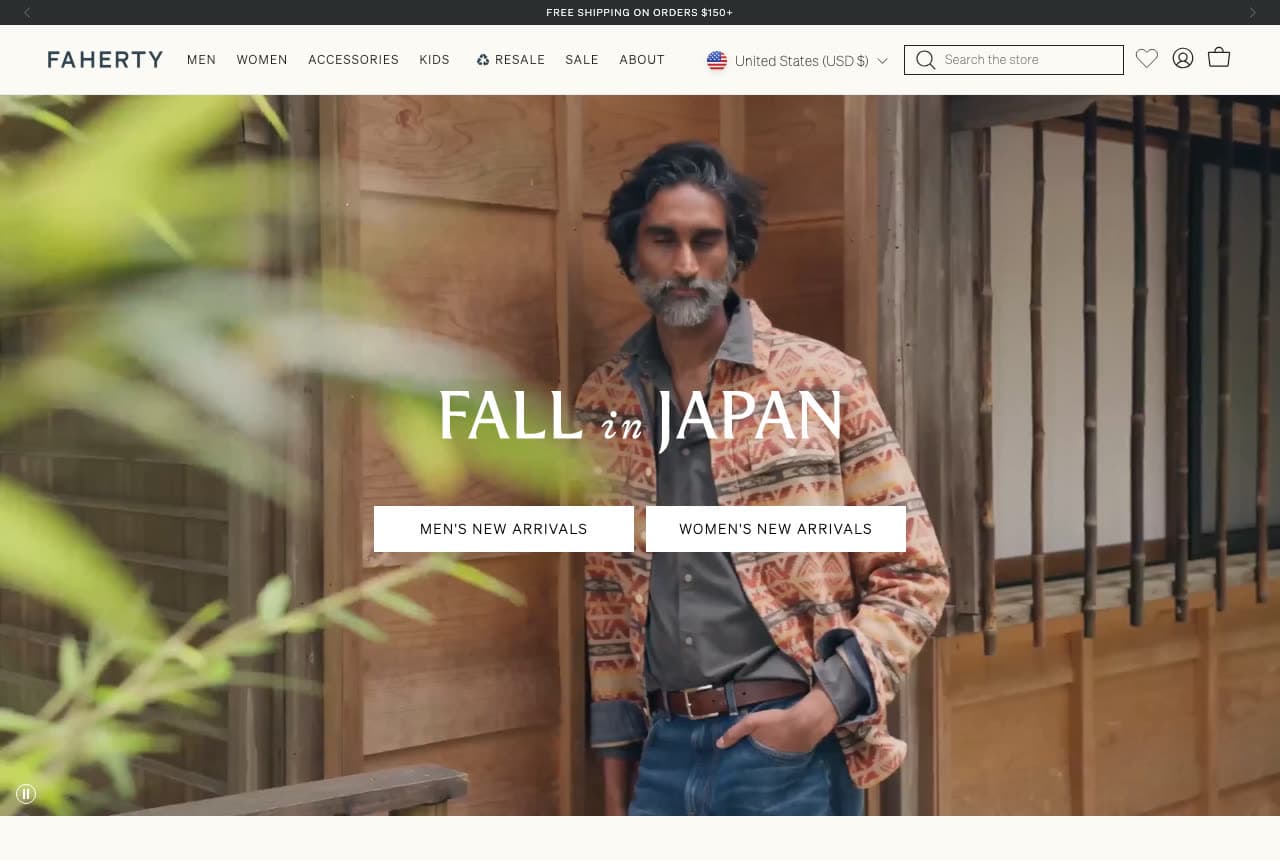
Faherty: 'FALL in JAPAN' with two buttons for men's and women's new arrivals

Faherty splits the season by gender with two buttons and one photograph. A black strip reads 'FREE SHIPPING ON ORDERS $150+'; the white header sets 'FAHERTY' left, a caps nav of MEN, WOMEN, ACCESSORIES, KIDS, a circular-arrow RESALE, SALE and ABOUT, then a 'United States (USD $)' selector, a 'Search the store' field and heart, account and bag icons. The hero is a photograph of a dark-haired, grey-bearded man in a patterned earth-toned shirt jacket over belted jeans, standing on a wooden porch, shot through bamboo leaves in the foreground. Centred over it, in serif capitals with an italic 'in', 'FALL in JAPAN', and beneath it two white buttons: 'MEN'S NEW ARRIVALS' and 'WOMEN'S NEW ARRIVALS'. A pause icon lower-left says the hero is a video. RESALE with its own icon in the main nav is the brand's second-hand programme, named at the top. Clone the two-button split if you sell to both.

Visit Faherty

Opens a similar Zarla design you can make yours.

Bombas website — Socks & Basics Brand design example
Real site
  • Socks & Basics Brand
  • Cheerful

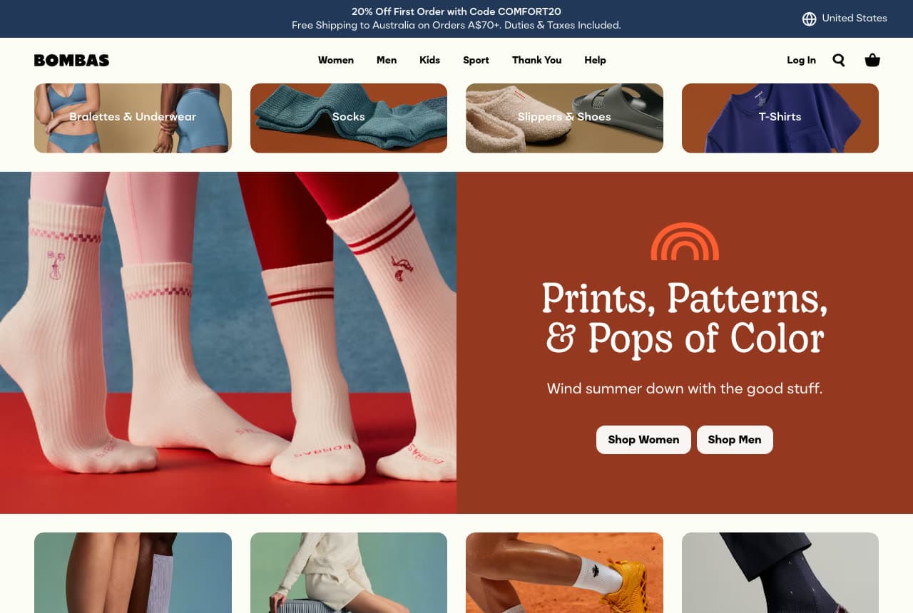
Bombas: Striped socks on a blue-and-red set beside a terracotta 'Prints, Patterns, & Pops of Color' panel

Bombas builds its hero as a split — product left, colour block right. A navy strip stacks '20% Off First Order with Code COMFORT20' over 'Free Shipping to Australia on Orders A$70+. Duties & Taxes Included.' with a 'United States' selector; the cream header sets the bold 'BOMBAS' left, a nav of Women, Men, Kids, Sport, Thank You and Help, and Log In, search and bag right. A row of four rounded tiles follows — Bralettes & Underwear, Socks, Slippers & Shoes, T-Shirts — each a photo with a label. Then the hero: on the left, legs in pink and red tights wearing white crew socks with red stripes, on a blue-and-red set; on the right, a terracotta panel with an orange arc icon, the serif 'Prints, Patterns, & Pops of Color', the line 'Wind summer down with the good stuff.' and two cream buttons, 'Shop Women' and 'Shop Men'. Below, a row of product photos begins. 'Thank You' in the nav is the give-back programme. Clone the split when you want a colour block without losing the product.

Visit Bombas

Opens a similar Zarla design you can make yours.

Wrenhaven Perfumery — Fragrance Boutique Template website design you can build with Zarla
Build this with Zarla
  • Fragrance Boutique Template
  • Sultry

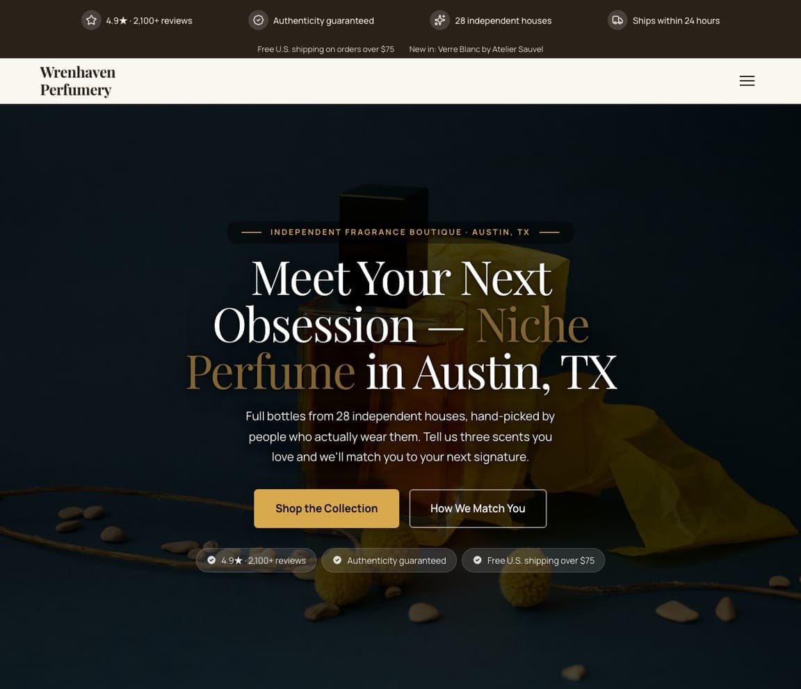
Wrenhaven Perfumery: 'Meet Your Next Obsession' in serif on a dark bottle photograph

Wrenhaven Perfumery is the Zarla fragrance-boutique template and the closest thing in the catalog to an independent clothing store: a shop that sells taste. A dark top strip carries four icon-and-label items — '4.9★ · 2,100+ reviews', 'Authenticity guaranteed', '28 independent houses', 'Ships within 24 hours' — and a second line, 'Free U.S. shipping on orders over $75 · New in: Verre Blanc by Atelier Sauvel'. The white header is a two-line serif wordmark and a hamburger. The hero is a dark photograph of an amber glass bottle with a black cap on yellow fabric with centred copy: a dashed pill, 'INDEPENDENT FRAGRANCE BOUTIQUE · AUSTIN, TX', the serif headline 'Meet Your Next Obsession — Niche Perfume in Austin, TX' with 'Niche Perfume' in gold, a paragraph about 28 houses hand-picked 'by people who actually wear them', and a gold 'Shop the Collection' beside an outline 'How We Match You'. Clone it for a boutique whose edit is the product.

See this template
Halloway Parfums — Perfume House Template website design you can build with Zarla
Build this with Zarla
  • Perfume House Template
  • Luxurious

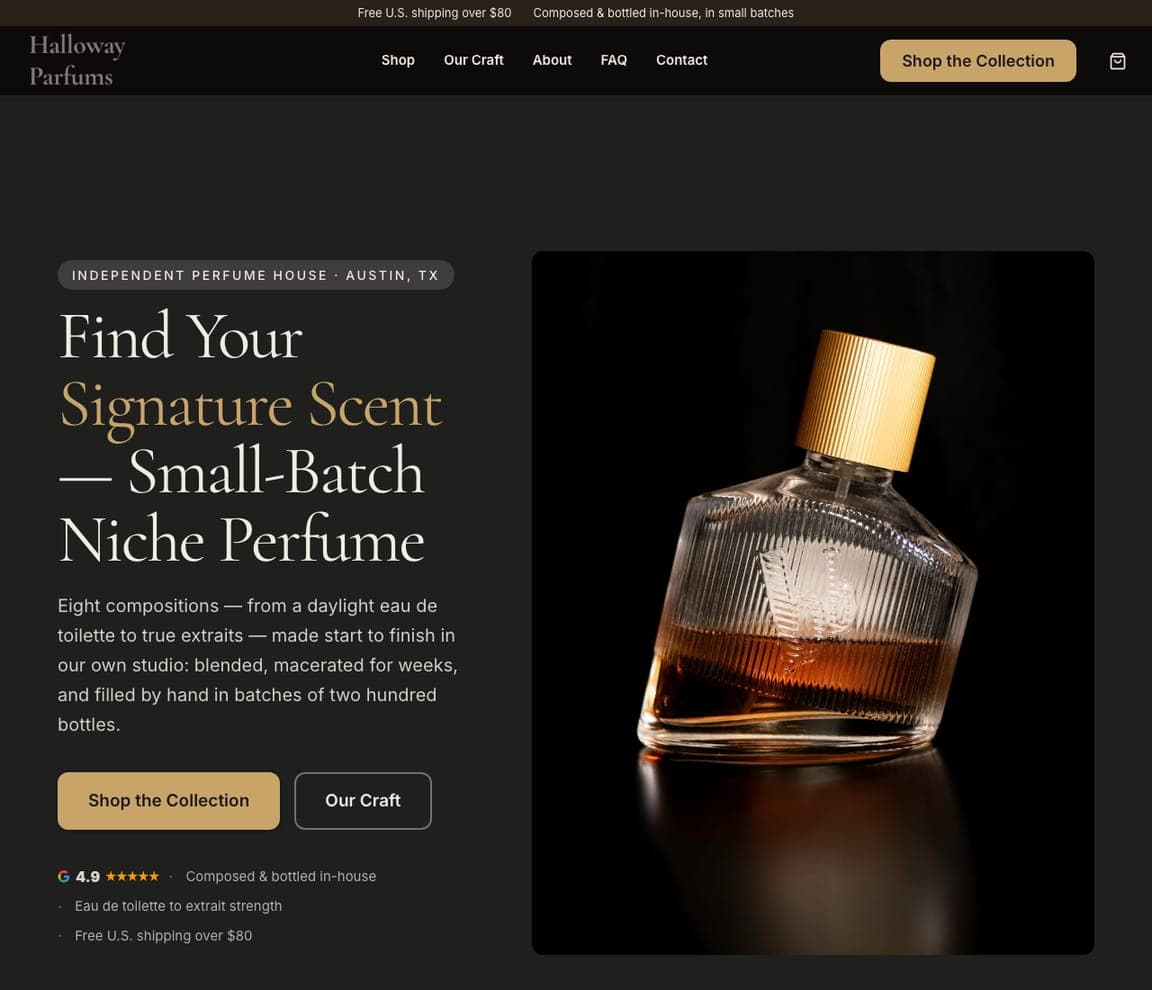
Halloway Parfums: 'Find Your Signature Scent' beside a gold-capped bottle on black

Halloway Parfums is the Zarla perfume-house template — the maker's version of the shop, for a label that sells what it makes. The ground is charcoal; a thin top line reads 'Free U.S. shipping over $80 · Composed & bottled in-house, in small batches'. The header sets the serif 'Halloway Parfums' against Shop, Our Craft, About, FAQ, Contact, a gold 'Shop the Collection' and a cart icon. The hero is split: on the left a pill, 'INDEPENDENT PERFUME HOUSE · AUSTIN, TX', the serif 'Find Your Signature Scent — Small-Batch Niche Perfume' with 'Signature Scent' in gold, and a paragraph about eight compositions 'blended, macerated for weeks, and filled by hand in batches of two hundred bottles'; on the right a photograph of a glass bottle with a ribbed gold cap on black. Clone it for a clothing label that makes its own line — the craft paragraph is the whole pitch.

See this template
Marigold & Mae — Flower Shop Template website design you can build with Zarla
Build this with Zarla
  • Flower Shop Template
  • Warm

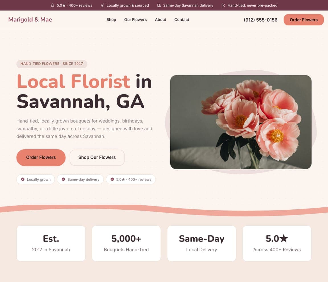
Marigold & Mae: 'Fresh Flowers, Made by Hand' beside pink peonies on a blush blob

Marigold & Mae is the Zarla flower-shop template and the friendliest shop layout in the catalog. A dusty-rose top strip holds four icon-and-label items — '5.0★ · 400+ reviews', 'Locally grown & sourced', 'Same-day Savannah delivery', 'Hand-tied, never pre-packed'. The white header sets the rose rounded-sans 'Marigold & Mae' against Shop, Our Flowers, About, Contact, the phone and a coral 'Order Flowers' pill. On the off-white hero, a pill reads 'FLOWER STUDIO & SHOP · SAVANNAH', the bold sans headline 'Fresh Flowers, Made by Hand' sits over a paragraph that lists the occasions — 'weddings, birthdays, sympathy, or a little joy on a Tuesday' — then a coral 'Order Flowers', an outline 'Shop Our Flowers' and three tick pills. On the right, a rounded photograph of pink peonies in a vase floats on a blush blob, and a wavy salmon band closes the screen. Clone it for a gift or clothing shop that delivers locally.

See this template

Frequently asked

What should a clothing store website show first?

One photograph and the season. Taylor Stitch gives the whole first screen to a man in a corduroy chore jacket with 'Facing East' and a 'SHOP NOW' button; Faherty does the same with 'FALL in JAPAN' and two buttons for men's and women's new arrivals; Petal & Pup writes 'an autumn weekend' in script over a field photograph with 'SHOP THE FALL EDIT' beneath. Wild Oak shows five pairs of jeans from behind and says 'new season. new fits.' A shopper decides from the picture, so the picture goes first.

How should a clothing boutique organise its navigation?

By what people type into search. Wild Oak's nav reads NEW, BEST SELLERS, CLOTHING, JEANS, TOPS, BOTTOMS, DRESSES, SHOES, ACCESSORIES, SALE; Petal & Pup's is NEW, DRESSES, BEST SELLERS, CLOTHING, WEDDING, TOPS, BOTTOMS, SHOES & ACCESSORIES, SALE; Hazel & Olive turns four of its categories into photo tiles labelled NEW ARRIVALS, BEST SELLERS, CONCERT CLOTHES & OUTFITS and HOMECOMING DRESSES. Both Wild Oak and Petal & Pup print SALE in red so it reads as a category and a promise.

Does a physical clothing shop need a different website from an online brand?

Yes — it needs to say where it is and when it opens. Cake Plus-Size Resale leads with a photograph of the shop floor, then prints 'CAKE PLUS-SIZE RESALE', the street address in Minneapolis, the phone number, the email and an Instagram handle, and a day-by-day hours list beside a photo of the storefront. The online brands here — Bombas, Faherty, Taylor Stitch — never name a shop; they lead with shipping terms instead.

Where should the shipping offer go on a clothing store site?

In a strip above the header, in one line. Petal & Pup: 'Free shipping on orders over $80*'. Taylor Stitch: 'FREE SHIPPING & RETURNS ON EVERY DOMESTIC ORDER'. Faherty: 'FREE SHIPPING ON ORDERS $150+'. Hazel & Olive: 'ALWAYS FAST, FREE SHIPPING FROM TX'. Bombas stacks two lines — a first-order code and free shipping to Australia over A$70 with duties included. Conscious Clothing uses the same strip for a different promise: 'CURRENT PRODUCTION TIME: ~2 WEEKS · HANDMADE TO ORDER IN MICHIGAN'.

How do the strongest clothing brands use colour on the homepage?

As a backdrop that matches the product. Bombas puts pink-and-red tights and striped socks on a blue-and-red set beside a terracotta panel headed 'Prints, Patterns, & Pops of Color'; Big Bud Press photographs black tie-dye trousers against the same tie-dye splatter and writes 'Magic Waters' in white script; Conscious Clothing shoots blue linen among orange wildflowers at night. The photograph carries the palette, so the interface stays white, black and one accent.

Can I build a clothing store website like these with Zarla?

Yes. Every real site here has a 'Build a site like this' button that opens the closest Zarla template in the editor — Wrenhaven Perfumery for a dark, photo-led boutique in the Conscious Clothing and Big Bud Press spirit, Halloway Parfums for a split photo-and-copy layout in the Bombas spirit, Marigold & Mae for a bright white shop with a rounded product photo and tick pills like Hazel & Olive — and you swap in your own photographs and categories. One full-screen photo, a season for a headline and a nav of the things people search for is the Taylor Stitch pattern, and it takes about 30 seconds.

You've seen what works. Now make it yours.

Describe your business and Zarla designs a complete, professional website in about 30 seconds — built to convert, just like the ones above.

Free to build and preview · no credit card · publish to your own domain on Premium