Inspiration · Community Group

The Best Community Group Website Examples, Explained

Looking for community group website examples? These 12 are the strongest we found — Commún's 'The Verb of Community' with a yellow underline beside three people laughing arm in arm, St Luke's Community Centre's 'WELCOME TO ST LUKE'S COMMUNITY CENTRE' beside thirty volunteers in purple T-shirts under bunting, Abbey Community Centre's gardeners on a verandah with 'more happens together' underneath — plus community-church, nonprofit and social-enterprise designs you can build with Zarla, each with a breakdown of the specific move that turns a 'community centre near me' search into a room booking, a membership or a volunteer. A community group's site is read by three people at once — the neighbour who wants to come, the person who wants to hire the hall and the one who wants to give — so the best ones here show the people, list what's on and give each visitor a button. Find an approach you love and you can build a site in that spirit, free, in about 30 seconds.

Real sites + designs you can build with Zarla — free to build and preview, no credit card

What makes a great community group website

The best community group websites show the people and split the doors. The people: St Luke's Community Centre's thirty volunteers in purple, Abbey Community Centre's eight gardeners with a fork and a watering can in the air, Commún's three friends arm in arm, Casa de Paz's living room of newcomers under a flag and painted plates. The doors: The Abbey Centre's four pills — 'Book Your Space', 'Community', 'Cafe', 'Donate' — and three more in the hero; St Luke's 'Hire a Room' and 'Become a Member'; Whittington Park Community Association's 'Room Hire' and 'Timetable'; Fitzrovia Community Centre's 'Room Hire', 'Calendar' and 'Make a Donation'. Notice how the buildings appear — The Abbey Centre's red-brick gable, Whittington Park's Victorian hall with a round window — and how two groups skip the building for a sentence: Inside Out Youth Services' 'YOU BELONG' on a rainbow of triangles, The GrowHaus's 'Providing Food Access & Wellness Education in Denver, Colorado' on a green card. Every example below tells you whether the group is offering a room, a programme or a welcome.

Commún website — Community Organization design example
Real site · Denver, CO
  • Community Organization
  • Warm
  • White + maroon

Commún: 'The Verb of Community' with a yellow underline, beside three people laughing arm in arm

Commún is the cover because it made its tagline the headline and its logo the punctuation. The white header sets a mountain-and-sun logo with 'Commún · THE VERB OF COMMUNITY', a nav — About, Programs, Loretto Heights, Resources, Get Involved — and a maroon 'DONATE'. The hero splits: left, the small maroon 'Welcome to Commún', the huge maroon 'The Verb of Community' with a hand-drawn yellow underline beneath 'Community', and a maroon pill 'LEARN ABOUT OUR WORK'; right, a photograph of three people laughing arm in arm in a hall — a woman in a light-blue tee with a flower in her hair, a man in a grey shirt with a name badge, a girl in black — set on a yellow block, with a large maroon mountain mark overlapping the photograph's lower-left corner and a thin vertical rule reading 'COMMÚN' at the far right. Beneath, a second photograph of women in a room begins. 'Loretto Heights' in the nav is the campus named as a page. Clone the tagline-as-headline if yours is that good.

  • The tagline as the headline
  • The logo mark overlapping the photograph
  • 'Loretto Heights' — the place as a nav item

Steal this: If your tagline is a sentence people repeat, make it the headline and underline the word it turns on — 'The Verb of Community'.

Visit Commún

Opens a similar Zarla design you can make yours.

Abbey Community Centre website — Community Centre Charity design example
Real site · Kilburn, London
  • Community Centre Charity
  • Joyful
  • Green + orange

Abbey Community Centre: Eight gardeners on a verandah with a fork and a watering can in the air, then 'more happens together'

Abbey Community Centre shows the people it serves having a good time. The white header sets a green 'Abbey' under an orange roof line with 'Community Centre' in orange; top right, an outlined green 'CONTACT US', an outlined purple 'DONATE' and blue circles for map, LinkedIn and Instagram; an orange nav runs Home, About Abbey, Our projects, What's on when, Our impact, Room hire, Volunteer with us, Support us. The hero is a photograph of eight older people on a wooden verandah — a woman in a yellow jumper with her fist and a gardening fork in the air, a man holding a watering can and a trowel, women in headscarves, one woman laughing with her head back — with slide arrows and a row of dots. A green band reads 'Welcome to - Abbey Community Centre'; the orange italic 'more happens together' follows, then the paragraph: 'Our local charity and community centre supports people of all ages, cultures and backgrounds living in or near Kilburn, North West London, to lead better connected, healthier and happier lives.' Clone the gardeners if your members are the story.

  • Members photographed mid-cheer
  • 'more happens together' as the line
  • 'What's on when' and 'Room hire' in the nav

Steal this: Photograph your members at the moment they are enjoying the place — a fist in the air, a fork held up — and write one lowercase line under it.

Visit Abbey Community Centre

Opens a similar Zarla design you can make yours.

St Luke's Community Centre website — Community Centre design example
Real site · Islington, London
  • Community Centre
  • Inclusive
  • Teal + purple

St Luke's Community Centre: 'WELCOME TO ST LUKE'S COMMUNITY CENTRE' beside thirty volunteers in purple T-shirts, with three tiles beneath

St Luke's Community Centre puts the whole team in the frame and the whole programme in three tiles. The white header sets a purple circle logo 'ST LUKE'S COMMUNITY CENTRE', the phone '020 7549 8181', Facebook, TikTok, Instagram, LinkedIn and YouTube icons, a nav — About Us, What's On?, Services & Support, Hire a Room, Support Us, More — a purple 'Contact Us', an orange 'Donate' and a search. The hero splits: left, a photograph of about thirty staff and volunteers in purple T-shirts crouched and standing under bunting in front of a brick building and a greenhouse; right, a teal panel with the white condensed capitals 'WELCOME TO / ST LUKE'S / COMMUNITY CENTRE', the line 'Building a stronger community through learning, wellness and connection in south Islington.' and a purple 'Become a Member'. Beneath, three tiles — a teal 'WHAT'S ON · Events, activities & classes' over children in masks, an orange 'CHILDREN & FAMILIES · Events tailored for families' over a dance class, a red 'ADULTS · Events tailored for adults' over a lunch in a greenhouse. Clone the team-and-tiles page.

  • Thirty volunteers in one photograph
  • 'Become a Member' as the hero button
  • Three tiles for three audiences

Steal this: Split the programme into three tiles by audience — what's on, children & families, adults — each with a photograph of that audience.

Visit St Luke's Community Centre

Opens a similar Zarla design you can make yours.

The Abbey Centre website — Community Centre design example
Real site · Westminster, London
  • Community Centre
  • Practical
  • White + purple

The Abbey Centre: 'The Abbey Centre — Your community space' beside a red-brick gable, with seven coloured pills

The Abbey Centre gives every visitor a coloured pill. The white header sets a lime-and-purple 'The Abbey Centre' logo and four pills — an orange 'Book Your Space', a teal 'Community', a blue 'Cafe', a purple 'Donate'; a purple bar beneath carries Get Involved, About Us, Contact Us and a search. The hero is a photograph of the centre's red-brick Victorian gable and chimney against a pale sky; left, the black 'The Abbey Centre', the line 'Your community space' and three more pills — a purple 'Book a Room', a teal 'Community Activities', a blue 'Wash House Cafe'. Beneath, a card begins 'Your conference space' beside a photograph of a hall with a stage. Seven pills in the first screen sounds like too many, but each is a different business — hire, activities, café, giving — and the colours keep them apart. Clone the colour-per-service pills.

  • A colour per service
  • The building as the photograph
  • 'Wash House Cafe' named as a pill

Steal this: Give each of your services its own colour and keep it everywhere — orange for hire, teal for community, blue for the café, purple for giving — so the visitor learns the code in one screen.

Visit The Abbey Centre

Opens a similar Zarla design you can make yours.

Whittington Park Community Association website — Community Association design example
Real site · Archway, London
  • Community Association
  • Traditional
  • Photo + green

Whittington Park Community Association: 'WHITTINGTON PARK COMMUNITY ASSOCIATION' in a green box over a Victorian hall with a round window

Whittington Park Community Association shows its hall and its motto. The white header sets a sketch logo with 'Whittington Park Community Association', a nav — Home in orange, About Us, Services, Timetable, Room Hire, News, Friends — and a yellow 'DONATE'. The hero is a photograph of the association's brick Victorian hall — a gable with a round window, tall multi-pane windows and arched doorways below, trees either side, a blue sky; a translucent green box carries the white capitals 'WHITTINGTON PARK / COMMUNITY ASSOCIATION', the italic line 'Serving the Generations for Generations' in quotation marks, and Instagram, Facebook and Bluesky icons; a yellow 'SIGN UP TO OUR NEWSLETTER' is cut at the bottom edge. 'Friends' in the nav is the supporters' scheme named the way a village hall would. Clone the hall-and-motto hero if your building is a landmark on its street.

  • The hall as the hero
  • A motto in quotation marks
  • 'Friends' and 'Timetable' in the nav

Steal this: Put your motto in quotation marks under the name — 'Serving the Generations for Generations' — so it reads as something the association actually says.

Opens a similar Zarla design you can make yours.

Fitzrovia Community Centre website — Community Centre design example
Real site · Fitzrovia, London
  • Community Centre
  • Gentle
  • White + purple

Fitzrovia Community Centre: A child's hands reaching for bubbles, with the autumn term's dates in a purple box

Fitzrovia Community Centre puts this term's dates on the photograph. The white header sets 'Search our site' beside a search field, then a logo of overlapping coloured circles with 'FITZROVIA Community CENTRE', a two-row nav — About Us, Calendar, Our Programmes, Room Hire / News & Blog, Support Us, Visit Us — Facebook, Instagram and LinkedIn icons, a cart showing '0' and a purple 'Make a Donation'. The hero is a photograph of a child's hands reaching up for soap bubbles in front of a bookshelf, a green knitted sleeve at the edge; round slide arrows sit at both sides and a purple box at the bottom reads 'Childen and Families Autumn Term (15 Sep–10 Dec)' — the site's own spelling. No headline sentence; the term and its dates are the message. 'Calendar' second in the nav says the centre is a timetable. Clone the dates-on-the-photo box if your programme runs in terms.

  • The term's dates on the photograph
  • 'Calendar' second in the nav
  • A cart in a community centre header
Visit Fitzrovia Community Centre

Opens a similar Zarla design you can make yours.

Inside Out Youth Services website — Youth Services Organization design example
Real site · Colorado Springs, CO
  • Youth Services Organization
  • Affirming

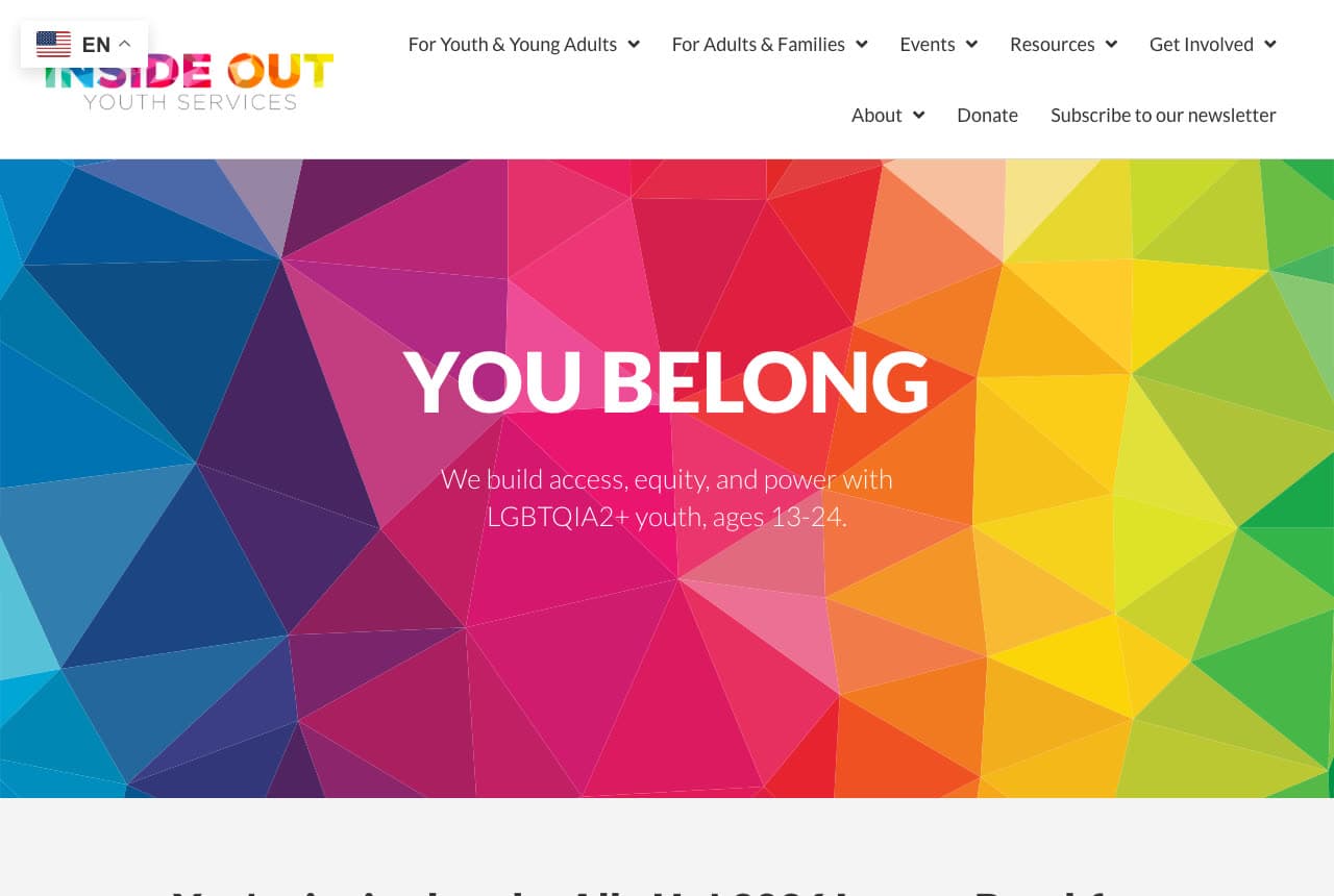
Inside Out Youth Services: 'YOU BELONG' on a rainbow of low-poly triangles, with one line and no button

Inside Out Youth Services says two words and lets the colour say the rest. The white header sets a multicolour 'INSIDE OUT YOUTH SERVICES' logo and a small 'EN' flag selector, with a two-row nav — For Youth & Young Adults, For Adults & Families, Events, Resources, Get Involved / About, Donate, Subscribe to our newsletter. The hero is a field of low-poly triangles running blue to purple to pink to orange to yellow to green; centred, the white bold 'YOU BELONG' and the line 'We build access, equity, and power with LGBTQIA2+ youth, ages 13-24.' There is no photograph and no button. The nav's first two items split the audience — youth and the adults around them — which is the group's whole design. Clone the two-word hero if your welcome fits in two words.

Visit Inside Out Youth Services

Opens a similar Zarla design you can make yours.

Casa de Paz website — Immigrant Welcome Organization design example
Real site · Aurora, CO
  • Immigrant Welcome Organization
  • Dignified

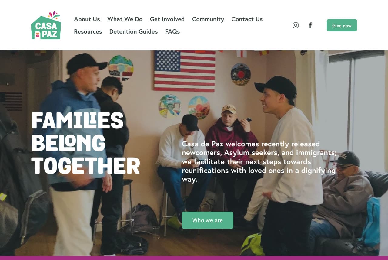
Casa de Paz: 'FAMILIES BELONG TOGETHER' over a living room of newcomers under a flag and painted plates

Casa de Paz photographs the room where its work happens. The white header sets a house-shaped 'CASA DE PAZ' logo in green with confetti, a two-row nav — About Us, What We Do, Get Involved, Community, Contact Us / Resources, Detention Guides, FAQs — Instagram and Facebook icons and a green 'Give now'. The hero is a photograph of a living room: men in caps and hoodies standing and sitting, an American flag and painted decorative plates on the wall, a man in a grey jumper seated at the right; over it, the white rounded capitals 'FAMILIES / BELONG / TOGETHER', a paragraph — 'Casa de Paz welcomes recently released newcomers, Asylum seekers, and immigrants; we facilitate their next steps towards reunifications with loved ones in a dignifying way.' — and a green 'Who we are'. A magenta band closes the crop. 'Detention Guides' in the nav is a resource named plainly for the people who need it. Clone the room photograph if your work has a room.

Visit Casa de Paz

Opens a similar Zarla design you can make yours.

The GrowHaus website — Food Access Nonprofit design example
Real site · Denver, CO
  • Food Access Nonprofit
  • Grounded

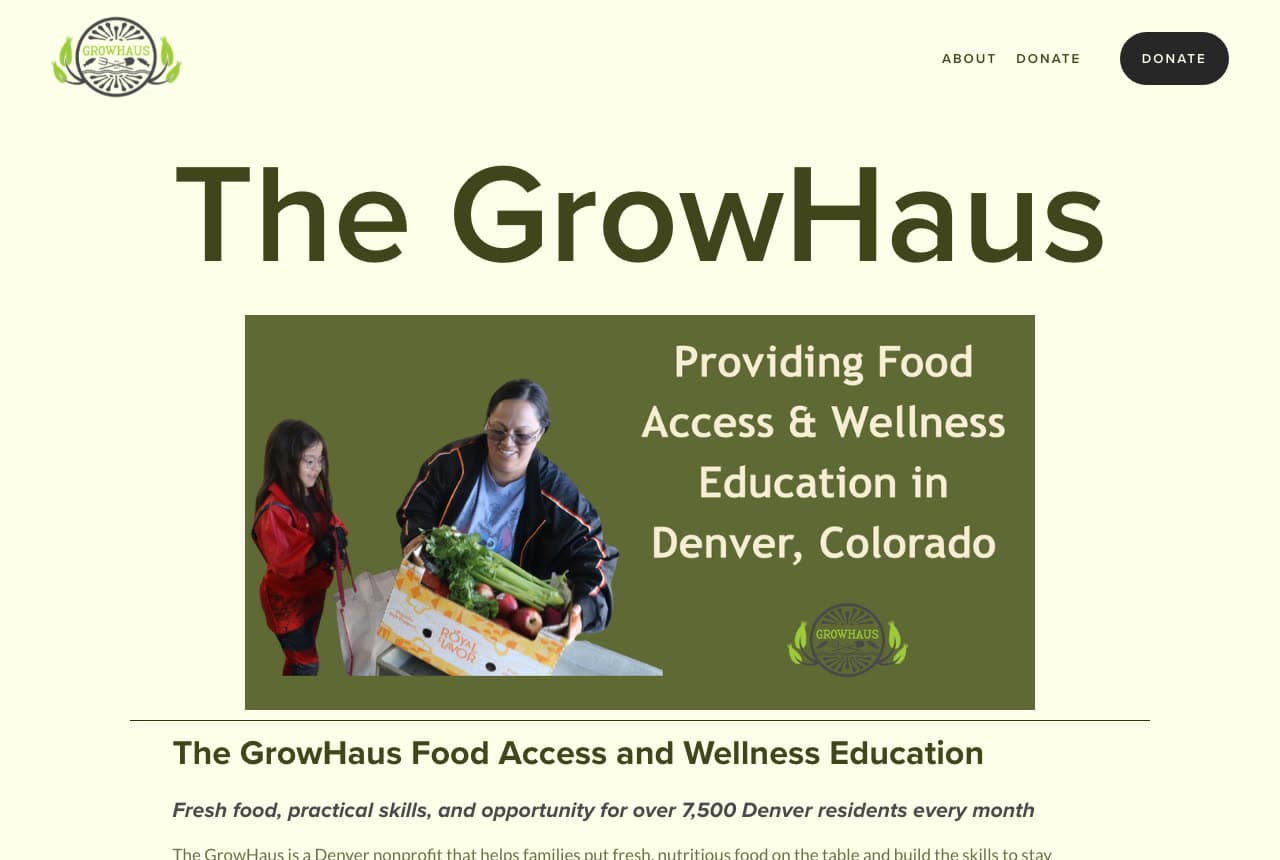
The GrowHaus: 'The GrowHaus' in huge green type over a green card that says what it does and where

The GrowHaus writes its name large and its mission in a card. The cream page sets a round 'GROWHAUS' seal with leaves top left, small caps 'ABOUT' and 'DONATE' and a black pill 'DONATE' top right. The hero is the huge dark green 'The GrowHaus', then a green card: a photograph of a woman in a black-and-orange jacket holding a box of produce, a girl in a red coat beside her, and the white 'Providing Food Access & Wellness Education in Denver, Colorado' with the seal beneath it. A rule, then 'The GrowHaus Food Access and Wellness Education' and the italic 'Fresh food, practical skills, and opportunity for over 7,500 Denver residents every month'. Two nav items and one number — 7,500 a month — is a small organisation being clear about what it is. Clone the name-then-card hero if your name is unusual enough to carry.

Visit The GrowHaus

Opens a similar Zarla design you can make yours.

Wildwood Community Church — Community Church Template website design you can build with Zarla
Build this with Zarla
  • Community Church Template
  • Warm

Wildwood Community Church: 'You're Welcome Here' over stained-glass windows, with service times in the top strip

Wildwood Community Church is the Zarla welcoming-light church template — a community group borrows it because 'You're Welcome Here' is the sentence every group's home page is trying to say. A green top strip carries 'Sundays 9 & 11 AM', 'Kids & Nursery Every Service', 'Everyone Welcome', 'Glenwood Ave, Raleigh'. The cream header stacks a three-line serif 'Wildwood Community Church', the phone and a gold 'Plan Your Visit' over a nav row of About, Ministries, Plan a Visit. The hero is a dark photograph of stained-glass windows with hanging lamps; centred over it, a gold italic eyebrow — 'WILDWOOD COMMUNITY CHURCH · RALEIGH' — the white serif 'You're Welcome Here' and a paragraph: 'However you come and wherever you've been, there's a place for you at Wildwood. Join us this Sunday at 9 or 11 AM for warm worship, real community, and a message of hope.' A gold 'Plan Your Visit' sits beside an outlined 'Service Times & Location'. Swap Sunday for your meeting night and 'Plan Your Visit' for 'Come Along'.

See this template
Alder Lane Films — Nonprofit Video Template website design you can build with Zarla
Build this with Zarla
  • Nonprofit Video Template
  • Earnest

Alder Lane Films: 'Stories That Move Missions — Nonprofit Video Production in Seattle' beside volunteers' hands passing food

Alder Lane Films is the Zarla nonprofit-video template — a community group borrows it for the mission-first split hero with a photograph of the work being done. The white header sets a rust serif 'Alder Lane Films', the phone and a green 'Tell Your Story' over a nav of Services, Our Films, How We Work, Contact. The hero, on off-white, opens with an italic pill — 'Nonprofit Video · Seattle' — and the huge dark serif 'Stories That Move Missions — Nonprofit Video Production in Seattle' across six lines; on the right, a rounded photograph of volunteers' hands passing a clear container of food. Beneath the headline, a paragraph — 'Alder Lane makes the films nonprofits fund their years with — gala films that raise records, documentaries that honor the people in them, and donor stories that turn attention into support.' — a green 'Tell Your Story' beside an outlined 'See Our Films', and three pills: '60 nonprofits served', '$18M+ raised at screenings', 'Filmed with dignity, always'. 'Tell Your Story' is the header button a community group can keep word for word. Swap the video vocabulary for your programme and keep the photograph of hands doing the thing.

See this template
Ninth & Kin Coffee — Social Enterprise Template website design you can build with Zarla
Build this with Zarla
  • Social Enterprise Template
  • Plain-Spoken

Ninth & Kin Coffee: 'Good Coffee, and a Way Back In' with the programme's numbers in the top strip

Ninth & Kin Coffee is the Zarla social-enterprise-cafe template — a community group borrows it for a page that leads with outcomes as numbers. A dark teal top strip carries '214 people through the programme', '4.9★ · 1,120+ reviews', '71% still working at 12 months', 'East 9th Street, Cleveland'. The white header sets 'Ninth & Kin Coffee', the phone and a teal 'Apply or Hire' over a nav of The Programme, Our Numbers, Menu, Contact. The hero, on white and centred, opens with a pill — 'A TRAINING CAFE · EAST 9TH STREET' — the huge 'Good Coffee, and a Way Back In — Social Enterprise Cafe in Cleveland, OH' with 'Social Enterprise Cafe' in teal, and a grey paragraph: 'A working cafe that pays for a fourteen-week barista programme for people coming out of incarceration. Two hundred and fourteen graduates since 2019, seventy-one percent still working a year on, and the accounts on this website every March.' No photograph. 'Our Numbers' as a nav item and 'the accounts on this website every March' are the trust moves. Swap the barista programme for yours and keep the numbers in the strip.

See this template

Frequently asked

What should a community group website show first?

The people who come. St Luke's Community Centre shows about thirty staff and volunteers in purple T-shirts under bunting in front of the building. Abbey Community Centre shows eight gardeners on a verandah — one with a fist and a fork in the air, one with a watering can. Commún shows three people laughing arm in arm in a hall. Casa de Paz shows the living room where newcomers wait. The Abbey Centre and Whittington Park Community Association show the building itself, a red-brick gable and a Victorian hall; Fitzrovia Community Centre shows a child's hands reaching for bubbles.

How does a community centre site handle room hire, programmes and donations on one page?

With a button for each. The Abbey Centre runs four pills across its header — an orange 'Book Your Space', a teal 'Community', a blue 'Cafe', a purple 'Donate' — and three more in the hero: 'Book a Room', 'Community Activities', 'Wash House Cafe'. St Luke's Community Centre puts 'Hire a Room' and 'Support Us' in the nav, 'Become a Member' in the hero and three tiles beneath — WHAT'S ON, CHILDREN & FAMILIES, ADULTS. Whittington Park lists Services, Timetable, Room Hire and a yellow 'DONATE'. Fitzrovia lists Calendar, Our Programmes, Room Hire and 'Make a Donation'.

How should a community group describe itself?

In one sentence with the place in it. Abbey Community Centre: 'Our local charity and community centre supports people of all ages, cultures and backgrounds living in or near Kilburn, North West London, to lead better connected, healthier and happier lives.' St Luke's: 'Building a stronger community through learning, wellness and connection in south Islington.' The GrowHaus: 'Providing Food Access & Wellness Education in Denver, Colorado'. Inside Out Youth Services: 'We build access, equity, and power with LGBTQIA2+ youth, ages 13-24.' Whittington Park: 'Serving the Generations for Generations'.

Should a community group show what's on this term?

In the hero if it changes. Fitzrovia Community Centre puts a purple box on its photograph — 'Childen and Families Autumn Term (15 Sep–10 Dec)' — so the current term is the first thing read. St Luke's Community Centre's first tile is 'WHAT'S ON · Events, activities & classes'. Whittington Park has 'Timetable' in the nav and 'SIGN UP TO OUR NEWSLETTER' at the fold. Abbey Community Centre lists 'What's on when' in the nav. A community centre's programme is its product; the date belongs on the front page.

Can a community group website be a single sentence?

Inside Out Youth Services is: a rainbow field of low-poly triangles, the white 'YOU BELONG', one line — 'We build access, equity, and power with LGBTQIA2+ youth, ages 13-24.' — and no button. The GrowHaus is close: a cream page, the huge green 'The GrowHaus', a green card with the mission, and 'Fresh food, practical skills, and opportunity for over 7,500 Denver residents every month' in italic. Commún turns its sentence into the name: 'Commún · THE VERB OF COMMUNITY'.

Can I build a community group website like these with Zarla?

Yes. Every real site here has a 'Build a site like this' button that opens the closest Zarla template in the editor — Wildwood Community Church for a welcome page with meeting times in the strip and the building in the photograph, the Abbey Community Centre, Whittington Park Community Association and Fitzrovia Community Centre spirit; Alder Lane Films for a mission-first hero with the people in the photograph, like Commún, St Luke's Community Centre and Casa de Paz; Ninth & Kin Coffee for a page that leads with outcomes and a plain sentence, like The Abbey Centre, Inside Out Youth Services and The GrowHaus — and you swap in your hall, your timetable and your donate link. The people in the photograph, the place in the sentence and a button per door is the St Luke's pattern, and it takes about 30 seconds.

You've seen what works. Now make it yours.

Describe your business and Zarla designs a complete, professional website in about 30 seconds — built to convert, just like the ones above.

Free to build and preview · no credit card · publish to your own domain on Premium