Inspiration · Concierge

The Best Concierge Website Examples, Explained

Looking for concierge website examples? These 12 are the strongest we found — Quintessentially's 'Expect the best. Experience better.' with private and corporate membership as two pills, Nota Bene's 'Your most valuable asset isn't money. It's time.' over a hotel pool, Insider's four services in one sentence over a monochrome Brooklyn Bridge — plus membership, house-call and event designs you can build with Zarla in the same register, each with a breakdown of the specific move that turns a 'concierge service near me' search into a consultation. A concierge's website has one job most business sites don't: it has to feel like the problem is already handled. Find an approach you love and you can build a site in that spirit, free, in about 30 seconds.

Real sites + designs you can build with Zarla — free to build and preview, no credit card

What makes a great concierge website

The best concierge websites sell time, access and calm, and they split by who they serve: the membership houses (Quintessentially, Knightsbridge Circle, Sienna Charles) speak in serif over a yacht, a marble hall or a balcony, and their ask is an application or a call; the New York personal concierges (Insider, deVivre, King) speak plainly — 'a membership-based luxury lifestyle management, personal concierge, event planning, & bespoke travel agency', 'The Concierge Standard In New York City' — and their ask is a contact link or a phone number. Notice the proof is discretion rather than reviews at the top end, and a phone number or a 'Reviews' link at the neighborhood end. Notice, too, how many say what they actually do in the first screen — travel, events, lifestyle management, sourcing — because 'concierge' means nothing until it's a list. Every example below makes you feel looked after before it tells you the membership fee.

Quintessentially website — Lifestyle Management Group design example
Real site · London, UK
  • Lifestyle Management Group
  • Assured
  • Black + white

Quintessentially: 'Expect the best. Experience better.' with private and corporate membership as two pills

Quintessentially states the standard in six words: a black page with a small circular logo, a nav that names the model (Membership, What We Do, Events Agency, About Us, Editorial, Contact), a white 'Request a call' pill and a Login, then a serif headline in two lines — 'Expect the best.' upright, 'Experience better.' italic — a paragraph that gives the number that matters ('For 25 years we have been the ultimate destination for discerning individuals and businesses seeking industry-leading concierge services worldwide…') and two pills, a white 'Private membership' and an outlined 'Corporate membership'. To the right, a photograph of a woman in white on a balcony above limestone islands in a bay. The two pills are the design decision: the visitor sorts themselves before reading anything else. Quintessentially shows a lifestyle-management house how to open: a serif promise, the years, and the two doors.

  • Two membership pills — private and corporate — as the first choice
  • 'For 25 years' — the proof as a number in the paragraph
  • A serif line in two registers, upright then italic

Steal this: If you serve two kinds of client, make them two buttons under the headline — private and corporate, household and business — so each reads the page written for them.

Visit Quintessentially

Opens a similar Zarla design you can make yours.

Nota Bene Global website — Private Travel Office design example
Real site
  • Private Travel Office
  • Composed
  • Blue + white

Nota Bene Global: 'Your most valuable asset isn't money. It's time.' over a hotel pool

Nota Bene Global sells the one thing its clients can't buy: a photograph of a hotel pool lined with white loungers, a Venetian bell tower behind it, and over the water a serif headline in three lines — 'Your most valuable asset isn't money. It's time.' — with the positioning beneath it in the same serif: 'Nota Bene Global: An exclusive private travel office unlocking a very special world.' The wordmark sits at the top, 'NOTA' stacked over 'BENE' with a vertical bar at their right, 'CONTACT' at the left, and one white pill, 'MEET THE FOUNDER'. No services, no membership tiers, no rating; a sentence about time and an invitation to meet a person. Nota Bene shows a private travel office how to be persuasive with almost nothing: one true sentence, one photograph of the world it opens, and the founder as the button.

  • A headline about time, not travel — the client's real scarcity
  • 'Meet the Founder' as the only button
  • 'Private travel office' — the category named in one phrase

Steal this: Write the headline about what your client is short of — time, attention, certainty — and make the button an introduction to a person.

Visit Nota Bene Global

Opens a similar Zarla design you can make yours.

Knightsbridge Circle website — Membership Concierge design example
Real site · London, UK
  • Membership Concierge
  • Serene
  • Blue + gold

Knightsbridge Circle: A yacht inside a gold ring on a painted sea

Knightsbridge Circle draws its promise instead of photographing it: a thin strip at the top with the UK and US telephone numbers and an enquiries address, then a blue sky over a flat blue sea, the 'KNIGHTSBRIDGE CIRCLE' mark — a ring — centered on a row with a three-word nav (Locations, About, Contact) at the left and an outlined 'APPLY FOR MEMBERSHIP' at the right, and below, a rendered white yacht cutting across the water inside a swept gold ring, with a cypress and a palm at the edges. No headline; the ring is the logo and the yacht is inside it. The phone numbers for two countries in the top strip say the membership is real and the office picks up. Knightsbridge Circle shows a membership concierge how to be quiet: an illustration instead of stock, the mark repeated as the frame, and 'Apply' as the only verb.

  • An illustrated yacht inside the brand's ring — the logo as the scene
  • 'Apply for Membership' as the only button
  • Two countries' phone numbers in the top strip

Steal this: If your logo is a shape, build the hero inside it — a ring, a frame, a crest — and let the picture sit within your own mark.

Visit Knightsbridge Circle

Opens a similar Zarla design you can make yours.

Sienna Charles website — Ultra-Luxury Travel & Lifestyle design example
Real site
  • Ultra-Luxury Travel & Lifestyle
  • Grand
  • Marble + white

Sienna Charles: 'The world's most exclusive…' over a marble hall, with the founder named

Sienna Charles opens inside the kind of building its members stay in: a photograph of a marble-columned hall — a grand staircase, a checkerboard floor, potted palms — darkened for the type, with the 'SIENNA CHARLES' wordmark, a nav (Our Founder, Services, Experiences, Voyage Magazine, Luxury Newsletter, Press) and a light grey 'Contact Us' button across the top. The serif headline claims the summit — 'The world's most exclusive ultra luxury travel & lifestyle experiences' — and the paragraph beneath names the founder and the clientele ('Jaclyn Sienna India's rigorous travels and elevated taste… for ultra-high net worth families and individuals from Business Executives to Presidents'); a grey 'Apply for Membership' closes it. 'Our Founder' is the first nav item because the founder is the product. Sienna Charles shows a founder-led luxury service how to write its page: the superlative in serif, the founder by name in the first paragraph, and an application rather than a booking.

  • The founder named — and linked — in the first paragraph
  • 'Our Founder' as the first nav item
  • 'Apply for Membership' instead of 'Book'

Steal this: If clients hire you for your taste, name yourself in the first paragraph and put 'Our Founder' first in the nav.

Visit Sienna Charles

Opens a similar Zarla design you can make yours.

Le Rambouillet website — Lifestyle Concierge design example
Real site · Los Angeles, CA
  • Lifestyle Concierge
  • Festive
  • Warm + white

Le Rambouillet: 'The Pinnacle of Luxury & Exclusivity' with two buttons: explore, or request

Le Rambouillet photographs the party it arranges: guests under strings of warm bulbs — a woman with a glass, men in shirts, a grill behind them — with a crest logo, a nav that includes 'Sourcing Request' and 'Membership', and an outlined 'REQUEST MEMBERSHIP →'. Over the photo, a bold headline — 'The Pinnacle of Luxury & Exclusivity' — a one-line description ('Bespoke experiences crafted with unparalleled discretion, dedication, and finesse') and two white buttons side by side: 'EXPLORE MEMBERSHIP' and 'REQUEST A PRIVATE CONSULTATION'. The two buttons split the visitor by readiness — browse or talk — and 'Sourcing Request' in the nav tells you the service finds things. Le Rambouillet shows a lifestyle concierge how to be warm rather than cold: photograph an evening with people in it, and offer a conversation beside the membership.

  • A party under string lights — the evening the service makes
  • Two buttons for two kinds of visitor: explore, or request a consultation
  • 'Sourcing Request' in the nav — what the service does, named

Steal this: Offer two buttons — one to browse and one to talk — and photograph an evening with real guests in it rather than an empty room.

Visit Le Rambouillet

Opens a similar Zarla design you can make yours.

Insider NYC website — Lifestyle Management design example
Real site · New York, NY
  • Lifestyle Management
  • Monochrome
  • Black + white

Insider NYC: A black-and-white Brooklyn Bridge and one sentence that lists the four services

Insider says everything it does in one sentence over the bridge: a black header with a small-caps nav (Home, About, Client Services), the 'INSIDER' wordmark with a swan mark centered, an outlined 'CONTACT US' at the right, and a black-and-white night photograph of the Brooklyn Bridge and the Manhattan skyline, lights on, the river still. Over the sky, in light sentence-case type, the whole offer: 'Insider is a membership-based luxury lifestyle management, personal concierge, event planning, & bespoke travel agency.' — and beneath it an outlined 'LEARN MORE'. No photograph of a person, no rating; the four services in one line and the city in the picture. Insider shows a membership concierge how to be clear in monochrome: name the four things you are in a sentence, photograph the city you serve at night, and keep the buttons outlined and small.

  • The four services named in a single sentence over the skyline
  • A black-and-white night photograph of the bridge — the city as the brand
  • Outlined 'Contact Us' and 'Learn More' — small asks on a dark page

Steal this: If you do four things, say all four in one sentence over one photograph of the city you serve — a list is clearer than a slogan.

Visit Insider NYC

Opens a similar Zarla design you can make yours.

Elite Lifestyle Management website — Lifestyle Management design example
Real site
  • Lifestyle Management
  • Aspirational

Elite Lifestyle Management: Boarding the jet: the category photographed as one moment

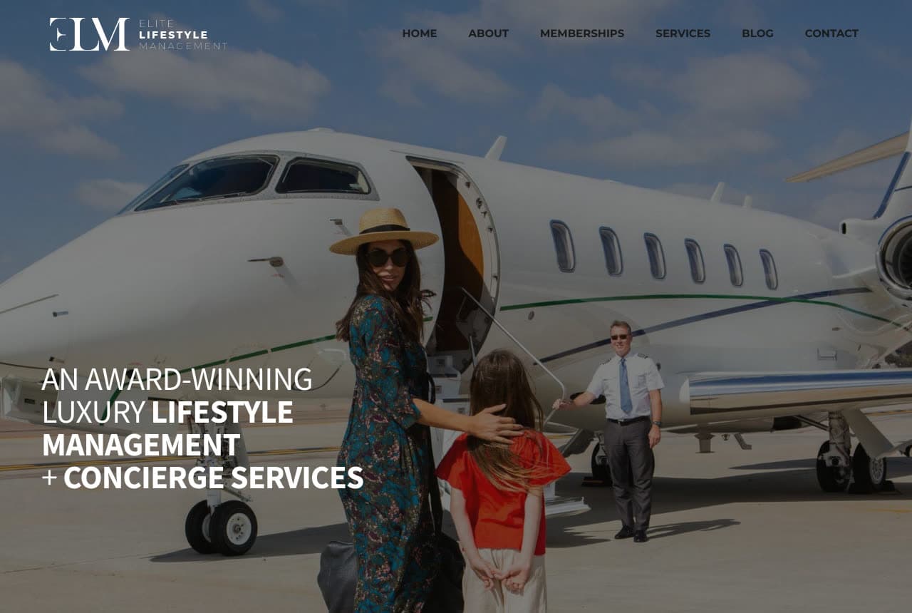
Elite Lifestyle Management shows the archetype: a photograph of a woman in a wide-brimmed hat and a printed dress guiding a child, a hand on the child's back, toward a private jet, a pilot waiting at the steps, a blue sky behind, with the 'ELM' logo and a plain nav (Home, About, Memberships, Services, Blog, Contact) across the top. Over the photo, the headline in white capitals mixes light and bold weights — 'AN AWARD-WINNING LUXURY LIFESTYLE MANAGEMENT + CONCIERGE SERVICES'. No button in the first screen, no paragraph; the picture is the whole promise and the headline is the category plus one credential. It's the image every concierge is implying, shown plainly. ELM shows a lifestyle-management firm how to be literal: photograph the moment the client pays for, and put the category and the award in the headline.

Visit Elite Lifestyle Management

Opens a similar Zarla design you can make yours.

deVivre Concierge website — Boutique Concierge design example
Real site · New York, NY
  • Boutique Concierge
  • Understated

deVivre Concierge: A 'V' monogram, a party table in a slideshow, and 'contact deVivre!'

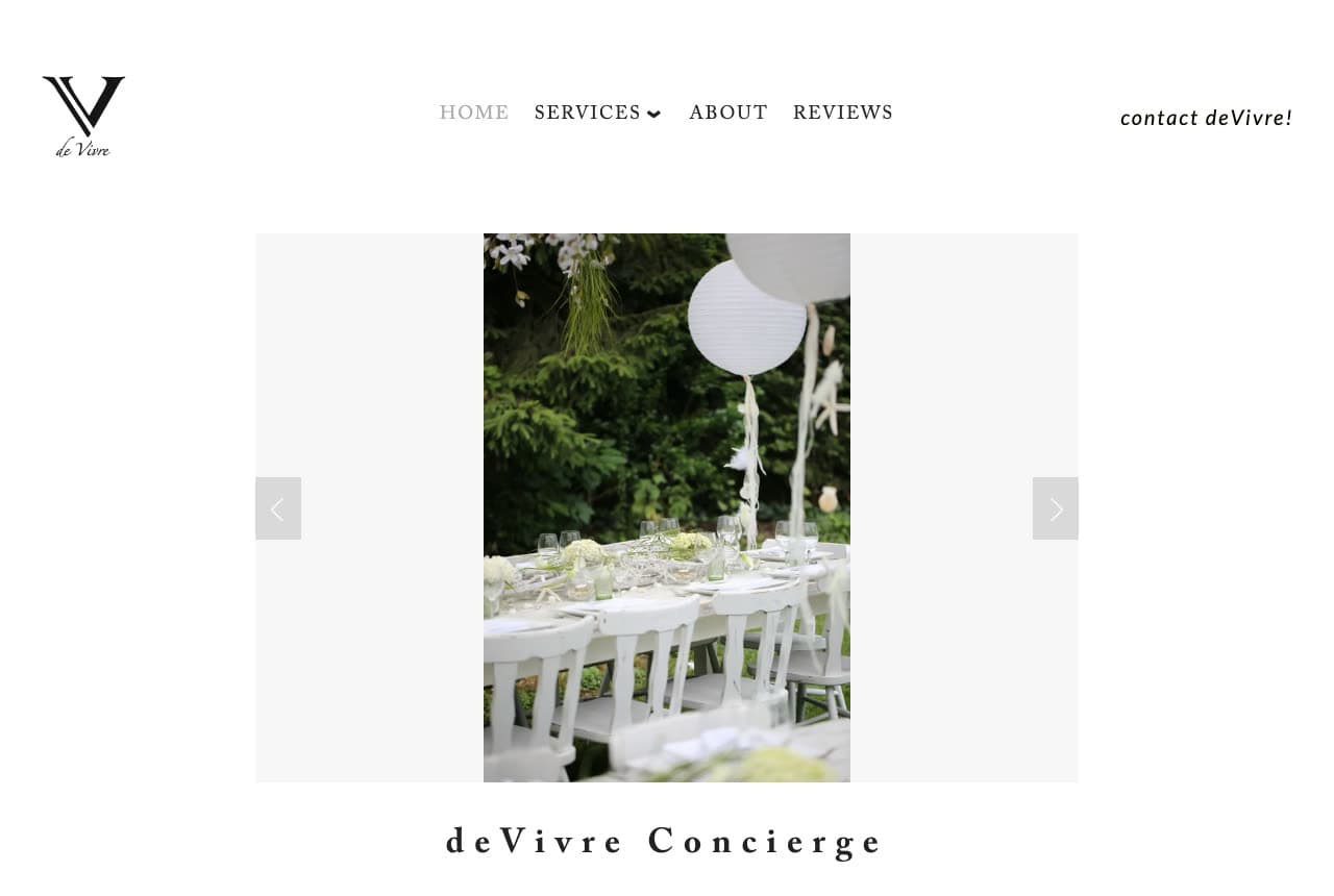
deVivre keeps a one-person concierge to a single screen: a white page with a serif 'V' monogram ('de Vivre' in script beneath it) top-left, a tracked small-caps nav (Home, Services, About, Reviews) and, at the right, an italic 'contact deVivre!' with the exclamation mark doing the warmth. The hero is a slideshow frame on pale grey — a photograph of a party table set in a garden, white chairs, white paper lanterns hanging among the trees — with arrows either side, and under it the name in letter-spaced serif, 'deVivre Concierge'. No headline, no rating, no list of services in the first screen; 'Reviews' in the nav is the proof and the party table is the promise. deVivre shows a boutique concierge how to look considered on a small budget: a monogram, a spaced name, one photograph of a job well done, and a contact link written like a person.

Visit deVivre Concierge

Opens a similar Zarla design you can make yours.

King Concierge Services website — Personal Concierge design example
Real site · New York, NY
  • Personal Concierge
  • Classic

King Concierge Services: 'The Concierge Standard In New York City' with the phone number in the logo

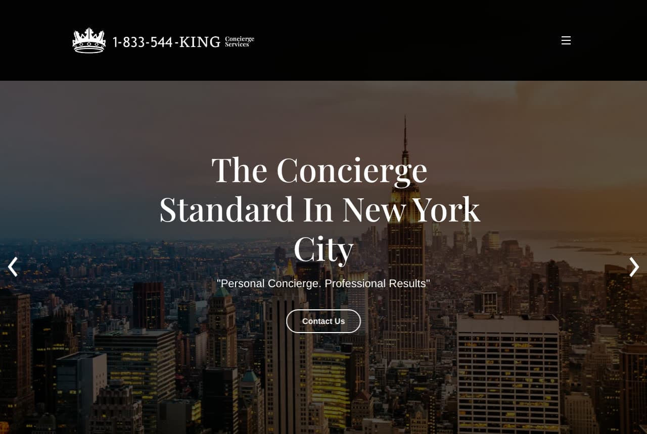
King Concierge Services puts the number where the name goes: a black header whose logo is a crown beside '1-833-544-KING Concierge Services', a hamburger at the right, then a photograph of Manhattan at dusk — the Empire State Building lit, the grid stretching to the river — and over it a serif headline, 'The Concierge Standard In New York City', a quoted tagline ('Personal Concierge. Professional Results') and an outlined 'Contact Us' pill; slideshow arrows either side. No services list in the first screen, no membership; a city, a standard, a phone number you can remember. King shows a small concierge how to be memorable with a vanity number: make it the logo, claim the city in the headline, and keep the hero to a skyline and one button.

Visit King Concierge Services

Opens a similar Zarla design you can make yours.

Auclair Aesthetics Club — Adaptable Template website design you can build with Zarla
Build this with Zarla
  • Adaptable Template
  • Exclusive

Auclair Aesthetics Club: 'Membership Aesthetics' — the by-invitation register

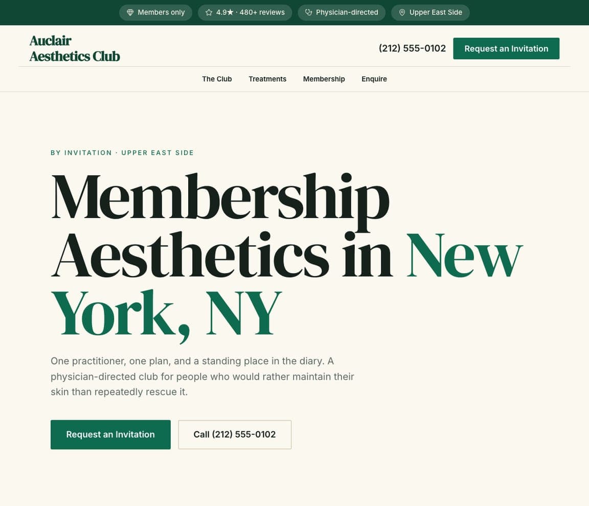
Auclair Aesthetics Club is a Zarla membership template, and — since the catalog has no concierge template yet — the closest match to the application-led houses here (Quintessentially, Knightsbridge Circle, Sienna Charles): an eyebrow that states the model ('BY INVITATION · UPPER EAST SIDE'), a headline with the city in green — 'Membership Aesthetics in New York, NY' — a paragraph about one practitioner, one plan and 'a standing place in the diary', a green 'Request an Invitation' button, a nav (The Club, Treatments, Membership, Enquire) and a strip of chips for members-only, the rating, physician-directed and the neighborhood. Clone it, swap treatments for services and 'invitation' for 'membership', and the register carries over: one relationship, a standing place, an application rather than a booking.

See this template
Wayfare Aesthetics — Adaptable Template website design you can build with Zarla
Build this with Zarla
  • Adaptable Template
  • Responsive

Wayfare Aesthetics: 'Concierge Botox' — the we-come-to-you register on a night skyline

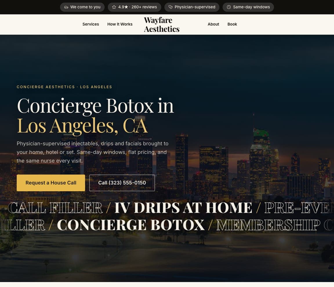
Wayfare Aesthetics is a Zarla house-call template, and the closest catalog match to the New York concierges here (Insider, deVivre, King): a night photograph of the Los Angeles skyline as the ground, a serif headline that uses the word itself — 'Concierge Botox in Los Angeles, CA' with the city in gold — a paragraph that promises 'brought to your home, hotel or set. Same-day windows, flat pricing, and the same nurse every visit', a gold 'Request a House Call' beside an outlined phone number, a dark top strip of chips (we come to you, the rating, physician-supervised, same-day windows) and a marquee of services beneath. Clone it, replace the treatments with your tasks, and 'Request a House Call' becomes 'Contact Us' — the same-day and same-person promises are exactly what a household concierge sells.

See this template
Voyage & Vow — Adaptable Template website design you can build with Zarla
Build this with Zarla
  • Adaptable Template
  • Reassuring

Voyage & Vow: 'Handled' — the everything-arranged register

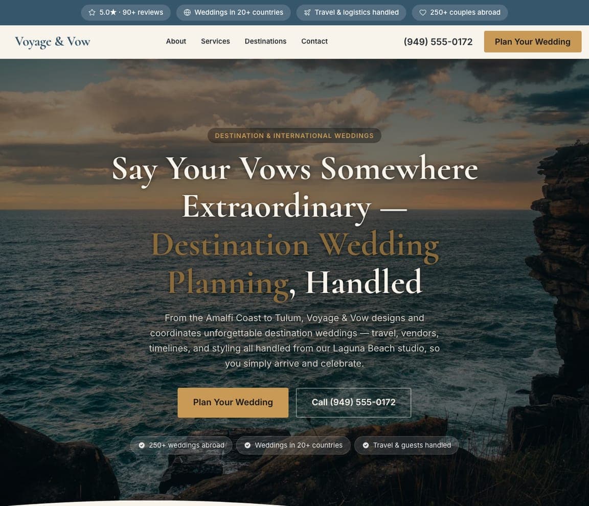
Voyage & Vow is a Zarla destination-wedding template, and the closest catalog match to the travel-and-events concierges here (Nota Bene, Le Rambouillet, Elite Lifestyle Management): a coastal cliff photograph, a serif headline that ends on the concierge's favorite word — 'Say Your Vows Somewhere Extraordinary — Destination Wedding Planning, Handled' — a paragraph that lists what's handled ('travel, vendors, timelines, and styling'), a 'Plan Your Wedding' beside a phone number, and chips for the rating, the countries covered, 'travel & logistics handled' and the couples served. Clone it for a travel or events concierge, swap 'wedding' for 'trip' or 'evening', and the list of what's handled becomes your services.

See this template

Frequently asked

Where can I find good concierge website examples?

Right here — this page curates concierge website examples across the spectrum: global lifestyle-management houses (Quintessentially, Knightsbridge Circle, Sienna Charles, Elite Lifestyle Management), a private travel office (Nota Bene Global), a Los Angeles lifestyle concierge (Le Rambouillet), and three New York concierge businesses (Insider, deVivre, King Concierge Services) — each linked so you can explore the live site — plus professionally designed Zarla membership, house-call and destination-planning templates whose register fits a concierge, which you can clone and make your own. Every example includes a note on why the design works — the promise, the proof, the ask — so you can copy the thinking, not just the look.

What makes a good concierge website?

It says who it's for, lists what it handles, and asks for the right first step. The strong examples above open on one promise about time or access, follow with a list of services (travel, events, lifestyle management, sourcing) so 'concierge' becomes concrete, show the proof that fits their level — awards and discretion at the top, a phone number and a reviews page for personal concierges — and end with the ask that matches: 'Apply for Membership', 'Request a call' or 'Contact Us'. The photography is aspirational at the top end and plain at the neighborhood end; both work when they match the price.

How much does a concierge website cost?

A custom site from an agency typically runs from a couple of thousand dollars up, membership-platform vendors charge a monthly fee for the site plus member management, and general template builders are roughly $16–$30 per month. An AI website builder generates a concierge site — services, memberships or packages, how it works, testimonials, a consultation or application form — from a short description in seconds, then lets you edit it in plain language. Spend the money you save on one photograph that shows the life you make easier — a set table, a packed car, a calm kitchen.

Should a concierge website lead with luxury or with the list of services?

Match the price. Membership houses lead with an image and a promise (a yacht in a gold ring, 'Expect the best') and keep the services behind 'What We Do'; the client already knows the category. Personal concierges lead with the list — Insider's 'luxury lifestyle management, personal concierge, event planning, & bespoke travel agency' in one sentence — because a household deciding whether to hire help needs to see the jobs named. If you charge by the hour, list the hours' work; if you charge a membership, sell the world.

What pages does a concierge website need?

Most concierges need six: a home page with the promise and the first step, a services page that names every task you take on, a memberships or packages page with what's included (and prices, if you sell by the hour or the bundle), a how-it-works page, an about page with the founder and the team, and a contact or application page with a form that asks what the client needs and how often. Add reviews and a blog if you have them — deVivre puts 'Reviews' in a four-item nav because they persuade.

How do concierge services get more clients from their website?

Name the tasks, make the first step easy, and put the phone number where a busy person can tap it. The converting pattern above: King's phone number built into the logo, deVivre's 'contact deVivre!' written like a person in the header, Quintessentially's 'Request a call' beside the login, Le Rambouillet's 'Request a Private Consultation' beside 'Explore Membership'. Then let the promise do the marketing — 'your most valuable asset isn't money, it's time' is a sentence people forward.

You've seen what works. Now make it yours.

Describe your business and Zarla designs a complete, professional website in about 30 seconds — built to convert, just like the ones above.

Free to build and preview · no credit card · publish to your own domain on Premium