Inspiration · Construction

The Best Construction Website Examples, Explained

Looking for construction website examples? These 8 are the best we could find — standout real construction sites plus designs you can build with Zarla — and each comes with a breakdown of the specific design move that makes it work. Find a look you love and you can build a site in that exact style, free, in about 30 seconds.

Real sites + designs you can build with Zarla — free to build and preview, no credit card

What makes a great construction website

The best construction websites share a few moves: they earn trust fast, lead with strong visuals of the work, point to one clear action, and match the design to how their customers decide. Each example below calls out the specific choice worth stealing for your own construction website.

Desert Star Construction website — Luxury Custom Homes design example
Real site · Scottsdale, AZ
  • Luxury Custom Homes
  • Aspirational
  • Dusk + earth

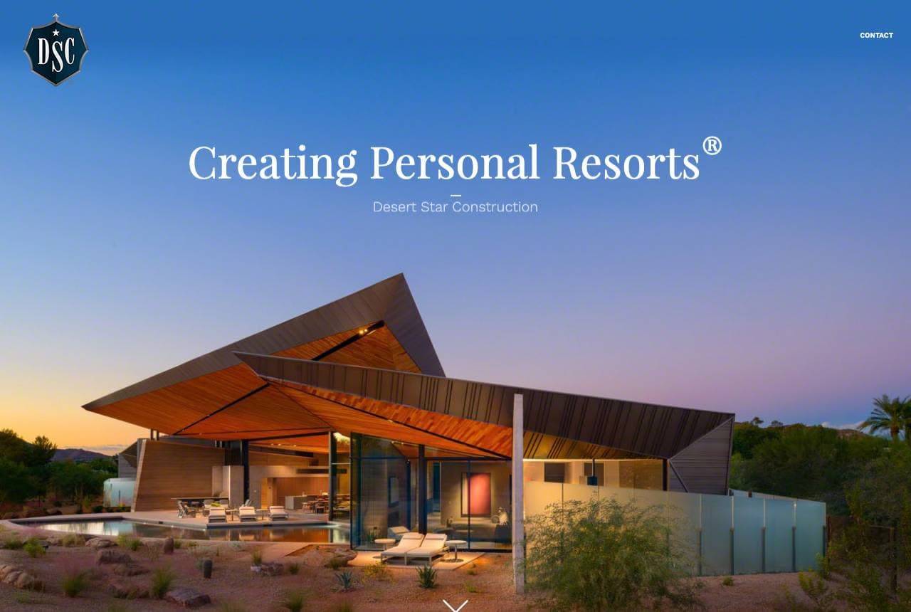
Desert Star Construction: Custom homes, sold as personal resorts

Desert Star Construction elevates custom home building into aspiration: 'Creating Personal Resorts®' (trademarked) over a breathtaking dusk photograph of a sleek Arizona desert-modern home glowing against a purple sky, with 'Since 1978.' The 'personal resorts' framing is brilliant positioning — it reframes 'we build houses' into 'we create the private luxury retreat you'll live in,' which is exactly the emotional aspiration a high-end custom-home client is buying. The stunning twilight architectural photography makes the work look like a five-star property, and the trademark on the phrase signals brand-building intent. The heartfelt copy ('every hope, every dream… we remain your loyal advocates and stewards of your most precious resources — your time, budget, and peace of mind') addresses the anxiety of a huge, personal build. For a custom home builder, a trademarked aspirational phrase plus resort-grade photography sells the dream, not the drywall.

  • 'Creating Personal Resorts' reframes houses as luxury retreats
  • Twilight architectural photography looks five-star
  • Empathetic copy addresses the anxiety of a huge personal build

Steal this: Reframe your product into the aspiration ('personal resorts', not 'custom homes'). Sell the dream the client's actually buying.

Chandos website — Commercial Construction design example
Real site · Canada
  • Commercial Construction
  • Collaborative
  • White + timber

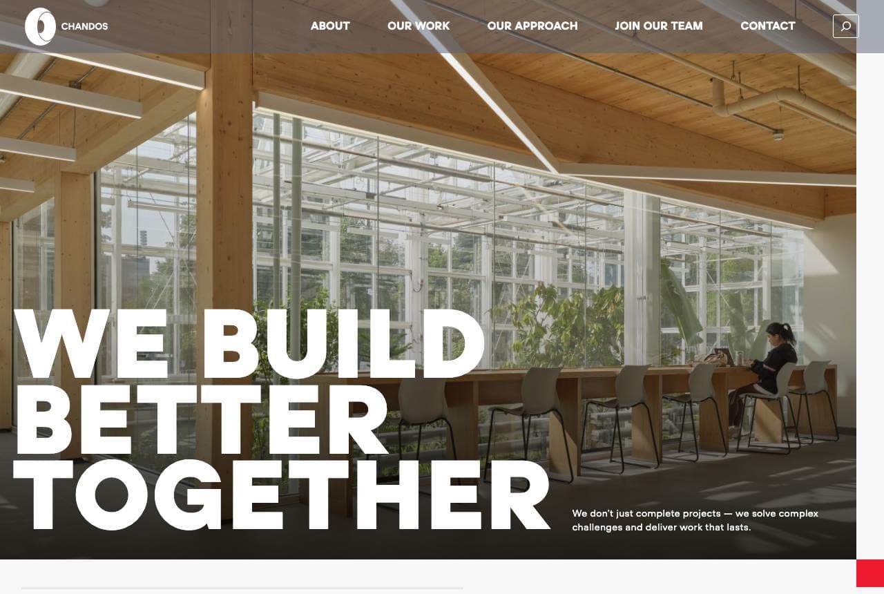
Chandos: 'Build better together', bigger than building

Chandos, a large Canadian construction firm, leads with values and collaboration: 'WE BUILD BETTER TOGETHER' in huge bold type over a beautiful timber-framed interior, and the follow-up line 'We're not just a builder… we don't just complete projects — we solve complex challenges and deliver work that lasts.' The oversized typographic hero and the 'not just a builder' positioning signal a firm that competes on partnership, problem-solving and being a purpose-driven (employee-owned, B-Corp) company, not just on pouring concrete. For large commercial construction, the client (an owner, developer or institution) is choosing a partner for a complex, high-stakes, multi-year relationship, so leading with collaboration and problem-solving ('together', 'solve complex challenges') addresses what they actually care about. The confident type and warm timber imagery keep it human. When you build big projects, sell the partnership and the values, not the trade.

  • 'Build better together' sells partnership over pouring concrete
  • 'Not just a builder' positions as a problem-solving partner
  • Bold type + warm timber signal a purpose-driven firm
Hensel Phelps website — National General Contractor design example
Real site · United States
  • National General Contractor
  • Scale
  • Gold + charcoal

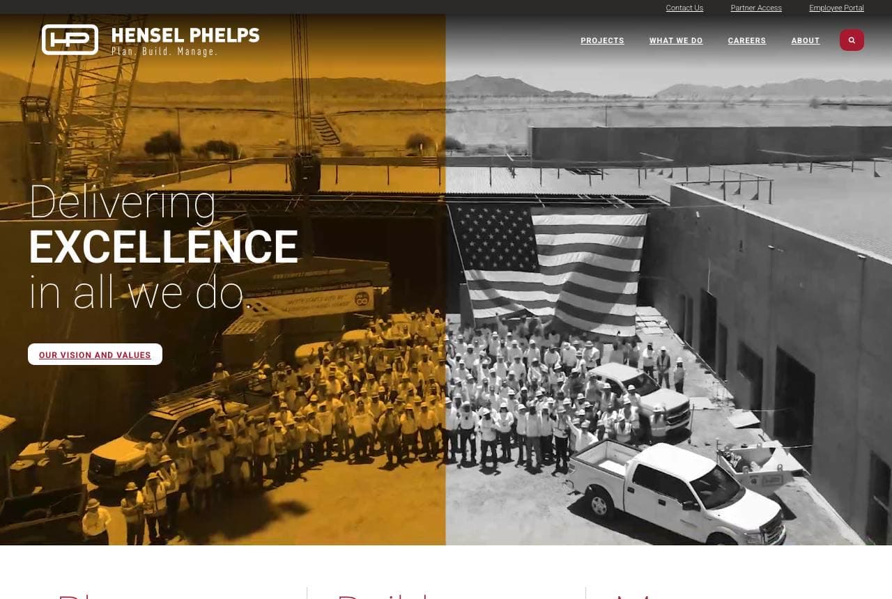
Hensel Phelps: Plan. Build. Manage. — scope in three words

Hensel Phelps, a major national general contractor, communicates its full lifecycle capability crisply: 'Delivering Excellence in All We Do,' the tagline 'Plan. Build. Manage.,' and three columns expanding each phase (plan with ingenuity, build with integrity, manage with assurance). For a large GC on major infrastructure and institutional projects, the client needs to know you can handle the entire project lifecycle — not just construction — so the three-word 'Plan. Build. Manage.' framing instantly communicates end-to-end capability. The imagery (a landmark project, the American flag, the workforce) signals scale, patriotism and workforce pride appropriate to big public projects, and case studies (Water-Wastewater) prove the depth. For a firm bidding large, complex work, articulating your full-lifecycle scope in a memorable three-beat phrase — and backing it with landmark project proof — is how you signal you can be trusted with the whole thing.

  • 'Plan. Build. Manage.' communicates full-lifecycle scope
  • Landmark project + workforce imagery signals scale
  • Case studies prove depth for large, complex bids
Metricon website — Volume Home Builder design example
Real site · Australia
  • Volume Home Builder
  • Approachable
  • Neutral + home

Metricon: A volume home builder, sorted by intent

Metricon, one of Australia's largest home builders, organizes a huge product range around the buyer's life stage: 'Love Where You Live' over a beautiful modern home, then an 'I want to…' selector with four intent paths — Build my first home, Upgrade to a bigger home, Build an investment property, Downsize to a smaller home. That intent-based navigation is exactly right for a volume builder serving many customer types at once; a first-home buyer and a downsizer want completely different homes, price points and information, so routing them immediately by their goal is far more useful than a giant undifferentiated catalogue. House-design browsing, display-home visits and house-and-land packages give each path somewhere to go. For a builder (or any business) with a broad range serving distinct customer segments, letting visitors self-select by their actual goal — 'I want to…' — is how you make a big catalogue feel personal and navigable.

  • 'I want to…' intent selector routes by life stage
  • First-home buyer vs downsizer get completely different paths
  • Makes a huge product range feel personal and navigable

Steal this: For a broad catalogue, route visitors by their goal ('I want to build my first home / downsize'). Intent-nav makes big feel personal.

A.P. Williams website — Commercial Design-Build design example
Real site · Pennsylvania
  • Commercial Design-Build
  • Process-Clear
  • Navy + orange

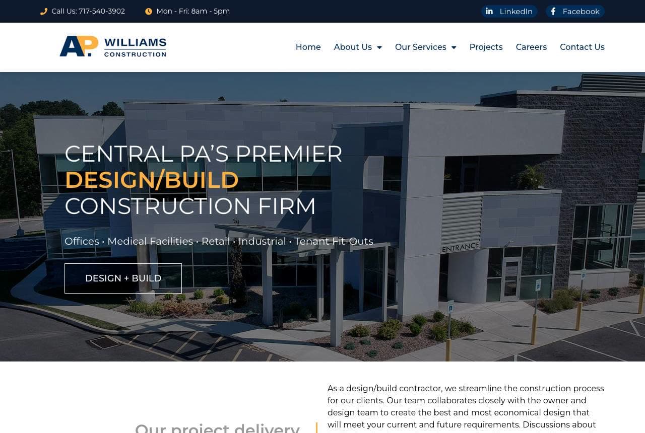
A.P. Williams: Design-build, and the process spelled out

A.P. Williams Construction leads with a clear specialty and demystifies the process: 'Central PA's Premier Design/Build Construction Firm' (with the sectors it serves — Offices, Medical Facilities, Retail, Industrial, Tenant Fit-Outs — listed right below), then a numbered 4-step delivery process (Consultation → Project Design → Construction → Close Out) each with a photo. For commercial construction, the design-build model (one firm handles both design and construction) is a genuine differentiator that saves the client time and money, and naming it plus showing the streamlined 4-step process addresses the owner's key concern: predictability. Spelling out exactly how a project will unfold — with steps and photos — reduces the perceived risk of a big, expensive, disruptive build. Listing the specific building types served also helps the right client self-identify. For a construction firm, naming your delivery model and visually walking through your process builds the confidence a nervous commercial client needs.

  • Design/build model named as the time-and-money differentiator
  • Numbered 4-step process reduces perceived project risk
  • Sector list (medical, retail, industrial) helps clients self-identify
Proficiency website — High-End Residential design example
Real site · London, UK
  • High-End Residential
  • Premium
  • Warm + navy

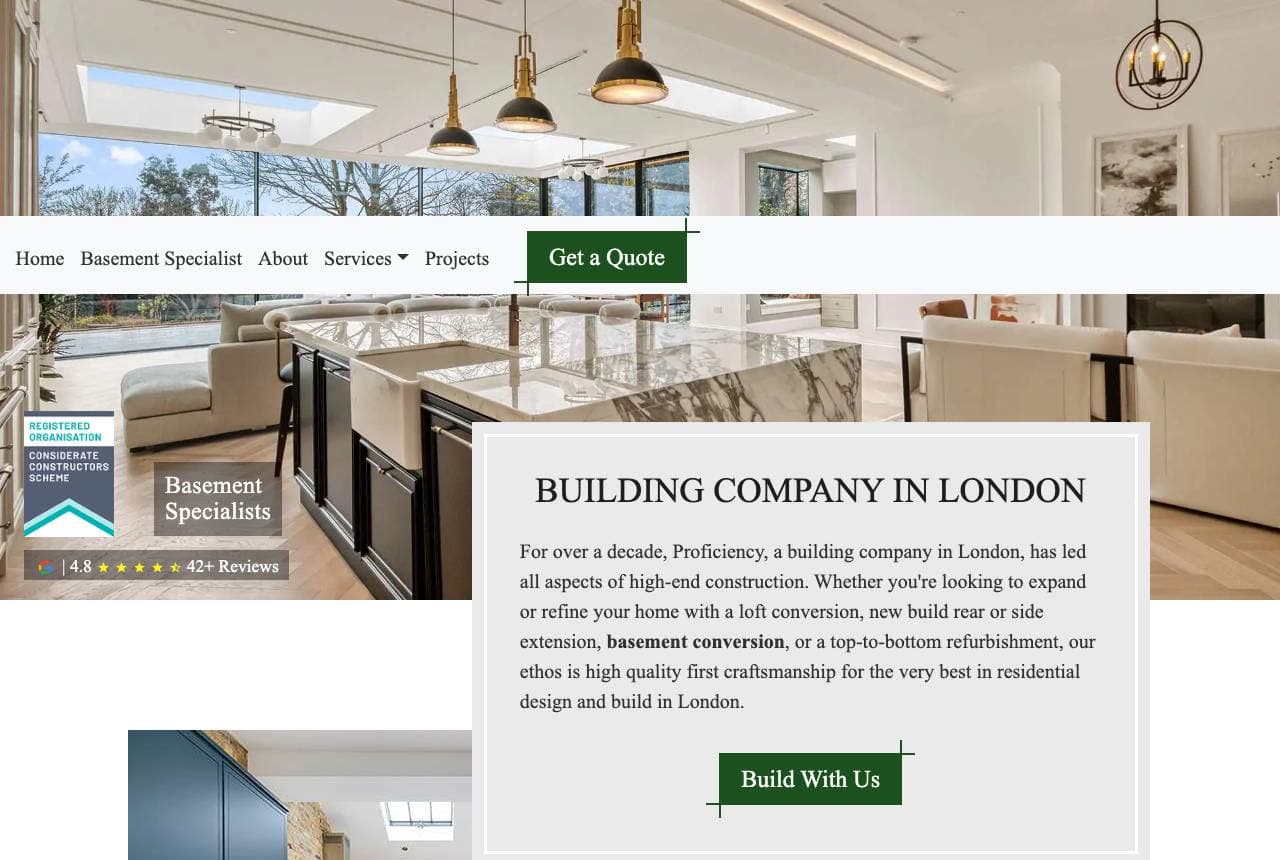
Proficiency: High-end residential, and a named specialty

Proficiency positions as a premium London residential builder with a specific hook: 'Building Company in London' over a gorgeous high-end kitchen interior, with 'Basement Specialists' called out as a distinct expertise (basement conversions are a huge, high-value niche in space-starved London) and a review rating (4.8, 42+ reviews) for trust. The copy is confident and aspirational — 'every day, we aim to be London's premier construction company, delivering nothing less than our absolute best' — and the beautiful finished-interior photography sells the quality of the craftsmanship. Naming a specialty like basement conversions within the broader residential-build offering is smart: it captures a specific, lucrative, frequently-searched service while still serving general high-end refurbishment. For a residential builder, pairing beautiful finished-project photography with a named high-value specialty (basements, extensions, loft conversions) and visible reviews wins the discerning homeowner.

  • 'Basement Specialists' names a high-value London niche
  • Beautiful finished-interior photos sell craftsmanship quality
  • Review rating provides the trust a big spend requires
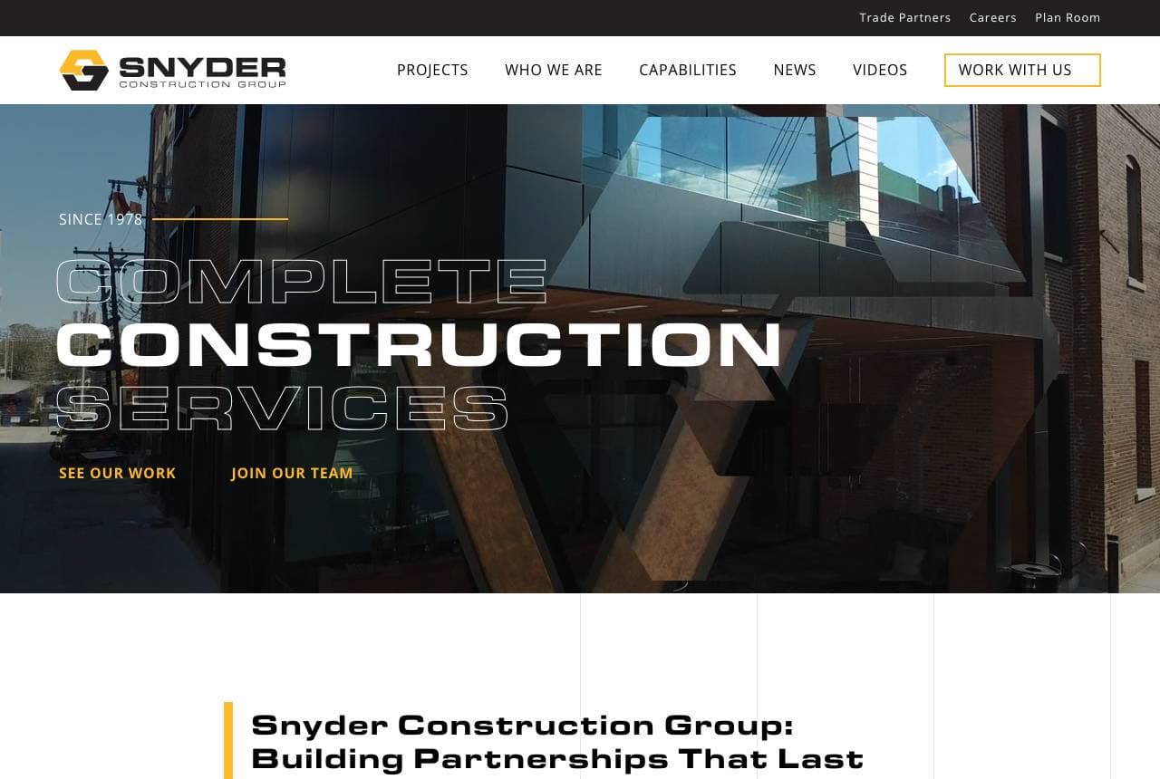
Snyder Construction Group website — Commercial GC design example
Real site · Springfield, MO
  • Commercial GC
  • Relationship-Led

Snyder Construction Group: Relationships as the whole promise

Snyder Construction Group leads a commercial construction pitch with relationships, not just buildings: 'Complete Construction Services' over a sleek glass commercial building, then the load-bearing headline 'Snyder Construction Group: Building Partnerships That Last,' backed by '45+ years… delivering on time and under budget, and exceeding client expectations each step of the way.' The 'partnerships that last' framing, plus the emphasis on the intangibles a commercial client actually worries about (on time, on budget, exceeding expectations), positions Snyder as a reliable long-term partner rather than a one-off vendor. The 'Complete Construction Services' hero establishes full capability, and 'Featured Projects' provides the proof. For a commercial general contractor, leading with the promise of a lasting, dependable relationship — and the on-time/on-budget reassurance every developer needs — speaks directly to what makes a client re-hire and refer. In commercial building, the repeat relationship is the business; sell it.

Ironhill Construction — Home Builder website design you can build with Zarla
Build this with Zarla
  • Home Builder
  • Solid

Ironhill Construction: Homes that outlast trends

Ironhill Construction is Zarla's builder template, and its fullwidth-overlay hero lands the promise a home builder needs: 'We Build Homes That Outlast Trends' over a full-bleed architectural image, in a deep-slate and warm-orange palette that reads solid, established and trustworthy. It borrows the right instincts from this gallery — show beautiful finished work, promise durability and quality, keep the enquiry easy — pre-built. The structure carries services (custom builds, renovations, design-build), a project gallery (where the aspirational photography that sells this trade lives), a process/why-us section, and a quote CTA. The 'outlast trends' framing sells timeless quality over fashionable flash — exactly what a client committing to a major build wants to hear. Swap in photos of your own projects and it's a credible, solid builder site in about 30 seconds — no photographer or designer required.

See this template

Frequently asked

Where can I find good construction website examples?

Right here — this page curates construction website examples two ways: standout real businesses (each linked, so you can explore the live site) and professionally designed Zarla templates you can clone and make your own. Every example comes with a note on why the design works — trust signals, layout, calls to action — so you can copy the move, not just the look.

What makes a good construction website?

A good construction website earns trust in the first few seconds, leads with strong visuals of the work, gives visitors one obvious action, and loads fast on a phone. Every design below leads with proof and a single clear call to action rather than a wall of text.

How much does a construction website cost?

A custom construction website from a designer typically runs into the thousands up front, and template builders charge roughly $16–$30 per month. An AI builder generates a complete, editable design for free and only charges (on the Premium plan) when you publish to your own domain — so you can build and preview before spending anything.

Do I need a designer to build a construction website?

No. Several designs on this page were generated by Zarla and are fully editable — you describe your business and get a complete, professionally designed site in about 30 seconds, then refine it by chatting. Building and previewing is free; publishing to your own domain needs the Premium plan.

What pages does a construction website need?

Most construction businesses need just a few: a home page that proves trust and points to one clear action, an about page that puts a face to the business, a services or work page that shows what you do, and a contact page with a form and a phone number. Local businesses also benefit from location or service-area pages that help them show up in nearby searches.

How do I get more customers from my construction website?

Lead with proof in the first few seconds (reviews, real photos, results), make one action obvious on every screen (call, book, or enquire), and keep it fast on mobile — most visitors arrive on a phone. The designs above each do this differently, but they all earn trust early and remove friction from the next step.

You've seen what works. Now make it yours.

Describe your business and Zarla designs a complete, professional website in about 30 seconds — built to convert, just like the ones above.

Free to build and preview · no credit card · publish to your own domain on Premium