Inspiration · Consultant

The Best Consultant Website Examples, Explained

Looking for consultant website examples? These 8 are the best we could find — standout real consultant sites plus designs you can build with Zarla — and each comes with a breakdown of the specific design move that makes it work. Find a look you love and you can build a site in that exact style, free, in about 30 seconds.

Real sites + designs you can build with Zarla — free to build and preview, no credit card

What makes a great consultant website

The best consultant websites share a few moves: they earn trust fast, lead with strong visuals of the work, point to one clear action, and match the design to how their customers decide. Each example below calls out the specific choice worth stealing for your own consultant website.

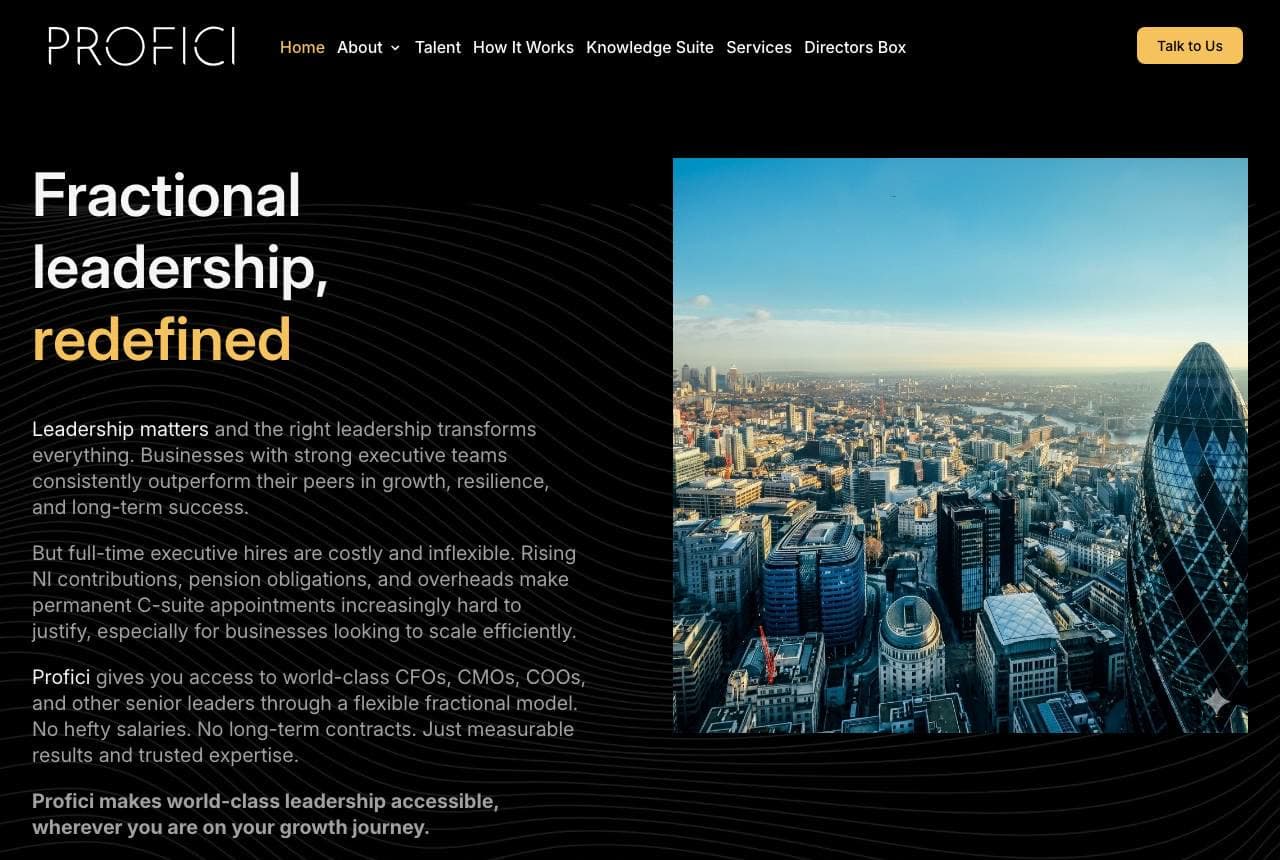
Profici website — Fractional C-Suite design example
Real site · Liverpool, UK
  • Fractional C-Suite
  • Premium
  • Black + gold

Profici: Six logos that end the argument

Profici sells fractional C-suite leadership, and its hero makes the abstract concrete fast: 'Fractional leadership, redefined' in gold on black beside a City of London skyline, with the pitch — world-class CFOs, CMOs and COOs without the salaries or long-term contracts — laid out in plain economic terms (rising NI contributions, pension obligations). Then the knockout: a 'Trusted by leading companies' bar carrying Coca-Cola, Cadbury, Meta, Amazon, Nike and Netflix. For a model many buyers haven't tried before, those six logos retire the perceived risk in one glance. Black-and-gold restraint does the rest, positioning a flexible service as a premium one. When you're selling a new category, borrowed logos are the fastest trust you can earn.

  • Household-name logo bar retires the new-model risk
  • Pitch argued in CFO language: NI, pensions, overheads
  • Black + gold makes 'flexible' read as 'premium'

Steal this: If your service model is unfamiliar, lead with recognizable client logos — familiarity transfers faster than explanation.

Opsize website — Startup Coaching design example
Real site · Online
  • Startup Coaching
  • Outrageous
  • Black + magenta

Opsize: A burger where the boardroom should be

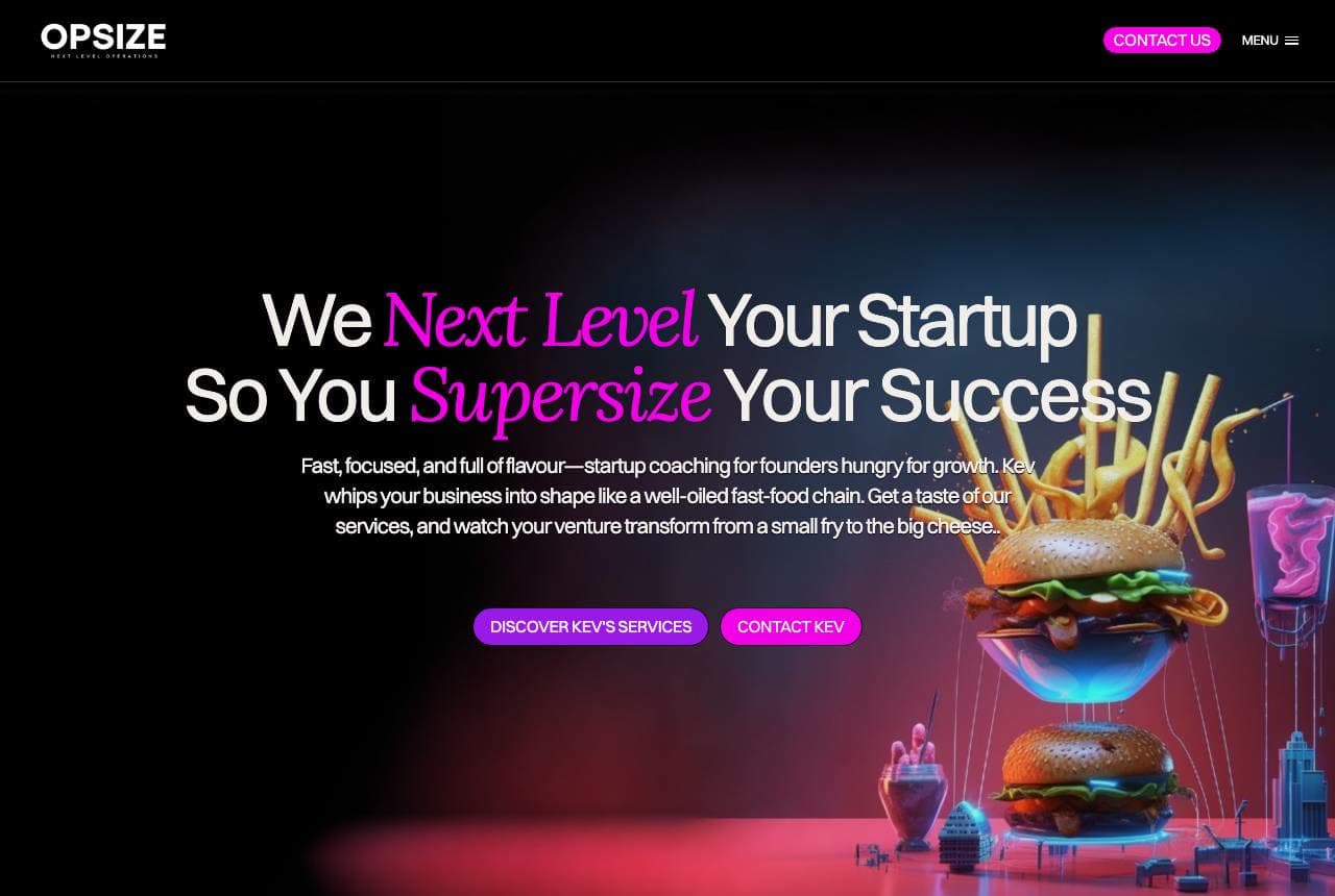
Opsize is startup coaching dressed as fast food, and it commits absurdly hard: 'We Next Level Your Startup So You Supersize Your Success' in magenta italics over a glossy 3D cheeseburger mid-explosion, with copy promising to whip your business into shape 'like a well-oiled fast-food chain.' It's the highest-risk design in this gallery and it works for exactly one reason: the metaphor is load-bearing. Fast food means systems, speed, repeatability — which is genuinely the consulting thesis — so the burger isn't decoration, it's the argument. In a category of interchangeable navy-suit sites, being unforgettable is a distribution strategy: founders screenshot this page and send it to other founders. That's the bet, and it's a rational one.

  • The absurd visual carries the actual thesis: systems + speed
  • Magenta-on-black neon is anti-consulting on purpose
  • Memorable enough to get screenshotted — design as distribution

Steal this: If you pick a metaphor, make it load-bearing. A burger that MEANS 'repeatable systems' beats a tasteful stock photo.

The Deerborne Group website — Biotech Consulting design example
Real site · United States
  • Biotech Consulting
  • Scientific
  • Deep blue

The Deerborne Group: A DNA helix declares the niche

The Deerborne Group could have written 'boutique management consulting' over a handshake photo; instead the hero is a DNA double-helix under 'Helping Clients Accelerate Insights Into Value,' and the specialization does all the differentiating: the firm 'focuses exclusively on the global biotechnology, in-vitro diagnostics, and life sciences industries.' The word 'exclusively' is the entire strategy — biotech executives scanning for advisors see their own world on screen instead of generic business imagery, and self-select in. The deep-blue scientific palette and the 'advising corporations, venture capital, and private equity' scope line complete the signal: not consultants who can learn your industry, consultants who already live in it. Niching is a homepage decision before it's a business one.

  • 'Exclusively' is the strongest word on the page
  • Helix imagery lets biotech buyers see their own world
  • VC/PE scope line targets who actually writes the cheque
Ascend Business Consulting website — SMB Consulting design example
Real site · Australia
  • SMB Consulting
  • Candid
  • Warm + charcoal

Ascend Business Consulting: Two named paths, prices included

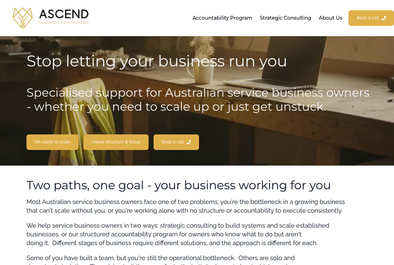
Ascend Business Consulting opens with a headline that diagnoses ('Stop letting your business run you') and then does what almost no consultant dares: it publishes the productized menu. 'Two paths, one goal' splits the offer into an Accountability Program and Strategic Consulting, each with Who It's For, What Changes, and — remarkably — Investment: $959 for six weeks on one path, around $2,500 a month on the other. The copy even sorts the reader honestly: 'Some of you have built a team but you're still the bottleneck. Others are solo and drowning in isolation. The advice isn't the same for both.' Pricing on the page filters out the tire-kickers and signals total confidence in the value. Consulting productized is consulting bought.

  • Published prices filter buyers and project confidence
  • 'Who it's for' honesty sorts two client types correctly
  • Diagnosis headline beats capability headline

Steal this: Productize into named paths with visible investment levels. Priced offers get bought; 'contact us' gets postponed.

YCP website — Corporate Strategy design example
Real site · Asia-Pacific
  • Corporate Strategy
  • Enterprise
  • Blue + navy

YCP: Two words, three numbers, one region

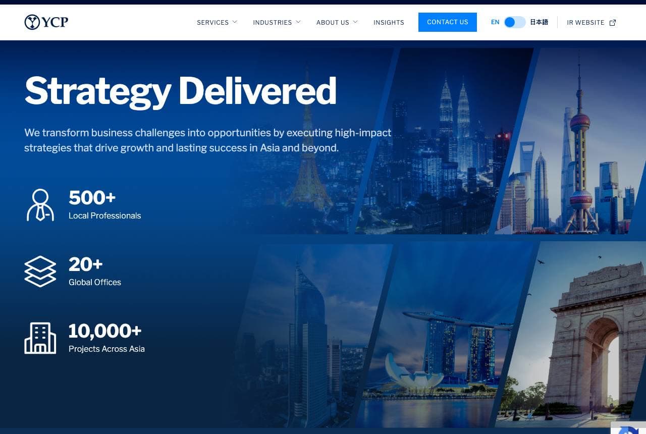
YCP compresses a firm's whole pitch into two words — 'Strategy Delivered' — and lets a stat stack carry the substance: 500+ local professionals, 20+ global offices, 10,000+ projects across Asia. The verb choice is surgical; 'delivered' positions against the strategy-deck-that-gathers-dust stereotype, promising execution rather than advice. Behind it, a collage of Asian skylines (Shanghai, Singapore, Delhi) makes the geographic moat visual, and the services architecture below (Advisory, PMO, digital transformation, supply chain) reads like a firm that operates rather than opines. For any consultancy whose edge is regional depth, this is the formula: claim the region in imagery, prove it in numbers, and pick a verb your competitors can't.

  • 'Delivered' — one verb against the dusty-deck stereotype
  • Skyline collage makes the regional moat visible
  • Stat stack scales trust the way logos do for Profici
Bright Wire website — Leadership Development design example
Real site · United States
  • Leadership Development
  • Polished
  • Ivory + gold

Bright Wire: The full bench, photographed together

Bright Wire leads with something leadership consultancies talk about but rarely show: the entire team, photographed together on a staircase, under 'Level Up Your Leadership.' Nineteen consultants in one frame is an argument — depth of bench, coherence of culture, and the confidence to put faces to the promise (most firms this size hide behind abstract imagery and a partners page). The ivory-and-gold palette with a single starburst mark keeps it executive-grade, and the follow-through line — 'We help high-achieving leaders reach higher' — names the actual client: people already succeeding. Serving the ambitious rather than the struggling is a sharper position than 'we fix problems,' and the polished group portrait embodies it.

  • A real 19-person team photo IS the depth-of-bench claim
  • Ivory + gold restraint reads executive-grade
  • 'High-achieving leaders' targets the ambitious, not the broken
Fortitude Business Consulting website — Business Advisory design example
Real site · Australia
  • Business Advisory
  • Conventional

Fortitude Business Consulting: A dictionary definition as tagline

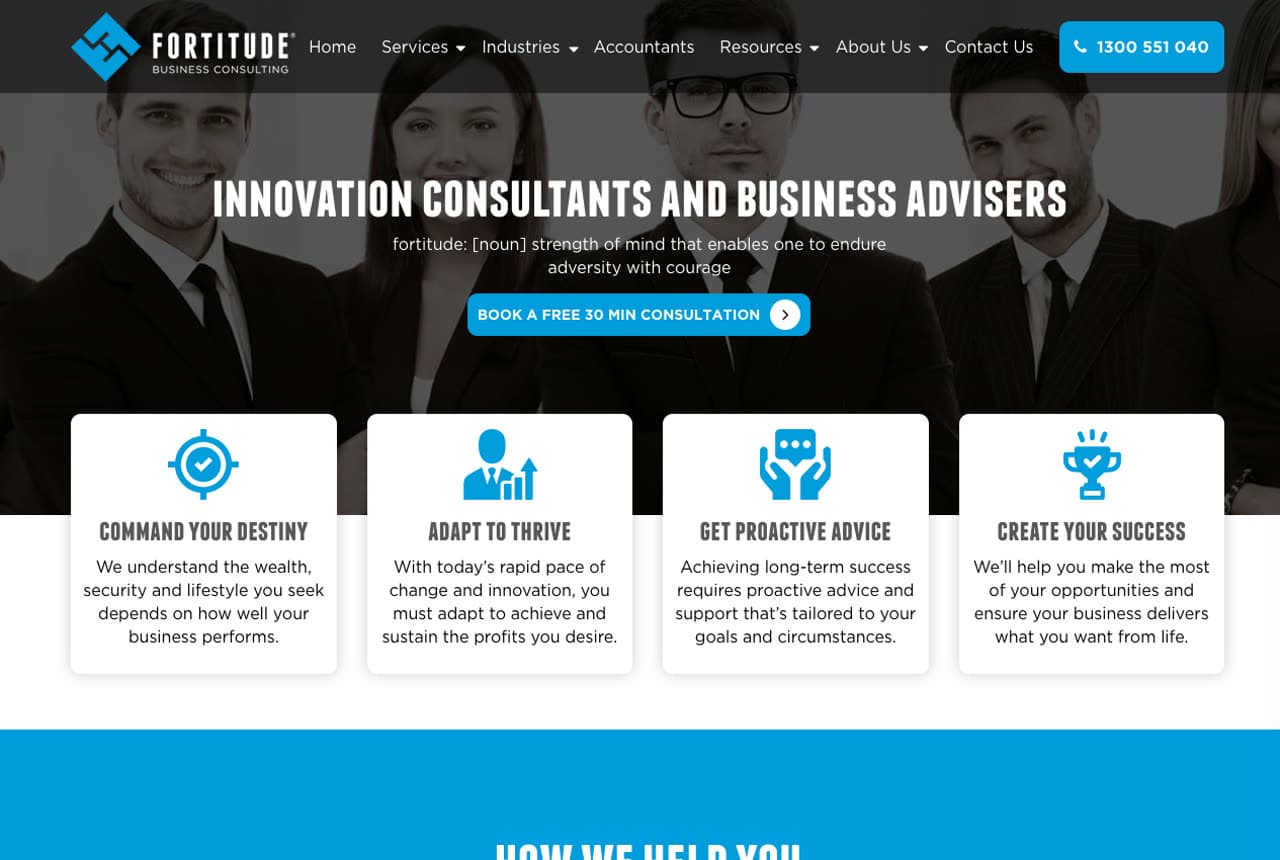
Fortitude Business Consulting hangs its brand on its own name, dictionary-style: 'fortitude. [noun] strength of mind that enables one to endure adversity with courage' sits directly under the all-caps headline. It's a modest device that does real work — it converts a generic-sounding firm name into a promise about temperament, which is what businesses in trouble are actually shopping for. The four icon cards beneath (Command Your Destiny, Adapt to Thrive, Get Proactive Advice, Create Your Success) and the tabbed 'How We Help You' selector (Innovation Consulting, Business Advisory, Accounting & Taxation) organize a broad practice into scannable doors. Conventional design, but the definition move is worth stealing for any business whose name means something.

Throughline Consulting — Business Consulting website design you can build with Zarla
Build this with Zarla
  • Business Consulting
  • Analytical

Throughline Consulting: Ambition in, measurable results out

Throughline Consulting is Zarla's consultant template, and its form-split hero pairs the promise — 'Turn Ambition Into Measurable Results' — with a consultation form in the same viewport, because consulting's conversion moment is a booked conversation, not a browsed brochure. The headline vocabulary is chosen for the trade: 'measurable' is the word that separates consultants who deliver from consultants who advise (the same instinct behind YCP's 'Strategy Delivered'). Deep navy with a teal accent reads analytical and current, and the structure descends through services, proof and process to the ask. If your practice needs a page that turns visitors into discovery calls this week, clone it — it's live in about 30 seconds.

See this template

Frequently asked

Where can I find good consultant website examples?

Right here — this page curates consultant website examples two ways: standout real businesses (each linked, so you can explore the live site) and professionally designed Zarla templates you can clone and make your own. Every example comes with a note on why the design works — trust signals, layout, calls to action — so you can copy the move, not just the look.

What makes a good consultant website?

A good consultant website earns trust in the first few seconds, leads with strong visuals of the work, gives visitors one obvious action, and loads fast on a phone. Every design below leads with proof and a single clear call to action rather than a wall of text.

How much does a consultant website cost?

A custom consultant website from a designer typically runs into the thousands up front, and template builders charge roughly $16–$30 per month. An AI builder generates a complete, editable design for free and only charges (on the Premium plan) when you publish to your own domain — so you can build and preview before spending anything.

Do I need a designer to build a consultant website?

No. Several designs on this page were generated by Zarla and are fully editable — you describe your business and get a complete, professionally designed site in about 30 seconds, then refine it by chatting. Building and previewing is free; publishing to your own domain needs the Premium plan.

What pages does a consultant website need?

Most consultant businesses need just a few: a home page that proves trust and points to one clear action, an about page that puts a face to the business, a services or work page that shows what you do, and a contact page with a form and a phone number. Local businesses also benefit from location or service-area pages that help them show up in nearby searches.

How do I get more customers from my consultant website?

Lead with proof in the first few seconds (reviews, real photos, results), make one action obvious on every screen (call, book, or enquire), and keep it fast on mobile — most visitors arrive on a phone. The designs above each do this differently, but they all earn trust early and remove friction from the next step.

You've seen what works. Now make it yours.

Describe your business and Zarla designs a complete, professional website in about 30 seconds — built to convert, just like the ones above.

Free to build and preview · no credit card · publish to your own domain on Premium