Inspiration · Dance Studio

The Best Dance Studio Website Examples, Explained

Looking for dance studio website examples? These 12 are the strongest we found — Murrieta Dance Project's crew mid-move under 'New @ MDP', Steps on Broadway's three students at the barre with 'Ages 2 – 18', Carolina Collective's neon sign on a plant wall — plus studio designs you can build with Zarla, each with a breakdown of the specific move that turns a parent's search into a trial class. A dance studio's website has to show the room, the level and the age in one screen, then make the first class easy to book. Find an approach you love and you can build a site in that spirit, free, in about 30 seconds.

Real sites + designs you can build with Zarla — free to build and preview, no credit card

What makes a great dance studio website

The best dance studio websites photograph their own students, not stock dancers, and say who the classes are for before they say anything else. The first screen tells a parent the ages (Steps on Broadway's 'Ages 2 – 18', DC Dance of LA's '3-18+'), the styles (I Love Dance's 'K-pop & street styles', Springs Dance's 'Ballet, Tap, Jazz, Contemporary and More') and the city, then offers one of three next steps — register, book a trial class, or see the schedule — as a button. Two moods show up: the bright, community studio (Dance Academy USA, Carolina Collective) and the dark, cinematic training space (Debut Dance District, Murrieta). Both work when the photograph is real. Every example below makes a parent or a dancer feel they know what walking in will be like.

Murrieta Dance Project website — Contemporary Studio design example
Real site
  • Contemporary Studio
  • Energetic
  • Charcoal + pink

Murrieta Dance Project: A crew mid-move under three thin words

Murrieta Dance Project opens on its dancers at full size: a photograph of a crew mid-routine in a dark studio — pink and lavender track pants, arms cocked, every dancer caught on the same beat — with three thin white capitals across the middle, 'NEW @ MDP', and nothing else. The nav is a white band with the logo centered and eight small items on either side (Studio, Register, Classes, Summer '26, Revue, Company, Performances, News); two social icons sit in the corner of the photo. No trial-class button, no paragraph, no ages — the photograph is the pitch, and the words point to what's new. Murrieta shows a contemporary studio how to lead with energy: shoot your own students on the beat, keep the type to three words, and let the nav carry the practical things.

  • The studio's own dancers, caught on the same beat
  • 'New @ MDP' — three words, no pitch
  • A centered-logo nav that carries all the practical links

Steal this: Photograph one class on the beat and put nothing but the studio's name over it — the energy is the argument.

Visit Murrieta Dance Project

Opens a similar Zarla design you can make yours.

Dance Academy USA website — Competition Studio design example
Real site
  • Competition Studio
  • Busy
  • Lilac + red

Dance Academy USA: A welcome, three promises and two red buttons

Dance Academy USA talks to the parent directly: over a lilac-tinted collage of stage photographs — recital lines, competition teams, tiny dancers in tutus — a bold headline says 'Welcome to Silicon Valley's Premier Dance Studio', a second line makes three promises ('Where Dancers Grow. Achieve. Belong.'), and two red buttons sit side by side with captions beneath them: '26-27 Season Schedule' ('Browse our full class schedule by style!') and 'Free Trial Class Sign-Ups' ('Browse our free trial offerings!'), with a line between them that creates the urgency ('Season 26-27 has begun! Get in while you can!'). A red 'Enroll/Login' waits in the nav, the phone number beside it. It's busy, and it's exactly what a parent scanning on a phone needs. Dance Academy USA shows a competition studio how to convert in one screen: welcome, promise, schedule, trial, enroll.

  • 'Grow. Achieve. Belong.' — three promises to the parent
  • Schedule and free trial as twin red buttons with captions
  • 'Season has begun — get in while you can' as the urgency line

Steal this: Put the two things a parent wants — the schedule and the free trial — as twin buttons with one-line captions under each.

Visit Dance Academy USA

Opens a similar Zarla design you can make yours.

I Love Dance website — K-pop Studio design example
Real site · New York, NY
  • K-pop Studio
  • Urban
  • Grey + white

I Love Dance: K-pop in Times Square, styles in three lines

I Love Dance puts its style and its city in one photograph: a dancer in a grey suit and a black mask strikes a pose on a Times Square sidewalk, the Gap sign and the crowd behind them, and over the scene three lines of condensed capitals say exactly what the studio is — 'KPOP & STREET STYLES / DANCE CREW | DANCE STUDIO / NEW YORK & NEW JERSEY'. A small heart logo sits top-left; the nav lists the business model as plainly as the hero (Online Classes, In-Studio Classes, Space Rental, Private Lessons, I Love Dance Company, Other Services); a chevron invites the scroll, and 'Follow Us On Social Media' with four icons sits directly under the hero, because for a K-pop studio the socials are the portfolio. I Love Dance shows a style-specific studio how to be found: name the genre first, the city second, and photograph the street the dancers came from.

  • Genre, format and city in three lines of capitals
  • A street photograph in the studio's own city
  • Social icons directly under the hero — the portfolio for a K-pop studio

Steal this: For a style-specific studio, put the genre in the first line and the city in the last — that is the exact phrase people search.

Visit I Love Dance

Opens a similar Zarla design you can make yours.

Springs Dance website — Youth Academy design example
Real site · Colorado Springs, CO
  • Youth Academy
  • Calm
  • Grey + purple

Springs Dance: 'More than just a dance studio', then the styles

Springs Dance makes the promise a parent wants to hear and then lists the styles: over a grey-toned photograph of hands on a barre, a bold white headline reads 'More Than Just a Dance Studio', with a sub-line that reframes the classes as character-building ('Training students of all ages in the art of confident leadership in Colorado Springs') and a purple 'Get Started'. Directly under the hero, a white section titled 'Ballet, Tap, Jazz, Contemporary and More' shows three circular black-and-white photographs of classes — small dancers at the barre, a line of children, an adult class. The nav is four items and the same purple button; a 'Jazz Intro 9/16' link advertises the next start date. Springs Dance shows a youth academy how to sell values and variety in two screens: the promise on the photograph, the styles under it, the next class date in the nav.

  • 'Confident leadership' — the class reframed as character
  • The styles listed as the first heading under the hero
  • The next start date ('Jazz Intro 9/16') as a nav item
Visit Springs Dance

Opens a similar Zarla design you can make yours.

Peridance website — Dance Center design example
Real site · New York, NY
  • Dance Center
  • Institutional
  • Teal + navy

Peridance: An institution in a white header and a teal nav

Peridance looks like the institution it is: a white header with the blue brushstroke logo and 'new york's premier dance center' in lowercase, a teal bar of seven audiences (About, Open Classes, Training Programs, International Students, Children & Teens, The Company, KnJ Theater), and then a photograph of two dancers — one in a tan leotard, one in a grey tank — with a program title set across them in wide, outlined capitals — 'PCDC SUMMER INTENSIVE'. The photograph runs to the bottom of the screen; one scroll down, a white band reads 'REGISTER FOR OUR SAP PROGRAMS'. No button, no trial offer in the first screen; the nav is the offer. The audiences in the teal bar — international students, children and teens, a company, a theater — are the whole pitch. Peridance shows a dance center how to present scale: organize the nav by who you serve, headline the current program, and let the photograph fill the screen.

  • A nav organized by audience — students, families, international, company
  • The current program as the hero headline in outlined capitals
  • The program registration as a white band one scroll down
Visit Peridance

Opens a similar Zarla design you can make yours.

Debut Dance District website — Street Dance Studio design example
Real site
  • Street Dance Studio
  • Moody
  • Magenta + black

Debut Dance District: Magenta light, black outfits, masks on

Debut Dance District looks like a music video: a photograph of dancers in black — chains, masks, hair mid-whip — under magenta and violet stage light, filling the width under a white header with the studio's stencil logo and a row of underlined tabs (Home, Classes, New Member (Waiver), Studio Rental, More). There is no headline on the photograph and no button; the image and the two words 'New Member' in the nav are the whole first screen. The waiver in the nav is a tell — this is a studio where you sign in and dance, not a school with a recital. Debut shows a street-dance studio how to signal its scene instantly: shoot the class under colored light, keep the type to a logo, and put the practical door ('New Member') in the nav.

  • Stage-lit photography — the studio as a set
  • No headline: the logo and the image carry it
  • 'New Member (Waiver)' in the nav — the sign-in-and-dance model
Visit Debut Dance District

Opens a similar Zarla design you can make yours.

Steps on Broadway website — Dance Academy design example
Real site · New York, NY
  • Dance Academy
  • Classic

Steps on Broadway: Three students at the barre, ages in italics

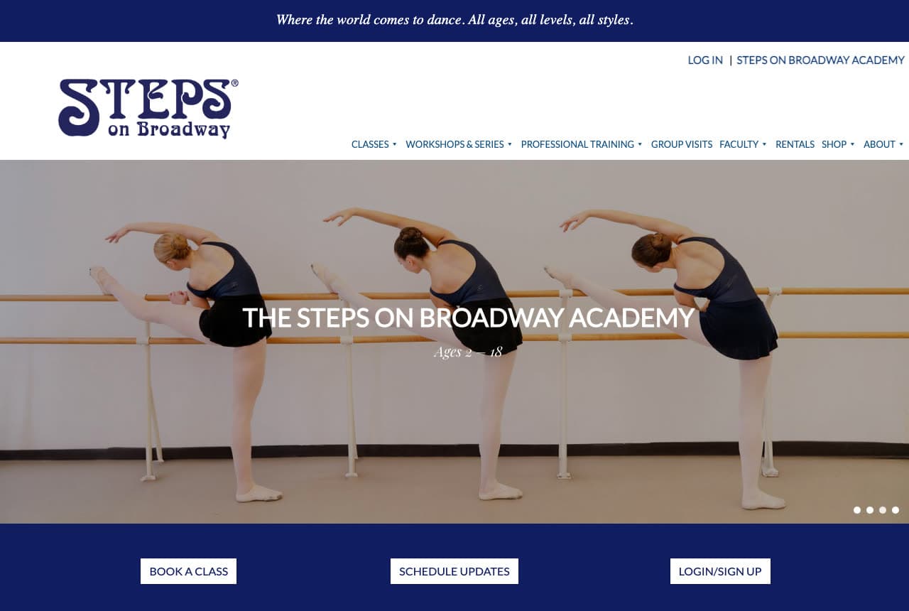
Steps on Broadway shows the academy in one photograph: three young students in navy leotards at a barre, arms arched in the same line, and over them the program name in white capitals — 'THE STEPS ON BROADWAY ACADEMY' — with the ages in small italics beneath, 'Ages 2 — 18'. A navy band closes the screen with three white buttons: 'BOOK A CLASS', 'SCHEDULE UPDATES', 'LOGIN/SIGN UP'. Above, the purple script wordmark sits beside a two-row nav (Classes, Workshops & Series, Professional Training, Group Visits, Faculty, Rentals, Shop, About) and a 'Log In | Steps on Broadway Academy' line. It's a slideshow, and this slide is the one that matters to parents. Steps shows a legendary open-class studio how to speak to families too: the children at the barre, the age range in one line, and the three buttons a parent needs.

Visit Steps on Broadway

Opens a similar Zarla design you can make yours.

DC Dance of LA website — Training Program design example
Real site · Los Angeles, CA
  • Training Program
  • Serious

DC Dance of LA: Kids mid-class and a trial-class tab on the edge

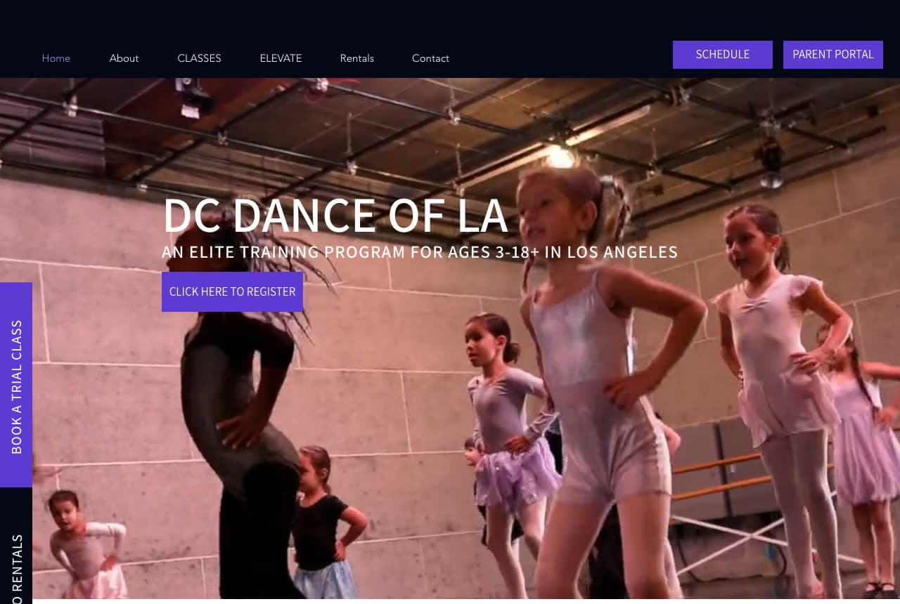
DC Dance of LA photographs a real class and pins the ask to the screen: children in leotards and tutus mid-exercise in a high-ceilinged studio, a teacher's back in the foreground, and over the room a white headline — 'DC DANCE OF LA' — with the positioning in tracked capitals beneath it, 'AN ELITE TRAINING PROGRAM FOR AGES 3-18+ IN LOS ANGELES', and a purple 'CLICK HERE TO REGISTER'. A purple tab reading 'BOOK A TRIAL CLASS' runs vertically down the left edge of the screen, with 'STUDIO RENTALS' beneath it. The dark nav ends in 'SCHEDULE' and 'PARENT PORTAL' buttons. Ages, city, level and both asks — all in the first screen, none of them loud. DC Dance shows a training program how to convert parents without a sales pitch: the class itself, one sentence with ages and city, and the trial class as a tab that never scrolls away.

Visit DC Dance of LA

Opens a similar Zarla design you can make yours.

Carolina Collective Dance Centre website — Community Studio design example
Real site
  • Community Studio
  • Fresh

Carolina Collective Dance Centre: A neon sign on a plant wall, then register

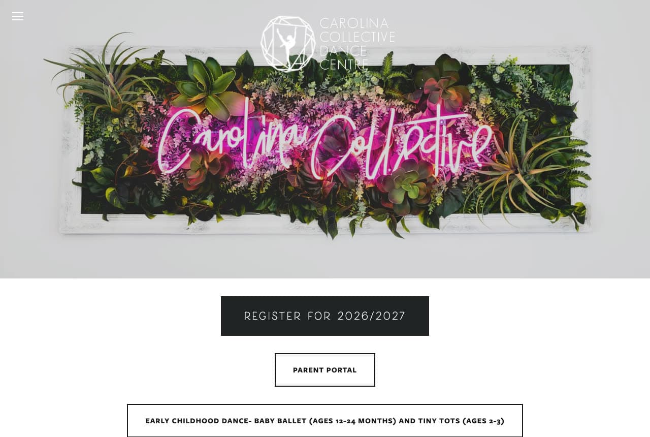
Carolina Collective Dance Centre opens on its own lobby: a photograph of the studio's neon sign — 'Carolina Collective' in pink script — glowing inside a white-framed wall of ferns and succulents, with the logo faint above it and a hamburger in the corner. Below, on white, the page gets straight to business: a black 'REGISTER FOR 2026/2027', an outlined 'PARENT PORTAL', and then the class list begins as a row of bordered labels, the first reading 'EARLY CHILDHOOD DANCE- BABY BALLET (AGES 12-24 MONTHS) AND TINY TOTS (AGES 2-3)'. No headline, no paragraph; the sign says the name and the buttons say the season. Carolina Collective shows a community studio how to feel current and be practical at once: photograph the one thing in your building that's yours, then put registration first.

Opens a similar Zarla design you can make yours.

Halcyon Dance Studio — Dance Studio website design you can build with Zarla
Build this with Zarla
  • Dance Studio
  • Joyful

Halcyon Dance Studio: 'Where Chicago learns to dance' beside a collage

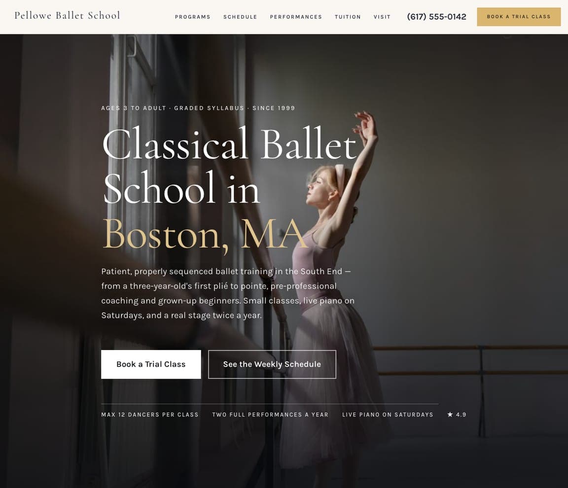
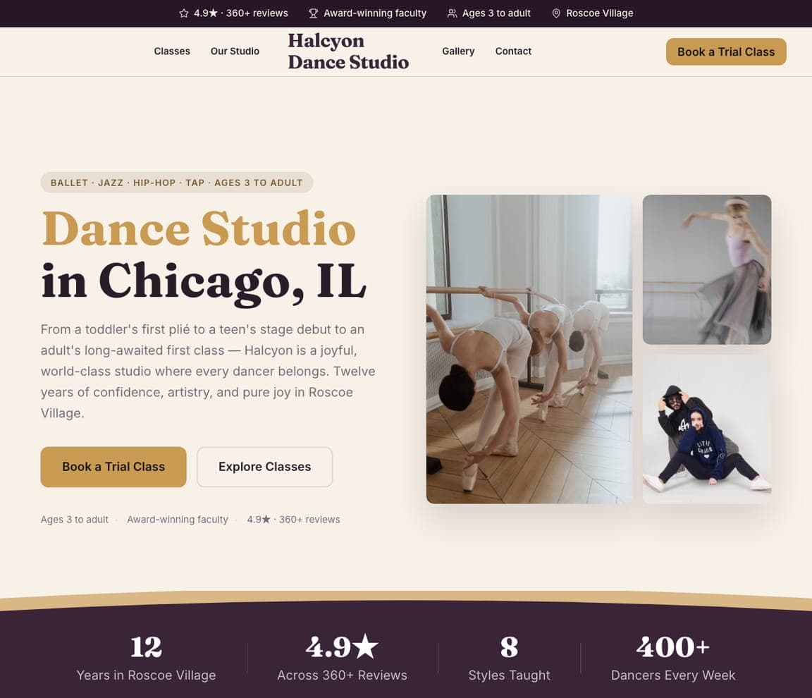
Halcyon Dance Studio is the Zarla dance-studio template: a cream ground, an eyebrow ('Dance Classes for All Ages · Chicago'), a serif headline — 'Where Chicago Learns to Dance' — a paragraph that runs from a toddler's first plié through a teen's stage debut to an adult's long-awaited first class, an amber 'Book a Trial Class' beside 'Explore Classes', and a collage of three dancer photographs. The top strip counts the reviews, the faculty awards and the ages ('Ages 3 to adult'). It's Springs Dance's warmth with Steps on Broadway's ages stated up front. Clone it, name your city, and the collage becomes your students.

See this template
Skybound Gymnastics Academy — Adaptable Template website design you can build with Zarla
Build this with Zarla
  • Adaptable Template
  • Playful

Skybound Gymnastics Academy: 'Where kids flip for fun' — the kids' program register

Skybound Gymnastics Academy is a gymnastics template, not a dance one — but its hero is the closest catalog match to the competition and kids' studios here (Dance Academy USA, DC Dance of LA): a white ground, an eyebrow ('Kids Gymnastics, Tumbling & Ninja · Minneapolis'), a bold headline — 'Where Kids Flip for Fun' — a paragraph from a toddler's first forward roll to a competitor's first medal, a coral 'Book a Free Trial Class' beside 'See Our Programs', three chips (ages 18 months and up, safety-certified coaches, the rating) and a photograph of a gymnast mid-leap. Swap 'flip' for 'dance' and it is a kids' dance academy with the trial class already in the hero. Clone it, and the chips become your ages and your faculty.

See this template
Crescendo Music School — Adaptable Template website design you can build with Zarla
Build this with Zarla
  • Adaptable Template
  • Dramatic

Crescendo Music School: 'Find your sound' — the dark, aspirational register

Crescendo Music School is the music-school template, and the closest catalog match to the darker studios here (Murrieta, Debut, Peridance): a dramatic photograph of piano keys, a centered eyebrow ('Music Lessons for All Ages · Boston'), a serif headline — 'Find Your Sound' — a paragraph about conservatory-trained teachers for kids, teens and adults, and a gold 'Book a Free Trial Lesson' beside 'Explore Lessons'. Swap the keys for a barre and 'sound' for 'movement', and it is a training studio with the trial lesson already in the hero. Clone it for a studio that wants to look serious rather than sweet.

See this template

Frequently asked

Where can I find good dance studio website examples?

Right here — this page curates dance studio website examples across the spectrum: contemporary and competition studios (Murrieta Dance Project, Dance Academy USA, DC Dance of LA), K-pop and street-style studios (I Love Dance, Debut Dance District), youth academies (Springs Dance, Carolina Collective Dance Centre) and two New York institutions (Peridance, Steps on Broadway) — each linked so you can explore the live site — plus professionally designed Zarla dance, gymnastics and music-school templates you can clone and make your own. Every example includes a note on why the design works — the students in the photograph, the ages and styles stated, the trial-class path — so you can copy the thinking, not just the look.

What makes a good dance studio website?

It answers a parent's three questions in the first screen — what styles, what ages, where — and gives one obvious next step: book a trial class, register, or see the schedule. The strong examples above use photographs of their own students and studio, state the ages plainly ('Ages 2 – 18', '3-18+'), put the schedule and registration in the nav, and keep a parent portal one click away for current families. A trial-class button in the hero (or as a side tab, the way DC Dance of LA does it) converts better than a contact form.

How much does a dance studio website cost?

Studio-management platforms bundle a templated site with registration for a monthly fee, agencies build custom studio sites for a few thousand dollars, and general template builders are roughly $16–$30 per month plus your time. An AI website builder generates a studio site — classes by style and age, schedule, faculty, a trial-class booking button, a parent portal link — from a short description in seconds, then lets you edit it in plain language. Whatever you choose, the photographs of your own classes are what make it convert.

Should a dance studio website lead with the schedule or the studio?

Lead with the studio and the students, and keep the schedule one click away in the nav. A parent chooses a studio on feel — the room, the teachers, the kids who look like theirs — and only then checks Tuesday at 4pm. Steps on Broadway's model is the cleanest: a photograph of students at the barre, the age range, then a navy band with 'Book a Class', 'Schedule Updates' and 'Login'. Springs Dance puts the styles ('Ballet, Tap, Jazz, Contemporary and More') directly under the hero for the same reason.

What pages does a dance studio website need?

Most studios need seven: a home page with the students, the ages and the trial button, a classes page organized by style and age group, a schedule page (embedded from your studio software, not a PDF), a faculty page with real photographs, a registration or trial-class page, a page for the competition team or company if you have one, and a contact page with a parent-portal link. Studios that rent space add a rentals page — I Love Dance, Debut and DC Dance of LA all list it in the nav.

How do dance studios get more students from their website?

Show your own students in the first screen, state the ages and styles in words, and make the trial class a button. The converting pattern above: Dance Academy USA's two red buttons ('Season Schedule', 'Free Trial Class Sign-Ups') under a welcome, DC Dance of LA's purple 'Book a Trial Class' tab pinned to the edge of the screen, Carolina Collective's 'Register for 2026/2027' as the first thing under the hero. Then build a page per style — 'ballet classes for kids', 'adult hip-hop' — so each search lands on the class it was looking for.

You've seen what works. Now make it yours.

Describe your business and Zarla designs a complete, professional website in about 30 seconds — built to convert, just like the ones above.

Free to build and preview · no credit card · publish to your own domain on Premium