Inspiration · Daycare

The Best Daycare Website Examples, Explained

Looking for daycare website examples? These 12 are the best we could find — standout real daycare sites plus designs you can build with Zarla — and each comes with a breakdown of the specific design move that makes it work. Find a look you love and you can build a site in that exact style, free, in about 30 seconds.

Real sites + designs you can build with Zarla — free to build and preview, no credit card

What makes a great daycare website

The best daycare websites share a few moves: they earn trust fast, lead with strong visuals of the work, point to one clear action, and match the design to how their customers decide. Each example below calls out the specific choice worth stealing for your own daycare website.

The Learning Experience website — Preschool Franchise design example
Real site · United States
  • Preschool Franchise
  • Playful
  • Multicolor + white

The Learning Experience: Joy in the headline, proof underneath

The Learning Experience leads with pure warmth — 'happy happens here' in playful multicolour type, then 'Preschool & Daycare That Inspires Discovery and Makes Learning Fun,' with a friendly mascot and a zip-code school finder. Beneath the cheer sits the reassurance a nervous parent needs: 'Happy Parent Stories' with named testimonials ('choosing a daycare felt overwhelming — the personal attention speaks volumes'), a 'rated 4.6 by 100,000+ parents' line, and accreditation badges. That's the exact emotional arc a childcare decision runs on — joy to attract, then hard trust to reassure — and the design nails both in sequence. Choosing childcare is one of the highest-anxiety purchases a parent makes; leading with the happiness they want for their child and immediately backing it with other parents' voices is the winning structure. Warmth to open, proof to close.

  • 'Happy happens here' leads with the emotion parents want
  • Named parent testimonials + rating close the trust gap
  • Zip-code finder routes to the local center

Steal this: Open with the joy parents want for their kid, then immediately back it with named parent testimonials. Warmth attracts, proof converts.

The Goddard School website — Premium Franchise design example
Real site · United States
  • Premium Franchise
  • Thoughtful
  • Navy + warm

The Goddard School: A premium promise, warmly stated

The Goddard School positions at the premium end of early education with a philosophy, not a price: 'best begins' over a joyful child-with-ribbons photo, and a 'Our Promise to Families' section — 'to empower children to grow into the best versions of themselves… following their curiosity, building care around who they are, not who we expect them to be.' A video, four differentiators (inquiry and guided play, personalized care, warm consistent teachers, a community families trust), and a school finder complete it. The child-led educational philosophy is the premium signal — it tells discerning parents this is thoughtful, individualized development, not just supervised care. For a childcare brand competing on quality rather than convenience, articulating a genuine educational philosophy (and showing real joyful kids, not stock) is how you justify the premium and attract the parent who's shopping on values.

  • 'Best begins' + a real philosophy signals premium development
  • Child-led ('who they are, not who we expect') attracts values shoppers
  • Four clear differentiators + joyful real-kid photography
Explore & Develop website — Nature-Led Learning design example
Real site · Australia
  • Nature-Led Learning
  • Warm-Natural
  • Cream + green

Explore & Develop: Nature-led learning, warmly shot

Explore & Develop, an Australian early-learning network, builds its brand on a specific philosophy: 'Where Curiosity Leads to Learning,' over warm photography of children exploring natural, home-like environments (wooden toys, outdoor discovery, not primary-plastic classrooms). Four pillars — Unique Environments, Learning Programs, Owner/Operator, Our Educators — emphasise that each centre is individually run by 'passionate early-childhood professionals.' The natural, earthy aesthetic and 'reflective of home' language differentiate it from institutional, brightly-branded chains, appealing to parents who want a calm, nurturing, nature-connected setting for their child. In a category where many centres look identical (bright colours, cartoon logos), leaning into a warm, natural, home-like aesthetic is a genuine point of difference — and it signals the specific parenting values (calm, curiosity, nature) of the family you're trying to attract.

  • Nature-connected, home-like aesthetic vs primary-plastic chains
  • 'Owner/operator' framing signals individual care, not a factory
  • Warm earthy palette attracts calm-and-curiosity parents
Little Sunshine's Playhouse website — Curriculum-Led design example
Real site · United States
  • Curriculum-Led
  • Nurturing
  • Cream + sage

Little Sunshine's Playhouse: Age-tier cards do the parent's sorting

Little Sunshine's Playhouse combines a warm philosophy with a genuinely useful navigation device: 'Curriculum for Curious Minds' over gentle floral art and a real caregiver-and-toddler photo, then a grid of age-band cards — Infants (6 weeks–1 year), Toddlers (1–2), Early Preschool (2–3), Preschool (3–4), Pre-K (5–6). Letting parents click straight to their child's exact age is smart UX for childcare, where a family cares only about the program for THEIR kid's stage, and it signals that the school has a thoughtfully differentiated curriculum for each developmental phase (not one blended room). The soft, nurturing palette and 'learning through play' language reassure. When your service is segmented by a clear variable — here, the child's age — surfacing that segmentation as the primary navigation both helps the visitor and demonstrates the depth of your program.

  • Age-band cards let parents jump straight to their child's stage
  • Signals a differentiated curriculum per developmental phase
  • Soft floral palette + 'learning through play' reassures
Bright Horizons website — Employer Childcare design example
Real site · United States
  • Employer Childcare
  • Professional
  • Teal + white

Bright Horizons: A childcare site that serves employers too

Bright Horizons has an unusual dual audience, and its homepage serves both cleanly: 'Children & Families Thrive Here,' with a menu that splits by user — 'Explore Our Child Care Centers' (parents), 'Access My Employee Benefits' (employees whose companies sponsor care), 'Learn About Careers' (educators), and 'Provide Employer Benefits' (HR decision-makers). Bright Horizons' core business is employer-sponsored childcare, so routing four distinct visitors — parent, employee, job-seeker, corporate buyer — from one screen is essential. The clean, professional (rather than cutesy) design reflects that it's selling to corporate benefits departments as much as to parents. When your business has multiple distinct customer types (here, B2B and B2C at once), explicit audience-based navigation on the homepage lets each find their path immediately instead of wading through content meant for someone else.

  • Four audience doors serve parents, employees, staff AND employers
  • Professional (not cutesy) design reflects the B2B buyer
  • Audience-based nav is essential for a dual B2B/B2C model
Magic Roundabout Nurseries website — UK Nursery design example
Real site · London, UK
  • UK Nursery
  • Trustworthy
  • Bright + warm

Magic Roundabout Nurseries: Regulator rating as the trust anchor

Magic Roundabout Nurseries leads with a joyful photo of a child playing outdoors and 'Play · Explore · Inspire,' then does the single most important thing a UK nursery can: it displays its 'Ofsted Good' rating prominently. In the UK childcare market, the Ofsted inspection rating is the trust currency parents check first, so surfacing it in the hero area (rather than burying it on a compliance page) directly answers the parent's biggest question. Three clear paths (Our Nurseries, Careers, News & Events) and a 'What Parents Say' testimonial row round out the reassurance. The colourful, warm design keeps it child-friendly. The transferable lesson: identify the specific trust credential your market checks first — an Ofsted rating, a licensing body, an accreditation — and put it where the eye lands, because for high-anxiety services, the credential the customer already trusts does more than any claim you write yourself.

  • Ofsted 'Good' rating surfaced in the hero — the UK trust currency
  • Answers the parent's first question before they ask it
  • 'What Parents Say' + clear paths complete the reassurance

Steal this: Surface the credential your market checks FIRST (Ofsted, licensing, accreditation) in the hero. A trusted rating beats any claim you write.

Pinwheel Preschool — Preschool website design you can build with Zarla
Build this with Zarla
  • Preschool
  • Cheerful

Pinwheel Preschool: A joyful place to grow

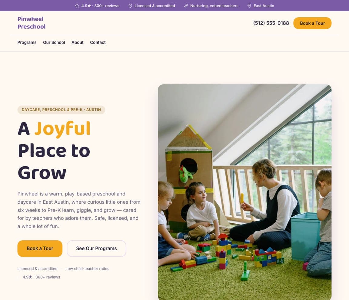
Pinwheel Preschool is Zarla's flagship daycare template, and its split-image-right hero lands the warm, reassuring register this category runs on: 'A Joyful Place to Grow,' in a friendly purple-and-marigold palette that reads cheerful without going garish. It captures the emotional core every childcare site needs — joy for the child, trust for the parent — and the structure carries programs, an about-the-center section, a staff/educators area, and an enrollment CTA. It's the pre-built version of the warmth-plus-proof arc The Learning Experience runs. Swap in photos of your own center and it's a welcoming, on-brand childcare site in about 30 seconds — no photographer or designer required. The floor of quality for a daycare's most important audience: an anxious parent deciding who to trust with their child.

See this template
Mossy Boots Forest School — Forest School website design you can build with Zarla
Build this with Zarla
  • Forest School
  • Nature-Immersion

Mossy Boots Forest School: Rain or shine, we're outside

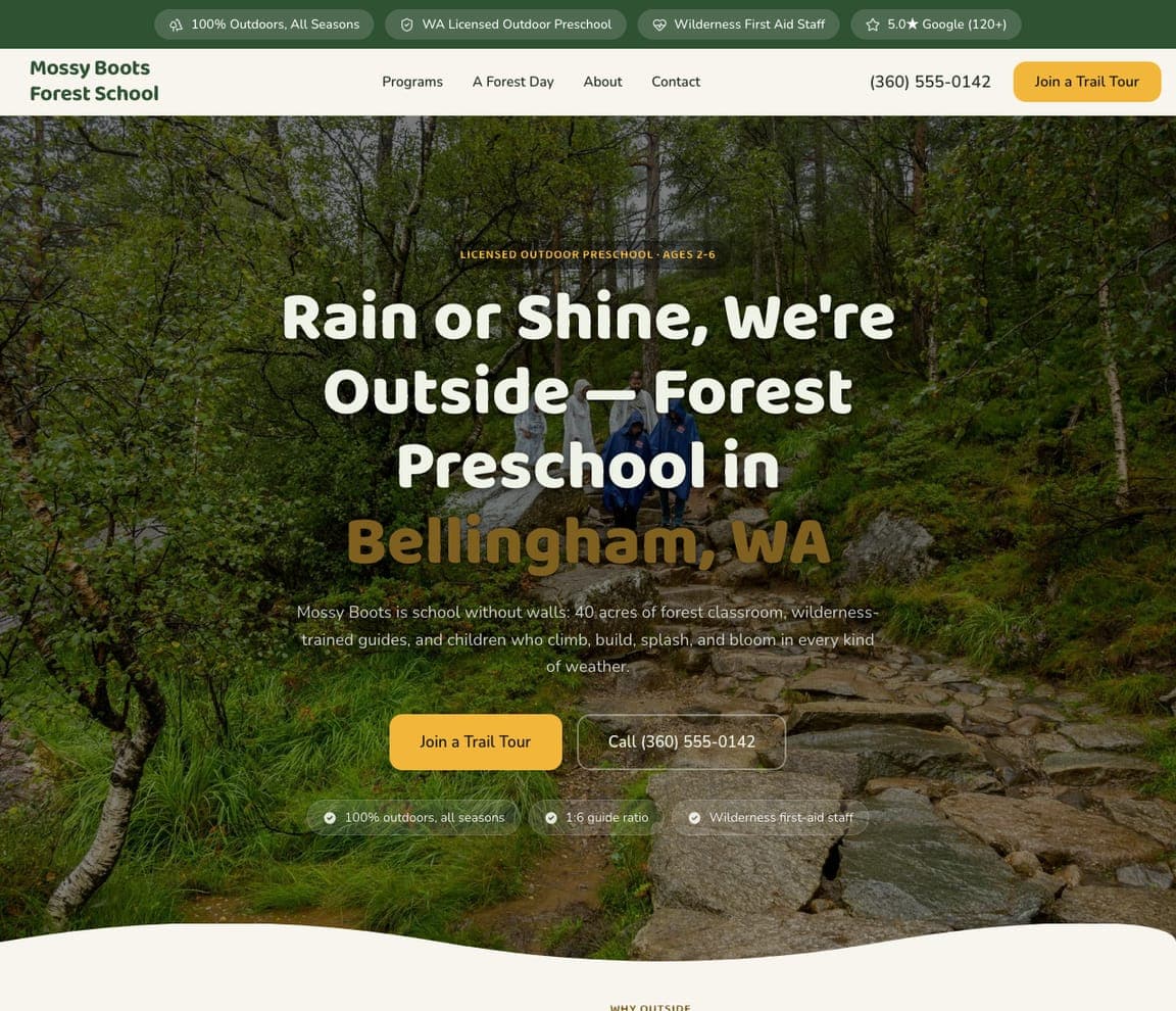
Mossy Boots Forest School is Zarla's forest-school template, and it owns a fast-growing niche with a headline that filters perfectly: 'Rain or Shine, We're Outside — Forest Preschool in Bellingham, WA.' The fullwidth-overlay hero puts the outdoors front and centre in a mossy-green and amber palette, and the 'rain or shine' promise self-selects exactly the parent who wants a nature-immersion, outdoor-play education (and gently warns off the one who doesn't). Forest and nature-based early learning is a distinct, values-driven segment, and the design commits to it visually rather than looking like a generic bright-classroom daycare. Clone it, set your city and philosophy, and the outdoor-education brand is live in about 30 seconds — the right register for a childcare business whose whole differentiator is that the classroom is the forest.

See this template
Juniper House Montessori — Montessori website design you can build with Zarla
Build this with Zarla
  • Montessori
  • Calm-Considered

Juniper House Montessori: Help me do it myself

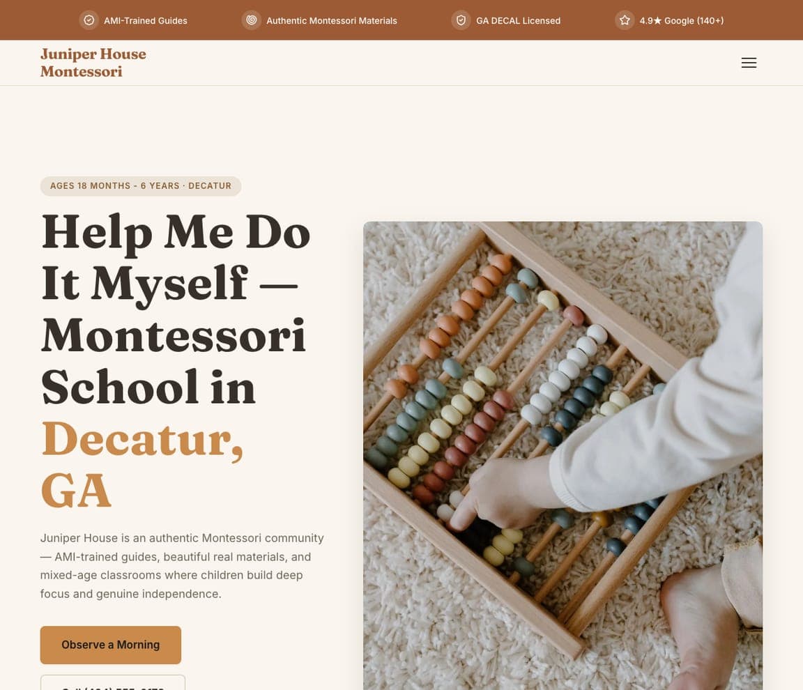
Juniper House Montessori is Zarla's Montessori template, and its headline is the method's own famous maxim: 'Help Me Do It Myself — Montessori School in Decatur, GA.' The split-image-right hero pairs that with a warm terracotta-and-clay palette that feels calm and considered, matching the Montessori aesthetic of natural materials and child-led independence. Using the recognized Montessori philosophy in the hero immediately signals to method-seeking parents (who specifically search for and value Montessori) that this is the real thing, not a daycare borrowing the buzzword. For a childcare business built on a named pedagogy, leading with that pedagogy's language and visual world is exactly how you attract the parents already sold on the method. Clone it, localize it, and the Montessori brand is live in about 30 seconds.

See this template
Canta y Crece Bilingual Preschool — Bilingual Immersion website design you can build with Zarla
Build this with Zarla
  • Bilingual Immersion
  • Vibrant

Canta y Crece Bilingual Preschool: Two languages, one happy childhood

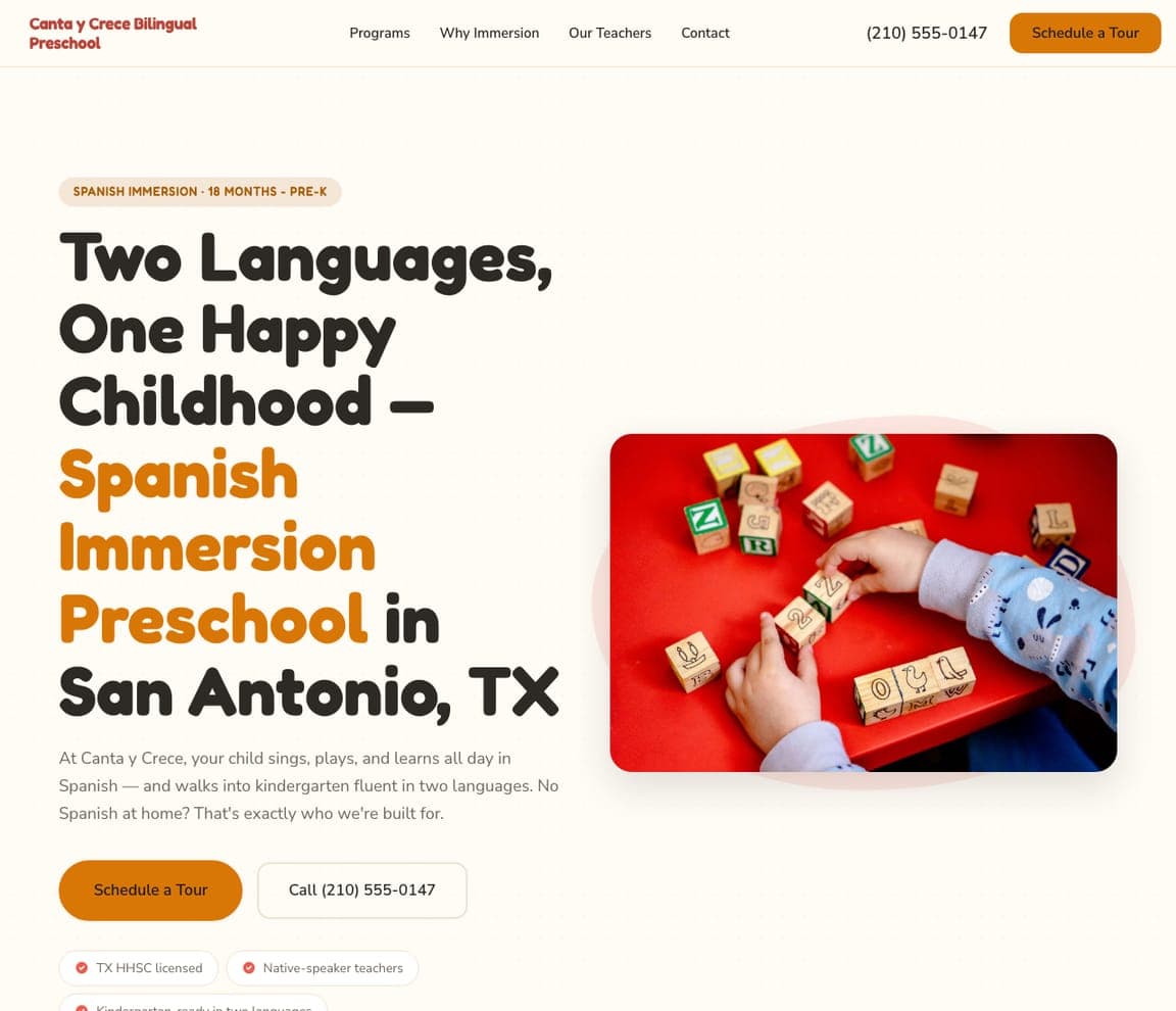
Canta y Crece is Zarla's Spanish-immersion template, and its playful-pop hero makes the bilingual promise warmly: 'Two Languages, One Happy Childhood — Spanish Immersion Preschool in San Antonio, TX,' in a vibrant coral-and-amber palette. The headline sells the outcome parents want (a happy child who also gains a second language) rather than the pedagogy jargon, and even the brand name works bilingually. Language-immersion childcare is a specific, growing niche — parents seek it out deliberately — so leading with the dual-language promise and a warm, celebratory palette both signals the specialty and reassures that immersion is joyful, not academic pressure. Clone it, set your language and city, and the immersion brand is live in about 30 seconds. The right register for a program whose whole differentiator is the second language woven through every playful day.

See this template
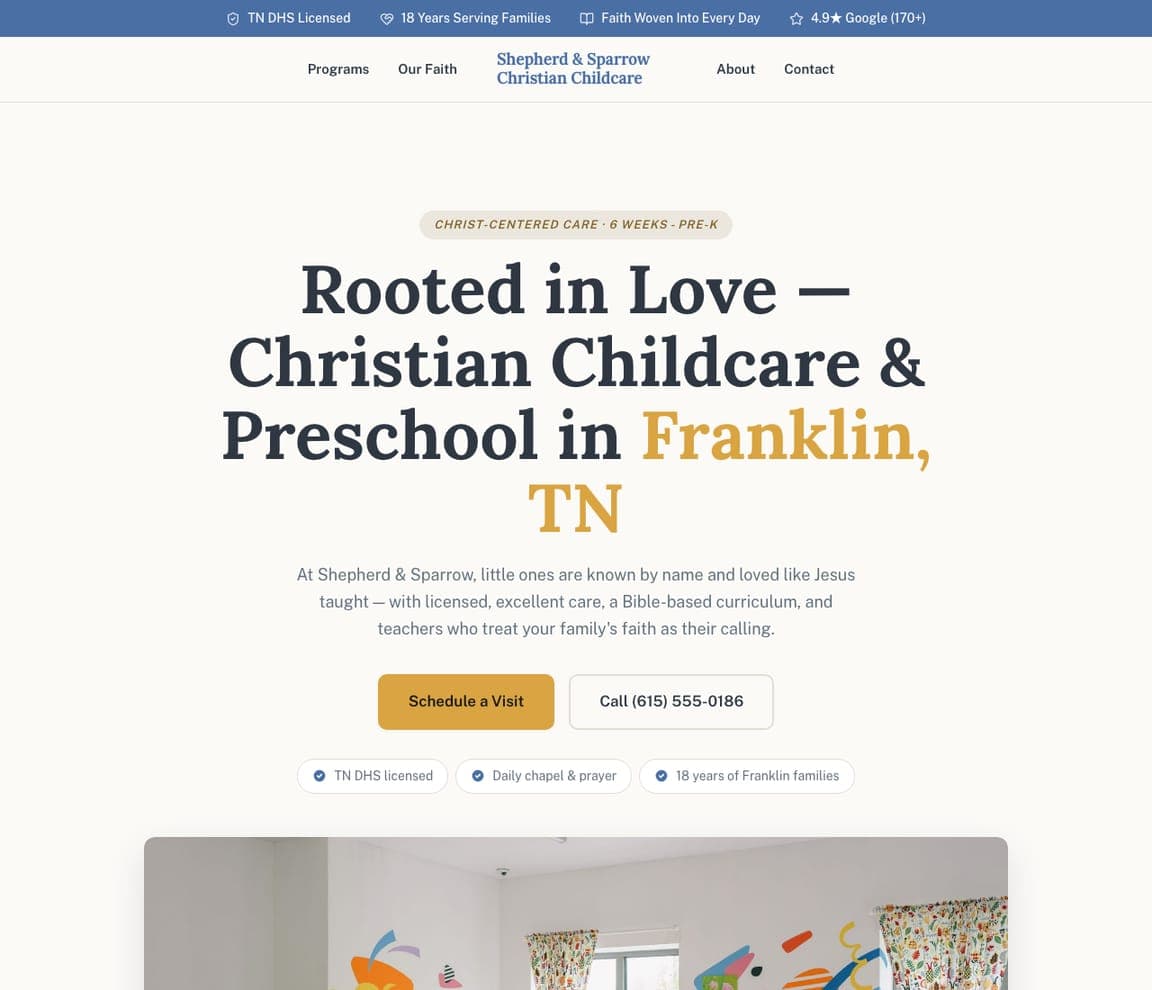
Shepherd & Sparrow Christian Childcare — Faith-Based Childcare website design you can build with Zarla
Build this with Zarla
  • Faith-Based Childcare
  • Warm-Reverent

Shepherd & Sparrow Christian Childcare: Rooted in love, centered and calm

Shepherd & Sparrow is Zarla's faith-based childcare template, and its centered hero states its values plainly: 'Rooted in Love — Christian Childcare & Preschool in Franklin, TN,' in a gentle blue-and-gold palette that reads warm and reverent without being heavy-handed. For families who specifically want faith woven into their child's early care, naming that faith clearly and warmly in the hero is exactly what they're searching for, and it self-selects the aligned family while the 'rooted in love' framing keeps it welcoming rather than preachy. Faith-based childcare is a substantial, values-driven segment, and a template that names the faith with warmth (not just a cross in the corner) serves it authentically. Clone it, set your denomination and city, and the faith-based brand is live in about 30 seconds.

See this template
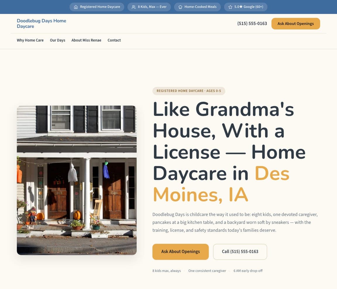
Doodlebug Days Home Daycare — Home Daycare website design you can build with Zarla
Build this with Zarla
  • Home Daycare
  • Cozy-Credible

Doodlebug Days Home Daycare: Like grandma's house, with a license

Doodlebug Days is Zarla's home-daycare template, and its headline is the most disarming in the set: 'Like Grandma's House, With a License — Home Daycare in Des Moines, IA.' The split-image-left hero pairs that warmth with a friendly blue-and-amber palette, and the copy nails the exact value proposition of in-home care: the cozy, personal, one-caregiver intimacy of a home combined with the legitimacy of licensing (the reassurance a parent needs to trust a home over an institution). Home daycare is a huge but under-designed segment — most in-home providers have no real website at all — so a warm, credible, professionally-designed template is a genuine competitive edge for the solo provider. Clone it, add your license number and photos of your space, and the home-daycare brand is live in about 30 seconds. Warmth plus legitimacy, exactly as the headline promises.

See this template

Frequently asked

Where can I find good daycare website examples?

Right here — this page curates daycare website examples two ways: standout real businesses (each linked, so you can explore the live site) and professionally designed Zarla templates you can clone and make your own. Every example comes with a note on why the design works — trust signals, layout, calls to action — so you can copy the move, not just the look.

What makes a good daycare website?

A good daycare website earns trust in the first few seconds, leads with strong visuals of the work, gives visitors one obvious action, and loads fast on a phone. Every design below leads with proof and a single clear call to action rather than a wall of text.

How much does a daycare website cost?

A custom daycare website from a designer typically runs into the thousands up front, and template builders charge roughly $16–$30 per month. An AI builder generates a complete, editable design for free and only charges (on the Premium plan) when you publish to your own domain — so you can build and preview before spending anything.

Do I need a designer to build a daycare website?

No. Several designs on this page were generated by Zarla and are fully editable — you describe your business and get a complete, professionally designed site in about 30 seconds, then refine it by chatting. Building and previewing is free; publishing to your own domain needs the Premium plan.

What pages does a daycare website need?

Most daycare businesses need just a few: a home page that proves trust and points to one clear action, an about page that puts a face to the business, a services or work page that shows what you do, and a contact page with a form and a phone number. Local businesses also benefit from location or service-area pages that help them show up in nearby searches.

How do I get more customers from my daycare website?

Lead with proof in the first few seconds (reviews, real photos, results), make one action obvious on every screen (call, book, or enquire), and keep it fast on mobile — most visitors arrive on a phone. The designs above each do this differently, but they all earn trust early and remove friction from the next step.

You've seen what works. Now make it yours.

Describe your business and Zarla designs a complete, professional website in about 30 seconds — built to convert, just like the ones above.

Free to build and preview · no credit card · publish to your own domain on Premium