Inspiration · Dog Groomer

The Best Dog Groomer Website Examples, Explained

Looking for dog groomer website examples? These 9 are the best we could find — standout real dog groomer sites plus designs you can build with Zarla — and each comes with a breakdown of the specific design move that makes it work. Find a look you love and you can build a site in that exact style, free, in about 30 seconds.

Real sites + designs you can build with Zarla — free to build and preview, no credit card

What makes a great dog groomer website

The best dog groomer websites share a few moves: they earn trust fast, lead with strong visuals of the work, point to one clear action, and match the design to how their customers decide. Each example below calls out the specific choice worth stealing for your own dog groomer website.

Fluff & Buff website — Grooming Studio design example
Real site · New Zealand
  • Grooming Studio
  • Charming
  • Cream + ink

Fluff & Buff: A fully hand-drawn identity, doodles and all

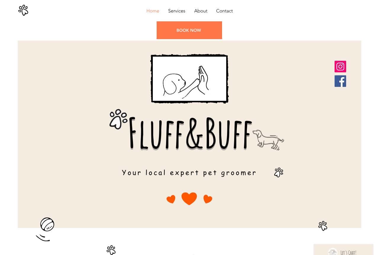
Fluff & Buff commits to illustration the way most groomers commit to stock photos: the logo is a sketched dog high-five, paw prints and bones doodle across the margins, and the centerpiece is a hand-drawn barber-shop scene of a groomer working on a poodle. Even the 'Who We Are' heading is lettered rather than typeset. The effect is a children's-book warmth no photograph can produce — and it solves the small-shop problem of having no glossy facility to shoot. One consistent illustration style, applied everywhere, turns a local groomer into a brand people remember and recommend by name. If you can't out-photograph the chains, out-charm them.

  • Hand-drawn everything — logo, scenes, margins — reads instantly warm
  • Illustration sidesteps the no-fancy-facility photo problem
  • A consistent doodle system is a brand, not a decoration

Steal this: If you can't out-photograph the big chains, out-charm them with one consistent illustration style.

HydroDog website — Mobile Grooming design example
Real site
  • Mobile Grooming
  • Warm
  • Slate + cream

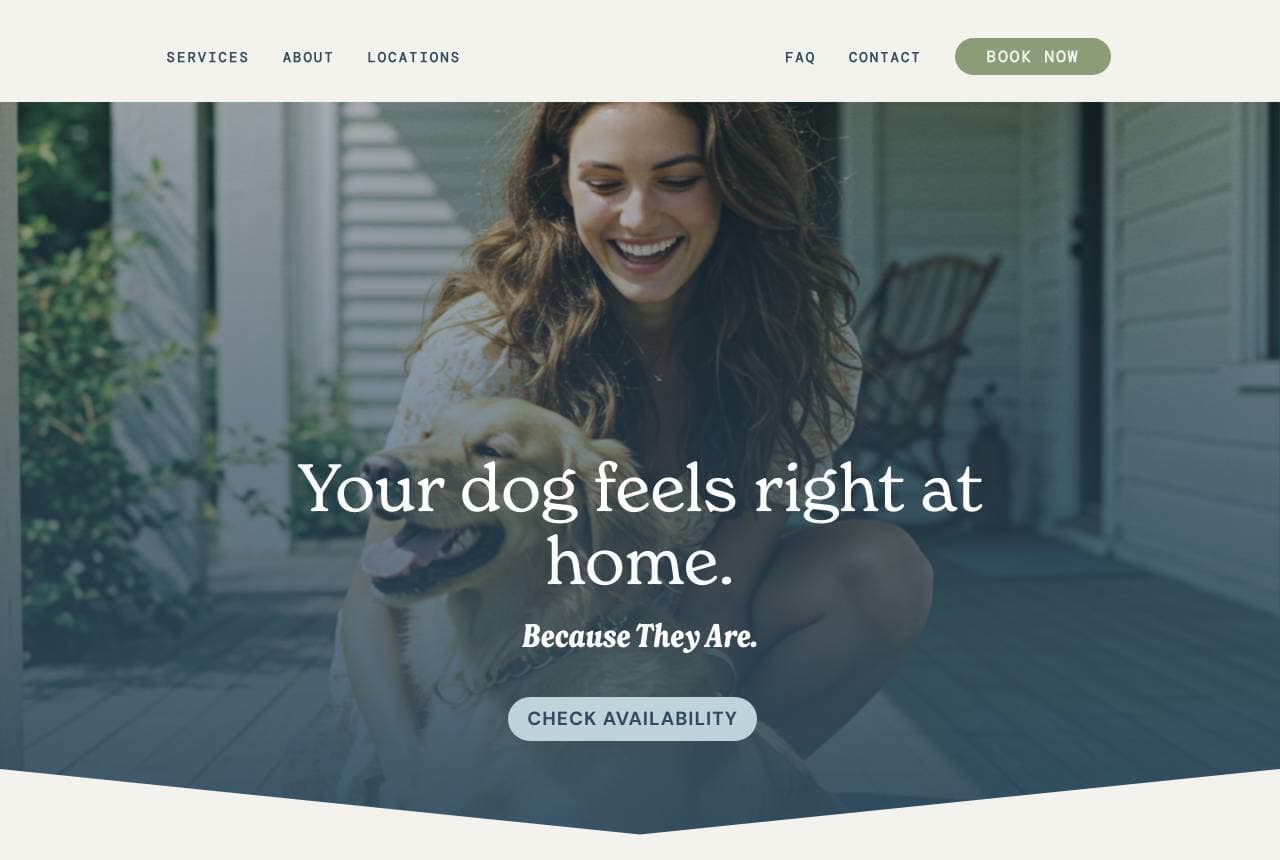
HydroDog: Three illustrated promises, zero chaos

HydroDog sells mobile grooming with a headline that lands twice: 'Your dog feels right at home. Because They Are.' The design's best section is an illustrated triptych that reframes the service around three beneficiaries — for your dog (no cages, no chaos), for your home (the mess stays in our van), for your time (no drives, no waits) — each with a woodcut-style drawing. That framing answers the three objections a first-timer actually has, in the order they think of them. 'Grooming. Made Simple.' closes the argument. A masterclass in benefit architecture: structure the page around who feels each benefit, not around your service list.

  • 'Because they are' rewards the reader mid-headline
  • Dog / home / time triptych mirrors real customer objections
  • Woodcut illustrations elevate a van business to a brand

Steal this: Organize benefits by who feels them — the dog, the home, the owner's time.

Pink Dog website — Dog Spa design example
Real site
  • Dog Spa
  • Glam
  • Black + pink

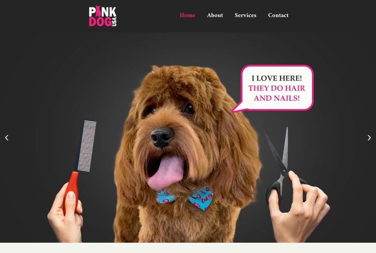
Pink Dog: Salon sass on a jet-black stage

Pink Dog styles itself like a human salon that happens to serve dogs: a jet-black hero where hands present a comb and shears to a perfectly coiffed doodle, whose speech bubble gushes 'I LOVE HERE! THEY DO HAIR AND NAILS!' Hot pink cuts through everywhere else — 'welcome to a place where your dog is treated to a relaxing spa experience' set in editorial serif, then a full pink band with a sunglasses-wearing pup. Black is a genuinely rare canvas in pet care, and against it the pink lands with fashion-magazine confidence. The talking-dog testimonial gag does more personality work than a page of copy. Glamour, played straight, for an audience that pampers.

  • A black canvas is rare in pet care — instant shelf-standout
  • The talking-dog speech bubble is personality in one element
  • Hair-salon staging reframes grooming as beauty, not maintenance
London Dog Grooming Co. website — Grooming Salon design example
Real site · London, UK
  • Grooming Salon
  • Boutique
  • Walnut + white

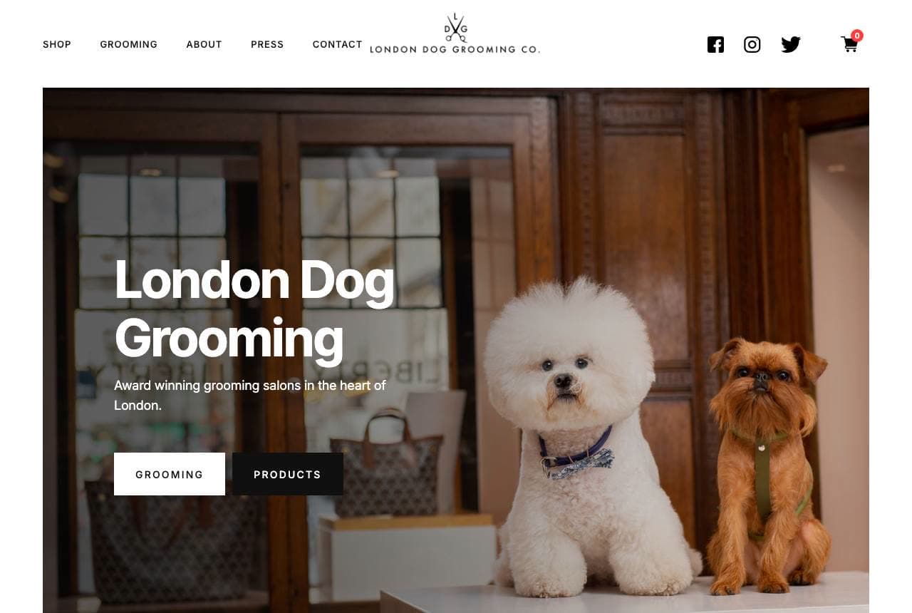
London Dog Grooming Co.: Groomed dogs presented like store mannequins

London Dog Grooming Co. photographs its work the way fashion retail photographs product: two immaculately groomed dogs — a cloud-white bichon and a bearded griffon — posed on a counter in a wood-panelled salon, under the plain claim 'Award winning grooming salons in the heart of London.' The dogs ARE the portfolio, styled and lit like a window display. Below, a retail row (leather collars, leads, combs) extends the boutique impression and adds a second revenue line. Navigation stays quiet — Shop, Grooming, About, Press — because the photography carries the persuasion. When your output is visible, show the output; one great after-shot beats any before-and-after slider.

  • The groomed dogs are the portfolio — styled like retail product
  • Wood-panelled setting says boutique without a word
  • A product row adds retail revenue and deepens the brand
Zoomin Groomin website — Mobile Grooming design example
Real site
  • Mobile Grooming
  • Friendly
  • Pink + blue

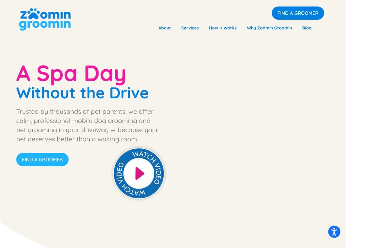
Zoomin Groomin: The drive named as the enemy

Zoomin Groomin condenses mobile grooming's entire pitch into six words: 'A Spa Day, Without the Drive' — pink script for the treat, blue type for the removed chore. The subline stacks the trust ('trusted by thousands of pet parents') and the empathy ('because your pet deserves better than a waiting room'), and a circular 'watch video' badge offers proof without leaving the page. 'Find a Groomer' as the CTA quietly signals network scale. The lesson is in the headline mechanics: name the specific friction you delete — the drive, the crate, the waiting room — and let the benefit ride on the contrast. Soft palette, hard positioning.

  • 'Without the drive' names the exact friction removed
  • Two-color typography splits treat from chore visually
  • 'Find a groomer' implies scale without boasting
Alder & Fox Grooming — Dog Grooming website design you can build with Zarla
Build this with Zarla
  • Dog Grooming
  • Playful
  • Violet + coral

Alder & Fox Grooming: Pamper energy in violet and red

Alder & Fox Grooming is Zarla's dog-grooming template on the playful-pop hero: 'Where Pups Get Pampered' in chunky display type over deep violet with red-coral accents and the variant's bouncing geometry. It's built for the groomer whose brand is joy — the shop where dogs pull their owners through the door — and the palette deliberately skips both the pastel-pink cliché and the clinical white, landing somewhere more toy-store. Booking-first structure underneath keeps the fun commercially pointed. Clone it, drop in your own before-and-after shots, and you have salon-grade brand energy in about 30 seconds — no photographer required to start.

  • Violet + coral escapes both pastel and clinical clichés
  • Playful-pop geometry supplies the joy a small shop can't stage
  • Booking-first layout keeps the fun pointed at revenue
See this template
Jim's Dog Wash website — Mobile Franchise design example
Real site · Australia
  • Mobile Franchise
  • Established

Jim's Dog Wash: Franchise trust, counted and badged

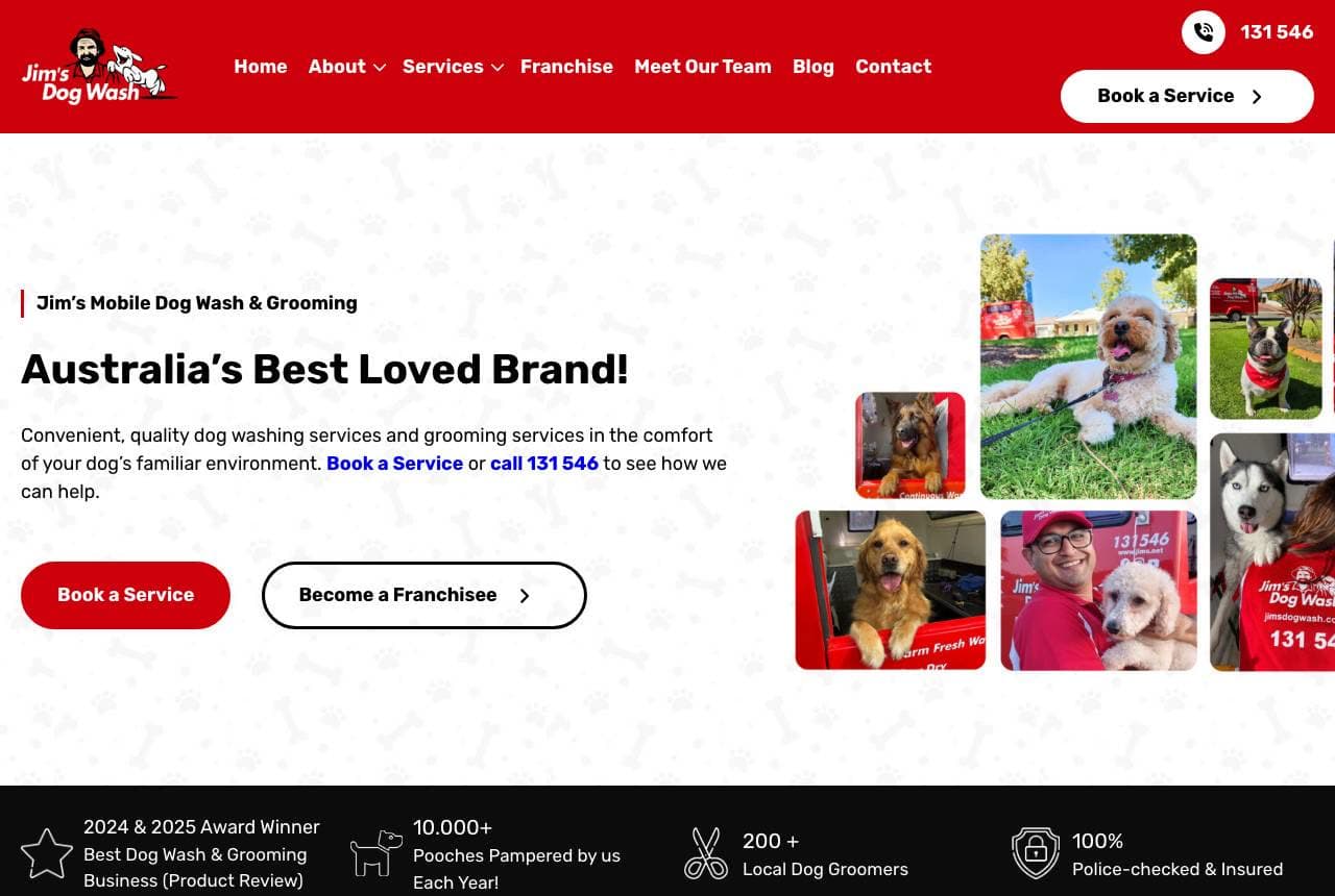
Jim's Dog Wash opens with a claim only a household name can make — 'Australia's Best Loved Brand!' — and then does the arithmetic to earn it: a black stats band counts 10,000+ pooches pampered yearly, 200+ local dog groomers, 100% police-checked and insured, plus a 2024 & 2025 award badge. The signature red trailer appears in a warm photo cluster of real groomers and clients. Where boutique sites sell intimacy, this page sells system: national coverage, vetted people, one phone number. The police-check stat is the sharpest line — it answers the unspoken question of letting a stranger into your driveway. Big operations should count in public.

Woof Gang Bakery & Grooming website — Bakery & Grooming design example
Real site
  • Bakery & Grooming
  • Sweet

Woof Gang Bakery & Grooming: Treat retail leading, grooming close behind

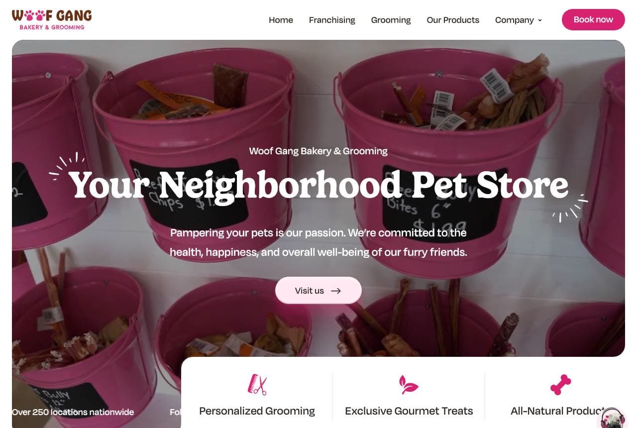
Woof Gang leads its hero not with clippers but with buckets of pink dog treats — 'Your Neighborhood Pet Store' in a friendly serif over the bakery photography, with grooming riding second in the icon row (personalized grooming, exclusive gourmet treats, all-natural products). That ordering is strategy: treats bring weekly foot traffic, grooming converts it into appointments, and '250+ locations nationwide' scrolls past to settle any trust question. The pink-forward palette keeps a big franchise feeling like a corner shop. For any groomer with retail shelf space, this is the model — lead with the products that create visits, and let services monetize the relationship.

Studio Hound website — Grooming Studio design example
Real site · Auckland, NZ
  • Grooming Studio
  • Promotional

Studio Hound: A loyalty program doing the heavy lifting

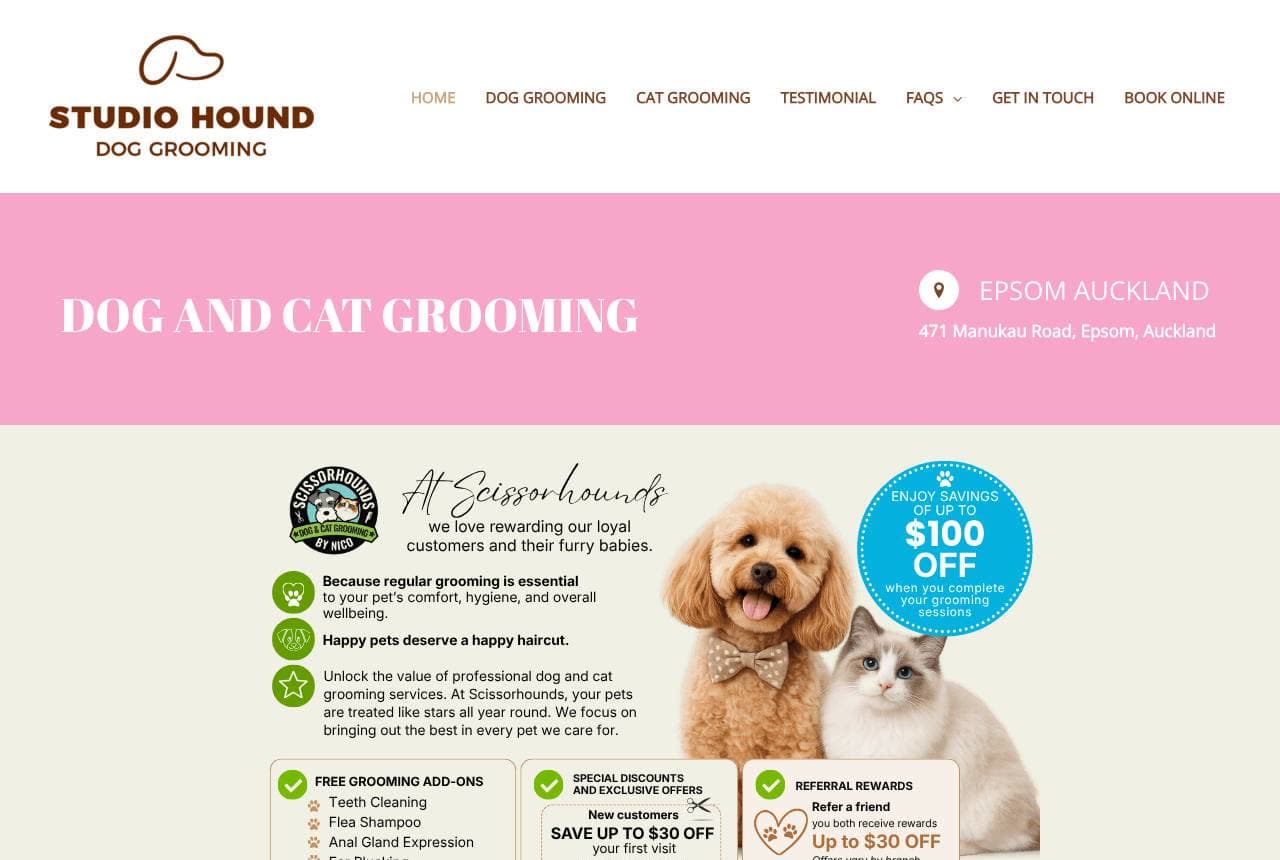
Studio Hound's pink-and-cream page reads like a rewards brochure, deliberately: a '$100 OFF' savings panel anchors the hero area, followed by checklists of free grooming add-ons (teeth cleaning, flea shampoo, ear plucking), new-customer discounts, referral rewards, and a stamped loyalty card program. For a service bought every six to eight weeks, retention economics beat acquisition economics, and this design allocates its best real estate accordingly. The illustrated poodle-and-cat mascots keep the promotional density from feeling like a coupon site. Most groomers hide their loyalty scheme on a counter card; putting it on the homepage turns repeat business into the visible core of the brand.

Frequently asked

Where can I find good dog groomer website examples?

Right here — this page curates dog groomer website examples two ways: standout real businesses (each linked, so you can explore the live site) and professionally designed Zarla templates you can clone and make your own. Every example comes with a note on why the design works — trust signals, layout, calls to action — so you can copy the move, not just the look.

What makes a good dog groomer website?

A good dog groomer website earns trust in the first few seconds, leads with strong visuals of the work, gives visitors one obvious action, and loads fast on a phone. Every design below leads with proof and a single clear call to action rather than a wall of text.

How much does a dog groomer website cost?

A custom dog groomer website from a designer typically runs into the thousands up front, and template builders charge roughly $16–$30 per month. An AI builder generates a complete, editable design for free and only charges (on the Premium plan) when you publish to your own domain — so you can build and preview before spending anything.

Do I need a designer to build a dog groomer website?

No. Several designs on this page were generated by Zarla and are fully editable — you describe your business and get a complete, professionally designed site in about 30 seconds, then refine it by chatting. Building and previewing is free; publishing to your own domain needs the Premium plan.

What pages does a dog groomer website need?

Most dog groomer businesses need just a few: a home page that proves trust and points to one clear action, an about page that puts a face to the business, a services or work page that shows what you do, and a contact page with a form and a phone number. Local businesses also benefit from location or service-area pages that help them show up in nearby searches.

How do I get more customers from my dog groomer website?

Lead with proof in the first few seconds (reviews, real photos, results), make one action obvious on every screen (call, book, or enquire), and keep it fast on mobile — most visitors arrive on a phone. The designs above each do this differently, but they all earn trust early and remove friction from the next step.

You've seen what works. Now make it yours.

Describe your business and Zarla designs a complete, professional website in about 30 seconds — built to convert, just like the ones above.

Free to build and preview · no credit card · publish to your own domain on Premium