Inspiration · Driving School

The Best Driving School Website Examples, Explained

These are some of the best driving school website designs we could find — a mix of standout real schools and designs you can build with Zarla — and instead of just showing them off, we explain why each one works. A driving school is chosen by a nervous parent or an anxious adult learner, so watch how the strongest sites lead with trust and reassurance — a pass rate, a real instructor, state licensing, and one easy way to book — before anything else. Then make any of the Zarla designs your own, free, in about a minute.

Real sites + designs you can build with Zarla — free to build and preview, no credit card

What makes a great driving school website

The best driving school sites do three things fast. They build trust on sight — a visible pass rate, state licensing (TDLR, DPS, DDS), and a real instructor photo do more than any 'expert instruction' line. They speak to the specific learner: nervous teen and parent, adult with a ticket, career-bound CDL student, or an older driver refreshing skills. And they make booking the one obvious action — a 'Book a Lesson' button or package selector right in the hero. Everything below is a variation on those moves; pick the one that matches the students you want.

DriveSafe website — Driving School design example
Real site · Denver, CO
  • Driving School
  • Trustworthy
  • Blue + mountain

DriveSafe: Trust signals stacked, decision made easy

DriveSafe is the most polished site in this category, and it wins by removing every reason to hesitate. 'Drivers Education with Colorado's Most Trusted Driving School' sits over a calm mountain-highway photo, but the real work happens in the badge row beneath it — AAA-approved, BBB-accredited, 40+ years, 12 locations, 200,000 students trained — a wall of proof that answers a nervous parent's every doubt at once. Two smart CTA cards ('Try Our Program Navigator' / 'Have Your Permit Already?') route the confused and the ready to different next steps instead of one generic button. The lesson is trust density: for a high-stakes decision about a teenager, stacking recognizable credentials and splitting the CTA by readiness converts far better than a prettier hero ever would.

  • A wall of recognizable badges (AAA, BBB, 40 yrs) answers every doubt
  • Two CTAs split the confused parent from the ready one
  • Trust density beats a prettier hero for a high-stakes decision

Steal this: Split your main CTA by readiness — 'not sure where to start?' vs 'ready to book?' converts better than one generic button.

ATX Driving School website — Driving School design example
Real site · Austin, TX
  • Driving School
  • Local
  • Orange + blue

ATX Driving School: A local, affordable answer, proven up front

ATX Driving School positions itself as the friendly, affordable local alternative to the big multi-location chains, and it makes that case in the first screen. 'Best Driving School in Austin, TX' over a real group photo of instructors and students, a four-point checklist (DPS-approved road test, flexible schedules, affordable packages, same-day road test), and a trust bar reading TDLR Approved / 100% Pass Rate / 4.8 Rating / 7 Days Support. The orange palette feels warmer and more approachable than the corporate blues around it. The takeaway is clear positioning against a bigger competitor: when you can't win on scale, win on being local, affordable, and personable — and prove each of those claims with a specific, scannable line right in the hero.

  • Positions as the warm local alternative to the chains
  • A four-point checklist proves each claim scannably
  • Orange palette reads friendlier than corporate blue
Wilco Driving School website — Driving School design example
Real site · Cedar Park, TX
  • Driving School
  • Minimal
  • Green + aerial

Wilco Driving School: Three services, aerial calm, nothing extra

Wilco Driving School proves that restraint converts. A serene aerial shot of a lakeside highway under a big, simple 'Learn to Drive,' followed immediately by three clean service cards — Driving Lessons, Simulator Lessons, Road Tests — each with a short checklist. That's the whole above-the-fold: no clutter, no carousel, no popup, just the three things a visitor needs to understand and one calm image. The green palette and generous white space make an anxiety-tinged decision feel manageable. The lesson is the power of a single-purpose page: for a straightforward local service, clearly naming your three offerings and letting the design breathe often beats a busy, feature-stuffed hero. Simplicity reads as competence and calm — exactly what a nervous learner (or parent) wants to feel.

  • Three clean service cards = the whole above-the-fold
  • Aerial calm + white space soothe an anxious decision
  • Restraint reads as competence for a simple local service

Steal this: Name your three core services in the hero and stop — a calm, single-purpose page beats a feature-stuffed one.

American Driving Academy website — Driving School design example
Real site · Denver, CO
  • Driving School
  • Established
  • Red + blue

American Driving Academy: Scale and bilingual reach as the pitch

American Driving Academy leans on the opposite strategy from the local guys: it sells scale. 'Colorado's Largest Driving School' beside a friendly photo of a waving teen, four service tiles (Drive Testing, Classroom, Online, Driving Lessons), and prominent English/Spanish toggling make the case that this is the established, everywhere, everyone-welcome option. The red-white-and-blue palette reinforces an approachable, all-American feel. The takeaway is knowing your advantage and leading with it: where a small school wins on personal touch, a large one wins on breadth — more locations, more formats (in-person and online), and bilingual access. Naming the biggest-and-most-accessible claim up front, and backing it with a service grid, tells the widest possible audience 'there's an option here for you.'

  • Leads with scale — 'Colorado's Largest' — the big-school advantage
  • A four-tile service grid covers every format
  • Prominent English/Spanish widens the audience
Community Driving School website — Driving School design example
Real site · Denver, CO
  • Driving School
  • Aspirational
  • Dark + road

Community Driving School: The open road, shown from the driver's seat

Community Driving School makes one confident image do the emotional work. 'State-Certified Driver's Education & Third-Party Testing in Denver, CO' sits over a first-person, hands-on-the-wheel shot of an open road ahead — the exact view a new driver is nervous-excited to earn. That POV framing is smart: rather than show an instructor or a classroom, it puts the visitor in the driver's seat and sells the feeling of freedom that a license actually represents. Being a certified third-party testing center is surfaced as a real convenience (skip the DMV). The lesson is emotional imagery over literal imagery: a driving school isn't selling lessons, it's selling independence — and a hero shot from behind the wheel conveys that promise faster than any photo of a car or a coach.

  • A POV 'hands on the wheel' hero sells freedom, not lessons
  • Third-party testing surfaced as skip-the-DMV convenience
  • Emotional imagery beats a literal car-or-classroom photo

Steal this: Shoot the hero from behind the wheel — the driver's-seat POV sells the independence a license really means.

Mile High Driver Training website — Driving School design example
Real site · Denver, CO
  • Driving School
  • Convenient
  • Green + branded

Mile High Driver Training: Walk-ins welcome, said out loud

Mile High Driver Training removes friction by naming its biggest convenience in the header: 'No Appointments Necessary — Walk-Ins Welcome.' Beside a branded photo of an instructor and a company car, quick-pick program buttons (Teen Driving, Saturday Permit Class, Adult Driving Lessons, Curso de Español de 2 Horas) let each visitor jump straight to their situation, and the Spanish option signals genuine bilingual service. The green branding carries across the site consistently. The lesson is leading with your operational edge: if the thing that actually wins customers is 'you don't have to wait or schedule,' don't bury it — put it in the header where a frustrated, ready-now customer will see it first. Convenience, stated plainly, is a conversion lever most competitors leave implicit.

  • 'Walk-ins welcome' in the header removes the scheduling barrier
  • Quick-pick program buttons route each visitor's situation
  • A Spanish course option signals real bilingual service
Affordable Driving School website — Driving School design example
Real site · Denver, CO
  • Driving School
  • Accessible

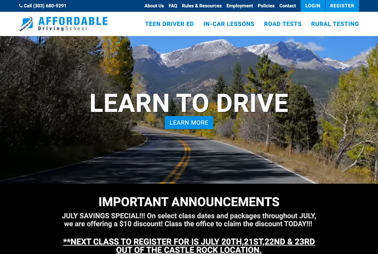
Affordable Driving School: A named niche: rural road testing

Affordable Driving School does one quietly clever thing — it names an underserved niche most competitors ignore. Alongside the expected Teen Driver Ed and In-Car Lessons, the nav surfaces 'Rural Testing,' speaking directly to learners outside the metro who struggle to find a convenient road-test site. 'Learn to Drive' over a mountain-highway photo keeps the main pitch broad, but that one specific menu item is a magnet for a real, poorly-served search. The lesson is niche capture through navigation: you don't have to rebuild your whole site around a sub-audience — sometimes just naming their specific need as a menu item (rural testing, senior refreshers, license reinstatement) pulls in a customer segment your generalist competitors never thought to address.

Duckworth Driving Academy — Teen Driver Ed website design you can build with Zarla
Build this with Zarla
  • Teen Driver Ed
  • Reassuring

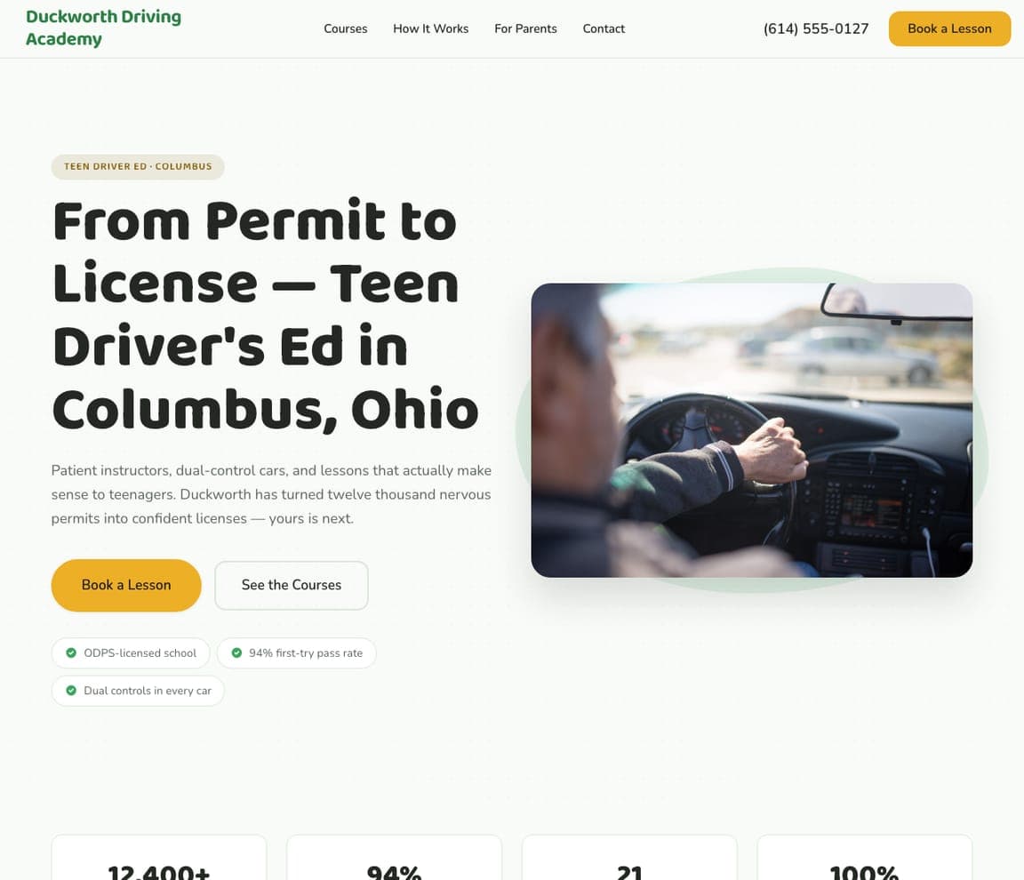
Duckworth Driving Academy: Reassure the parent who's actually deciding

Duckworth Driving Academy understands that a teen's driving school is chosen by an anxious parent, and it speaks to them directly. 'From Permit to License — Teen Driver's Ed in Columbus, Ohio' over a real photo of a teen at the wheel, with copy engineered for the worried mom or dad: 'patient instructors, dual-control cars, and lessons that actually make sense to teenagers. Duckworth has turned twelve thousand nervous permits into confident licenses.' The trust strip (state-licensed, 94% first-try pass rate, dual controls in every car) answers safety and outcome at once. It's a template built around the real decision-maker: the teen takes the lessons, but the parent picks the school, so lead with safety, patience, and a proven pass rate. Describe your school and it's yours in about a minute.

See this template
Bastion Driving Institute — Defensive Driving website design you can build with Zarla
Build this with Zarla
  • Defensive Driving
  • Direct

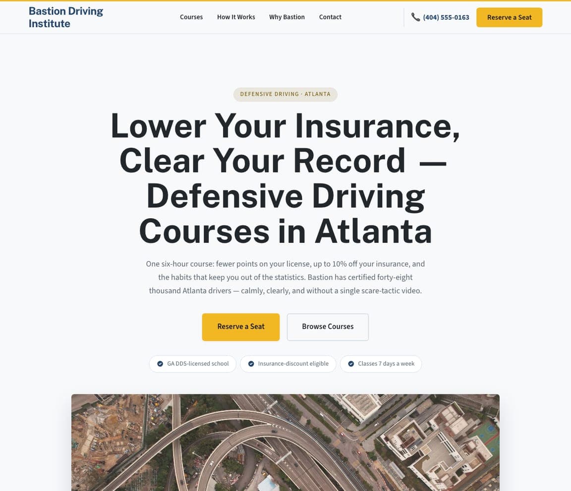
Bastion Driving Institute: Lead with the two things a ticket-holder wants

Bastion Driving Institute nails a completely different customer from the teen schools: an adult with a ticket. 'Lower Your Insurance, Clear Your Record — Defensive Driving Courses in Atlanta' leads with the two exact outcomes that person is searching for, and the copy is refreshingly specific: 'one six-hour course: fewer points on your license, up to 10% off your insurance, and the habits that keep you out of the statistics — without a single scare-tactic video.' Insurance-discount-eligible and state-licensed reassurances seal it. The lesson is outcome-first copy for a transactional buyer: a defensive-driving customer isn't shopping for a relationship, they want points gone and insurance lowered, fast — so name those two results in the headline and get out of the way. Point it at your course and publish it free.

See this template
Draymore CDL Academy — CDL Training website design you can build with Zarla
Build this with Zarla
  • CDL Training
  • Career

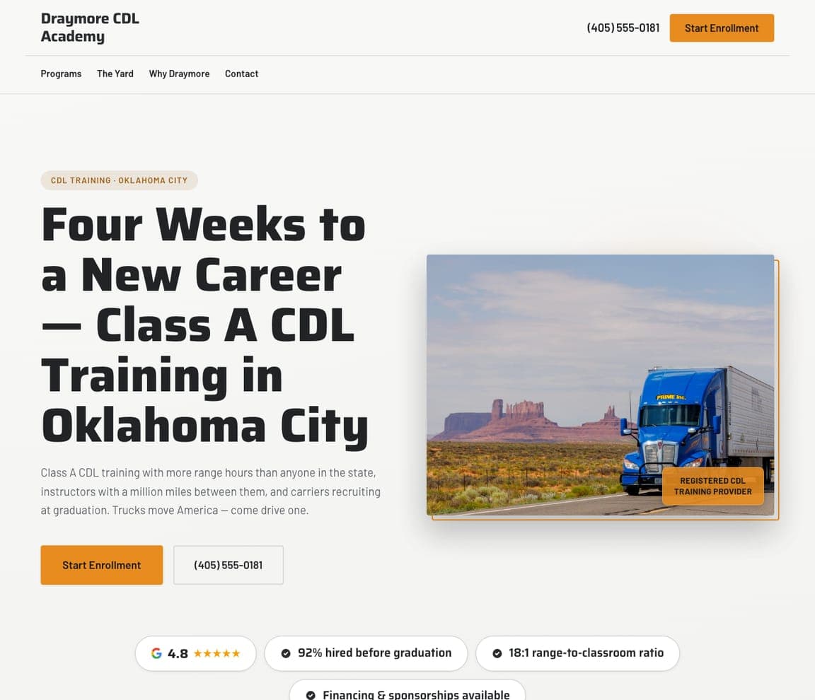
Draymore CDL Academy: Sell a career, not a course

Draymore CDL Academy sells an outcome no teen school can: a new career. 'Four Weeks to a New Career — Class A CDL Training in Oklahoma City' over a photo of a semi on an open desert highway reframes the offer from 'a course' to 'a life change,' and the proof points are all about employment — 'carriers recruiting at graduation,' 92% hired before graduation, financing and sponsorships available. The orange accent and the big-rig imagery signal a serious, adult, work-focused program. The lesson is selling the destination, not the training: a CDL student is buying a paycheck and a way out, so lead with 'new career' and 'hired at graduation,' not curriculum hours. When your service is really a career on-ramp, the design should promise the career. Swap in your details and publish it free.

See this template
Compass Rose Driving School — Senior Driving website design you can build with Zarla
Build this with Zarla
  • Senior Driving
  • Respectful

Compass Rose Driving School: Serve a niche with dignity, not condescension

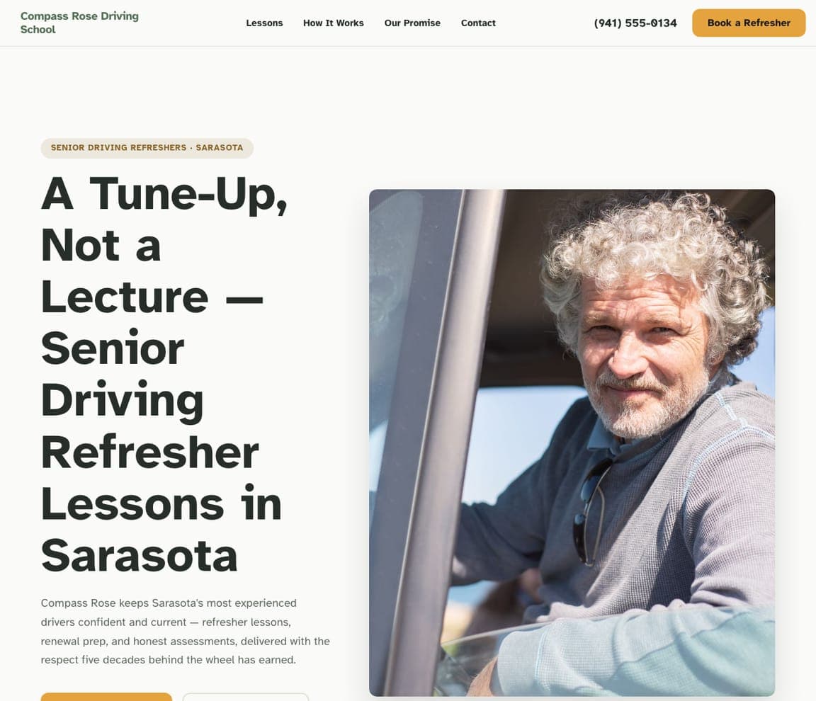
Compass Rose Driving School designs for an audience almost every competitor ignores or patronizes: older drivers. 'A Tune-Up, Not a Lecture — Senior Driving Refresher Lessons in Sarasota' is a masterstroke of tone, reframing a potentially touchy service (are you still safe to drive?) as routine maintenance rather than a test, and a warm portrait of a confident older man sets the respectful mood. The copy earns trust with dignity: 'refresher lessons, renewal prep, and honest assessments, delivered with the respect five decades behind the wheel has earned.' The lesson is tone as differentiation for a sensitive niche: when your customer might feel defensive, the words and imagery that treat them with respect are the entire pitch. Describe your program and it's yours in about a minute.

See this template
Quiet Roads Driving School — Nervous Drivers website design you can build with Zarla
Build this with Zarla
  • Nervous Drivers
  • Gentle

Quiet Roads Driving School: Design for the customer's emotional state

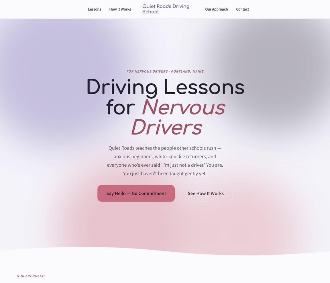
Quiet Roads Driving School builds its entire identity around one feeling: fear. 'Driving Lessons for Nervous Drivers' over a soft lavender-and-pink gradient — deliberately gentle, the opposite of the bold, fast imagery most driving sites use — and copy that speaks straight to the anxious heart: 'we teach the people other schools rush — anxious beginners, white-knuckle returners, and everyone who's ever said I'm just not a driver. You are. You just haven't been taught gently yet.' Even the CTA is low-pressure: 'Say Hello — No Commitment.' The lesson is designing for an emotional state: a terrified adult learner has been failed by high-pressure schools, so every choice — the soft palette, the reassuring copy, the no-commitment CTA — signals safety. When your customer is scared, the whole design should feel like a deep breath. Swap in your details and publish it free.

See this template

Frequently asked

What makes a good driving school website?

A good driving school website builds trust in the first few seconds with a visible pass rate, state licensing (TDLR, DPS, DDS depending on your state), and a real photo of an instructor or student — not stock — then makes booking the single obvious action with a 'Book a Lesson' button or package selector in the hero. Because the decision-maker is often a nervous parent or an anxious adult, the best sites lead with reassurance and proof rather than a list of course hours.

What pages does a driving school website need?

Most driving schools need five: a home page that builds trust and points to booking, a courses or packages page with clear pricing (teen ed, behind-the-wheel, defensive driving, road tests), an about page with real instructor photos and credentials, a locations page if you serve several areas, and a contact page with a form and phone number. A Google Business Profile connected to the site is what gets you found for 'driving school near me' and 'driving lessons near me.'

How do driving schools get more students from their website?

The schools that convert do three things: they lead with trust (a visible first-try pass rate, state licensing, real instructor faces), they make booking frictionless (a package selector or 'Book a Lesson' button in the hero, click-to-call on mobile), and they keep a steady stream of Google reviews — the biggest factor in both ranking for 'driving school near me' and getting a nervous parent to choose you. Speaking to a specific learner — a teen, a ticket-holder, a CDL student, a senior — rather than everyone is what makes all three land.

You've seen what works. Now make it yours.

Describe your business and Zarla designs a complete, professional website in about 30 seconds — built to convert, just like the ones above.

Free to build and preview · no credit card · publish to your own domain on Premium