ascentcorp.com
- Data Center Engineering
- Sleek
Ascent: One gradient, one promise: mission critical
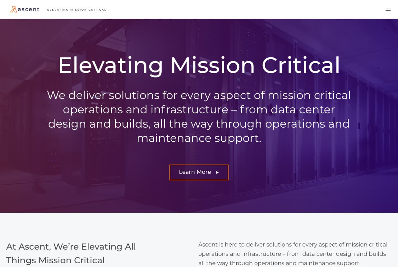
Ascent sells data-center engineering with a mood rather than a machine: a purple-to-violet gradient washes over a dim photograph of server rows, and centered on it a light sans headline reads 'Elevating Mission Critical'. The paragraph beneath is the whole offer in one sentence — 'solutions for every aspect of mission critical operations and infrastructure – from data center design and builds, all the way through operations and maintenance support' — and a single outlined 'Learn More' follows. The nav is nearly empty: a wordmark, the tagline in tiny caps, a hamburger. Below the fold the same promise repeats in plain type. It's the visual language of a SaaS product applied to design-build. Ascent shows a firm in a hot market how to look like the category leader: one color, one phrase, no clutter.
Opens a similar Zarla design you can make yours.
landform.net
Landform: A rotating adjective and three studio cards
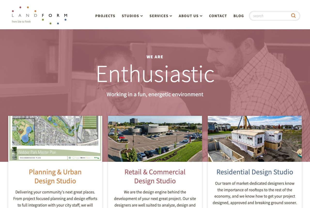
Landform makes its culture the hero and its studios the navigation: a dusty-rose tint over a photograph of two people at a screen, an eyebrow that says 'WE ARE', a single rotating word set large — 'Enthusiastic' in this frame — and a one-line caption, 'Working in a fun, energetic environment'. Directly beneath, three white cards route the visitor by what they're building: 'Planning & Urban Design Studio', 'Retail & Commercial Design Studio', 'Residential Design Studio', each with a project photograph and two sentences. The nav lists Projects and Studios before Services, and a search box sits in the header. Landform shows a site-design and civil firm how to do two jobs in one screen — recruit with personality up top, and sort clients into the right studio below.
Opens a similar Zarla design you can make yours.
carlsonmccain.com
- Environmental Consulting
- Straightforward
Carlson McCain: The trench photo and a three-column promise
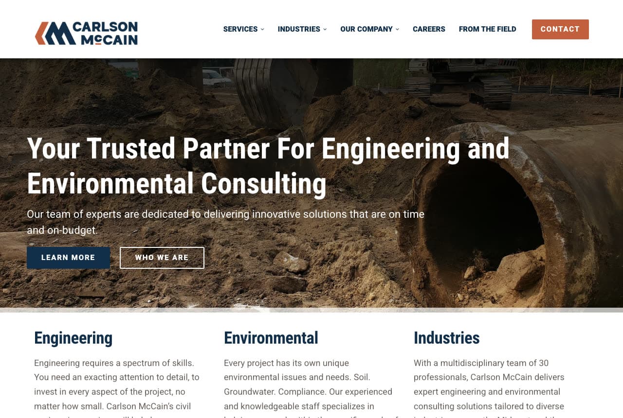
Carlson McCain shows the ground open: a photograph of an excavation with a large culvert pipe being set into the trench fills the hero, and over it a bold white headline states the offer without decoration — 'Your Trusted Partner For Engineering and Environmental Consulting'. The sub-line makes the one promise a client cares about ('innovative solutions that are on time and on-budget'), and two buttons follow, a navy 'LEARN MORE' and an outlined 'WHO WE ARE'. Directly below, three columns — Engineering, Environmental, Industries — each open with a short paragraph, so the whole firm is legible in one scroll. The nav ends in an orange 'CONTACT'. Carlson McCain shows a regional firm how to look substantial with almost no design: real dirt, plain words, three columns.
Opens a similar Zarla design you can make yours.
bluestemcivilgroup.com
- Civil Engineering
- Credible
Bluestem Civil Group: Permits in the headline, proof in the chips
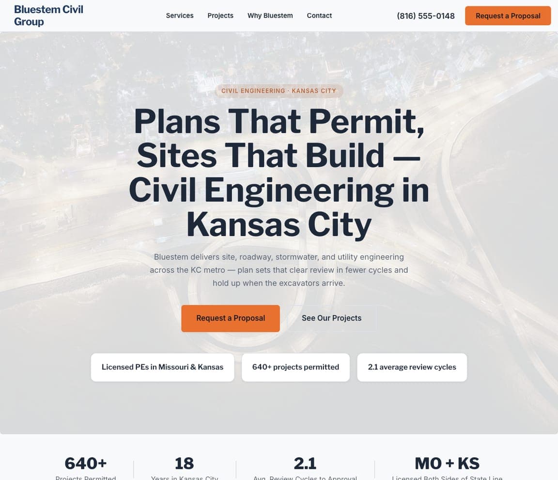
Bluestem Civil Group is the Zarla template for a civil firm that sells permits, not adjectives: a white ground, an eyebrow 'CIVIL ENGINEERING · KANSAS CITY', a serif headline that names the outcome and the city — 'Plans That Permit, Sites That Build — Civil Engineering in Kansas City' — an orange 'Request a Proposal' beside 'See Our Projects', and a row of proof chips underneath (licensed PEs in Missouri and Kansas, 640+ projects permitted, 2.1 average review cycles). It's the HR Green move — plain words, real numbers — with the proposal ask already in the first screen. Clone it, name your city and disciplines, and the chips become your numbers.
gantrystructuralengineers.com
- Structural Engineering
- Serious
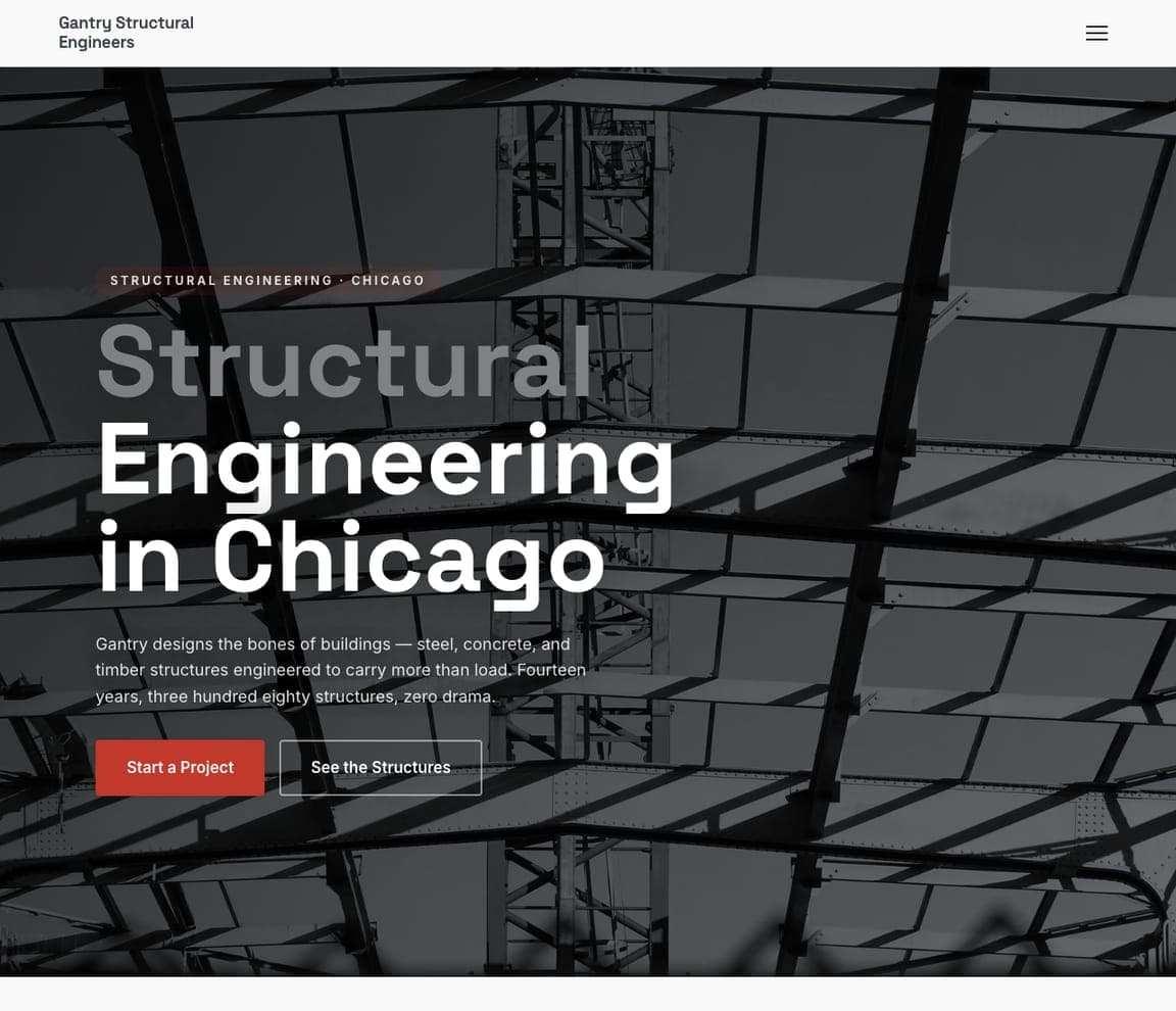
Gantry Structural Engineers: Steel behind type set huge
Gantry Structural Engineers goes dark and type-led: a photograph of steel framing behind a headline set enormous — 'Structural Engineering in Chicago' — a one-paragraph practice story ('steel, concrete, and timber structures engineered to carry more than load… three hundred eighty structures, zero drama') and a red 'Start a Project' beside 'See the Structures'. It's the register Schneider Structural reaches for, with the type doing the work instead of a slogan. For a firm whose projects photograph well at dusk or in steel, Gantry is the closest catalog match — clone it and the headline becomes your discipline and your city.
tridentbuildingsystems.com
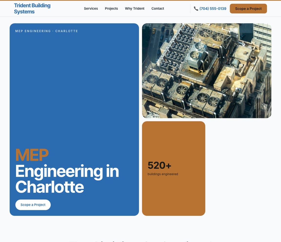
Trident Building Systems: Three tiles for three disciplines
Trident Building Systems is a bento hero: a blue tile carrying 'MEP Engineering in Charlotte', a photograph of rooftop mechanical plant beside it, and a copper tile with a single number — 520+ buildings engineered. The three-tile layout is a natural fit for a firm with three disciplines (mechanical, electrical, plumbing), and the stat tile does what Ascent's gradient does with a number instead of a mood. Trident suits any building-systems firm that wants to look modern without a stock handshake. Clone it, swap the plant photo for your own and the number for yours.
baselinelandsurveying.com
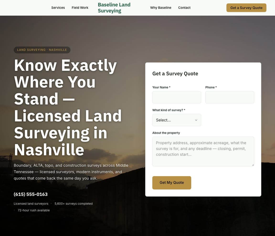
Baseline Land Surveying: The quote form standing in the hero
Baseline Land Surveying is the conversion-first template in the set: a dark landscape photograph, a headline that answers the client's real question — 'Know Exactly Where You Stand — Licensed Land Surveying in Nashville' — and a 'Get a Survey Quote' form card standing in the hero with the survey type as a dropdown and a 'Get My Quote' button. It's the right shape for any engineering service that sells by quote rather than by portfolio; Landform's studio cards route visitors, Baseline's form converts them on the spot. Clone it, and the form arrives wired to your inbox with the survey types you offer.
headwaterengineering.com
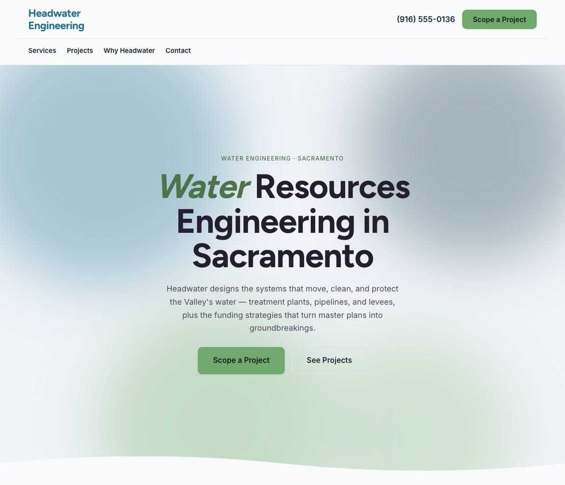
Headwater Engineering: No photo at all — the discipline in green
Headwater Engineering is the calm one: a pale aurora gradient instead of a photograph, 'Water Resources Engineering in Sacramento' with the first word in green, two lines about treatment plants, pipelines and the funding strategies that get them built, and a green 'Scope a Project' beside 'See Projects'. It's SWA's sky-blue restraint pushed further — no image at all, so the discipline and the city carry the screen. For a firm without strong project photography yet, Headwater is the honest starting point: clone it, and add photographs as the projects come in.


