Inspiration · Florist

The Best Florist Website Examples, Explained

Looking for florist website examples? These 8 are the best we could find — standout real florist sites plus designs you can build with Zarla — and each comes with a breakdown of the specific design move that makes it work. Find a look you love and you can build a site in that exact style, free, in about 30 seconds.

Real sites + designs you can build with Zarla — free to build and preview, no credit card

What makes a great florist website

The best florist websites share a few moves: they earn trust fast, lead with strong visuals of the work, point to one clear action, and match the design to how their customers decide. Each example below calls out the specific choice worth stealing for your own florist website.

Aoyama Flower Market website — Lifestyle Florist design example
Real site · Tokyo, JP
  • Lifestyle Florist
  • Refined
  • Multicolor + black

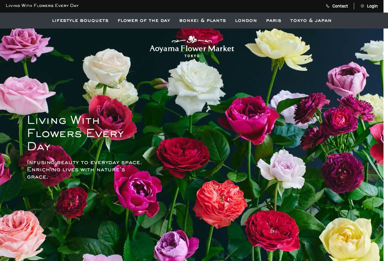
Aoyama Flower Market: A philosophy, not a product, up front

Aoyama Flower Market opens on a dense, saturated wall of roses in every hue and the phrase 'Living With Flowers Every Day' — and that line, not a bouquet price, is the brand. The copy explains the concept ('infusing beauty to everyday space, enriching lives with nature's grace') and then quietly flexes scale: London, Paris, Tokyo shop links and 'around one hundred stores.' The design sells a lifestyle philosophy that happens to be delivered through flowers, which lets a florist transcend the occasion-only purchase (weddings, funerals, apologies) and become a daily habit. The elegant serif over the maximalist bloom photography is Japanese retail at its most refined. When you can name a philosophy your customers want to live by, lead with it.

  • 'Living With Flowers Every Day' sells a daily habit, not an occasion
  • Maximalist rose wall + refined serif — Japanese retail polish
  • Global shop links flex scale without a stats bar

Steal this: Sell a philosophy, not stems. 'Flowers every day' turns an occasional buy into a habit worth repeating.

Flowers Vasette website — Luxury / Events design example
Real site · Melbourne, AU
  • Luxury / Events
  • Dramatic
  • Black + green

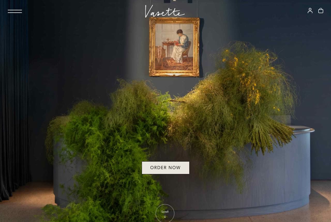
Flowers Vasette: A florist that shoots like a gallery

Flowers Vasette treats its homepage like an art installation: a moody, low-lit photograph of an enormous cascading green arrangement spilling over a plinth, a gilt-framed painting behind it, an 'Order Now' button floating in the dark. There's not a single cheerful bouquet in sight — the drama IS the positioning, telling event planners and luxury buyers that this florist works at gallery scale, not grocery-store scale. The near-black palette makes the greenery theatrical and the whole thing feel curated rather than transactional. It's a deliberate filter: the customer who wants a $40 hand-tied bunch bounces, and the customer commissioning a statement installation leans in. Art-directing your best large-scale work is how a florist charges installation prices.

  • Gallery-scale installation as hero — not a $40 bunch
  • Near-black drama filters for luxury and event buyers
  • Curated, not transactional — the palette does the pricing

Steal this: Lead with your biggest installation, lit like art. Scale in the hero photo sets the price in the buyer's head.

Oak & Olive Flowers website — Grower-Florist design example
Real site · Decorah, IA
  • Grower-Florist
  • Natural
  • Stone + garden

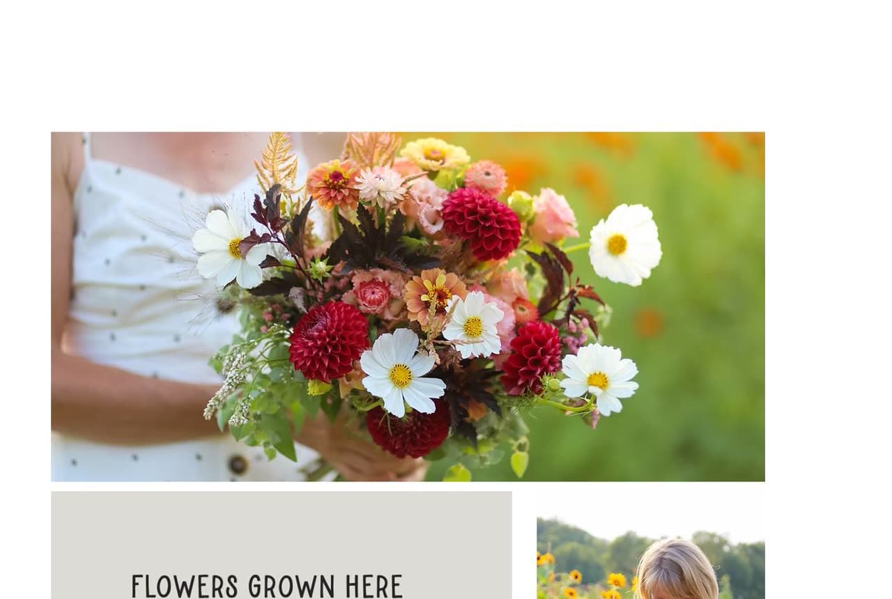
Oak & Olive Flowers: 'Flowers grown here' — the farm advantage

Oak & Olive Flowers leads not with arrangements but with provenance: a lush garden-style bouquet, then a section titled 'Flowers Grown Here' with a photo of the grower in her own field. The pitch is farm-to-vase — 'a tiny flower farm and floral design studio… fresh, local, and sustainable' — and that's a moat imported-flower shops can't cross. The soft, natural photography and understated stone palette let the blooms' real colors carry the page, and putting the farmer in-frame makes 'local' concrete rather than a marketing word. For the grower-florist, the field IS the differentiator; a photo of you among your own flowers does more than any 'locally sourced' badge. Own the part of the supply chain your competitors outsource.

  • 'Flowers Grown Here' + grower-in-field photo makes local concrete
  • Farm-to-vase is a moat import florists can't match
  • Natural palette lets the real bloom colors carry the page
Props Floral Design website — Seasonal Florist design example
Real site · Nova Scotia, CA
  • Seasonal Florist
  • Vibrant
  • Multicolor + white

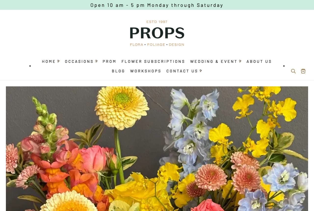
Props Floral Design: Honesty about what you'll actually get

Props Floral Design fills the screen with a riotous, un-styled explosion of seasonal blooms — coral, yellow, blue, every texture — and then writes the most honest paragraph in floristry: 'while you may not receive an exact copy of our web products, we'll always emulate their colour palette and feel with what's fresh in the fridge.' Naming the industry's dirty secret (the photo is never exactly what arrives) and reframing it as a feature — freshness over uniformity — builds more trust than any perfectly-styled catalog. The 'non-standard designs' positioning and the vivid, real photography attract customers who want character over predictability. Radical honesty about a known limitation is a conversion tool most businesses are too afraid to use.

  • Names the 'photo ≠ delivery' secret and reframes it as freshness
  • Riotous real blooms attract character-over-predictability buyers
  • 'Non-standard designs' turns inconsistency into a brand promise

Steal this: Name the limitation your whole industry hides. Honest expectation-setting converts better than a flawless catalog.

Snapdragon website — Local Florist design example
Real site · Edinburgh, UK
  • Local Florist
  • Seasonal
  • Sage + cream

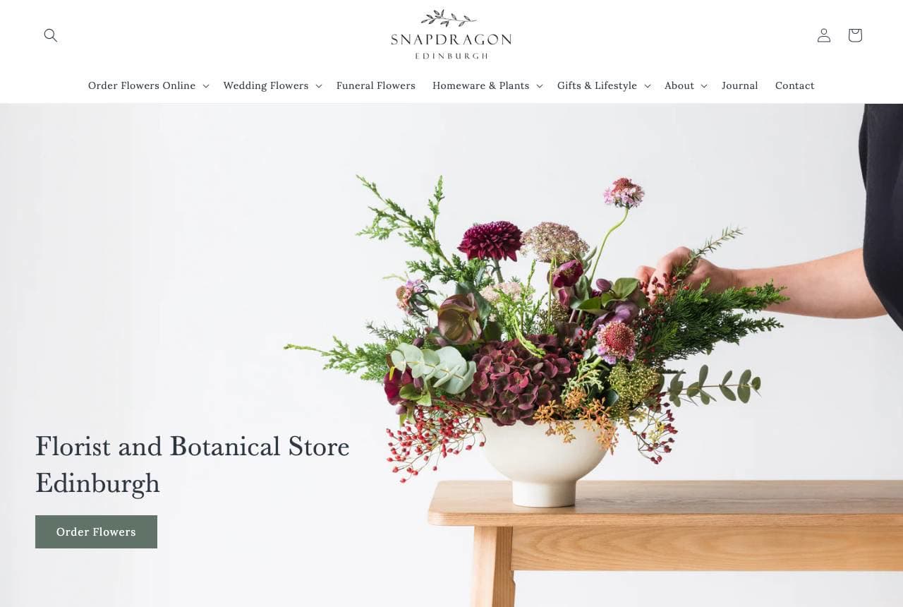
Snapdragon: Garden-style blooms, keyword-perfect copy

Snapdragon balances beauty and findability better than almost any florist here: a photo of a hand placing a moody garden-style arrangement in a stone urn, 'Florist and Botanical Store Edinburgh' as the plain headline, and a subhead — 'Fresh, Seasonal Flowers from Your Local Edinburgh Florist' — that reads naturally while packing the exact search term twice. The body lists every occasion (weddings, birthdays, anniversaries, funerals) so the page ranks for each, and the three arrangement thumbnails show the garden-inspired house style. It's proof that SEO discipline and elegant design aren't enemies: the copy names the city and craft plainly for Google while the muted, seasonal photography keeps it aspirational for humans. Say where you are and what you do, in words people search.

  • 'Local Edinburgh Florist' — the search term, said naturally
  • Occasion list makes the page rank for each intent
  • Garden-style thumbnails establish the house aesthetic
Starbright website — Delivery Florist design example
Real site · New York, NY
  • Delivery Florist
  • Bold
  • Yellow + white

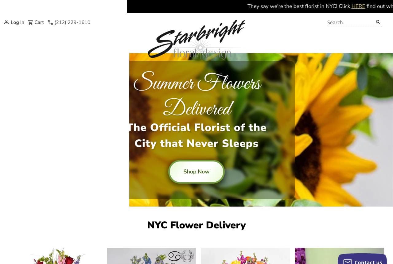
Starbright: Owning a city with one bold claim

Starbright plants a flag: 'The Official Florist of the City that Never Sleeps,' set over a sunny sunflower hero with a script wordmark, plus a top-bar dare — 'They say we're the best florist in NYC! Click HERE find out why.' It's brash in a way most florists are too delicate to attempt, and it works precisely because floristry skews soft — a confident, big-city claim stands out in a category of pastel gentility. 'NYC Flower Delivery' underneath nails the transactional search term, and the phone number sits up top for the same-day caller. The lesson: category conventions are an opportunity. When everyone in your field whispers, the business that states a bold claim owns the memory.

  • A brash city claim stands out in a soft-spoken category
  • 'NYC Flower Delivery' captures the transactional search
  • Phone up top for the same-day delivery caller
Wild Poppies website — E-Commerce Florist design example
Real site · Auckland, NZ
  • E-Commerce Florist
  • Romantic

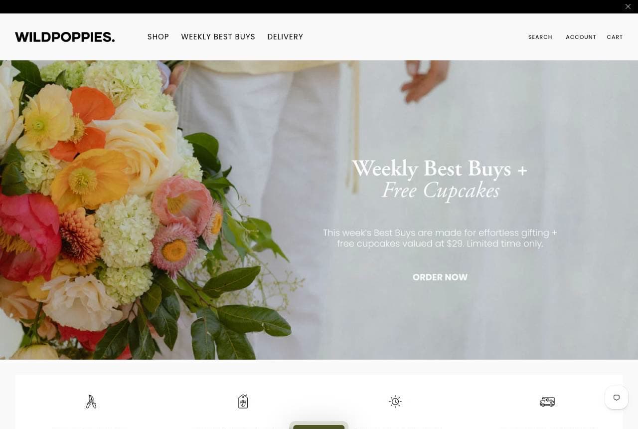
Wild Poppies: A gift-perk and four delivery promises

Wild Poppies runs the e-commerce florist playbook with unusual polish: a soft, romantic hero of pastel blooms, 'Weekly Best Buys + Free Cupcakes' as an irresistible limited-time offer, and — the conversion engine — a four-icon row spelling out exactly how delivery works: Made to Order, Shop Now Pay Later, Same Day Delivery, Overnight Delivery. Flowers are usually a last-minute, anxious purchase ('will it arrive in time?'), and answering the logistics up front removes the exact friction that kills the sale. The free-cupcake add-on is a clever gift-upsell that also justifies checking back weekly. Pretty photography gets the click; the delivery-promise row gets the order. For any florist selling online, spell out the fulfilment before the flowers.

Marigold & Mae — Neighborhood Florist website design you can build with Zarla
Build this with Zarla
  • Neighborhood Florist
  • Playful

Marigold & Mae: Handmade blooms in playful pop

Marigold & Mae is Zarla's florist template, and its playful-pop hero lands the register a neighbourhood flower shop wants: 'Fresh Flowers, Made by Hand,' in a plum-and-coral palette that's cheerful and feminine without tipping into twee. 'Made by Hand' is the quiet craft claim that separates a real florist from a supermarket bucket — the same instinct behind Oak & Olive's grower story. The structure carries an arrangements gallery, an about-the-shop section, occasion categories, and a contact-and-order path, which is exactly the checklist a local florist needs. The bright, optimistic palette photographs beautifully against real bouquet imagery. Swap in your own arrangements and you have a warm, on-brand florist site in about 30 seconds — no photographer or designer required.

See this template

Frequently asked

Where can I find good florist website examples?

Right here — this page curates florist website examples two ways: standout real businesses (each linked, so you can explore the live site) and professionally designed Zarla templates you can clone and make your own. Every example comes with a note on why the design works — trust signals, layout, calls to action — so you can copy the move, not just the look.

What makes a good florist website?

A good florist website earns trust in the first few seconds, leads with strong visuals of the work, gives visitors one obvious action, and loads fast on a phone. Every design below leads with proof and a single clear call to action rather than a wall of text.

How much does a florist website cost?

A custom florist website from a designer typically runs into the thousands up front, and template builders charge roughly $16–$30 per month. An AI builder generates a complete, editable design for free and only charges (on the Premium plan) when you publish to your own domain — so you can build and preview before spending anything.

Do I need a designer to build a florist website?

No. Several designs on this page were generated by Zarla and are fully editable — you describe your business and get a complete, professionally designed site in about 30 seconds, then refine it by chatting. Building and previewing is free; publishing to your own domain needs the Premium plan.

What pages does a florist website need?

Most florist businesses need just a few: a home page that proves trust and points to one clear action, an about page that puts a face to the business, a services or work page that shows what you do, and a contact page with a form and a phone number. Local businesses also benefit from location or service-area pages that help them show up in nearby searches.

How do I get more customers from my florist website?

Lead with proof in the first few seconds (reviews, real photos, results), make one action obvious on every screen (call, book, or enquire), and keep it fast on mobile — most visitors arrive on a phone. The designs above each do this differently, but they all earn trust early and remove friction from the next step.

You've seen what works. Now make it yours.

Describe your business and Zarla designs a complete, professional website in about 30 seconds — built to convert, just like the ones above.

Free to build and preview · no credit card · publish to your own domain on Premium