Inspiration · Foundation

The Best Foundation Website Examples, Explained

Looking for foundation website examples? These 12 are the strongest we found — Pulte Family Charitable Foundation's 'COMMITTED TO SERVING SOCIETY'S MOST VULNERABLE' with a grid of stats beneath it, Fairfield County's Community Foundation's 'Forward Together' across six portrait strips, Omaha Community Foundation's 'Where generosity meets impact.' beside four kids on a basket swing — plus nonprofit and wealth-planning designs you can build with Zarla, each with a breakdown of the specific move that turns a donor, a grant-seeker or an advisor into someone who opens a fund. A foundation's site is read by three people at once — the giver, the grantee and the advisor — so the best ones here give each a door in the first screen and say what the money has done. Find an approach you love and you can build a site in that spirit, free, in about 30 seconds.

Real sites + designs you can build with Zarla — free to build and preview, no credit card

What makes a great foundation website

The best foundation websites give three visitors three doors. The doors: Community Foundation of Greater Des Moines' stacked tiles — 'Donor Opportunities', 'Nonprofit Organizations', 'Professional Advisors'; Omaha Community Foundation's 'DONATE', 'OPEN A FUND', 'LOGIN'; Community Foundation for Southeast Michigan's 'GIVE', 'APPLY', 'MYCF' tabs; Community Foundation of Southern New Mexico's five pills. The proof: Pulte Family Charitable Foundation's '10 Million people served' and '257 Nonprofit organizations benefited' tiles, The Bolger Foundation's family of thirteen waving on the lawn. The place: 'Building A Better Bronx', 'A Great Place To Live, A Great Place To Give.', 'LEGACY LIVES HERE' over a Michigan main street, 'Forward Together' over six faces of Fairfield County. Notice the shortest line in the gallery — The Dayton Foundation's 'We help you help others.' — and the two buttons that are not 'donate': 'Submit Grant Application' at The Bolger Foundation, 'Access Your Fund' at The Dayton Foundation. Every example below tells you whether the foundation is talking to the giver, the grantee or the advisor first.

Pulte Family Charitable Foundation website — Family Charitable Foundation design example
Real site
  • Family Charitable Foundation
  • Purposeful
  • Photo + gold

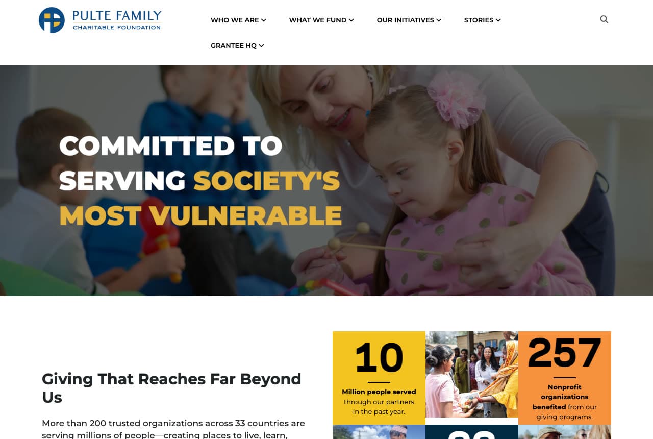
Pulte Family Charitable Foundation: 'COMMITTED TO SERVING SOCIETY'S MOST VULNERABLE' over a girl with a xylophone, then a grid of stats

The Pulte Family Charitable Foundation is the cover because it states its purpose and then counts it. The white header sets a blue 'PULTE FAMILY CHARITABLE FOUNDATION' logo and a caps nav — WHO WE ARE, WHAT WE FUND, OUR INITIATIVES, STORIES, GRANTEE HQ — with a search icon. The hero is a dimmed photograph of a woman helping a girl with a pink bow and a polka-dot top strike a xylophone, a boy in blue behind them; left, the bold capitals 'COMMITTED TO SERVING SOCIETY'S MOST VULNERABLE' on three lines, with 'SOCIETY'S MOST VULNERABLE' in gold. Beneath, on white, 'Giving That Reaches Far Beyond Us' and a paragraph beginning 'More than 200 trusted organizations across 33 countries are serving millions of people—creating places to live, learn,…', beside a grid of tiles — a yellow '10 Million people served through our partners in the past year', a photograph of aid being handed to women, an orange '257 Nonprofit organizations benefited from our giving programs', and more cut by the crop. There is no hero button; 'GRANTEE HQ' in the nav is the door for the people who apply. Clone the purpose-then-numbers stack.

  • The purpose in three lines, the last phrase in gold
  • Stats as coloured tiles
  • 'GRANTEE HQ' in the nav

Steal this: Follow the purpose with a grid of numbers — '10 Million people served', '257 Nonprofit organizations benefited' — so the mission is a record, not a wish.

Opens a similar Zarla design you can make yours.
The Bolger Foundation website — Family Foundation design example
Real site
  • Family Foundation
  • Genteel
  • Maroon + cream

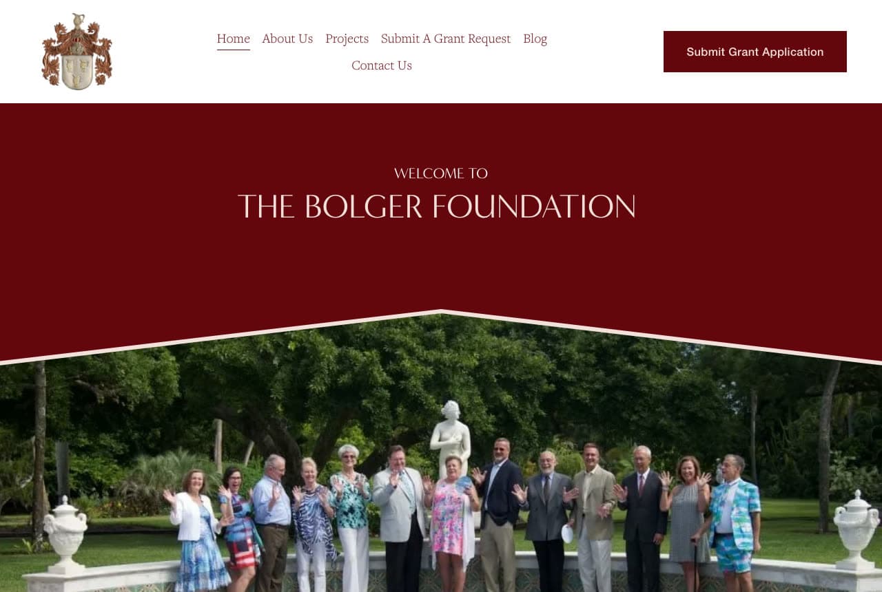
The Bolger Foundation: 'WELCOME TO THE BOLGER FOUNDATION' on a maroon chevron over the family waving on a lawn

The Bolger Foundation shows the family that gives. The white header sets a heraldic crest — a gold-and-red coat of arms — a serif nav on two rows (Home, About Us, Projects, Submit A Grant Request, Blog / Contact Us) and a maroon 'Submit Grant Application'. The hero is a maroon panel whose bottom edge dips to a chevron, carrying the small tracked capitals 'WELCOME TO' and the thin capitals 'THE BOLGER FOUNDATION'; beneath it, a photograph of thirteen family members lined up on a lawn in front of a stone balustrade and a white statue, all waving, in summer dresses and blazers, palms and live oaks behind. No paragraph and no donate button — a family foundation gives, it does not ask — and 'Submit A Grant Request' is the only verb. Clone the crest-and-family page if your foundation carries a family name.

  • A coat of arms as the logo
  • The family photographed waving
  • 'Submit Grant Application', not 'donate'

Steal this: If your foundation is a family, photograph the family — thirteen people waving on a lawn says who is giving better than a mission statement.

Visit The Bolger Foundation

Opens a similar Zarla design you can make yours.
Community Foundation of Southern New Mexico website — Community Foundation design example
Real site · Las Cruces, NM
  • Community Foundation
  • Rooted
  • Teal + red

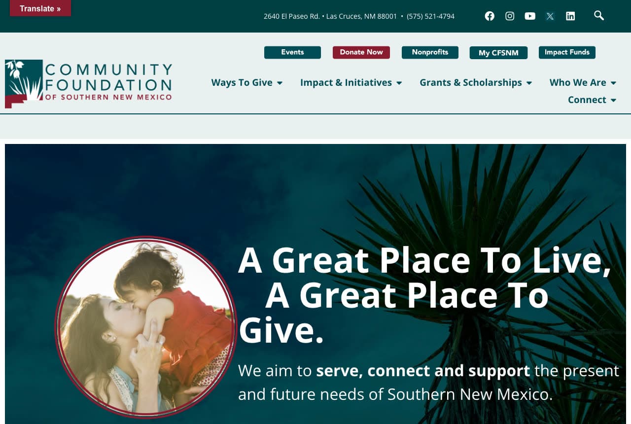
Community Foundation of Southern New Mexico: 'A Great Place To Live, A Great Place To Give.' beside a circular photo of a mother kissing a child, with five pills in the header

The Community Foundation of Southern New Mexico rhymes its place with its purpose. A teal strip carries a red 'Translate »', the address '2640 El Paseo Rd. • Las Cruces, NM 88001 • (575) 521-4794' and social icons; the white header sets a logo with a yucca illustration, a row of five pills — a teal 'Events', a red 'Donate Now', a teal 'Nonprofits', a dark 'My CFSNM', a teal 'Impact Funds' — and a nav: Ways To Give, Impact & Initiatives, Grants & Scholarships, Who We Are, Connect. The hero is a teal-tinted photograph of a yucca with a circular inset, ringed in red, of a mother kissing a small child in a red dress; right, the white bold 'A Great Place To Live, A Great Place To Give.' and the line 'We aim to serve, connect and support the present and future needs of Southern New Mexico.' with 'serve, connect and support' in bold. Five pills for five visitors, and a yucca for the place. Clone the rhyming headline if your foundation belongs to a region.

  • Five pills for five visitors
  • A circular inset on the photograph
  • The place rhymed with the purpose

Steal this: Write the place into the promise — 'A Great Place To Live, A Great Place To Give.' — and put the regional plant, not a skyline, behind it.

Opens a similar Zarla design you can make yours.
Community Foundation of Greater Des Moines website — Community Foundation design example
Real site · Des Moines, IA
  • Community Foundation
  • Organised
  • Purple + green

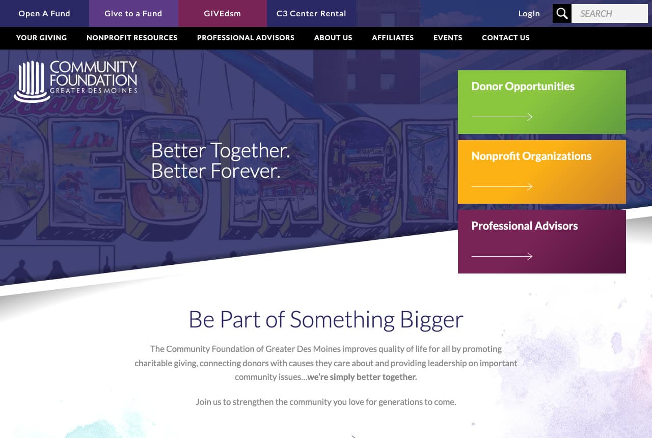
Community Foundation of Greater Des Moines: 'Better Together. Better Forever.' over a purple mural, with three stacked tiles — donors, nonprofits, advisors

The Community Foundation of Greater Des Moines gives each visitor a coloured tile. A top bar runs four coloured tabs — 'Open A Fund', 'Give to a Fund', 'GIVEdsm', 'C3 Center Rental' — with 'Login' and a search; a black bar carries the caps nav: YOUR GIVING, NONPROFIT RESOURCES, PROFESSIONAL ADVISORS, ABOUT US, AFFILIATES, EVENTS, CONTACT US. The hero is a purple-tinted photograph of a 'Greater Des Moines' mural; the white 'COMMUNITY FOUNDATION · GREATER DES MOINES' logo sits top left, the thin white 'Better Together.' / 'Better Forever.' beneath it; on the right, three stacked tiles with arrows — a green 'Donor Opportunities', an orange 'Nonprofit Organizations', a plum 'Professional Advisors'. A diagonal cut leads to white: 'Be Part of Something Bigger' and a paragraph ending '…we're simply better together.' then 'Join us to strengthen the community you love for generations to come.' Three tiles, three colours, three readers. Clone the stacked tiles if you serve three audiences.

  • Three coloured tiles for three readers
  • Four coloured tabs in the top bar
  • A mural as the photograph

Steal this: Stack a tile per audience beside the headline — donors, nonprofits, advisors — each in its own colour, so nobody has to find themselves in a dropdown.

Opens a similar Zarla design you can make yours.
Omaha Community Foundation website — Community Foundation design example
Real site · Omaha, NE
  • Community Foundation
  • Generous
  • Photo + blue

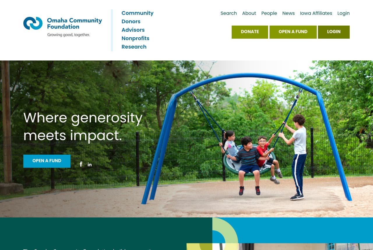
Omaha Community Foundation: 'Where generosity meets impact.' beside four kids on a blue basket swing, with 'OPEN A FUND' as the button

The Omaha Community Foundation writes four words and shows a playground. The white header sets a blue 'Omaha Community Foundation' logo with the strap 'Growing good, together.', a two-column nav — Community, Donors, Advisors, Nonprofits, Research at the left; Search, About, People, News, Iowa Affiliates, Login at the right — and three buttons: a blue 'DONATE', a green 'OPEN A FUND', a dark 'LOGIN'. The hero is a photograph of four children on a blue basket swing in a playground, a fence and trees behind; left, the white 'Where generosity meets impact.' on two lines, a blue 'OPEN A FUND' and Facebook and LinkedIn icons. A teal band with a lime arc begins beneath. 'OPEN A FUND' in the hero, not 'DONATE', says who the foundation most wants to talk to. Clone the four-word headline and the fund button.

  • 'OPEN A FUND' as the hero button
  • A two-column nav by audience
  • A playground as the proof

Steal this: Make the hero button 'OPEN A FUND' rather than 'DONATE' — the visitor a community foundation most needs is the one who starts a fund.

Visit Omaha Community Foundation

Opens a similar Zarla design you can make yours.
The Bronx Community Foundation website — Community Foundation design example
Real site · Bronx, NY
  • Community Foundation
  • Proud
  • Photo + light blue

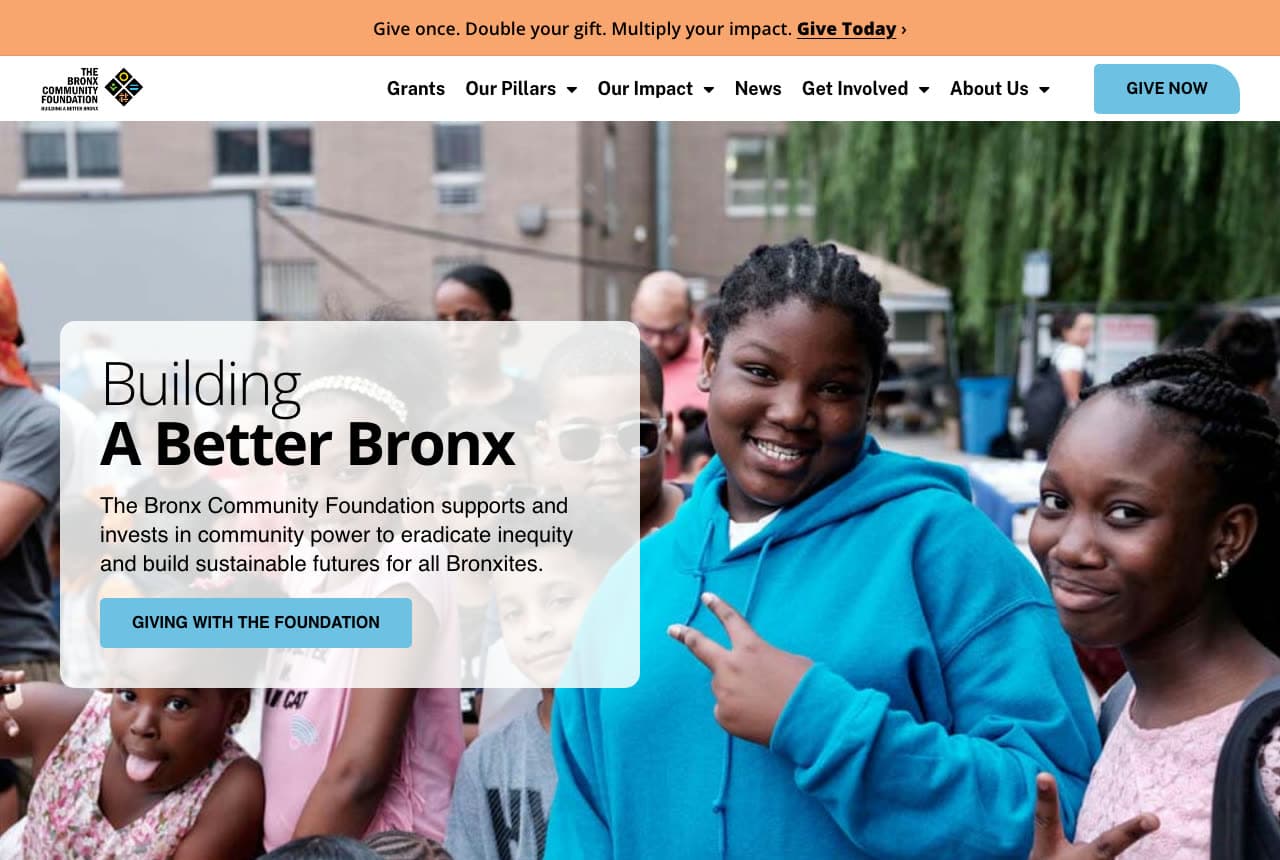
The Bronx Community Foundation: 'Building A Better Bronx' in a translucent card over girls at a street event, with a matching-gift strip on top

The Bronx Community Foundation puts the borough in the headline and the offer in the strip. An orange strip reads 'Give once. Double your gift. Multiply your impact. Give Today ›'; the white header sets the foundation's logo with 'BUILDING A BETTER BRONX' beneath it, a nav — Grants, Our Pillars, Our Impact, News, Get Involved, About Us — and a light-blue 'GIVE NOW'. The hero is a photograph of children at an outdoor event — a girl in a blue hoodie flashing a peace sign, a girl in pink beside her, a boy in sunglasses, a brick building and a willow behind; a translucent white card at the left carries the thin 'Building' over the bold 'A Better Bronx', the line 'The Bronx Community Foundation supports and invests in community power to eradicate inequity and build sustainable futures for all Bronxites.' and a light-blue 'GIVING WITH THE FOUNDATION'. 'Our Pillars' in the nav is the strategy named as a page. Clone the card-over-crowd hero for a place-based foundation.

  • The place in the headline
  • A matching-gift strip above the header
  • A translucent card over the photograph

Steal this: Run the matching-gift offer as a one-line strip above the header — 'Give once. Double your gift. Multiply your impact.' — and keep the hero for the people.

Opens a similar Zarla design you can make yours.
Fairfield County's Community Foundation website — Community Foundation design example
Real site · Fairfield County, CT
  • Community Foundation
  • Forward

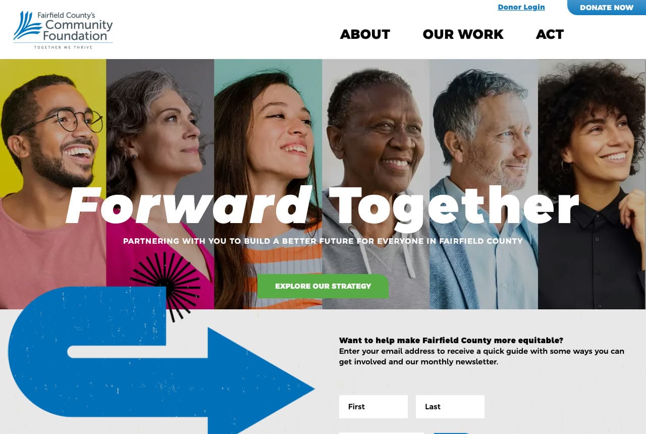
Fairfield County's Community Foundation: 'Forward Together' across six portrait strips, with 'EXPLORE OUR STRATEGY' and a giant blue arrow beneath

Fairfield County's Community Foundation shows six faces and one direction. The white header sets the foundation's logo with 'TOGETHER WE THRIVE', a bold caps nav — ABOUT, OUR WORK, ACT — a 'Donor Login' link and a blue 'DONATE NOW'. The hero is six vertical portrait strips side by side: a man laughing in a pink shirt on yellow, a grey-haired woman, a young woman laughing in stripes, an older woman in grey, a grey-haired man in a blue jacket, a curly-haired woman in black; across them, the giant white 'Forward Together' with 'Forward' in italic, the capitals 'PARTNERING WITH YOU TO BUILD A BETTER FUTURE FOR EVERYONE IN FAIRFIELD COUNTY' and a green 'EXPLORE OUR STRATEGY'. Beneath, a giant blue arrow illustration curls right beside 'Want to help make Fairfield County more equitable?' and a form with First and Last fields. 'ACT' as a three-letter nav item is the whole ask. Clone the portrait strips if your foundation is about people rather than places.

Opens a similar Zarla design you can make yours.
Community Foundation for Southeast Michigan website — Community Foundation design example
Real site · Detroit, MI
  • Community Foundation
  • Steady

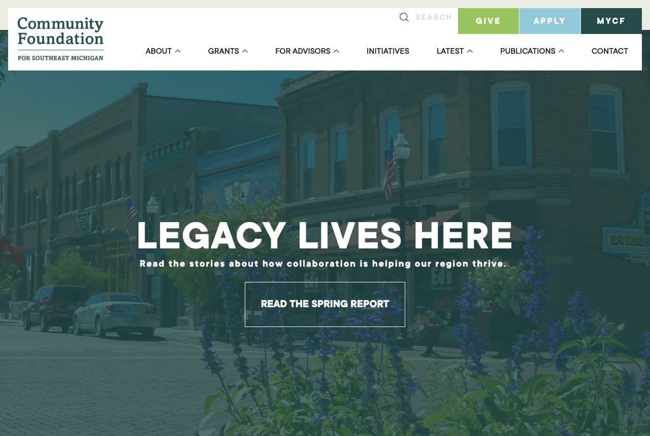
Community Foundation for Southeast Michigan: 'LEGACY LIVES HERE' over a green-tinted small-town main street, with GIVE / APPLY / MYCF tabs

The Community Foundation for Southeast Michigan makes three tabs do the work of three pages. The white header sets a green serif 'Community Foundation FOR SOUTHEAST MICHIGAN' logo, a search field and three tabs — a green 'GIVE', a light-blue 'APPLY', a dark green 'MYCF' — over a caps nav: ABOUT, GRANTS, FOR ADVISORS, INITIATIVES, LATEST, PUBLICATIONS, CONTACT. The hero is a green-tinted photograph of a small-town main street — brick storefronts, a street lamp with a flag, purple flowers in the foreground, a parked car; centred, the white bold capitals 'LEGACY LIVES HERE', the line 'Read the stories about how collaboration is helping our region thrive.' and an outlined 'READ THE SPRING REPORT'. 'PUBLICATIONS' in the nav and a report as the hero button say the foundation reports before it asks. Clone the three tabs if your visitors are givers, applicants and fund-holders.

Opens a similar Zarla design you can make yours.
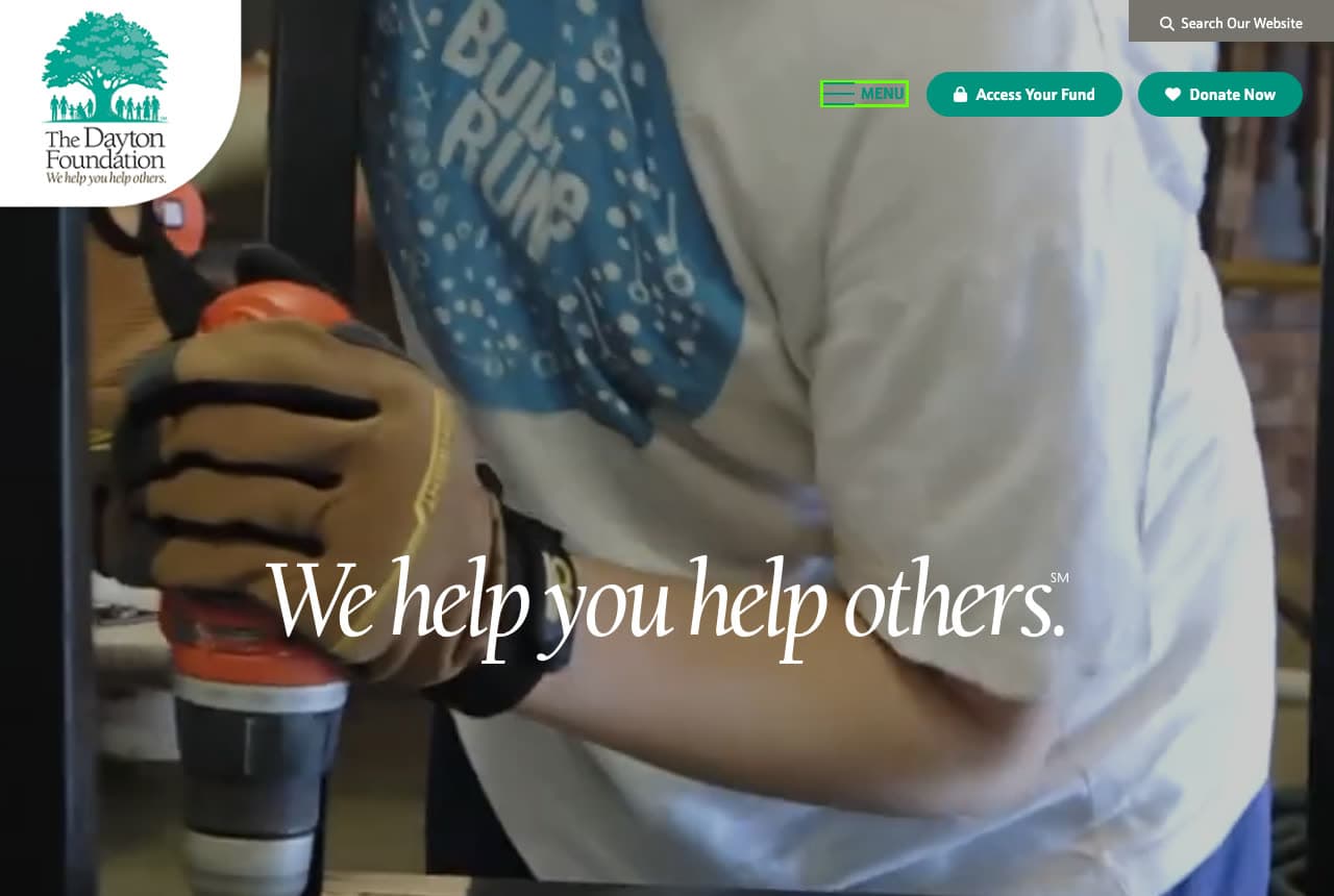
The Dayton Foundation website — Community Foundation design example
Real site · Dayton, OH
  • Community Foundation
  • Plain-Spoken

The Dayton Foundation: 'We help you help others.' in italic serif over a video still of a volunteer with a drill

The Dayton Foundation says its purpose in five words and makes it a service mark. The hero is a video still: a volunteer in a white T-shirt and a blue bandana, a gloved hand gripping an orange drill, a workshop behind; the foundation's logo — a green tree above 'The Dayton Foundation · We help you help others.' — sits in a white rounded corner top left; 'Search Our Website' runs in a dark box top right; a green 'MENU' and two green pills — 'Access Your Fund' with a lock and 'Donate Now' with a heart — sit right. Centred low, the white italic serif 'We help you help others.' with a small service mark after it. There is no nav and no paragraph in the first screen; the sentence is the logo, the tagline and the headline at once. 'Access Your Fund' before 'Donate Now' says fund-holders come first. Clone the one-sentence hero if you can trademark yours.

Visit The Dayton Foundation

Opens a similar Zarla design you can make yours.

Alder Lane Films — Nonprofit Video Template website design you can build with Zarla
Build this with Zarla
  • Nonprofit Video Template
  • Earnest

Alder Lane Films: 'Stories That Move Missions' beside volunteers' hands, with 'Tell Your Story' as the header button

Alder Lane Films is the Zarla nonprofit-video template — a foundation borrows it for the mission-first split hero with a photograph of grant money at work. The white header sets a rust serif 'Alder Lane Films', the phone and a green 'Tell Your Story' over a nav of Services, Our Films, How We Work, Contact. The hero, on off-white, opens with an italic pill — 'Nonprofit Video · Seattle' — and the huge dark serif 'Stories That Move Missions — Nonprofit Video Production in Seattle' across six lines; on the right, a rounded photograph of volunteers' hands passing a clear container of food. Beneath the headline, a paragraph, a green 'Tell Your Story' beside an outlined 'See Our Films', and three pills — '60 nonprofits served', '$18M+ raised at screenings', 'Filmed with dignity, always'. A foundation's version keeps the serif, the pill and the hands, and writes the mission where the video vocabulary sits — 'Grants That Move Missions'. Clone it if your foundation funds people rather than buildings.

See this template
Beacon Nonprofit CPAs — Nonprofit CPA Template website design you can build with Zarla
Build this with Zarla
  • Nonprofit CPA Template
  • Trustworthy

Beacon Nonprofit CPAs: 'Financials Your Board & Funders Trust' beside four smiling colleagues, with '400+ Nonprofits Served' in the strip

Beacon Nonprofit CPAs is the Zarla nonprofit-cpa template — a foundation borrows it for the board-and-funders register and the audited-numbers strip. An indigo top strip carries 'Nonprofit Specialists', 'Peer-Reviewed', '400+ Nonprofits Served', '26 Years of Service'. The white header sets Services and About left, an indigo two-line serif 'Beacon Nonprofit CPAs' centred, Contact right, and a gold 'Request a Proposal'. The hero splits: a pill — 'NONPROFIT AUDIT & 990 · MINNEAPOLIS, MN' — and the huge navy serif 'Financials Your Board & Funders Trust — Nonprofit CPAs in Minneapolis' with 'Minneapolis, MN' in gold, then a paragraph — 'Beacon serves Minneapolis nonprofits — and only nonprofits. Clean single audits, a 990 that tells your story, fund accounting, and board-ready reports, so your funders, board, and community trust every number.'; on the right, a rounded photograph of four smiling young people in a bright room, arms around each other. 'Board & Funders' names the two readers a foundation site really has. Swap the audit for your grant programme and keep the strip of institutional facts.

See this template
Ridgeline Wealth & Tax — Wealth Planning Template website design you can build with Zarla
Build this with Zarla
  • Wealth Planning Template
  • Quiet

Ridgeline Wealth & Tax: 'Keep More of What You've Built' in thin serif on white, with '$900M+ Advised' in the strip

Ridgeline Wealth & Tax is the Zarla wealth-tax-planning template — a family foundation borrows it for the quiet, no-photograph page that families with money expect. A dark green top strip carries four icon-and-text items: 'CPA · PFS Credentialed', 'Private Wealth Focus', '$900M+ Advised', '21 Years of Planning'. The white header sets Services and About left, a two-line serif 'Ridgeline Wealth & Tax' centred, Contact right, and a brown-gold 'Request a Consultation'. The hero, on white and centred, opens with a pill — 'WEALTH & TAX PLANNING · SCOTTSDALE, AZ' — the huge thin serif 'Keep More of What You've Built — Wealth & Tax Planning in Scottsdale, AZ' with 'Scottsdale, AZ' in gold, and a grey paragraph: 'Ridgeline is a private wealth and tax firm for successful Scottsdale families. We don't just file your return — we plan your year, and your decade, so more of what you've earned stays yours.' Then a small tracked 'SCOTTSDALE, AZ', a brown-gold 'Request a Consultation' beside an outlined 'Call (480) 555-0137'. No photograph in the first screen. Swap the planning for giving — 'Give More of What You've Built' — and keep the thin serif and the green strip.

See this template

Frequently asked

What should a foundation website show first?

The people the money reaches. Pulte Family Charitable Foundation shows a woman helping a girl in a pink bow play a xylophone. Omaha Community Foundation shows four kids on a blue basket swing. The Bronx Community Foundation shows girls at a street event, one flashing a peace sign. Fairfield County's Community Foundation shows six portraits side by side. Community Foundation for Southeast Michigan shows a small-town main street. The Bolger Foundation shows the family itself — thirteen people waving on a lawn.

How does a foundation site serve donors, grantees and advisors on one page?

With a door for each. Community Foundation of Greater Des Moines stacks three coloured tiles — 'Donor Opportunities', 'Nonprofit Organizations', 'Professional Advisors' — beside the headline, with 'Open A Fund' and 'Give to a Fund' in the top bar. Omaha Community Foundation puts 'DONATE', 'OPEN A FUND' and 'LOGIN' in the header and lists Community, Donors, Advisors, Nonprofits, Research in the nav. Community Foundation for Southeast Michigan uses three tabs — 'GIVE', 'APPLY', 'MYCF'. Community Foundation of Southern New Mexico runs five pills — Events, Donate Now, Nonprofits, My CFSNM, Impact Funds.

Should a foundation website show numbers?

Pulte Family Charitable Foundation does it best: under 'Giving That Reaches Far Beyond Us', a grid of tiles — a yellow '10 Million people served through our partners in the past year', a photograph of aid being handed out, an orange '257 Nonprofit organizations benefited from our giving programs' — and 'More than 200 trusted organizations across 33 countries' in the paragraph. Community Foundation for Southeast Michigan offers the report instead — 'READ THE SPRING REPORT'. The Bronx Community Foundation's orange strip makes the number the donor's: 'Give once. Double your gift. Multiply your impact.'

What should the button on a foundation site say?

It depends who you are talking to. For donors: Omaha Community Foundation's 'OPEN A FUND', The Bronx Community Foundation's 'GIVING WITH THE FOUNDATION', The Dayton Foundation's 'Donate Now' beside 'Access Your Fund'. For grantees: The Bolger Foundation's 'Submit Grant Application' in the header and 'Submit A Grant Request' in the nav. For readers: Community Foundation for Southeast Michigan's 'READ THE SPRING REPORT', Fairfield County's 'EXPLORE OUR STRATEGY'. Pulte Family Charitable Foundation has no hero button at all; 'GRANTEE HQ' in the nav is the door.

How short can a foundation headline be?

Two to five words. The Dayton Foundation: 'We help you help others.' in italic serif over a video still of a volunteer with a drill. Omaha Community Foundation: 'Where generosity meets impact.' Fairfield County's Community Foundation: 'Forward Together'. Community Foundation for Southeast Michigan: 'LEGACY LIVES HERE'. Community Foundation of Greater Des Moines: 'Better Together. Better Forever.' The Bronx Community Foundation: 'Building A Better Bronx'. A foundation's headline is a promise about a place; the place name usually belongs in it.

Can I build a foundation website like these with Zarla?

Yes. Every real site here has a 'Build a site like this' button that opens the closest Zarla template in the editor — Alder Lane Films for a mission-first hero with a photograph of the work, the Community Foundation of Southern New Mexico, Omaha Community Foundation, Bronx Community Foundation and Dayton Foundation spirit; Beacon Nonprofit CPAs for a board-and-funders register with institutional facts in a strip, like Pulte Family Charitable Foundation, Community Foundation of Greater Des Moines and Fairfield County's Community Foundation; Ridgeline Wealth & Tax for a quiet, type-led page like The Bolger Foundation and Community Foundation for Southeast Michigan — and you swap in your place, your funds and your grant form. A door for each visitor, the place in the headline and the numbers under it is the pattern here, and it takes about 30 seconds.

You've seen what works. Now make it yours.

Describe your business and Zarla designs a complete, professional website in about 30 seconds — built to convert, just like the ones above.

Free to build and preview · no credit card · publish to your own domain on Premium