Inspiration · Home Renovation

The Best Home Renovation Website Examples, Explained

Looking for home renovation website examples? These 14 are the strongest we found — AT Design Remodel's 'kitchens & baths you'll love coming home to', Block Renovation's 'built on trust', Environs' one-word luxury hero — plus contractor designs you can build with Zarla, each with a breakdown of the specific move that turns a homeowner's late-night browse into a booked consultation. A remodeler's website is judged the way the work is: by whether the details look handled. Find an approach you love and you can build a site in that spirit, free, in about 30 seconds.

Real sites + designs you can build with Zarla — free to build and preview, no credit card

What makes a great home renovation website

The best home renovation websites show a finished room before they say a word, then say the one thing a homeowner is worried about: will this be handled? Kitchen photography is the category's currency — every strong example here leads with a real project, not a stock render — and the copy that converts is about process and reassurance (one visit, a written quote, the same crew every day) rather than superlatives. The moods split cleanly: bright and welcoming for kitchens and baths (AT Design, SF Design Build, Normandy), quiet and editorial for luxury builders (Environs), bold and modern for platforms (Block). Pick the register your clients live in.

AT Design Remodel website — Design-Build design example
Real site · Cape Cod, MA
  • Design-Build
  • Warm
  • White + navy

AT Design Remodel: A kitchen photo and the feeling of coming home

AT Design Remodel opens on a finished kitchen — white cabinetry, stone counters, a tiled backsplash — and writes the promise in the homeowner's own emotion: 'Cape Cod's Design Remodel Specialists — Creating Kitchens & Baths You'll Love Coming Home To', followed by a line that explains the philosophy ('because how it comes together matters as much as how it looks'). The service area is stated plainly (Bourne to Dennis), and directly beneath the hero a 'Choose Your Project' row offers three navy buttons — Bath, Kitchen, Whole Home Remodeling — so a visitor self-routes in one click. Serif type over the photograph keeps it warm rather than corporate. AT Design shows the design-build formula: a real room, a feeling, a region, and a three-way fork.

  • The headline promises a feeling ('love coming home to'), not a service
  • A three-button project chooser routes visitors immediately
  • Service area named in the hero for local intent

Steal this: Under the hero, offer three buttons for the three jobs you actually do — visitors route themselves and your leads arrive pre-sorted.

Visit AT Design Remodel

Opens a similar Zarla design you can make yours.

Block Renovation website — Renovation Platform design example
Real site
  • Renovation Platform
  • Bold
  • Dark green + orange

Block Renovation: Trust as the headline, a homeowner as the photo

Block Renovation sells the thing homeowners fear losing most — control — in three stacked words of heavy capitals: 'RENOVATIONS BUILT ON TRUST'. The sub-line explains the model ('personalized, protected remodels from top contractors'), one orange 'Get Started' button follows on a dark green ground, and the photograph is not a kitchen but a person: a smiling homeowner on a tiled bench surrounded by plants, the after-state made human. It's a platform's design language — bold grotesque, a single accent color, a portrait instead of a product — applied to a category that usually shows cabinets. Block shows that when your differentiator is process and protection rather than craft, the hero should show the relieved customer, not the countertop.

  • 'Built on trust' names the category's real anxiety
  • A happy homeowner replaces the obligatory kitchen shot
  • Heavy white capitals on dark green + one orange button: platform confidence

Steal this: If you sell reassurance (a process, a guarantee), photograph the relieved homeowner — the room is the proof, the person is the promise.

Visit Block Renovation

Opens a similar Zarla design you can make yours.

Environs Group website — Luxury Builder design example
Real site
  • Luxury Builder
  • Editorial
  • Cream + walnut

Environs Group: One word in serif over a finished room

Environs Group runs the luxury-builder playbook with total discipline: a full-bleed photograph of a completed living room — cream upholstery, a sculptural chandelier, marble and warm wood — and over it a single word in widely tracked serif capitals, 'ENVIRONS'. The nav is one row of tiny tracked caps across the top (Home, Available, Recently Completed, Process, Interior Design, Portfolio) and nothing else competes; there's no tagline, no button, no trust strip. The confidence is the pitch: a builder whose finished rooms look like this doesn't need to explain itself in the first screen. Environs shows the high end of the category — the work as the entire message, the brand name as the only copy.

  • A one-word hero over a real finished interior
  • Nav as one quiet row of small caps — nothing competes
  • Zero claims in the first screen; the photograph carries everything
Visit Environs Group

Opens a similar Zarla design you can make yours.

Sedgeholm Renovations — Handy Remodeler website design you can build with Zarla
Build this with Zarla
  • Handy Remodeler
  • Plain-Spoken
  • White + green

Sedgeholm Renovations: The small-jobs promise most contractors won't make

Sedgeholm Renovations is the Zarla home-renovation template, and its hero speaks to the homeowner every other contractor ignores: 'One Visit: Home Renovation in Grand Rapids', with the city in green, then a paragraph that names the frustration ('Most good contractors stop returning calls once a job gets small') and the fix — 'we come out once, one crew, one setup, one invoice'. The button is 'Send Us Your List', and three chips below carry the policy that makes it credible: a $4,000 minimum stated up front, every call back inside one working day, the same people every day. Clone it, change the city, and a small-projects remodeler has a positioning most competitors can't copy. Sedgeholm proves that a stated minimum and a returned phone call are a brand.

  • 'One visit, one crew, one invoice' — the promise is a process
  • A stated minimum ('$4,000, stated up front') filters and reassures
  • Cloneable — the punch-list funnel comes pre-wired

Steal this: State your minimum and your callback policy in the hero — the homeowners you want will trust you for it, and the ones you don't will self-select out.

See this template
Friendly Structures website — Design-Build design example
Real site · Blacksburg, VA
  • Design-Build
  • Calm
  • Sage + stone

Friendly Structures: Serif over a mountain ridge

Friendly Structures makes a design-build firm feel like the place it builds in: a photograph of a house with a deep porch against a wooded ridge, and over the sky a serif headline that names the offer and the town — 'Boutique Design-Build Firm in Blacksburg Virginia' — with the promise underneath, 'Creating Custom Homes, Additions and Remodels You Dream About', and a soft blue 'View Our Recent Projects'. The palette is sage and stone; the tree logo and a slim nav sit in a sage header band above it. Nothing here says 'contractor' in the usual orange-and-hard-hat register — it says architecture, place, care. Friendly Structures shows a small firm how to borrow the calm of an architect's site while still saying exactly what it does.

  • The landscape sells the region; the serif sells the craft
  • 'Boutique' and 'design-build' position above the generic remodeler
  • Sage + stone palette instead of contractor orange
Visit Friendly Structures

Opens a similar Zarla design you can make yours.

Normandy Remodeling website — Full-Service Remodeler design example
Real site · Chicago, IL
  • Full-Service Remodeler
  • Reassuring
  • White + gold

Normandy Remodeling: A service menu beside a freestanding tub

Normandy Remodeling turns the hero into a menu: a gold roundel logo, a serif headline that removes the fear ('Home Additions and Remodeling Made Easy'), and directly under it a short list of doors — Home Additions, Kitchen Remodeling, Bathroom Remodeling, Home Remodeling — each with an arrow, beside a photograph of a bathroom with a freestanding tub in soft light. A blue 'Request An Appointment' rides in the nav, and the sub-nav names the firm's design studios and a remodeling FAQ. It's a large, established remodeler behaving like a helpful receptionist: which room, then which step. Normandy shows that for a multi-service firm, the hero's job is routing, and a photograph of one beautiful room is enough atmosphere.

  • 'Made Easy' — the headline addresses the dread, not the design
  • Four arrowed service links act as the site's front desk
  • One serene bathroom photo carries the whole mood
Visit Normandy Remodeling

Opens a similar Zarla design you can make yours.

512 Remodel website — Interior Remodeler design example
Real site · Austin, TX
  • Interior Remodeler
  • Confident

512 Remodel: Three nouns over a marble island

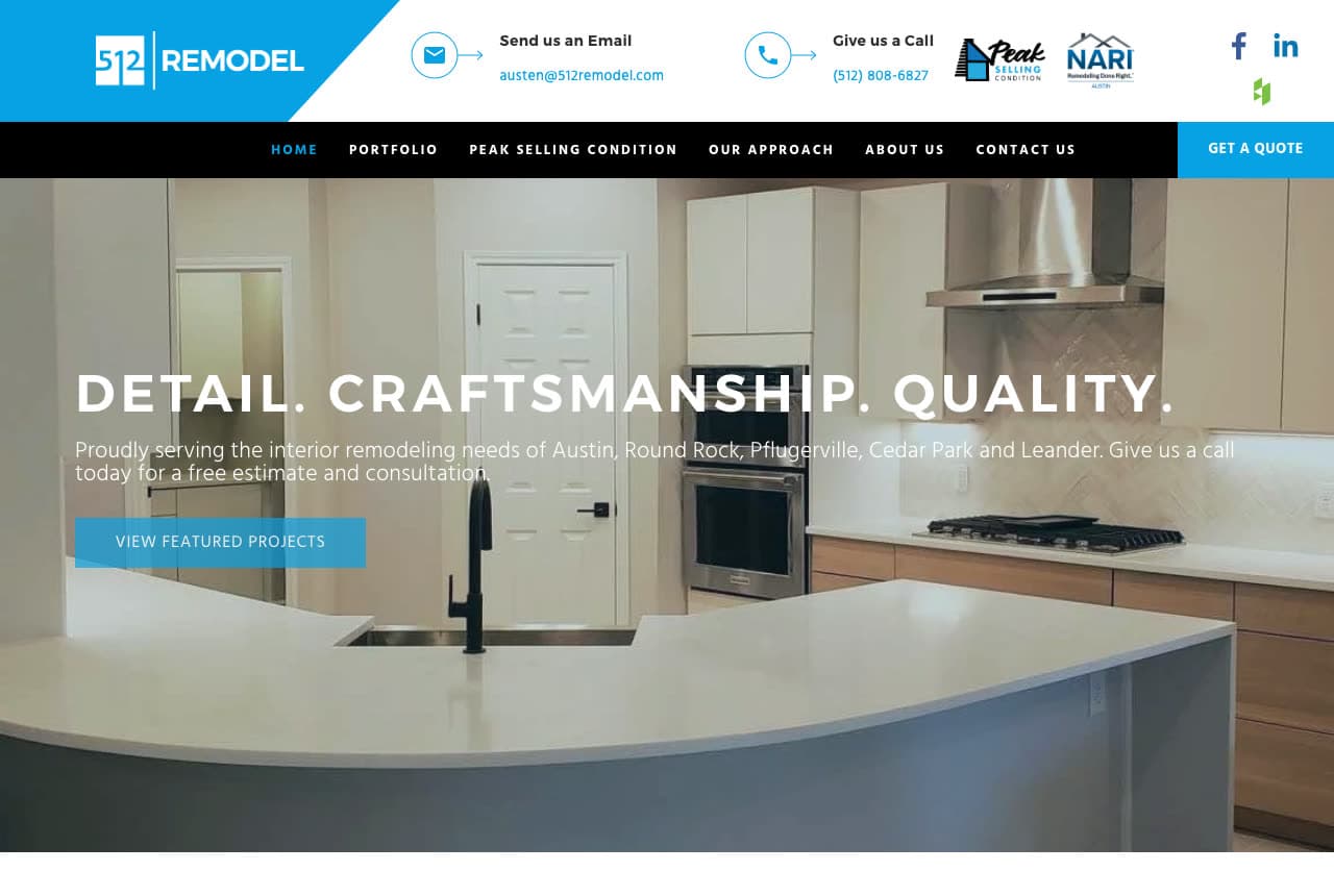
512 Remodel keeps the pitch to three words in tracked capitals — 'DETAIL. CRAFTSMANSHIP. QUALITY.' — set over a photograph of a bright kitchen with a marble island and glass cabinet doors, then lists the suburbs it serves (Austin, Round Rock, Pflugerville, Cedar Park, Leander) and invites a free estimate. A blue bar above the nav carries the email, the phone and a pair of industry logos, and the single button says 'View Featured Projects' — the work before the ask. The area code is the brand name, which does local positioning without a word of copy. 512 Remodel shows a mid-size remodeler how to look premium with a good photograph, three nouns and a list of towns.

Visit 512 Remodel

Opens a similar Zarla design you can make yours.

HDR Remodeling website — Design-Build design example
Real site
  • Design-Build
  • Minimal

HDR Remodeling: Warm oak and four words

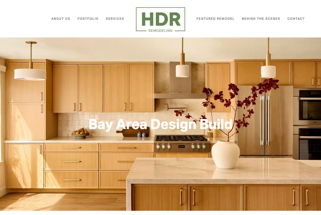
HDR Remodeling lets one photograph do almost all the work: a kitchen in warm oak veneer, brass pendants and a vase of dark stems, with four words in bold white centered over it — 'Bay Area Design Build' — and a boxed HDR logo in a slim white nav (About, Portfolio, Services, Featured Remodel, Behind the Scenes, Contact). No paragraph, no trust chips, no button in the first screen; the nav's 'Behind the Scenes' entry hints at the transparency the firm sells. The restraint reads as taste, and the oak-and-brass palette dates the photograph to now rather than to a stock library. HDR shows that for a firm whose work is genuinely beautiful, a region and a discipline are headline enough.

Visit HDR Remodeling

Opens a similar Zarla design you can make yours.

SF Design Build website — Design-Build design example
Real site · San Francisco, CA
  • Design-Build
  • Light

SF Design Build: The room first, the sentence second

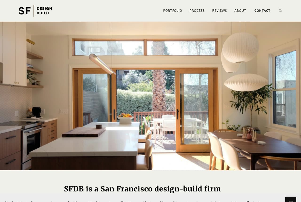
SF Design Build reverses the usual order: the photograph comes first and the words wait underneath. The hero is a sunlit kitchen-dining room — paper lanterns, sliding glass doors open to a deck, a long table set with fruit — and only below it does a serif caption state the business: 'SFDB is a San Francisco design-build firm', with a paragraph on whole-home remodels following. A monogram logo (SF | DESIGN BUILD) and a five-item nav are the only chrome. The effect is a portfolio book rather than a sales page, which suits a firm whose clients arrive by referral and want to see taste before terms. SF Design Build shows the photo-first layout done properly: the picture is the pitch, the caption is the confirmation.

Visit SF Design Build

Opens a similar Zarla design you can make yours.

Renovation Husbands website — Renovation Creators design example
Real site
  • Renovation Creators
  • Editorial

Renovation Husbands: A creator duo's site built like a portfolio

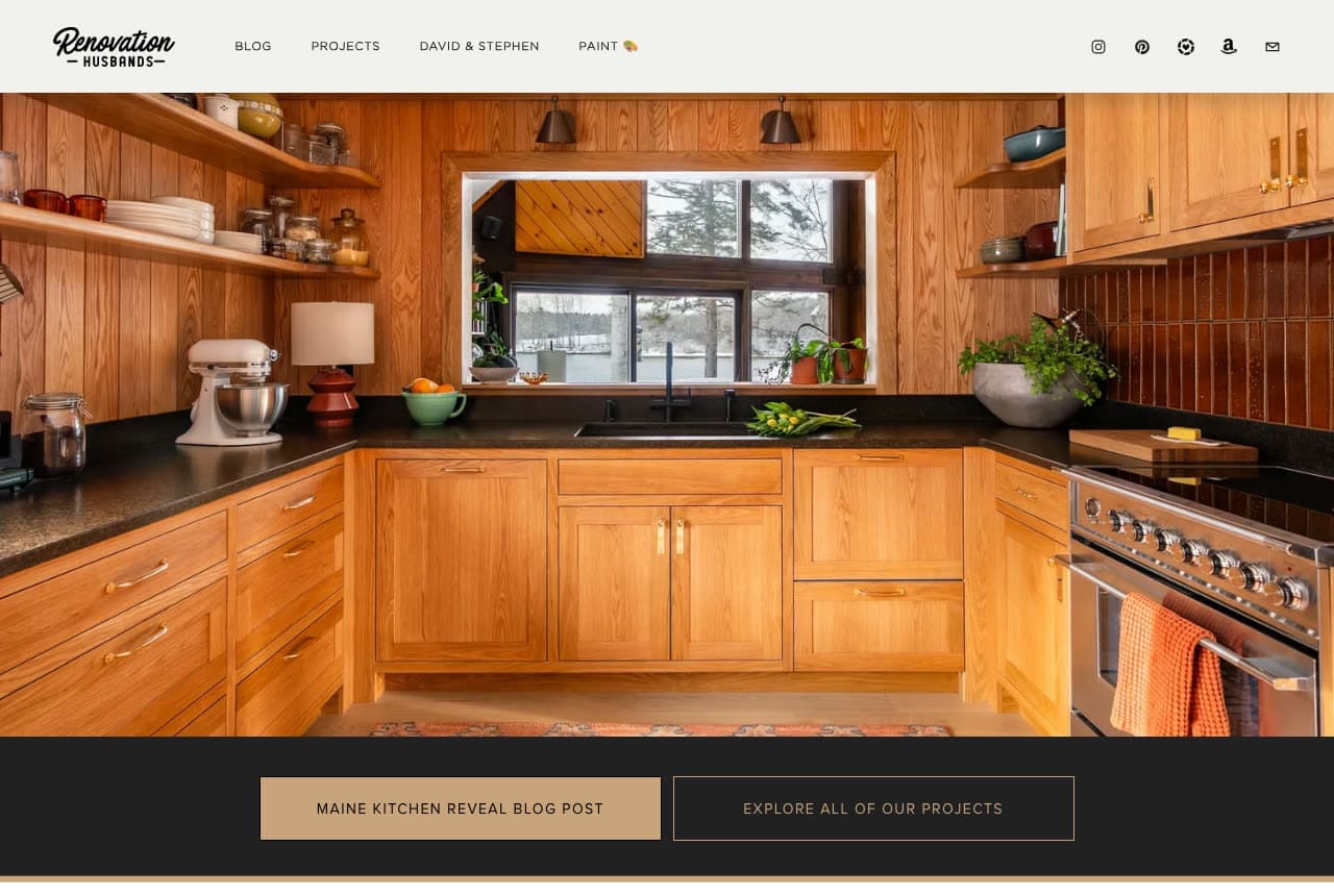
Renovation Husbands is the category's newest archetype — renovators who are also creators — and the site is built accordingly: a full-bleed photograph of a finished oak kitchen (open shelves, a range, a window over the sink) with no headline at all, and two buttons beneath it: a gold 'Maine Kitchen Reveal Blog Post' and an outlined 'Explore All of Our Projects'. The hero rotates through projects (another frame reads 'We created the backyard of our dreams'), so the page behaves like a feed of reveals rather than a service menu. There's no 'get a quote' because the product is the story and the audience. Renovation Husbands shows what a renovation brand looks like when the portfolio is the business: reveals first, projects second, everything else later.

Visit Renovation Husbands

Opens a similar Zarla design you can make yours.

Quillan Cabinet Co. — Cabinet Specialist website design you can build with Zarla
Build this with Zarla
  • Cabinet Specialist
  • Honest

Quillan Cabinet Co.: The honest alternative, stated in the headline

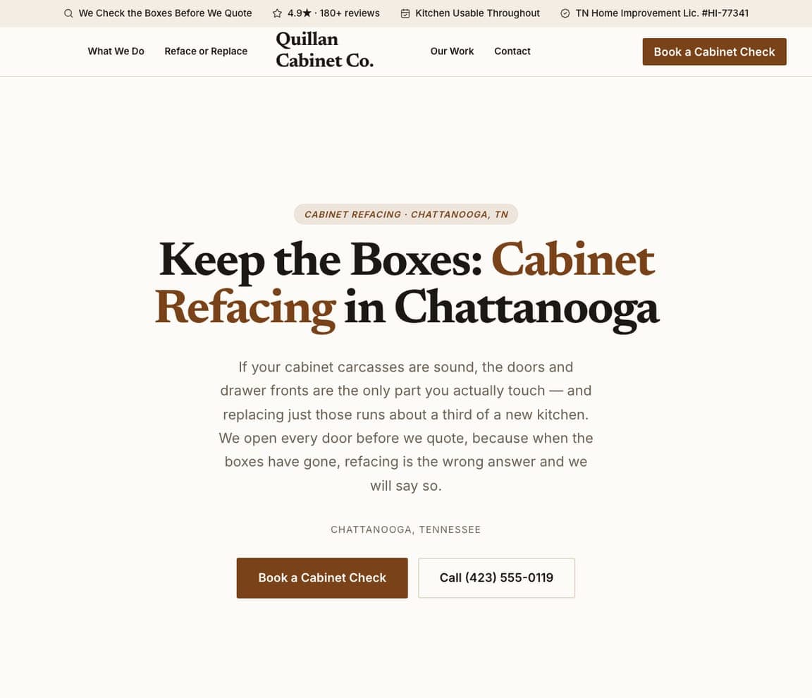
Quillan Cabinet Co is a Zarla template for a single, specific service, and its hero argues the case in serif: 'Keep the Boxes: Cabinet Refacing in Chattanooga', followed by the plain-language logic ('If your cabinet carcasses are sound, the doors and drawer fronts are the only part you actually touch… replacing the boxes is the wrong answer and we will say so'). The button is a 'Book a Cabinet Check' rather than a quote, the palette is cream and walnut, and the trust chips carry the reviews and a same-day promise. It's the refacing specialist as a trusted advisor: honest about when not to spend. Clone it for any specialty where the pitch is 'the smarter, smaller job'.

See this template
Larkmoor Closet Co. — Closet Installer website design you can build with Zarla
Build this with Zarla
  • Closet Installer
  • Premium

Larkmoor Closet Co.: Oversized type and a measured promise

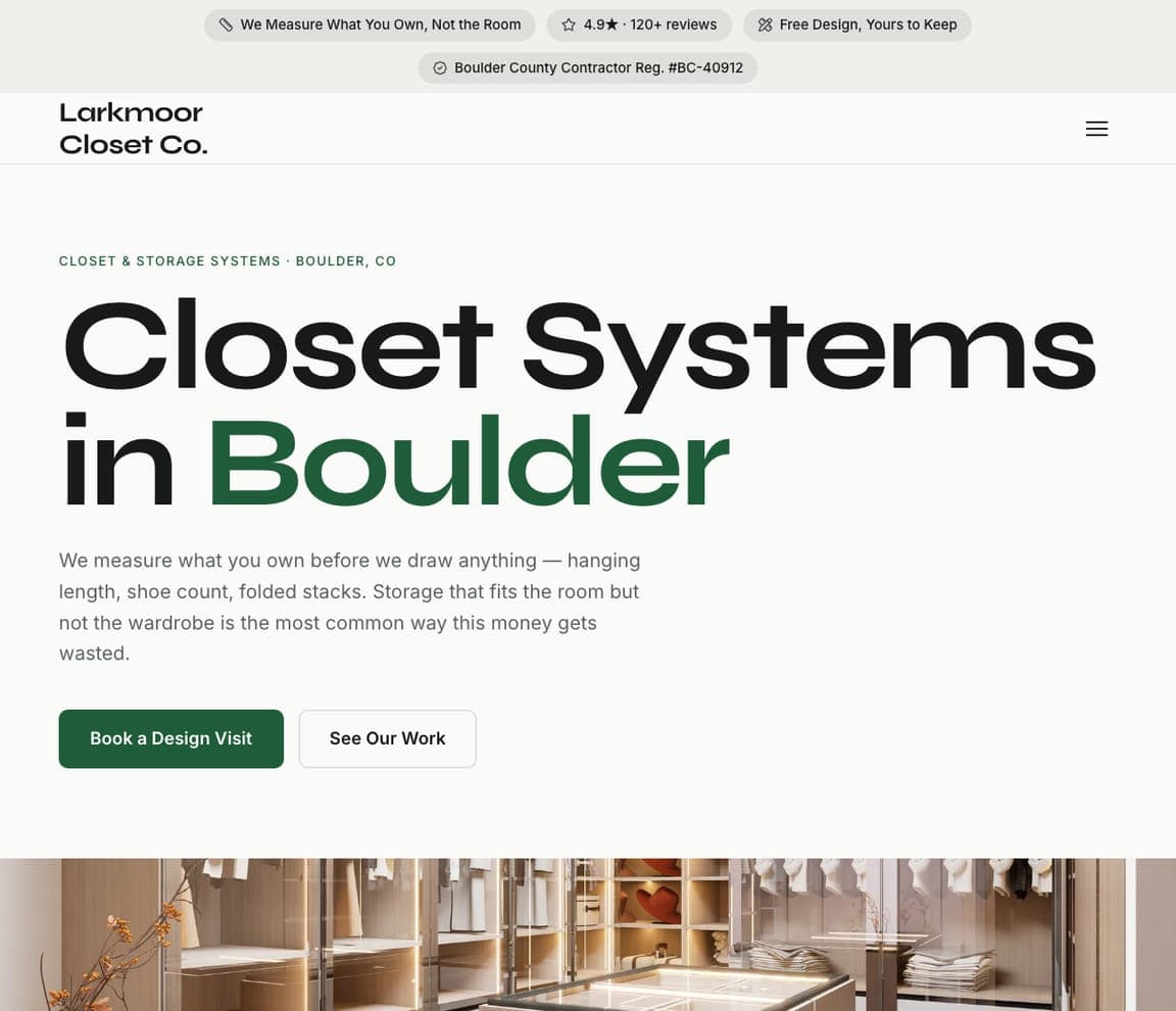
Larkmoor Closet Co gives a niche service a big voice: 'Closet Systems in Boulder' in enormous serif with the city in green, a paragraph that explains the method ('We measure what you own before we draw anything — hanging length, shoe count, folded stacks…'), and two buttons, 'Book a Design Visit' in green and 'See Our Work'. A closet photograph runs beneath the type, and chips above the nav carry the reviews and a transferable written warranty. The design borrows the scale of a fashion brand for a storage installer, and the copy earns it with specifics. Clone it for any measured, made-to-fit trade — closets, shelving, wardrobes — where the sell is precision.

See this template
Drybarrow Waterproofing — Waterproofing website design you can build with Zarla
Build this with Zarla
  • Waterproofing
  • Direct

Drybarrow Waterproofing: Dark, direct, diagnostic

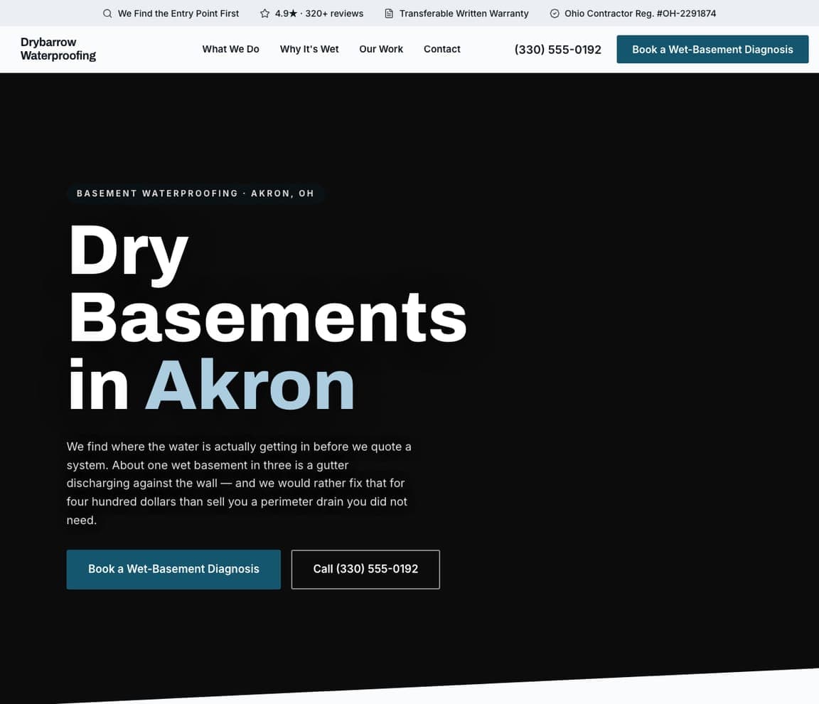
Drybarrow Waterproofing is a Zarla template built for a problem-solver's tone: a dark field, three stacked words — 'Dry Basements in Akron' — with the city in blue, and a paragraph that sells the diagnosis before the system ('We find where the water is actually getting in before we quote… a gutter discharging against the wall… a perimeter drain you did not need'). The button is a 'Book a Wet-Basement Diagnosis', with a phone number beside it, and the chips above the nav carry the reviews and a transferable warranty. The dark palette suits a trade that works below ground and sells honesty. Clone it for waterproofing, drainage, mold or any service where the customer fears being sold something they don't need.

See this template
Cordwell Restoration — Restoration website design you can build with Zarla
Build this with Zarla
  • Restoration
  • Heritage

Cordwell Restoration: Capitals over a Victorian, standards over style

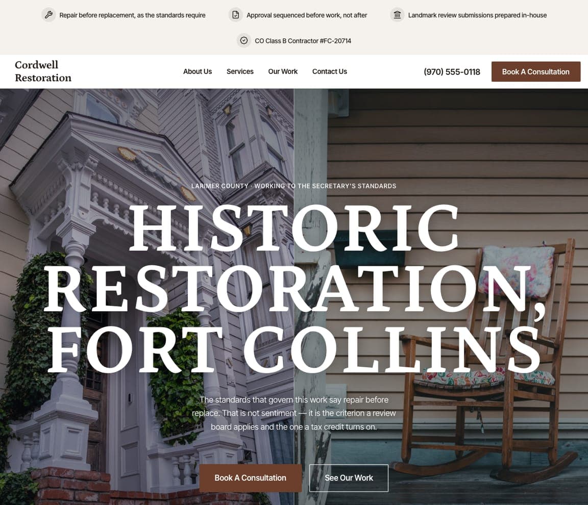
Cordwell Restoration is the Zarla template for the top of the trade: a photograph of a Victorian house with ornate trim, and over it two lines of white capitals — 'HISTORIC RESTORATION, FORT COLLINS' — with an eyebrow naming the county's landmark standards and a paragraph that positions the work as legal before it's aesthetic. Two buttons, 'Book a Consultation' and 'See Our Work', sit beneath; chips above the nav carry the reviews and the review-board approvals. It's the register of Environs and 512 Remodel — a real house, few words, serious type — pointed at heritage work. Clone it for restoration, period remodeling or any craft where the client is buying expertise more than square footage.

See this template

Frequently asked

Where can I find good home renovation website examples?

Right here — this page curates home renovation website examples across the spectrum: design-build firms like AT Design Remodel, Friendly Structures and SF Design Build, remodelers like Normandy and 512 Remodel, a luxury builder (Environs), a renovation platform (Block) and even a renovation-creator duo (Renovation Husbands), each linked so you can explore the live site — plus professionally designed Zarla contractor templates you can clone and make your own. Every example includes a note on why the design works — the photography, the reassurance, the booking path — so you can copy the thinking, not just the look.

What makes a good home renovation website?

It proves craftsmanship before it claims it. That means real project photography above the fold (kitchens and baths sell best), a plain statement of the service area and specialties, visible licenses and awards, and one clear next step — a consultation, a design visit, a written quote. The examples above never lead with a slogan alone; they lead with a finished room and a promise about how the work will be handled.

How much does a home renovation website cost?

A custom site from an agency that serves contractors typically runs into the thousands up front, and template builders charge roughly $16–$30 per month. An AI builder generates a complete, editable contractor site for free and only charges (on the Premium plan) when you publish to your own domain — so you can build, load your project photos and preview before spending anything.

Should a remodeling website show prices or minimums?

Stating a minimum or a process saves everyone time. Several of the Zarla templates here state a project minimum or a quote turnaround in the first screen (Sedgeholm's '$4,000 minimum, stated up front'), and the best real firms describe their process — a design visit, a written quote that holds — so homeowners know what to expect before they call. Vague 'contact us for pricing' pages lose the visitors who were ready.

What pages does a home renovation website need?

Most remodelers need six: a home page with the strongest project photo and the specialties, a portfolio or 'our work' page organized by room, a process page (how a project runs from first visit to final walkthrough), an about page with the team and licenses, a reviews page, and a contact page with a short project form. Design-build firms add a 'what we do' page that separates design from construction.

How do remodelers get more leads from their website?

Lead with a real finished room, name the service area, and make the first step small and specific. The converting pattern in the examples above: a kitchen or bath photograph, a headline about the outcome ('kitchens & baths you'll love coming home to'), proof beside it (licenses, awards, reviews), and a single action — book a design visit, request a written quote — rather than a generic 'contact us'.

You've seen what works. Now make it yours.

Describe your business and Zarla designs a complete, professional website in about 30 seconds — built to convert, just like the ones above.

Free to build and preview · no credit card · publish to your own domain on Premium