Inspiration · Ice Cream Shop

The Best Ice Cream Shop Website Examples, Explained

Looking for ice cream shop website examples? These 14 are the strongest we found — Morgenstern's thirty scoops photographed on white around 'New Flavors Available Now', Wanderlust's open pints in offset rows of pastels on bright blue, Henry's Secret's handwritten 'Blink and you'll miss it' on black — plus ice-cream-shop designs you can build with Zarla, each with a breakdown of the specific move that turns a hot-afternoon search into a visit or a pint order. An ice cream shop's website has one job most business sites don't: it has to look like the flavor tastes. Find an approach you love and you can build a site in that spirit, free, in about 30 seconds.

Real sites + designs you can build with Zarla — free to build and preview, no credit card

What makes a great ice cream shop website

The best ice cream shop websites are the most colorful pages in any industry, and the color comes from the product: scoops on white (Morgenstern's), pints — from above at Wanderlust, side-on at Jeni's —, cones on plum tiles with the flavors handwritten beside them (Molly Moon's). Notice how many lead with what's new — 'Summer refresh', 'Fall just dropped', 'This Wednesday's drop' — because a scoop shop's calendar is its marketing. Notice the second business, too: pints shipped, cakes, catering, gift cards, a farm stand. Salt & Straw goes red for a collaboration; Henry's Secret goes black for scarcity; Ferris Acres shows a cow on a wooden sign. Every example below makes you want a cone before it tells you where to park.

Morgenstern's Finest Ice Cream website — Flavor-Forward Parlor design example
Real site · New York, NY
  • Flavor-Forward Parlor
  • Playful
  • White + scoops

Morgenstern's Finest Ice Cream: Thirty scoops on white around 'New Flavors Available Now'

Morgenstern's shows the whole case at once: a white page with a hamburger, the script logo ('Morgenstern's FINEST ICE CREAM') centered, an outlined 'VIEW FLAVORS' and a cart, and then some thirty scoops photographed individually on white — pale vanilla, pink, chocolate, pistachio, cookies-and-cream, a swirl with berries — arranged in rows around a centered announcement: 'SUMMER REFRESH / NEW FLAVORS / AVAILABLE NOW!' Below, 'THE MORGENSTERN'S COOKBOOK'. No shop, no cone, no button on the photo; the scoops are the design and the count is the brag. Morgenstern's shows a flavor-forward parlor how to be irresistible on white: photograph every scoop the same way, arrange them like a specimen chart, and put the news in the middle.

  • Every flavor photographed as a single scoop on white
  • The new-flavor announcement set in the middle of the grid
  • 'View Flavors' as the only button — the case is the pitch

Steal this: Photograph every flavor as one scoop on the same white table and tile them around your news — a grid of scoops is a menu people can taste with their eyes.

Opens a similar Zarla design you can make yours.

Salt & Straw website — Craft Ice Cream Chain design example
Real site · Portland, OR
  • Craft Ice Cream Chain
  • Bold
  • Red + cream

Salt & Straw: 'The Tacolate' — a collaboration as a red poster with one button

Salt & Straw gives the whole first screen to one launch: a cream header with the logo and a dropdown nav (Our Flavors, Order Now, Scoop Shops, Gift, Subscribe, About Us), then a solid red field with the product name in cream script — 'The Tacolate®' — 'SALT & STRAW® × TACO BELL®' beneath it, a cream 'ORDER NOW' pill, and at the right a hand with red nails holding a chocolate-dipped waffle taco while a purple 'Wild Berry' sauce packet pours over it. Under the hero, an illustrated band of red-and-white stripes. Slideshow dots say the launch will rotate; the red says it's the only thing that matters today. Salt & Straw shows a craft chain how to launch: one product, one color, one button, and the collaboration named in the same type as your own.

  • One product launch as the entire hero, in one color
  • The collaborator's name set beside your own with an ×
  • A hand holding the product — scale and appetite in one photo

Steal this: When you launch something, give it the whole first screen in one color with one button — everything else can wait a scroll.

Visit Salt & Straw

Opens a similar Zarla design you can make yours.

Wanderlust Creamery website — World-Flavor Creamery design example
Real site · Los Angeles, CA
  • World-Flavor Creamery
  • Vivid
  • Blue + pastel

Wanderlust Creamery: Offset rows of pastel pints on bright blue

Wanderlust Creamery makes color the whole design: a bright sky-blue page, a circular logo with a scoop centered at the top, a plain nav beneath it (Order Now, e-Gift Cards, Locations, Events and Catering, Content, Accessibility Statement), and then an overhead photograph of open pints in offset rows, like a honeycomb, under a scalloped top edge — ube purple, matcha green, pale yellow, strawberry pink, a marbled cream — each lid off, each surface showing its swirl. No headline, no button on the photo, no shop; the pints on the blue are the brand, and the flavors' colors are the argument for a creamery built on global flavors. Wanderlust shows a color-forward shop how to win the scroll: choose one loud ground color, photograph the product from above with the lids off, and let the flavors be the palette.

  • Open pints photographed from above in offset rows
  • A single loud ground color — sky blue — behind everything
  • No headline: the flavors' colors are the copy

Steal this: Take the lids off, photograph the pints from above on one bright color, and let the flavors' own colors do the headline's job.

Visit Wanderlust Creamery

Opens a similar Zarla design you can make yours.

Jeni's Splendid Ice Creams website — Pint Brand design example
Real site · Columbus, OH
  • Pint Brand
  • Seasonal
  • Cream + orange

Jeni's Splendid Ice Creams: 'Fall Just Dropped' with three pints beside it

Jeni's runs the home page like a season: a black bar at the top announces it ('NEW! Fall flavors just dropped.'), a white header carries the logo and a shop-first nav (Shop, Delivery, Grocery, Scoop Shops, Gift, Our Story, search, Rewards, cart), and the hero is a cream card — 'New!', then 'FALL JUST DROPPED' in heavy capitals, a two-line note ('Our favorite season for flavor is here, complete with three fresh pints to meet the moment'), an orange 'SHOP ALL FLAVORS' and an underlined 'SHOP COLLECTIONS' — beside three pints on a grey ground with the flavors hand-lettered on the labels (Miso Butterscotch Brownie, Pumpkin with Brown Sugar Blondies). It's a pint brand first and a scoop shop second, and the page says so: shop, delivery and grocery come before the shops. Jeni's shows an ice cream brand with a calendar how to use it: announce the season twice, show the pints, and make 'Shop All Flavors' the button.

  • The season announced in the top bar and again as the headline
  • Three pints with the flavors hand-lettered on the labels
  • 'Shop All Flavors' in orange — the pint sale as the primary button

Steal this: Treat every new season like a product launch — announce it in the top bar, headline it, and photograph the three pints that prove it.

Visit Jeni's Splendid Ice Creams

Opens a similar Zarla design you can make yours.

Molly Moon's Homemade Ice Cream website — Neighborhood Scoop Shops design example
Real site · Seattle, WA
  • Neighborhood Scoop Shops
  • Homespun
  • Plum + blue

Molly Moon's Homemade Ice Cream: Cones on plum tiles with the flavors handwritten beside them

Molly Moon's draws its menu like a zine: a white header with the script logo, a nav (About, Locations, Menu, Milkfund, Online Shop, Blog) split around a mascot — a Boston terrier holding a cone, then 'HOMEMADE ICE CREAM' in light-blue tracked capitals, and beneath it a mosaic of plum and pink tiles — stacked scoops on cones with the flavors written by hand and lines drawn to each ('vegan caramel apple', 'summer plum', 'apples & honey', 'milky moon bar'), a sundae labelled the same way, a photograph of the Seattle Harbor Department building, a shop exterior, and a pink 'ORDER ONLINE' tile. The handwriting makes the flavors feel like the day's chalkboard; the plum keeps the whole thing on-brand. Molly Moon's shows a neighborhood chain how to feel like one shop: draw on the photographs, name the flavors by hand, and tile the neighborhood in beside the cones.

  • Flavor names handwritten onto the photographs with pointer lines
  • A mosaic of plum tiles: cones, a sundae, the shopfronts
  • 'Milkfund' in the nav — the giving program as a menu item

Steal this: Write the flavor names on the photographs by hand with a line to each scoop — a chalkboard on the website.

Opens a similar Zarla design you can make yours.

Henry's Secret website — Weekly-Drop Creamery design example
Real site · Los Angeles, CA
  • Weekly-Drop Creamery
  • Scarce
  • Black + cream

Henry's Secret: 'Blink and you'll miss it' — scarcity handwritten on black

Henry's Secret sells the shortage: a black bar at the top prints the only pickup window ('Pickup Location: 9163 W. Sunset Blvd. Orders can be picked up Friday from 6pm-10pm or Saturday & Sunday from 11am-7pm'), a white header carries the script name and a nav that is also the concept (Flavors of the Week, The Vault, About, FAQ), and then the hero on black: a tiny 'FAIR WARNING', three handwritten lines — 'Crafted in ultra-limited batches each week. Blink and you'll miss it.' — and two rows of tracked caps beneath, 'NO RESTOCKS. NO RAINCHECKS. WHEN IT'S GONE, YOU WAIT TILL NEXT WEDNESDAY.' Below, on cream, 'This Wednesday's drop!' and the scoop. No shop photo, no price; the rules are the brand. Henry's Secret shows a small-batch creamery how to turn limits into desire: print the pickup window in the top bar, write the warning by hand, and name the day the next batch arrives.

  • The pickup window printed in the top bar as the first fact
  • A handwritten warning on black — scarcity as the hero
  • 'This Wednesday's drop!' — the weekly release as the second screen

Steal this: If you sell out, say so in your own handwriting on a black screen and name the day the next batch lands — the limit is the marketing.

Visit Henry's Secret

Opens a similar Zarla design you can make yours.

Caffè Panna website — Italian-Style Scoop Shop design example
Real site · New York, NY
  • Italian-Style Scoop Shop
  • Warm

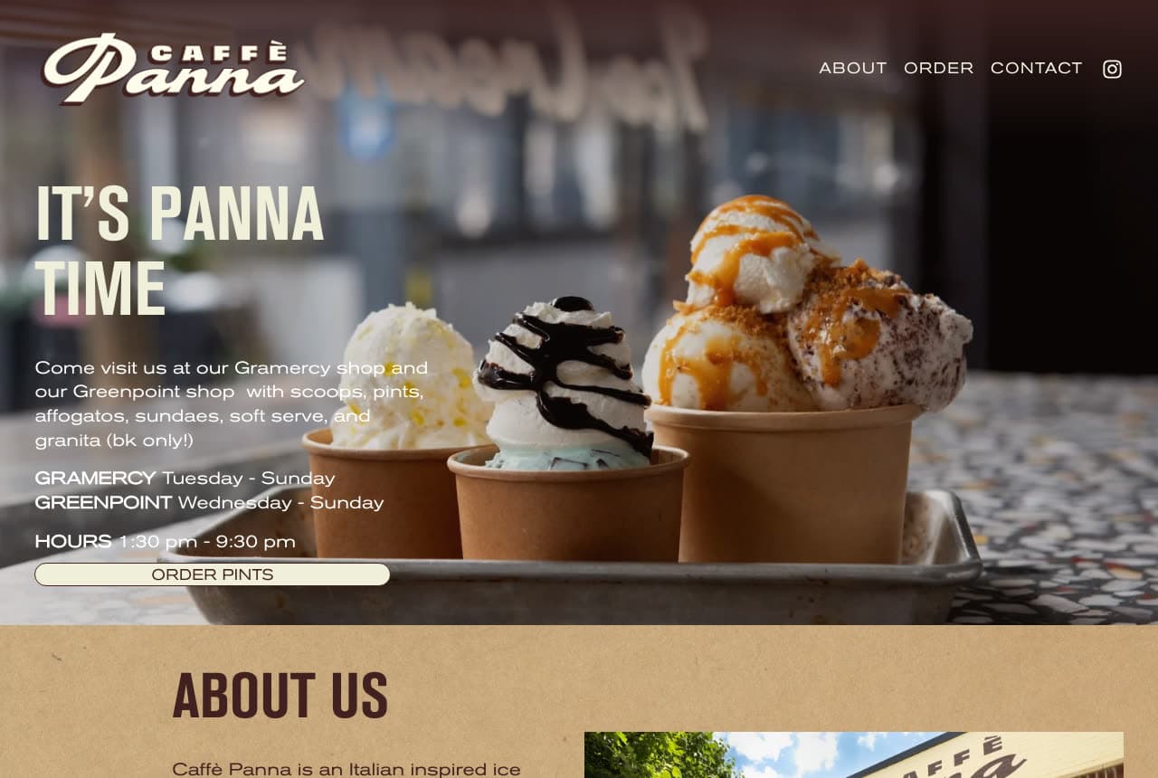
Caffè Panna: 'It's Panna Time' with both shops' hours in the hero

Caffè Panna puts the practical facts where the eye lands: a dark header with the 'CAFFÈ Panna' logo and a three-word nav (About, Order, Contact), then a photograph of three sundae cups on a metal tray — whipped cream, chocolate sauce, caramel — darkened at the left so the copy reads: 'IT'S PANNA TIME' in condensed capitals, a sentence that names both shops and the menu ('Come visit us at our Gramercy shop and our Greenpoint shop with scoops, pints, affogatos, sundaes, soft serve, and granita (bk only!)'), then the days for each shop and 'HOURS 1:30 pm - 9:30 pm', and a cream 'ORDER PINTS' pill. Below, on kraft, 'ABOUT US'. The hero is a poster and a schedule at once. Caffè Panna shows a two-shop scoop business how to be useful: the sundaes as the photo, the days and hours as the copy, and pints as the button.

Visit Caffè Panna

Opens a similar Zarla design you can make yours.

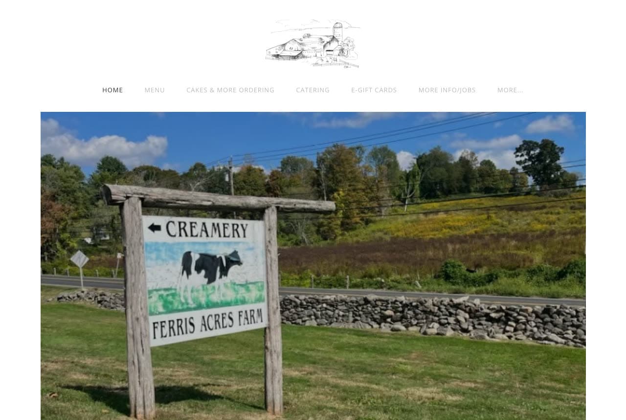
Ferris Acres Creamery website — Farm Creamery design example
Real site · Newtown, CT
  • Farm Creamery
  • Rustic

Ferris Acres Creamery: A wooden farm sign with a cow: the creamery as a place

Ferris Acres Creamery leads with the farm: a white page, a line drawing of the barns as the logo, a row of small-caps links (Home, Menu, Cakes & More Ordering, Catering, E-Gift Cards, More Info/Jobs, More…), and a photograph of the sign at the road — a wooden post with '← CREAMERY' on top, a painted Holstein cow, and 'FERRIS ACRES FARM' beneath — in front of a stone wall, a field and trees. No scoop, no headline, no button; the sign points you in, and the field says the milk comes from here. For a creamery that regularly tops the country's best-scoop lists, the modesty is the charm. Ferris Acres shows a farm creamery how to be itself online: photograph the sign people photograph, draw the barns for the logo, and keep the nav to the things a family needs.

Visit Ferris Acres Creamery

Opens a similar Zarla design you can make yours.

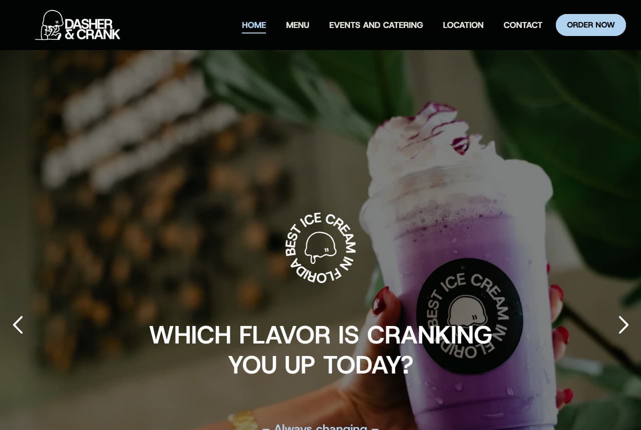
Dasher & Crank website — Small-Batch Creamery design example
Real site · Miami, FL
  • Small-Batch Creamery
  • Fun

Dasher & Crank: 'Which flavor is cranking you up today?' with a 'Best Ice Cream in Florida' stamp

Dasher & Crank asks a question and stamps the answer: a black header with the logo (a hand-cranked churn), a plain nav (Home, Menu, Events and Catering, Location, Contact) and a light-blue 'ORDER NOW' pill, then a photograph of a hand holding a purple shake piled with whipped cream, a plant and a wall of lights blurred behind it, and over the photo a circular stamp — 'BEST ICE CREAM IN FLORIDA' — above the headline in white capitals, 'WHICH FLAVOR IS CRANKING YOU UP TODAY?', with '— Always changing —' beneath. Slideshow arrows either side. The pun is the name, the stamp is the proof, and the question is an invitation to come see the board. Dasher & Crank shows a small-batch shop how to be fun and credible at once: a question for the headline, the award as a stamp on the photo, and 'Order Now' in the brand's own blue.

Visit Dasher & Crank

Opens a similar Zarla design you can make yours.

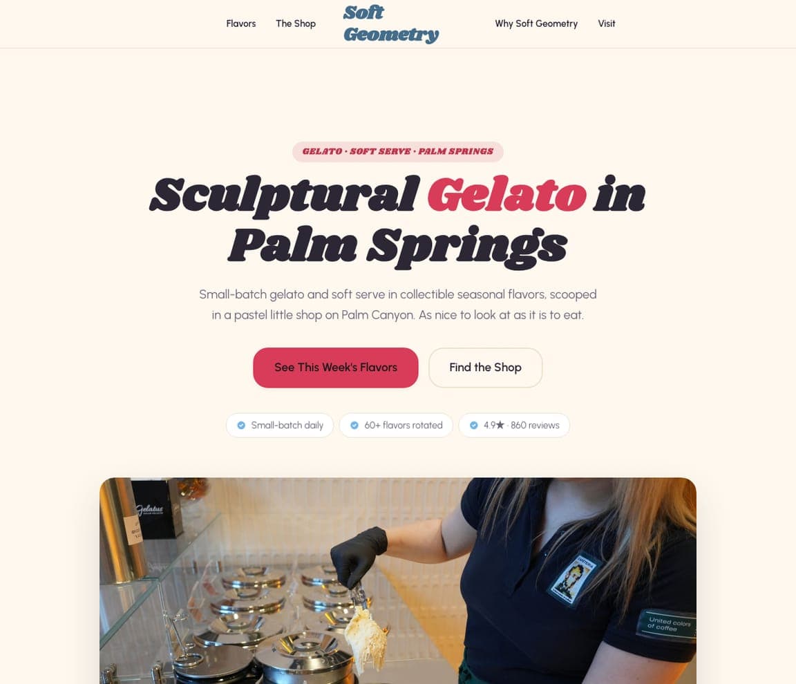
Soft Geometry — Adaptable Template website design you can build with Zarla
Build this with Zarla
  • Adaptable Template
  • Sweet

Soft Geometry: 'Sculptural Gelato in Palm Springs' in italic serif on cream

Soft Geometry is the Zarla gelateria template, and the closest catalog match to the color-first shops here (Wanderlust, Morgenstern's): a cream ground, an eyebrow in a pink pill ('GELATO · SOFT SERVE · PALM SPRINGS'), an italic serif headline with 'Gelato' in red — 'Sculptural Gelato in Palm Springs' — a two-line description ('Small-batch gelato and soft serve in collectible seasonal flavors, scooped in a pastel little shop on Palm Canyon. As nice to look at as it is to eat'), a red 'See This Week's Flavors' beside 'Find the Shop', and three chips (small-batch daily, sixty-plus flavors rotated, the rating). Clone it, name your street, and 'See This Week's Flavors' becomes your rotating board.

See this template
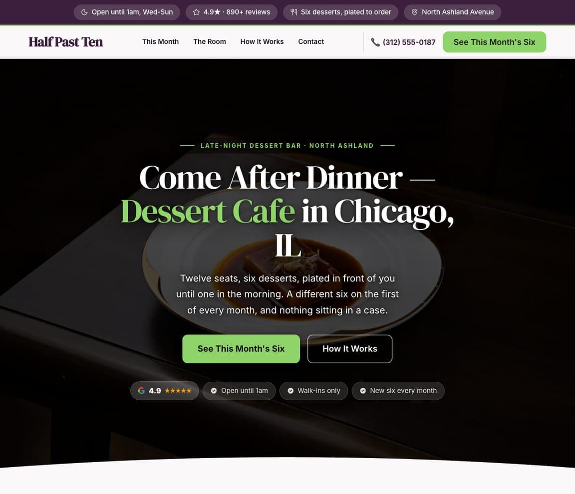
Half Past Ten — Adaptable Template website design you can build with Zarla
Build this with Zarla
  • Adaptable Template
  • Late-Night

Half Past Ten: 'Come After Dinner' — a dark dessert room with six a month

Half Past Ten is the dessert-cafe template, and the closest catalog match to the dark, rule-driven sites here (Henry's Secret, Caffè Panna): a black field, an eyebrow ('LATE-NIGHT DESSERT BAR · NORTH ASHLAND'), a serif headline with the format in green — 'Come After Dinner — Dessert Cafe in Chicago, IL' — a paragraph that states the rules ('Twelve seats, six desserts, plated in front of you until one in the morning. A different six on the first of every month, and nothing sitting in a case'), a green 'See This Month's Six' beside 'How It Works', and chips for the rating, the 1am close, walk-ins only and the monthly change. Clone it for a scoop shop with late hours or a weekly drop, and the chips become your rules.

See this template
Glaze & Co — Adaptable Template website design you can build with Zarla
Build this with Zarla
  • Adaptable Template
  • Fresh

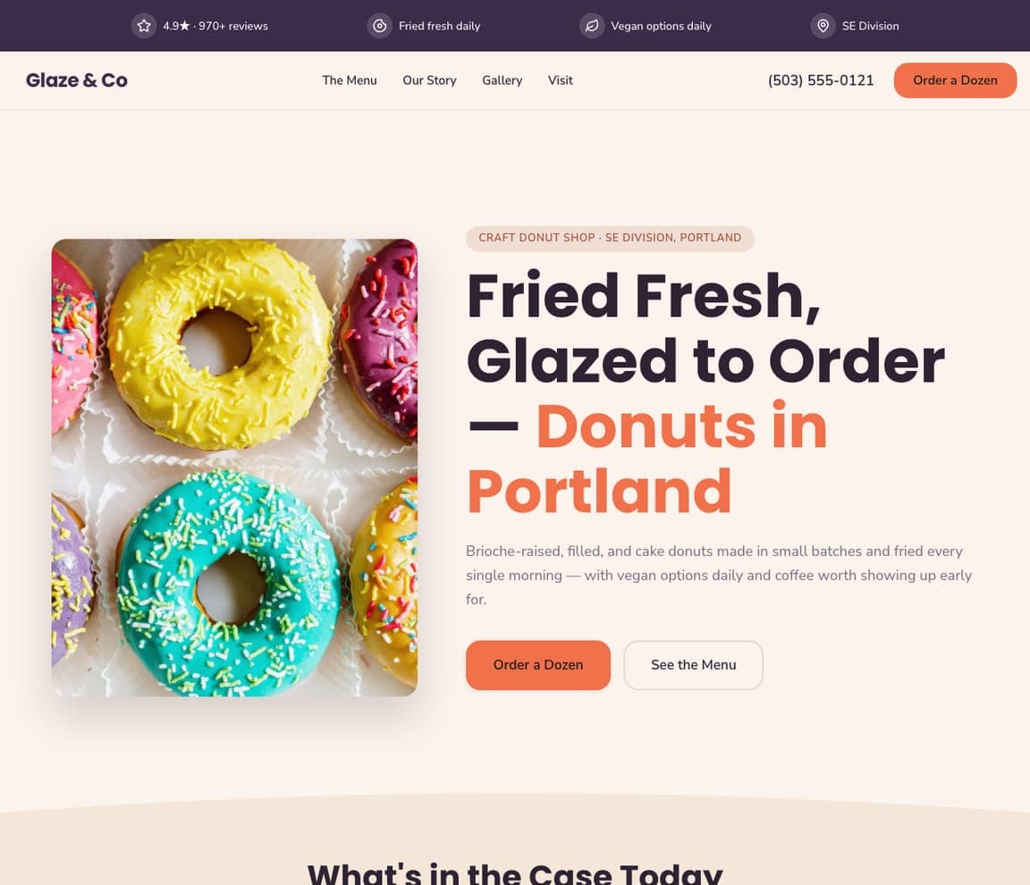
Glaze & Co: 'Fried Fresh, Glazed to Order' beside the donuts

Glaze & Co is the donut-shop template, and the closest catalog match to the white, product-beside-the-copy sites here (Jeni's, Ferris Acres): a white ground, a photograph of glazed donuts on the left, an eyebrow ('CRAFT DONUT SHOP · SE DIVISION, PORTLAND'), a bold headline with the format in orange — 'Fried Fresh, Glazed to Order — Donuts in Portland' — a paragraph about brioche-raised and cake donuts fried every morning with vegan options daily, an orange 'Order a Dozen' beside 'See the Menu', and a header strip with the rating, fresh daily, vegan daily and the neighborhood. Clone it for any daily-batch sweet shop, and 'Order a Dozen' becomes your pint or cake order.

See this template
Pop & Tier — Adaptable Template website design you can build with Zarla
Build this with Zarla
  • Adaptable Template
  • Festive

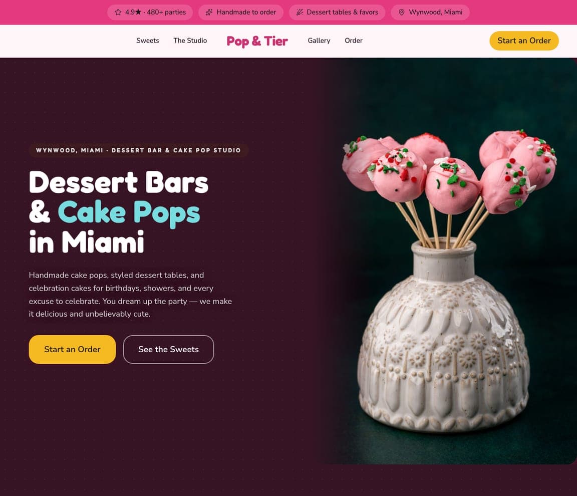
Pop & Tier: 'Dessert Bars & Cake Pops in Miami' with cyan on plum

Pop & Tier is the dessert-bar template, and the closest catalog match to the loud, dark-ground sites here (Salt & Straw, Dasher & Crank): a deep plum field, an eyebrow ('WYNWOOD, MIAMI · DESSERT BAR & CAKE POP STUDIO'), a bold headline with 'Cake Pops' in cyan — 'Dessert Bars & Cake Pops in Miami' — a paragraph that lists cake pops, styled dessert tables and celebration cakes ('You dream up the party — we make it delicious and unbelievably cute'), a yellow 'Start an Order' beside 'See the Sweets', a photograph of pink cake pops in a vase, and chips for the party count, handmade to order, dessert tables and favors, and the neighborhood. Clone it for a shop that caters parties, and 'Start an Order' becomes your catering form.

See this template
Sprinkle Theory — Adaptable Template website design you can build with Zarla
Build this with Zarla
  • Adaptable Template
  • Joyful

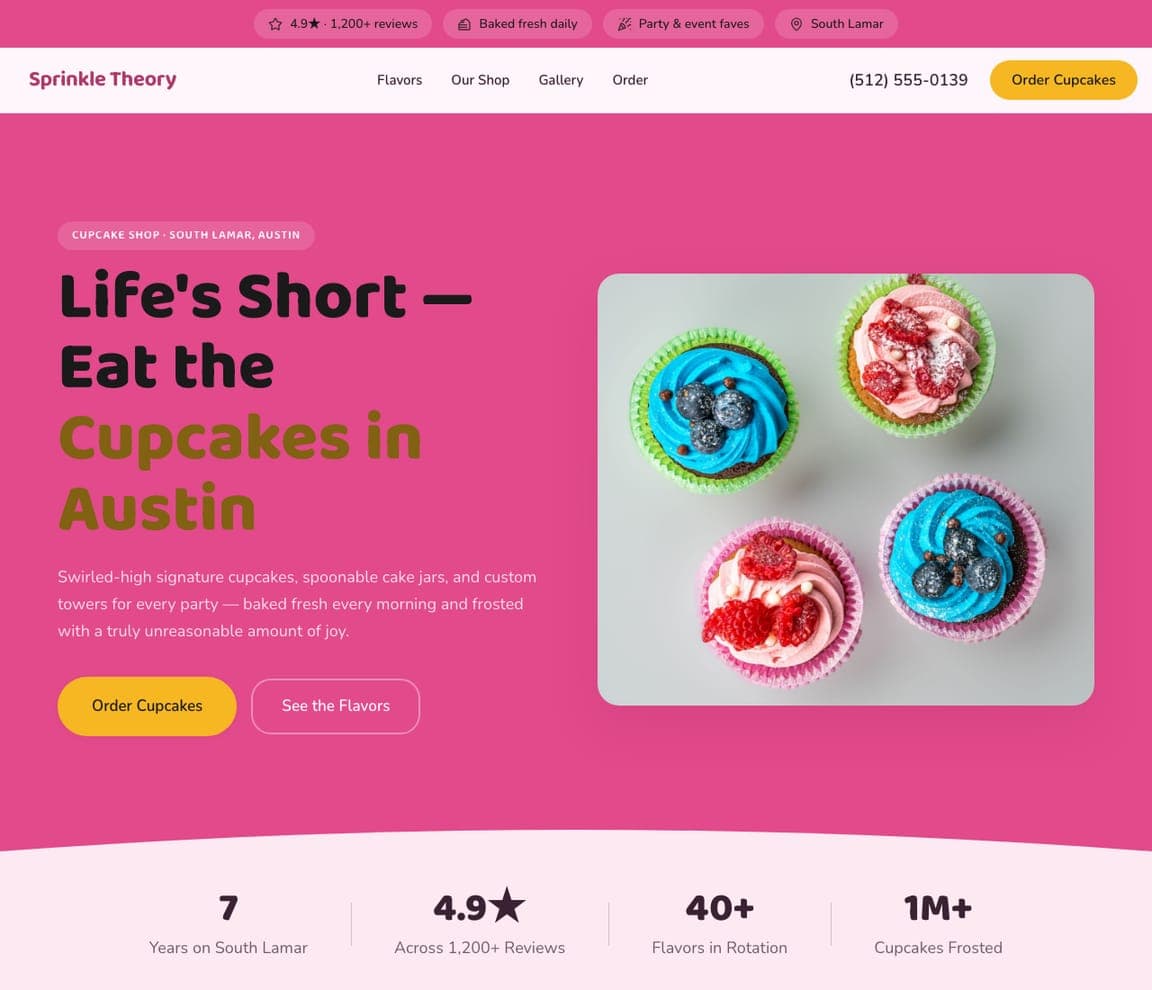
Sprinkle Theory: 'Life's Short — Eat the Cupcakes' on pink

Sprinkle Theory is the cupcake-shop template, and the closest catalog match to the handwritten, cheerful sites here (Molly Moon's): a pink field, an eyebrow ('CUPCAKE SHOP · SOUTH LAMAR, AUSTIN'), a bold black headline with 'Cupcakes in Austin' in olive-gold — 'Life's Short — Eat the Cupcakes in Austin' — a paragraph about swirled-high cupcakes, cake jars and custom towers 'frosted with a truly unreasonable amount of joy', a yellow 'Order Cupcakes' beside 'See the Flavors', a photograph of frosted cupcakes at the right, and chips for the rating, baked fresh daily, party and event faves and the street. Clone it for a scoop shop with cakes, and 'Order Cupcakes' becomes your cake order.

See this template

Frequently asked

Where can I find good ice cream shop website examples?

Right here — this page curates ice cream shop website examples across the spectrum: a flavor-obsessed New York parlor (Morgenstern's), a craft chain mid-collaboration (Salt & Straw), a global-flavor creamery (Wanderlust), a pint brand with a seasonal calendar (Jeni's), a Seattle neighborhood institution (Molly Moon's), a weekly-drop creamery that sells out (Henry's Secret), an Italian-style scoop shop with its hours in the hero (Caffè Panna), a Connecticut farm creamery (Ferris Acres) and a Miami small-batch shop (Dasher & Crank) — each linked so you can explore the live site — plus professionally designed Zarla gelateria, dessert-cafe, donut-shop, dessert-bar and cupcake-shop templates you can clone and make your own. Every example includes a note on why the design works — the photograph, the calendar, the order path — so you can copy the thinking, not just the look.

What makes a good ice cream shop website?

It looks like the flavor tastes and tells you what's new. The strong examples above photograph the product in color — scoops, cones, pints, sundaes — on a bright or white ground, lead with the seasonal news ('Fall just dropped', 'This Wednesday's drop'), keep hours and locations one tap away, and put 'Order' in the header for pints, cakes and catering. The copy is short and cheerful — a flavor name, a date, a joke — and the photography is your scoops, not stock.

How much does an ice cream shop website cost?

A custom site from a food-and-beverage agency typically runs from a couple of thousand dollars up, ordering-platform builders charge a monthly fee for the site plus a cut of online orders, and general template builders are roughly $16–$30 per month. An AI website builder generates an ice-cream-shop site — flavors, hours, locations, pint and cake ordering, catering, gift cards — from a short description in seconds, then lets you edit it in plain language. Spend the money you save on one photo session of your scoops on a white table in good light.

Should an ice cream shop website show the scoops or the shop?

The scoops, almost always. Most sites above lead with the product — scoops, cones, pints, a shake — because color is the reason people come. The exceptions are deliberate: Henry's Secret leads with a handwritten warning, Molly Moon's with a title line, and Ferris Acres with its farm sign, which says 'we make it here' more clearly than a cone could. If your shop has a story (a farm, a family, a landmark building), show it; otherwise show the flavors and put the shop a scroll below.

What pages does an ice cream shop website need?

Most ice cream shops need five: a home page with the flavors and what's new, a flavors or menu page (current flavors, with allergens noted), a locations-and-hours page with a map, an ordering page for pints, cakes and catering (as a page, not a PDF), and a contact page. Add gift cards, a loyalty club, wholesale and a shop for merch if you have them — Jeni's, Molly Moon's and Salt & Straw all put them in the nav because they sell.

How do ice cream shops get more customers from their website?

Tell people what's new this week, put the hours and the closest location on the first screen, and give pints, cakes and catering an order button. The converting pattern above: Jeni's 'Shop All Flavors' under 'Fall just dropped', Caffè Panna's hours for both shops printed in the hero above 'Order Pints', Henry's Secret's pickup window in the top bar, Dasher & Crank's 'Order Now' pinned in the header. Then let the photography do the marketing — a scoop that looks this good gets shared.

You've seen what works. Now make it yours.

Describe your business and Zarla designs a complete, professional website in about 30 seconds — built to convert, just like the ones above.

Free to build and preview · no credit card · publish to your own domain on Premium