Inspiration · Interior Design

The Best Interior Design Website Examples, Explained

These are some of the best interior design website designs we could find — a mix of standout real studios and designs you can build with Zarla — and instead of just showing them off, we explain why each one works. Interior design is sold on taste, so the site itself is the audition: watch how the best studios let magazine-grade project photography carry the pitch, commit to a distinctive aesthetic, and keep the typography quiet so the work speaks. Then make any of the Zarla designs your own, free, in about a minute.

Real sites + designs you can build with Zarla — free to build and preview, no credit card

What makes a great interior design website

The best interior design sites understand that the website IS the portfolio audition. They lead with real, beautifully-shot project photography — not stock — because the work is the entire pitch. They commit to a distinctive point of view (warm-traditional, dark-luxury, maximalist, minimal) that filters in the right client and repels the wrong one. And they keep the interface quiet — restrained type, generous white space — so nothing competes with the rooms. Everything below is a variation on those moves; pick the one that matches the clients and the caliber of work you want to attract.

Studio McGee website — Interior Design design example
Real site · Salt Lake City, UT
  • Interior Design
  • Editorial
  • Warm + neutral

Studio McGee: A design house that reads like a magazine

Studio McGee has become the reference point for approachable, high-end residential design, and its site earns that status. 'A Design House Rooted in Modern Tradition' sits over a warm, beautifully styled kitchen — copper pots, a checkerboard floor, natural light — that looks lifted from a shelter magazine, and the restrained serif and generous white space let the photography carry everything. The nav is disciplined (Read, Portfolio, About, Work With Us), treating the blog as a genuine content engine rather than an afterthought. The lesson for any design firm is that in this category the work IS the pitch: invest in real, gorgeously-shot project photography, frame it with quiet typography, and get out of its way. Taste, demonstrated, is more persuasive than any 'award-winning' claim.

  • Magazine-grade project photography carries the whole site
  • Restrained serif + white space let the work speak
  • The blog is treated as a real content engine

Steal this: Invest in real, magazine-grade project photos and frame them with quiet type — in design, the work is the pitch.

Heidi Caillier Design website — Interior Design design example
Real site · Seattle, WA
  • Interior Design
  • Maximalist
  • Pattern-rich

Heidi Caillier Design: Maximalism that dares to use pattern

Heidi Caillier Design stands out precisely because it refuses the beige-minimalist default. The hero is a richly layered dining room — floral wallpaper, mixed patterns, moody warmth, a distinctly English-country-eclectic sensibility — that signals a designer with a strong, specific point of view. In a category where most portfolios blur into the same greige palette, that confident maximalism is itself the differentiator: it attracts exactly the client who wants character and repels the one who'd only ask her to tone it down. The nav ('Portfolio, About, Memories of Home, Collections') hints at a real brand world beyond the projects. The takeaway is that a distinctive aesthetic, shown unapologetically, is a filter that pulls in your ideal client — playing it safe just makes you forgettable.

  • Confident maximalism is a filter for the right client
  • A strong POV stands out in a greige-blur category
  • Playing it safe reads as forgettable

Steal this: Show your most distinctive work, not your safest — a strong aesthetic filters in the client who actually wants you.

NICOLEHOLLIS website — Interior Design design example
Real site · San Francisco, CA
  • Interior Design
  • Minimal-luxury
  • Dark + moody

NICOLEHOLLIS: Dark, spare, and unmistakably luxury

NICOLEHOLLIS makes the case that restraint can be the loudest statement. The hero is a single, moody, tightly-cropped detail — an antique iron ring on weathered wood, shot almost like fine-art photography — over a near-black ground with a stark, all-caps wordmark. There's no room shot, no headline promise, just atmosphere and confidence. That extreme minimalism is a deliberate luxury signal: by showing less and explaining nothing, the studio positions itself for the high-end client who already knows the name and values discretion over a sales pitch. The lesson is that at the top of a market, the design of the site itself becomes the credential — a spare, gallery-like presentation communicates 'expensive and exclusive' faster than any list of projects could. Confidence is shown by what you leave out.

  • Extreme restraint reads as high-end and exclusive
  • A fine-art detail shot replaces the expected room hero
  • At the top of a market, the site design is the credential
Nate Berkus Associates website — Interior Design design example
Real site · New York, NY
  • Interior Design
  • Editorial
  • Dark + refined

Nate Berkus Associates: A celebrity brand, kept editorial

Nate Berkus Associates has every excuse to lean on celebrity, and instead the site stays disciplined and editorial. A moody, close-up hero of a beautiful object — leather, brass, stone — under the plain 'NATE BERKUS' wordmark, with a nav that splits the brand cleanly into its real parts: The Design Firm, The Book, The Collections. Rather than a splashy about-the-famous-designer page, it treats each venture as its own considered surface. The lesson is brand architecture: when a personal name spans a design practice, a book, and product lines, the site's job is to organize those without letting any one cheapen the others. The restraint keeps the high-end design firm feeling like a high-end design firm, not a merch store with a famous face.

  • Editorial restraint over celebrity splash
  • Nav cleanly separates firm / book / collections
  • Brand architecture keeps the design practice premium
Marie Flanigan Interiors website — Interior Design design example
Real site · Houston, TX
  • Interior Design
  • Luxury
  • Refined neutral

Marie Flanigan Interiors: Refined luxury, quietly confident

Marie Flanigan Interiors nails the register most high-end residential firms are reaching for: refined, warm, and quietly confident. The hero is an impeccably styled bedroom — a four-poster bed, soft neutrals, a chandelier, layered textures — shot with the calm, natural-light polish of a design monograph. The serif wordmark and a clean nav (Portfolio, Philosophy, Inquire, Press, Journal) signal a firm that takes both craft and content seriously. Nothing shouts; everything reassures. The takeaway is that for luxury residential work, 'expensive' is communicated through restraint and consistency, not flash — a cohesive, softly-lit visual identity across every image tells an affluent client 'this firm has taste and will not embarrass you.' Polish, sustained across the whole site, is the pitch.

  • Monograph-quality photography signals luxury
  • A serif identity + 'Philosophy'/'Journal' nav reads serious
  • Restraint and consistency communicate 'expensive'
Jean Stoffer Design website — Interior Design design example
Real site · Grand Rapids, MI
  • Interior Design
  • Classic
  • Bright + warm

Jean Stoffer Design: Timeless kitchens, photographed to sell

Jean Stoffer Design leads with the room that sells interior-design work best: a stunning kitchen. The hero is a bright, airy space — a wood island, black stools, statement pendants, layered natural light — styled and shot to look both aspirational and genuinely livable. It's a smart strategic choice, because kitchens are the highest-consideration, highest-budget room in a home, so opening with one immediately signals the firm's range and the client's likely investment. The elegant serif wordmark keeps it classic rather than trendy. The lesson is leading with your highest-value work: rather than a generic 'welcome' hero, show the exact project type that attracts your best-paying clients, shot well enough that a visitor can already picture living in it.

  • Opens with a kitchen — the highest-budget room
  • Bright, livable styling reads aspirational yet real
  • Lead with the work that attracts your best clients
Leanne Ford Interiors website — Interior Design design example
Real site · Los Angeles, CA
  • Interior Design
  • Minimal

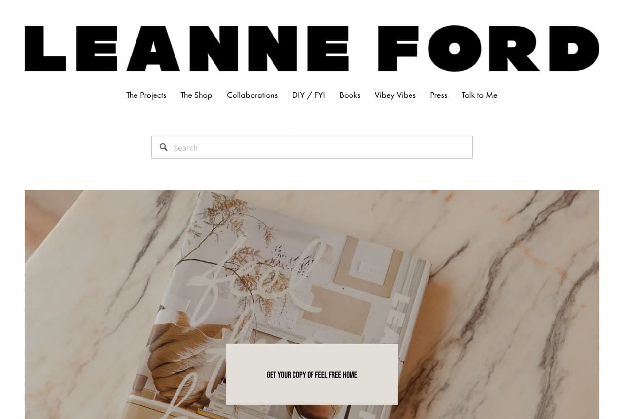
Leanne Ford Interiors: White-space minimalism as a brand

Leanne Ford Interiors turns a signature aesthetic — stark white, raw textures, bold black type — into an instantly recognizable brand system. The hero is almost architectural: an oversized 'LEANNE FORD' set in heavy type over generous white space, with a playful, personality-rich nav (The Projects, The Shop, Vibey Vibes, Talk to Me) that makes a high-end designer feel approachable and human. Where other luxury firms whisper in serif and shadow, Ford shouts in clean, confident sans on white. The lesson is that a consistent, ownable visual signature — hers is the white-on-white minimalism she's known for on TV and in print — lets the site double as brand-building: a visitor recognizes the aesthetic before they read a word, and the personality in the copy makes the whole thing feel like a person, not a firm.

Halcyon Interior Design — Interior Design website design you can build with Zarla
Build this with Zarla
  • Interior Design
  • Refined

Halcyon Interior Design: The full-service studio, done right

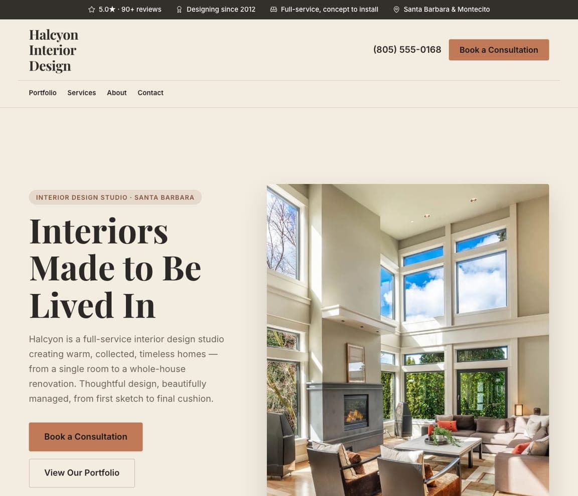
Halcyon Interior Design is the clean template for a full-service residential studio. 'Interiors Made to Be Lived In' over a warm, beautifully-styled living room, with copy that names the whole offer: 'a full-service interior design studio creating warm, collected, timeless homes — from a single room to a whole-house renovation, from first sketch to final cushion.' A cream palette, elegant serif, and a simple Book a Consultation / View Our Portfolio pairing keep it refined without being cold, and a trust strip (5.0 stars, designing since 2012, full-service concept-to-install) reassures on caliber. It's the template to reach for when you offer end-to-end residential design and want to look established and tasteful from the first scroll. Describe your studio and it's yours in about a minute.

See this template
Form & Field — Modern Design website design you can build with Zarla
Build this with Zarla
  • Modern Design
  • Bold

Form & Field: A style specialist, stated boldly

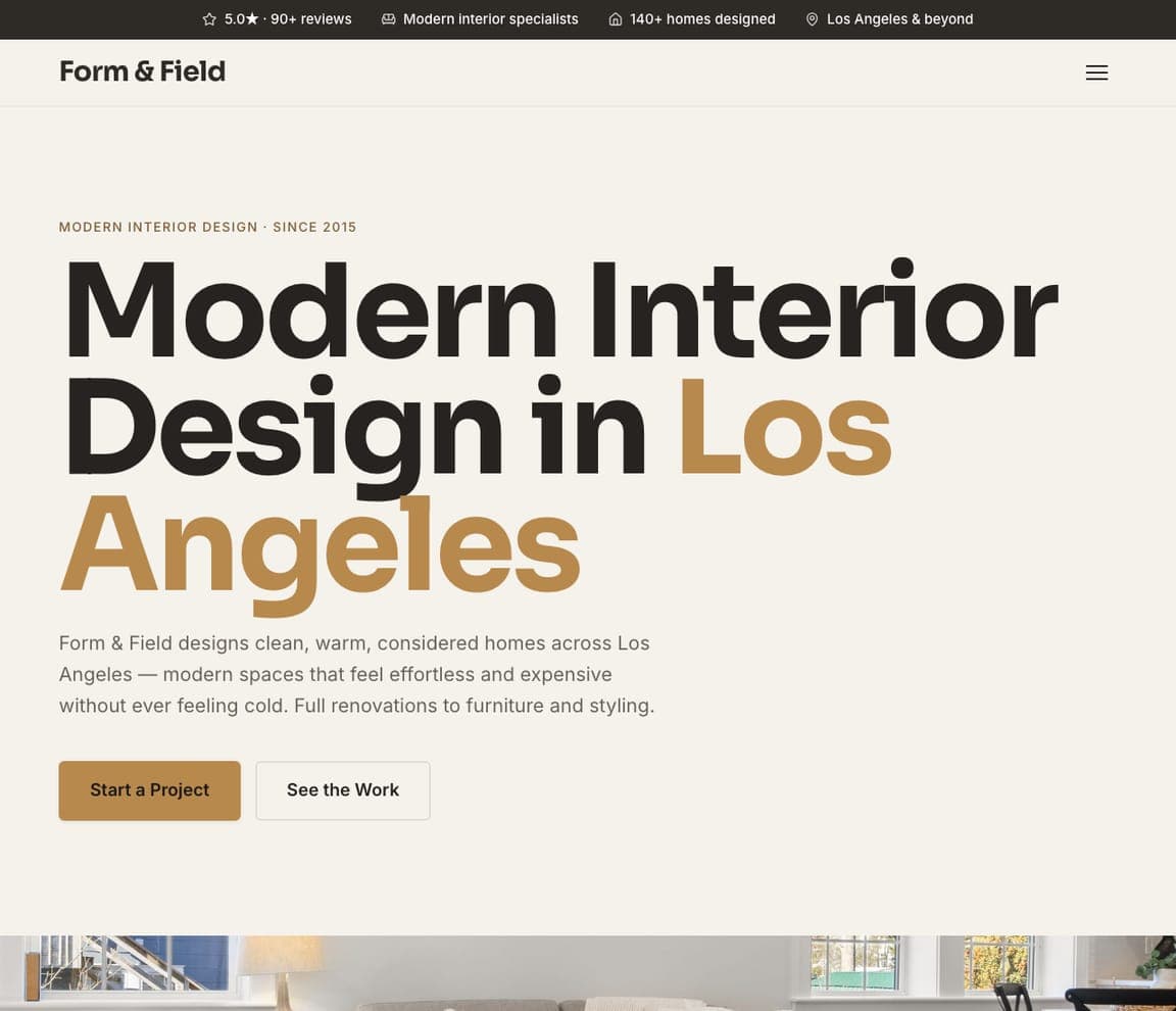
Form & Field shows how to own a single aesthetic. 'Modern Interior Design in Los Angeles' is set in oversized, confident type — the words themselves are the hero — with copy that sharpens the niche: 'clean, warm, considered homes that feel effortless and expensive without ever feeling cold.' By declaring a specific style (modern) and city up front, the template attracts exactly the client who wants that look and skips the mismatched inquiries. The bold typographic treatment doubles as a design demonstration: a studio that lays out type this well clearly has an eye. It's the template for a style-specialist rather than a do-everything generalist — narrow the aesthetic, say it loudly, and let the confident typography prove the point. Point it at your studio and publish it free.

See this template
Hearth & Honed — Kitchen & Bath website design you can build with Zarla
Build this with Zarla
  • Kitchen & Bath
  • Craft

Hearth & Honed: Own the two rooms that matter most

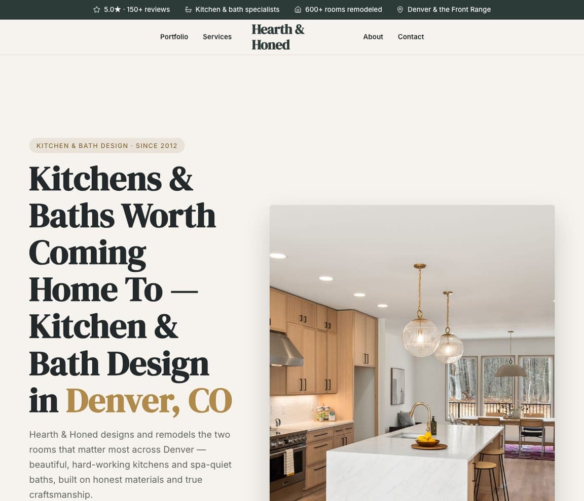
Hearth & Honed narrows to a lucrative niche and makes the case for it. 'Kitchens & Baths Worth Coming Home To' over a warm, high-end kitchen photo, with copy that's smart about focus: 'the two rooms that matter most — beautiful, hard-working kitchens and spa-quiet baths, built on honest materials and true craftsmanship.' Kitchens and baths are the highest-budget, highest-consideration remodels, so a specialist who does only those signals depth and justifies premium pricing. The serif type and craftsmanship language keep it feeling bespoke rather than contractor-generic. It's the template for a design-build firm that specializes rather than dabbles — name the specific rooms, lead with the craftsmanship, and let the focus read as expertise. Swap in your details and publish it free.

See this template
Threshold Staging — Home Staging website design you can build with Zarla
Build this with Zarla
  • Home Staging
  • Results-led

Threshold Staging: A different business: staging to sell

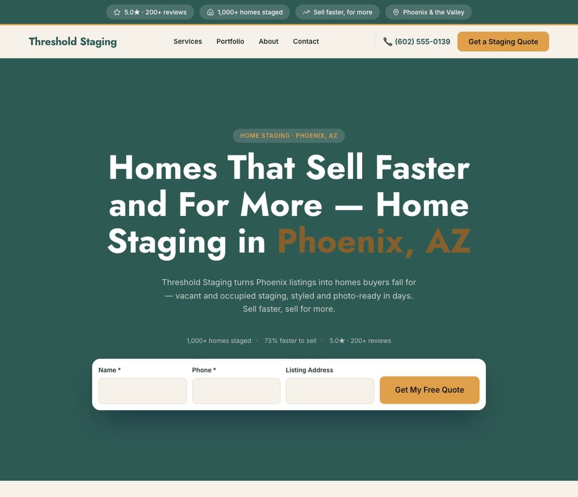
Threshold Staging is a reminder that 'interior design' contains several distinct businesses, and staging is its own. 'Homes That Sell Faster and For More — Home Staging in Phoenix, AZ' leads with the only outcome a staging client cares about — a faster, higher sale — and a quote form (Name / Phone / Listing Address) sits right in the hero to capture the time-pressured realtor or seller. A confident deep-green palette and hard proof (1,000+ homes staged, 73% faster to sell) sell competence. The lesson is matching the pitch to the buyer's actual goal: a staging customer isn't shopping for taste, they're shopping for ROI on a listing, so the design leads with sale speed and price, not aesthetics. It's the template for a staging business that wants realtor and seller leads fast. Describe your service and it's yours in about a minute.

See this template
Roomlift — Online Design website design you can build with Zarla
Build this with Zarla
  • Online Design
  • Accessible

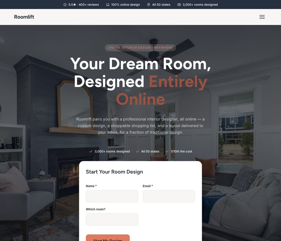
Roomlift: The e-design model, made trustworthy

Roomlift packages the newest interior-design business model — remote, online, affordable — and makes it feel legitimate. 'Your Dream Room, Designed Entirely Online' over a real room photo, with copy that explains the unfamiliar offer clearly: 'a professional interior designer, all online — a custom design, a shoppable shopping list, and a layout delivered to your inbox, for a fraction of traditional design.' A 'Start Your Room Design' form in the hero and proof points (all 50 states, 3,000+ rooms, 1/10th the cost) handle the two objections e-design faces: is it real, and is it worth it. The lesson is de-risking a novel model with clarity and proof: when your service works differently than customers expect, spell out exactly what they get and stack the numbers that make it believable. Point it at your business and publish it free.

See this template

Frequently asked

What makes a good interior design website?

A good interior design website treats itself as the portfolio audition: it leads with real, professionally-shot project photography (never stock), commits to a distinctive aesthetic that signals the designer's point of view, keeps the typography and layout quiet so the rooms carry the page, and makes it easy to see the portfolio and get in touch. Because clients hire on taste, the design and photography of the site matter more here than in almost any other industry — the site itself has to look like something you'd want in your home.

What pages does an interior design website need?

Most studios need five: a home page that leads with the best project photography, a portfolio (ideally organized by project, with generous images), an about or philosophy page that conveys the designer's point of view, a services page that clarifies the offer (full-service, e-design, staging, kitchen & bath), and a contact or inquiry page — often with an intake form to qualify leads. A blog or 'journal' is common too, since design content ranks well and demonstrates expertise.

How do interior designers get more clients from their website?

The studios that convert do three things: they invest in real, magazine-quality project photography (it's the single biggest factor — the work is the pitch), they commit to a clear aesthetic and ideal-client fit rather than trying to appeal to everyone, and they make inquiring easy with a simple intake form that also qualifies the lead (budget, scope, timeline). Getting found matters too — a Google Business Profile plus design content (a journal, before-and-afters) helps rank for 'interior designer near me' and design-idea searches.

You've seen what works. Now make it yours.

Describe your business and Zarla designs a complete, professional website in about 30 seconds — built to convert, just like the ones above.

Free to build and preview · no credit card · publish to your own domain on Premium