Inspiration · Jewelry

The Best Jewelry Website Examples, Explained

Looking for jewelry website examples? These 12 are the strongest we found — Mejuri's stacked eternity rings under 'The Essentials', Stone and Strand's gold on skin with 'Build your capsule', Dinosaur Designs' resin beads split with a red vase — plus boutique designs you can build with Zarla, each with a breakdown of the specific move that turns a scroll into a purchase or an appointment. A jewelry website has one job before any other: make the piece look the way it will feel on. Find an approach you love and you can build a site in that spirit, free, in about 30 seconds.

Real sites + designs you can build with Zarla — free to build and preview, no credit card

What makes a great jewelry website

The best jewelry websites photograph the piece on a body and say very little. Hands wearing the rings (Mejuri, Stone and Strand), a neck with the necklace (Hortense's pearl, Bluboho's evil eye), a model in the bangles (Gorjana) — the product is shown the way a customer will see it in a mirror, and the headline is a collection name or a mood ('The Essentials', 'Most loved. Most layered.', 'Oceana'), never a list of categories. The nav does the categories; the promo bar does the offer; the hero does the desire. Notice the two registers: the fine-jewelry brands go quiet (white, serif, a single underlined link), and the personality brands go loud (Tatty Devine's marbled swirl, Dinosaur Designs' red). Every example below would make you want to try the piece on before it tells you the price.

Mejuri website — Fine Jewelry Brand design example
Real site
  • Fine Jewelry Brand
  • Editorial
  • Stone + gold

Mejuri: Stacked rings on a hand, a collection in tracked caps

Mejuri opens on the product in use: a hand pressed against grey stone, four diamond eternity bands stacked on two fingers, photographed close enough to see the settings. Over the stone, the collection name is set in tracked capitals — 'THE ESSENTIALS' — with a two-line typewriter sub-line ('Jewelry that becomes second skin. Worn every day, loved by generations.') and one small underlined 'SHOP NOW'. A black promo bar above the nav runs the offer ('Before We Melt: 40% Off More Styles'); the nav itself is the category list. One scroll down, a manifesto section ('JEWELRY YOU CAN LIVE IN… you deserve the damn diamond') does the brand voice. Mejuri shows a jewelry brand how to sell fine pieces as everyday objects: one hand, one name, one link, and the attitude saved for the second screen.

  • Diamonds photographed on a hand, not on velvet
  • A collection name as the headline, in tracked capitals
  • The offer in the promo bar, the manifesto one scroll down

Steal this: Name the collection in the headline and photograph one hand wearing it — the customer sees the stack on their own fingers.

Visit Mejuri

Opens a similar Zarla design you can make yours.

gorjana website — Everyday Gold design example
Real site
  • Everyday Gold
  • Warm
  • Tan + gold

gorjana: 'Most loved. Most layered.' on a model in bangles

gorjana leads with the wearer: a model reclines on a tan leather chair, gold bangles and chains stacked on her wrist, hair loose, and across the photograph a serif headline in white capitals says 'MOST LOVED. MOST LAYERED.' with a small sub-line ('Best-selling styles for every stack.') and one underlined 'Shop Best Sellers'. The header is white and calm — a lowercase wordmark, a category nav (Shop By, Best Sellers, Necklaces, Earrings, Bracelets, Rings, Charms, Fine Jewelry, Gifts), a 'Find a Store Near You' bar above it — and under the hero a row of four product photographs picks up the gold. The word 'layered' is the whole brand in one adjective. gorjana shows an everyday-gold brand how to sell the habit rather than the piece: a photograph of the stack being worn, an alliterative headline, and the best sellers one tap away.

  • 'Most layered' — the buying habit named in the headline
  • Gold photographed on a wrist in warm light, not on a tray
  • 'Find a store near you' above the nav — the retail side in one line

Steal this: Sell the habit, not the item: 'layered', 'stacked', 'everyday' in the headline tells a customer they'll buy more than one.

Visit gorjana

Opens a similar Zarla design you can make yours.

Stone and Strand website — Solid Gold Everyday design example
Real site
  • Solid Gold Everyday
  • Minimal
  • Skin + gold

Stone and Strand: Gold on skin with a capsule to build

Stone and Strand crops tight and says four words: two hands raised to a black strapless top, every finger and wrist wearing solid gold — bands, a knot ring, a chain bracelet — against a blush background, and in the corner a tiny eyebrow, 'BUILD YOUR CAPSULE', over an underlined white link, 'Shop Solid Gold'. The header is spare: a tracked serif wordmark, a four-word nav (Shop, New, About, Sale) and the icons. Under the hero, 'Shop by Category' begins a row of circular crops — rings on a hand, an ear, a wrist. The idea of a capsule turns a purchase into a collection. Stone and Strand shows a fine-jewelry brand how to make gold feel modern: skin, black fabric, a tight crop, and a headline that invites the customer to keep going.

  • A tight crop of hands in gold — no face, no room, just the pieces
  • 'Build your capsule' — a wardrobe idea applied to jewelry
  • Category crops as body parts: a hand, an ear, a wrist

Steal this: Crop to the body part that wears the piece — hands, an ear, a wrist — and let the category row repeat the idea.

Visit Stone and Strand

Opens a similar Zarla design you can make yours.

Jenny Bird website — Fashion Jewelry design example
Real site
  • Fashion Jewelry
  • Editorial
  • White + gold

Jenny Bird: A season in serif and two editorial photographs

Jenny Bird presents a drop like a lookbook: on white, the season is the headline — 'fall '26' in a light serif — with a justified paragraph beneath ('Voluminous, clean metal designs created by Jenny to become staples in your Jewelry Capsule Wardrobe') and an underlined 'DISCOVER THE COLLECTION'; to the right, two photographs sit side by side, a close-up of hands in a sculptural gold ring and a woman in a white coat wearing gold earrings against a city street. The tracked wordmark 'JENNYBIRD' sits over a seven-item nav, and two slim promo bars stack above it (a free travel case with orders over $350, the app). It reads as a magazine spread with a shop attached. Jenny Bird shows a fashion-jewelry brand how to launch a season: name it, describe it in one sentence, show it twice, and keep the offers to the bars.

  • The season as the headline: 'fall '26'
  • Two photographs paired like a lookbook spread
  • Two promo bars stacked above the nav — offers kept out of the hero
Visit Jenny Bird

Opens a similar Zarla design you can make yours.

bluboho website — Boutique Jeweler design example
Real site
  • Boutique Jeweler
  • Playful
  • Blush + gold

bluboho: An evil eye on the lips, charms in a row

bluboho makes a single motif the hero: a close-up of a woman's lips and chin with a fine gold chain caught between them, an evil-eye pendant hanging from it, and the words 'evil eye' handwritten in white across the photograph; beside it, a flat-lay of gem charms — hexagons, eyes, snakes, stars — on pale stone, and a white button, 'PROTECT YOURSELF'. A red ticker above the nav repeats 'proudly canadian. all orders ship from canada', the nav carries 'BOOK AN APPOINTMENT' beside the shop links, and one scroll down a 'MEET YOUR ALTAR!' heading opens the product row. The button's wording is the joke and the promise at once. bluboho shows a boutique jeweler how to build a campaign around one symbol: photograph it worn, show the variations, and write the call to action in the symbol's own language.

  • One motif — the evil eye — as the whole campaign
  • 'Protect yourself' as the button: the symbol's own language
  • 'Book an appointment' in the nav beside the shop
Visit bluboho

Opens a similar Zarla design you can make yours.

Abby Seymour website — Artisan Jeweler design example
Real site
  • Artisan Jeweler
  • Poetic
  • Sea green + silver

Abby Seymour: 'Oceana' in serif over a bare back

Abby Seymour names a collection like a poem: a photograph of a woman from behind, hands lifting her dark hair to show drop earrings and a ring, the light sea-green and soft, and over her back the collection title in white serif — 'Oceana' — with an italic line beneath it, 'Honoring Australia's Seascape'. The nav is a single row of small words around a geometric logo (Shop, Engagements, Custom Designed, About, Workshops, Stockists), with a cart count in the corner. No button, no price, no promo bar. The words 'Custom Designed' and 'Workshops' in the nav tell you this is a maker, not a merchant. Abby Seymour shows an artisan jeweler how to sell craft with restraint: one photograph in the collection's own light, a title, a line of place, and the making in the nav.

  • A collection title and a line of place — no product copy at all
  • Sea-green light that matches the collection's name
  • 'Custom Designed' and 'Workshops' in the nav: a maker's site
Visit Abby Seymour

Opens a similar Zarla design you can make yours.

Hortense website — Fine Jewelry Boutique design example
Real site
  • Fine Jewelry Boutique
  • Quiet

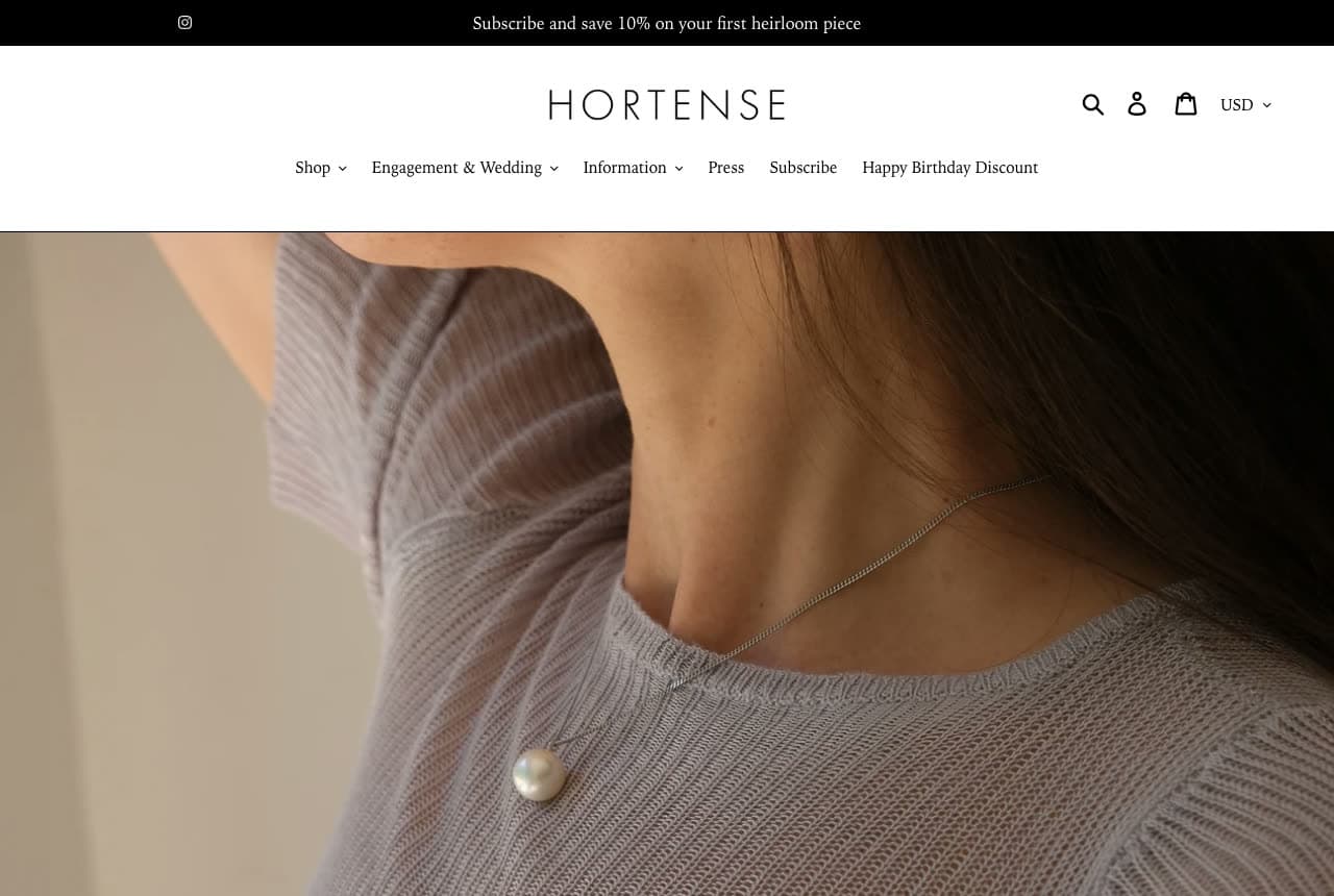
Hortense: One pearl on a grey sweater

Hortense reduces the hero to a single pearl: a photograph of a woman's shoulder and neck in a fine grey knit, hair up, and a lone pearl on a thin silver chain resting at the collarbone. Above it, a black bar offers ten percent off 'your first heirloom piece', the wordmark 'HORTENSE' sits in tracked serif capitals, and a small nav lists Shop, Engagement & Wedding, Information, Press, Subscribe and a 'Happy Birthday Discount'. No headline, no button, no copy on the photograph. The word 'heirloom' in the bar and the pearl in the frame say the same thing at two volumes. Hortense shows a fine-jewelry house how to be quiet with confidence: photograph one piece the way it's worn, put the offer in a bar, and let the wordmark be the only large type.

Visit Hortense

Opens a similar Zarla design you can make yours.

Tatty Devine website — Personalised Jewellery design example
Real site
  • Personalised Jewellery
  • Playful

Tatty Devine: A marbled swirl and a name necklace to design

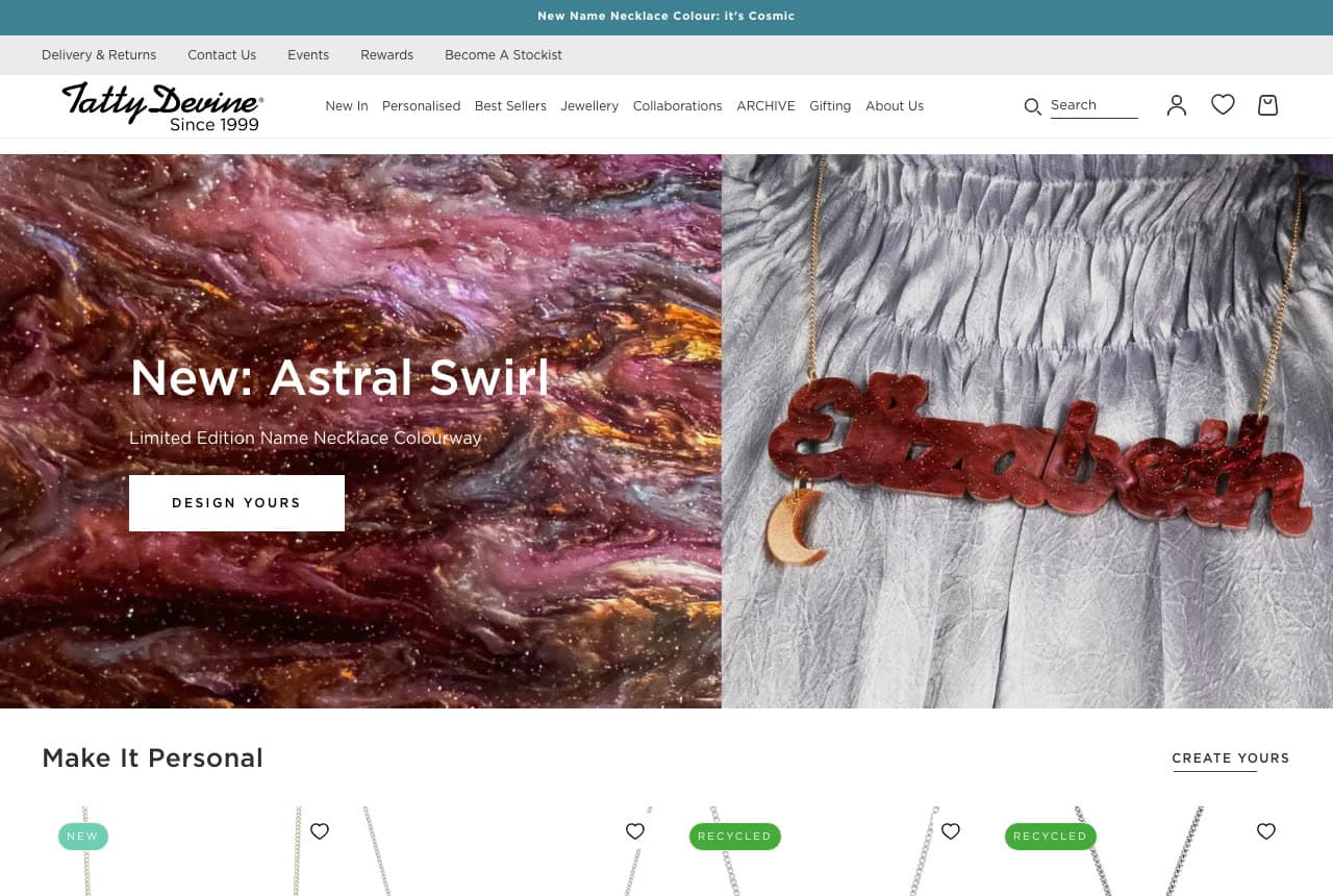
Tatty Devine sells personalisation as a launch: the hero splits into a marbled purple-and-orange swirl texture on the left, carrying 'New: Astral Swirl' with a sub-line ('Limited Edition Name Necklace Colourway') and a white 'DESIGN YOURS' button, and on the right a photograph of a red acrylic necklace spelling 'Elizabeth' with a crescent-moon charm, laid on silver fabric. A teal promo bar announces the colourway, the nav includes 'Personalised' and 'ARCHIVE' beside the usual categories, and 'Since 1999' sits under the script wordmark. Below, a 'Make It Personal' row starts with products tagged NEW and RECYCLED. The material is the brand — laser-cut acrylic in colours nobody else uses — and the page shows it as a texture before it shows it as a product. Tatty Devine shows a personalised-jewellery brand how to launch a colour: make the texture the hero, name it, and put 'design yours' where 'shop' would be.

Visit Tatty Devine

Opens a similar Zarla design you can make yours.

Dinosaur Designs website — Resin Jewellery design example
Real site
  • Resin Jewellery
  • Bold

Dinosaur Designs: Resin beads and a red vase, split down the middle

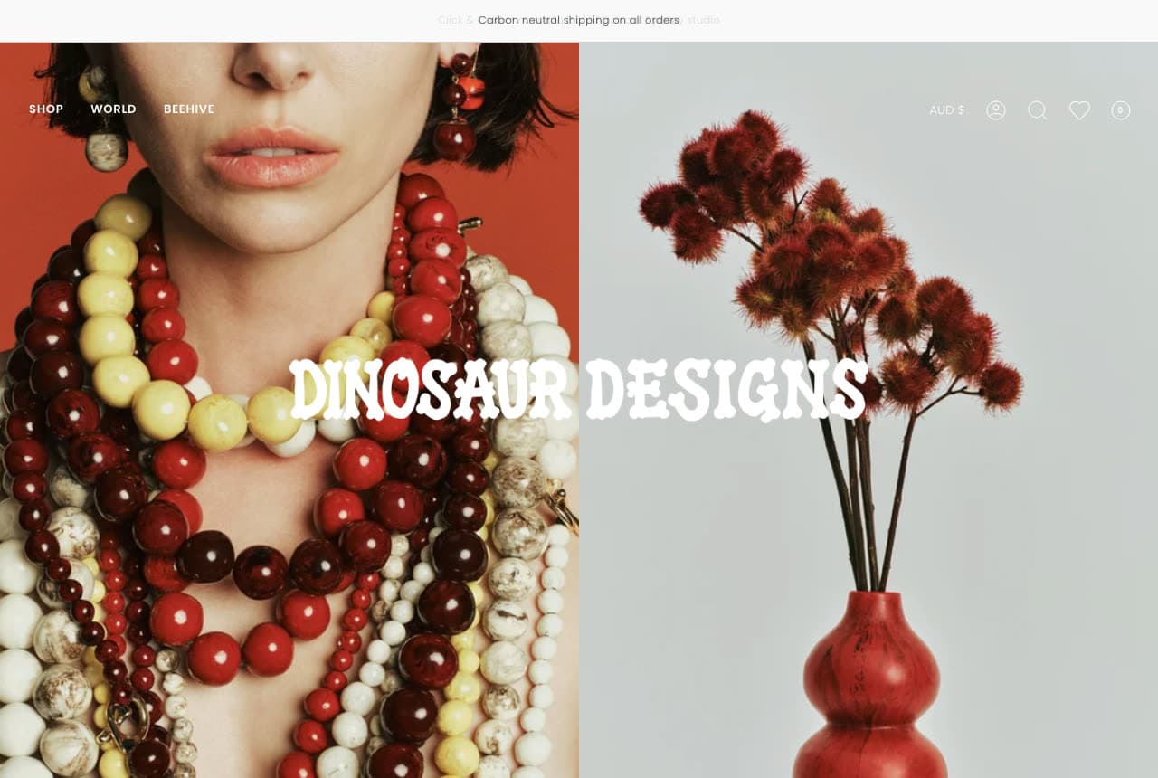
Dinosaur Designs shows jewelry and homeware as one material: the hero is split in two — on the left, a model on a tomato-red ground wears layered strands of oversized resin beads in yellow, cream and cherry, a bead earring at her jaw; on the right, a gourd-shaped red resin vase holds dried flowers against grey. Across the seam, the name is set in a wobbly, hand-drawn display face: 'DINOSAUR DESIGNS'. A thin bar above notes carbon-neutral shipping, the nav is three words (Shop, World, Beehive) with a currency selector, and there is no button and no copy. The colour does the selling and the split does the positioning — this is a studio, not a category. Dinosaur Designs shows a brand with a signature material how to introduce itself: put the material on a body and on a table, side by side, and set the name in a face that looks made by hand.

Visit Dinosaur Designs

Opens a similar Zarla design you can make yours.

Wrenhaven Perfumery — Adaptable Template website design you can build with Zarla
Build this with Zarla
  • Adaptable Template
  • Moody

Wrenhaven Perfumery: A moody boutique hero with the shop attached

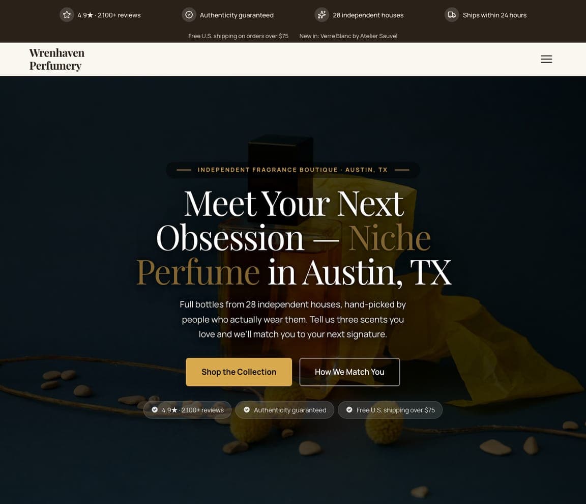
Wrenhaven Perfumery is a Zarla perfume-boutique template, not a jeweler's — but its hero is the closest catalog match to the quiet fine-jewelry sites here: a dark, moody photograph, an eyebrow ('Independent Fragrance Boutique · Austin, TX'), a serif headline with a gold phrase — 'Meet Your Next Obsession — Niche Perfume in Austin, TX' — a paragraph about hand-picked pieces and a matching service, and a gold 'Shop the Collection' beside 'How We Match You'. It has a working online store behind it. Swap perfume for jewelry, the matching service for a fitting appointment, and it is Hortense's register with Bluboho's booking. Clone it, and the product grid becomes your pieces.

See this template
Halloway Parfums — Adaptable Template website design you can build with Zarla
Build this with Zarla
  • Adaptable Template
  • Luxe

Halloway Parfums: Gold on noir for the maker who sells their own line

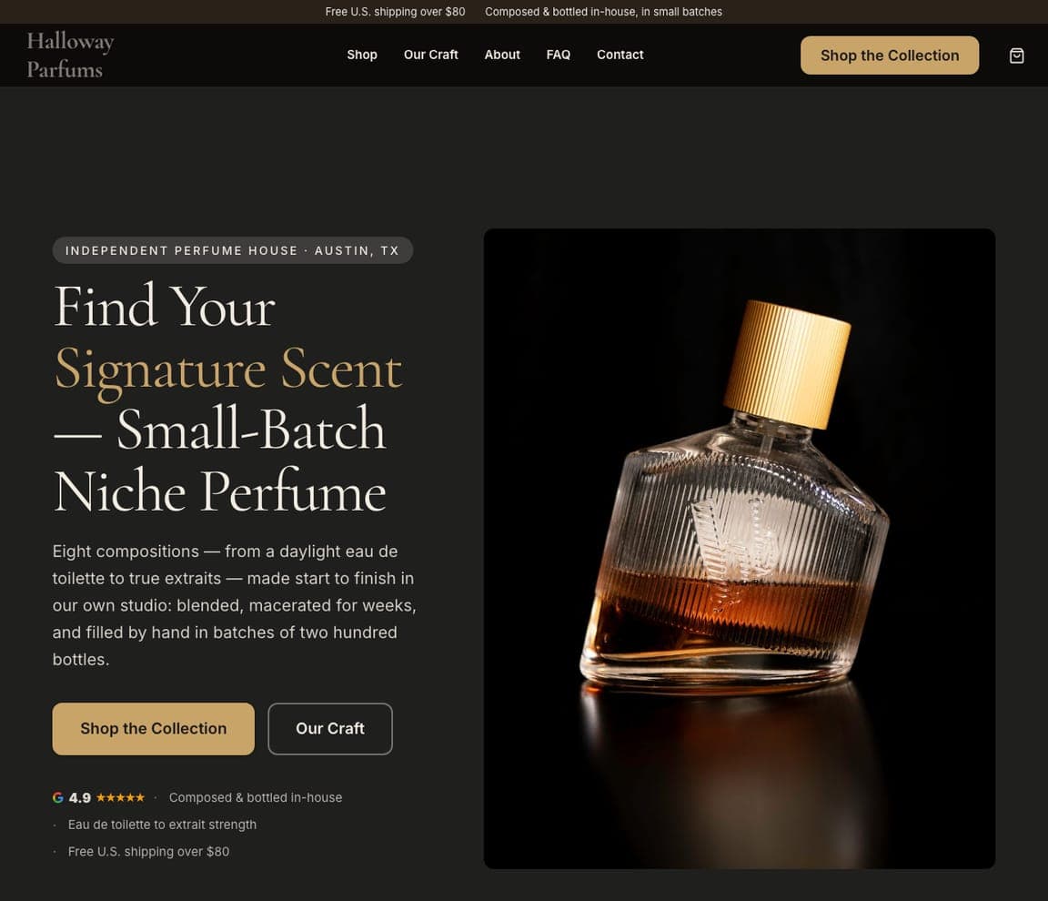
Halloway Parfums is the perfume-house template — a near-black storefront for a maker selling its own small-batch line: an eyebrow ('Independent Perfume House · Austin, TX'), a serif headline with the key phrase in gold — 'Find Your Signature Scent — Small-Batch Niche Perfume' — a paragraph about compositions made start to finish in the studio, and a photograph of a single bottle lit against black. It's the maker's version of Abby Seymour's and Stone and Strand's confidence. For a jeweler who designs and makes every piece, clone it and the paragraph becomes your bench story.

See this template
The Spotted Easel — Adaptable Template website design you can build with Zarla
Build this with Zarla
  • Adaptable Template
  • Creative

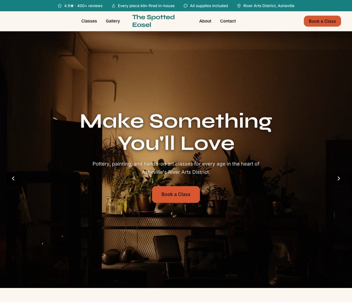
The Spotted Easel: Make something you'll love — for the studio with workshops

The Spotted Easel is the art-studio template, and the closest catalog match to the personality brands here (Tatty Devine, Dinosaur Designs) and to jewelers who teach: a dark photograph of a studio doorway, a headline — 'Make Something You'll Love' — a line about hands-on classes for every age, a coral 'Book a Class', a priced class list and a gallery of finished work below. Abby Seymour's 'Workshops' nav item is this page. Clone it for a jewelry studio that runs classes or a brand whose material is the story, and the class list becomes your workshops and the gallery your pieces.

See this template

Frequently asked

Where can I find good jewelry website examples?

Right here — this page curates jewelry website examples across the spectrum: fine-jewelry brands (Mejuri, Stone and Strand, Hortense), everyday gold and fashion jewelry (Gorjana, Jenny Bird), boutique and artisan jewelers (Bluboho, Abby Seymour) and two personality brands (Tatty Devine's acrylic name necklaces, Dinosaur Designs' resin) — each linked so you can explore the live site — plus professionally designed Zarla boutique and studio templates you can clone and restyle for a jewelry business. Every example includes a note on why the design works — the on-body photography, the collection headline, the shop path — so you can copy the thinking, not just the look.

What makes a good jewelry website?

It shows the piece worn, at a size where you can see the metal, and gets out of the way. The strong examples above open on one photograph of jewelry on a hand, a neck or a wrist, use a collection name or a mood as the headline, keep the categories in the nav and the offer in a slim promo bar, and make 'shop' a single underlined link rather than a row of buttons. For a boutique that sells in person, the equivalent is 'book an appointment' beside the shop link — Bluboho puts both in the nav.

How much does a jewelry website cost?

A custom e-commerce build from an agency runs into the thousands, commerce platforms charge a monthly plan plus transaction fees, and general template builders are roughly $16–$30 per month before payments. An AI website builder generates a jewelry site — collections, product pages, about, appointment booking or a shop — from a short description in seconds, then lets you edit it in plain language. What you can't skip is the photography: on-body shots in natural light are the difference between a site that sells and one that lists.

Should a jewelry website lead with products or a lifestyle photograph?

Lead with the product on a person — that is the lifestyle photograph. Mejuri's hand of stacked rings, Gorjana's model in bangles and Hortense's single pearl on a sweater all show the piece and the life at once. Flat-lay product shots belong on the category and product pages; a home page that opens on a grid of items on white reads as a catalog, and catalogs are what the marketplaces are for.

What pages does a jewelry website need?

Most jewelers need six: a home page with one on-body hero and a collection link, category pages (rings, necklaces, earrings, bracelets), product pages with the metal, stone and sizing stated plainly, an about or story page (materials, making, the founder), a care and shipping page that answers returns and resizing, and a contact or appointment page. Boutiques with custom or bridal work add a 'custom designed' or 'engagement' page — Abby Seymour and Bluboho both do — because that is the highest-value enquiry a jeweler receives.

How do jewelers get more customers from their website?

Photograph the pieces on people, name the collection in the headline, keep the offer in the promo bar and make one link the ask. The converting pattern above: Mejuri's 'Shop Now' under a two-line mood, Stone and Strand's 'Build your capsule / Shop Solid Gold' as an underlined link, Tatty Devine's 'Design Yours' beside a personalised necklace. Then let an email bar do the retention — Hortense's 'subscribe and save 10% on your first heirloom piece' is the model — because the second purchase is where a jewelry business makes its margin.

You've seen what works. Now make it yours.

Describe your business and Zarla designs a complete, professional website in about 30 seconds — built to convert, just like the ones above.

Free to build and preview · no credit card · publish to your own domain on Premium