Inspiration · Juice Bar

The Best Juice Bar Website Examples, Explained

Looking for juice bar website examples? These 8 are the best we could find — standout real juice bar sites plus designs you can build with Zarla — and each comes with a breakdown of the specific design move that makes it work. Find a look you love and you can build a site in that exact style, free, in about 30 seconds.

Real sites + designs you can build with Zarla — free to build and preview, no credit card

What makes a great juice bar website

The best juice bar websites share a few moves: they earn trust fast, lead with strong visuals of the work, point to one clear action, and match the design to how their customers decide. Each example below calls out the specific choice worth stealing for your own juice bar website.

JuiceLand website — Juice Chain design example
Real site · Austin, TX
  • Juice Chain
  • Playful
  • Pink + mustard

JuiceLand: Sticker-sheet maximalism, in control

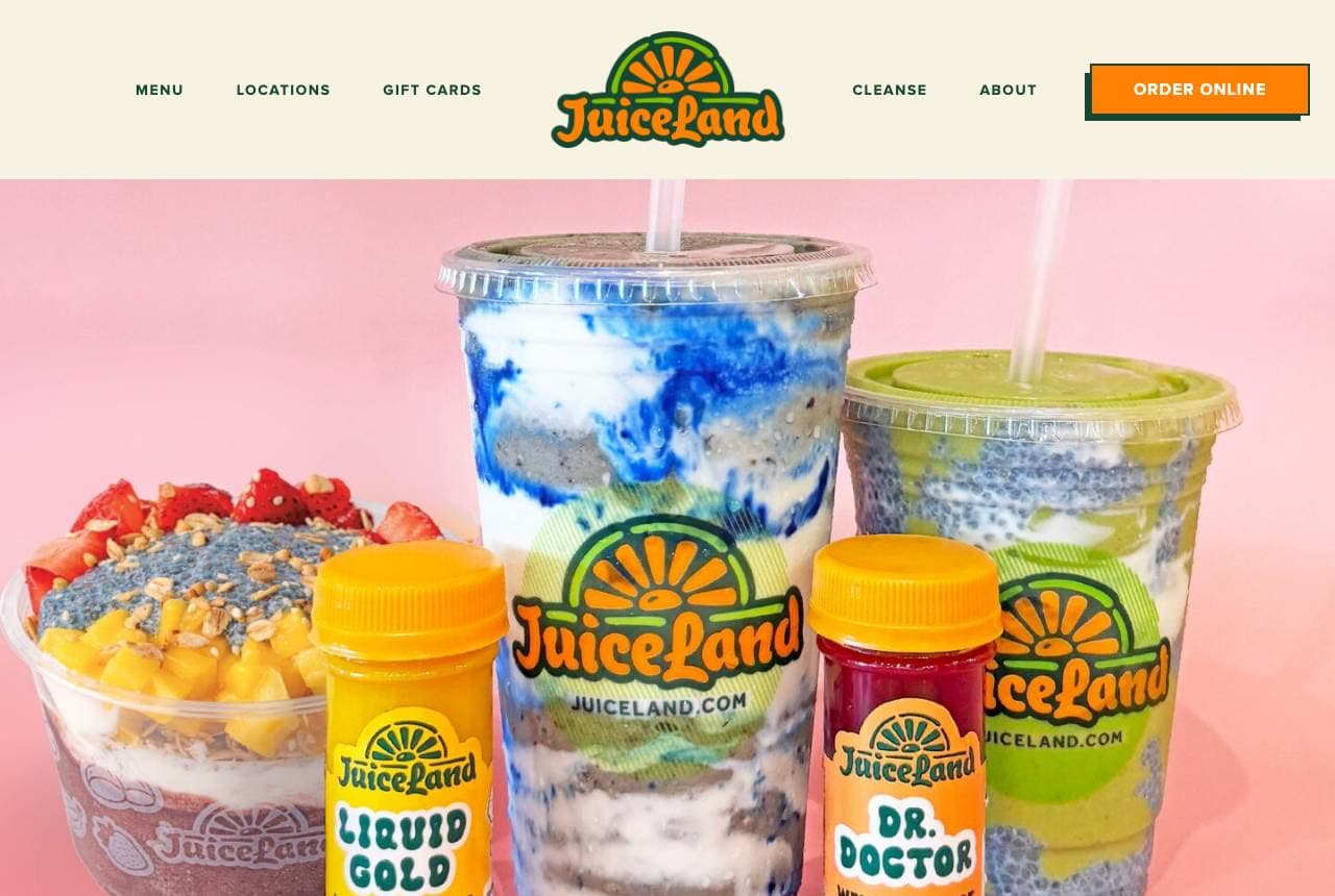
JuiceLand's homepage looks like the inside of a well-loved sticker collection: a retro sunburst logo, wellness shots labeled 'Liquid Gold' and 'Dr. Doctor' in comic lettering, a pink backdrop, and tile buttons — Daily Special, What's New — drawn like patches, plus a Texas map sticker marking Dallas, Austin and Houston. It should be chaos, but the palette (pink, mustard, green) and the consistent cartoon lettering hold it together as one voice. The design does the brand's actual job: juice is a repeat, impulse, feel-good purchase, and this page feels like the product tastes. Personality this committed also makes every cup and label instantly recognizable on a shelf or a feed — the design system IS the marketing.

  • Comic lettering + patch-style tiles read as one voice
  • Named wellness shots turn SKUs into characters
  • The page feels like the product tastes — brand as flavor

Steal this: Name your drinks like characters ('Dr. Doctor'). Named products get remembered, reordered and posted.

Temple Boba website — Bubble Tea design example
Real site · Brisbane, AU
  • Bubble Tea
  • Heritage
  • Maroon + gold

Temple Boba: A tea house with editorial gravity

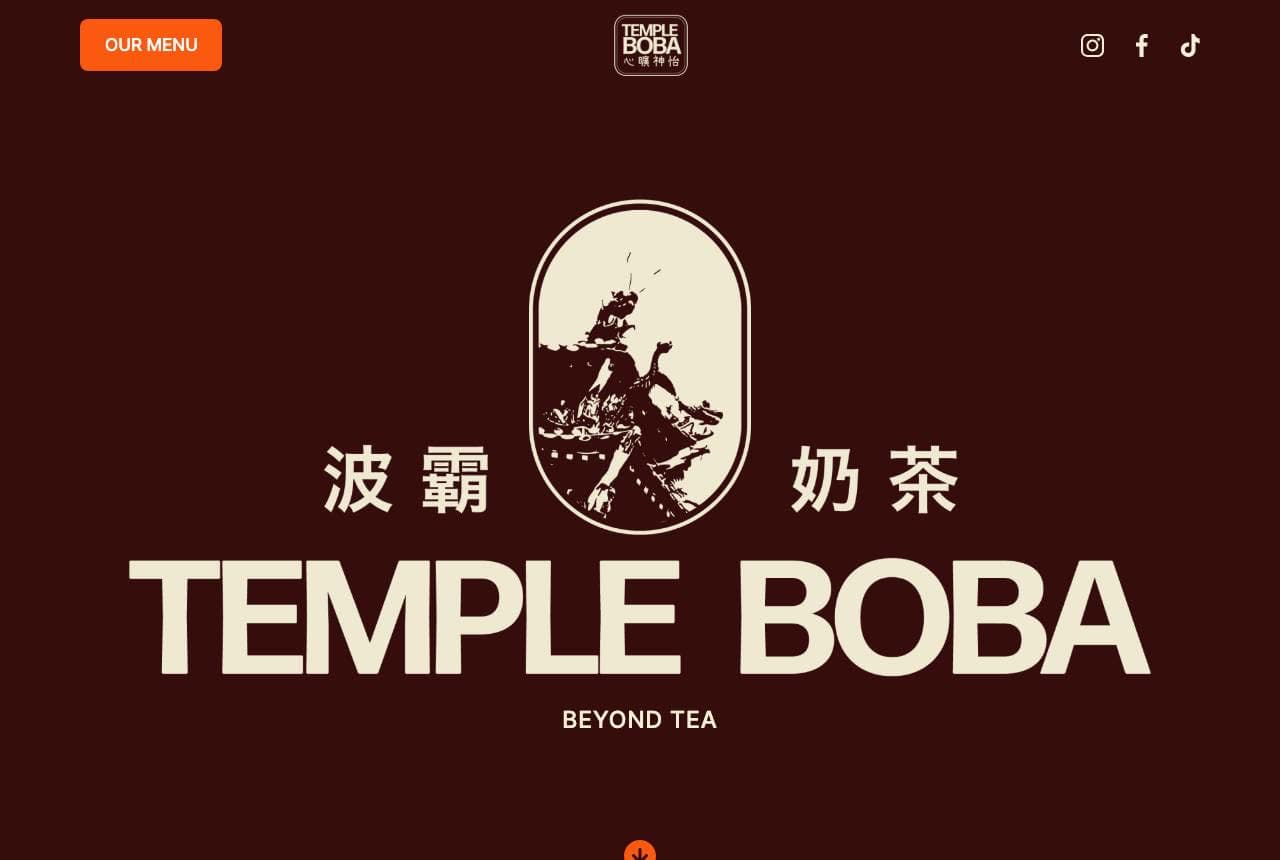
Temple Boba treats bubble tea with the seriousness of a heritage tea house: a deep maroon canvas, an oval crane emblem, Chinese characters (波霸奶茶) flanking the wordmark, and 'Beyond Tea' as the promise. Below, the about section opens '01. WHO WE ARE — A Sanctuary of Flavours' with editorial numbering, describing the shop as 'a premium destination where traditional meets today.' Every choice — the calligraphic characters, the muted gold on maroon, the numbered chapters — positions boba as craft rather than trend, which justifies premium pricing and separates the brand from the neon-cup competitors. Cultural specificity is the differentiator here: the design honors where the drink comes from, and customers can feel the respect.

  • Maroon + gold reads heritage where rivals go neon
  • Bilingual typography honors the drink's origin
  • Numbered editorial chapters slow the page down, on purpose

Steal this: Design to your product's origin story. Cultural specificity reads premium where generic 'Asian-inspired' reads costume.

Soda Jerk Co. website — Milkshake Bar design example
Real site · Phoenix, AZ
  • Milkshake Bar
  • Retro
  • Cream + teal

Soda Jerk Co.: The product is the spectacle

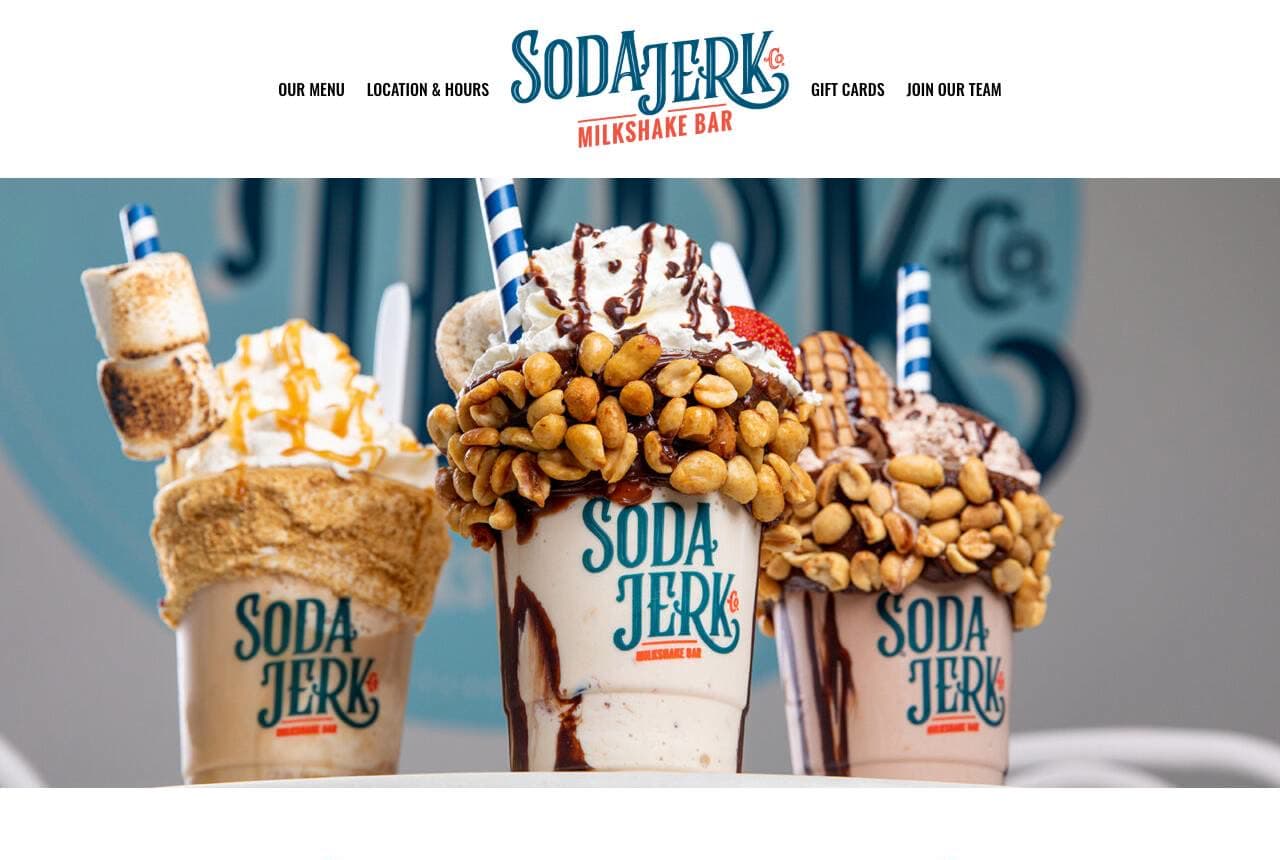
Soda Jerk Co. understands that an outrageous milkshake is a photograph first and a dessert second: the hero is a full-bleed shot of marshmallow-and-pretzel-crowned monsters wearing the logo cup, styled and lit like an album cover. The retro script wordmark ('Milkshake Bar' underneath) and the flourish dividers around 'Featured & Seasonal' commit to the 1950s soda-fountain fantasy, while the seasonal trio — Berries & Stripes, Yankee Doodle, Berry Proud — shows the menu as rotating limited editions, each with its own portrait. Rotating named specials are the engagement engine of the milkshake trade; they give regulars a reason to return and the feed something new to post. The site makes that machine visible.

  • Album-cover product photography IS the hero
  • Retro script + flourishes commit to the soda-fountain era
  • Named seasonal editions give regulars a reason to return
Purr Tea website — Bubble Tea design example
Real site · Calgary, AB
  • Bubble Tea
  • Cozy
  • Cream + orange

Purr Tea: A mascot and a promise of home

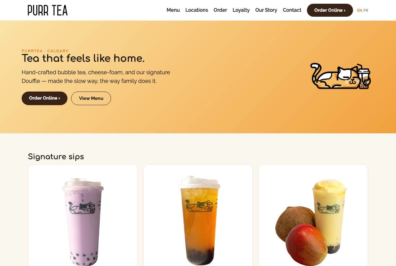
Purr Tea leads with the warmest headline in the category — 'Tea that feels like home.' — on a cream-to-orange gradient, with a line-drawn cat mascot sipping boba in the corner. The subhead does quiet quality work: 'hand-crafted bubble tea, cheese-foam, and our signature Doufflé — made the slow way, the way family does it.' Then straight to commerce: three Signature Sips cards (Taro Latte, Passion Fruit Tea, MangoCoco) each with its own Order button, and 'Two cosy Calgary shops' with addresses, hours and Directions buttons — everything a customer needs without a click. The mascot gives the brand a face merch can carry; the copy gives it a family story chains can't fake.

  • 'Made the slow way, the way family does it' — story in one line
  • Product cards with per-drink Order buttons shorten the path
  • A drawable mascot is a brand asset that scales to cups and merch
The Crazy Mason website — Milkshake Franchise design example
Real site · United States
  • Milkshake Franchise
  • Vibrant
  • Pink + blue

The Crazy Mason: 'Choose wisely' as menu architecture

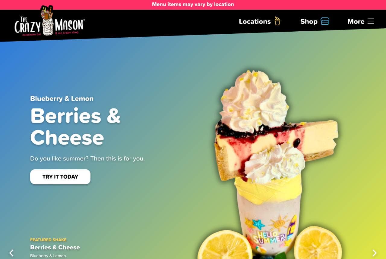
The Crazy Mason turns decision paralysis into the brand experience: a gradient hero carousels the featured shake ('Berries & Cheese — do you like summer? Then this is for you.') as a towering garnished mason jar, and below, 'Choose wisely.' introduces four hot-pink category tiles — Crazy Masons, Crazy Waffles, Crazy Bombs, Crazy Desserts. The copy even admits it: 'The hardest part about a trip to The Crazy Mason is figuring out what to order.' That's confident franchise design — naming the abundance instead of apologizing for it — and the repeated 'Crazy X' naming system makes the whole menu feel like one collectible family. The mason jar itself, wordmarked and reused everywhere, is the brand's souvenir move: the cup goes home and keeps advertising.

  • Featured-shake carousel sells one hero item at a time
  • 'Crazy X' naming turns categories into a collectible set
  • The branded jar is a souvenir that keeps advertising at home
Campo Juice + Kitchen website — Juice + Kitchen design example
Real site · Denver, CO
  • Juice + Kitchen
  • Wholesome
  • Green + earth

Campo Juice + Kitchen: Farm etymology as brand spine

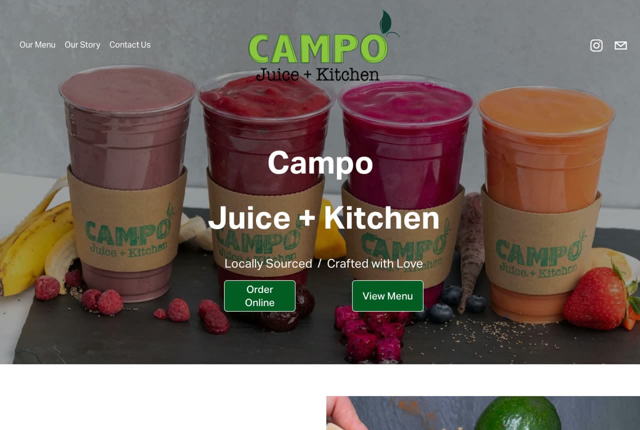
Campo Juice + Kitchen builds its whole identity on one Spanish word: 'campo (KAHM-po) refers to the countryside where food is grown,' the about copy explains, and everything upstream earns it — a hero of labeled cold-pressed cups in cardboard sleeves surrounded by loose berries and bananas, 'Locally Sourced / Crafted with Love' as the tagline, and fresh greens in the photography. The green-on-photo palette stays literal to the produce, and the story names real suppliers' produce (cucumbers, peaches, plums, celery) rather than gesturing at 'fresh ingredients.' For a juice bar, provenance is the price justification; Campo's page makes the supply chain the poetry. Explaining your name is an underrated trust move — it proves the brand means something.

  • Explaining the name turns a label into a mission
  • Real produce lists beat 'fresh ingredients' every time
  • Kraft sleeves + loose fruit styling keep it farm-literal
Buzzed Bull Creamery website — Nitrogen Creamery design example
Real site · Cincinnati, OH
  • Nitrogen Creamery
  • Theatrical

Buzzed Bull Creamery: Nitrogen fog as the opening act

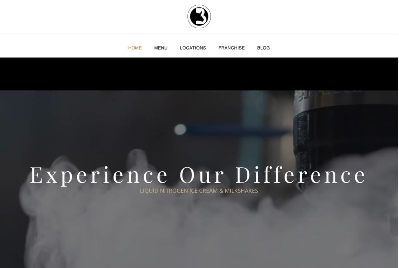
Buzzed Bull Creamery sells liquid-nitrogen ice cream and milkshakes, and its hero leads with the show: a dark, cinematic still of nitrogen fog rolling over the counter under the serif line 'Experience Our Difference.' It's an unusual register for a dessert shop — closer to a cocktail bar than a creamery — and that's the positioning: made-to-order theatre for adults (the 'buzzed' menu includes alcohol-infused options), not a kids' scoop counter. The restraint has a lesson in it: when your process is genuinely different, the process is the hero image, and mystique can out-market sprinkles. The 'Who We Are' section then explains the nitrogen craft plainly, cashing the intrigue the fog created.

Sunroot Juicery — Juice Bar website design you can build with Zarla
Build this with Zarla
  • Juice Bar
  • Wholesome

Sunroot Juicery: Fresh as a feeling, collaged

Sunroot Juicery is Zarla's juice-bar template, and its image-collage hero makes the right promise: 'Fresh Is a Feeling' over a warm arrangement of juice photography, in a leaf-green and citrus-orange palette that stays literal to the product the way the best sites in this gallery do. The collage format matters for this trade — juice is visual variety (color is the menu), and a single hero photo can't show the rainbow the cooler holds. Below, the structure carries a menu with per-item imagery and an order-forward flow. It reads farm-stand wholesome rather than franchise-slick, which suits the local juice bar competing on freshness. Clone it, drop in your own cups, and it's live in about 30 seconds.

See this template

Frequently asked

Where can I find good juice bar website examples?

Right here — this page curates juice bar website examples two ways: standout real businesses (each linked, so you can explore the live site) and professionally designed Zarla templates you can clone and make your own. Every example comes with a note on why the design works — trust signals, layout, calls to action — so you can copy the move, not just the look.

What makes a good juice bar website?

A good juice bar website earns trust in the first few seconds, leads with strong visuals of the work, gives visitors one obvious action, and loads fast on a phone. Every design below leads with proof and a single clear call to action rather than a wall of text.

How much does a juice bar website cost?

A custom juice bar website from a designer typically runs into the thousands up front, and template builders charge roughly $16–$30 per month. An AI builder generates a complete, editable design for free and only charges (on the Premium plan) when you publish to your own domain — so you can build and preview before spending anything.

Do I need a designer to build a juice bar website?

No. Several designs on this page were generated by Zarla and are fully editable — you describe your business and get a complete, professionally designed site in about 30 seconds, then refine it by chatting. Building and previewing is free; publishing to your own domain needs the Premium plan.

What pages does a juice bar website need?

Most juice bar businesses need just a few: a home page that proves trust and points to one clear action, an about page that puts a face to the business, a services or work page that shows what you do, and a contact page with a form and a phone number. Local businesses also benefit from location or service-area pages that help them show up in nearby searches.

How do I get more customers from my juice bar website?

Lead with proof in the first few seconds (reviews, real photos, results), make one action obvious on every screen (call, book, or enquire), and keep it fast on mobile — most visitors arrive on a phone. The designs above each do this differently, but they all earn trust early and remove friction from the next step.

You've seen what works. Now make it yours.

Describe your business and Zarla designs a complete, professional website in about 30 seconds — built to convert, just like the ones above.

Free to build and preview · no credit card · publish to your own domain on Premium