Inspiration · Junk Removal

The Best Junk Removal Website Examples, Explained

Junk removal websites have one job before anything else: convince someone who dreads the clutter that you'll make it disappear fast, fairly, and without hassle. These are some of the best junk removal website designs we could find — a mix of standout national haulers, eco and dumpster specialists, and designs you can build with Zarla — and we break down the specific move that makes each one win bookings. Look for the patterns that repeat: a single low-friction action (check availability, get an instant price, book online), proof at scale (huge review counts, real crews), and a clear reason to pick you. Then make any of the Zarla designs yours, free, in about 30 seconds.

Real sites + designs you can build with Zarla — free to build and preview, no credit card

What makes a great junk removal website

The best junk removal sites share a few moves: they promise effortlessness and remove the 'call for a quote' friction with instant or upfront pricing, they prove trust at scale (Google ratings, real crew photos, huge review counts), and they give one clear reason to choose them — fair 'pay for the space' pricing, an eco or donation mission, veteran ownership, or white-glove service. The category defaults to green and the same truck-and-crew photo, so the ones that win often break that mold. Each example below calls out the specific choice worth stealing for your own junk removal website.

1-800-GOT-JUNK? website — Full-Service Junk Removal design example
Real site
  • Full-Service Junk Removal
  • Trusted
  • Green + blue

1-800-GOT-JUNK?: Sell the customer zero effort

1-800-GOT-JUNK? built a category leader on one promise: you do nothing. The hero crew is photographed mid high-five in crisp blue uniforms, the headline reads 'We make junk disappear,' and the subhead spells out the entire value proposition in five words — 'All you have to do is point.' On a clean green-and-blue, Roboto-set layout, the only thing it asks of a visitor is a zip code to check availability. Backing it is staggering proof: a 4.98 rating from over 724,000 verified reviews. For a service people dread dealing with, the winning move isn't listing what you haul — it's promising effortlessness and proving it at scale.

  • 'All you have to do is point' sells effortlessness, not a service list
  • A zip-code availability check is the lowest-friction hero CTA
  • 724,000+ verified reviews is trust at a scale rivals can't fake

Steal this: Sell the outcome — effortlessness — not the list of what you haul.

LoadUp website — On-Demand Junk Removal design example
Real site
  • On-Demand Junk Removal
  • Modern
  • Lime green

LoadUp: Upfront online pricing kills 'call for a quote'

LoadUp drops the biggest friction point in junk removal — the dreaded 'call for a quote' — and makes instant, upfront online pricing the entire pitch. The hero, 'On-Demand Junk Removal,' pairs a fair-pricing promise ('simple, fast, and fair solutions for everyday life transitions') with a surprising visual: a retro TV illustration instead of the usual truck-and-crew photo, which makes a commodity service feel like a modern tech brand. Lime-green pill buttons, a custom 'LoadUp Pro' typeface, and an 'as featured in Inc and Forbes' strip reinforce the polish, with 200,000+ reviews for proof. Productising a quote into instant online pricing — and dressing the brand like software, not a hauler — is how LoadUp stands apart in a sea of crews and trucks.

  • Instant upfront online pricing removes the 'call for a quote' barrier
  • A retro-TV illustration makes a commodity service feel like a tech brand
  • A custom typeface + press logos signal modern polish
Heartwood Estate Cleanouts — Estate Cleanouts website design you can build with Zarla
Build this with Zarla
  • Estate Cleanouts
  • Compassionate
  • Cream + sage

Heartwood Estate Cleanouts: Empathy as the entire positioning

Heartwood Estate Cleanouts is Zarla's estate-cleanout template, and it proves junk removal doesn't have to shout. Where the rest of the category leads with speed and price, Heartwood leads with feeling: a warm cream-and-sage palette, a soft photo of a lived-in living room, and the headline 'A Gentle Hand Through a Hard Transition.' The copy names the real moments — settling a loved one's estate, helping a parent downsize — and promises patience, discretion, and 'never rushing you through it,' with trust chips like 'keepsakes always set aside.' For a buyer in grief or overwhelm, that tone IS the sale; a 'same-day, flat price' pitch would actively repel them. Describe your service and you can build this empathetic, consultation-led site, fully editable, in about 30 seconds.

  • A warm palette + gentle copy fit a grieving or overwhelmed buyer
  • Naming the real moment (downsizing, loss) builds instant trust
  • 'Keepsakes set aside' turns discretion into a selling point
See this template
College HUNKS Hauling Junk website — Junk + Moving design example
Real site
  • Junk + Moving
  • Playful
  • Orange + green

College HUNKS Hauling Junk: Bundle junk with moving — and a mission

College HUNKS Hauling Junk does two things most haulers don't. First, it bundles junk removal with moving under one playful, high-energy brand — condensed display type, an orange-and-green palette, and the line 'Make room for things that really matter' that reframes hauling as life improvement, not chore. Second, it bakes social good into the model: every service donates meals, and up to 70% of junk is recycled. Three clear cards (find a location, see pricing, get a quote) route visitors fast. Across 200+ locations, that combination of an energetic brand, a two-service offer, and a give-back mission is what makes College HUNKS memorable in a category of interchangeable trucks.

  • Bundling junk + moving doubles the reasons to call
  • A donate-a-meal mission makes a commodity brand likeable
  • Playful condensed type stands out among generic haulers

Steal this: Personality plus a real mission turns a commodity into a brand people root for.

Junk King website — Full-Service + Dumpster design example
Real site
  • Full-Service + Dumpster
  • Bold
  • Red + green

Junk King: Make your pricing model the pitch

Junk King turns a pricing detail into its whole competitive argument. On a red-green-and-dark, Inter-set layout, the hero ('#1 Rated Junk Removal Services') leans on a precise, enormous trust number — 337,257 customers, 5/5 — and the differentiator surfaces fast: bigger trucks, and 'we only charge for the space your junk takes up.' That single fairness promise answers the customer's quiet fear of being overcharged for a half-empty truck. A dismissible 'save $20' bar nudges online booking, and three modes (full-service, dumpster rental, dumpster-bag) cover every job size. Eco credentials (up to 60% recycled) round it out. If your pricing model is genuinely fairer, say so in the hero — Junk King makes 'only pay for the space you use' the reason to choose it.

  • 'Only pay for the space you use' answers the overcharge fear
  • A precise customer count (337,257) reads truer than '500+'
  • Three service modes cover every job size
Stand Up Guys website — Full-Service Junk Removal design example
Real site
  • Full-Service Junk Removal
  • Bold
  • Navy + yellow

Stand Up Guys: Break the category's color rule

Stand Up Guys makes a deliberate design choice that pays off instantly: it refuses the green every other junk-removal brand defaults to. A confident blue-navy-and-yellow palette with oversized, bold display typography makes 'Full-Service Junk Removal Company' feel like a statement, not a tagline — and in a search full of near-identical green trucks, that contrast alone earns a second look. A persistent navy booking bar pinned to the bottom of the screen keeps 'Book Online Today' one tap away no matter how far you scroll. When a whole category converges on the same look, the cheapest way to stand out is to break the color convention on purpose — Stand Up Guys proves distinctiveness can be a palette decision.

  • A non-green palette stands out in a green-saturated category
  • Oversized display type makes the brand feel confident
  • A sticky bottom booking bar keeps the CTA always in reach

Steal this: When a category converges on one look, break the color convention on purpose.

The Junkluggers website — Eco Junk Removal design example
Real site
  • Eco Junk Removal
  • Fresh

The Junkluggers: Make eco the brand, not a footnote

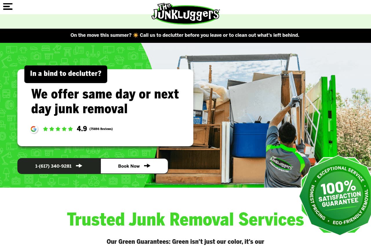
The Junkluggers builds its identity on the one thing most haulers treat as fine print: where your stuff actually goes. A bright-green, BentonSans layout leads with same/next-day convenience ('In a bind to declutter?'), but the spine of the brand is a 'Green Guarantee' to donate and recycle whenever possible, backed by charity partnerships and a 100% satisfaction badge right in the hero. A 4.9 rating from roughly 76,000 reviews proves the eco promise hasn't cost them on service. For the customer who feels guilty sending a truckload to landfill, that mission is the deciding factor. The Junkluggers shows that owning the eco-and-donation angle as your core brand — not a sustainability page nobody reads — is a genuine differentiator.

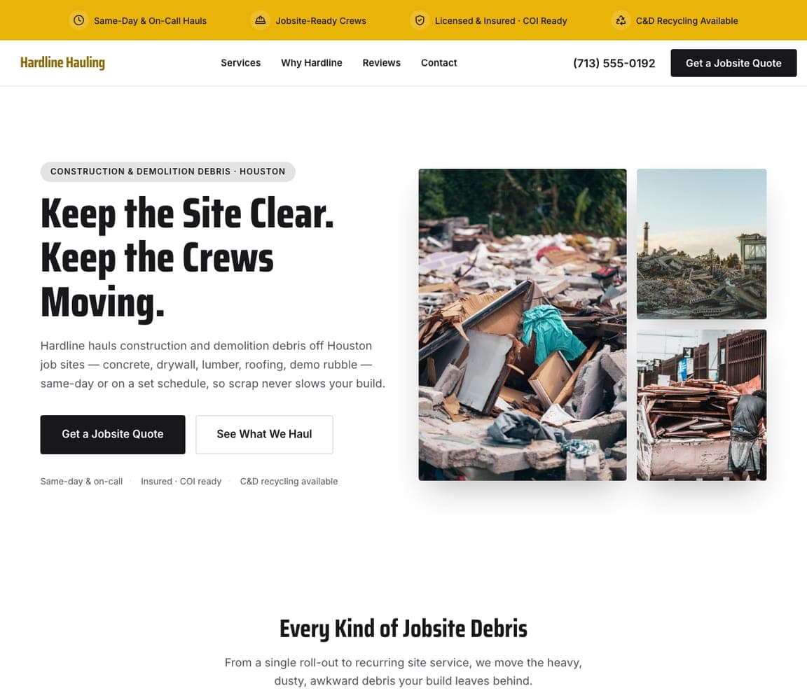
Hardline Hauling — Construction Debris website design you can build with Zarla
Build this with Zarla
  • Construction Debris
  • Rugged

Hardline Hauling: A B2B hauler needs a B2B site

Hardline Hauling is Zarla's construction-debris template, and it speaks to a completely different buyer than the homeowner sites around it — the general contractor who needs scrap gone before it slows the build. The headline says it in their language: 'Keep the Site Clear. Keep the Crews Moving.' A clean black-and-white layout with an orange trust strip (same-day & on-call, jobsite-ready crews, licensed & COI-ready, C&D recycling) names exactly what a builder checks before hiring, and the gritty grid of real debris photos signals 'we handle the heavy, dusty stuff.' The CTA is 'Get a Jobsite Quote,' not 'book online.' It's proof that a B2B niche needs B2B language and trust signals, not consumer polish. Build it in about 30 seconds.

See this template
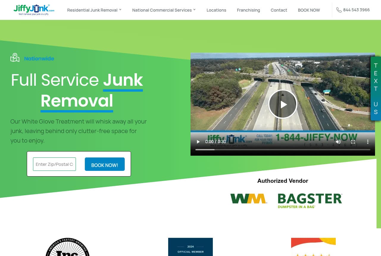
Jiffy Junk website — Full-Service Junk Removal design example
Real site
  • Full-Service Junk Removal
  • Premium

Jiffy Junk: Premium framed as 'white glove'

Jiffy Junk reaches for the premium end of a budget-driven category with two words: 'White Glove Treatment.' On a restrained grey-and-blue, Poppins-and-Manrope layout, a video hero shows the service in motion while the copy promises fully licensed, insured teams who handle everything — office cleanouts, garage declutter — so the customer lifts nothing and worries about nothing. Tree-planting partnerships and a 'WM Bagster authorized vendor' badge add credibility. Where rivals compete on speed and price, Jiffy Junk competes on effortless, done-for-you polish — a positioning that justifies a higher rate to a busy or higher-income customer. A premium frame and a calm, restrained design can lift a commodity service out of the price war.

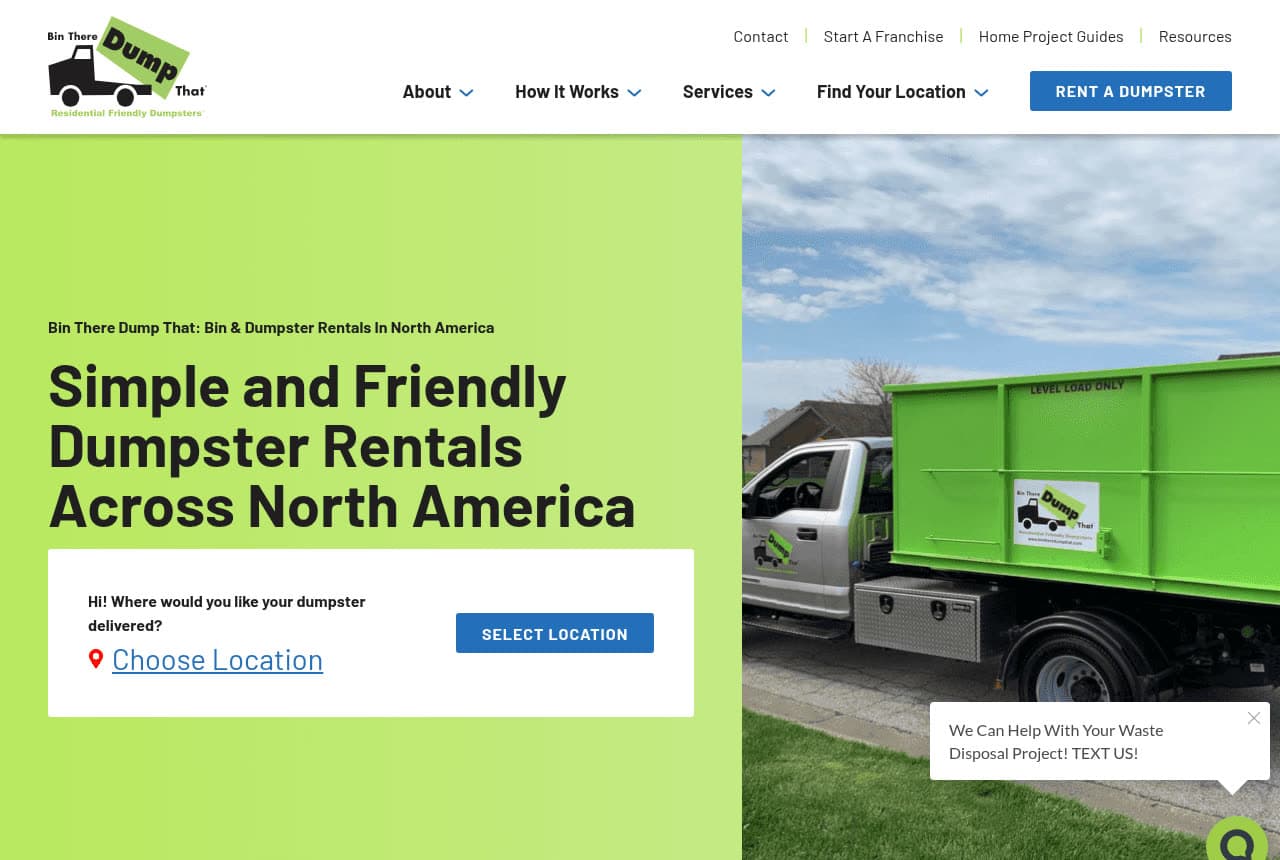
Bin There Dump That website — Dumpster Rental design example
Real site
  • Dumpster Rental
  • Friendly

Bin There Dump That: Sell DIY dumpsters as homeowner-friendly

Bin There Dump That carves out the DIY corner of junk removal — you fill it yourself — and wins by making industrial dumpsters feel residential. The hero, 'Simple and Friendly Dumpster Rentals Across North America' on a lime-green panel, leans on the word 'friendly,' and the differentiators are all about not wrecking your property: walk-in double doors so you don't heave junk over a wall, driveway-protection boards, and spotlessly clean bins. The booking flow is refreshingly literal — a location-selector that just asks where to deliver. For homeowners intimidated by a contractor-grade roll-off, that residential-friendly framing is the whole pitch. Bin There Dump That proves you can win a sub-niche by softening an industrial product for a gentler buyer.

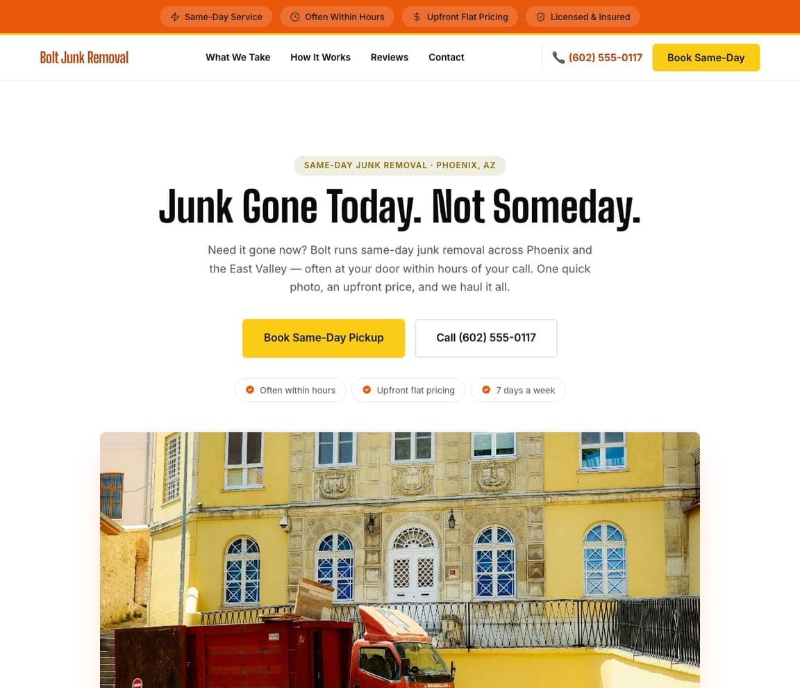
Bolt Junk Removal — Same-Day Junk Removal website design you can build with Zarla
Build this with Zarla
  • Same-Day Junk Removal
  • Energetic

Bolt Junk Removal: When speed is the whole product

Bolt Junk Removal is Zarla's same-day template, and it commits entirely to one promise: now. The headline is a tidy piece of positioning — 'Junk Gone Today. Not Someday.' — and the subhead doubles down ('often at your door within hours of your call'). A high-energy yellow-and-red palette signals urgency the way a budget full-service site never could, and the offer is stripped to the essentials a panicked customer wants: one quick photo, an upfront price, same-day pickup, seven days a week. The CTAs are 'Book Same-Day Pickup' and a phone number — no quote form to slow things down. For the customer who needs it gone before guests, a closing, or an inspection, speed is the entire value. Build this urgency-led site in about 30 seconds.

See this template
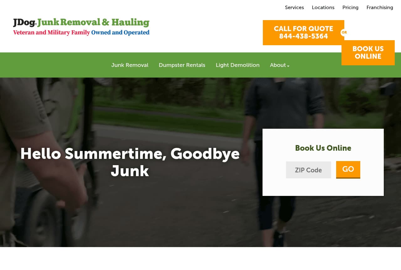
JDog Junk Removal & Hauling website — Veteran-Owned Junk Removal design example
Real site
  • Veteran-Owned Junk Removal
  • Trustworthy

JDog Junk Removal & Hauling: A values brand built on veteran-owned

JDog Junk Removal & Hauling turns one fact into an entire identity: every operator is a Veteran or military family member. The military green-and-orange palette, the service ethos ('hard work, dedication and service'), and the name itself all reinforce it — so a customer choosing JDog feels they're supporting veteran business ownership, not just clearing a garage. Practical signals back the brand: recycling 60-80%, transparent pricing by weight and volume, and add-on lines (dumpster rentals, light demolition) that widen the offer. A sticky 'Book Us Online' tab keeps conversion close. For a buyer who wants their money to mean something, that values alignment is a real tiebreaker. JDog shows a single authentic story — who you are — can be the whole differentiator.

Mammoth Heavy Removal — Heavy & Large-Item Removal website design you can build with Zarla
Build this with Zarla
  • Heavy & Large-Item Removal
  • Bold

Mammoth Heavy Removal: Own the jobs everyone else refuses

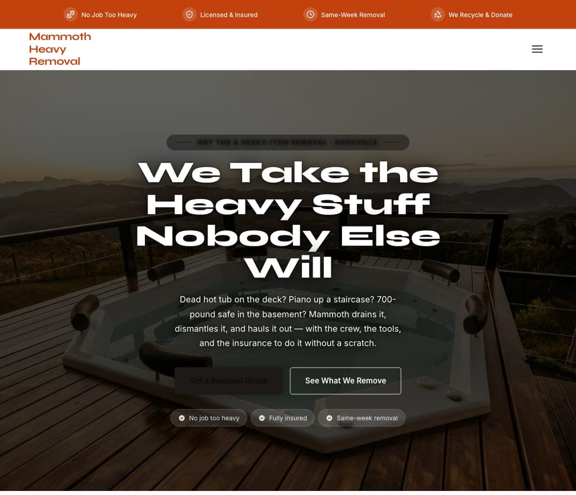
Mammoth Heavy Removal is Zarla's hot-tub-and-large-item template, and it wins by claiming the jobs other haulers turn down. On a dark, dramatic theme that signals serious capability, the headline is a flat-out challenge — 'We Take the Heavy Stuff Nobody Else Will' — and the positioning is the whole strategy: hot tubs, pianos, safes, gym equipment, the awkward, back-breaking items a standard crew won't touch. By specialising in the hard stuff, Mammoth skips the price war over easy garage cleanouts and commands a premium for expertise and the right equipment. The dark palette reinforces 'we handle what others can't.' It's proof that niching into the difficult jobs — not the common ones — can be a stronger, less crowded position. Build it in about 30 seconds.

See this template
Greenbarrow Yard Removal — Yard & Green Waste website design you can build with Zarla
Build this with Zarla
  • Yard & Green Waste
  • Natural

Greenbarrow Yard Removal: A photo-led pitch to homeowners' weekends

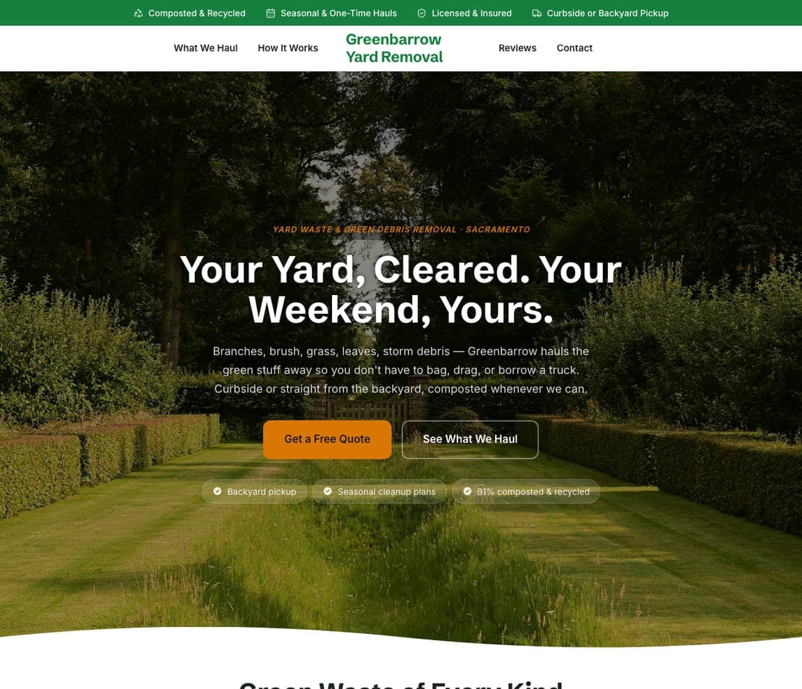
Greenbarrow Yard Removal is Zarla's yard-and-green-waste template, and it sells a feeling more than a service: your Saturday back. The hero, 'Your Yard, Cleared. Your Weekend, Yours,' sits over a lush, sunlit garden photo rather than the usual truck-and-crew shot, so the page feels green, natural, and outdoorsy — instantly on-theme for branches, leaves, soil, and old fencing. It's a smart reframe: the homeowner isn't buying 'green-waste hauling,' they're buying a free weekend and a yard they can enjoy. The seasonal, outdoor positioning carves out a niche distinct from the indoor-clutter haulers. A photo-led hero matched to the actual job — here, a beautiful yard — and an outcome-led headline can out-sell a generic service list. Buildable in about 30 seconds.

See this template
Turnkey Property Cleanouts — Foreclosure & REO Cleanouts website design you can build with Zarla
Build this with Zarla
  • Foreclosure & REO Cleanouts
  • Professional

Turnkey Property Cleanouts: Speak to realtors, not homeowners

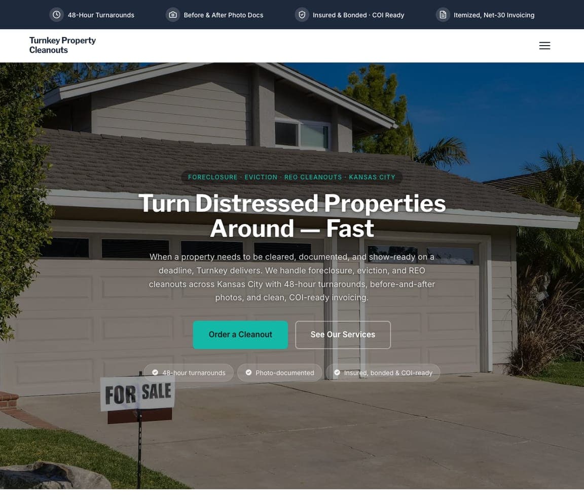
Turnkey Property Cleanouts is Zarla's foreclosure-and-eviction template, and it targets a buyer the consumer haulers ignore entirely: realtors, property managers, and banks who need a distressed property emptied and rent-ready fast. The headline is in their language — 'Turn Distressed Properties Around — Fast' — and the page leads with the metrics that buyer cares about (a stats row: jobs completed, rating, tonnage hauled, partners served) rather than warm storytelling. For a recurring B2B client, reliability and turnaround time are the product, so the design reads professional and proof-heavy. It shows that a junk-removal business can build an entire, higher-margin line around one B2B niche by speaking its language and leading with performance numbers. Build it in about 30 seconds.

See this template

Frequently asked

What should a junk removal website include?

At minimum: a single low-friction action up top (check availability, get an instant price, or book online), a clear list of what you take and your service area, genuine reviews or a Google rating, real photos of your crew and trucks, and your pricing approach. Notice how the designs below lead with one obvious next step rather than burying it under paragraphs — for a service people dread, removing friction is the whole game.

What makes a good junk removal website design?

A good junk removal website makes the job feel effortless and the booking feel instant. The best ones promise to do the work for you ('all you have to do is point'), kill the 'call for a quote' friction with upfront or instant online pricing, and prove trust at scale with big review counts and real crew photos. Most of the category defaults to green and an identical truck photo, so the standouts often win by breaking that mold — a different palette, a clearer pricing promise, or a sharper mission.

How much does a junk removal website cost?

A custom junk removal website from a designer typically runs $2,000–$8,000 up front, and template builders like Wix or Squarespace charge roughly $16–$30 per month. An AI builder generates a complete, editable junk removal site for free and only charges (on the Premium plan) when you publish to your own domain — so you can build and preview the whole thing, service list and booking flow included, before spending anything.

Should I show junk removal prices on my website?

Showing how you price is one of the strongest moves you can make — and several designs above prove it. 'Call for a quote' is the biggest friction point in junk removal; an instant online price, an upfront flat price, or even a clear 'you only pay for the space you use' explanation lets customers self-qualify and book without a phone call. Exact prices vary by volume, but explaining your pricing model removes the fear of being overcharged that stops most bookings.

How do I get more junk removal bookings from my website?

Make one action obvious on every screen — check availability, get an instant price, or book online — and back it with proof: a Google rating, real crew photos, and a big review count. Reduce the customer's effort to almost nothing ('just point, we do the rest'), and give one clear reason to choose you over the identical green truck down the street, whether that's fair pricing, same-day speed, an eco mission, or veteran ownership. The designs above each pick one of those and lead with it.

What's the best way to stand out as a junk removal company online?

Pick one genuine differentiator and build the whole site around it. The standouts above each own a single angle — effortless 'we do the rest' service, instant upfront pricing, an eco or donation mission, veteran ownership, white-glove premium, or same-day speed — rather than claiming to be everything. Because the category is saturated with near-identical green truck-and-crew sites, even a design choice as simple as a non-green palette or oversized type can earn the second look that wins the booking.

You've seen what works. Now make it yours.

Describe your business and Zarla designs a complete, professional website in about 30 seconds — built to convert, just like the ones above.

Free to build and preview · no credit card · publish to your own domain on Premium