Inspiration · Laundromat

The Best Laundromat Website Examples, Explained

These are the best laundromat website designs we could find — real laundromats, wash-and-fold counters and laundry-delivery brands, plus designs you can build with Zarla — and each one comes with a breakdown of the specific move that makes it work. Laundry is a low-margin, high-frequency business, so the website's job is narrow: prove the store is clean and staffed, say what a load costs, and make the next step obvious, whether that is driving over, dropping off, or booking a pickup. Find a look you like and you can build a site in that exact style, free, in about 30 seconds.

Real sites + designs you can build with Zarla — free to build and preview, no credit card

What makes a great laundromat website

The best laundromat websites answer four questions fast: where you are and when you are open, what a wash costs, whether someone is on the floor, and how to hand over laundry without coming in. Notice how many of the examples below put an address, a rating or a booking field inside the hero itself — laundry customers decide in seconds, usually on a phone, often while standing next to a machine that just died at home. Each note calls out the one choice worth stealing for your own laundromat website.

Spin Laundry Lounge website — Eco Laundromat design example
Real site · Portland, OR
  • Eco Laundromat
  • Welcoming
  • Industrial grey

Spin Laundry Lounge: The store itself as the hero shot

Spin Laundry Lounge does the one thing most laundromat sites will not: it shows you the room. The hero is a full-bleed photograph of the actual Portland store — a draped ceiling, exposed beams, red pendant lights, a café corner of chairs and benches at tables on the left and a customer bent over a cart on the right — with the headline set straight on top of it in heavy slab type. For a business whose product is partly an hour of your time spent somewhere, that photograph answers the only question that matters: is this a place I want to sit? Both store addresses and the email sit in the hero underneath it, so a nearby customer never has to hunt for a contact page.

  • A real interior photo answers “would I sit here?”
  • Both addresses live in the hero, not a contact page
  • Heavy slab type stays readable over a busy photo

Steal this: If customers spend an hour on your premises, photograph the premises — not a stock washing machine.

Visit Spin Laundry Lounge

Opens a similar Zarla design you can make yours.

Sunshine Laundromat website — Laundromat Bar design example
Real site · Brooklyn, NY
  • Laundromat Bar
  • Playful
  • Navy + purple

Sunshine Laundromat: A laundromat that leads with pinball

Sunshine Laundromat sells the side of the business nobody expects. The nav reads PINBALL, BEERS, EVENTS, SHOP — washing is not in it at all — and the deep-navy page is drawn like an arcade cabinet: a hand-brushed wordmark with a sun beside it, a purple line illustration of two dogs clinking cups over a laundry basket, pinball flippers rising from the bottom edge, and a cart counter rendered in pixel-LED red. It is a working Greenpoint laundromat with self-serve machines running late, but the site is organized around the thing customers tell their friends about. If your business has a second, more interesting story — a café, an arcade, a garden — let that one lead, because it is what gets the site shared.

  • The nav leads with pinball, not washing machines
  • A hand-drawn illustration beats another photo of machines
  • Pixel-LED details carry the arcade theme into the interface
Visit Sunshine Laundromat

Opens a similar Zarla design you can make yours.

Celsious website — Premium Laundry design example
Real site · Brooklyn, NY
  • Premium Laundry
  • Modern
  • Marigold + white

Celsious: A branded cargo bike doing the advertising

Celsious turns its delivery vehicle into the advertisement. The hero is a photograph of the company's cargo bike parked against a red-brick Brooklyn rowhouse, its side panels printed with the offer itself — laundry pickup and delivery, book now or download the app — so the picture carries the pitch and the headline beside it only has to say “Hassle-free laundry pickup and delivery”. Everything else is restrained: a near-white page, black text, one marigold button, and a nav that quietly separates the NYC laundry services from the shop where the founders sell their own detergent. It is proof that a premium feel comes from removing decoration rather than adding it, and that your van or bike is free advertising you already own.

  • The delivery bike does the advertising in the hero
  • One accent color on a near-white page reads premium
  • A shop in the nav turns a service into a brand

Steal this: Photograph your branded van or bike — it is advertising you have already paid for.

Visit Celsious

Opens a similar Zarla design you can make yours.

Columbia Pike Laundry website — Pickup & Delivery design example
Real site · Arlington, VA
  • Pickup & Delivery
  • Friendly
  • Charcoal + blue

Columbia Pike Laundry: The weekend, not the wash, is the promise

Columbia Pike Laundry writes its headline for Google and its subhead for the human. “Laundry & Dry Cleaning Pickup and Delivery Arlington, VA” is the literal search phrase, and directly beneath it “Your Laundry Done. Your Weekend Back.” sells the outcome — a split that lets one hero do both jobs without sounding like either. The photograph behind it is a family rather than a machine, scrimmed dark so the white text stays readable, and the proof sits immediately under the buttons: 4.7 out of 5 from 350+ local families. A hand-lettered wordmark keeps a delivery service feeling like the neighborhood shop it is rather than an app.

  • The H1 is the search phrase; the subhead sells the outcome
  • Rating and same-day pickup sit right under the buttons
  • A hand-lettered mark keeps a delivery service local
Visit Columbia Pike Laundry

Opens a similar Zarla design you can make yours.

Nightbourne 24 Hour Laundry — 24 Hour Laundromat website design you can build with Zarla
Build this with Zarla
  • 24 Hour Laundromat
  • Bold
  • Charcoal + lime

Nightbourne 24 Hour Laundry: Built for the shift that ends at midnight

Nightbourne picks one customer — the person whose shift ends at midnight — and builds the hero around them. The photograph is the aisle itself, desaturated to near black and white, with one acid lime running through the overline strip, the words “24 Hour”, the primary button and the header's Ask A Question. The subhead spends one clause on facts (fifty-two machines, lit and staffed every hour of every day) and the rest on a moment — your shift ends at midnight, or your machine died on a Sunday. Four chips then answer what a 2am customer worries about: a Google rating, open 365 days, attended overnight, card and contactless. A narrow promise beats a broad one, and a dark page reads as “open late” without saying so.

  • One acid accent on a near-monochrome photo directs the eye
  • The subhead names a moment, not a feature list
  • Chips answer what a 2am customer worries about

Steal this: Write your subhead for one specific customer at one specific hour.

See this template
The Eco Laundry Company website — Eco Dry Cleaning design example
Real site · New York, NY
  • Eco Dry Cleaning
  • Editorial
  • Cream + neon yellow

The Eco Laundry Company: A press quote doing the persuading

The Eco Laundry Company spends its hero on one sentence and one endorsement. Huge type, light-weight except for the one word it wants you to keep, reads “Take your laundry & dry cleaning to a conscious place” — “conscious” set bold and in neon yellow, one of only two saturated marks on a bleached photograph of hands and fabric, the other a small “$5 FOR YOU” chip in the top corner. Down in the corner, set small, is a pull quote: “Pioneers of Eco-Friendly Laundry”, credited to Bloomberg Businessweek. Third-party praise inside the hero, rather than a logo strip further down, is the move worth stealing: it convinces before any claim of your own is made. A thin clothespin logo with the nav split either side keeps the page reading like a magazine cover.

  • Neon yellow on a bleached photo is the entire palette
  • A press quote in the hero out-persuades a logo strip
  • Splitting the nav around the logo reads editorial
Visit The Eco Laundry Company

Opens a similar Zarla design you can make yours.

Windy City Wash House website — Self-Service Laundromat design example
Real site · Chicago, IL
  • Self-Service Laundromat
  • Modern

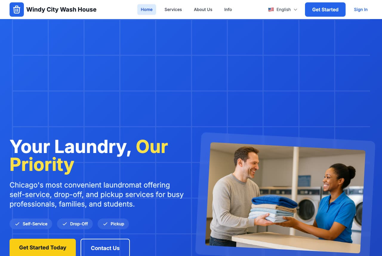
Windy City Wash House: Three service chips that route every visitor

Windy City Wash House solves the problem every laundromat site has — three different jobs arriving on one page — with three chips. Self-Service, Drop-Off and Pickup sit as white check pills directly under the subhead, so a visitor picks their own in a second, before any scrolling. The rest is confident and cheap to produce: a royal-blue gradient with a faint white grid instead of a photographic background, “Our Priority” picked out in yellow, and a single tilted photo card showing an attendant handing a stack of folded towels across the counter. That one image is doing real work, because it shows a person — the difference between a laundromat that folds your clothes and a room full of machines.

Visit Windy City Wash House

Opens a similar Zarla design you can make yours.

Quillon Laundry — Self-Service Laundromat website design you can build with Zarla
Build this with Zarla
  • Self-Service Laundromat
  • Modern

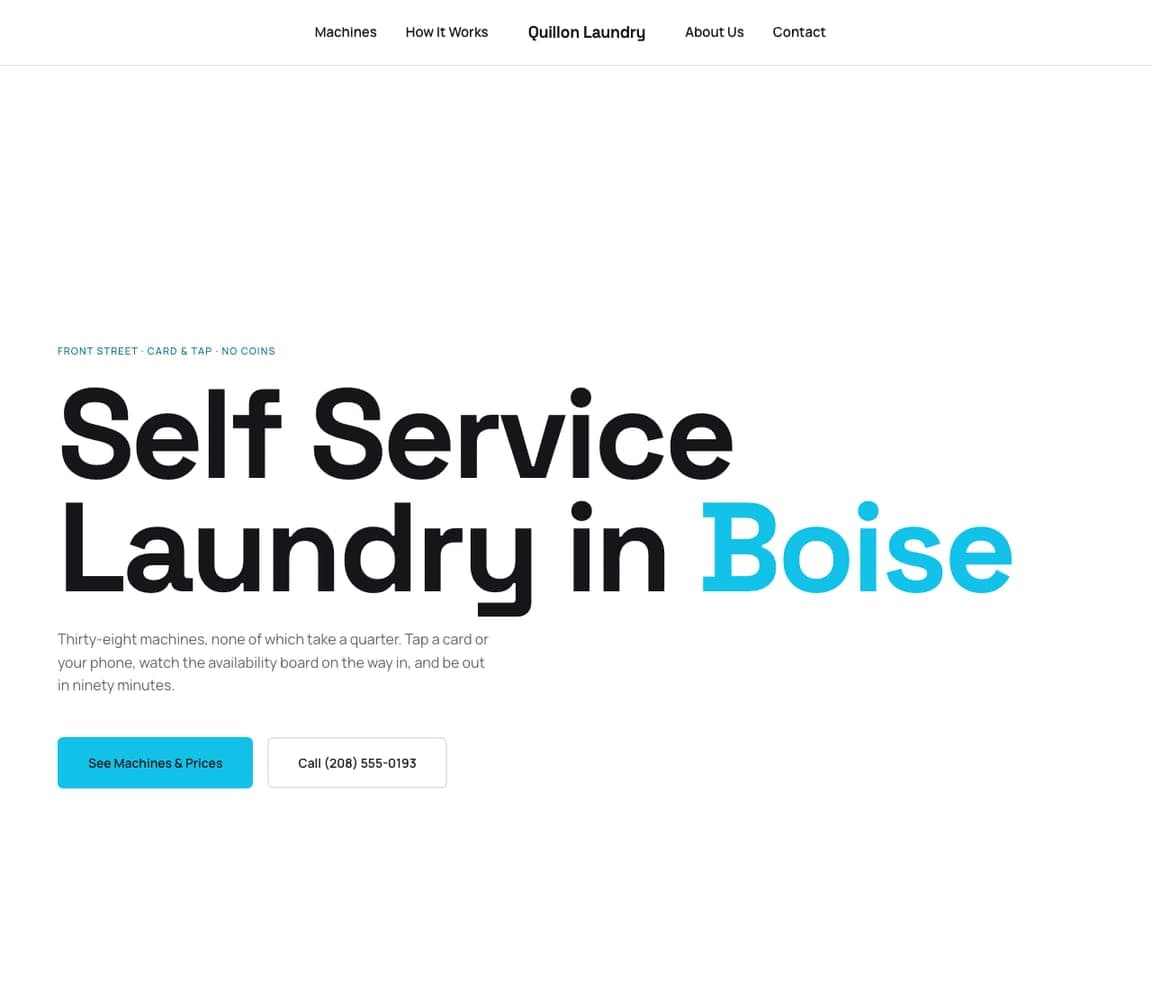
Quillon Laundry: Type so big it needs no photograph

Quillon Laundry proves a laundromat does not need a hero photograph at all. The whole top of the page is the sentence “Self Service Laundry in Boise” set enormous in black, with the city in cyan and nothing competing — no image, no gradient, just white space. The overline carries the details that would otherwise clutter the headline (the street, card and tap, no coins), and the subhead makes a promise a coin laundry cannot: thirty-eight machines, none of which take a quarter, an availability board to check on the way in, and out in ninety minutes. For an owner without good photographs of their store, this is the honest answer — scale the words up instead of scaling a bad picture up.

See this template
Rinse website — Laundry Delivery design example
Real site · United States
  • Laundry Delivery
  • Premium

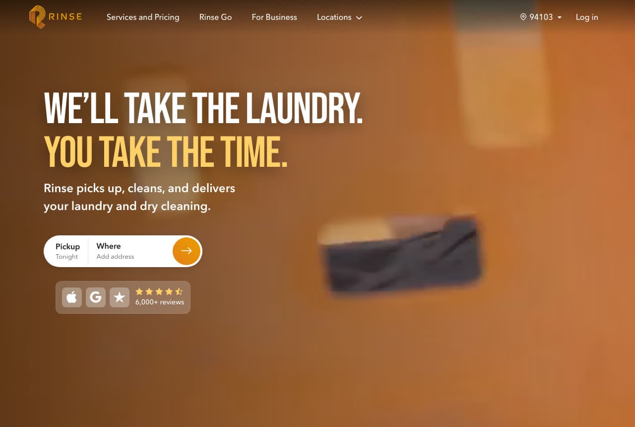
Rinse: An address field where the headline ends

Rinse puts the first step of the order inside the hero. Under “WE'LL TAKE THE LAUNDRY. YOU TAKE THE TIME.” — the second line set in gold — and a one-line promise beneath it sits a white pill holding two fields, a pickup day and an address box, with an orange arrow to submit. There is no “learn more” and no contact page in the way: the visitor types where they live and they are in the funnel. Everything around it supports that one action: a warm, deliberately blurred amber photograph that sets a mood without competing, then a badge strip of three tiles — Apple, Google, a star mark — with a 4.5-star rating and 6,000+ reviews. If you sell convenience, the website itself has to be convenient.

Visit Rinse

Opens a similar Zarla design you can make yours.

Pelliston Laundry — Family Laundromat website design you can build with Zarla
Build this with Zarla
  • Family Laundromat
  • Friendly

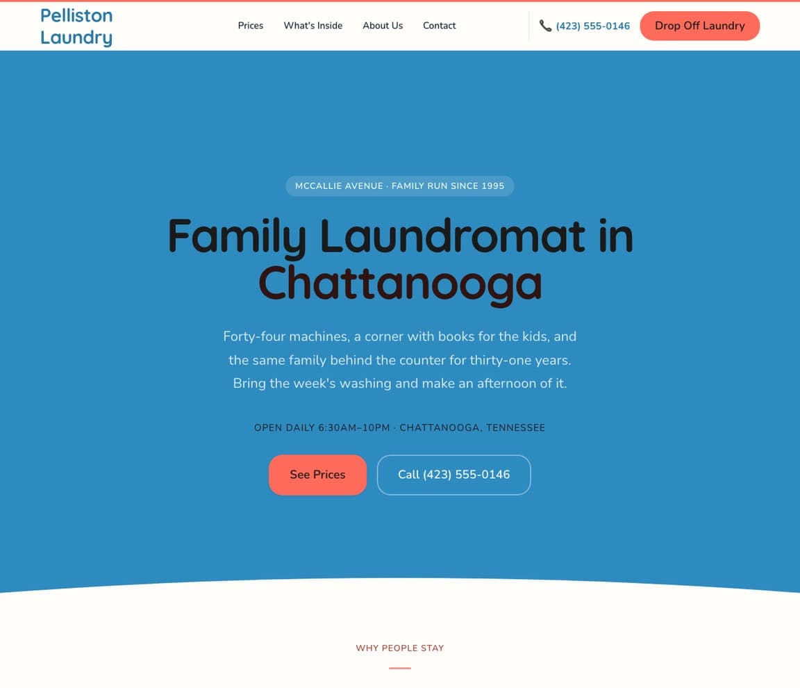
Pelliston Laundry: A family business that looks like one

Pelliston Laundry is the warmest design in this set, and the warmth is almost entirely typographic: a rounded, near-hand-drawn display face on a sky-blue field, with coral buttons that look like something you would want to press. The copy matches — forty-four machines, a corner with books for the kids, and the same family behind the counter for thirty-one years — and then invites you to “make an afternoon of it” instead of promising speed. That is a deliberate counter-position: where most laundromat sites sell getting out fast, this one sells staying, and the section heading waiting below the curved white section edge is “WHY PEOPLE STAY”.

See this template
Tide Cleaners website — Dry Cleaning design example
Real site · United States
  • Dry Cleaning
  • Professional

Tide Cleaners: The app screen is the product shot

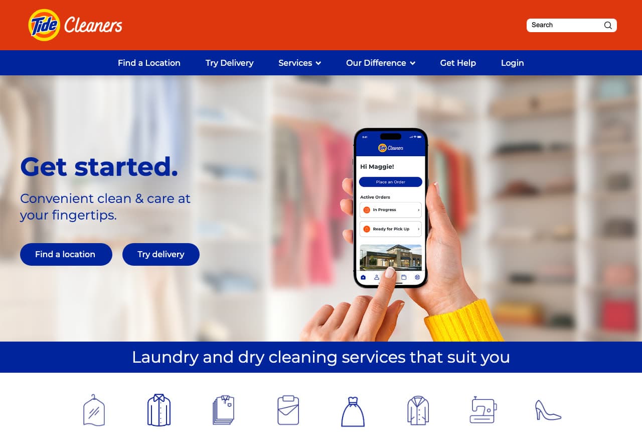
Tide Cleaners shows the app instead of describing it. The hero photograph is a hand holding a phone with the real order screen on it — a greeting by name, a Place an Order button, and two live orders marked In Progress and Ready for Pick Up — so the promise beside it, “Convenient clean & care at your fingertips”, is demonstrated rather than claimed. Behind the phone, a closet of hanging clothes is thrown far out of focus so the screen stays the subject. The brand does the rest: the familiar orange band across the top, navy everywhere else, and a row of eight thin garment icons — garment bag, dress shirt, folded stack, hamper, gown, coat, sewing machine, high heel — standing in for a paragraph of service copy.

Visit Tide Cleaners

Opens a similar Zarla design you can make yours.

Havermont Cleaners — Dry Cleaning website design you can build with Zarla
Build this with Zarla
  • Dry Cleaning
  • Elegant

Havermont Cleaners: A stats strip that answers the trust question

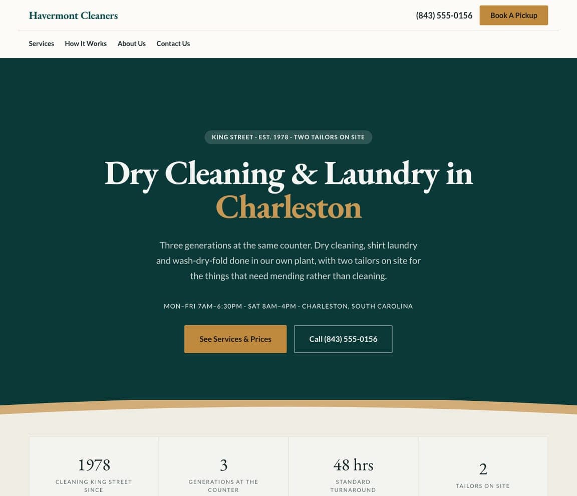
Havermont Cleaners is the design here that reads as expensive, and it gets there with two decisions: a deep forest green instead of the category's default white, and a high-contrast serif for the headline with the city set in gold. Directly under the hero, a four-column strip converts the story into numbers a customer can check — cleaning King Street since 1978, three generations at the counter, a 48-hour standard turnaround, two tailors on site. That last figure is the smartest of them, because it quietly says the mending happens in-house rather than being sent away. For a trade where the real worry is “will they ruin it?”, dates and headcounts reassure more than any adjective.

See this template
Poplin website — Wash & Fold design example
Real site · United States
  • Wash & Fold
  • Bold

Poplin: One photograph, no headline at all

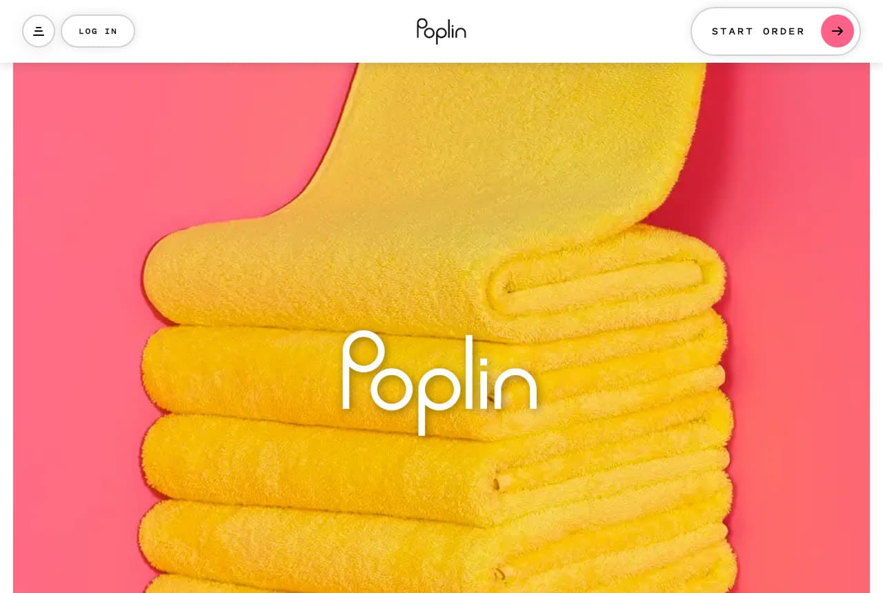
Poplin opens with no headline whatsoever — just a studio photograph of saffron-yellow towels stacked against a coral-pink background, filling the page below a slim white header band, with the wordmark set over it in thin white letters. That band is the only interface: a hamburger, a LOG IN pill, the wordmark again in black, and a single START ORDER button with a pink arrow. It is the most confident page in this gallery, and it works because the photograph is genuinely good: colors nobody else in laundry is using, styled like a fashion campaign. The lesson is not “delete your headline” — it is that one properly art-directed image can carry an entire hero, and a category full of blue and white is easy to stand out in.

Visit Poplin

Opens a similar Zarla design you can make yours.

Wrenhollow Laundry Co. — Pickup & Delivery website design you can build with Zarla
Build this with Zarla
  • Pickup & Delivery
  • Modern

Wrenhollow Laundry Co.: The booking form is the first section

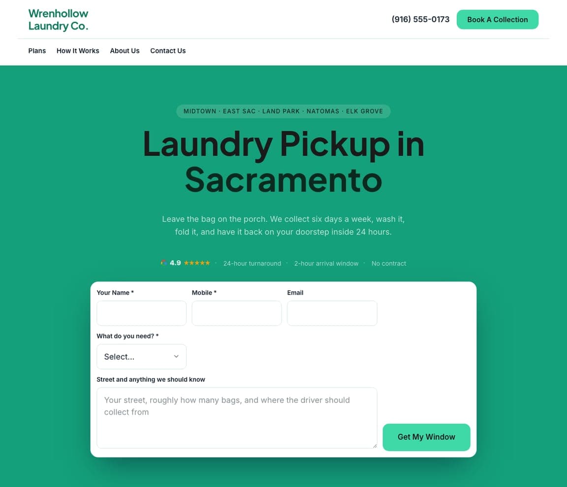
Wrenhollow Laundry Co. puts the whole booking form in the hero, and writes the form the way a person would ask. Beneath the usual name, mobile and email, its one free-text box asks for your street, roughly how many bags, and where the driver should collect from — the three answers that let the company quote and schedule off the first submission, which is why the button reads “Get My Window” rather than “Submit”. Above it, the overline lists five named neighborhoods so a Sacramento visitor knows instantly whether they are covered, and a trust row takes the objections in order: rating, 24-hour turnaround, a two-hour arrival window, no contract. The emerald field stops a form-heavy page from feeling like paperwork.

See this template
Hamperapp website — Commercial Linen design example
Real site · United States
  • Commercial Linen
  • Bright

Hamperapp: Leading with the business customer

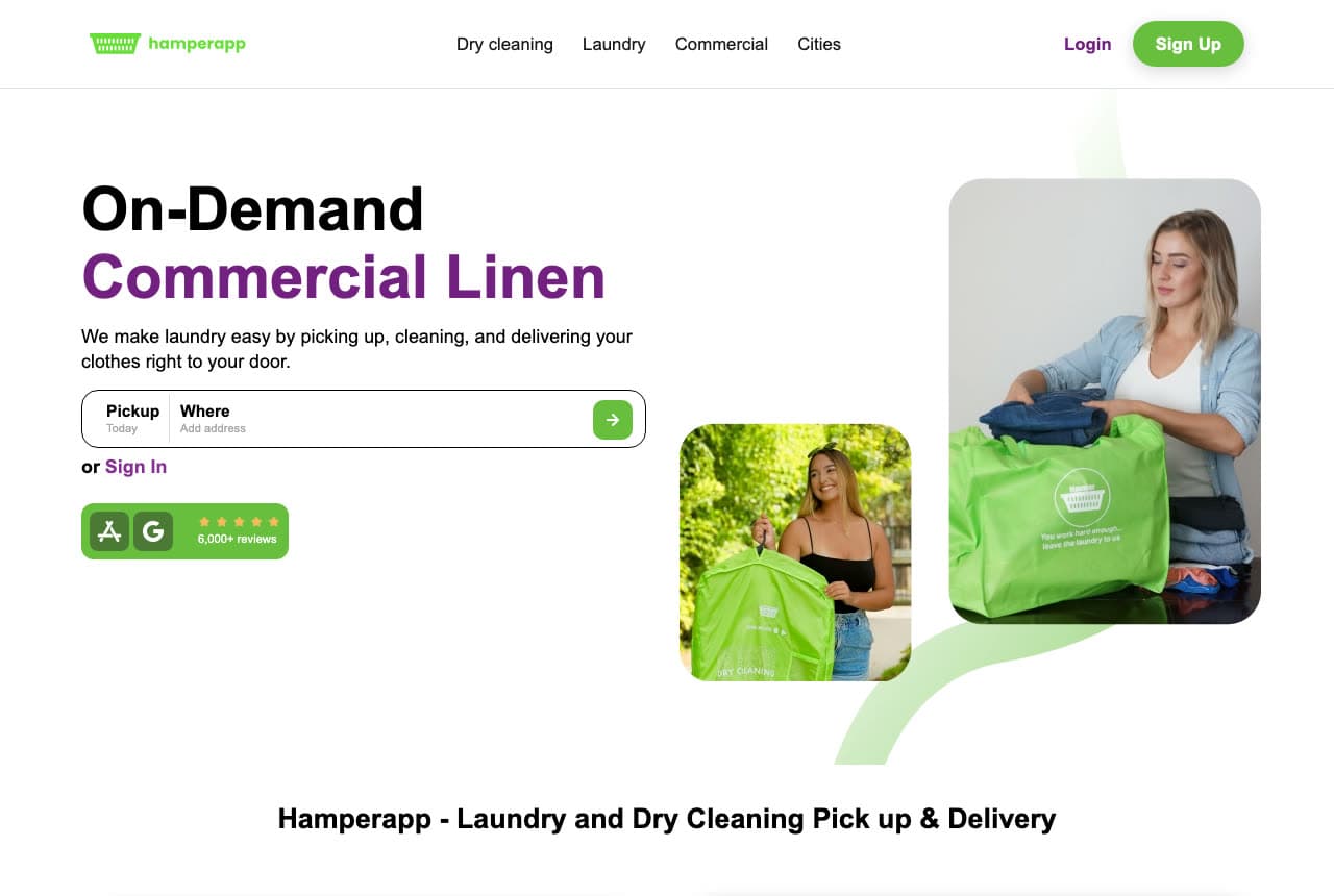
Hamperapp makes an unusual call for a consumer laundry app: the headline on its home page leads with Commercial Linen, set in purple beneath a black “On-Demand”, rather than the household wash-and-fold most of its customers buy. It is a deliberate bet that the higher-value business customer is worth the prime slot, with one address widget serving both audiences. The design leans on a single color — the signal green running from the hamper mark in the logo through the branded bags filling both photo cards — so the brand registers before a word is read. Below the address field sits a green block the width of a button: an App Store badge, a Google mark, five stars, a 6,000+ review count.

Visit Hamperapp

Opens a similar Zarla design you can make yours.

Verrimont Commercial Laundry — Commercial Laundry website design you can build with Zarla
Build this with Zarla
  • Commercial Laundry
  • Bold

Verrimont Commercial Laundry: A number that names the real risk

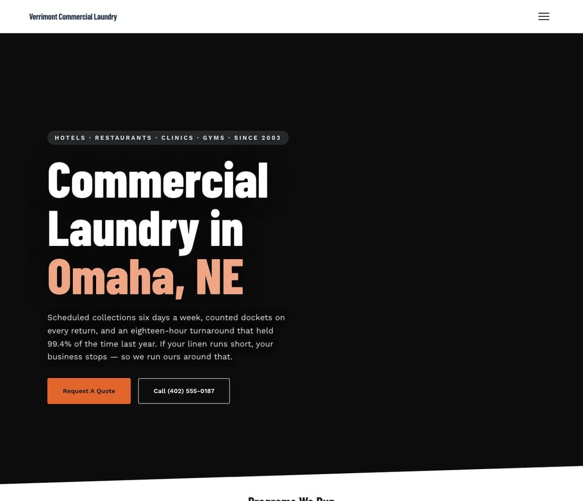
Verrimont Commercial Laundry writes for one buyer and no one else: the hotel or restaurant manager whose service stops the moment the linen runs short. The subhead says exactly that, and backs it with a figure precise enough to be real — an eighteen-hour turnaround that held 99.4% of the time last year — which persuades a business buyer far better than the word “reliable”. The design matches the audience: a black page, condensed white type with the city in coral, a hamburger in place of a nav bar, and a lead button reading Request A Quote rather than Book Now, because this sale starts with a conversation. The overline names the four industries served before you scroll.

See this template

Frequently asked

What should a laundromat website include?

At minimum: your address and hours where nobody has to hunt for them, a price list by machine size or by the pound, whether the store is attended, and the payment methods you take — coins, card, tap or app. Add pickup-and-delivery details if you offer them, a few real photos of the inside of the store, and your Google rating. Someone looking for a laundromat is usually on a phone and usually needs a machine today, so put the practical answers above the fold rather than behind a menu.

Do laundromats really need a website?

Yes, mostly because of Google. Laundry customers search “laundromat near me” and “laundromat open now”, and a website carrying your address, hours and services is what lets Google answer those searches with your store, and what your Google Business Profile links to. It also does work a storefront sign cannot: publishing prices, showing the inside of the store before somebody drives over, and taking wash-and-fold or pickup bookings while you are closed.

How do I get more customers from my laundromat website?

Lead with the three things a laundry customer decides on — location, price, and whether the place is clean and staffed — and prove them with real photos of your store rather than stock pictures of machines. Make one action obvious on every screen: call, get directions, or book a pickup. Then keep your hours and price list accurate, because wrong hours cost you the customer and the review that follows.

What photos should a laundromat website use?

Photos of your actual store, taken when it is clean and the lights are on. Customers are choosing where to spend an hour of their evening, so the interior — the machines, the folding tables, the seating, the attendant — is the most persuasive image you have. Stock photos of anonymous washing machines say nothing, and the first example above wins purely by showing the real room. If your store does not photograph well yet, a type-led design with no hero image beats a bad photo.

Should a laundromat website show prices?

Almost always. Price is the second thing a laundry customer checks after location, and publishing it filters out the calls you do not want. List self-service by machine size, wash-dry-fold by the pound with your minimum stated, and price bulky items such as comforters separately. If you run pickup and delivery, say what the delivery minimum is — a minimum discovered at checkout is where bookings are lost.

How much does a laundromat website cost?

A custom site from a freelancer or agency usually runs into the low thousands up front, and template builders like Wix or Squarespace charge roughly $16–$30 per month. An AI builder generates a complete, editable laundromat site for free and only charges (on the Premium plan) when you publish to your own domain — so you can build the whole thing, look at it, and change your mind before spending anything.

You've seen what works. Now make it yours.

Describe your business and Zarla designs a complete, professional website in about 30 seconds — built to convert, just like the ones above.

Free to build and preview · no credit card · publish to your own domain on Premium