Inspiration · Locksmith

The Best Locksmith Website Examples, Explained

Looking for locksmith website examples? These 12 are the strongest we found — Houston Safe & Lock's century-old storefront brand, Broadway Lock & Key's plain 'home, car, and business' promise, Anderson Lock's commercial-door authority — plus locksmith designs you can build with Zarla, each with a breakdown of the specific move that turns a locked-out visitor into a phone call. Locksmith websites are judged in a panic: the phone number and the promise have to land in the first second. Find an approach you love and you can build a site in that spirit, free, in about 30 seconds.

Real sites + designs you can build with Zarla — free to build and preview, no credit card

What makes a great locksmith website

The best locksmith websites are built for two visitors at once: the person standing outside their car at midnight, and the property manager comparing three quotes on a Tuesday. For the first, the phone number sits in the hero as a button, the response time is a number, and the area is named. For the second, licenses, years in business and payment options do the persuading. Notice how the strongest examples state the service triangle — home, car, business — in plain words, and how the good ones (Houston Safe & Lock, Anderson Lock) lean on age and specialty rather than urgency alone. Every example below puts the number where a panicked thumb can find it.

Houston Safe & Lock website — Safe Dealer design example
Real site · Houston, TX
  • Safe Dealer
  • Established
  • White + navy

Houston Safe & Lock: A century-old dealer, split into two doors

Houston Safe & Lock leads with the fact most locksmiths would kill for — 'Est. 1923 · Houston, Texas' — in a small eyebrow above the name, then states the business in one line: 'Houston's largest safe dealer and security solutions provider'. The hero is not a photograph but two tiles, and they route the two very different customers: a black safe under 'Shop Safes', a technician at a workbench under 'Locksmith Services'. The nav repeats the split (Safes, Locksmith, Showrooms) and a yellow 'Shop Safes' button sits top right. It's a retailer's layout applied to a trade, on a white ground with plain sans type. Houston Safe & Lock shows that when a locksmith is also a store, the homepage should behave like a shop with two departments.

  • 'Est. 1923' as the eyebrow — a century of trust in two words
  • Two tiles route retail buyers and service customers instantly
  • White ground + plain sans: a dealer, not an emergency van

Steal this: If you sell products and services, split the hero into two tiles — one per customer — instead of forcing both through one headline.

Visit Houston Safe & Lock

Opens a similar Zarla design you can make yours.

Broadway Lock & Key website — Mobile Locksmith design example
Real site · Denver, CO
  • Mobile Locksmith
  • Direct
  • Navy + red

Broadway Lock & Key: The service triangle in the headline

Broadway Lock & Key says the whole business in one line over a blue-tinted, blurred view of the Denver skyline: 'Denver Mobile Locksmith For Home, Car, And Business'. The paragraph beneath is written as the visitor's own questions ('Locked out, need locks rekeyed, or need a car key replaced?'), and two red buttons offer the two paths a locked-out person wants — 'Request Service' and 'Call 303-578-8539' with the number printed on the button itself. A single line under the buttons restates the promise (local, mobile, residential, commercial, automotive), and the top bar carries the phone and email again. Nothing decorative; the cityscape is soft enough to read over. Broadway shows the mobile-locksmith formula at its cleanest: city, triangle, two buttons, number on the button.

  • 'Home, Car, And Business' — the service triangle stated in the headline
  • The phone number printed ON the button, not near it
  • Copy written as the visitor's own emergency questions

Steal this: Print the phone number on the call button itself — a panicked visitor shouldn't have to hunt for the digits.

Visit Broadway Lock & Key

Opens a similar Zarla design you can make yours.

Anderson Lock website — Commercial Locksmith design example
Real site · Chicago, IL
  • Commercial Locksmith
  • Industrial
  • Charcoal + red

Anderson Lock: Commercial authority in a red bar

Anderson Lock positions itself above the residential fray in the first screen: a dark photograph, an eyebrow that dates the firm — 'Opening doors, securing futures since 1960' — and a headline that names the specialty, 'Chicago's Premier Commercial Door and Locksmith Services', with 'Family Owned and Operated' underneath. A red bar across the top of the hero is the real nav: access control systems, locksmith services, commercial door sales, shop locks & door hardware, industries we serve, get a consultation. Three white cards then explain the three service lines with short paragraphs. It's the design of a supplier to property managers, and the red-on-charcoal palette reads industrial rather than emergency. Anderson Lock shows a commercial locksmith how to look like an institution buyers can put on a vendor list.

  • 'Since 1960' + 'family owned' in the hero — longevity as the pitch
  • A red service bar doubles as the site's real navigation
  • Three explained service cards instead of an icon row

Steal this: For commercial buyers, make the service bar the navigation — property managers scan for the line item they need.

Visit Anderson Lock

Opens a similar Zarla design you can make yours.

Sentinel Lock & Key — Emergency Locksmith website design you can build with Zarla
Build this with Zarla
  • Emergency Locksmith
  • Reassuring
  • Charcoal + amber

Sentinel Lock & Key: The 30-minute promise, stated with numbers

Sentinel Lock & Key is the Zarla locksmith template built for the midnight visitor: a dark photograph of a door and lock, an eyebrow that names the service and city, and a headline that is the exact thought in a locked-out person's head — 'Locked Out? We're On the Way.' The paragraph promises a real person answering and a technician 'typically at your door in 30 minutes across the Valley', with the number as a button ('Call (602) 555-0167') and a 'View Services' beside it. Below the fold, a stats band makes the promise measurable — years established, 25,000+ jobs, a 30-minute average, a 4.9★ rating — and trust chips ride above the nav. Clone it, change the city and the phone, and the emergency funnel is wired. Sentinel proves reassurance is a set of numbers.

  • The headline is the visitor's own thought, answered
  • Response time as a figure in the copy AND the stats band
  • Cloneable — the call button carries the number
See this template
I.V.S. Security website — Locksmith design example
Real site · Atlanta, GA
  • Locksmith
  • Plain
  • White + orange

I.V.S. Security: No surcharge, said before anything else

I.V.S. Security wins with the plainest possible page: a white ground, a bold headline that says what it is — 'Licensed and Insured Professional Locksmith' — and, in the very next line, the policy that separates it from the industry's reputation: 'NO additional fees for nights holiday or weekends'. An orange 'Free quote' and an outlined 'Call us now' follow, then a ticked list (fast response, emergency services, local family owned, 15+ years, labor and parts warranty) and a 'We Accept' line that includes Zelle, CashApp, Venmo and Apple Pay. The photograph is the real van with the real number on its side. There's no design flourish and it doesn't need one. I.V.S. shows that for a local locksmith, the most persuasive design element is a fee policy in the second line.

  • The 'no night or weekend fees' line sits directly under the headline
  • A ticked list and an accepted-payments line answer the practical questions
  • The real van, with the real number painted on it
Visit I.V.S. Security

Opens a similar Zarla design you can make yours.

Front Range Locksmith website — Mobile Locksmith design example
Real site · Denver, CO
  • Mobile Locksmith
  • Loud
  • Yellow + orange

Front Range Locksmith: Every promise in a different color

Front Range Locksmith is the loud end of this gallery and knows it: over an aerial photograph of Denver, the name runs in orange script, the towns in bold yellow ('Denver · Aurora · Boulder · Littleton'), the response promise in orange ('20-Minute ETA · 24 Hours A Day') and the credentials in yellow again ('Certified · Licensed · Professional'), with a red 'Order Service' button carrying the phone number. Four lines, four facts, three colors — it reads like the side of a van, which is the point for a mobile locksmith whose brand IS the van. Every question a stranded driver has is answered before the nav. Front Range shows that in a panic category, a hero that looks like signage can outperform one that looks like a brand.

  • Four facts in four lines — towns, ETA, hours, credentials
  • Signage colors on purpose: the site matches the van
  • The phone number on the red button, again
Visit Front Range Locksmith

Opens a similar Zarla design you can make yours.

Mile High Locksmith website — Mobile Locksmith design example
Real site
  • Mobile Locksmith
  • Minimal

Mile High Locksmith: One sentence over a blue-washed van

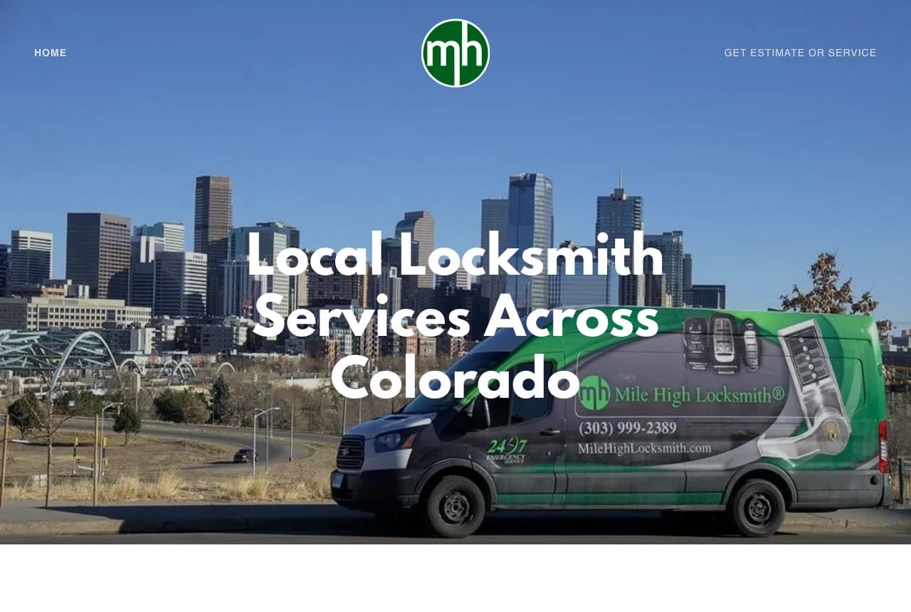
Mile High Locksmith keeps the hero to a single sentence — 'Local Locksmith Services Across Colorado' — set in bold white over a photograph of the company van washed in cool blue, with a round green 'mh' logo in the top corner and a nav that offers just two things: Home, and 'Get Estimate or Service'. The blue treatment turns an ordinary van photo into a brand color, and the copy's only claim is geography, which is exactly what a search visitor wants confirmed. It's the minimal mobile-locksmith page: where you are, what you do, one way to get help. Mile High shows how a color wash and one sentence can make a small operator look like a statewide brand.

Visit Mile High Locksmith

Opens a similar Zarla design you can make yours.

West Florida Locks website — Emergency Locksmith design example
Real site · Spring Hill, FL
  • Emergency Locksmith
  • Straightforward

West Florida Locks: The towns are the headline

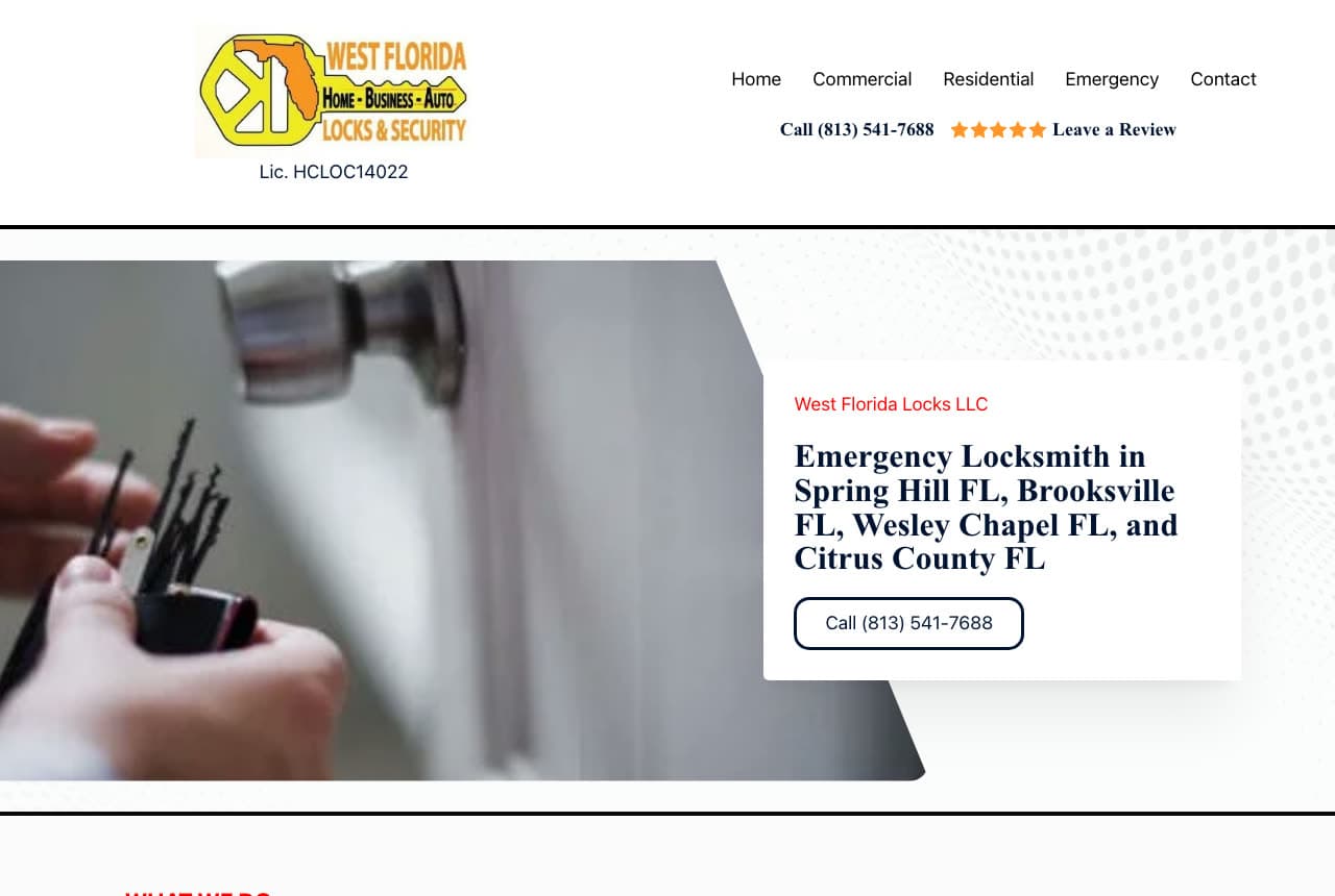
West Florida Locks writes its headline for the search engine and the searcher at once: a white card over a soft photograph of a hand at a lock reads 'Emergency Locksmith in Spring Hill FL, Brooksville FL, Wesley Chapel FL, and Citrus County FL' — every town it serves, in the headline — with a single outlined button carrying the number. The nav is honest and small (Home, Commercial, Residential, Emergency, Contact) and the logo is a yellow triangle stamped 'Home · Business · Auto Locks & Security', with the license number printed right beneath it and a five-star 'Leave a Review' link beside the phone. Nothing here is pretty and everything is findable. West Florida Locks shows the rural-and-suburban formula: list the towns, show the license, put the number in reach.

Visit West Florida Locks

Opens a similar Zarla design you can make yours.

Sure Lock & Key website — Locksmith Franchise design example
Real site
  • Locksmith Franchise
  • Urgent

Sure Lock & Key: Keys on hooks and a toll-free number

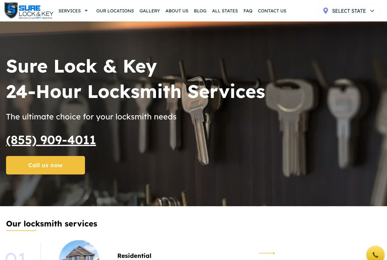
Sure Lock & Key scales the locksmith page to a multi-state operation without losing the panic-friendly shape: a dark photograph of keys hanging on hooks, a two-line headline in white — 'Sure Lock & Key / 24-Hour Locksmith Services' — a tagline, then the toll-free number in large type and a yellow 'Call us now' button. The nav gives the national footprint away (Our Locations, All States, a 'Select State' menu) and the section below starts a numbered services list ('01 Residential'). A floating yellow phone button follows the visitor down the page. The palette is one color on black, which reads urgent without shouting. Sure Lock & Key shows how a locksmith brand with many locations keeps one hero, one number, one color.

Visit Sure Lock & Key

Opens a similar Zarla design you can make yours.

Rowntree Locksmiths — Emergency Locksmith website design you can build with Zarla
Build this with Zarla
  • Emergency Locksmith
  • Urgent

Rowntree Locksmiths: Three in the morning, a person answers

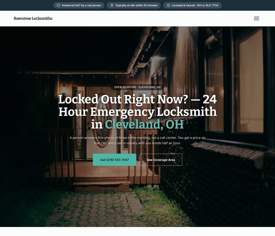
Rowntree Locksmiths is the Zarla emergency template, and its hero is written for the exact moment: a dark photograph of a door, a headline that asks the visitor's question and answers it — 'Locked Out Right Now? — 24 Hour Emergency Locksmith in Cleveland, OH' with the city in yellow — and a paragraph that promises the thing emergency locksmiths rarely say plainly ('A person answers this phone at three in the morning'). A yellow 'Call (216) 555-0167' leads, 'See Coverage Area' follows, and the trust chips above the nav carry the response time and the license. It's Broadway's and Front Range's promise with the number and the human answer in the same breath. Clone it, change the city and the license, and the midnight funnel is ready.

See this template
Pellerin Home Locks — Rekeying Specialist website design you can build with Zarla
Build this with Zarla
  • Rekeying Specialist
  • Calm

Pellerin Home Locks: The new-homeowner's problem, in serif

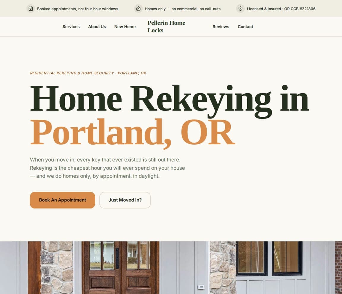
Pellerin Home Locks is the Zarla template for the calm end of locksmithing — the customer who just got the keys and is thinking ahead: a cream ground, a serif headline, 'Home Rekeying in Portland, OR' with the city in orange, and a paragraph that names the anxiety exactly ('When you move in, every key that ever existed is still out there'). Two quiet buttons — 'Book An Appointment' and 'Just Moved In?' — and an eyebrow that states the specialty (residential rekeying & home security). No urgency, no van, no red. It's the register of I.V.S. and West Florida Locks made elegant. Clone it for a locksmith whose best customers are planning, not panicking — rekeying, smart locks, home security.

See this template
Winsloe Keyless — Smart-Lock Installer website design you can build with Zarla
Build this with Zarla
  • Smart-Lock Installer
  • Modern

Winsloe Keyless: Cobalt for the keyless customer

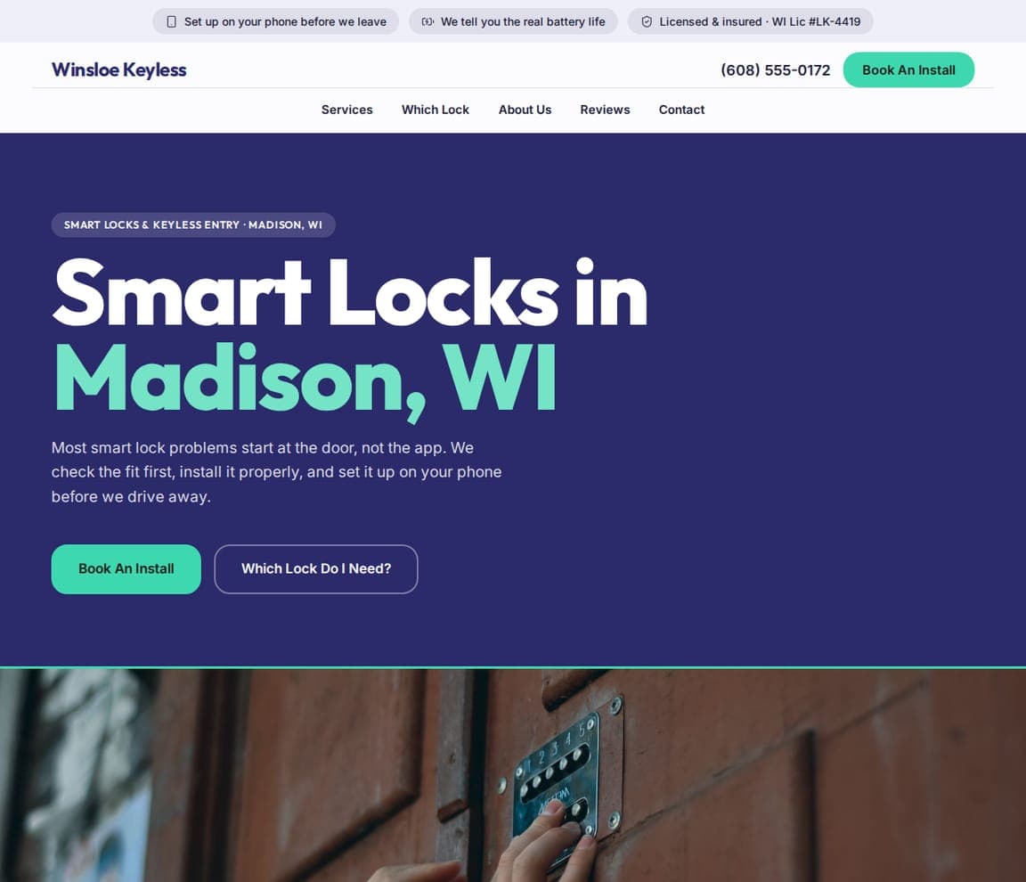
Winsloe Keyless is the Zarla template for the newest locksmith niche, and it looks like it: a cobalt-blue field, a bold headline — 'Smart Locks in Madison, WI' with the city in green — and a paragraph that positions the installer as the fix for a specific modern frustration ('Most smart lock problems start at the door, not the app'). A green 'Book An Install' and an outlined 'Which Lock Do I Need?' offer the two paths, and a photograph of a keypad lock runs beneath the copy. The chips above the nav carry the reviews and the license. It's the only design in this gallery that could pass for a technology brand, which is the point. Clone it for a locksmith selling installs and integrations rather than lockouts.

See this template

Frequently asked

Where can I find good locksmith website examples?

Right here — this page curates locksmith website examples across the spectrum: century-old security dealers like Houston Safe & Lock and Anderson Lock, mobile locksmiths like Broadway Lock & Key, Mile High Locksmith and Front Range Locksmith, local independents like I.V.S. Security and West Florida Locks, and a multi-state operator (Sure Lock & Key) — each linked so you can explore the live site — plus professionally designed Zarla locksmith templates you can clone and make your own. Every example includes a note on why the design works — the phone path, the trust signals, the service triangle — so you can copy the thinking, not just the look.

What makes a good locksmith website?

It answers a panicked visitor in one second and a careful one in ten. That means the phone number as a button in the hero, a response time or availability stated as a number, the service area named, the three services (home, car, business) in plain words, and the trust facts — licensed, bonded, insured, years in business — visible without scrolling. The examples above are not elaborate; they are fast to read.

How much does a locksmith website cost?

A custom site from an agency typically runs into the thousands up front, and template builders charge roughly $16–$30 per month. An AI builder generates a complete, editable locksmith site for free and only charges (on the Premium plan) when you publish to your own domain — so you can build and preview before spending anything.

Should a locksmith website lead with emergencies or with services?

Lead with the promise the visitor is in the middle of needing, then show the range. Mobile and emergency locksmiths (Broadway, Front Range, Sure Lock & Key) put 'locked out?' and the phone number first; established dealers (Houston Safe & Lock, Anderson Lock) lead with age and specialty because their customers are planning, not panicking. Pick the visitor you serve most and design the hero for them.

What pages does a locksmith website need?

Most locksmiths need five: a home page with the phone number, the promise and the area, a services page split into residential, automotive and commercial, a service-area page listing the towns you cover, an about page with licenses and years in business, and a contact page with the number repeated. Dealers add a showroom or products page — Houston Safe & Lock's 'Shop Safes' tile is the model.

How do locksmiths get more calls from their website?

Make the number a button, state a response time, and name the towns. The converting pattern in the examples above: a headline that names the situation ('locked out?') or the service triangle ('home, car, and business'), a phone number in a colored button beside a request form, the response time as a figure ('20-minute ETA', '30 minutes across the Valley'), and licenses and reviews in a strip right under the hero.

You've seen what works. Now make it yours.

Describe your business and Zarla designs a complete, professional website in about 30 seconds — built to convert, just like the ones above.

Free to build and preview · no credit card · publish to your own domain on Premium