Inspiration · Massage

The Best Massage Website Examples, Explained

These are some of the best massage website designs we could find — a mix of standout real studios and a design you can build with Zarla — and instead of just showing them off, we explain why each one works. Massage is booked to feel calmer, so watch how the best sites set a mood on arrival — a warm palette, a serene photo, real reviews — and make booking effortless. And notice the ones that break the mold: repositioning massage as serious bodywork or an upbeat routine. Then make the Zarla design your own, free, in about a minute.

Real sites + designs you can build with Zarla — free to build and preview, no credit card

What makes a great massage website

The best massage sites do three things fast. They set a calm mood on sight — a warm, uncluttered palette and a real, serene photo do more than any 'relaxing' line. They prove trust with reviews, licensing (LMT), and real photos of the actual space and therapists (not stock). And they make booking the one obvious action, since most massage bookings happen on a phone. The strongest also pick a clear identity — relaxation, sports recovery, holistic, or modern-boutique — rather than trying to be everything. Everything below is a variation on those moves; pick the one that fits the clients you want.

Press Modern Massage website — Massage design example
Real site · New York, NY
  • Massage
  • Editorial
  • Modern + neutral

Press Modern Massage: Editorial polish, therapeutic substance

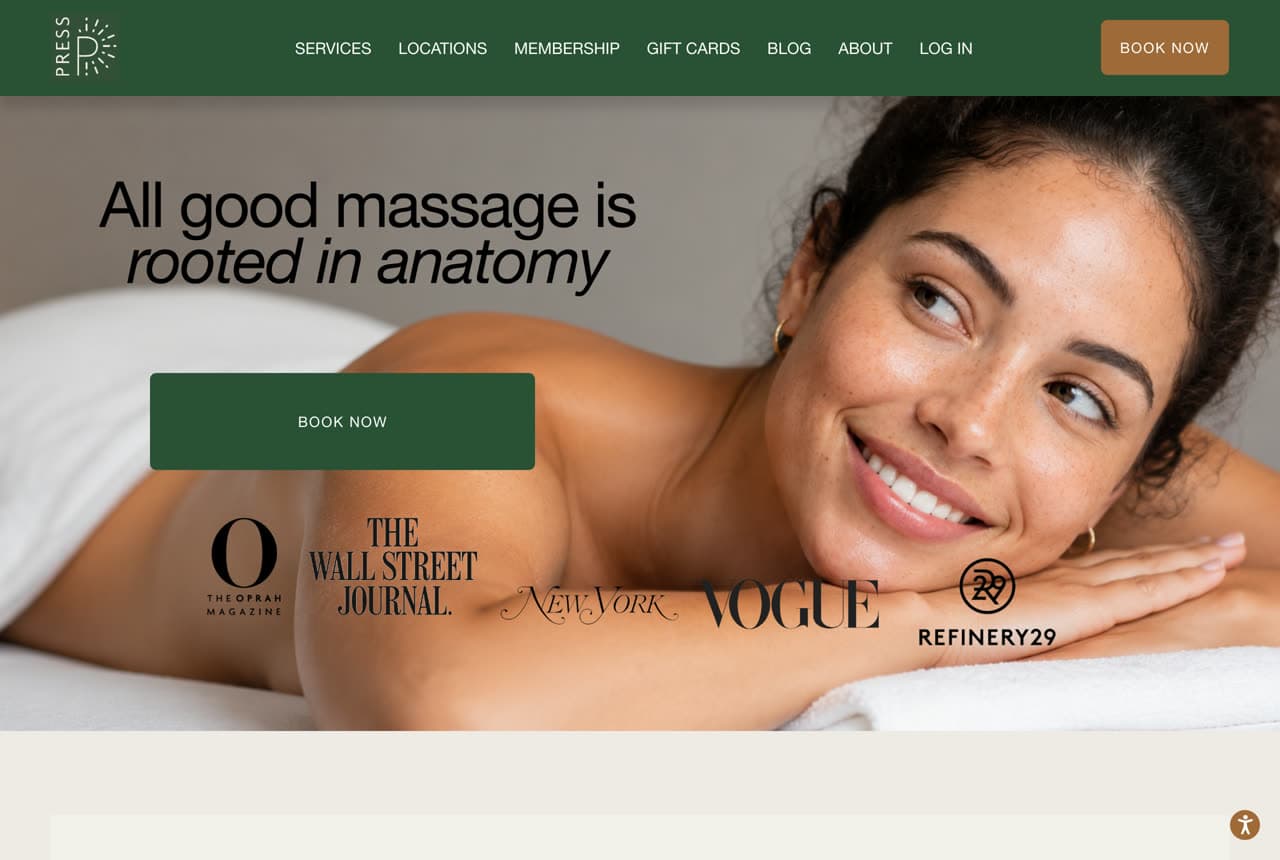
Press Modern Massage reframes massage from spa indulgence to serious bodywork, and the design sells that repositioning. 'All good massage is rooted in anatomy' over a clean, editorial photo, with press logos (Wall Street Journal, Vogue, New York, Refinery29) stacked as instant credibility — this reads like a wellness brand featured in a magazine, not a strip-mall spa. The modern, restrained palette and 'Modern' right in the name signal a practice for people who want results (chronic pain, recovery, knots), not just relaxation. The lesson is repositioning through design: by borrowing the visual language of an editorial wellness brand and leading with press proof, Press elevates a commoditized service into something premium and credible. When you want to charge more, look like the brand the magazines cover.

  • Press logos deliver instant editorial credibility
  • 'Rooted in anatomy' repositions spa → serious bodywork
  • A modern, restrained look justifies premium pricing

Steal this: Stack your press mentions in the hero — 'as seen in Vogue' repositions a commodity service as a credible brand.

The Lotus Room website — Massage design example
Real site · Nashville, TN
  • Massage
  • Holistic
  • Moody + warm

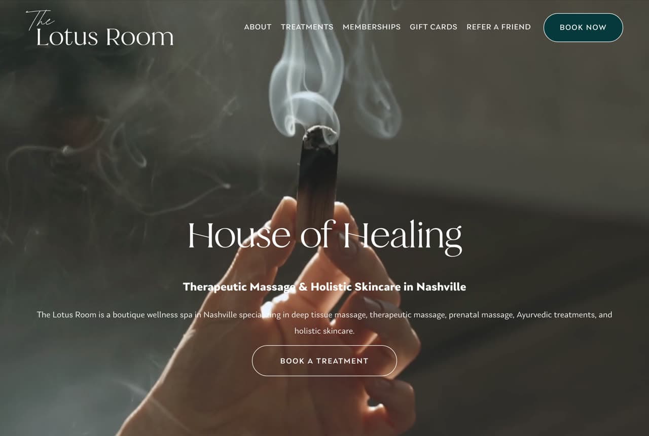
The Lotus Room: A boutique spa sold as a sanctuary

The Lotus Room leads with mood, and it's exactly right for the category. 'House of Healing / Therapeutic Massage & Holistic Skincare in Nashville' over a dim, atmospheric photo of hands and rising incense creates an instant sense of calm and ritual before a single service is listed. The copy widens the offer thoughtfully — deep tissue, therapeutic, prenatal, Ayurvedic, holistic skincare — positioning the studio as a full sanctuary rather than a single treatment. For a service people book to de-stress, the site's job is to make them feel the calm on arrival, and the moody, sensory imagery does that immediately. The lesson is that atmosphere is a feature: when you sell relaxation and healing, the hero should lower the visitor's shoulders before it sells them anything.

  • Moody, sensory imagery makes the visitor feel the calm
  • 'House of Healing' frames a sanctuary, not a service
  • Atmosphere is the feature when you sell relaxation
The NOW Massage website — Massage design example
Real site
  • Massage
  • Modern
  • Warm + minimal

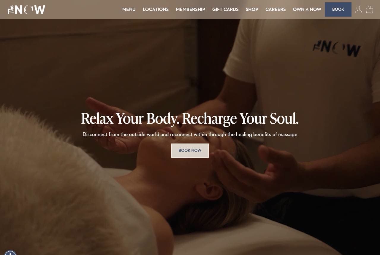
The NOW Massage: A franchise that looks boutique

The NOW Massage proves a scalable franchise can still feel like a design-led boutique. 'Relax Your Body. Recharge Your Soul. / Disconnect from the outside world and reconnect within' over a warm, softly-lit massage photo, with a minimalist wordmark and a clean, modern layout that could belong to a luxury skincare brand. Nothing about it reads 'chain,' even though it's built to replicate across locations. The lesson is design as a scaling asset: most multi-location services look generic because consistency is treated as templating, but The NOW invests in a cohesive, boutique-quality identity that travels — so every location feels intentional and premium, not franchised. If you plan to grow beyond one location, build a design system worth replicating.

  • Boutique-quality design that doesn't read 'chain'
  • A minimalist identity built to scale across locations
  • Design as a scaling asset, not just templating
Denver Sports Massage website — Sports Massage design example
Real site · Denver, CO
  • Sports Massage
  • Clinical
  • Orange + active

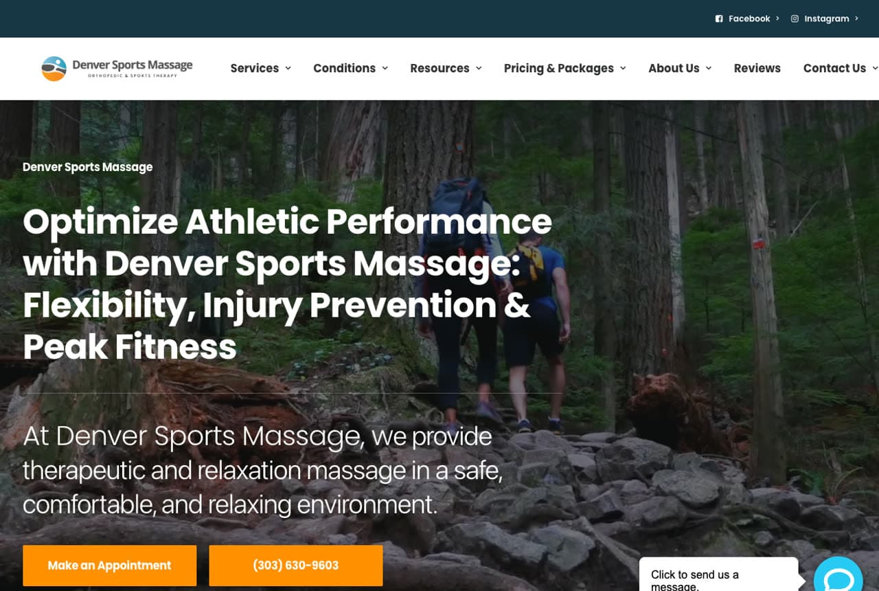
Denver Sports Massage: Massage as a performance tool

Denver Sports Massage refuses the relaxation cliché and wins a different customer. 'Optimize Athletic Performance: Flexibility, Injury Prevention & Peak Fitness' over an outdoor, active photo positions massage as sports medicine, not pampering — aimed squarely at athletes and active people with a specific problem to solve. Conditions-based navigation, a clinical 'Assessment → Treatment Plan' philosophy, and a prominent 4.9-star, 500+-review badge reinforce the credible, results-first framing. The lesson is choosing a lane: by specializing in sports and orthopedic work rather than general relaxation, the studio attracts a higher-intent client who's willing to pay for outcomes, and the whole design — active imagery, clinical language, conditions menu — signals 'we fix problems' rather than 'we help you unwind.' A clear niche beats a generic spa every time.

  • Positions massage as sports medicine, not pampering
  • Conditions-based nav + clinical language signal results
  • A clear niche pulls a higher-intent, higher-paying client

Steal this: Pick a lane — 'performance and injury' beats 'relaxation' for attracting higher-intent clients who pay for outcomes.

LoDo Massage Studio website — Massage design example
Real site · Denver, CO
  • Massage
  • Premium
  • Copper + B&W

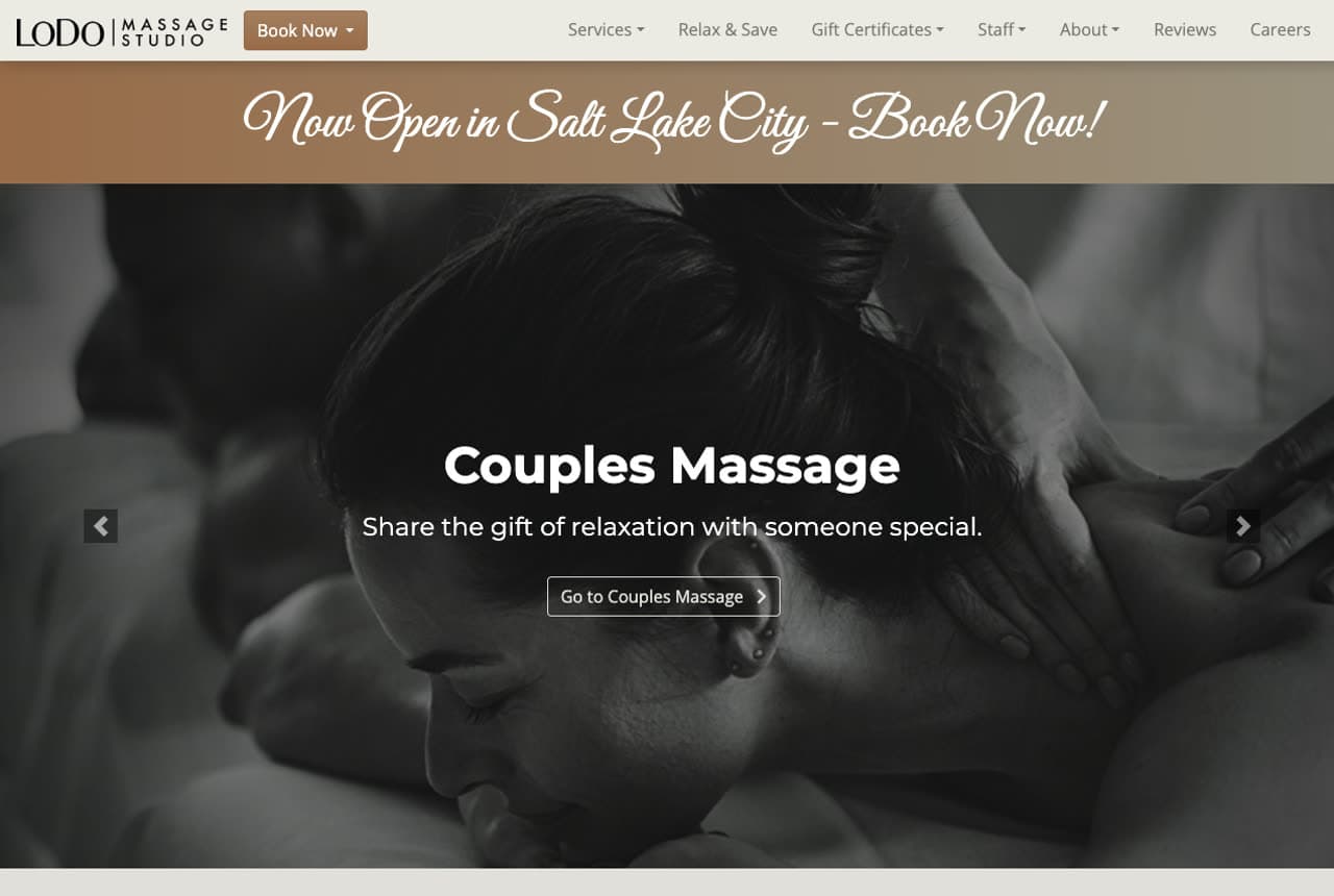
LoDo Massage Studio: Multi-location logistics, handled gracefully

LoDo Massage Studio solves a real problem most multi-location services fumble: making booking effortless across sites. A warm copper palette and elegant B&W treatment photography set a premium tone, but the smart part is operational — location-specific 'Book LoDo, Book Highlands, Book Salt Lake City' buttons, a per-location review link, and a 'Now Open in Salt Lake City' announcement banner all reduce the friction of 'which location, and is it any good?' A 'The LoDo Difference' section adds a personal intake story. The lesson is that for a growing service business, the booking UX is a design problem worth solving: when you have multiple locations, route each visitor to the right one immediately and show location-specific proof, so nobody bounces trying to figure out where to go.

  • Per-location booking buttons remove 'which one?' friction
  • Location-specific reviews build local trust
  • Booking UX is a real design problem for multi-location brands
Squeeze website — Massage design example
Real site
  • Massage
  • Playful
  • Bright teal

Squeeze: Bright and playful in a calm-toned category

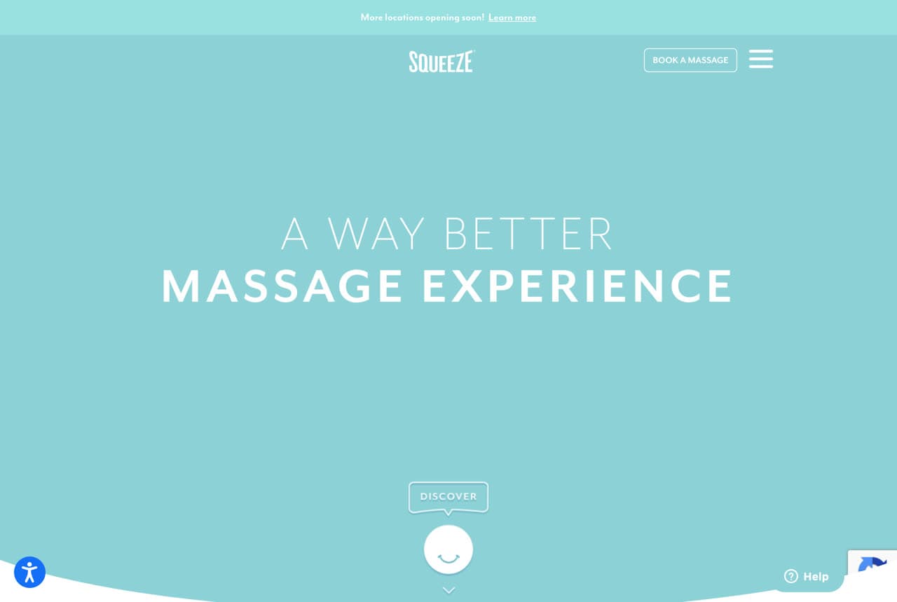
Squeeze — from the founders of Drybar — brings retail-brand energy to massage. 'A Way Better Massage Experience' on a bright, saturated teal ground with a smiley icon is the polar opposite of the muted sage-and-stone every competitor uses, and that contrast is the whole strategy. By looking like a fun, modern consumer brand rather than a hushed spa, Squeeze pitches massage as an upbeat, repeatable part of a self-care routine, not a rare indulgence — appealing to a younger customer who books through an app and expects a slick experience. The lesson is that breaking the category's visual conventions is a legitimate differentiation play: when every rival whispers in earth tones, being confidently bright and playful makes you instantly memorable and signals a different, more modern experience.

  • A bright teal brand breaks every spa convention
  • Retail-brand energy pitches massage as a routine, not a treat
  • Defying the category's palette is a differentiation play

Steal this: Break the category's palette on purpose — if every rival is muted sage, being boldly bright makes you unforgettable.

Sage Blossom Massage website — Massage design example
Real site · Austin, TX
  • Massage
  • Relaxation

Sage Blossom Massage: Classic, warm, and comfortingly familiar

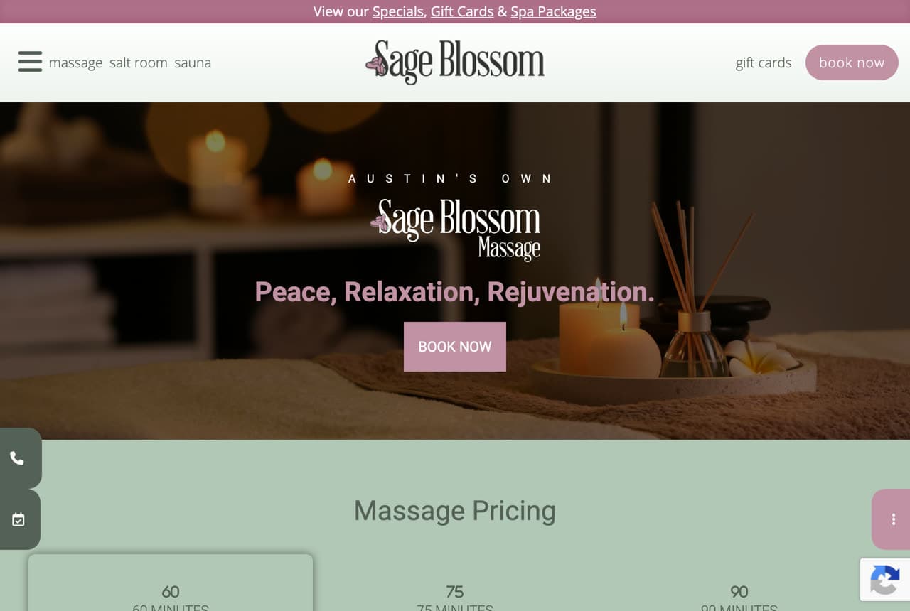
Sage Blossom Massage nails the warm, familiar register a lot of clients actually want. 'Austin's Own Sage Blossom Massage / Peace, Relaxation, Rejuvenation' over a cozy, candlelit spa photo delivers exactly the comforting, no-surprises experience the headline promises. There's nothing avant-garde here, and that's the point: a warm palette, soft candlelight, and the classic three-word relaxation promise reassure a nervous or first-time client that they'll get the calming, straightforward massage they're picturing. The lesson is that familiarity converts: not every business needs to reinvent the category — for a local relaxation-focused studio, meeting the visitor's existing mental image of 'a nice massage place,' done warmly and competently, can be more reassuring than a bold reinvention that risks feeling clinical or cold.

Flow Birth & Body website — Bodywork design example
Real site · Austin, TX
  • Bodywork
  • Hybrid

Flow Birth & Body: Massage and movement, sold together

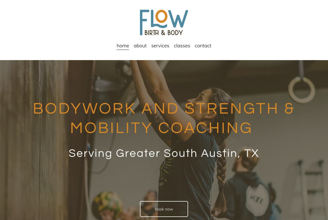
Flow Birth & Body bundles two services into one clear positioning. 'Bodywork and Strength & Mobility Coaching / Serving Greater South Austin' pairs massage with movement coaching, presenting the studio as a place to both recover and get stronger rather than a single-service shop. The orange-on-dark hero and 'Flow' branding feel active and modern, matching the hybrid pitch. The lesson is complementary bundling: when your services naturally reinforce each other — bodywork to release, coaching to build — saying so up front raises the perceived value and the average client relationship (someone who comes for massage may stay for mobility work). Rather than hide a secondary offering on an inner page, Flow leads with the combination, which both differentiates it and deepens the client relationship.

Anchor Point Massage — Massage Therapy website design you can build with Zarla
Build this with Zarla
  • Massage Therapy
  • Therapeutic

Anchor Point Massage: Warm, therapeutic, and booking-ready

Anchor Point Massage captures the register most independent therapists want: warm, credible, and therapeutic without the fluff. 'Bodywork That Actually Holds' in an elegant serif over a beautifully-lit photo of a serene, arched treatment room, with copy that's specific and human — 'real, therapeutic massage in downtown Asheville, tailored to your body by licensed therapists who listen first.' A terracotta-and-cream palette feels earthy and premium rather than clinical or spa-generic, and a trust strip (4.9 stars from 480+ reviews, licensed LMT, tailored to your body) plus a clear 'Book a Session' handle credibility and conversion. It's the template for a solo therapist or small studio that does serious, personalized bodywork and wants to look established and trustworthy. Describe your practice and it's yours in about a minute.

See this template

Frequently asked

What makes a good massage website?

A good massage website sets a calm, trustworthy mood in the first few seconds with a warm palette and a real, serene photo of your actual space (not stock), proves trust with reviews and licensing (LMT), and makes booking the single obvious action — ideally an online booking button in the hero, since most massage appointments are booked on a phone. The strongest sites also commit to a clear identity (relaxation spa, sports/therapeutic, holistic, or modern boutique) rather than trying to appeal to everyone.

What pages does a massage therapy website need?

Most studios need five: a home page that sets the mood and points to booking, a services or menu page with clear treatments and prices, an about page with the therapists' credentials (LMT) and real photos, a booking or contact page connected to scheduling software (Vagaro, Acuity, MassageBook), and often a page for a specialty (prenatal, sports, couples). Gift cards and memberships are common revenue add-ons worth a page too. A Google Business Profile connected to the site is what gets you found for 'massage near me.'

How do massage therapists get more clients from their website?

The studios that convert do three things: they set a calming, trustworthy tone with real photos of the space and therapists, they make booking frictionless (an online booking button in the hero, mobile-first, since 70%+ of massage bookings happen on phones), and they keep a steady stream of Google reviews — the biggest factor in both ranking for 'massage near me' and getting a first-timer to book. Picking a clear niche (sports, prenatal, relaxation, holistic) rather than trying to serve everyone is what makes all three land.

You've seen what works. Now make it yours.

Describe your business and Zarla designs a complete, professional website in about 30 seconds — built to convert, just like the ones above.

Free to build and preview · no credit card · publish to your own domain on Premium