willowmedspa.com
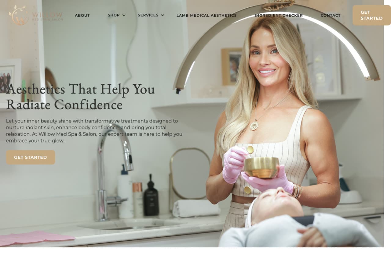
Willow Med Spa: The practitioner, the ring light and a warm serif
Willow Med Spa makes the provider the hero: a photograph of the practitioner in the treatment room — pink gloves, a bowl in hand, a client reclined beneath a ring light — beside a serif headline that promises the feeling, 'Aesthetics That Help You Radiate Confidence', and a paragraph that names the outcomes in plain language (radiant skin, body confidence, relaxation). A tan 'Get Started' button under the copy (and again in the nav). The nav quietly shows the range (a shop, an ingredient checker, a medical-aesthetics partner), but the first screen is a person you'd trust with your face, working. Willow shows that for a smaller practice, a real photograph of the real practitioner mid-treatment does more than any stock model could.
Opens a similar Zarla design you can make yours.
skinversemedspa.com
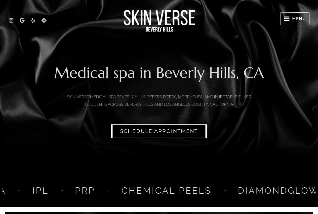
Skin Verse Medical Spa: Dark, plain and searchable
Skin Verse Medical Spa writes its hero the way a search engine reads it: over a photograph of black satin, a serif headline that is simply 'Medical spa in Beverly Hills, CA', a sub-line that lists the treatments and the service area (Botox, Morpheus8, injectable filler; Beverly Hills and Los Angeles County), and an outlined 'Schedule Appointment'. Below runs a treatment marquee — IPL, PRP, chemical peels, DiamondGlow — in wide-tracked capitals. It is the least decorated page in this gallery and possibly the most findable: every element is a term a client would type. The black-fabric backdrop keeps it from feeling like a directory listing. Skin Verse shows a clinic how to be blunt about what it does and where, and still look expensive.
Opens a similar Zarla design you can make yours.
sanjivamedspa.com
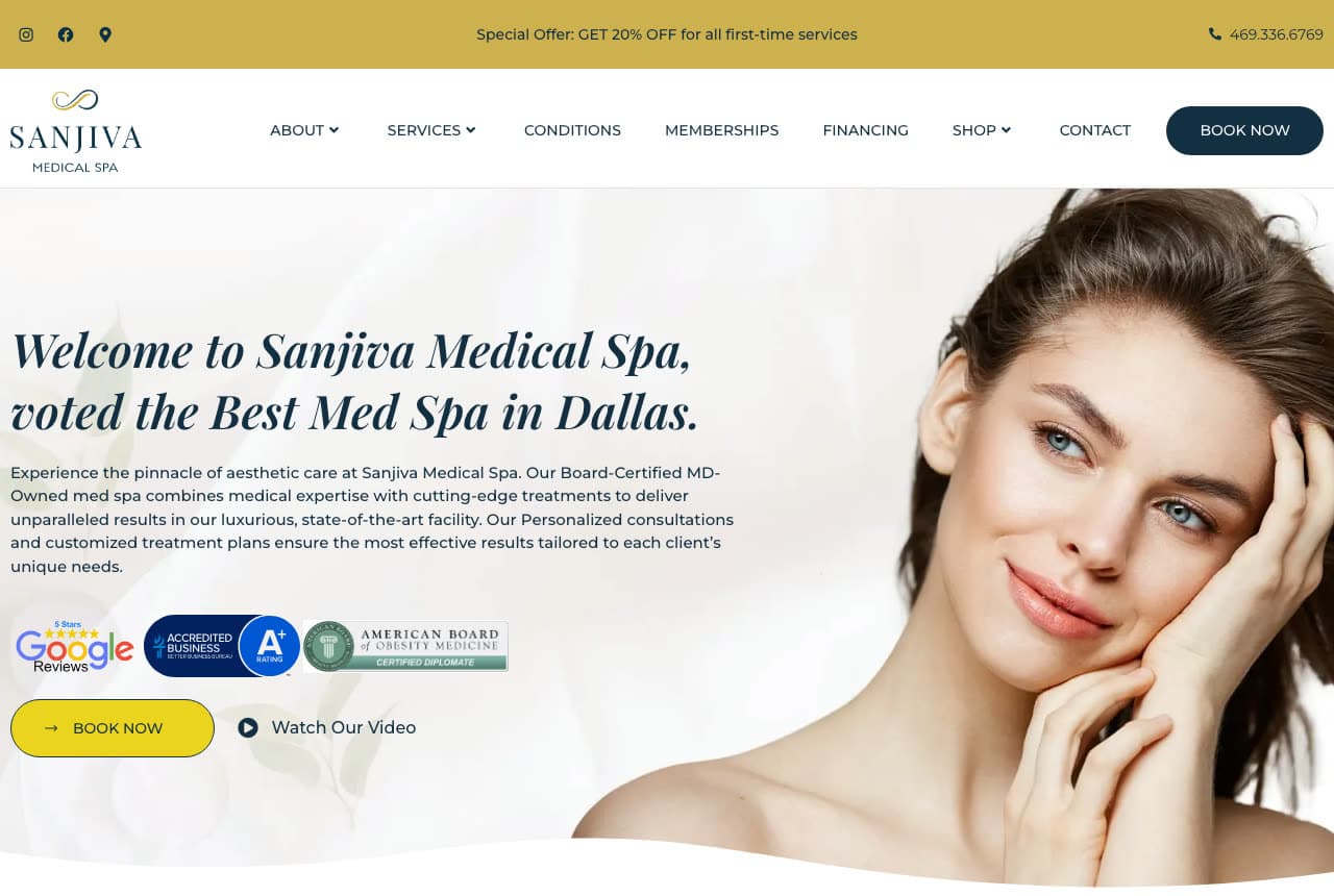
Sanjiva Medical Spa: Awards, badges and an offer in the first screen
Sanjiva Medical Spa stacks every kind of proof a Dallas client might want and still keeps the page calm: a serif italic welcome that carries the award — 'voted the Best Med Spa in Dallas' — a paragraph that says 'Board-Certified MD-Owned' in the first line, a row of badges (Google reviews, an accreditation seal, a board logo) and then two buttons, 'Book Now' and 'Watch Our Video'. A slim gold bar above the nav adds the first-visit incentive: 20% off first-time services. The portrait — a woman touching her cheek — is the only decorative element. Sanjiva shows the classic med spa formula executed cleanly: award in the headline, credentials in the paragraph, badges below, an offer above.
Opens a similar Zarla design you can make yours.
purelynaturalspa.com
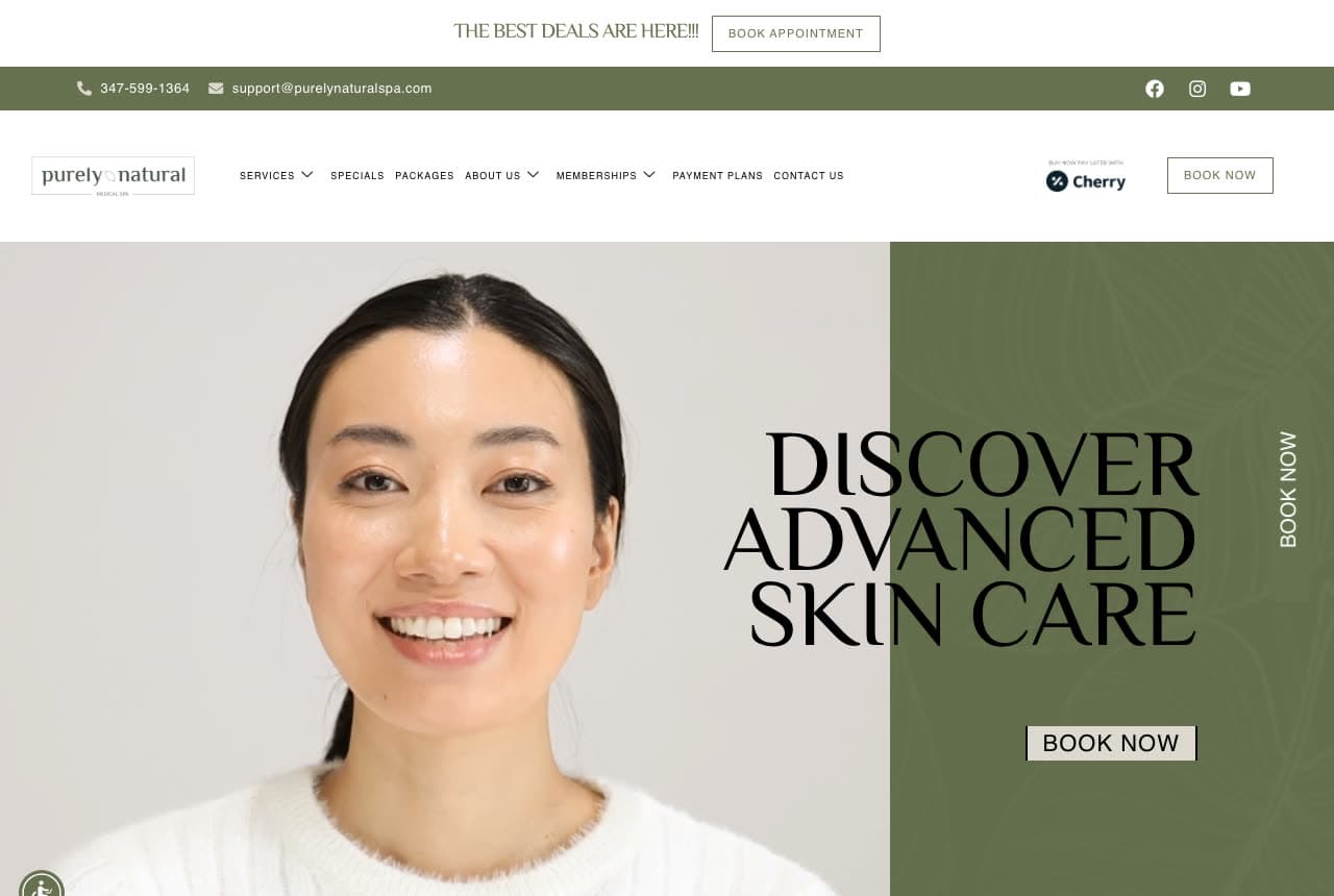
Purely Natural Medical Spa: Tall capitals on an olive block
Purely Natural Medical Spa splits its hero into a photograph and a color block: a woman laughing with her eyes closed fills the left, and an olive-green panel on the right carries the headline in tall, tightly stacked capitals — 'DISCOVER ADVANCED SKIN CARE' — with a plain 'Book Now' beneath. A vertical 'BOOK NOW' runs up the edge like a spine, and a cream bar with gold text above the nav announces the current deals. The palette is unusual for the category — olive and cream instead of blush and gold — and it makes the clinic feel botanical and honest, which is exactly what the name promises. Purely Natural shows how one off-category color can make a small practice look like a considered brand.
Opens a similar Zarla design you can make yours.
aldwynaesthetics.com
- Injectables Studio
- Discreet
Aldwyn Aesthetics: Dark, close and honest about restraint
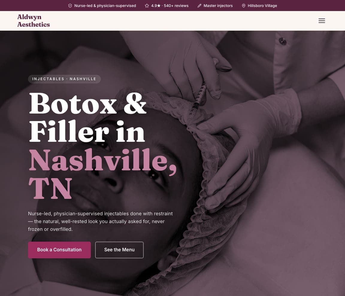
Aldwyn Aesthetics is the Zarla injectables studio: a plum-dark photograph of a treatment in progress, a headline that names the service and the city — 'Botox & Filler in Nashville, TN' with the city in pink — and a sub-line that answers the biggest fear in the category: 'Nurse-led, physician-supervised injectables done with restraint — the natural, well-rested look you actually asked for, never frozen or overfilled.' Two buttons, 'Book a Consultation' and 'See the Menu'. The trust chips above the nav carry the supervision and the reviews. It's the buildable version of Upkeep's sultry register with the medical reassurance made explicit. Aldwyn suits a studio whose clients want results nobody can spot.
mirevallipfillerstudio.com
Mireval Lip & Filler Studio: One service, one loud color
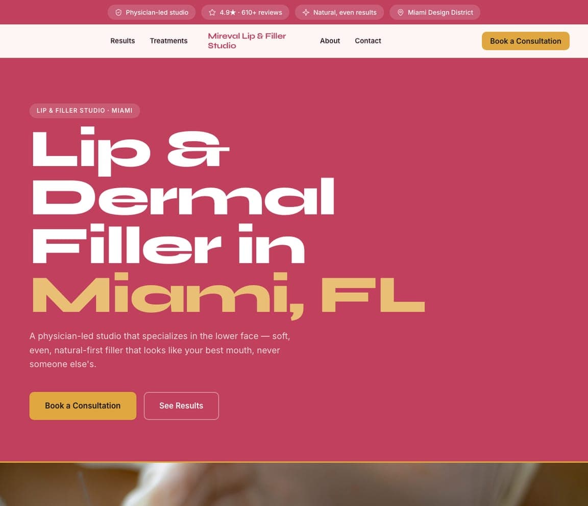
Mireval Lip & Filler Studio is a single-service clinic template that refuses to whisper: a deep rose field, a heavy rounded headline — 'Lip & Dermal Filler in Miami, FL' with the city in gold — and a sub-line that positions the practice as a physician-led lower-face specialist ('soft, even, natural-first filler that looks like your best mouth, never someone else's'). Two buttons: a gold-filled 'Book a Consultation' and an outlined 'See Results'. The trust chips run pink on cream above the nav. Where most of this gallery is cream and serif, Mireval proves a specialist can own a color and a bold typeface. Clone it for any single-treatment studio that wants to be unmistakable in a crowded market.
auclairaestheticsclub.com
- Membership Clinic
- Exclusive
Auclair Aesthetics Club: Aesthetics as a membership, by invitation
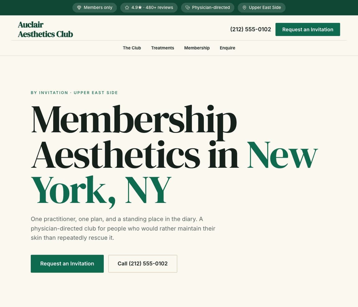
Auclair Aesthetics Club is the Zarla take on the membership model: a cream ground, a serif headline — 'Membership Aesthetics in New York, NY' with the city in deep green — an eyebrow that says 'By Invitation · Upper East Side', and a one-line philosophy: 'One practitioner, one plan, and a standing place in the diary.' The buttons follow the model ('Request an Invitation' rather than 'Book Now'), and the chips above the nav read members only, physician-directed, a 4.9★ from hundreds of reviews. It's the design language of Cienega's calm end taken one step more exclusive. Clone it for a practice that sells continuity and a relationship rather than one-off treatments.
halbrookmensaesthetics.com
Halbrook Men's Aesthetics: Big capitals for a client who wants no fuss
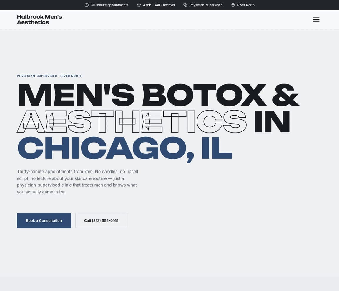
Halbrook Men's Aesthetics is built for the visitor the rest of this gallery isn't talking to: a white ground, a huge sans headline in capitals — 'MEN'S BOTOX & AESTHETICS IN CHICAGO, IL' with one word set as an outline — and a paragraph that sells the absence of ceremony: thirty-minute appointments from 7am, 'no candles, no upsell script'. A navy 'Book a Consultation' and a phone number are the only actions. It borrows Peachy's directness and LYEV's typographic scale and points them at a male client who wants results and an early appointment. Clone it for a men's clinic or a practice adding a men's line — the copy already knows the customer.


