Inspiration · Moving

The Best Moving Website Examples, Explained

Looking for moving website examples? These 9 are the best we could find — standout real moving sites plus designs you can build with Zarla — and each comes with a breakdown of the specific design move that makes it work. Find a look you love and you can build a site in that exact style, free, in about 30 seconds.

Real sites + designs you can build with Zarla — free to build and preview, no credit card

What makes a great moving website

The best moving websites share a few moves: they earn trust fast, lead with strong visuals of the work, point to one clear action, and match the design to how their customers decide. Each example below calls out the specific choice worth stealing for your own moving website.

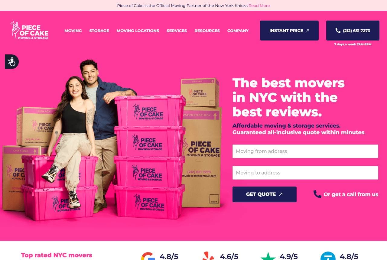
Piece of Cake website — City Movers design example
Real site · New York, NY
  • City Movers
  • Playful
  • Hot pink + navy

Piece of Cake: Moving, rebranded as easy and pink

Piece of Cake reinvents the most stressful service in this gallery as something cheerful: a hot-pink hero, stacked pink moving boxes, real smiling movers, and 'The Best Movers in NYC with the Best Reviews' beside an instant-quote form. The name itself reframes the dread ('a piece of cake'), and the brand commits with a colour no competitor owns in a category of blue-and-white sameness. Below, review scores from four platforms (Google 4.8, Yelp, etc.), a 'New York Knicks Official Sponsor' badge, and a row of real customer video testimonials ('guess what? I moved!') stack authentic social proof. Reframing a painful purchase as painless — in the name, the colour, and the faces — is how a mover becomes a brand people actually recommend. Own an emotion and a colour.

  • The name reframes moving-day dread as painless
  • Ownable pink in a blue-and-white category
  • Four review scores + video testimonials stack real proof

Steal this: Reframe a dreaded service in the name and colour ('piece of cake', pink). Owning an emotion beats claiming 'professional'.

Einstein Moving website — Awarded Movers design example
Real site · Austin, TX
  • Awarded Movers
  • Trustworthy
  • Navy + blue

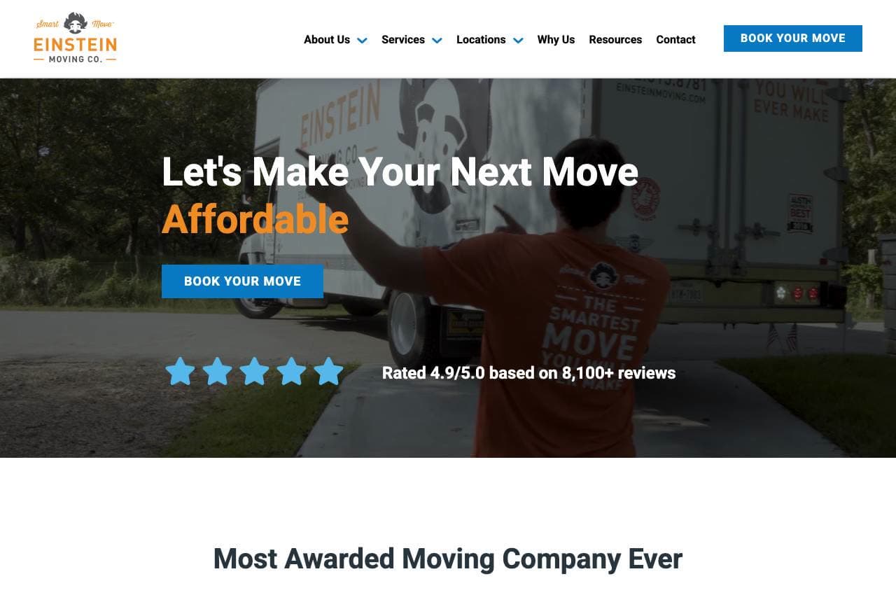
Einstein Moving: An award wall and a rating in the hero

Einstein Moving anchors on trust the way movers must: 'Let's Make Your Next Move Affordable' with 'Rated 4.9/5.0 based on 8,100+ reviews' right under it, then a section titled 'Most Awarded Moving Company Ever' displaying a wall of real badges (Best of 2023-2025, SA Current Best, Inc. 5000, Aggie 100). Moving is a high-anxiety, high-trust purchase where strangers carry your belongings, so front-loading a huge review count and a stack of verifiable awards directly attacks the customer's fear. The playful 'Einstein' brand and clean layout keep it approachable despite the credential density. '6 Reasons 50+ People Move Every Day With Einstein' adds momentum. When trust is the entire barrier, put the biggest number and the most badges where the eye lands first.

  • 8,100+ review count stated in the hero — trust up front
  • 'Most Awarded Ever' badge wall attacks the core fear
  • Playful brand keeps credential density approachable
Muval website — Moving Marketplace design example
Real site · Australia
  • Moving Marketplace
  • App-Like
  • White + orange

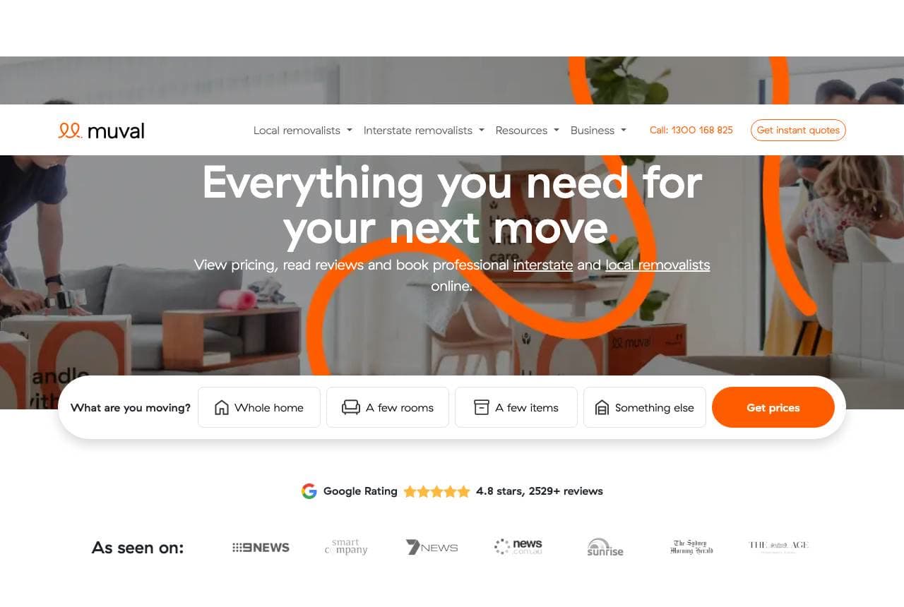
Muval: A booking marketplace, not a mover

Muval isn't a moving company at all — it's a platform, and the design makes that instantly clear: 'Everything you need for your next move,' a 'What are you moving?' selector (Whole home / A few rooms / A few items) that starts a quote flow, and 'view pricing, read reviews and book professional removalists online.' It's the Booking.com model applied to moving: aggregate suppliers, add reviews and transparent pricing, own the customer relationship. The interactive selector turns a vague enquiry into a structured booking, a 'Google 4.8, 2,529+ reviews' bar plus press logos build trust in the platform itself, and helper services (electricity, gas connection) extend the relationship past the move. When you're a marketplace, the homepage's job is to make choosing feel effortless and safe — Muval leads with the selector, not a sales pitch.

  • Interactive 'what are you moving?' selector starts the booking
  • Platform trust: aggregated reviews + transparent pricing
  • Utility-connection add-ons extend the relationship
Two Small Men website — Heritage Movers design example
Real site · Vancouver, BC
  • Heritage Movers
  • Warm
  • Blue + white

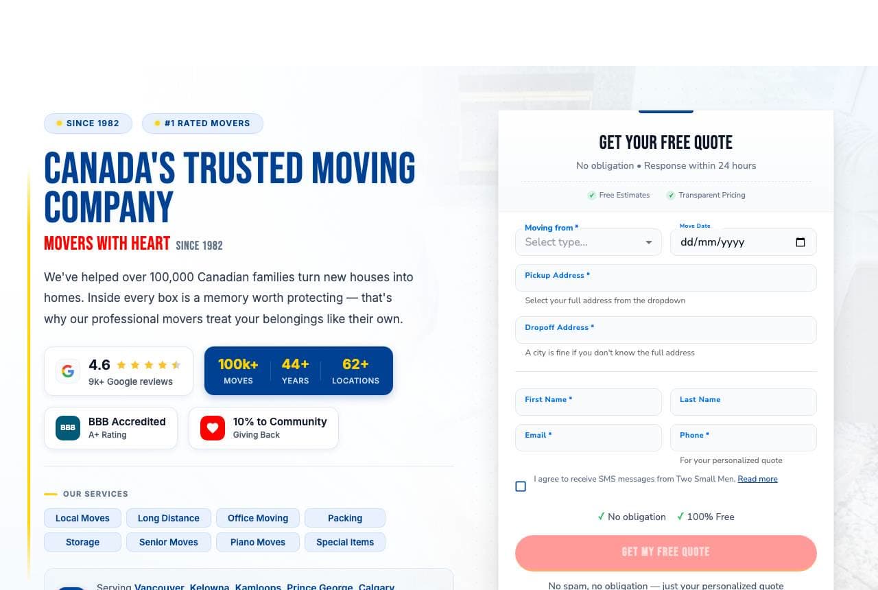
Two Small Men: Heritage, heart and the form right there

Two Small Men with Big Hearts leads with warmth and receipts at once: 'Canada's Trusted Moving Company — Movers with Heart Since 1982' beside a 'Get Your Free Quote' form that's open in the hero, so the visitor can start booking without a click. A compact stat trio (4.6 Google / 100k+ moves / 44+ years / 62+ locations) plus BBB A+ and '10% to Community' badges pack credibility into a small space, and a service-city list ('Vancouver, Kelowna, Kamloops…') does local SEO. The charming, self-deprecating name ('two small men, big hearts') is memorable in a category of interchangeable 'Elite/Premier/Pro' movers. Pairing an in-hero quote form with a four-decade heritage claim answers both the ready-to-book customer and the still-deciding one in a single screen.

  • In-hero quote form — start booking with no click
  • Heritage ('since 1982') + heart in a memorable name
  • Stat trio + community badge pack trust into small space
Miami Movers website — Local Movers design example
Real site · Miami, FL
  • Local Movers
  • Straightforward
  • Red + white

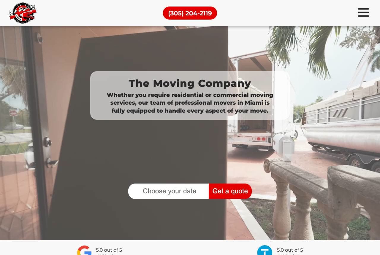
Miami Movers: Local claim, dual-platform proof

Miami Movers keeps it clean and local: a photo of the moving truck and crew, a floating 'Choose your date / Get a quote' widget, and beneath it dual review badges (Google 5.0 / 323 reviews, Thumbtack 5.0 / 100 reviews) flanking 'Movers in Miami to Help You Move Easily.' The copy is reassuringly plain — it names the exact worries ('furniture too heavy? struggling with packing? storage needed?') and answers each, then closes with 'licensed and insured.' A three-column trust grid (Guaranteed Pricing / Top-Rated Company / Stress-Free Moving) organizes the promises. It's the solid, no-gimmick local-mover playbook executed well: name the city, show two platforms' worth of perfect ratings, put the date-picker in the hero, and speak to the specific anxieties of moving day.

  • Date-picker widget in the hero shortens the path to quote
  • Dual-platform 5.0 badges verify the local claim
  • Copy names the exact moving-day worries and answers them
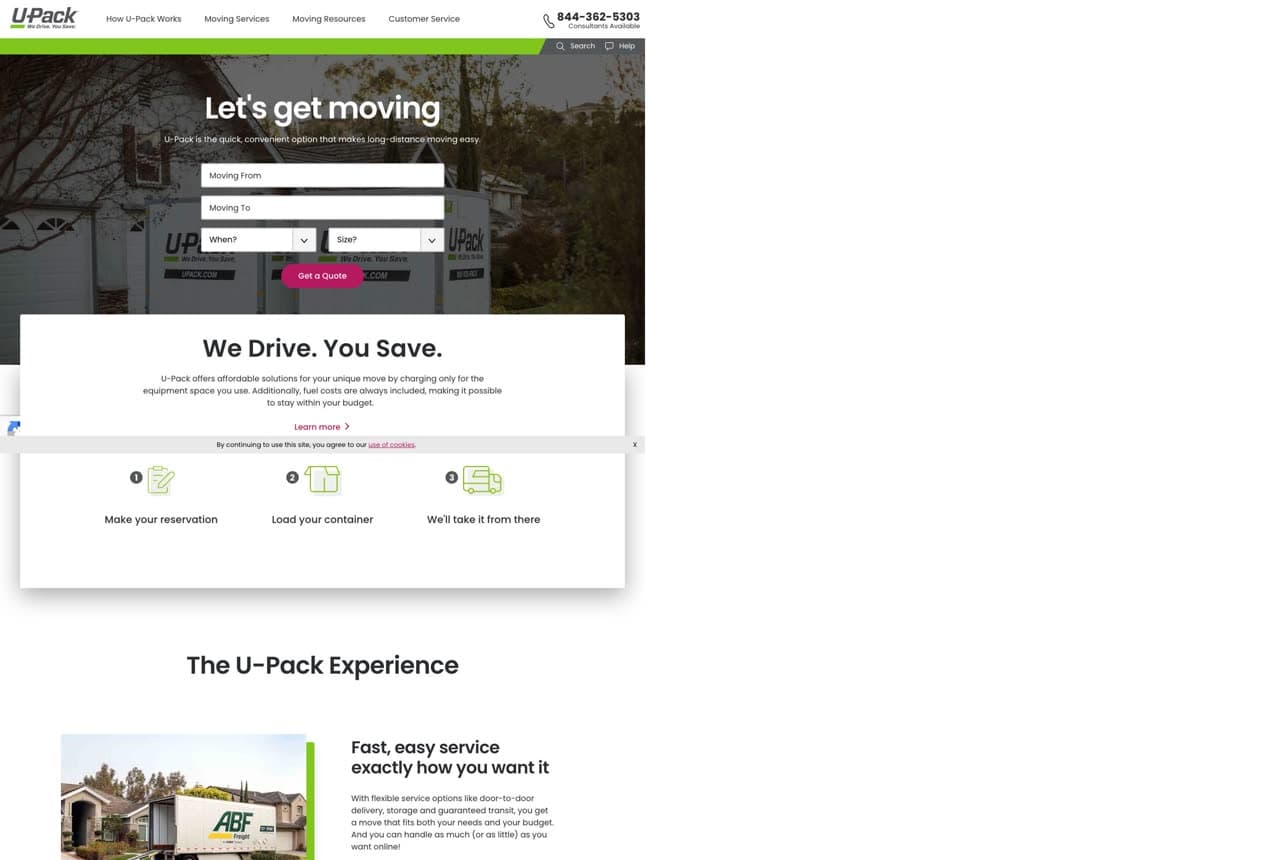
U-Pack website — Self-Move Hybrid design example
Real site · United States
  • Self-Move Hybrid
  • Explanatory
  • White + green

U-Pack: A hybrid model, named in four words

U-Pack sells a genuinely different product and says so in four words: 'We Drive. You Save.' The model is hybrid self-moving — you load a container or trailer, they handle the long-distance driving — and the whole page is built to explain and price that unfamiliar concept: a 'Let's get moving' quote form up front, then a clear three-step 'U-Pack Experience' (make your reservation / load your container / we'll take it from there) with supporting icons. For a service that doesn't fit the 'full-service movers' or 'rent a truck' mental models, the design's main job is teaching, and it does it with plain steps and a strong cost-savings hook. When your offering is a new category, lead with the one-line explanation of how it works and immediately show the steps.

  • 'We Drive. You Save.' explains a hybrid model in four words
  • Three-step 'experience' teaches the unfamiliar concept
  • Cost-savings hook targets the budget-driven long-distance mover

Steal this: If your model is unfamiliar, lead with a four-word 'how it works' and show the numbered steps immediately.

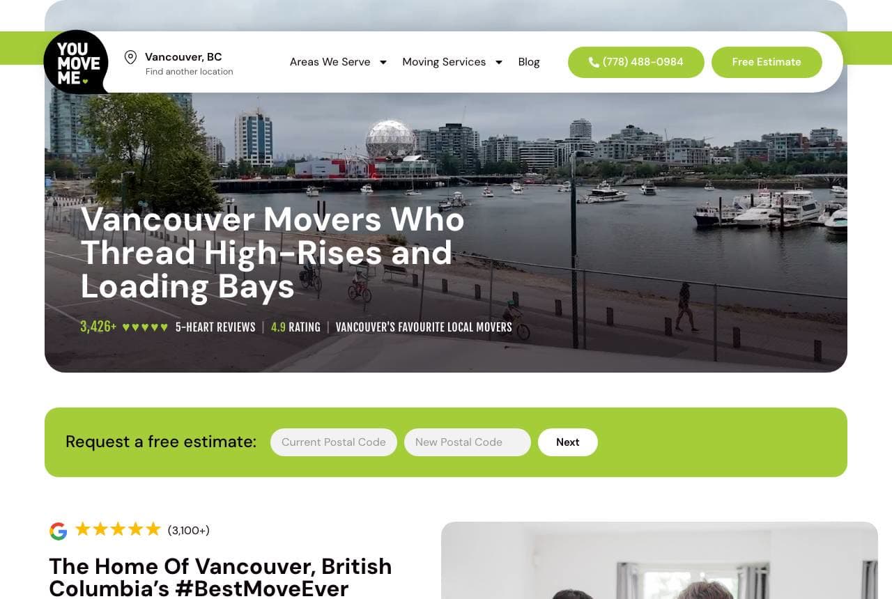
You Move Me website — Hyper-Local Movers design example
Real site · Vancouver, BC
  • Hyper-Local Movers
  • Friendly

You Move Me: A hyper-local, hyper-specific promise

You Move Me's Vancouver page wins on specificity: 'Vancouver Movers Who Thread High-Rises and Loading Bays,' a headline so local it could only be written for that city's condo-tower reality. Set over a Vancouver skyline photo with '#BestMoveEver' and '5-heart reviews,' it signals 'we know YOUR streets and buildings,' which is exactly the reassurance a downtown apartment-dweller needs. The green-accented, friendly design and 'big-hearted service / friendly, uniformed crew / clean move-ready trucks' promises keep it warm and human. A location-specific landing page that names the city's actual moving challenges (not generic 'we move anything') is a powerful local-SEO and trust move — it proves familiarity before a single booking. Write to the specific place, not the general service.

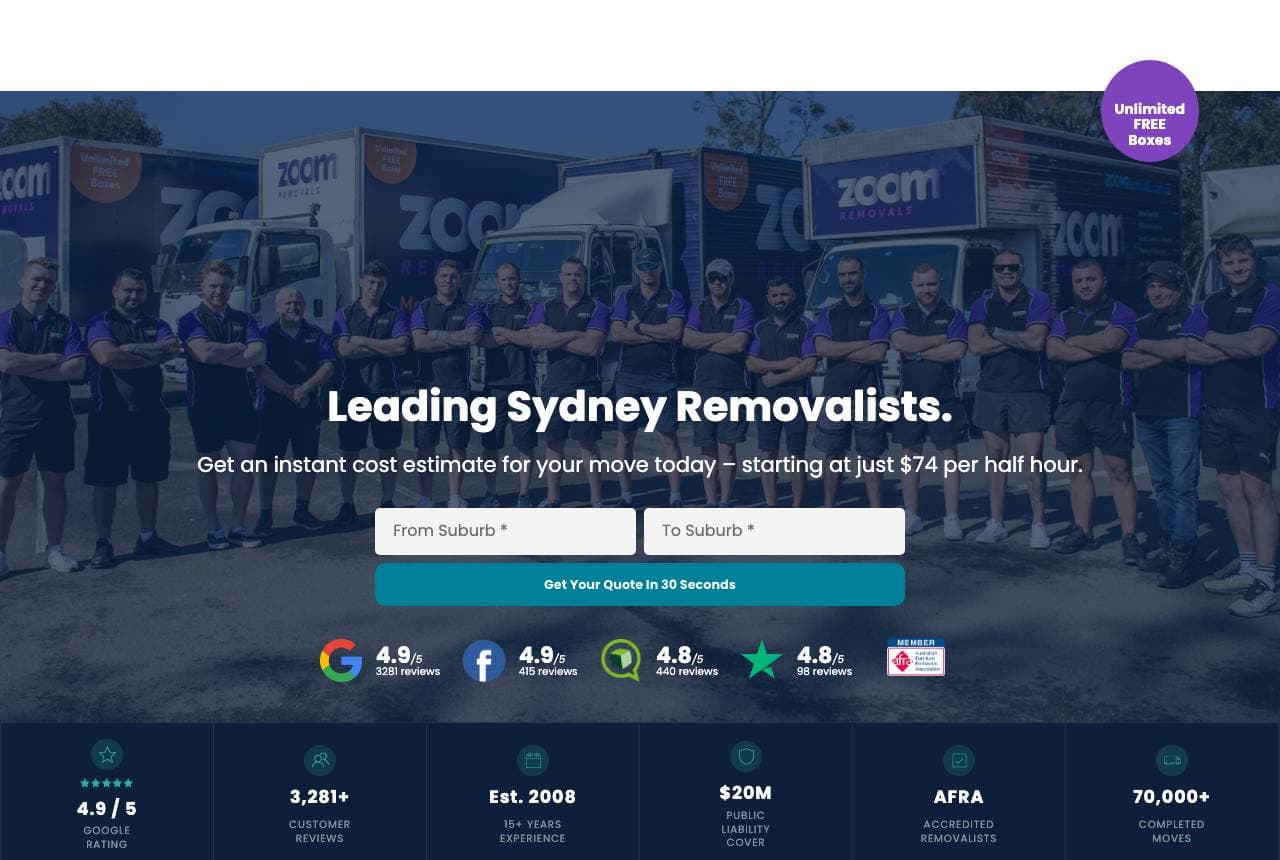
Zoom Removals website — Removalists design example
Real site · Sydney, AU
  • Removalists
  • Transparent

Zoom Removals: The whole crew, and an instant estimate

Zoom Removals leads with its people: a wide photo of the entire uniformed team lined up in front of branded trucks, 'Leading Sydney Removalists,' and 'Get an instant cost estimate for your move today — starting at just $74 per half hour.' Publishing the actual hourly rate up front is a transparency move that pre-qualifies price-sensitive customers and builds trust, and the 'Get Your Quote in 30 Seconds' form promises speed. A four-platform review row (Google 4.9, Facebook, etc.) and a hard-stat bar (4.9 rating / 3,281+ reviews / est. 2008 / $20M liability cover / 70,000+ moves) do heavy credibility lifting. The full-team photo is the standout: showing every mover's face signals accountability and scale a stock photo never could. Real crew, real rate, real numbers.

Ledger & Crane Moving — Moving Company website design you can build with Zarla
Build this with Zarla
  • Moving Company
  • Trustworthy

Ledger & Crane Moving: Move with confidence, full-bleed

Ledger & Crane Moving is Zarla's classic moving-company template, and its fullwidth-overlay hero lands the register this whole gallery proves matters: 'Move With Confidence — Movers in Denver, CO' over a strong full-bleed image of a real crew loading a truck, in a navy-and-red palette that reads trustworthy and established. Moving is a trust purchase, so the template front-loads exactly what the reals do — a confident promise, trust markers (licensed & insured, years in business, moves completed), a services breakdown (local, long-distance, packing, storage), a gallery of recent moves, and a quote CTA. The classic, credible design suits a mover who wants to look like the safe, professional choice rather than the cheapest option. Swap in your own crew photos, service area and review count and you have a credible moving-company site in about 30 seconds — no photographer or designer required.

See this template

Frequently asked

Where can I find good moving website examples?

Right here — this page curates moving website examples two ways: standout real businesses (each linked, so you can explore the live site) and professionally designed Zarla templates you can clone and make your own. Every example comes with a note on why the design works — trust signals, layout, calls to action — so you can copy the move, not just the look.

What makes a good moving website?

A good moving website earns trust in the first few seconds, leads with strong visuals of the work, gives visitors one obvious action, and loads fast on a phone. Every design below leads with proof and a single clear call to action rather than a wall of text.

How much does a moving website cost?

A custom moving website from a designer typically runs into the thousands up front, and template builders charge roughly $16–$30 per month. An AI builder generates a complete, editable design for free and only charges (on the Premium plan) when you publish to your own domain — so you can build and preview before spending anything.

Do I need a designer to build a moving website?

No. Several designs on this page were generated by Zarla and are fully editable — you describe your business and get a complete, professionally designed site in about 30 seconds, then refine it by chatting. Building and previewing is free; publishing to your own domain needs the Premium plan.

What pages does a moving website need?

Most moving businesses need just a few: a home page that proves trust and points to one clear action, an about page that puts a face to the business, a services or work page that shows what you do, and a contact page with a form and a phone number. Local businesses also benefit from location or service-area pages that help them show up in nearby searches.

How do I get more customers from my moving website?

Lead with proof in the first few seconds (reviews, real photos, results), make one action obvious on every screen (call, book, or enquire), and keep it fast on mobile — most visitors arrive on a phone. The designs above each do this differently, but they all earn trust early and remove friction from the next step.

You've seen what works. Now make it yours.

Describe your business and Zarla designs a complete, professional website in about 30 seconds — built to convert, just like the ones above.

Free to build and preview · no credit card · publish to your own domain on Premium